Table of Contents
The Neurobiology of Digital Fatigue and Directed Attention
Modern digital interfaces demand an enormous amount of mental energy from users. When someone visits a website today, their brain must work constantly to filter out flashing advertisements, sudden pop-up windows, auto-playing media, and high-contrast visual noise. This mental effort is managed by the prefrontal cortex, which is the part of the human brain responsible for executive functions, decision making, impulse control, and focused concentration. In psychology, the mental strain caused by prolonged focus is known as Directed Attention Fatigue. When users experience this type of fatigue, their ability to process information drops, their patience decreases, and their likelihood of abandoning a website rises dramatically.
To solve this widespread problem, web designers must understand how human biology interacts with digital environments. Applying attention restoration theory offers a scientifically grounded method for building websites that support human mental capacity rather than depleting it. The principles of attention restoration theory demonstrate that human attention is a finite cognitive resource that requires regular recovery. When a user is forced to constantly suppress distractions on a cluttered website, their directed attention burns out quickly. This burnout leads to banner blindness, high bounce rates, and overall frustration with the digital product.
Traditional minimalist web design attempted to solve this issue by removing visual elements and creating stark, empty white pages. However, sterile subtraction is not the same as true cognitive restoration. An empty white screen with harsh black text still demands directed mental effort to read and navigate. It does not provide any gentle visual elements that allow the prefrontal cortex to rest. This is where biophilic user experience design and attention restoration theory provide a much better alternative. Instead of creating an empty vacuum, we create rich, restorative digital spaces that offer gentle visual engagement. By designing interfaces that actively restore mental energy, web creators can build digital experiences that feel calming, intuitive, and easy to use.
The business benefits of using attention restoration theory in website design are substantial. When users do not feel mentally exhausted while browsing a site, they spend more time exploring content, complete tasks with fewer errors, and form a positive emotional connection with the brand. Rather than using aggressive design patterns that manipulate attention through stress and urgency, applying attention restoration theory creates sustainable user engagement based on mental clarity, visual comfort, and mutual respect.
+-------------------------------------------------------------------------+
|                  THE CYCLE OF DIRECTED ATTENTION FATIGUE                |
+-------------------------------------------------------------------------+
|                                                                         |
|  [ High-Noise Interface ] ---> [ Constant Stimulus Filtering ]          |
|            ^                                     |                      |
|            |                                     v                      |
|  [ User Quits / Bounces ] <--- [ Mental Exhaustion & Error Spikes ]     |
|                                                                         |
+-------------------------------------------------------------------------+
|                THE RESTORATIVE DIGITAL INTERACTION CYCLE                |
+-------------------------------------------------------------------------+
|                                                                         |
|  [ Biophilic Layout ]    ---> [ Soft Fascination & Natural Flow ]       |
|            |                                     |                      |
|            v                                     v                      |
|  [ High Brand Trust ]    <--- [ Prefrontal Cortex Recovery ]            |
|                                                                         |
+-------------------------------------------------------------------------+
Theoretical Foundation: Kaplan’s Attention Restoration Theory
To successfully apply attention restoration theory to digital design, we must first examine its origins in environmental psychology. In the late 1980s, psychologists Stephen Kaplan and Rachel Kaplan introduced attention restoration theory to explain how interactions with natural environments help human beings recover from mental exhaustion. Their research built upon the earlier work of William James, who divided human attention into two distinct categories: voluntary attention and involuntary attention.
Voluntary attention, which is also called directed attention, requires conscious mental effort. You use directed attention when you balance a budget, write code, read dense technical manuals, or navigate an unfamiliar, confusing checkout process on an e-commerce website. Because directed attention requires active mental control to ignore competing distractions, it easily leads to fatigue over time. In contrast, involuntary attention requires no conscious effort at all. It is triggered effortlessly by interesting, non-threatening stimuli, such as watching river water move over stones, seeing leaves sway in a gentle breeze, or observing the play of sunlight through tree branches.
+-------------------------------------------------------------------------+
|              DIRECTED ATTENTION vs. INVOLUNTARY ATTENTION               |
+-------------------------------------------------------------------------+
|  DIRECTED ATTENTION (Voluntary)   |  INVOLUNTARY ATTENTION (Effortless) |
+-----------------------------------+-------------------------------------+
|  * Requires active conscious work |  * Requires zero mental effort      |
|  * Burns prefrontal resources     |  * Allows executive networks to rest|
|  * Easily fatigued by noise       |  * Triggered by gentle movements    |
|  * Used in data entry and forms   |  * Used when observing nature       |
|  * High risk of user burnout      |  * Core engine of mental recovery   |
+-----------------------------------+-------------------------------------+
Kaplan and Kaplan established that attention restoration theory relies on the concept of fascination, which they separated into two forms: hard fascination and soft fascination. Hard fascination occurs when an intense, fast-moving stimulus completely captures your attention, leaving no room for reflective thought. Modern social media feeds, flashing banner ads, automatic video players, and urgent alert badges are clear digital examples of hard fascination. While they hold a user’s gaze, they do not allow the prefrontal cortex to recover; in fact, they often increase mental fatigue.
Soft fascination, on the other hand, occurs when a stimulus is visually pleasing and interesting enough to hold attention gently, but quiet enough to allow your mind to wander and reflect. Under attention restoration theory, soft fascination is the primary mechanism that allows the directed attention system to rest and rebuild its energy. When applied to website design, soft fascination translates into harmonious color palettes, fluid animations, natural layouts, and organic visual rhythms that do not demand aggressive focus.
Many designers ask: Can digital screens provide real psychological recovery according to attention restoration theory? While looking at a physical forest or walking through a living garden provides the deepest level of restoration, decades of empirical research confirm that digital representations of nature can also deliver meaningful cognitive benefits. When digital interfaces incorporate the core principles of attention restoration theory, users demonstrate lower stress levels, improved working memory, and faster cognitive recovery compared to when they interact with harsh, cluttered interfaces.
The Four Pillars of Attention Restoration Theory Mapped to Website UX Architecture

The framework created by Stephen and Rachel Kaplan identifies four essential qualities that an environment must possess to provide mental restoration. In this section, we examine each of these four pillars and translate them directly into practical user interface and user experience strategies.
                               +-----------------------------------------+
                               |  ATTENTION RESTORATION THEORY IN UX/UI  |
                               +-----------------------------------------+
                                                    |
         +---------------------------+--------------+--------------+---------------------------+
         |                           |                             |                           |
         v                           v                             v                           v
  +--------------+            +--------------+              +--------------+            +--------------+
  |  BEING AWAY  |            |  FASCINATION |              |    EXTENT    |            |COMPATIBILITY |
  +--------------+            +--------------+              +--------------+            +--------------+
  | Navigational |            | Soft Motion, |              | Coherent IA, |            | Frictionless |
  | Sanctuaries, |            | Fractals,    |              | Spatial Flow,|            | Ergonomics,  |
  | Low Clutter  |            | Micro-cues   |              | Visual Depth |            | User Control |
  +--------------+            +--------------+              +--------------+            +--------------+
Pillar One: Being Away (Psychological Detachment and Digital Sanctuaries)
In environmental psychology, the concept of being away refers to physically or mentally removing oneself from everyday routines, pressures, and mental burdens. When a person steps into a quiet park, they gain psychological distance from the demands of work and household chores.
In digital design, applying being away through attention restoration theory means creating websites that feel like a calm refuge from the noisy, aggressive web. Most modern websites bombard visitors with cookie consent banners, newsletter signup overlays, chat widgets bouncing in the corner, and high-contrast promotional banners. This constant barrage forces the user to remain in a defensive, high-stress mental state.
To create a genuine sense of being away, website user experience must provide clear visual sanctuaries:
- Eliminate Aggressive Overlays: Do not trap users in a maze of modals and pop-ups the second they land on a page. Allow visitors to enter the space peacefully and absorb content without immediate interruption.
- Dedicated Focus and Reading Modes: Provide clean reading views that strip away sidebars, animated advertisements, and unrelated content recommendations, allowing the user to focus calmly on a single article or task.
- Calm Visual Breathing Room: Use generous, proportional white space around important text and imagery to create a feeling of spaciousness, helping the visitor feel mentally unburdened.
By designing interfaces that provide psychological separation from digital chaos, attention restoration theory allows a website to serve as an oasis of calm.
Pillar Two: Soft Fascination (Effortless Involuntary Engagement)
Soft fascination is the engine of mental recovery within attention restoration theory. In the natural world, soft fascination is created by the gentle movement of clouds, the flickering of a campfire, or the motion of water. These visual phenomena catch the eye without demanding analytical effort or critical problem solving.
To bring soft fascination into website design, user interface elements must offer gentle visual interest that engages involuntary attention without overwhelming the user:
- Natural Motion Curves: Replace sudden, mechanical UI movements with smooth transitions based on natural physics. Interface elements should ease in and out using organic acceleration and deceleration curves that mimic natural motion.
- Subtle Organic Background Textures: Use subtle vector textures inspired by natural materials like paper grain, stone surfaces, or soft water ripples instead of flat, harsh, single-color backgrounds.
- Gentle Interactive Feedback: Design hover states, loading indicators, and scroll reactions to respond softly to user input, avoiding jarring color changes or rapid visual flashing.
Using soft fascination in user experience design ensures that the interface remains visually captivating while simultaneously restoring directed attention.
Pillar Three: Extent (Spatial Coherence and Scope)
The third pillar of attention restoration theory is extent. Extent means that an environment must feel like a coherent, fully realized world that is rich enough to explore without feeling disconnected or confusing. In physical nature, a trail system offers extent because it feels connected to a larger, unified landscape with clear landmarks and pathways.
In website architecture, extent means designing an information structure that feels continuous, organized, and logically connected:
- Clear Visual Hierarchy and Mental Mapping: Every page must have an obvious visual structure that tells the user where they are, where they have been, and where they can go next. Breadcrumb navigation, clear section headers, and consistent layout grids establish this structural coherence.
- Continuous Spatial Flow: Use smooth page transitions and logical card arrangements rather than sudden, jarring page reloads. When a user clicks an item, the interface should visually expand or slide in a predictable manner that maintains spatial orientation.
- Explorable Depth Without Confusion: Organize complex documentation or long-form articles into layered, easily discoverable sections, allowing users to dive deeper into content at their own pace without getting lost.
When a website achieves extent according to attention restoration theory, users feel secure and confident as they navigate the digital environment.
Pillar Four: Compatibility (Frictionless Alignment of Intent)
The fourth pillar of attention restoration theory is compatibility. Compatibility occurs when an environment naturally supports the goals, intentions, and personal tendencies of the person within it. If you enter a forest to find peace and quiet, the forest is highly compatible with your goal. If you enter that same forest looking for high-speed Wi-Fi, the environment is incompatible.
In website user experience, compatibility means ensuring that the interface works in total harmony with the user’s objectives:
- Zero Dark Patterns: Never trick users with hidden fees, pre-checked checkboxes, confusing unsubscribe links, or false urgency timers. Deceptive patterns cause intense mental friction and destroy trust immediately.
- Predictable Interface Controls: Interactive elements must behave exactly as expected. Buttons should look like buttons, links should clearly indicate their destination, and search bars should provide fast, accurate results.
- Respect for User Autonomy: Give visitors full control over their experience. Do not auto-play audio or video, do not hijack browser scrolling behavior, and make it simple to save, bookmark, or exit at any time.
When an interface achieves high compatibility through attention restoration theory, the user experiences no wasted cognitive effort, allowing their mental resources to stay fresh and clear.
Applying Attention Restoration Theory to Interface Systems

Translating the psychological concepts of attention restoration theory into functional code and user interfaces requires a methodical approach. This section outlines four concrete steps for building websites that restore directed attention.
+-------------------------------------------------------------------------+
|                  FOUR STEPS FOR RESTORATIVE UI SYSTEMS                  |
+-------------------------------------------------------------------------+
|                                                                         |
|  [ Step 1: Fractal Geometries ]   ---> Statistical D = 1.3 to 1.5       |
|                                                                         |
|  [ Step 2: Soft Micro-Actions ]   ---> Organic Cubic-Bezier Curves      |
|                                                                         |
|  [ Step 3: Circadian Lighting ]   ---> Solar Elevation Color Shifts     |
|                                                                         |
|  [ Step 4: Ergonomic Cadence  ]   ---> Golden Ratio 60-75 Char Lines    |
|                                                                         |
+-------------------------------------------------------------------------+
Step One: Implementing Mathematical Fractal Geometries
One of the most effective ways to apply attention restoration theory to website visuals is through the use of natural fractal patterns. In mathematics and biology, a fractal is a pattern that repeats at different scales. Trees, coastlines, clouds, and river systems are all natural fractals. Research in visual science shows that human eyes process statistical fractals with a fractal dimension value between 1.3 and 1.5 with minimum effort. Viewing these specific patterns lowers physiological stress markers in the human body.
Web designers can incorporate these mathematical principles into interface architecture:
- Modular Grid Proportions: Build layout grids using mathematical scales inspired by nature, such as the Fibonacci sequence or the golden ratio (1.618), rather than arbitrary pixel values.
- Biomorphic Background SVGs: Use lightweight scalable vector graphics with fractal dimension ratios to create subtle background patterns, section dividers, and structural illustrations.
- Organized Component Nesting: Structure UI cards, containers, and spacing units in recursive proportions so that the layout feels naturally balanced to the human eye.
By designing layouts based on natural mathematical harmony, attention restoration theory helps reduce the optical processing burden placed on the visitor.
+-------------------------------------------------------------------------+
|                SAMPLE MATHEMATICAL FRACTAL PROPORTIONS                  |
+-------------------------------------------------------------------------+
|  Base Container Width:       1200px                                     |
|  Primary Content Column:      741.6px  (1200 / 1.618 - Golden Ratio)    |
|  Secondary Sidebar Column:    458.4px  (Primary / 1.618)                |
|  Component Padding Unit:       24px                                     |
|  Macro Section Spacing:        64px    (24 * 1.618^2 approx)            |
+-------------------------------------------------------------------------+
Step Two: Calibrating Soft-Fascination Micro-Interactions
Motion on a website can either cause severe mental fatigue or facilitate cognitive restoration. Linear, mechanical animations feel unnatural and trigger rapid visual tracking, draining directed attention. To align micro-interactions with attention restoration theory, animations should mimic the smooth, physical properties of natural objects.
Follow these technical animation rules for restorative user experience:
- Natural Easing Curves: Always use non-linear cubic-bezier timing functions. A timing function such as
cubic-bezier(0.25, 0.1, 0.25, 1.0)provides a gentle ease-in and ease-out that feels organic and non-threatening. - Appropriate Duration Limits: Keep micro-interaction durations between 250 milliseconds and 500 milliseconds. Transitions that are faster than 200 milliseconds feel abrupt, while transitions longer than 600 milliseconds create perceived lag.
- Soft Opacity and Blur Dissolves: When revealing new elements or switching views, use smooth opacity fades and gentle blur transitions rather than sudden sliding boxes.
CSS
/* Restorative CSS Transition Token Example */
:root {
  --ease-organic: cubic-bezier(0.25, 0.1, 0.25, 1.0);
  --duration-soft: 350ms;
}

.restorative-card {
  transition: transform var(--duration-soft) var(--ease-organic),
              box-shadow var(--duration-soft) var(--ease-organic);
}

.restorative-card:hover {
  transform: translateY(-4px);
  box-shadow: 0 12px 28px rgba(34, 45, 38, 0.08);
}
Through calm, physics-based micro-interactions, attention restoration theory transforms a digital interface into an effortless visual environment.
Step Three: Atmospheric Lighting and Phenological Color Palettes
Color and contrast have an immediate physiological impact on the human nervous system. Harsh, saturated neon colors and stark, high-contrast pure black-on-white text create intense eye strain and accelerate mental fatigue. Attention restoration theory encourages the use of bio-resonant, phenological color systems derived from natural landscapes and ambient lighting conditions.
+-------------------------------------------------------------------------+
|                  PHENOLOGICAL COLOR HARMONY PALETTE                     |
+-------------------------------------------------------------------------+
|  Deep Forest Slate (Text):      #1E2822   (Warm, low-strain dark tone)  |
|  Soft Lichen Green (Accents):   #4A7C59   (Natural grounding green)     |
|  Warm Alabaster (Background):   #F7F8F5   (Off-white, glare-reducing)   |
|  Muted Ochre (Alerts / Cues):   #C68B45   (Non-aggressive warm amber)   |
|  Slate River Grey (Borders):    #DDE2DC   (Soft structural delimiter)   |
+-------------------------------------------------------------------------+
- Eliminate Pure Black and Pure White: Replace pure black
#000000text with deep forest slates like#1E2822or rich charcoal tones. Replace stark white#FFFFFFbackgrounds with warm, glare-reducing tones like#F7F8F5or soft sand hues. - Circadian UI Modes: Dynamically adjust the color temperature and luminance of the interface based on the user’s local solar time. During morning hours, present fresh, balanced daylight tones. As evening approaches, transition the interface to warmer, low-blue-light color palettes to protect the user’s natural sleep cycle.
- Muted, Earth-Derived Accents: Use calming greens, warm ochres, muted terracottas, and soft river blues for interactive buttons and indicators rather than screaming neon alerts.
By grounding color systems in natural daylight principles, attention restoration theory protects the visual system from unnecessary strain.
Step Four: Typography, Line Ergonomics, and Foveal Load
Reading text on screens is one of the most demanding tasks performed by directed attention. If typography is set poorly, the eyes must work overtime to track lines of text, leading to rapid cognitive exhaustion. Attention restoration theory provides clear guidelines for ergonomic, restorative typography.
+-------------------------------------------------------------------------+
|                     FOVEAL LOAD & LINE ERGONOMICS                       |
+-------------------------------------------------------------------------+
|                                                                         |
|  [ Too Long: > 90 Chars ] ---> Hard to find next line; high eye strain  |
|                                                                         |
|  [ Restorative Range ]    ---> 60 to 75 characters per line (Optimal)   |
|                                                                         |
|  [ Too Short: < 45 Chars ] ---> Choppy reading cadence; frequent jumps  |
|                                                                         |
+-------------------------------------------------------------------------+
- Optimal Line Lengths: Restrict body copy column widths to between 60 and 75 characters per line. Lines that are too long force the eye to make tiring saccadic jumps across the screen, while lines that are too short break the reader’s natural mental rhythm.
- Proportional Line Height: Set line height to approximately 1.5 to 1.65 times the font size for body text. Generous line spacing gives the eye a clear return path when moving from the end of one line to the beginning of the next.
- Balanced Typographic Cadence: Use a clear typographic hierarchy based on the golden ratio or major third musical scale. When heading sizes and paragraph sizes follow predictable mathematical steps, the prefrontal cortex processes the content structure effortlessly.
Applying attention restoration theory to typography ensures that reading long-form content on a screen remains a comfortable and pleasant activity.
Measuring Cognitive Restoration: Ergonomic and Behavioral UX Metrics
To verify that attention restoration theory is successfully improving a website’s user experience, design teams must measure cognitive load and user behavior using appropriate testing methods. Relying solely on crude metrics like clicks or short-term page views will not reveal whether an interface is truly restorative.
+-------------------------------------------------------------------------+
|             RESTORATIVE METRICS vs. TRADITIONAL METRICS                 |
+-------------------------------------------------------------------------+
|  METRIC CATEGORY       | TRADITIONAL METRIC     | RESTORATIVE UX METRIC |
+------------------------+------------------------+-----------------------+
|  Cognitive Strain      | Bounce Rate            | NASA-TLX Mental Load  |
|  Visual Processing     | Raw Time on Page       | Fixation Duration     |
|  Workflow Efficiency   | Speed to Click         | Low Error Completion  |
|  Brand Relationship    | Raw Impressions        | Qualitative Trust     |
+-------------------------------------------------------------------------+
The NASA-TLX Cognitive Load Scale
The NASA Task Load Index (NASA-TLX) is a proven psychological assessment tool that measures the subjective mental workload of completing a task. By having users complete standard website tasks and then rate their mental demand, temporal demand, effort, and frustration, design teams can objectively determine whether applying attention restoration theory reduces cognitive fatigue. A lower score on mental demand and frustration directly indicates that the interface supports prefrontal cortex recovery.
Eye-Tracking and Fixation Analysis
Eye-tracking technology provides direct insight into how the visual system navigates an interface designed with attention restoration theory:
- Saccade Velocity and Frequency: Rapid, erratic eye movements indicate that the user is hunting for information in a cluttered, confusing layout. Smooth, steady eye movements indicate that the visual hierarchy is working effectively.
- Fixation Duration: When users stare intensely at an interface element for a long time, it often signals confusion rather than engagement. Balanced, comfortable fixation times show that content is being absorbed without excessive mental strain.
- Gaze Dispersion Heatmaps: Heatmaps of websites built using attention restoration theory show natural, focused viewing patterns concentrated on primary content areas, without the scattered, defensive searching typical of cluttered layouts.
Calm Interaction Efficiency
In traditional web design, speed is often viewed as the only measure of success. In restorative design, we look at calm interaction efficiency. This metric measures whether a user can complete their intended task accurately, comfortably, and without making errors, regardless of whether they rush through the process. Websites that apply attention restoration theory show lower error rates on complex multi-step forms, fewer accidental clicks, and significantly higher rates of thoughtful, deliberate engagement.
Anti-Patterns and Pitfalls to Avoid
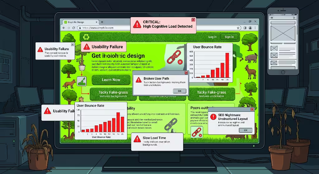
When designers begin applying attention restoration theory to digital products, it is easy to make mistakes by taking concepts too literally or implementing them incorrectly. Below are three common anti-patterns that must be avoided.
+-------------------------------------------------------------------------+
|             COMMON RESTORATIVE DESIGN ANTI-PATTERNS                     |
+-------------------------------------------------------------------------+
|  [!] Literal Skeuomorphism:  Cluttering UI with fake wood and grass     |
|  [!] Animation Overload:     Too many moving particles causing lag      |
|  [!] Boundary Ambiguity:     Removing structure under "organic flow"    |
+-------------------------------------------------------------------------+
Anti-Pattern One: Literal Nature Skeuomorphism
One of the biggest mistakes is assuming that attention restoration theory requires turning a website into a literal simulation of a forest. Adding heavy background images of grass, fake wood grain textures, chirping bird sound effects, or leaf-shaped buttons does not create cognitive restoration. Instead, this literal skeuomorphism introduces heavy visual clutter and increases cognitive load. The goal of attention restoration theory in web design is to capture the structural, mathematical, and spatial qualities of nature, not to build a superficial digital terrarium.
Anti-Pattern Two: Animation and Particle Overload
Another frequent pitfall is overusing animated particles, floating leaves, or complex parallax scrolling under the mistaken belief that more movement equals more soft fascination. Excessive motion overwhelms the visual cortex, drains device battery life, causes frame rate drops, and can trigger severe motion sickness in users with vestibular disorders. Under attention restoration theory, motion must always be subtle, purposeful, and quiet. If an animation draws attention away from the primary content, it is causing distraction rather than restoration.
Anti-Pattern Three: Ambiguous Spatial Boundaries
In an effort to make an interface feel natural and free-flowing, some designers eliminate clear navigation bars, card borders, and structured grids entirely. This approach is a serious mistake. Without clear structural boundaries, the user cannot build a reliable mental map of the site. This spatial ambiguity directly violates the third pillar of attention restoration theory, which demands extent and coherence. An interface must always maintain clear, predictable organization so that the user never feels disoriented or lost.
Frequently Asked Questions About Attention Restoration Theory in Web Design
What are the four main components of attention restoration theory in web design?
The four main components of attention restoration theory in website user experience are being away, soft fascination, extent, and compatibility.
- Being away provides mental refuge by removing pop-ups, clutter, and intrusive interruptions.
- Soft fascination uses gentle motion, balanced colors, and natural visual rhythms to hold involuntary attention without demanding mental effort.
- Extent ensures the website has a clear, connected structure that feels like a coherent space to explore.
- Compatibility aligns all interface controls with the user’s natural goals, eliminating deceptive dark patterns and unnecessary friction.
How does attention restoration theory improve website conversion rates?
Many website owners fear that removing aggressive pop-ups and high-pressure urgency cues will lower sales. However, research and real-world testing demonstrate that applying attention restoration theory actually improves long-term business performance. When users experience Directed Attention Fatigue on high-stress websites, their impulse is to close the tab and leave. By creating a calm, restorative user experience, attention restoration theory lowers cognitive fatigue, enhances decision-making clarity, builds deep brand trust, and leads to higher completion rates on checkout and contact forms.
Can attention restoration theory be applied to complex web applications and dashboards?
Attention restoration theory is exceptionally valuable for complex web applications, enterprise software, and analytics dashboards. Users often spend eight or more hours a day working inside these professional tools, making them highly vulnerable to mental exhaustion. By applying attention restoration theory, software designers can reduce visual noise, implement circadian dark and light modes, organize complex data into harmonious fractal grids, and use gentle, informative micro-interactions. This significantly reduces workplace burnout and increases daily productivity.
How does biophilic UX design differ from traditional minimalist web design?
Traditional minimalist web design focuses almost entirely on subtraction, removing visual elements until only plain text and empty white space remain. While this approach eliminates some clutter, it often results in cold, sterile, and uninviting interfaces that still place a heavy reading burden on directed attention. Biophilic user experience design, guided by attention restoration theory, focuses on purposeful enrichment. It introduces natural fractal proportions, calming earth-derived color palettes, organic physics-based motion, and clear spatial coherence to actively refresh the user’s mental energy.
Practical Implementation Checklist for Designers and Developers
To ensure your web projects successfully incorporate attention restoration theory, use this practical implementation checklist during every stage of your design and development workflow.
+-------------------------------------------------------------------------+
|              RESTORATIVE UX IMPLEMENTATION CHECKLIST                    |
+-------------------------------------------------------------------------+
|  [ ] 1. Remove automatic modal pop-ups and intrusive overlays.          |
|  [ ] 2. Replace pure #000000 and #FFFFFF with organic slates and sands. |
|  [ ] 3. Set body text line length strictly between 60 and 75 characters.|
|  [ ] 4. Apply non-linear cubic-bezier easing to all interface motion.   |
|  [ ] 5. Establish layout grids using the golden ratio (1.618).          |
|  [ ] 6. Eliminate all deceptive dark patterns and artificial urgency.   |
|  [ ] 7. Implement circadian color shifts matching local daylight cycles.|
|  [ ] 8. Test user task load using the NASA-TLX cognitive metric.        |
+-------------------------------------------------------------------------+
By systematically applying each of these items, your digital products will honor the biological needs of the human mind. Grounding website user experience in attention restoration theory creates digital spaces that feel intuitive, elegant, and genuinely restorative for every visitor who arrives at your digital doorstep.