
Table of Contents
The Digital Ecosystem in Crisis
The modern internet is facing a major crisis of focus. Every single day, people open their web browsers only to find a digital world that feels like a chaotic and noisy marketplace. Websites use flashing banners, sudden pop-ups, and hidden tricks to capture your eyes. This constant noise hurts your ability to focus. At Silphium Design LLC, we look at the internet differently. We believe that a website should be designed like a peaceful natural habitat. It should be a place where people can think clearly and find what they need without feeling stressed out.
Right now, most web design is based on a bad idea. This idea is that web developers must steal as much user attention as possible. They treat user attention like a natural resource, such as coal or oil, that needs to be dug up and sold. This method hurts the people who visit your website. It makes them tired, frustrated, and ready to leave your site. When you design a website this way, people do not stay long. They click away because their brains are tired of fighting for control.
There is a much better way to build for the web. We can look at how the human brain interacts with nature to find a solution. Scientists call this Attention Restoration Theory. This theory shows that being around nature helps your mind rest and rebuild its strength. We can bring these same natural principles into the digital world. When you build a website that respects user attention, you create a space that helps the user feel calm. This approach is not just a nice thing to do for your visitors. It is also a powerful way to make your website more successful.
When your website protects user attention, visitors will trust your brand much more. They will stay on your pages longer and read what you have to say. Search engines like Google also reward websites that care about user attention. They want to send people to web pages that are fast, clean, and helpful. Throughout this article, we will look at how to build an amazing website that protects user attention. We will combine the smart rules of computer science with the beautiful patterns of nature to build a better web.
The Psychological Toll: What is the Attention Economy in Web Design?

To fix the web, we first have to understand the business models that run it today. The phrase attention economy describes a world where human focus is treated as a commodity. Companies make money based on how many seconds or minutes you look at a screen. Because of this model, web designers are forced to build layouts that actively fight against your will. They want to control your eyes so they can show you advertisements or clickbait links. This constant fight for user attention is causing a huge amount of mental fatigue for everyday web users.
Our human brains were not built for this kind of constant digital assault. In cognitive science, we study how the human brain processes information from the outside world. The brain has two main ways of paying attention. The first way is called directed attention. This is the effortful focus you use when you are reading a complex text, solving a math problem, or filling out a tax form. Directed attention requires a lot of energy. Your brain has to work hard to ignore distractions and stay on task. When a website forces you to look at moving parts, it drains this specific type of energy.
The second way the brain pays attention is called involuntary attention, which is also known as soft fascination. This happens when you look at something that is naturally interesting but does not require hard work to understand. Think about watching clouds float across the sky, or seeing leaves move in a gentle breeze. Your brain can look at these things for a long time without getting tired. In fact, soft fascination actually allows your directed attention to rest and recover. It refills your mental gas tank.
Sadly, most modern websites do not allow for soft fascination. Instead, they constantly drain user attention through aggressive design choices. When you visit a noisy website, your brain is forced to switch tasks every few seconds. You might be trying to read an informative article, but an animated ad flashes on the right side of the screen. Your brain automatically looks at the movement. Then, you have to force your eyes back to the text. This task switching happens so fast that you might not even notice it. However, it takes a massive toll on your nervous system.
When a website drains user attention continuously, the visitor experiences something called directed attention fatigue. This state makes people irritable, easily distracted, and less capable of making good decisions. From a business standpoint, a tired and annoyed visitor is highly unlikely to buy a product or sign up for a newsletter. They want to escape the uncomfortable digital space as quickly as possible. This is why websites built around stealing user attention often suffer from high bounce rates. People leave because their brains are protecting themselves from exhaustion.
By shifting our design philosophy toward protecting user attention, we can change this dynamic entirely. We can build websites that act like quiet digital glades. These are spaces where text is easy to read, images are peaceful, and layout elements remain steady. When a website values user attention, it does not force the brain to do extra work. Instead, it aligns with the natural limits of human perception. This creates a deeply satisfying user experience that keeps people coming back because your site feels like a relief from the rest of the noisy internet.
Distraction Audits: What Website Features Distract Users the Most?
Before you can build a clean website, you need to know exactly what elements are harming user attention. A distraction audit is a process where you look at every piece of your web design and ask if it helps or hurts the user. Most websites are filled with high friction features that act like mental speed bumps. These features actively steal user attention away from the core message of your page. Let us look at the worst offenders that ruin focus and drive visitors away.
The biggest enemy of user attention is autoplay media. This includes videos that start playing with sound the moment a page loads, as well as background videos that loop forever. When something moves automatically on a screen, the human eye is forced to look at it. This is an ancient survival instinct. Our ancestors had to notice movement in the bushes to avoid predators. Modern screens trick this primitive system. When a video starts playing without permission, user attention is stolen instantly. The visitor loses their place in the text and feels a sudden surge of annoyance.
Another terrible feature for user attention is the intrusive pop-up modal. This is a box that blocks the screen to ask for an email address or offer a discount code. Often, these boxes appear just as a reader is getting into the middle of an important sentence. This completely shatters user attention. It breaks the mental flow of the visitor and forces them to search for a tiny close button. Many times, these close buttons are hidden or made hard to see on purpose. This bad practice frustrates users and makes them want to close the entire website tab immediately.
Infinite scroll is another feature that is incredibly harmful to user attention. This technique automatically loads more content at the bottom of the page so the user never reaches the end. It was created by social media networks to keep people hooked for hours. In standard web design, infinite scroll destroys the user sense of place. The human brain naturally looks for closure points, which are clear endings to a task. A traditional footer at the bottom of a website gives the brain a signal that the job is done. Without a footer, user attention is trapped in an endless loop that causes mild anxiety and mental drift.
We must also look at countdown timers and flashing urgency banners. Many online stores use these elements to make people feel like they are running out of time to buy something. These tools trigger a fear of missing out, which is a stressful emotional state. This fake urgency overloads user attention by creating a sense of panic. The user can no longer evaluate the product calmly because their brain is focusing on the ticking clock. This type of design is manipulative and ultimately destroys long term customer trust.
The ultimate solution to all of these problems is to establish quiet defaults across your entire website. A quiet default means that the website remains completely silent, still, and predictable until the user decides to act. Videos should never play unless a visitor clicks a clear play button. Pop-up boxes should be replaced by static sign-up areas that sit neatly within the layout. By choosing quiet defaults, you hand control back to the visitor. You show that your business values user attention, which makes the user feel safe and respected on your site.
Modern Cognitive Design: How Do You Design for a Short Attention Span?
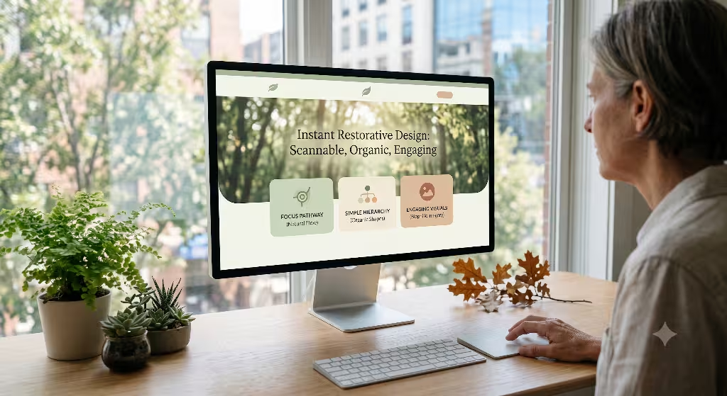
A very common phrase in modern marketing is that humans now have a short attention span. Many articles claim that our focus is now shorter than that of a goldfish. As a scientist, I can tell you that this claim is completely false. Human beings are still capable of reading long books, watching multi-hour movies, and working on complex projects for days. The real change is that people now have an advanced filtering system for digital junk. Because the web is so full of noise, users filter out bad content within a single second. To succeed, you must learn how to design for this protective filter while safeguarding user attention.
When a person lands on your website, their brain asks two quick questions. First, is this page helpful to me? Second, is this page going to be easy to use? If your layout looks like a messy room, the brain will instantly reject it to save energy. To pass this filter, you must use a clear visual hierarchy. Visual hierarchy is the arrangement of elements in a way that implies importance. It tells the human eye exactly where to look first, second, and third. This structure guides user attention naturally down the page without requiring heavy mental effort.
Most western web users scan pages using specific structural paths known as the F-Shaped and Z-Shaped patterns. When looking at a text-heavy page, the eyes usually move across the top, down the left side, and across the middle, forming the letter F. If you place your most important headings and data along this F-shaped path, you align with natural human eye movements. You make it incredibly easy for user attention to catch the main points of your content. The user does not have to hunt for information, which keeps their mind relaxed.
Typography is another vital tool for managing user attention. Typography refers to the style and appearance of printed matter on the screen. If all the text on your website is the same size and weight, the brain sees it as a solid wall of bricks. It looks impossible to climb, so the user attention drifts away. You must use a deliberate typography scale to break up the page. For example, your main title should be large and heavy, your section subheadings should be medium-sized, and your body text should be highly readable. This scale creates a visual staircase that the mind can climb downward with total ease.
Let us look at a standard, highly effective typography scale for an attention-respecting website:
- Main Title (Heading 1): 48 pixels, bold weight, used only once at the very top.
- Section Headers (Heading 2): 24 pixels, medium weight, used to divide major topics.
- Sub-section Headers (Heading 3): 20 pixels, regular-bold weight, for smaller points.
- Body Text: 16 pixels, generous line spacing, used for all standard reading paragraphs.
Beyond text sizes, we must talk about the power of negative space, which is often called white space. Many untrained web designers look at white space and see empty territory that needs to be filled with badges, links, or pictures. This is a massive mistake that destroys user attention. In biophilic design, we view white space as visual breathing room. It is the digital equivalent of a clearing in a dense forest. When you surround a block of text or an image with ample white space, you tell the user attention that this specific item is important. It isolates the element from surrounding noise, making it peaceful to process.
We can also look to natural geometry to build layouts that feel right to the human eye. For thousands of years, artists and architects have used the Golden Ratio to design structures. This ratio is found all throughout nature, from the spiral of a seashell to the arrangement of seeds in a sunflower. When a web layout uses these organic proportions, it feels inherently balanced to human spatial perception. The eyes move across the screen effortlessly because the design matches the natural world. By building with these geometric systems, you create an environment where user attention can rest comfortably on your content.
Hard Architecture: How Does Slow Page Speed Impact User Attention?
When we think about user attention, we often focus on the visual elements of a webpage. However, the technical code running beneath the surface has a massive impact on human focus. Specifically, slow page loading speed is a major destroyer of user attention. If a website takes more than a few seconds to load, the user mental model of the experience breaks completely. In computer science, we know that human beings expect instant feedback when they interact with a machine. When that feedback is delayed, the brain suffers from immediate focus drift.
Think about what happens when you press a light switch. You expect the light to turn on instantly. If it takes three seconds to turn on, you will assume the system is broken. The exact same thing happens when a user clicks a link to your website. Their brain is ready to receive information. If the screen remains blank for two or three seconds, the link between the action and the result is severed. During those empty seconds, user attention is left hanging in a vacuum. Because the human brain dislikes empty spaces, it will immediately look for something else to focus on, such as a phone notification or a different browser tab.
The modern web is incredibly bloated because developers use massive JavaScript frameworks and heavy tracking scripts. This code bloat has a real ecological cost, as it burns extra electricity in data centers. It also has a cognitive cost, because it forces the user device to work harder and wait longer to show the page. When you build an efficient website using server-side rendering and clean code, you save energy and protect user attention at the same time. You deliver the content before the user mind has a chance to wander away.
To understand how speed affects user attention, we must look at the Core Web Vitals. These are specific performance metrics that Google uses to judge the user experience of a webpage. The first major metric is called Largest Contentful Paint, or LCP. This measures how long it takes for the main content of a webpage to appear on the screen. If your LCP takes longer than two seconds, you are actively losing user attention. The visitor is looking at a loading screen, which causes immediate mental friction and increases the likelihood that they will leave your site.
The second crucial metric for user attention is Cumulative Layout Shift, or CLS. This measures how much the elements on a webpage move around while the page is still loading. We have all experienced the frustration of reading an article when suddenly a late-loading advertisement pops in, pushing the text down the page. This sudden jump is a terrible shock to user attention. The eyes lose their place, and the brain has to re-read the page to find where it was. This layout shifting is incredibly jarring and causes immediate mental irritation.
Let us review the ideal technical benchmarks you should hit to keep user attention locked onto your website without causing cognitive strain:
| Performance Metric | Target Threshold | Attention Impact |
| Largest Contentful Paint (LCP) | Less than 1.2 seconds | Delivers content instantly before the mind drifts away. |
| Cumulative Layout Shift (CLS) | 0 (Perfectly static) | Keeps text steady so eyes never lose their place. |
| First Input Delay (FID) | Less than 50 milliseconds | Makes the site feel highly responsive to human touch. |
By optimizing these technical foundations, you are treating speed as a form of empathy. You show the visitor that you value their time and their focus. A fast website acts like a clear, smooth pathway through a meadow. There are no sudden rocks to trip over, and there are no long delays blocking the journey. The visitor can move through your information at their own natural pace, which keeps their user attention completely focused on your core message.
Accessible and Circadian Interfaces
An internet that values user attention must be built for every single human being, regardless of their physical or cognitive abilities. This is why web accessibility is a fundamental part of attention-focused design. When a website is hard to navigate for someone with a disability, it demands an immense amount of extra focus just to move around the page. By following the Web Content Accessibility Guidelines, or WCAG, we can lower this unnecessary friction and make the interface completely smooth for everyone.
Consider the issue of color contrast on a webpage. If your website uses light gray text on a white background, it looks elegant to some designers, but it is incredibly hard to read. The human eye has to strain significantly to separate the letters from the background. This physical eye strain causes rapid mental fatigue, which quickly drains user attention. To protect focus, you must use strong contrast ratios. A minimum contrast ratio of 4.5:1 ensures that text stands out sharply against its background, allowing the eyes to glide over words without extra physical effort.
Keyboard navigability is another vital component of accessible design that protects user attention. Many users cannot use a mouse and rely entirely on the keyboard to move through a website. If your site code is poorly structured, the keyboard focus indicator might jump around randomly or disappear entirely. This flaw leaves the user completely lost on the page. They have to spend a large amount of user attention just figuring out where their cursor is located. A clear, linear keyboard path keeps the experience predictable and stress-free.
We must also think about how websites affect the natural biological rhythms of the human body. Our bodies have an internal clock known as the circadian rhythm, which reacts to the light in our environment. For thousands of years, humans woke up to warm sunlight, experienced bright blue light during the midday hours, and relaxed to warm orange firelight in the evening. Modern screens disrupt this natural cycle by blasting bright blue light into our eyes at all hours of the night. This blue light tricks the brain into thinking it is daytime, which causes neural stress and ruins sleep quality.
An attention-respecting website can solve this issue by using circadian-aligned styling. This means that your website code can automatically detect the time of day in the user location. During the bright daylight hours, the site can display a clean, high-contrast light mode. When the sun goes down, the website can automatically shift into a warm, gentle dark mode. This dark theme should avoid harsh neon colors and bright white text. Instead, it should use soft charcoal backgrounds and muted amber tones.
By offering a circadian-aligned dark mode, you protect the physical health of your visitor. You ensure that their evening visit to your website does not cause a spike in stress hormones or disrupt their upcoming sleep. This thoughtful design choice shows a deep level of respect for the user attention and their overall well-being. The visitor does not have to fight against painful glare to read your content, which makes their interaction with your brand feel incredibly comfortable and restorative.
Ethical Conversion: From Interruption to Invitation
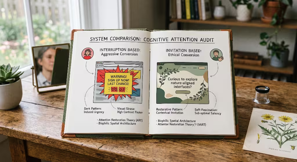
A major worry for many business owners is that an attention-respecting website will not make enough money. They believe that if they remove the aggressive pop-ups, countdown timers, and flashing ads, their sales will drop to zero. This fear is based on a misunderstanding of how human trust works. Aggressive tricks might get a few quick clicks in the short term, but they destroy the long-term relationship between a business and its customers. Ethical conversion architecture is the practice of turning visitors into buyers through invitation rather than interruption, which preserves user attention completely.
When a website uses manipulative tricks to force a sale, it is using what designers call dark patterns. A dark pattern is a user interface that has been carefully crafted to trick users into doing things they might not want to do. Examples include hiding the unsubscribe button, automatically adding extra items to a shopping cart, or using confusing language on checkboxes. While these patterns might increase sales for a few weeks, they destroy brand loyalty. Users quickly realize they have been tricked, and they leave the website feeling cheated. This practice destroys user attention by forcing people to be hyper-vigilant against scams.
Ethical conversion architecture takes the exact opposite approach. Instead of jumping out from behind a bush to scare the user, an ethical website places helpful invitations exactly where they make sense. We call these passive and contextual calls to action, or CTAs. A contextual CTA is a button or link that matches the exact topic the user is reading about at that moment. Because it matches their current intent, it does not feel like an interruption. It feels like a helpful next step in their journey.
Imagine reading a deeply informative article about how to care for indoor ferns. As you reach the middle of the text, you see a beautifully styled box that says, “Download our free chart on fern watering schedules.” This invitation does not slide over the text, it does not dim the screen, and it does not flash in neon colors. It sits quietly within the article, surrounded by comfortable white space. Because this offer directly relates to your current focus, it naturally attracts user attention without causing any annoyance. You click the link because you want to, not because you were forced to look at it.
To build an ethical conversion system, you should always follow the principle of compatibility. This means that your business goals must align with the goals of the person visiting your site. If someone comes to your website to read a simple recipe, do not force them to scroll through ten screen-length ads just to see the ingredients list. Give them the recipe cleanly and instantly. Then, at the bottom of the page, invite them to check out your cooking book. This approach respects user attention and leaves the visitor with a wonderful impression of your business. They will buy from you because they respect your honesty and clarity.
The Silphium Method for a Restorative Web
Building a website that respects user attention is the most important choice a modern business can make. The internet is currently filled with digital pollution that exhausts the human mind and drives people away from online spaces. By breaking away from the hostile models of the attention economy, we can build a new digital landscape that feels like a calm and healthy forest. We can use the timeless rules of biology, psychology, and computer science to create web pages that truly nurture the human spirit.
When you choose to protect user attention, you are investing in the long term health of your online presence. You will see your bounce rates drop as people find comfort in your clean layouts and fast load times. Your search engine rankings will climb because systems like Google are built to identify and reward websites that offer a stress-free experience. Most importantly, you will build an authentic bond of trust with your audience. They will know that when they visit your digital home, their focus will be treated with absolute dignity.
We must stop treating user attention as a resource to be stolen and exploited. Instead, we must view it as a precious and delicate ecosystem that needs to be protected. Let us build websites that use clean visual structures, quiet defaults, and blazing fast speeds. Let us replace the screaming interruptions of the modern web with quiet, respectful invitations. By committing to these ethical principles, we can transform the internet into a restorative space that honors the mind, supports the body, and helps every business thrive naturally.
The 5-Step Transition: Audit & Redesign for Attention
For developers and designers who are ready to transform an aggressive website into a peaceful, attention-respecting environment, this transition sequence should be followed in exact order.
1.Conduct a Distraction Audit:Phase 1: Identify the Noise.
Examine every element on your active website to find features that disrupt user attention. Flag all auto-playing videos, background loops, interruptive pop-up boxes, and shifting text areas. Measure your current loading speeds and layout shifts using free speed analysis tools.
2.Establish Visual Breathing Room:Phase 2: Maximize Negative Space.
Redesign your layout to increase the amount of white space across all pages by at least 30 percent. Remove unnecessary sidebar badges, social media widgets, and secondary links. Reduce the number of calls to action per view to one clear, quiet option so user attention can focus on one task at a time.
3.Implement Circadian Styles & Soft Motion:Phase 3: Integrate Biophilic Assets.
Update your style sheet to use natural, earth-toned colors that relax the eyes. Set up an automatic light and dark mode system that adjusts based on the local time of day to protect the user circadian rhythm. If you use animations, make sure they are slow, gentle, and mimic natural organic movements.
4.Optimize the Technical Foundations:Phase 4: Accelerate Content Delivery.
Convert all of your website images to high-efficiency formats like WebP to keep file sizes incredibly small. Clean up your underlying code by removing old tracking scripts and unneeded JavaScript frameworks. Ensure your server-side settings deliver content to the user attention in under 1.5 seconds.
5.Install Respectful Interactive Defaults:Phase 5: Empower the User.
Set all media files to stay paused until the user chooses to press play. Remove any code that alters natural browser scrolling speeds or patterns. Make sure every single link and button can be easily found and used with a standard computer keyboard, keeping user attention completely free from operational frustration.