
Table of Contents
The Attention Economy
The modern internet has become a loud, crowded marketplace. Every website, application, social media feed, and digital platform fights for a single prize: your time and focus. In digital design, this environment is called the attention economy. In the attention economy, human focus is treated as a scarce commodity that businesses extract, harvest, and monetize. Just like oil, timber, or precious metals, human attention has become one of the most valuable resources in the global market.
Web designers find themselves at the center of this system. When you open a browser, every pixel, color choice, pop-up window, and animation is part of a calculated battle for your eyes. However, the human brain was not built for constant digital stimulation. Our sensory systems evolved to read natural patterns, assess physical landscapes, and focus on one meaningful task at a time. The aggressive mechanics of the attention economy often run directly against human biology. By turning user focus into a currency, many modern websites create mental fatigue, stress, and visual exhaustion.
Understanding the attention economy is the first step toward building a better digital world. Designers do not have to rely on cheap tricks, noisy interruptions, or manipulative layouts to deliver value. By studying how the brain processes information, we can replace extractive design with calm, respectful, and restorative digital spaces. This comprehensive guide explores how the attention economy operates within web design, why it harms user experience, and how we can use sustainable, nature-inspired principles to build websites that respect human attention.
Defining the Attention Economy Through a UX Lens
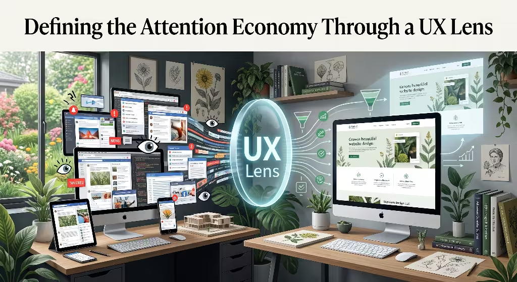
To understand the attention economy in web design, we must first look at how user experience (UX) has changed over the past three decades. In the early days of the internet, websites functioned mostly like digital libraries. They were utility tools built to help people find specific information, read articles, or send messages. Once a user finished their task, they closed the page and moved on with their day.
As the internet matured, business models shifted. Free services replaced paid software, and digital advertising became the primary engine of web monetization. Suddenly, a website could not make money simply by helping you finish a task quickly. Instead, platforms discovered that the longer they kept your eyes glued to the screen, the more advertisements they could show you and the more personal data they could collect.
+-------------------------------------------------------------+
|               THE ATTENTION ECONOMY CYCLE                   |
|                                                             |
|   [ Digital Content ]  ---> Captures ---> [ Human Focus ]   |
|            ^                                     |          |
|            |                                     v          |
|    [ Engagement Loops ] <--- Monetizes <--- [ Screen Time ] |
+-------------------------------------------------------------+
This structural shift gave birth to the modern attention economy. In the attention economy, web design is no longer just about visual aesthetics or functional navigation. It is about capturing, directing, and holding human consciousness for as long as possible. User experience design became weaponized to serve engagement metrics rather than human well-being.
The Biological Reality of Cognitive Bandwidth
The fundamental problem with the attention economy is that it ignores human biological limits. Your brain is a physical organ with a limited amount of daily energy. This mental capacity is known as cognitive bandwidth.
Every time your eyes process a bright color, read a line of text, decode an icon, or react to a moving banner, your brain uses glucose and oxygen. Your working memory can only hold a small amount of information at any single moment. When a website bombards you with five different calls to action, three flashing badges, and an auto-playing video, it causes cognitive friction.
In the natural world, the human visual system relies on clear, gentle cues. When you walk through a forest, the visual environment is rich but calm. Sunlight filters through leaves, textures vary in a balanced way, and changes in the environment happen organically. You do not experience sensory shock because the natural world does not aggressively demand your focus.
In the digital attention economy, websites behave like chaotic, flashing carnivals. Designers use high-contrast colors, sudden visual movements, and artificial urgency to trigger your ancient survival instincts. Your brain treats sudden motion on a screen the same way it would treat a predator stepping out from behind a bush. By constantly triggering these primal reflexes, the attention economy drains your cognitive bandwidth and leaves you mentally exhausted.
Herbert Simon’s Axiom in Modern Interfaces
The foundation of the attention economy was accurately predicted long before the modern web existed. In 1971, psychologist, economist, and Nobel laureate Herbert A. Simon wrote a profound statement about the relationship between information and focus:
“In an information-rich world, the wealth of information means a dearth of something else: a scarcity of whatever it is that information consumes. What information consumes is rather obvious: it consumes the attention of its recipients. Hence a wealth of information creates a poverty of attention.”
Simon realized that when information becomes overly abundant, human attention becomes the limiting factor. Today, the internet produces an endless supply of text, video, images, and notifications. Because information is effectively infinite, the attention economy turns human focus into the ultimate prize.
       INFINITE INFORMATION
                |
                v
  [ Digital Proliferation ]
                |
                v
       POVERTY OF ATTENTION
                |
                v
    [ Scarcity of Human Focus ]
                |
                v
   THE ATTENTION ECONOMY BATTLE
In web design, Simon’s axiom explains why modern interfaces feel so hyperactive. When thousands of websites compete for the same limited pool of human focus, designers feel pressured to shout louder than their competitors. A quiet, useful website is often treated as a failure by marketing departments because it allows the user to leave. In the attention economy, silence and simplicity are replaced with constant visual noise to prevent the user from looking away.
How Modern Web Architecture Commodifies User Focus
To capture value in the attention economy, digital architects changed the basic structure of the web. Traditional web architecture was built around distinct pages, logical directories, and clear endings. A reader would reach the bottom of an article, see a footer, and recognize that the experience was complete.
In the attention economy, clear endings are viewed as a design flaw. Modern web architecture is engineered to remove natural stopping points. Designers create continuous content loops that feed users new stimuli before they have time to decide to leave.
Consider how modern platforms structure their pages:
- Infinite Scrolling: Removing the page footer so content loads continuously, preventing the user from finding a psychological resting point.
- Auto-Play Queues: Automatically starting the next video or article before the current one finishes.
- Sticky Elements: Locking navigation bars, floating video players, and promotional banners to the screen so they follow you as you scroll.
- Algorithmic Feed Recommendations: Replacing organized, chronological information with continuous streams of personalized content designed to trigger emotional reactions.
These structural patterns turn the user from an active explorer into a passive consumer. In the attention economy, web architecture is designed to capture your focus and hold it hostage, trading your mental peace for corporate advertising revenue.
Common Attention Economy Tactics: The Mechanics of Capture
To survive in the attention economy, many web platforms rely on specific psychological triggers and visual tricks. These techniques are deliberately crafted to bypass rational decision-making and exploit human evolutionary habits. When designers prioritize the attention economy over user respect, they lean on three major mechanisms: sensory hijacking, dark patterns, and manufactured urgency.
+-------------------------------------------------------------+
|         ATTENTION ECONOMY CAPTURE MECHANISMS                |
|                                                             |
|   1. SENSORY HIJACKING    --> Autoplay, blinking badges     |
|   2. DARK PATTERNS        --> Infinite scroll, fake timers  |
|   3. EMOTIONAL PROVOCATION--> Outrage algorithms, clickbait |
|                                                             |
|   RESULT: Chronic cognitive fatigue and high bounce rates   |
+-------------------------------------------------------------+
Sensory Hijacking
The human visual system is wired to detect sudden changes in light, color, and motion. In nature, these changes signal important events, such as an approaching storm or an edible animal moving through the grass. Sensory hijacking occurs when web designers abuse these biological reflexes to force visual engagement.
Common examples of sensory hijacking in the attention economy include:
- High-Contrast Notification Badges: Bright red dots placed over menu icons. Red is an evolutionary warning color that indicates danger, blood, or ripe fruit. Placing red dots across an interface forces the brain to look, even when the underlying notification is completely trivial.
- Auto-Playing Media: Videos and animated graphics that play automatically as soon as a page loads. Because the human eye cannot easily ignore moving objects in its peripheral vision, your eyes are pulled away from the text you intended to read.
- Animated Floating Elements: Chat widgets that bounce, pulse, or shake in the corner of the screen while you are trying to concentrate on page content.
- Layout Shifts: Advertisements and dynamic banners that load slowly, causing the text on the page to suddenly jump downward just as you are about to click a link.
These sensory interruptions disrupt your train of thought. In the attention economy, your focus is treated like a toy that can be yanked in any direction by the highest bidder.
Dark Patterns and Variable Reward Schedules
The attention economy often uses deceptive design choices known as dark patterns. Dark patterns are user interfaces that have been carefully crafted to trick users into doing things they might not otherwise do, such as signing up for recurring charges, sharing private contacts, or spending hours browsing irrelevant content.
Many dark patterns in the attention economy borrow mechanics directly from the gambling industry. In the 1950s, psychologist B.F. Skinner discovered that animals repeat behaviors most obsessively when rewards are delivered on an unpredictable schedule. This is known as a variable reward schedule, and it is the exact mechanism that makes slot machines addictive.
[ Trigger: Pull to Refresh ] ---> [ Variable Delay ] ---> [ Unpredictable Reward ]
          ^                                                        |
          |                                                        v
          +-------------------- Repeat Action <--------------------+
Web designers apply variable reward schedules in several ways:
- Pull-to-Refresh Gestures: Mimicking the physical arm pull of a slot machine, forcing users to wait a brief second to see if new content appears.
- Infinite Scroll Feeds: Hiding whether the next piece of content will be boring or exciting, which encourages endless scrolling.
- Fake Urgency Countdowns: Displaying timers that claim a discount or product is expiring in five minutes, even when the offer is permanently available.
- Confirmshaming: Writing decline buttons with manipulative, guilt-inducing text, such as “No thanks, I hate saving money.”
In the attention economy, these techniques are used to extract extra minutes and clicks from users by manipulating their emotional vulnerabilities.
The Cost of Overstimulation
While extractive tactics may produce short-term gains in clicks and ad impressions, they cause severe long-term damage to both users and brands. Constant sensory overload leads to digital burnout, visual fatigue, and deep frustration. When a website treats a visitor like a collection of eyeball metrics in an aggressive attention economy, the visitor naturally develops defensive behaviors.
One of the most visible defensive behaviors is banner blindness. Because users have learned that bright, flashing boxes contain useless advertisements, their eyes automatically skip over large sections of web pages. When designers fill a website with too much noise, users stop reading altogether. They skim quickly, miss critical instructions, and frequently leave the site entirely.
Furthermore, the attention economy creates an environment of distrust. When users realize that a website is using fake countdown timers, hidden subscription checkboxes, or disorienting popups, their respect for that brand evaporates. In the modern attention economy, short-term engagement metrics often destroy long-term brand equity and customer loyalty.
Cognitive Ergonomics: How the Brain Scans Digital Spaces
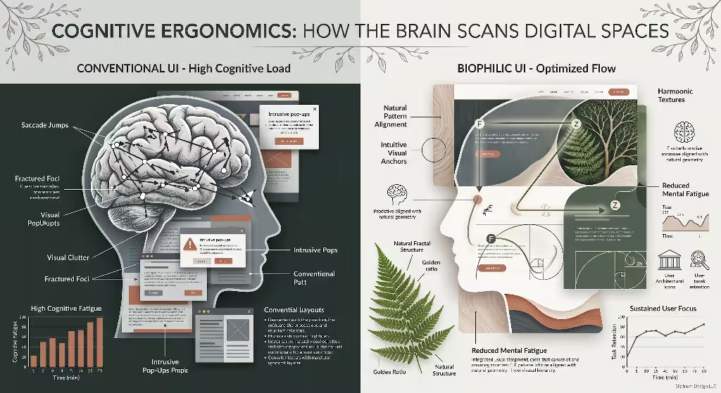
To counter the extractive tactics of the attention economy, web designers must understand cognitive ergonomics. Cognitive ergonomics is the science of designing digital systems so they match the natural capabilities and limits of the human mind. Rather than fighting human biology to steal focus, ergonomic web design cooperates with human biology to make reading, learning, and navigating feel effortless.
+-------------------------------------------------------------+
|                 COGNITIVE ERGONOMICS IN UX                  |
|                                                             |
|   HUMAN WORKING MEMORY       VISUAL SCANNING PATHS          |
|   - Holds 4 to 7 items       - F-Pattern (Text-dense pages) |
|   - Drained by visual noise  - Z-Pattern (Visual landings)  |
|                                                             |
|   GOAL: High signal, low noise, structured hierarchy        |
+-------------------------------------------------------------+
Selective vs. Divided Attention
Human attention operates in two primary modes: selective attention and divided attention. Understanding the difference between these two modes is essential for building interfaces that resist the worst impulses of the attention economy.
- Selective Attention (Top-Down Focus): This occurs when a user visits your website with a clear, conscious goal. For example, a user might want to check the weather forecast, read a scientific article, or buy a specific gardening tool. Their conscious brain directs their eyes to find relevant information while filtering out distractions.
- Divided Attention (Bottom-Up Capture): This occurs when involuntary sensory signals pull a user’s focus away from their goal. An unexpected animation, a flashing banner, or a sudden newsletter pop-up triggers an involuntary reflex, splitting the user’s attention into pieces.
The attention economy constantly attacks top-down focus. It relies on bottom-up interruptions to pull users off their chosen path and into profitable distraction loops.
Ethical web design does the exact opposite. It protects selective attention by removing visual clutter, maintaining steady layouts, and allowing users to accomplish their goals without unnecessary interruptions.
SELECTIVE ATTENTION (Top-Down)
[ User Goal ] --------------> [ Direct Path ] --------------> [ Success ]

DIVIDED ATTENTION (Attention Economy Disruption)
[ User Goal ] ----> [ Pop-Up ] ----> [ Autoplay Video ] ----> [ Frustration ]
When users read content online, their eyes follow predictable scanning patterns:
- The F-Pattern: On text-heavy pages, users read across the top heading, move down the left side, read across a shorter second heading, and then scan vertically down the left margin.
- The Z-Pattern: On landing pages with strong visual hierarchy, the eye moves across the top bar, cuts diagonally down across the page, and finishes across the bottom row.
In a calm design, these scanning paths feel smooth and natural. In the chaotic attention economy, intrusive design elements constantly break these reading paths, forcing the user to restart their visual search again and again.
Working Memory and Hick’s Law
Working memory is the mental workbench where your brain temporarily stores and processes information. In 1956, cognitive psychologist George Miller demonstrated that human working memory can only hold about seven pieces of information at once. Modern research shows that for complex visual tasks, that number is often as low as four items.
When a web interface overloads working memory, users experience decision paralysis. This psychological reality is expressed mathematically through Hick’s Law:
T = b X log2(n + 1)
In this equation, T represents the time required to make a decision, n is the number of equal options presented, and b is an empirical constant. As the number of choices increases, the mental effort and time required to make a choice grows logarithmically.
Decision Time (T)
  ^
  |               . - - - - - - (Hick's Law Curve)
  |           . '
  |        . '
  |      /
  |    /
  |  /
  +-------------------------------------> Number of Options (n)
The attention economy often breaks Hick’s Law by packing sidebars with related links, social media widgets, promotional offers, and chat bubbles. This forces the brain to spend massive amounts of energy simply ignoring irrelevant choices. Ethical web designers fight the attention economy by limiting visible choices, grouping related items into simple categories, and presenting clear next steps.
The Signal-to-Noise Ratio in Layout Architecture
In communication theory, the signal-to-noise ratio compares the level of desired information (the signal) to the level of background interference (the noise). This concept is one of the most powerful tools for evaluating web interfaces in the attention economy.
Signal-to-Noise Ratio = Meaningful Content (Signal)/Visual Clutter and Distractions (Noise)
- The Signal: Clear typography, helpful educational text, intuitive navigation menus, relevant high-resolution photography, and functional action buttons.
- The Noise: Flashing advertisements, decorative visual clutter, unorganized links, unnecessary badges, tracking scripts that slow down rendering, and manipulative pop-ups.
LOW SIGNAL-TO-NOISE RATIO (Attention Economy Standard)
+-------------------------------------------------------------+
| [FLASH AD]  Header  [SALE!]  [NOTIFICATIONS (3)]  [SIGN UP] |
| [POPUP]  Text text text  [AUTOPLAY VIDEO]  Text text text  |
| [COOKIE BANNER]  [CHAT WIDGET]  [RECOMMENDED CLICKBAIT]     |
+-------------------------------------------------------------+

HIGH SIGNAL-TO-NOISE RATIO (Restorative Design Standard)
+-------------------------------------------------------------+
| Brand Logo                       Navigation Menu            |
|                                                             |
| Clear Headline                                              |
| Clean, readable article text with generous margins.         |
| Meaningful visual diagram supporting the content.           |
|                                                             |
| Clear Footer and Task Completion                            |
+-------------------------------------------------------------+
Websites built for the extractive attention economy naturally have a low signal-to-noise ratio. They intentionally add noise because noise creates opportunities for accidental clicks and advertising impressions. Websites built for human beings maintain a high signal-to-noise ratio, ensuring that every visual element serves a clear, respectful purpose.
The Restorative Counter-Model: Biophilic and Calm Web Design

If the attention economy represents an extractive, high-stress approach to the digital landscape, what is the alternative? The answer lies in biophilic design and calm technology. Biophilic design is the practice of connecting human beings to natural patterns, materials, and processes within the built environment. When applied to digital architecture, biophilic principles create digital spaces that feel intuitive, restful, and deeply aligned with human biology.
Nature does not fight for your attention using flashing red lights or emotional manipulation. Instead, natural systems use organized complexity, gradual transitions, and balanced spatial proportions. By borrowing these patterns from the physical world, web designers can create interfaces that heal the mental fatigue caused by the attention economy.
+-------------------------------------------------------------+
|                 BIOPHILIC WEB DESIGN PILLARS                |
|                                                             |
|   1. SPATIAL RELIEF      --> Generous whitespace, clean margins
|   2. ORGANIC RHYTHMS     --> Soft transitions, natural palettes
|   3. INTENTIONAL SLOW UX --> User consent, clear endpoints   |
+-------------------------------------------------------------+
Visual Pacing and Spatial Relief
In physical architecture, a well-designed building includes open courtyards, quiet corridors, and windows that look out onto natural landscapes. These open areas give the mind a chance to reset before entering a crowded room.
In web design, whitespace serves the exact same purpose. Whitespace is not empty, wasted space; it is the visual oxygen of an interface. In an aggressive attention economy, designers often treat whitespace as unused real estate that should be filled with advertisements or promotions. This creates a dense, claustrophobic experience that suffocates the reader.
Biophilic web design uses generous visual pacing to provide spatial relief:
- Generous Line Spacing: Setting line heights to 1.5 to 1.7 times the font size so sentences are effortless to track.
- Controlled Line Lengths: Limiting paragraphs to 50 to 75 characters per line to keep the eye from tiring as it scans back and forth.
- Expansive Section Padding: Separating major concepts with substantial vertical space, allowing the brain to process one idea before encountering the next.
- Clear Margins: Framing content with wide borders that keep the eye focused on the central signal rather than drifting toward screen edges.
Giving users spatial relief is a direct, peaceful rebellion against the attention economy. It tells the reader that their peace of mind is more important than packing the screen with promotional noise.
Organic Rhythms vs. Algorithmic Urgency
The attention economy is characterized by synthetic, harsh interactions: rapid pop-ups, jarring layout shifts, and blinking countdown timers. These elements feel unnatural because they operate on mechanical, algorithmic urgency.
In contrast, biophilic design incorporates organic rhythms. In the natural world, physical objects obey the laws of physics. Leaves fall with gentle acceleration, shadows shift slowly as the sun moves, and water flows around obstacles with fluid grace. When digital interfaces reflect these physical behaviors, our brains process them with minimal effort.
To build organic rhythms into a website:
- Use Natural Easing Curves: When elements move or expand on screen, use smooth cubic-bezier transitions rather than sudden linear cuts. Visual motion should mimic the way real objects accelerate and decelerate.
- Adopt Earth-Grounded Color Palettes: Base your visual themes on balanced natural tones, such as deep forest greens, slate grays, warm stone neutrals, and soft terracotta accents. Avoid hyper-saturated neon colors for background elements unless they represent critical functional states.
- Incorporate Natural Geometry: Soften harsh, sharp rectangular boxes with subtle border radii, gentle curves, and organic layout proportions that reflect natural structures like riverbeds, branching trees, or coastal shorelines.
ALGORITHMIC URGENCY                     ORGANIC RHYTHM
[ Harsh flashing red badge ]    vs.    [ Soft, natural state transition ]
[ Instant, jarring pop-up ]     vs.    [ Gentle fade with smooth easing ]
[ Clashing neon contrast ]      vs.    [ Balanced, earth-grounded tones ]
These subtle design choices reduce visual stress and help users feel grounded. By replacing artificial urgency with organic pacing, designers create websites that counter the exhausting friction of the attention economy.
Intentional Friction (Slow UX)
The attention economy relies on zero-friction mechanics to keep users moving impulsively. When it is effortless to swipe to the next video, purchase a product with one click, or share an inflammatory headline without reading the article, people act on raw instinct rather than thoughtful intention.
Slow UX is the deliberate introduction of intentional friction into digital systems. Intentional friction gives users a moment to pause, reflect, and make conscious choices.
EXTRACTIVE NO-FRICTION FLOW
[ Impulsive Trigger ] --------> [ Instant Action ] --------> [ Regret / Fatigue ]

SLOW UX INTENTIONAL FRICTION FLOW
[ Action Request ] ---> [ Clarity Pause / Summary ] ---> [ Conscious Confirmation ]
Examples of healthy, intentional friction include:
- Confirmation Checkpoints: Asking users to review the contents of an order or confirmation details clearly before completing a major transaction.
- Reading Verification: Prompting users who attempt to share an article on social media to read the piece first if they have only spent three seconds on the page.
- Deliberate Navigation: Replacing infinite scrolling with thoughtful pagination, allowing users to choose whether they wish to continue to page two or complete their session.
- Calm Notification Summaries: Delivering non-urgent updates in a single, daily batch rather than firing individual push notifications throughout the workday.
Intentional friction demonstrates respect for human autonomy. It rejects the attention economy premise that speed and continuous engagement are the only metrics that matter in software design.
Comparing Web Design Paradigms
To see the difference between these two design philosophies clearly, we can compare their core metrics, navigational structures, and psychological impacts side by side.
The attention economy treats the user as an energy source to be consumed. The restorative model treats the user as a human guest to be assisted and respected.
| Design Dimension | Extractive Attention Model | Restorative / Sustainable Model |
| Primary Metric | Time on page, total clicks, ad impressions, scroll depth | Task completion speed, user clarity, long-term brand trust |
| Navigation Flow | Infinite scroll, algorithmic loops, auto-playing queues | Structured pagination, clear directories, definitive endpoints |
| Visual Hierarchy | Clustered calls to action, flashing alerts, high visual noise | Single focal anchor, balanced whitespace, logical layout |
| Color and Tone | Hyper-saturated neon accents, aggressive warning colors | Calming earth-grounded tones, harmonious natural contrast |
| Motion and Animation | Jarring layout shifts, bouncing chat widgets, pop-ups | Smooth physics-based transitions, minimal ambient motion |
| Friction Strategy | Zero friction for impulsive actions, high friction for canceling | Intentional friction for conscious choices, effortless task exits |
| User Psychological State | Overwhelmed, distracted, mentally exhausted, anxious | Focused, calm, capable, in control of their digital time |
This comparison reveals that the difference between these models is not just visual; it is ethical. Designing for the attention economy requires viewing human cognitive limits as obstacles to overcome. Designing for restoration means viewing human cognitive limits as sacred boundaries to protect.
Practical Implementation: How to Design for True Value
Moving away from the attention economy requires practical, actionable changes in how we plan, design, and code websites. Designers, developers, and product managers can follow a structured three-step implementation process to ensure their digital products deliver authentic value without relying on extractive mechanisms.
+-------------------------------------------------------------+
|              THREE STEPS TO RESTORATIVE DESIGN              |
|                                                             |
|   STEP 1: ATTENTION AUDIT       --> Clear the visual debris |
|   STEP 2: PROGRESSIVE DISCLOSURE--> Reveal data on demand   |
|   STEP 3: ASYNCHRONOUS SCANNING --> Build scannable paths   |
+-------------------------------------------------------------+
Step 1: Conduct an Attention Audit
Before adding new features, animations, or marketing banners to a website, conduct a thorough attention audit of the existing layout. An attention audit evaluates every single visual element on a page to determine whether it helps the user or simply serves the attention economy.
To perform an attention audit:
- Take a Full-Page Screenshot: Capture your entire web page, from the top header to the bottom footer.
- Identify Every Focal Point: Place a small circle over every element that demands visual attention (buttons, badges, banners, bold text, images, icons, and animations).
- Apply the 3-Second Rule: Look at the interface for three seconds. Can a user instantly identify the main purpose of the page and the primary action they need to take? If the page has more than one primary visual anchor, it suffers from attention fragmentation.
- Remove the Non-Essential: Eliminate floating widgets, secondary promotional banners, auto-play elements, and decorative graphics that do not directly answer the user’s primary question.
ATTENTION AUDIT MATRIX

Element Type         | User Value | Business Value | Action
---------------------|------------|----------------|------------------------
Primary Article Text | High       | High           | Retain and optimize
Search Input Bar     | High       | Medium         | Retain with clear focus
Bouncing Chat Widget | Low        | Low            | Remove or make static
Newsletter Pop-Up    | Low        | Medium (Short) | Replace with inline box
Auto-Playing Video   | Low        | High (Ad Rev)  | Remove entirely
By conducting an attention audit, you strip away the visual noise that characterizes the attention economy, creating a clean slate where essential information can shine.
Step 2: Implement Progressive Disclosure
Progressive disclosure is a classical interaction design pattern that prevents cognitive overload by presenting only the information necessary for the immediate task. Secondary, complex, or advanced details are hidden until the user explicitly asks to see them.
[ Essential Overview State ]
         |
         v (User clicks "View Technical Specs")
[ Expanded Detail State ]
In the extractive attention economy, websites often dump massive amounts of content, recommendations, and related links onto the screen at once, hoping that something will catch the user’s eye. Progressive disclosure takes the opposite approach:
- Use Expandable Accordions: On complex informational pages, organize deep technical details into clean, expandable sections so users can explore at their own pace.
- Multi-Step Form Design: Instead of presenting a massive form with thirty input fields, break the process into small, manageable steps with clear progress indicators.
- Contextual Tooltips: Provide helpful definitions or background information through subtle hover or click states rather than cluttering the main body text with parenthetical explanations.
Progressive disclosure respects human working memory. It allows users to control the flow of information, completely dismantling the chaotic firehose approach favored by the attention economy.
Step 3: Optimize for Asynchronous Consumption
Users do not read websites like printed novels. They scan pages quickly, looking for specific anchor points that answer their questions. If a website is poorly structured, users must expend enormous mental energy trying to find relevant facts amid walls of unstructured text.
Optimizing for asynchronous consumption means organizing content so that a reader can extract value in thirty seconds or thirty minutes, depending on their needs:
- Informative, Descriptive Subheadings: Write section headers that summarize key concepts directly, rather than using vague, clever teasers. A user scanning headers should understand the core message of the article without reading every paragraph.
- Contextual Inline Bolding: Use bold formatting on critical phrases and key terms to guide the reader’s scanning eye along a logical journey through the text.
- Digestible Content Chunks: Keep paragraphs short (two to four sentences). Long, unbroken blocks of text create visual fatigue and trigger high bounce rates in an already crowded attention economy.
- Summary Tables and Bulleted Lists: Convert dense, comparative data into structured tables or clear lists to enable rapid comprehension.
UNSTRUCTURED TEXT (High Mental Effort)
"When you design a website you have to consider many things like colors,
fonts, layouts, white space, mobile responsiveness, server speed, and
accessibility, and if you fail to do these things your users will get
confused and they will bounce from your page very quickly."

STRUCTURED ASYNCHRONOUS LAYOUT (Low Mental Effort)
Core Design Factors for User Retention:
* Visual Foundations: Balanced color palettes, accessible fonts, generous whitespace.
* Technical Performance: Fast server response times, responsive mobile rendering.
* User Outcome: Clear navigation paths that prevent cognitive fatigue.
When you structure content for asynchronous reading, you allow users to engage with your ideas on their own terms, rejecting the manipulative traps of the attention economy.
Frequently Asked Questions About the Attention Economy
How does the attention economy affect user experience (UX)?
The attention economy damages user experience by shifting the focus of design from human utility to platform engagement. Instead of helping users accomplish tasks efficiently, interfaces built for the attention economy use disruptive pop-ups, infinite scrolling, auto-playing media, and dark patterns to prolong screen time. This constant competition for human focus increases cognitive load, creates visual fatigue, and erodes long-term trust between users and digital brands.
What are examples of attention economy tactics in web design?
Common tactics include infinite scrolling feeds that eliminate natural stopping points, bright red notification badges that trigger survival reflexes, and auto-playing videos that pull peripheral vision away from text. Other widespread tactics include fake countdown timers that manufacture false urgency, guilt-inducing opt-out buttons (confirmshaming), and interstitial newsletter pop-ups that block access to primary content until the user interacts with them.
How do you design for human attention without using dark patterns?
Designing ethically requires adopting calm, biophilic principles that respect human cognitive limits. Designers should maintain a high signal-to-noise ratio by eliminating non-essential visual elements, using generous whitespace to provide spatial relief, and adopting natural color palettes with smooth transitions. Additionally, ethical design relies on progressive disclosure to reveal information on demand, provides clear pagination with definitive endpoints, and implements intentional friction to support conscious user choices.
What is the difference between capturing attention and respecting attention in UI?
Capturing attention relies on bottom-up sensory disruption, such as sudden movement, loud contrasts, and psychological manipulation, to force the user’s eyes toward profitable digital elements. Respecting attention relies on top-down cognitive support, using clean visual hierarchy, predictable navigation, and scannable content to help users achieve their self-directed goals. Capturing focus treats the user as an energy source, while respecting focus treats the user as an autonomous partner.
Building a Sustainable, Human-Centered Web
The attention economy has defined the digital landscape for over two decades, but its costs have become impossible to ignore. Chronic distraction, mental fatigue, and visual exhaustion are driving users away from noisy, extractive platforms toward quieter, more respectful digital spaces.
Web designers, developers, and business owners hold immense power in shaping the future of human consciousness. Every interface we build is an environment where human minds will spend hours of their lives. We can choose to build stressful, hyperactive digital casinos that treat human focus as a raw material to be strip-mined. Or we can choose to build restorative, biophilic gardens that offer clarity, calm, and genuine value.
Rejecting the attention economy does not mean sacrificing business success. When you build websites that respect human attention, you create deep, authentic user loyalty. Visitors remember how your website made them feel: calm, capable, and respected. In a digital world drowning in endless noise, providing a quiet, useful, and beautiful space is the ultimate competitive advantage. By embracing cognitive ergonomics, biophilic design patterns, and ethical usability, we can dismantle the extractive attention economy and build a web that enriches the human experience.