The Biological Logic of Color
Nature has spent millions of years teaching our eyes what to look for. When you walk through a thick forest or stand on a beach, your brain feels a certain way. This is because humans grew up in the wild. We did not grow up in front of bright glowing screens. My background in biology tells me that our eyes are built to see the colors of the earth. In fact humans see the color, green, the best and can differentiate the most shades of it than any other color.
When we design a website, we should respect this history. This is called the biophilic premise. It is the idea that humans have a deep need to connect with nature. Using a color palette that mimics the natural world is a smart way to make a website feel right.
When we talk about natural hues, we are not just talking about green and brown. A natural color palette can include the deep blues of a storm or the soft pinks of a morning sky. It is about how these colors work together. In the digital world, we often use colors that are too bright. These colors can hurt the eyes and make the brain feel tired. By creating a harmonious color palette with natural hues, we can make a website more comfortable. This is good for the user and good for the business. If a user feels calm on your site, they will stay longer. This is a simple truth that links biology to web design.
The value of this approach is clear. A good color palette helps people read your content without getting a headache. It creates a sense of trust. Think about a high quality garden or a clean park. You feel safe there. We want people to feel that same safety when they click on your link. This is why we focus so much on the spectral variety found in nature. We want to use the full range of colors that the earth gives us. This is how we build a bridge between the physical world and the internet.
Table of Contents
The Science of Creating a Harmonious Color Palette with Natural Hues
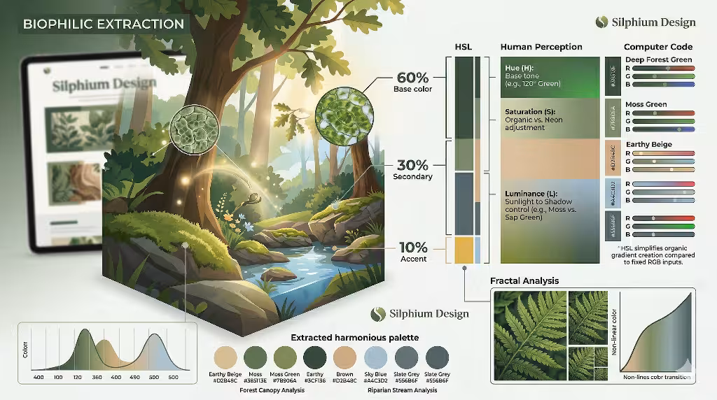
Creating a great design starts with understanding math and light. Nature uses a specific balance. Think about a forest. You see a lot of green, some brown from the trees, and maybe a few bright spots from flowers. This follows a rule we call the 60 30 10 rule. This rule says that 60 percent of your design should be a main color. 30 percent should be a secondary color. 10 percent should be an accent color. When you pick a color palette based on this, your website starts to look like a real place.
Here at Silphium Design, we prefer to use HSL instead of RGB. HSL stands for Hue, Saturation, and Lightness. RGB stands for Red, Green, and Blue. RGB is how computers think, but HSL is how humans think. It is much easier to make a color palette feel organic when you can adjust the lightness easily. If you want a green that looks like moss in the shade, you just lower the lightness. If you want a green that looks like a leaf in the sun, you raise it. This makes the color palette feel alive.
Nature also uses something called fractal distribution. This means that patterns repeat at different sizes. You can see this in a snowflake or a tree branch. You can also see it in color. A single leaf has many shades of green. When you build a color palette, you should not just pick three flat colors. You should pick colors that have depth. This keeps the eye moving and makes the design feel rich. It stops the website from looking like a flat piece of plastic. Instead, it looks like a textured piece of wood or stone.
How Do You Make a Natural Color Palette?
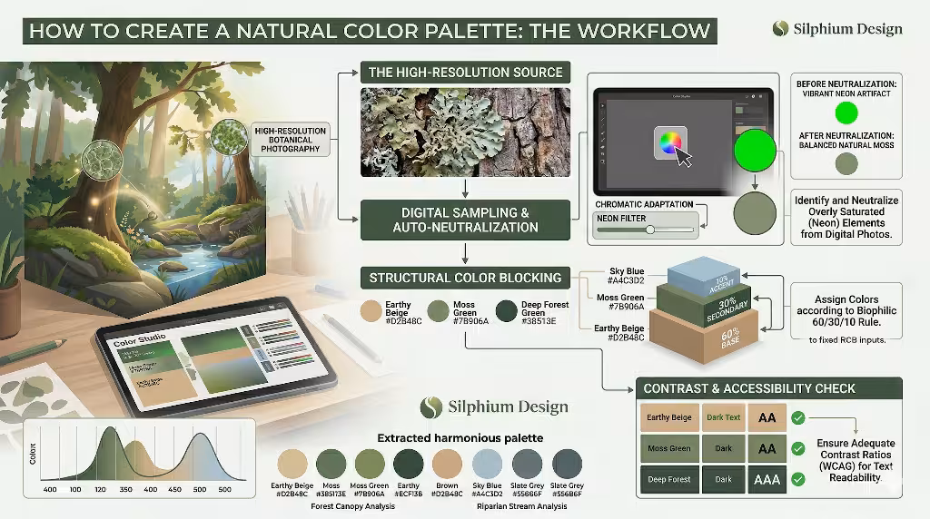
To make a color palette that feels like nature, you have to start by looking at the world. One of the best ways is to take a photo of a beautiful place. You might take a photo of a mountain range or a desert at sunset. You can then use a tool to pull the colors from that photo. This gives you a color palette that is already balanced by nature itself. However, you have to be careful. Sometimes a photo has colors that are too bright for a screen. You might need to turn down the saturation. A more modern solution is to use artificial iintelligence (AI).
When you are picking these colors, you are looking for a base. The base is usually an earth tone. This might be a soft grey or a warm tan. Then you add your primary color. This could be a deep forest green. Finally, you add an accent. This could be a bright berry red or a golden yellow. A good color palette will have enough contrast so that people can read the text. But it will not have so much contrast that it hurts to look at. You are aiming for harmony. Harmony means all the parts work together to make a whole.
What Colors are Considered Natural Hues?
Natural hues are colors that you can find in the environment without any human help. We often group them into three main areas. The first is earth tones. These are colors like terracotta, ochre, and deep brown. They feel solid and grounded. They are great for the background of a website because they feel like the floor under your feet. Using these in a color palette makes a site feel stable.
The second group is atmospheric tones. These are the colors of the sky and the water. Think of slate grey, cerulean blue, and soft lavender. These colors feel open and airy. They help a website feel like it has room to breathe. When you add these to a color palette, you give the user a sense of space. It is like looking out a window instead of looking at a wall.
The third group is botanical tones. These are the colors of plants. You have sap green, moss, and flower colors like violet or orange. These colors feel full of life. They are great for buttons or links because they draw the eye. A color palette that uses botanical tones well will feel energetic. It tells the user that the website is active and growing. By mixing these three groups, you create a complete experience.
Why Is Biophilic Design Important in Web Design?
Biophilic design is important because we spend too much time indoors. Most people spend hours every day looking at a computer. If those websites are full of neon colors and sharp edges, people get stressed. Their heart rate might even go up. By using a natural color palette, we can lower that stress. We call this a biophilic design because it brings the love of life into the digital space.
When a website feels like nature, the bounce rate goes down. The bounce rate is a number that tells us how many people leave a site quickly. If a site is ugly or stressful, people leave. If it uses a calming color palette, they stay. They read more. They click more buttons. This is why SEO experts care about color. Search engines like Google can tell if people like your site. If people stay for a long time, Google thinks your site is good. So, a natural color palette actually helps you rank higher in search results.
How Do Natural Colors Affect User Behavior?
Colors change how we think and feel. This is a fact of biology. For example, the color blue can lower your blood pressure. The color green can help you think more creatively. When you choose a color palette for a website, you are choosing how you want the user to feel. If you use soft, natural colors, you are telling the user to relax. You are telling them that they can trust you.
Trust is a big part of user behavior. It is hard to trust a website that looks like a neon sign. It feels like someone is shouting at you. But a website with a soft color palette feels like a conversation. It feels like a professional person speaking to you in a quiet room. This leads to more sales and more sign ups. People are more likely to give their information to a site that feels safe. Nature is the ultimate sign of safety for the human brain. We have used these colors for thousands of years to find food and water. Now, we use them to find information.
The Un Neutral Neutral in Website Design
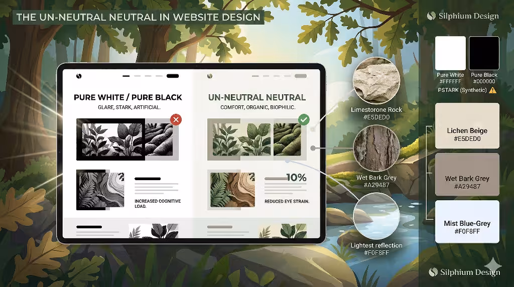
In the old days of web design, people used pure white and pure black. This is a mistake. Pure white is very bright. It is like looking at a light bulb. Pure black is very dark and does not exist much in nature. In my work at Silphium Design, I suggest using what I call the un neutral neutral. This means using a color palette that has off whites and soft greys.
Think of the color of a bone or a piece of limestone. These are not pure white. They have a little bit of yellow or brown in them. They are much easier on the eyes. When you use an off white for your background, you reduce glare. This means people can read your blog posts for a longer time. The same is true for black. Instead of using a flat black, use a very dark charcoal or a deep navy. These colors have more character. They make your color palette look more expensive and professional. It is a small change that makes a huge difference in how the site feels.
Seasonal Variation in SEO and Design
Nature changes with the seasons. A forest in the summer looks very different from a forest in the winter. You can use this idea for your website too. Changing your color palette to match the season can be a great way to keep your site fresh. In the fall, you might use more oranges and deep reds. In the spring, you might use light greens and yellows.
This is not just for looks. It can also help with SEO. When you update your site, search engines notice. It shows them that the site is being looked after. Also, users like to see things that match their current world. If it is snowing outside, a warm and cozy color palette will feel very inviting. It creates a connection between the user’s real life and their digital life. This makes your brand feel more human and less like a robot.
Accessibility and Nature in Web Palettes
We must always think about accessibility. This means making sure everyone can use your website, including people who cannot see well. Some natural colors are very light. If you put light green text on a light brown background, nobody can read it. When we build a color palette, we have to check the contrast ratios. There are rules for this called WCAG.
You can still use a natural color palette and follow these rules. You just have to be smart about it. You might use a very dark brown for your text and a very light cream for your background. This gives you a natural look while keeping the text clear. Accessibility is a key part of modern web design. It shows that you care about all your users. It also helps your SEO because search engines want sites that everyone can use. A good color palette is one that is both beautiful and functional for every person who visits.
Technical Implementation of Your Color Palette
Once you have picked your colors, you need to put them into the code. The best way to do this is with CSS variables. This is a way to tell the computer what your colors are in one place. If you want to change your color palette later, you only have to change it in one spot. This makes your code clean and fast. Fast websites are very important for SEO. If your site takes too long to load because of messy code, Google will punish you.
Using a consistent color palette also helps with something called Largest Contentful Paint or LCP. This is a fancy way of saying how fast the biggest part of your page loads. If your images and colors are all planned out, the browser can draw the page much faster. This makes the user happy because they do not have to wait. A technical expert knows that a color palette is not just about art. It is also about how the website performs on a server.
Semantic HTML and the Role of Color
Semantic HTML is a way of writing code that tells the computer what each part of the page is. For example, an article tag tells the computer this is a story. A header tag tells it this is the top of the page. You can use your color palette to help this structure. You might use one color for all your headers and another color for all your links.
This helps the user understand where they are. It also helps search engines understand your content clusters. If all your related pages use a specific color palette, it creates a visual theme. This theme reinforces the topic of your site. It makes the whole website feel like a single, solid unit. This is how you build authority online. You show the world that you have a clear plan and a clear style.
The Visual Hierarchy of a Natural Palette
A visual hierarchy is a way of showing what is most important on a page. You use your color palette to lead the user’s eye. Imagine a path through a garden. The path is a neutral color, but the flowers at the end of the path are bright. Your eyes naturally follow the path to the flowers. You should do the same thing on a website.
Your background should be a quiet part of your color palette. Your buttons and calls to action should be the bright parts. If everything is bright, the user will not know where to click. They will get confused and leave. But if you use a harmonious color palette, you can guide them. You can use a soft forest green for the page and a bright sky blue for the “Buy Now” button. This feels natural to the eye. It is like finding a clear blue lake in the middle of a green forest. It stands out in a way that feels good, not annoying.
Psychological Comfort and Dwell Time
Dwell time is the amount of time a person spends looking at your page. This is a very important number for search engines. If a person spends ten minutes on your page, it must be good. If they spend ten seconds, it might be bad. A natural color palette is a great tool for increasing dwell time. It makes the environment of the website feel comfortable.
Think about the difference between a library and a busy street corner. A library is quiet and has soft colors. You can stay there for hours. A street corner has bright lights and loud colors. You want to leave as soon as you can. Your website should be like a library. Using a color palette with natural hues creates that quiet feeling. It allows the user to focus on your words. When they focus, they stay. When they stay, your SEO improves. It is all connected.
The Role of Texture in Digital Color
In the real world, color always has texture. A red apple has a different look than a red brick. In web design, we can use our color palette to suggest texture. We can use gradients or small patterns to make a color feel like stone or wood. This adds a layer of reality to the digital experience.
When you add texture to your color palette, you are using biophilic design to its full potential. You are not just showing a color; you are showing a material. This makes the website feel more “real.” People like things that feel real. In a world full of AI and fake news, a website that feels like it has texture can stand out. It feels grounded. It feels like something you can touch. This builds a deeper bond with your audience.
Choosing a Palette Based on Geographic Location
One of my favorite things to do is to match a color palette to a specific place. If you are a business in Vermont, your color palette should look like Vermont. It should have the greens of the summer mountains and the oranges of the maple trees. If you are a business in Arizona, your color palette should look like the desert. It should have the reds of the rocks and the sages of the bushes.
This local SEO strategy is very powerful. When people from your area visit your site, they will feel at home. They will recognize the colors of their own backyard. This creates an instant connection. It shows that you are part of the community. Even if your business is global, you can choose a color palette that reflects the values of your brand. A brand that values growth might use a botanical color palette. A brand that values stability might use an earth tone color palette.
Balancing Warm and Cool Natural Hues
A great color palette needs balance. In nature, you often see a mix of warm and cool colors. Warm colors are reds, oranges, and yellows. They feel like the sun or a fire. Cool colors are blues, greens, and purples. They feel like water or the shade. If your website is all cool colors, it might feel cold and unfriendly. If it is all warm colors, it might feel too intense.
The secret is to mix them. You might have a cool blue background and warm orange buttons. This is called a complementary color palette. It is very pleasing to the eye because it creates balance. It is like a cold drink on a hot day. It provides exactly what the eye is looking for. When you achieve this balance, your website feels professional and well planned. It shows that you understand the science of light and the beauty of nature.
The Importance of Testing Your Palette on Different Screens
Not all screens are the same. A color might look great on an expensive computer but look terrible on a cheap phone. When you choose a color palette, you must test it. You want to make sure your natural hues still look natural on every device. If your soft moss green looks like neon slime on a phone, you have a problem.
This is part of being a competent designer. You have to look at your work in many different ways. You should check it in bright light and in a dark room. You should check it on an iPhone and on an Android. A robust color palette is one that stays harmonious no matter where it is seen. This ensures that every user gets the same high quality experience. It protects your brand and keeps your message clear.
Avoiding “Greenwashing” in Digital Design
Sometimes designers use green just to look “eco friendly.” We call this greenwashing. It is often fake and people can tell. A true biophilic color palette is not just about being green. It is about the whole system of nature. It is about using colors that feel honest.
If you use a color palette that is too bright or too fake, you will lose trust. People are very good at spotting things that are not real. My goal at Silphium Design is to help you find an honest color palette. We look for colors that truly represent what you do. We look for the colors of real wood, real stone, and real water. This honesty is what makes a design last for a long time. It does not go out of style because nature never goes out of style.
The Future of the Living Web
Creating a harmonious color palette with natural hues is more than a trend. It is a better way to build the internet. As we spend more time online, we need our digital spaces to feel more like our natural spaces. This is the only way to stay healthy and happy in a digital world. By using a natural color palette, you are doing a favor for your users. You are giving them a place to rest their eyes and their minds.
This approach is good for everyone. It helps your SEO by keeping people on your site. It helps your brand by building trust. It helps your users by reducing stress. In my career, I have seen many styles come and go. But the colors of the earth are always here. They are the foundation of everything we see. When you build your website on that foundation, you are building something that will last.
Are you ready to bring the beauty of nature to your website? A well chosen color palette can change everything. It is the first thing people see and the last thing they remember. Let us use the wisdom of the natural world to make your digital home a better place.
A Final Note from Silphium Design LLC
At Silphium Design LLC, we are trying make the connection to nature possible for everyone. Whether you are building a small blog or a large online store, your color palette matters. It is the skin of your website. Make sure it is healthy, natural, and beautiful.
The technical side of this is just as important as the artistic side. A clean color palette leads to clean code and better search engine rankings. It is a complete package. By following these steps, you can create a website that is not only good to look at but also performs at the highest level. That is the power of biophilic design. It is the perfect mix of biology, art, and web design.