An AI-generated natural color palette is a color scheme that has been created by artificial intelligence. The AI’s job is to look at a source from nature, like a photograph of a forest, a coastline, or a mineral, and intelligently pick out the most important and harmonious colors to put together a natural color palette. It analyzes the data in the image and extracts a set of colors that work well together. These AI-generated natural color palettes go beyond what the human eye might pick. They capture the true, complex shades of the natural world.
For a long time, designers faced a problem. When asked to make a “natural” design, they would often guess. They would pick a simple, bright “grass green” and a “bark brown.” This is a human bias, and it’s a “cartoon” of nature. It’s not what nature actually looks like. The real color of a forest is complex, with dozens of shades of gray, brown, and desaturated greens.
This is where AI provides the solution. Artificial intelligence moves beyond our human bias. It uses mathematical logic and powerful algorithms to analyze an image. It does not “guess” at the colors; it quantifies them. It finds the real, subtle, and complex color relationships that are actually present. This article will explain the technology behind how AI creates these natural color palettes. We will explore the deep biological reason why using these natural color palettes is so important for digital design. And finally, we will review the specific tools and applications you can use to bring this natural harmony to your own work.
Table of Contents
How Does AI Actually “See” and Generate a Natural Color Palette?
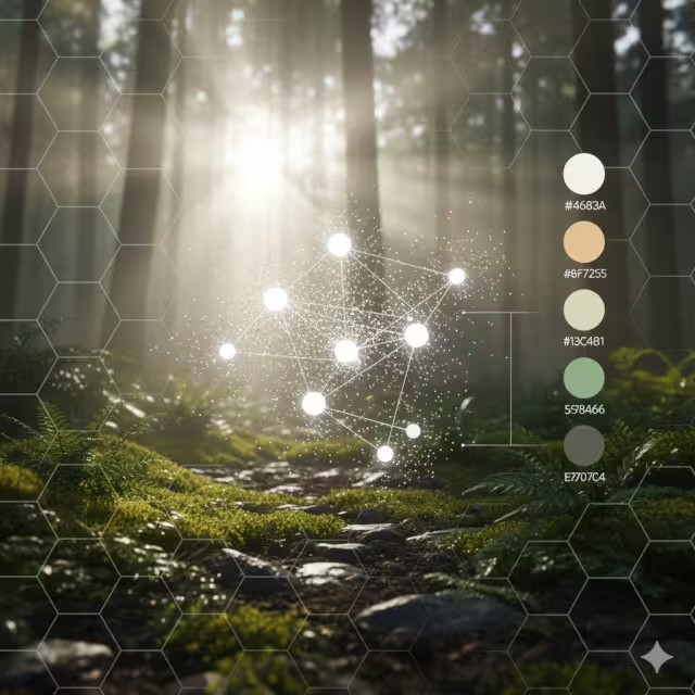
When we say AI “sees” color, it’s not like how a human sees. AI does not experience the color blue; it reads the color’s data. Every color on your screen can be broken down into a set of numbers, such as an RGB code (Red, Green, Blue) or a HEX code. A single digital photo is made of millions of these colored dots, called pixels.
AI’s job is to look at all those millions of data points and make sense of them. It uses special computer programs called algorithms to sort through the noise and find the most important colors. There are a few different ways it can do this. Some AIs “extract” color like a scientist taking a sample, while others “learn” what colors go together and “generate” new combinations. Let’s look at the main methods.
Method 1: Extraction via Clustering Algorithms (e.g., K-Means)
This is the most common and direct method for pulling colors from an image. The most popular algorithm for this is called K-Means Clustering.
The name sounds technical, but the idea is simple. “K” just means “a number.” Let’s say you want a 5-color palette from a photo. In this case, K=5. “Clustering” means “grouping.” So, the K-Means algorithm will sort all the pixels in your photo into 5 groups.
Imagine you have a big bucket filled with thousands of tiny pebbles. The pebbles are all different shades of blue, beige, white, and gray from a photo of a beach. You tell a robot, “Please sort these into 5 piles.”
How does the robot do it?
- Starts: It first picks 5 random pixels from the image. These are the “centers” (or “centroids”) of the 5 groups.
- Sorts: The AI then looks at every other pixel in the image. It asks, “Which of the 5 centers is this pixel closest to in color?” It puts that pixel into that group.
- Finds New Centers: After it has sorted all the pixels, it looks at each of the 5 groups. It finds the new, true average color (the new center) of all the pixels in that group.
- Repeats: The old centers are gone. The AI now uses these 5 new centers. It repeats the whole sorting process again.
It keeps doing this—sorting, finding new centers, and resorting—until the centers stop moving. When the groups are stable, the AI is finished. The 5 final center colors are its answer. These 5 colors are the most dominant and representative colors from the photo. This is how an AI can look at a picture of a sunset and give you a perfect palette of orange, purple, deep blue, and gold. It’s a very logical way to create natural color palettes.
Method 2: Generative Models via Deep Learning (GANs & Neural Networks)
This second method is much more advanced. Instead of just “sorting” colors from one image, this type of AI learns what makes a good palette by studying millions of examples. This is where Deep Learning and Neural Networks come in.
A Neural Network is a computer system that is built to work like a human brain. It has layers of “neurons” that find patterns. You can “train” a neural network. To create natural color palettes, developers “feed” the AI millions of images: beautiful nature photos, famous paintings, well-designed websites, and art. The AI learns the rules of color harmony. It learns what colors “feel” natural and which ones “feel” synthetic. It learns which colors “go together” based on all this data.
Some tools use an even more advanced system called a GAN (Generative Adversarial Network). A GAN is like two AIs working in competition.
- One AI is the “Generator” (like an artist). Its job is to create new, original color palettes.
- The other AI is the “Discriminator” (like a critic). Its job is to look at the palette and guess if it was a real palette from a photo or a fake one made by the Generator.
The Artist (Generator) tries to create natural color palettes that are so good, they can fool the Critic. The Critic (Discriminator) gets better and better at spotting fakes. This “battle” between them forces the Generator to become a master artist. It learns to create incredibly beautiful, complex, and new natural color palettes that are not from any single image but feel like they could be. Tools like Colormind.io use this kind of deep learning to generate endless, harmonious palettes.
Method 3: Preference-Based Learning (Interactive AI)
This third method puts you in charge. The AI learns from your personal taste. This is the most customized way to create natural color palettes.
A great example of this is the tool Khroma.ai. When you first visit the site, it does not give you any palettes. Instead, it asks you to choose 50 of your favorite colors. You just click on the colors you like from a giant grid.
As you are clicking, a neural network in the background is learning. It is building a unique “brain” that is trained on your exact preferences. It is learning the kinds of colors you are drawn to. If you keep picking soft, earthy greens and desaturated blues, the AI understands that this is your style.
After you are finished, the AI uses this new “brain” to generate endless palettes just for you. It can show you natural color palettes as text on a background, as a four-color gradient, or as an image. This is extremely powerful for designers. It allows them to use the power of AI to create natural color palettes that are not random, but are perfectly matched to their personal or brand style. It is a true partnership between human creativity and machine intelligence.
Why Use Natural Color Palettes? The Biophilic Connection
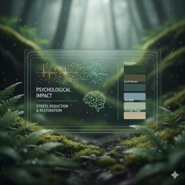
Now we know how AI finds these colors. But why should we use them? Especially on a website, which is a purely technical and digital space. The answer comes from biology. As a biophilic design expert, this is the most important part of the puzzle. Using natural color palettes is not just an aesthetic choice; it is a health and wellness choice.
Beyond Aesthetics: The Psychological Impact of Natural Color
There is a scientific theory called Biophilia. It is the idea, made famous by biologist E.O. Wilson, that humans have an innate, genetic need to connect with nature and other forms of life. For hundreds of thousands of years, our survival depended on understanding nature. We are hard-wired to find natural settings calming.
This leads to another idea: Attention Restoration Theory. This theory states that our brains get tired. When we focus on hard tasks, like working on a computer, answering emails, or navigating a busy city, we use “directed attention.” This is draining. It causes mental fatigue and stress.
Nature, on the other hand, does not require this kind of “work” to look at. A walk in a park or a view of the ocean captures our attention effortlessly. This is called “soft fascination,” and it allows our brains to rest, recharge, and restore.
So, what does this have to do with web design? A website is a digital environment. Many websites are stressful. They are full of bright, flashing ads, high-contrast sales banners, and chaotic layouts. They demand our directed attention and make us tired.
A website that uses a calm, complex, natural color palette does the opposite. When a user lands on a page that uses the soft colors of a misty morning or the gentle, earthy tones of a desert, their brain gets a signal of “safety” and “calm.” It is a micro-dose of “soft fascination.” This reduces cognitive load. The user feels less stressed, more at ease. They are more likely to trust the website, read the content, and have a positive experience. Using natural color palettes is a simple, powerful way to make digital spaces healthier for humans. These natural color palettes are a form of digital wellness.
The “Nature-Inspired” vs. “Natural” Distinction
This is an expert insight that is critical to understand. There is a huge difference between a “nature-inspired” palette and an authentic “natural” palette.
“Nature-inspired” is a cliché. It is what most people think of when they hear “nature.” It is a cartoon. It’s the bright, 100% saturated green of a new plastic leaf (HEX #00FF00) and a simple, flat brown. These colors are not actually common in nature. They are loud, simple, and can feel just as synthetic and stressful as neon colors.
“Natural” palettes are different. They are what you actually see if you go outside and look closely. Nature is not simple; it is deeply complex. The color of a real forest is not one green. It is thousands of different shades. It is the deep, blue-green of a pine needle, the pale, gray-green of lichen on a rock, the yellow-green of new moss, and the brown-green of a decaying leaf.
Authentic natural color palettes are:
- Complex: They include many different shades.
- Desaturated: They are often softer, mixed with gray, brown, or blue.
- Harmonious: They all work together because they all came from the same source.
This is where AI is so valuable. Humans, when left to their own bias, will pick the “nature-inspired” cliché. An AI has no bias. It can analyze a high-resolution photo of a single piece of granite and pull out 10 different colors: whites, grays, blacks, but also subtle pinks, blues, and silvers that our eyes might miss.
These truly natural color palettes feel more sophisticated, more calming, and more real. When you use these AI-generated natural color palettes in your design, the user feels that authenticity, even if they cannot explain why. Using these complex natural color palettes is the key to successful, mature biophilic design.
A Practical Toolkit: The Best AI Color Palette Generators for Natural Aesthetics

Understanding the theory is good. But to put it into practice, you need tools. The market is full of AI-driven color tools, and they fall into two main categories: “Extraction” tools (which pull from images) and “Discovery” tools (which generate new palettes). Here is a technical breakdown of the best tools for finding natural color palettes.
For Direct Image-to-Palette Extraction
These tools are your best choice when you have a specific source of inspiration, like a photograph of a place you love.
- Adobe Color: This is the professional industry standard. It is part of the Adobe Creative Cloud. Its AI engine is called Adobe Sensei. You can upload a photo of a mountain range, a forest floor, or a coral reef, and it will instantly extract a 5-color theme. It is extremely powerful. You can then move the selectors around to different parts of the image to fine-tune your palette. Crucially, it also includes an Accessibility Checker. This will tell you if your text color and background color have enough contrast to be read by people with visual impairments. This feature is not just helpful; it is essential.
- Coolors.co: This is one of the most popular, fast, and user-friendly tools. It has a fantastic “Pick palette from image” feature. You upload your nature photo, and it intelligently picks a palette. But its best feature is the control it gives you. You can click and drag the little circles to any spot on the image to pick the exact color you want. You can “lock” colors you like and ask the AI to find other colors from the image that go with them. It is very fast for experimenting with many different natural color palettes.
- Canva Color Palette Generator: This tool is perfect for beginners, marketers, or anyone who already works inside the Canva design ecosystem. It is very simple. You upload your photo, and it gives you a 4-color palette, along with the photo and the HEX codes. It is not as complex as Adobe’s tool, but its strength is its simplicity. It’s a great, free way to get started and instantly begin using natural color palettes in your social media or blog post designs.
For AI-Driven Discovery and Generation
These tools are for when you don’t have a specific photo. You just want the AI to generate new, beautiful, natural color palettes for you based on its training.
- Colormind.io: This tool is brilliant. It uses deep learning. As mentioned before, its AI “brain” has been trained on millions of real-world examples. When you press the “generate” button, it does not pick colors at random. It generates a 5-color palette that it knows is harmonious. Its best feature is that it shows you the palette in action. It has a demo website template on the right side of the screen, so you can see exactly how your natural color palettes would look as a live website. You can lock in a color (for example, a soft, stony gray for your background) and hit “generate” again. The AI will then find 4 other colors that work perfectly with it.
- Huemint: This is a very advanced and intelligent tool. It uses machine learning to generate palettes for a specific purpose. This is a key difference. You do not just ask for “a palette.” You tell the AI how you will use the colors. For example, you can tell it, “I need a 3-color palette for a website. This color is the background, this is for the text, and this is an accent button.” The AI will then generate combinations that are not only beautiful but function well for those jobs. It understands that a background color needs to be subtle, while a button needs to stand out. This makes it incredibly useful for creating sophisticated, usable, and complex natural color palettes for professional UI/UX design.
From Algorithm to Asset: Applying Natural Palettes in Web Design
Getting the palette is just the first step. The real art is in the application. How do you take those 5-7 colors from an AI and build a functional, beautiful, and SEO-friendly website? This is where my work as a computer scientist and designer comes together.
Case Study: Designing a UI with a “Forest Floor” Palette
Let’s walk through a real-world example.
The Goal: We need to design a website for a new wellness blog. The brand’s keywords are “grounded,” “calm,” and “authentic.”
The Process:
- Find the Source: We do not want a generic “forest.” We find a specific, high-resolution photo of a forest floor in the Pacific Northwest. It is rich with detail: deep green moss, dark wet soil, gray pebbles, and the pale green of new ferns.
- AI Extraction: We upload this photo to a tool like Adobe Color. The AI analyzes the millions of pixels and, using K-Means Clustering, it gives us a 5-color palette.
Deep Moss Green (#3a5a40): A dark, saturated green.Damp Earth Brown (#582f0e): A rich, dark brown.Granite Gray (#6c757d): A middle-gray, cool and solid.Fern Green (#a3b18a): A lighter, softer, desaturated green.Dappled Light Beige (#f0ead2): A very light, warm beige, like sunlight.
- Application (The Design): This is the most important part. We assign jobs to these colors.
- Background: We do not use white. We use the
Dappled Light Beigeas the main page background. It is easy on the eyes, warm, and reduces the harsh glare of a pure white screen. This lowers cognitive load immediately. - Text: We use a very dark version of the
Damp Earth BrownorGranite Grayfor our main body text. It is softer than 100% black, which can also be jarring. - “Grounding” Elements: We use the
Damp Earth Brownfor the website’s footer (the very bottom panel) and maybe the top navigation bar. This “grounds” the design, visually anchoring the page. - Content Boxes: We use the
Granite Grayfor the “cards” or “boxes” that hold each blog post. This creates a gentle, subtle separation from the beige background. - Primary Button: We use the
Deep Moss Greenfor our “Call to Action” buttons, like “Subscribe” or “Read More.” It is the most vibrant color in our natural color palette, so it will draw the eye. - Accents: We use the
Fern Greenfor small accents, like link hovers, icons, or quote boxes.
- Background: We do not use white. We use the
The result is a website that feels like the forest floor. It is harmonious, calm, and professional. Every color has a job, and they all work together. This is the power of building a design system from a single, biophilic source using AI. This natural color palette is now a core brand asset.
The Critical Intersection: AI, Accessibility, and Natural Color
I must include a critical warning. Natural color palettes are often subtle, soft, and desaturated. This is their strength, but it is also their greatest danger.
It is very easy to create a beautiful website that many people cannot read. For example, using the Fern Green as text on top of the Granite Gray background might look “natural” and “earthy,” but the contrast is too low. People with visual impairments, or even just people on a phone in bright sunlight, will not be ableto see it.
This is where you must use technology to check your work. The WCAG (Web Content Accessibility Guidelines) are the global standard. They define a specific mathematical “contrast ratio” that text and its background must have.
This is not optional. Good biophilic design is inclusive. It should make all users feel welcome and comfortable.
The solution is to use AI in combination with a contrast checker. Most good AI tools, like Adobe Color, have one built-in. After you generate your beautiful, soft, natural color palettes, you must test them. You may find that your Fern Green text needs to be made 20% darker to pass the test. You must make that change. The goal is a website that is both biophilic and functional. Your natural color palettes are useless if they make your website unusable.
The SEO Connection: How Biophilic Color Impacts Dwell Time
This is the final piece of the puzzle. How do natural color palettes affect your Search Engine Optimization (SEO), or your ranking on Google? The connection is indirect, but extremely powerful.
Google has one main goal: to give its users the best possible answer and the best possible experience. To measure this, it tracks “user experience metrics.” One of the most important is Dwell Time (how long a person stays on your page) and Session Duration (how long they stay on your entire website).
Imagine a user searches for “wellness tips.”
- Scenario A: They click on a site that is a visual assault. It has a pure black background, neon green text, and flashing ads. It is stressful, jarring, and hard to read. The user’s brain says, “This is chaotic and untrustworthy.” They feel anxious. They hit the “back” button within 3 seconds. This is called a “bounce.” This signals to Google: “This page is a bad experience. The user hated it.” Google will rank this page lower over time.
- Scenario B: They click on your “Forest Floor” website. The page loads. Their eyes are met with the soft
Dappled Light Beigebackground, the readableEarth Browntext, and the calm, natural layout. Their brain says, “This is calm. This is safe. This is professional.” Their shoulders relax. They are not in a hurry to leave. They take their time, read the article, and maybe even click another link.
This longer dwell time is a powerful signal to Google. It says: “This page is a great experience. The user is engaged and satisfied.” Google will reward this page by ranking it higher in search results.
Therefore, your natural color palettes, by creating a low-stress, biophilic, and high-quality user experience, are a direct (though often overlooked) tool for improving your SEO. It is a core part of a “natural SEO” strategy, where we align the user’s biological well-being with the search engine’s technical goals. Using natural color palettes is not just good design; it is smart business.
AI Not as a Crutch, but as a Microscope
We stand at a unique intersection of technology and biology. The AI-generated natural color palettes we have discussed are the perfect example of this. They are the point where my PhD in Computer Science and my BS in Biology meet. They are logic and life, data and design, all working together.
An AI is not a replacement for a talented human designer. It is not a “crutch” for those who cannot pick colors. It is a tool. I like to think of it as a powerful, new kind of microscope.
Before, we could stand back and look at the forest. We could imitate it and paint a “nature-inspired” picture. Now, with AI, we can zoom in. We can use AI as a microscope to see the actual, complex, and mathematical color structure of a single leaf, a stone, or a galaxy.
This technology helps us get past our own human limitations and biases. It allows us to stop imitating nature and start a new phase of collaboration with nature’s underlying logic.
These natural color palettes are the future of digital design. They help us build a web that is not only more beautiful but quieter, calmer, and more human. Using natural color palettes is a smart, technical, and deeply biophilic choice.
The next step is to experiment. Find a photo of a natural scene you love, a desert at sunset, a snowy mountain, a local garden, and use one of the tools mentioned. See what hidden natural color palettes you can find. What you discover might just surprise you.