When we look at a building or a website, our brains do a lot of work that we do not even notice. This work is part of a field called the Psychology of Space. At Silphium Design LLC, we believe that the way a digital environment is built matters just as much as a physical room. Our ancestors lived in the wild for thousands of years. Their brains learned to scan the horizon for food and look for a safe place to sleep.
Today, those same brains are scanning your website. If the design feels cramped or confusing, the brain triggers a stress response. If the design feels open and natural, the brain feels safe. This is the core of the Psychology of Space. We call this neuroarchitecture. It is the study of how the places we inhabit change our brain chemistry. In this article, we will look at how the Psychology of Space helps us move from cold digital boxes to warm natural environments that make people feel good.
Table of Contents
The Evolutionary Blueprint: Prospect and Refuge
To truly grasp how we design for the modern world, we must look at the Biology of our ancestors. The Psychology of Space is not just a modern idea. It is a set of rules written into our DNA over millions of years. When we talk about the Evolutionary Blueprint, we are talking about a concept called Prospect and Refuge. This theory was created by a geographer named Jay Appleton in 1975. He wanted to know why humans find some landscapes beautiful and others scary. He found that our feelings are tied to our survival.
In the wild, survival depended on two things. First, you needed to see your surroundings. You had to look for food, water, and danger. This is called Prospect. Second, you needed a place where you could not be seen from behind. You needed a safe spot to rest without a predator sneaking up on you. This is called Refuge. The Psychology of Space tells us that when a person feels both Prospect and Refuge at the same time, they feel a deep sense of peace. This is the ultimate goal of biophilic design.
The Biology of Prospect
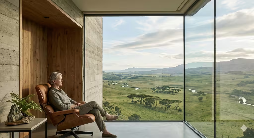
Prospect is all about the view. Think about why people pay more for a hotel room with a view of the ocean or a park. It is because our brains equate a long view with safety. If you can see far away, you can see a threat coming from a long distance. In the Psychology of Space, this gives the person time to react. It makes the brain feel powerful and in control. This is a big part of the Psychology of Space because it satisfies our need for information.
In digital design, we use Prospect by creating clear hierarchies. When a user lands on a website, they want to see the whole landscape. They want to know where the buttons are, where the menu is, and what the site is about. If a site is zoomed in too far or has a messy layout, it ruins the Prospect. The user feels like they are in a thick fog. This causes the brain to release stress hormones. By using the Psychology of Space to provide a clear view of the digital horizon, we make the user feel like a successful hunter gathering information.
The Biology of Refuge
Refuge is the opposite of a wide view. It is about protection. In nature, a refuge might be a cave, a dense thicket of trees, or a high cliff. It is a place where your back is protected. Have you ever noticed that in a restaurant, people almost always choose the booths against the wall first? No one wants to sit in the middle of a busy room with people walking behind them. This is the Psychology of Space in action. Our brains hate having our backs exposed to the unknown.
When we apply the Psychology of Space to websites, Refuge takes the form of focus. A long article with big margins provides a sense of Refuge. It feels like a quiet corner where you can read and think. Pop-up ads and flashing banners are the enemies of Refuge. They feel like a predator jumping out of the bushes. If a website does not provide a sense of Refuge, the user will feel exposed and jumpy. They will not stay long enough to read your content. The Psychology of Space requires us to build digital “nooks” where users can feel safe and focused.
The Balance of the Savanna
The perfect environment is one that balances these two needs. This is often called the Savanna Hypothesis. Humans evolved on the African savanna. This land had wide open spaces (Prospect) but also clusters of trees (Refuge). The Psychology of Space shows that we are most happy when we have a little of both. We want to be in a protected spot while looking out at a wide view.
In architecture, this might be a porch with a roof. The roof and the wall behind you provide Refuge. The open side looking at the yard provides Prospect. In the Psychology of Space, this is the “sweet spot” of design. At Silphium Design LLC, we try to create this feeling on every page. We might use a dark, solid header to provide a feeling of a “ceiling” or Refuge. Then, we use a clean, open body section to provide Prospect. This balance is a core pillar of the Psychology of Space.
Neuroarchitecture and the Amygdala
To be technical, the Psychology of Space is handled by a part of the brain called the amygdala. This is the part of the brain that looks for danger. When you are in a space with no Refuge, your amygdala stays active. It is constantly scanning for threats. This uses up a lot of energy. It makes you tired and irritable. The Psychology of Space teaches us that good design can “turn off” the amygdala.
When we use biophilic principles to create Prospect and Refuge, we tell the amygdala that it can rest. This lowers the heart rate and improves thinking. If a website is built with the Psychology of Space in mind, the user can actually think more clearly while they are on the site. They are not distracted by a feeling of unease. This is why the Psychology of Space is so important for educational websites or complex tools. You want the user’s brain to be in a state of calm so they can learn.
The Psychology of Space in Digital Wayfinding
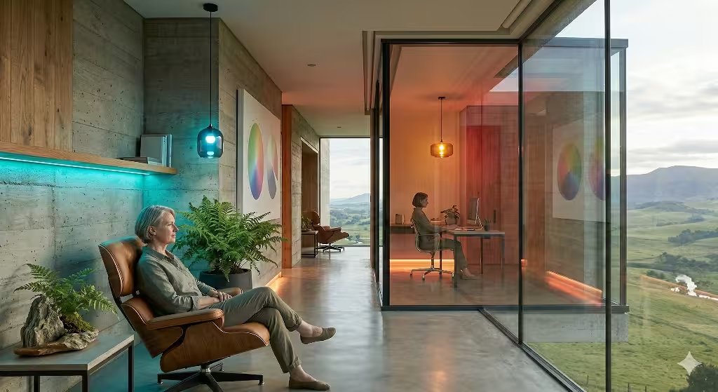
Wayfinding is the act of moving through a space. In a forest, you use a tall tree or a river to find your way. In the Psychology of Space, these are called landmarks. A website needs these same landmarks. If a user feels lost, they lose their sense of Prospect. They feel like they are wandering in a dark woods.
By using the Psychology of Space, we create digital landmarks. A big, bold logo is a landmark. A bright “Contact Us” button is a landmark. These items give the user a sense of where they are in the digital environment. When a user knows their location, they feel a sense of Refuge. They know they are not lost. The Psychology of Space is about more than just looking good. It is about making sure the user’s mental map stays accurate and clear.
Creating “Digital Edges”
In ecology, the “edge effect” is the place where two different environments meet. This is usually where the most life is found. For example, the edge of a forest and a field is a very busy place. The Psychology of Space suggests that humans love edges. We like to stand at the edge of things.
In web design, we create edges using borders, shadows, and color changes. These edges help the brain define the space. The Psychology of Space tells us that a page with no edges feels infinite and scary. It feels like being in the middle of the ocean with no land in sight. By adding clear edges to our design, we give the brain something to hold onto. We create a sense of structure that mimics the natural world. This is another way the Psychology of Space makes a digital site feel like a real home.
The Role of Scale and Proportion
The Psychology of Space also deals with how big things feel. If a room has ceilings that are too high, we feel small and unimportant. If the ceilings are too low, we feel trapped. The Psychology of Space helps us find the right scale. In the digital world, scale is handled by font sizes and image blocks.
If a website uses fonts that are too big, it feels like someone is shouting at you. If they are too small, it feels like a secret you are not supposed to know. The Psychology of Space guides us to use proportions that feel natural to the human eye. We often use the Golden Ratio, which is a mathematical pattern found throughout nature. By using the Psychology of Space to set our scales, we make sure the website feels “just right” to the user’s brain.
Designing for Human Emotion
At the end of the day, the Psychology of Space is about how we feel. We are not just logic machines. We are emotional beings. If a design makes us feel bad, we will not use it, no matter how useful it is. The Psychology of Space gives us the tools to design with empathy.
When we use Prospect and Refuge, we are telling the user that we care about their comfort. We are acknowledging that their brain has deep, ancient needs. The Psychology of Space is our way of being kind to the people who visit our sites. By following the Evolutionary Blueprint, we create spaces that nourish the soul instead of just filling a screen with data. This is the true power of the Psychology of Space in the modern age.
Fractal Fluency and Cognitive Load
Nature is full of patterns. If you look at a tree, the big branches look like the trunk. The small twigs look like the big branches. This is called a fractal. Our eyes love these patterns because they are easy for our brains to process. This is a major part of the Psychology of Space. Scientists use math to describe these patterns. They found that humans prefer a fractal dimension of D ~1.3 to 1.5. When we see these patterns, our stress levels go down.
Using the Psychology of Space in digital design means bringing these patterns to the screen. We do not just use straight lines and sharp corners. We use shapes that mimic nature. This is called fractal fluency. It lowers the work your brain has to do to understand the page. When the brain has less work to do, it feels happy. If a website is just a bunch of boxes, the brain gets tired. By using the Psychology of Space and natural patterns, we keep the user relaxed and focused. This is why biophilic design is so powerful in the modern world.
Chromatic Signaling: Beyond Basic Color Theory
Color is not just about looking pretty. It is a biological signal. In the Psychology of Space, different colors tell our bodies how to act. For example, blue light comes from the sky. When our eyes see blue, our bodies stop making a chemical called melatonin. This makes us feel awake and alert. This is why many tech companies use blue. They want you to stay awake and use their tools.
However, the Psychology of Space also tells us that too much blue can cause stress. Green and brown colors remind us of plants and earth. These colors tell the brain that there is water and food nearby. This lowers the activity in the part of the brain that handles fear. When we design a website using the Psychology of Space, we choose colors that match the feeling we want to create. If we want a user to feel calm, we use earth tones. If we want them to take action, we might use a splash of bright color. This is how the Psychology of Space turns a screen into a living environment.
Common Questions About Spatial Design and the Psychology of Space
A common question is how the Psychology of Space affects how we act. The answer is that design acts like a map for our feelings. If a room is small and dark, people tend to talk less and feel sad. If a room is bright and open, people are more social. The Psychology of Space works the same way online. If a website is cluttered, people will leave quickly because they feel overwhelmed.
Another common question is why the Psychology of Space is important for business. It is important because happy people buy more things. If a user feels comfortable on your site, they trust you more. The Psychology of Space helps build that trust without using words. It uses the language of the brain. When you use the Psychology of Space correctly, you are answering the user’s basic need for safety and clarity. This is why understanding the emotional responses to architectural space is a key skill for any modern designer.
Sensory Substitution in Digital Design
We cannot touch a website with our hands, but our brains still try to. This is a fascinating part of the Psychology of Space. Even though a screen is flat, we can use shadows and textures to make it feel deep. This is called sensory substitution. If a button looks like it has a texture, your brain “feels” it even if your finger does not.
The Psychology of Space teaches us that humans crave touch. In a physical office, we might use wood or stone. In a digital space, we use images that remind us of those materials. We might use a background that looks like soft paper or a button that looks like smooth glass. By using the Psychology of Space to satisfy the brain’s need for touch, we make the digital experience feel more real. This reduces the cold, robotic feeling that many websites have. It makes the technology feel like a part of the natural world.
The Impact of Lighting and Luminance Contrast
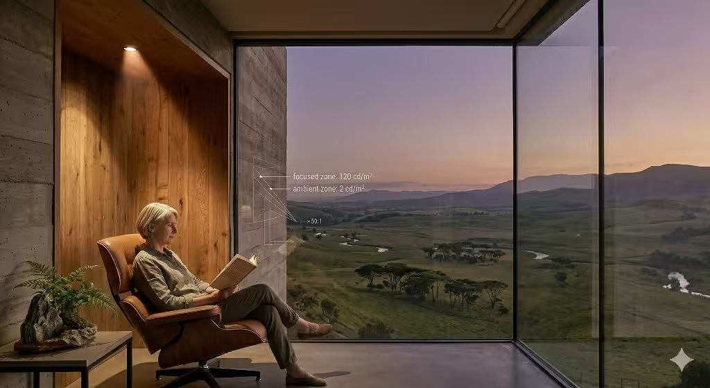
Light is one of the most important parts of the Psychology of Space. In a forest, light filters through leaves. It creates a soft pattern of light and dark. In a modern office, the light is often flat and harsh. This flat light can make people feel bored or tired. The Psychology of Space suggests that we should use contrast to guide the eye.
On a website, we use luminance contrast to show what is important. If the background is dark and a button is bright, the eye goes to the button first. This mimics how our ancestors looked for sunlight in a dark forest. The Psychology of Space also helps us decide between dark mode and light mode. Dark mode can feel like a cozy night, which is good for reading. Light mode feels like a bright day, which is good for work. Using the Psychology of Space to manage light helps keep the user’s energy at the right level for the task they are doing.
Wayfinding and Spatial Memory
Have you ever walked into a building and felt lost right away? That is a failure of the Psychology of Space. Humans build mental maps of their surroundings. We look for landmarks to tell us where we are. In the Psychology of Space, this is called wayfinding. If you cannot find your way, you feel anxious.
On a website, landmarks are things like the logo, the search bar, or a big hero image. The Psychology of Space tells us that these items should stay in predictable places. If the navigation menu moves every time you click a page, the user’s mental map breaks. This causes a negative emotional response. By following the rules of the Psychology of Space, we make the website easy to map. When the user knows where they are, they feel in control. Feeling in control is a big part of why people enjoy using certain products over others.
Biophilic SEO: Why Search Engines Value Natural Design
You might wonder what the Psychology of Space has to do with search engines. Google and other search engines want to show people the best websites. They track how long people stay on a page. If people leave a site in two seconds, Google thinks the site is bad. The Psychology of Space helps keep people on your site.
When you use the Psychology of Space to create a calm and beautiful site, people stay longer. They click more buttons. They read more words. This tells the search engine that your site is high quality. We call this Biophilic SEO. It is the practice of using the Psychology of Space to improve your rankings. By focusing on the human brain first, we end up winning the search engine game too. The Psychology of Space is not just a design trick. It is a business strategy that works because it respects the person behind the screen.
The Ethical Designer’s Mandate
As we look to the future, the Psychology of Space will become even more important. We spend most of our lives looking at screens. If those screens are designed poorly, they can make us stressed and unhappy. At Silphium Design LLC, we believe it is our job to use the Psychology of Space to create a better digital world.
The Psychology of Space reminds us that we are still biological creatures. We still need nature, light, and safety. By bringing these things into our websites, we do more than just sell products. We help people feel better. The Psychology of Space is the bridge between our high-tech tools and our ancient hearts. As an expert in this field, I hope you see that every pixel and every color choice is a chance to use the Psychology of Space for good. When we design with the brain in mind, we create a world that is not just efficient, but also beautiful and kind.