Modern website design has a problem. Most websites look like they were made in a sterile lab. They are too clean. They are too perfect. However, from a biophilic design point of view, this is a biological mismatch. Humans did not grow up in glass boxes. We grew up in forests and fields. When we look at a screen that is perfectly straight and perfectly white, our brains feel a tiny bit of stress. We call this the crisis of digital perfection.
At Silphium Design LLC, along with biophlic design, we use a concept called wabi-sabi to fix this. Wabi-sabi is an ancient Japanese idea about finding joy in things that are not perfect. In the world of tech, we use it as a guide to imperfect beauty in UX/UI. This method helps us make websites that feel like a home rather than a hospital. By using imperfect beauty, we can lower the stress of the person using the site. We can make the internet feel more natural. This article will show you how to move away from cold pixels and toward a design that feels alive.
Table of Contents
The Crisis of Digital Perfection
For many years, web designers tried to make everything look like a machine made it. They wanted every line to be perfectly straight. They wanted every color to be solid and flat. This led to a world of websites that all look the same. If you go to ten different tech company websites, you might not be able to tell them apart. They all use the same grids and the same clean fonts. This is what we call the pixel perfect fallacy. It is the wrong idea that perfection makes a better user experience.
In reality, hyper polished designs often feel cold. They feel fake. When a human sees something too perfect, they might find it hard to trust. Nature is never perfect. A leaf has tiny holes. A stone has cracks. These flaws give things character. When we remove all flaws from a website, we remove the soul of the design. We are left with a clinical layout that lacks warmth. This is why many users feel bored or tired after browsing the web for too long. Their brains are looking for the natural variety of the real world, but all they see are rigid boxes. Embracing imperfect beauty is the cure for this digital fatigue.
Defining the Guide to Imperfect Beauty in UX/UI
Wabi-sabi is a way of seeing the world that values things that are simple and aging. In design, it means we stop trying to hide the “mess” of life. Instead, we use that mess to create a better connection with the user. Using imperfect beauty means we accept that things change. We accept that things are not finished. In a website, this means using textures that look like real paper or wood. It means using layouts that are not perfectly centered.
This guide to imperfect beauty in UX/UI is not about making things look messy or bad. It is about “organized irregularity.” It is about making choices that feel human. When a button has a slightly uneven edge, it reminds the user of a handmade object. This makes the digital experience feel more grounded. It bridges the gap between the glowing screen and the physical world we live in. We use imperfect beauty to tell a story. We use it to show that there is a person behind the screen, not just a cold computer program.
The Principles of Digital Wabi-sabi: Fukinsei
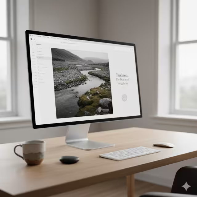
The first big idea in wabi-sabi is Fukinsei, which means asymmetry. In most web designs, we use a grid that is derived from CSS. A grid is a set of invisible lines that keep everything lined up. Grids are helpful, but they can be too stiff. Nature does not use grids. Trees do not grow in perfect rows unless humans force them to.
When we use Fukinsei, we break the grid on purpose. We might put a picture slightly to the left. We might let some text overlap an image. This creates a sense of movement. It makes the page feel like it is growing or breathing. This use of imperfect beauty keeps the eye moving. It prevents the user from getting stuck in a boring pattern.
Asymmetry feels more organic to our brains. When things are perfectly balanced, they feel still and dead. When things are slightly off balance, they feel active and alive. Using imperfect beauty through asymmetry is a powerful way to stand out in a world of boring, centered websites.
The Principles of Digital Wabi-sabi: Kanso
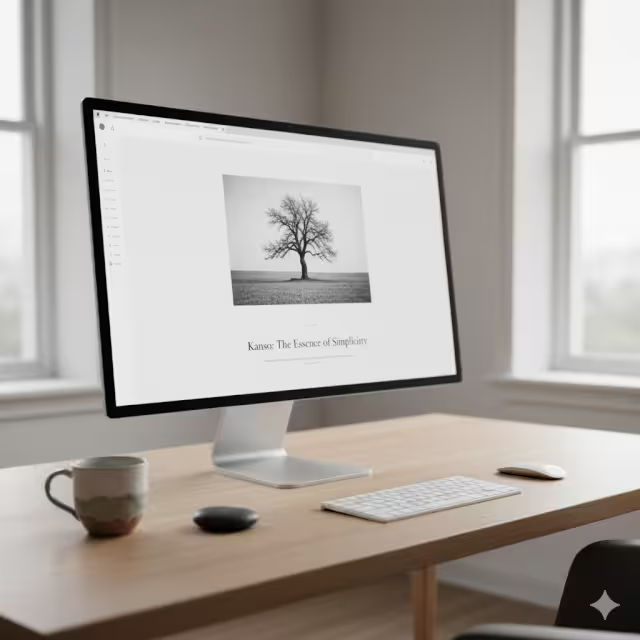
The second idea is Kanso, which means simplicity. Many people think minimalism and Kanso are the same thing, but they are different. Minimalism is often about having as little as possible. It can feel empty and cold. Kanso is about focus. It is about getting rid of the things that do not matter so the things that do matter can shine.
In web design, this means we do not fill every empty space with an ad or a button. We leave space for the mind to rest. This is a form of imperfect beauty because it admits that we do not need to be busy all the time. It is a digital version of a quiet garden. When a website is simple, the user feels calm. They can find what they need without getting a headache.
Kanso is about the beauty of the “lesser” things. It shows that a single, well placed word can be more powerful than a whole page of flashy graphics. This quiet way of designing is a key part of the guide to imperfect beauty in UX/UI.
The Principles of Digital Wabi-sabi: Shibuity
Shibuity refers to beauty that is quiet and deep. It is not a beauty that screams for attention. It is a beauty that you notice slowly over time. In terms of web design, we see this in our color choices. Many websites use very bright, neon colors. These colors are meant to grab your eye, but they also tire you out.
Shibuity suggests using colors found in nature. Think of the color of wet sand, or the grey of a stormy sky, or the soft green of moss. These colors have imperfect beauty because they are not “pure.” They are mixed and muted. When we use a quiet color palette, the website feels more sophisticated. It feels like it has a history.
We also see this in how we handle interactions. Instead of a big, fast animation, we might use a slow, gentle fade. This creates a sense of peace. It makes the user feel like they are in a safe space. This is how we use imperfect beauty to build trust and comfort.
Technical Implementation: From Biology to CSS
How do we actually build this? We use code to create things that look like they were not made by code. One way is to use CSS noise filters. A perfectly flat color on a screen looks fake. If you add a tiny bit of “noise” or grain, it looks like a real surface. It gives the color imperfect beauty. It looks like paint or stone.
SVG Displacement Maps
We can also use something called SVG displacement maps. These are sets of instructions that tell the computer to warp a line just a little bit. Instead of a perfectly straight line, the line might have a tiny wiggle. This wiggle mimics the look of a hand drawn line. It is a digital way to capture the imperfect beauty of a human touch.
Variable Typography
We also look at variable typography. These are modern fonts that allow us to change how they look in real time. We can make letters look slightly thicker or thinner as the user scrolls. This mimics how ink might look on old paper. It adds a layer of imperfect beauty that a standard font cannot match.
Squircles
We also avoid using perfect circles for buttons. A “squircle” or an organic blob shape feels much better to the human eye. These shapes have a biophilic quality. They remind us of cells, or water drops, or smooth pebbles. By using these technical tools, we can bake imperfect beauty right into the code of the website.
Organic Textures and Digital Grain
When we talk about texture, we are talking about how a surface feels. Even though a screen is flat glass, our eyes can perceive texture. If a website looks too smooth, it feels “plastic.” Plastic is the opposite of nature. To fix this, we use digital textures. We might use a background image that has the faint pattern of linen. Or we might use a header that looks like a piece of handmade paper.
This is a classic example of imperfect beauty. The tiny bumps and fibers in the “paper” make the site feel tactile. It makes the user want to reach out and touch it. This creates a deep sense of presence.
Digital grain is another tool. Just like in old film movies, grain adds a layer of depth. It hides the “sharpness” of the screen. This softness is a form of imperfect beauty that makes long reading sessions much easier on the eyes. It reduces the harsh blue light feel and replaces it with something that feels more like a book.
Variable Typography and the Human Touch
The words on a screen are the most important part of most websites. But if the font is too perfect, it can feel like a robot is talking to you. We use variable typography to add a human soul to the text. We can set the code so that the letters change slightly depending on the screen size. This keeps the design from looking like a frozen template.
We also like to use fonts that have tiny mistakes in them. Some fonts are designed to look like they were made with an old printing press. They might have a tiny bit of ink missing on one side of a letter. This imperfect beauty makes the text feel more honest. It tells the user that a real person wrote these words. In a world full of AI generated content, showing a human touch through imperfect beauty is very important. It creates a connection that a perfect, standard font simply cannot build.
The Hand-Drawn Heuristic in UI
A heuristic is just a fancy word for a rule of thumb. Our rule is that every website should have at least one element that looks hand drawn. This could be an icon, a line under a title, or a border around a photo. When everything is drawn with perfect math, the site feels like a blueprint. When something is drawn with a “shaky” hand, it feels like a sketch. A sketch is full of imperfect beauty. It shows the process of creation. It makes the user feel like they are part of a creative journey.
We use these hand drawn elements to guide the user’s eye. A hand drawn arrow is much more friendly than a standard computer arrow. It feels like a friend is pointing the way. This is how we use imperfect beauty to make the user experience feel more like a conversation and less like a transaction.
How Do You Apply Wabi-sabi to UI Design?
This is an often asked question. The first step is to embrace “intentional friction.” Usually, web designers want everything to be as fast and easy as possible. But sometimes, a little bit of friction is good. It makes the user slow down and notice things. Think of it like walking on a garden path. If the path is perfectly flat concrete, you walk fast and see nothing. If the path has some stones and turns, you slow down and see the flowers.
We use imperfect beauty to create these “turns” in the design. We might use a menu that opens in a slightly unexpected way. Or we might use images that are not the same size. This encourages the user to explore. To apply wabi-sabi, you must also look at the “negative space.” This is the empty space around your content. Instead of trying to fill it, let it be. Let the empty space have its own imperfect beauty. This gives your content room to breathe and makes the whole site feel more relaxed.
Is Wabi-sabi the Same as Digital Minimalism?
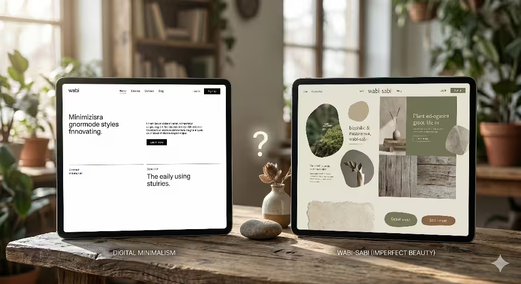
It is easy to get these two mixed up. Digital minimalism is about efficiency. it is about removing everything that is not needed for the task. It is very “clean” and often has a lot of white-space. Wabi-sabi is about character. A minimalist room might be white with one chair. A wabi-sabi room might be white with one chair, but the chair is made of old wood with cracks in it. The second room feels warmer. It has imperfect beauty.
In web design, minimalism can sometimes feel boring or even “cheap.” Wabi-sabi feels rich and textured even when it is simple. Minimalism focuses on the “less.” Wabi-sabi focuses on the “soul.” We use imperfect beauty to make sure our simple designs do not feel empty. We want them to feel full of history and life. That is the main difference. One is about subtraction, the other is about appreciation of the natural world.
Can Imperfect Beauty Improve User Experience?
The answer is a very strong yes. As a biologist, I know that humans are wired to respond to natural patterns. This is called biophilia, a topic that is often discussed on this blog. We find comfort in things that look like nature. When a website uses imperfect beauty, it triggers this comfort response. It lowers the user’s heart rate. It makes them feel less “on edge.”
This is very important for websites that deal with stressful topics, like health or finance. If a user is calm, they can make better decisions. They stay on the site longer. They remember the brand more fondly. Imperfect beauty also builds trust. We tend to trust things that show their flaws. A person who admits they made a mistake is more trustworthy than a person who claims to be perfect. A website that shows its “human side” through imperfect beauty feels more honest. This leads to higher user retention and better brand loyalty.
Biophilic Synthesis: The Nature-Web Connection
At Silphium Design LLC, we talk a lot about biophilic synthesis. This is the idea of combining the digital world with the biological world. The guide to imperfect beauty in UX/UI is our main tool for this. We look at things like fractal geometry. Fractals are patterns that repeat at different scales. You see them in clouds, trees, and coastlines. Our brains love these patterns because they have the perfect amount of complexity. They have imperfect beauty because they are not perfectly predictable, but they still have an order.
We can use code to create these types of patterns in our website backgrounds or layouts. This creates a sense of “digital nature.” It makes the screen feel like a window into a garden. This synthesis is the future of design. As we spend more time online, we need our digital spaces to feel as healthy as our physical spaces. Using imperfect beauty is the only way to achieve this.
The Savannah Hypothesis and Digital Layouts
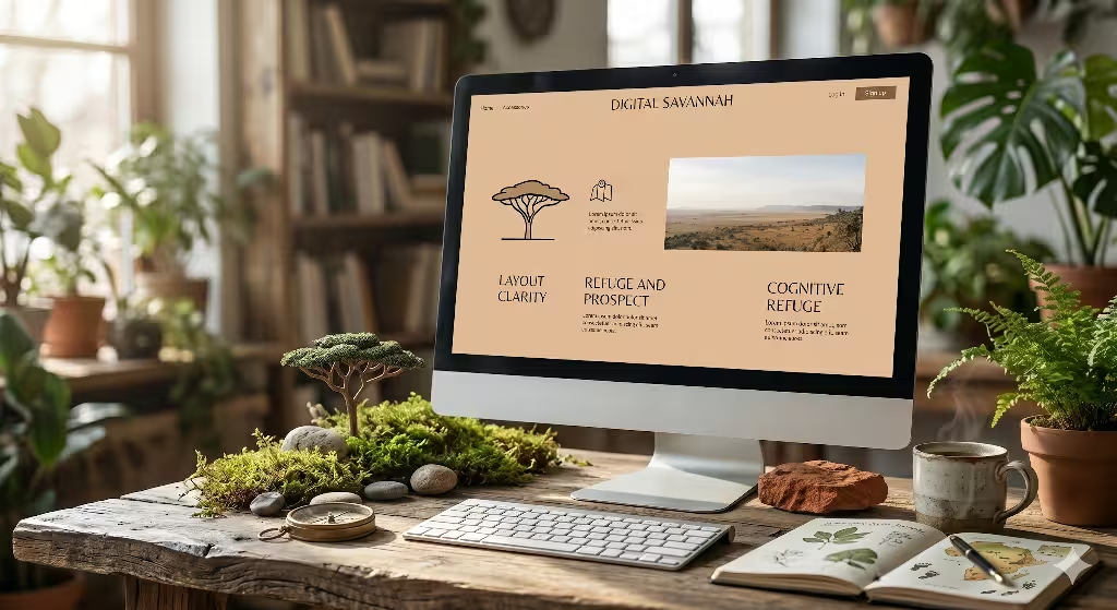
There is an idea in biology called the Savannah Hypothesis. It says that humans prefer landscapes that look like the African savannah. We like open spaces with a few scattered trees and a view of water. This is because these areas were safe and had food for our ancestors. You may have heard this idea with Prospect and Refuge.
We can apply this to web design using imperfect beauty. An “open” layout with clear paths and “clumps” of information feels safe to our brains. If a website is too crowded, it feels like a dense jungle where a predator could be hiding. If it is too empty, it feels like a desert where there is no life. We use imperfect beauty to create a “digital savannah.” We place elements in a way that feels scattered but purposeful. This creates a feeling of ease and clarity. It is a biological way to improve the user experience without the user even knowing why they feel so good on the site.
Digital Weathering: The Beauty of Age
In the physical world, things get better with age. A leather bag gets softer. A stone path gets smoother. In the digital world, things usually stay exactly the same until they are deleted. We think this is a missed opportunity. We are exploring the idea of digital weathering. This means a website might change slightly the more you use it. Maybe the colors get a little softer. Maybe the edges of the buttons get a little more rounded.
This type of imperfect beauty creates a sense of “place.” It makes the user feel like the website is a space that they actually live in. It creates a history between the user and the site. This is a very high level use of imperfect beauty. It requires a lot of smart code, but it makes for a truly unique experience. It turns a website from a tool into a companion.
SEO Strategy and Semantic Integration
You might wonder how imperfect beauty helps with SEO. Search engines like Google are getting smarter. They no longer just look for keywords. They look for “helpful, reliable, people first content.” This is part of what they call E-E-A-T (Experience, Expertise, Authoritativeness, and Trustworthiness). A website that looks and feels human builds trust faster. When a user spends more time on a site because it feels comfortable, Google notices. This is called “dwell time.” High dwell time tells the search engine that your site is valuable.
By using the guide to imperfect beauty in UX/UI, we improve these user signals. We also use semantic keywords. Instead of just repeating the same word, we talk about related ideas like organic design, digital authenticity, and human centric layouts. This shows the search engine that we have deep knowledge of the topic. Imperfect beauty is not just a visual style; it is a signal of quality that search engines love.
Schema Markup and Rich Snippets
To really help the search engines, we use something called schema markup. This is a special bit of code that tells the search engine exactly what each part of the page is. We use it to highlight our “People Also Ask” section. This helps the search engine create “rich snippets,” which are the little boxes of info you see at the top of a search.
By answering questions about imperfect beauty clearly, we increase the chances of our site showing up there. This drives more traffic to our site. It shows that we are leaders in the field of biophilic design. Even the technical code of a website can have a sort of imperfect beauty when it is crafted with care and purpose. It is about doing the hidden work that makes the whole experience better for everyone.
Case Studies: Wabi-sabi in the Wild
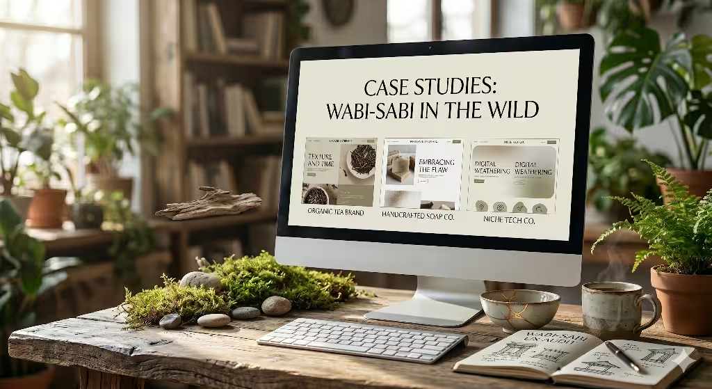
Let’s look at some real world examples. There are many boutique brands that are moving away from the “big tech” look.
Brands for Tea or Handmade Soap
Think of a company that sells organic tea or handmade soap. Their websites often use imperfect beauty to match their products. They use soft, earthy colors. They use photos that are not perfectly staged. They might have text that looks like it was typed on an old typewriter. This creates a cohesive brand story. The user feels the “truth” of the product through the design of the site.
Sustainable Fashion Brands
Another example is sustainable fashion brands. They often use layouts that are very open and simple, using Kanso to show they care about the environment. They use imperfect beauty to show that they are not a faceless factory. They are a group of people who care about the earth. These sites often have much higher conversion rates because the design feels so authentic.
Analysis of Boutique Brands and Authenticity
When we analyze these brands, we see a common thread. They all value “realness” over “perfection.” They use imperfect beauty to signal that they are high quality. In the past, “perfect” meant high quality. Today, “perfect” often means “cheap and mass produced.” “Imperfect” now means “crafted and rare.” This is a big shift in how people think.
By using imperfect beauty in UX/UI, a brand can position itself as a premium, artisan choice. This is very powerful for small businesses trying to compete with giant corporations. You can’t beat the giants at being perfect, but you can beat them at being human. Imperfect beauty is the secret weapon of the modern designer. It allows us to create emotional depth that a computer grid could never achieve.
The Role of Empty States as a Canvas
In web design, an “empty state” is what you see when there is no data. For example, when your shopping cart is empty or you have no messages. Most designers ignore these pages. We see them as a great place for imperfect beauty. Instead of a boring “No items found” message, we can use a beautiful, simple illustration. We can use a soft texture and a kind word.
This turns a moment of “nothing” into a moment of delight. It shows the user that we care about every single part of their journey. This is a key part of the guide to imperfect beauty in UX/UI. It is about finding beauty in the places where people usually don’t look. It makes the entire website feel complete, even when it is technically empty.
Embracing the Flaw: A Final Thought
As we reach the end of this guide, I want to remind you why we do this. We do this because we are humans. We are biological beings who live in a messy, beautiful world. When we try to force our digital lives into perfect, sterile boxes, we lose something. We lose our connection to nature. We lose our sense of wonder.
Embracing imperfect beauty is about bringing that wonder back to the screen. It is about making the internet a place where we can breathe and feel at home. At Silphium Design LLC, we don’t just build websites; we build digital ecosystems similar to that in nature. We use imperfect beauty to ensure those ecosystems are healthy for the people who use them.
The Future of Human-Centric Design
The future of design is not about more pixels or faster speeds. Those things are already here. The future is about “feeling.” It is about how a digital space makes us feel when we are in it. As AI continues to grow, everything will start to look more and more “perfect.”
The only way to stand out will be to be intentionally imperfect (that is to not look like AI). Imperfect beauty will be the mark of a human designer. It will be how we tell the difference between a soul-less machine and a creative person. By following this guide to imperfect beauty in UX/UI, you are preparing yourself for this future. You are learning to value the things that actually matter to the human heart.
Final Review of the Imperfect Beauty Methodology
To summarize our guide, remember the three main pillars. First, use asymmetry (Fukinsei) to create movement and life. Second, use simplicity (Kanso) to create focus and calm. Third, use quiet beauty (Shibuity) to create depth and trust. Combine these with technical tools like digital grain, organic shapes, and variable fonts. This creates a website full of imperfect beauty.
This approach is better for the user’s brain, better for your brand’s trust, and better for your search engine rankings. It is a holistic way of thinking about design that goes beyond the screen. It is a philosophy for a better digital world. We believe that by choosing imperfect beauty, we are choosing a better future for everyone who uses the internet.
Conclusion: Why Human Pixels Matter
In the end, every pixel on a screen is just a tiny dot of light. But when we arrange them with the principles of wabi-sabi, they become more. They become a story. They become a feeling. They become a connection. Using imperfect beauty is how we make our digital work matter. It is how we honor our biological roots while using our technological tools.
I hope this guide has inspired you to look at your designs in a new way. Don’t be afraid of the “mistake.” Don’t be afraid of the “flaw.” Those are the places where the light gets in. Those are the places where imperfect beauty lives. As we move forward, let’s strive to make an internet that is as diverse, surprising, and beautiful as a wild forest. That is the true goal of biophilic design.