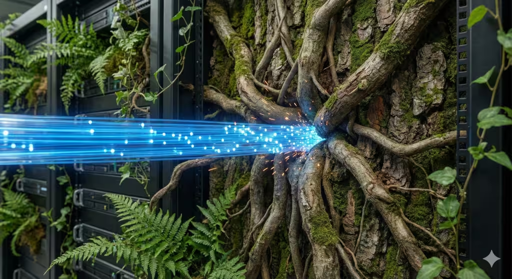
At Silphium Design we spend a lot of time trying make the internet feel a bit more like a walk in the woods and less like a fluorescent-lit basement. We obsess over a very specific tug-of-war: speed vs. space. On one hand, you want your website to load instantly—that is the speed.
On the other hand, you want it to feel open, airy, and natural—that is the space. Finding the right balance in design is basically the “Golden Ratio” of the modern web. If you go too fast, the site feels clinical and cold. If you add too much visual space with big, beautiful nature photos, the site crawls like a snail. We are here to bridge that gap using biology and computer science.
Table of Contents
The Digital Equilibrium
When you walk into a dense forest, your brain does not feel overwhelmed. Even though there are millions of leaves and branches, there is a natural order to it. In design, we call this the digital equilibrium. We are trying to find the perfect point where a website feels fast enough to keep you happy but spacious enough to let you breathe.
The problem we face today is that the internet is getting heavier. Websites are packed with tracking scripts, high-definition videos, and complex animations. This creates a massive conflict between speed vs. space. As a designer with a background in biology, I look at this through the lens of “Prospect and Refuge.” This is a fancy way of saying that humans like to have a clear view (prospect) and a safe place to sit (refuge). A good website should give you both. It should load quickly so you do not feel stuck, but it should have enough “visual quiet” so you do not feel crowded.
The Physics of Speed: Why Latency is the Ultimate Friction
In the world of computers, speed is measured in milliseconds. If a site takes more than three seconds to load, most people will just leave. This is what we call friction. Think of it like trying to run through water. The thicker the water, the harder it is to move. On a website, “thick water” is usually caused by unoptimized code or images that are way too big.
Google uses something called Core Web Vitals to judge how fast your site is. They look at things like how long it takes for the biggest piece of content to show up and if things jump around while the page is loading. When we talk about speed vs. space, we have to realize that every byte of data we add to create “space” acts as a weight on “speed.”
From a technical perspective, the time it takes for the first bit of information to reach your screen is vital. If your server is in Boston and your reader is in California, that data has to travel through physical wires. If the site is “heavy” with too many features, that travel time increases. This is why we have to be very careful about what we put on the page.
The Architecture of Space: More Than Just Empty Room

Many people think that space on a website is just “wasted” area where nothing is happening. That is not true at all. In biophilic design, space is a tool. We call it “white space” or “negative space.” It acts like the clearing in a forest. It gives your eyes a place to rest so you can focus on the important parts, like the text or the buttons.
Using space correctly helps reduce “cognitive load.” This is a fancy term for how hard your brain has to work to understand what it is looking at. If a website is cluttered, your brain gets tired and you want to close the tab. By using speed vs. space effectively, we create a sense of calm.
We also look at fractal patterns. Fractals are patterns that repeat at different scales, like the veins in a leaf or the branches of a tree. Humans are hardwired to find these patterns relaxing. We can build these patterns into the layout of a website using code, which creates a feeling of natural space without needing a massive, slow-loading photo.
Common Questions About Speed and Space
One question people often ask is: “Does white space make my website load slower?” The answer is a big no. In fact, white space is usually just code telling the browser to leave a gap. It weighs almost nothing. The confusion happens because people think “space” means “big background pictures.” While pictures create a sense of space, they are also very heavy.
Another common question is: “What is the best balance between high-quality images and fast performance?” The trick is to use images only where they matter most. You do not need a 4K photo of a forest for every single section. Sometimes, a simple color or a light texture works better.
People also wonder if biophilic design helps with SEO. SEO stands for Search Engine Optimization, which is how you get your site to show up on Google. The answer is yes. When a site feels natural and spacious, people stay on it longer. Google sees that people are spending time on your site and decides that your site must be high quality, which moves you up in the rankings.
Finding the Golden Ratio: Optimization Strategies
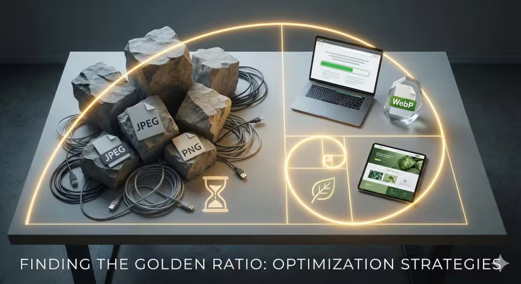
So, how do we actually win the battle of speed vs. space? We use a few technical tricks. First, we use new image formats. Instead of using old JPEG files, we use WebP or AVIF. These are like magic suitcases that can fit a huge, beautiful photo into a tiny file size. This allows us to have the “space” of a big image without losing the “speed.”
We also use something called “lazy loading.” Imagine you are reading a long book. You do not need to see the pictures on page 100 while you are still on page 1. Lazy loading tells the website to only load the images when you scroll down to them. This keeps the initial speed very high while still allowing for a very long, spacious design.
Another trick is using CSS gradients instead of images. We can write a few lines of code to make the background look like a sunset or a misty morning. Because it is just code and not a photo, it loads instantly. This is a great way to handle the speed vs. space trade-off.
Local SEO and the Natural User Experience
When you are looking for a local business, you are usually in a hurry. You might be on your phone walking down the street. In this situation, speed is even more important. However, if the site looks like a generic template from 1995, you might not trust the business.
Even for local search, the balance of speed vs. space matters. We want the site to feel like it belongs to your city. If we are designing for a business in Burlington, Vermont, we might use colors and shapes that feel like the Green Mountains. We have to do this while making sure the site loads in the blink of an eye on a mobile phone. This creates a “Sense of Place,” which makes people feel more connected to the local brand.
Technical Details: Under the Hood of Design
To really understand speed vs. space, we have to look at the “Critical Rendering Path.” This is the order in which a computer draws a website. If we put a giant, heavy file right at the top, the computer gets “stuck” and the rest of the site does not show up.
We use something called a Content Delivery Network (CDN). This is a group of servers spread out all over the world. If you are in Boston, the CDN sends the website from a server in Boston. This cuts down on the distance the data has to travel, which helps us maintain speed even when we have a lot of spacious design elements.
We also focus on “Raster vs. Vector.” Raster images are made of dots (like a photo) and get blurry if you zoom in. Vector images are made of math (like a logo) and are always sharp and very small in file size. Whenever possible, we use vectors to keep the site fast and clean.
Case Study: How Silphium Design LLC Does It
At Silphium Design LLC, we recently worked with a client who wanted a very “earthy” feel but had a lot of information to show. They were worried that adding nature-inspired elements would ruin their performance. We used a technique called Server-Side Rendering. Basically, we let our powerful servers do all the “heavy lifting” of building the page before sending it to the user’s phone.
By doing this, we were able to include beautiful, flowing layouts and organic shapes while keeping the load time under half a second. This proved that you do not have to choose one or the other. You can have both speed vs. space if you use the right technology. We focused on the Fibonacci Sequence to place our elements, which made the “space” feel naturally balanced to the human eye.
Harmonizing the Tension
In the end, the secret to a great website is not just being the fastest or having the most “room.” It is about how those two things work together. Speed is the foundation. Without speed, no one will ever see your design because they will leave before it loads. Space is the soul. Without space, your website is just a wall of noise that people want to escape from.
The balance of speed vs. space is something we constantly monitor. As internet speeds get faster and computers get smarter, we get more tools to play with. But the basic rules of human biology stay the same. We will always want things to be quick, and we will always need room to breathe. Finding the right balance in design is a journey, not a destination.
When you look at your own website, ask yourself: Does this feel like a crowded elevator, or does it feel like a park? If it feels like an elevator, you might have a “space” problem. If it takes forever to open the doors, you have a “speed” problem. By keeping an eye on the speed vs. space ratio, you can create a digital home that people actually want to visit.
Finding the right balance in design is what makes a website successful. It is the difference between a tool that just works and an experience that people remember. Whether you are a small local shop or a big company, your users deserve a site that respects their time (speed) and their mental well-being (space).
Remember that speed vs. space is a technical challenge, but it is also a human one. We use high-tech tools like AVIF images and CDNs, but we do it to satisfy ancient human needs for clarity and calm. That is the heart of biophilic design. It is using the best of our modern world to get back in touch with the natural one.
As we look toward the future of the web, the tension of speed vs. space will only grow. We will have more data, more images, and more features. But at Silphium Design LLC, we believe that the best designs will always be the ones that feel the most natural. By focusing on speed vs. space, we can build an internet that is not just functional, but beautiful and restorative as well.
Every choice we make, from the font size to the way an image fades in, is a decision about speed vs. space. It is a constant calibration. If we add a little more “space” here, we have to find a way to add more “speed” somewhere else. It is like a scale that must stay level. When the scale is balanced, the user wins. They get the information they need quickly, and they feel good while they are getting it.
So, next time you are browsing the web, take a moment to notice the speed vs. space around you. Notice which sites make you feel rushed and which ones make you feel at peace. That feeling is the result of a designer somewhere working hard to find that perfect balance. It is a difficult job, but when it is done right, the results are worth every second of effort.
In the world of professional web design, we never stop learning. We are always looking for new ways to optimize the speed vs. space of our projects. We look at how trees grow to understand better layout structures. We look at how light filters through water to understand better color gradients. And we look at the latest computer science papers to find ways to make it all load instantly.
The goal is simple: a faster, more spacious, and more natural internet for everyone. By understanding the relationship between speed vs. space, we can make that goal a reality. It takes work, it takes science, and it takes a bit of art, but the balance of speed vs. space is the key to the next generation of web design.