Table of Contents
The Evolution of Digital Tactility
Look closely at your computer screen or your smartphone. For many years, web designers built interfaces that were completely flat. This style is known as flat design. It uses solid colors, clean edges, and basic shapes. However, many modern users are starting to feel what we call flat design fatigue. This means that people are getting tired of looking at sterile, digital spaces that look like plastic boxes. When you look at a flat screen all day, your mind feels disconnected from the physical world. The reason is simple. Human beings did not evolve to interact with completely flat surfaces. We evolved to touch, see, and navigate a world filled with rough stone, soft leaves, and layered landscapes.
To fix this problem, we must study the science of human sight. Our minds use a special process called haptic vision. Haptic vision means that your eyes can actually feel what they are looking at on a screen. When your eyes see a surface with micro-grain or soft shading, your brain immediately recalls what it feels like to touch that object in real life. Your brain processes visual textures as physical surfaces before you even think about it. If a web button looks slightly raised, your brain understands that it can be pushed down. If a background looks like matte paper, your brain expects a soft experience. This is why creating realistic textures is so important for modern websites.
By connecting organic reality with browser environments, web creators can build spaces that feel real. When you build websites with realistic textures, you create an invisible bridge between the computer and the human body. This connection changes how people browse the web. Websites that feature realistic textures often keep visitors online for a much longer time. The bounce rate, which is the percentage of people who leave a page quickly, drops significantly. Visitors feel comfortable when they see realistic textures because those visuals mimic the natural patterns of our world. In this article, we will look at how to use code, light theory, and natural geometry to build digital surfaces that feel completely alive.
The Physics of Light and Shadow in UI
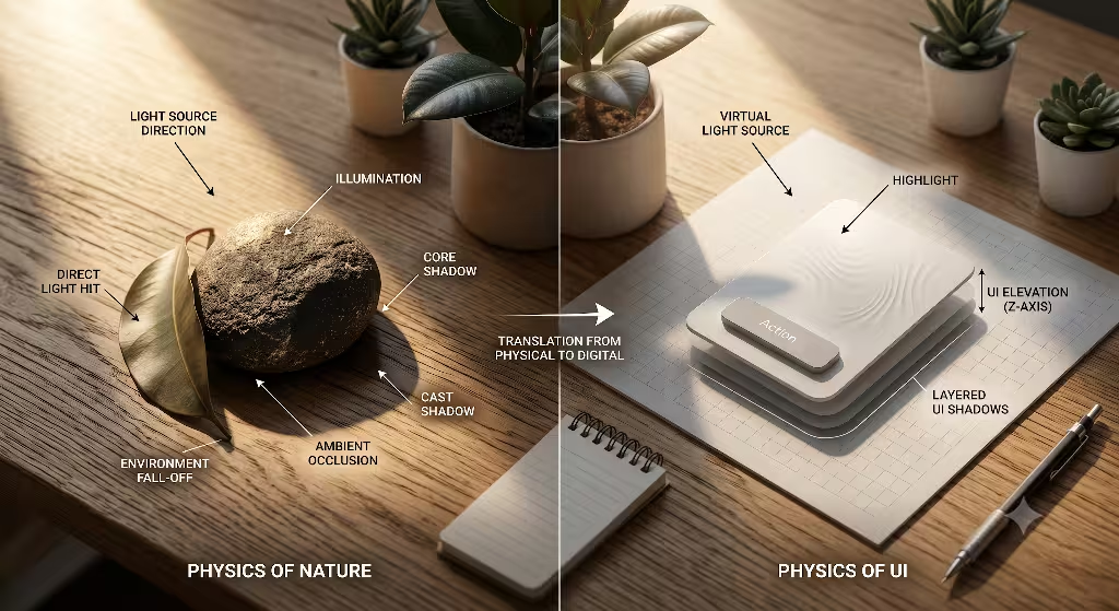
To build realistic textures on a screen, you must understand how light works in the real world. Light is the engine that creates depth. Without a light source, every object on your screen will look completely flat. The first step in creating realistic textures is establishing an invisible light source. You must pick a single point in space where your imaginary sun or lamp is shining from.
In web design, we usually place this global light source at the top left corner of the screen at a forty-five degree angle. Once you set these light coordinates, every element on your page must follow them. If a button has a shadow on the bottom right, then every single image, card, and text block must also have a shadow on the bottom right. This global logic tricks the brain into thinking the digital space is a real physical box.
Next, you need to understand the difference between form shadows and cast shadows. A form shadow is the dark side of an object itself. It happens because the object turns away from the global light source. Form shadows change gradually from light to dark, creating soft curves.
On the other hand, a cast shadow is the dark shape thrown onto a nearby surface because the object blocks the light. Cast shadows are crucial when you want to build realistic textures. They tell the user exactly how high an object is floating above the background. If the cast shadow is small and dark, the object is close to the surface. If the cast shadow is large and blurry, the object is floating high in the air.
Sadly, many web developers try to build realistic textures by using a single line of code for their shadows. This is a mistake that creates a muddy effect. In the real world, a shadow is never just one blurry gray shape. A true shadow is made of multiple layers of light and dark.
To build realistic textures that look authentic, you must use a technique called ambient occlusion. Ambient occlusion represents the tight, dark areas where two surfaces touch directly. It is a very thin, dark shadow with high opacity. Outside of that tight zone, you must add an environment fall-off shadow. This second layer is broad, soft, and has low opacity. When you stack these two types of shadows together, your realistic textures will suddenly look three-dimensional.
+-------------------------------------------------+
|               Invisible Global Light            |
|                     (Top-Left)                  |
|                         \                       |
|                          \                      |
|                           v                     |
|                     +-----------+               |
|                     |  UI Card  |               |
|                     +-----------+               |
|                      \         \                |
|  Ambient Occlusion    \         \               |
|  (Tight & Dark) ------>|=========|              |
|                         \         \             |
|  Environment Fall-off    \         \            |
|  (Broad & Soft) ----------->.................   |
+-------------------------------------------------+
Texture Mapping: From Skeuomorphism to Biophilic Realism
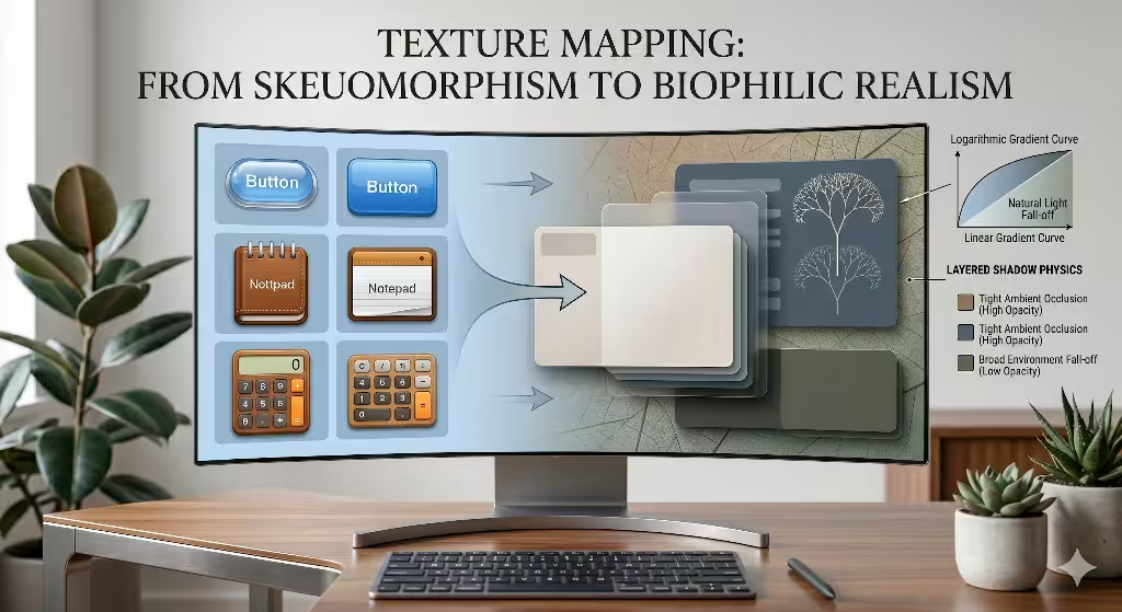
Digital design has a unique history when it comes to replicating physical surfaces. Around the year 2010, many websites used a style called skeuomorphism. This style tried to copy real-world objects exactly as they were. Buttons looked like glossy plastic domes, and note-taking apps looked like yellow legal pads with leather stitches. While it helped people learn how to use touchscreens, it often looked cheap and overly dramatic.
Today, we are moving beyond that old style. We are moving toward a concept called biophilic realism. Biophilic realism means we use design elements that honor our biological love for nature, without making the interface look like a cartoon. We use realistic textures to create clean, modern interfaces that still feel natural.
When you implement biophilic realism, you look closely at natural surfaces for inspiration. For example, consider micro-grain textures. You can add a very subtle grain to a webpage to mimic the look of natural stone, clay, or fine matte paper. This micro-grain does something amazing for the user. It reduces screen glare and breaks up the artificial shine of computer monitors. When a background uses realistic textures like fine sand or leaf veins, it feels softer on the human eye. The screen no longer looks like a sheet of glowing glass. Instead, it feels like an organic material that you can interact with comfortably.
To make these surfaces work correctly, you must master the scale of contrast. In the physical world, your eyes see details differently depending on how close an object is to your face. If an object is right in front of you, you can see every tiny bump and groove. If it is far away, the surface looks smooth. You must use this rule when creating realistic textures on a website.
Interactive elements that sit in the foreground should have sharper details and higher contrast. Background elements should have soft, blurry details with low contrast. By managing this scale, your realistic textures will tell the user exactly what items are close enough to click and what items are just part of the scenery.
Technical Implementation: Code and Vectors
Now let us look at the code required to build these surfaces. You do not need to use giant image files to create realistic textures on a webpage. In fact, large images will slow down your loading times. Instead, you can build realistic textures programmatically by using multi-layered CSS box shadows. CSS allows you to write several shadow profiles inside a single line of code.
By separating each profile with a comma, you can stack shadows on top of each other. The first shadow should be a very tight, dark line to mimic the ambient occlusion. The second shadow should be a medium blur with low opacity. The third shadow should be a very wide, light mist that mimics the natural scattering of light. This code approach keeps your website running fast while providing realistic textures.
CSS
/* Example of a programmatically layered shadow for depth */
.biophilic-card {
  box-shadow:
    0 1px 2px rgba(0, 0, 0, 0.2),  /* Ambient Occlusion */
    0 4px 12px rgba(0, 0, 0, 0.1), /* Mid-field fall-off */
    0 12px 32px rgba(0, 0, 0, 0.05); /* Broad environment mist */
}
Another great tool for creating realistic textures is the SVG filter. SVG stands for Scalable Vector Graphics. Inside an SVG code block, you can use special elements called filter primitives. Two of the best tools are feTurbulence and feDisplacementMap.
The feTurbulence element allows you to generate mathematical noise directly inside the browser. This noise acts as a random pattern of pixels that mimics natural variations. You can then use feDisplacementMap to warp and roughen the edges of your digital shapes using that noise. By combining these two tools, you can transform a perfect, artificial vector line into a rough edge that looks like handmade paper or natural wood. These SVG tools allow developers to build realistic textures without using heavy graphics files.
SVG
When you build these advanced visual elements, you must always think about performance optimization. Search engines prioritize websites that load quickly and run smoothly. If your realistic textures take too long to render, your Core Web Vitals scores will drop, and your search engine ranking will suffer. To prevent this, you should compress any image-based textures into modern file formats like WebP or AVIF. These formats offer high fidelity while keeping file sizes small. Additionally, make sure to use hardware-accelerated CSS properties like transform and opacity when animating your realistic textures. This ensures that the user’s graphics card handles the heavy rendering work, keeping the frame rate smooth and responsive.
Frequently Asked Questions about Realistic Texture
When web designers begin their journey into modern user interfaces, they often search for specific answers on Google. Let us explore the most common questions people ask about creating realistic textures and depth in digital layouts.
How do you make a flat texture look realistic?
To turn a completely flat color or simple shape into a realistic texture, you must focus on the micro-details of light. In the real world, no surface is ever perfectly uniform in color. A solid blue wall actually has thousands of tiny variations in color caused by the texture of the drywall and the angle of the light. Therefore, the first step is to apply a subtle noise gradient over the flat color. This breaks up the perfect mathematical digital coloring.
Next, you must focus on the edges of your shapes. If a shape is flat, its edges are perfectly sharp. To make it look like a real physical object, you must add microscopic highlights on the edges that face your global light source. These highlights should be a very light shade of the base color or a soft white with transparency. On the opposite side, you must add a micro-shadow. This tells the viewer’s brain that the surface has thickness. By introducing these edge highlights and micro-gradients, flat elements transform into realistic textures that look authentic to the human eye.
How do you add depth and shadow to digital art and web layouts?
Adding true depth to a web layout requires you to think like an optical engineer. You must separate your website into three core planes: the foreground, the middleground, and the background. Each plane has its own set of rules for handling light, shadow, and realistic textures. By assigning every element on your page to one of these three planes, you create a clear visual hierarchy that guides the user’s eyes.
- The Background Canvas: This is the lowest plane on your screen. It should feature your lowest contrast levels. Textures used here must be soft and slightly out of focus. Shadows on this plane are rare because everything sits flat against it.
- The Middleground Workspace: This is where your main content lives, such as text articles, product grids, and image blocks. Elements in the middleground should use distinct cast shadows with medium blur. These shadows tell the user that these items are raised slightly above the background canvas. The realistic textures here should be crisp but not distracting.
- The Foreground Interaction Zone: This plane is reserved for critical interactive elements like popup windows, navigation menus, and floating action buttons. Because these items sit closest to the user, they must throw large, soft, wide shadows onto the middleground below them. Their realistic textures should feature the highest amount of detail, mimicking an object that you could reach out and pick up with your hand.
What are the best techniques for creating realistic textures?
The best techniques for engineering realistic textures involve layering transparency and utilizing digital blend modes. When you look at an organic surface like a leaf or a piece of polished wood, you are not just seeing the top layer. You are seeing light pass through multiple translucent layers of fibers and cells. To mimic this effect on a computer screen, you should never use a single flat image layer. Instead, you should stack multiple transparent layers on top of each other using CSS or canvas rendering tools.
A primary technique is using the Multiply blend mode for your shadow layers and the Soft Light blend mode for your highlight layers. The Multiply blend mode combines the colors of your texture with the colors below it, creating a natural, rich darkness that avoids the muddy gray look. The Soft Light blend mode blends your highlights gently into the material, making it look like light is naturally reflecting off a physical surface.
Furthermore, you should reference mathematical distributions found in nature, such as Fractal Brownian Motion. This is a mathematical formula that generates random, nested patterns that perfectly copy the irregular spacing of mountain ranges, clouds, and rock surfaces. By using these natural mathematical models, your digital surfaces will display truly realistic textures.
Biophilic UI: Designing for the Human Subconscious

When we design websites using biophilic principles, we are speaking directly to the human subconscious. Human beings spent millions of years living in natural wilderness settings before we built cities and computers. Our brains are hardwired to recognize and relax around the shapes and lighting patterns found in nature. This is why linear gradients often feel strange and artificial to our eyes. A linear gradient changes color at a perfectly constant mathematical rate.
In nature, light never behaves this way. When light hits a curved tree trunk or a rolling hill, it distributes across a logarithmic curve. A logarithmic curve means that the light changes quickly at first, and then slows down as it stretches across the surface. By using logarithmic curves for your digital gradients, you can craft realistic textures that feel instantly familiar and soothing to the user.
Linear Gradient (Artificial):
[Color A]========>========>========>========>========> [Color B]
(Changes at a stiff, mechanical, uniform rate)

Logarithmic Gradient (Natural/Biophilic):
[Color A]==>===>=====>=======>===========>============> [Color B]
(Changes quickly at first, then stretches out softly like real sunlight)
Another critical element of biophilic UI design is color temperature modulation. Many untrained web developers make their shadows by using a transparent black color like rgba(0, 0, 0, 0.5). This creates an artificial, dead look on the screen because black shadows do not exist in nature. In the physical world, shadows always contain ambient color from the surrounding environment. If you look at a shadow in a deep forest, the shadow is not black; it is a rich, dark forest blue or charcoal green. This happens because the blue sky and green leaves reflect their colors into the shaded areas.
To create truly realistic textures on your website, you must inject environmental color temperatures into your digital shadows. If your webpage uses a warm, sandy background color, your shadows should feature deep, warm brown tones. If your website is themed around water or plants, your shadows should use dark, cool slate blues or rich pine tones. This subtle color modulation completely changes how a user feels when browsing your site. The realistic textures look unified with the color scheme, making the interface feel like a coherent, organic ecosystem rather than a collection of code snippets.
A Strategic Checklist
Building high-quality digital environments requires a balance of technical skill and natural intuition. Flat design served its purpose by cleaning up the chaotic web layouts of the past, but it left our interfaces feeling cold and disconnected from the real world. By focusing on creating realistic textures with deep shadows and organic light maps, we can bring human warmth back to our digital experiences. When a user navigates a website that uses these principles, they are not just looking at cold code. They are interacting with a digital space that honors the physics of our physical universe. This biophilic approach results in higher user engagement, improved brand trust, and superior search engine performance.
To ensure your digital projects meet these advanced standards, use this three-point audit checklist during your next design review:
- Is the global light source unified across all pages? Check every card, button, text shadow, and texture block to ensure they all react to a single, consistent set of light coordinates. If your navigation bar throws a shadow downward, your content cards must not throw shadows upward. Consistency is the key to tricking the subconscious mind.
- Do your shadows contain layered steps to reflect ambient occlusion? Look closely at your interactive elements. Eliminate any single-line box shadows that create a muddy appearance. Replace them with multi-layered shadow arrays that pair a tight, high-opacity ambient occlusion line with a wide, soft environment fall-off mist.
- Are your textures optimized to load in under 100 milliseconds? Never sacrifice performance for visual style. Ensure all your realistic textures are generated programmatically using lightweight CSS and SVG filters, or compressed into modern AVIF and WebP file formats to keep your Core Web Vitals sharp and your search engine ranking high.
Comprehensive Data Reference Table
To help you implement these design rules accurately, use this reference guide for setting up your spatial layouts and shadow intensities across different UI elements:
| UI Plane Layer | Perceived Distance | Core CSS Shadow Technique | Texture Grain Density | Target Subconscious Reaction |
| Background Canvas | Lowest Layer (0px) | No shadows; uses soft, low-contrast background color mixing. | Fine micro-grain (1-2% opacity) mimicking clay or matte paper. | Reduces screen glare, grounds the workspace, and relaxes eye muscles. |
| Middleground Cards | Raised Layer (4px to 8px) | Tight ambient occlusion line paired with a 12px blurry environment fall-off. | Crisp, medium-density texture showing subtle natural surface variations. | Signals that the content card is a solid container holding important data. |
| Foreground Overlays | Highest Layer (16px+) | Wide, diffuse 32px shadow mist with very low opacity (3-5%) for natural scattering. | Smooth surfaces with high-contrast edge highlights facing the light source. | Commands immediate user attention and signals an urgent interactive zone. |
By following this structured layout matrix, your digital interfaces will transition smoothly from flat screens into rich, three-dimensional tactile experiences that users can easily navigate.