Here at Silphium Design we see the internet through a very specific lens: Biophilic Design. This means we believe our digital tools should feel as natural as a walk in the park. One of the most important ways we do this is through shadow effects.
In the natural world, shadows are everywhere. They tell our brains how far away an object is or how rough a surface feels. When you look at a leaf on the ground, the shadow it casts tells you if it is flat against the dirt or hovering just above it. In web design, we use shadow effects to give those same clues. Without them, a website feels flat, cold, and “fake.” By adding realistic shadow effects, we bridge the gap between your glass screen and the 3D world you live in. This makes a website feel safe, intuitive, and easy to use. Today, I want to show you how we use these effects to create digital ecosystems that truly breathe.
Table of Contents
Why Your UI Needs Natural Physics
When we talk about User Interface (UI), we are talking about how you communicate with your computer. For a long time, designers used “flat design.” This meant everything was a flat color with no depth. While it looked clean, it was actually hard for the human brain to understand. Our brains evolved over millions of years to look for depth. We look for “affordance,” which is a fancy word for a clue that tells us what we can do with an object.
A button with shadow effects looks like it can be pushed. A window with a soft shadow looks like it is floating above the background. This is part of our biophilic imperative. Biophilia is our innate love for living things and natural systems. Because nature always has light and shadow, our eyes feel more relaxed when we see those same patterns on a screen. When shadow effects are done right, your brain doesn’t have to work as hard to figure out what is clickable. It just feels right. This reduces “cognitive load,” which is just a way of saying it keeps your brain from getting tired.
The Anatomy of a Realistic Shadow
In the world of biophilic design, we look at the digital screen as if it were a window into a real, physical space. To make that window feel believable, we have to treat light like a scientist would. Those same rules apply to shadow effects on a website.
If a shadow is just a blurry gray blob, your brain knows it is fake. But if that shadow follows the laws of physics, your brain relaxes. It accepts the interface as a “real” object. To reach that level of realism, we have to break the shadow down into its specific parts.
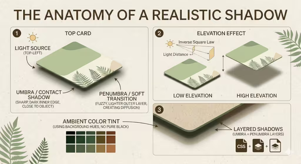
The Light Source: The Sun of Your Screen
In nature, shadows don’t just happen; they are caused by a light source hitting an object. On a website, your light source is invisible, but it must be consistent. Imagine there is a single sun shining on your phone or laptop.
Usually, we imagine this “sun” is sitting at the top-left corner of the screen. Because of this, shadow effects should mostly appear on the bottom and the right side of your buttons or boxes. If one button has a shadow on the right and another has a shadow on the left, it feels chaotic. It’s like having two suns in the sky, which doesn’t happen on Earth. By keeping the light source in one spot, you create a sense of harmony that feels natural to the eye.
The Umbra: The Core of the Shadow
The “Umbra” is the darkest part of a shadow. In the physical world, this is the area where the light source is completely blocked by the object. When you are applying shadow effects to a UI element, the umbra is the thin, dark line right where the element “touches” the background.
In code, we make this part of the shadow very thin and slightly darker. It shouldn’t be very blurry because it represents the physical contact between two things. Without a strong umbra, your buttons will look like they are “glowing” gray rather than sitting on a surface. This tiny detail is what gives a design “weight.”
The Penumbra: The Soft Transition
Surrounding the dark umbra is the “Penumbra.” This is the fuzzy, lighter edge of the shadow. This happens because light isn’t a single point; it’s a soft glow that “wraps” around the edges of an object.
To get this right with shadow effects, we use a much larger blur radius. This part of the shadow should be very faint—almost invisible. It mimics how light bounces off the floor and fills in the edges of a shadow. If you make the penumbra too dark, the website starts to look “dirty.” If you make it too small, the object looks like it’s made of harsh metal or plastic. For a biophilic, organic feel, we want a large, soft penumbra that feels like a shadow cast on a soft forest floor.
Color Temperature and Ambient Light
One of the most important things we explain at Silphium Design LLC is that shadows are never truly gray. In fact, in my blog, we often use the green that is part of the brand. In nature, a shadow is filled with “ambient light.” This is light that has bounced off other things.
If your website has a green background, your shadow effects should have a tiny bit of green in them. If you use a flat, neutral gray shadow on a colorful background, it looks “muddy” and “dead.” By adding a hint of the background color into the shadow, you make the object look like it is actually reflecting its environment. This creates a “glow” that makes the digital space feel warm and alive, rather than cold and mechanical.
Elevation and the Inverse Square Law
In physics, as an object moves further away from a surface, its shadow gets bigger, lighter, and fuzzier. We use this rule to show “elevation” in our apps.
- Low Elevation: A button that is “resting” on the page will have a tight, dark shadow.
- High Elevation: A pop-up window or a menu that is “floating” high above the page will have shadow effects that are spread out very wide and are very light.
By following this rule, you tell the user’s brain exactly how “high” an object is floating. This helps them understand what is most important. The “higher” the object, the more it grabs the user’s attention.
Texture and Diffusion
Finally, we have to think about what the shadow is falling onto. A shadow on a piece of smooth glass looks different than a shadow on a piece of rough wood. In biophilic web design, we often use textures like paper, grain, or linen in our backgrounds.
When you apply shadow effects over a textured background, the shadow should slightly “break up” to follow that texture. We do this by using subtle noise or gradients within the shadow itself. This makes the interface feel tactile, like something you could actually reach out and touch. When a user feels like they can “touch” your website, they trust it more.
Technical Implementation: The CSS Stack
Now, let’s talk about how we actually build these shadow effects using code. You don’t need to be a math genius to do this, but you do need to understand how the computer draws depth.
Advanced box-shadow Syntax
In the language of the web (CSS), we use a tool called box-shadow. It asks for four main numbers: how far left or right the shadow goes, how far up or down it goes, how blurry it is, and how big it spreads. To make realistic shadow effects, we keep the “spread” at zero or even a negative number. This keeps the shadow from looking like a thick outline. We want the shadow to “fall” away from the object, not just sit behind it like a heavy coat.
The Elevation Scale
Think of your website like a set of shelves. Some things are on the bottom shelf (the background), and some things are on the higher shelves (buttons or menus). As something moves higher up, its shadow effects should change. A button that is high up will have a shadow that is very blurry and far away from the button. A button that is low down will have a shadow that is tight and dark. We create an “elevation scale” so that every part of the website knows exactly how much shadow it should have based on how “high” it is floating.
Using drop-shadow for Organic Shapes
Sometimes, a box isn’t enough. If you have a picture of a leaf or a round logo, a box-shadow will still draw a square shadow around it. That looks terrible! Instead, we use a tool called filter: drop-shadow. This tool looks at the actual shape of the image and draws shadow effects that match the curves and edges. This is vital for biophilic design because nature is full of curves, not just straight lines.
Biophilic Patterns: Light through the Canopy
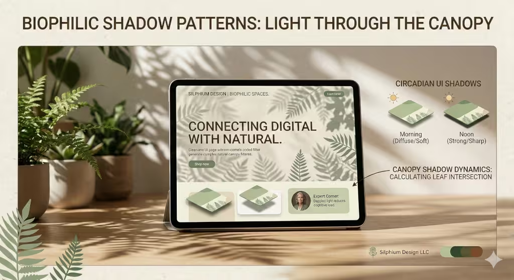
As a botanist, I love how light filters through trees. This is called “dappled light.” We can use shadow effects to bring this feeling to a website. Instead of every shadow being a perfect circle or square, we can use soft, uneven shadow effects to make the screen feel like it is sitting under a tree.
We also have to think about the time of day. Many apps now have “Dark Mode.” In the real world, shadows at night look different than shadows at noon. In the daytime, shadow effects are sharp and clear. At night, they are soft and very dark. By changing your shadow effects when a user switches to dark mode, you are respecting their biological rhythms. This makes the app feel like a living thing that changes with the world around it.
Common Questions Answered About Shadow Effects
People often ask me how to get started with these techniques. Here are some of the most common questions I hear about shadow effects in modern design.
How do I make shadows look realistic in UI?
The short answer is: stop using default settings. Most design tools give you a heavy, gray shadow by default. To make it realistic, you need to lower the “opacity” (make it see-through) to about 10% or 20%. Then, use at least two layers. One layer should be very close to the object, and the other should be spread out and soft. This mimics how light bounces around in a real room.
What is the difference between drop shadow and inner shadow?
Think of a button. A regular shadow makes the button look like it is popping out toward you. An inner shadow makes the button look like it is pressed into the page, like a footprint in the sand. We use inner shadow effects for things like text boxes where you type your name. It tells the user, “This is a hole you can fill with information.”
How many shadows are too many?
You have to be careful. If every single item on your page has heavy shadow effects, the page will look messy and confusing. It’s like having twenty people talking at once. You should use shadows to highlight the most important things, like your main “Buy Now” button or a pop-up message. If everything is special, then nothing is special.
Why are shadows important in UI/UX?
Shadows create a hierarchy. They tell the user what to look at first. Things with bigger, softer shadow effects look closer to the user, so they feel more important. Things with no shadows look like they are part of the background. This helps people navigate your site without getting lost.
Performance and SEO: The Hidden Value
You might think that shadow effects are just for looks, but they actually help your business grow. Below are some ways that shadow effects can help with your website’s SEO.
Rendering Efficiency
If you add too many complex shadow effects, a mobile phone might struggle to load the page. If the page is slow, Google will rank you lower in search results. This is why we use “CSS variables” to keep our code clean and fast. We want the beauty of nature without the weight of heavy files.
Behavioral Metrics
When a website feels “real” and “trustworthy,” people stay on it longer. They click more buttons and read more articles. Google notices this. If people spend five minutes on your site instead of ten seconds, Google thinks, “This must be a great website!” and moves you higher up in the search results. Realistic shadow effects are a psychological trick that builds trust. A site that looks high-quality usually is high-quality in the eyes of the consumer.
The Physics of Softness
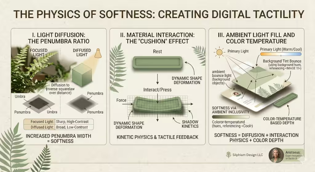
Humans are afraid of sharp corners. In nature, sharp things usually mean danger, thorns, teeth, or jagged rocks. Soft things, like moss, leaves, or rounded river stones, feel safe. However, if you look at a lot of websites, you see quite a few sharp corners.
Shadow effects help us create “softness” even on a digital screen. By using very large “blur” values, we can make the edges of our digital boxes feel soft to the touch. This makes your app feel friendly. When a user feels safe, they are more likely to interact with your brand. We call this “emotional design.” It’s about more than just code; it’s about how the person on the other side of the screen feels while they use your product.
Mobile-First Shadow Strategies
Designing for a phone is different than designing for a big computer monitor. On a small screen, your finger is the “mouse.” Because your finger is thick, you need very clear shadow effects to show exactly where a button begins and ends.
However, you have to be careful not to make the shadow effects too “muddy.” On a high-definition phone screen, a messy shadow looks like a smudge of dirt. We keep our mobile shadows a bit tighter and slightly more colorful. This ensures that even in bright sunlight (like when someone is botanizing in a field!), they can still see the buttons clearly.
Building a Tactile Future
At Silphium Design LLC, we don’t just build websites; we build environments. My time at Princeton studying biology taught me that everything is connected. The way light hits a leaf is the same way light should hit a digital card on your screen.
By mastering realistic shadow effects, we move away from the cold, flat internet of the past. We move toward a future where our digital lives feel as rich and textured as our physical lives. Whether you are building a simple blog or a complex app, remember that depth is your friend. Use shadow effects to guide your users, comfort their eyes, and bring a little piece of the natural world into the palm of their hand.
Take a look at your current website. Do the buttons look like they could be pushed? Does the menu look like it’s floating, or is it stuck flat against the page? If your site feels a bit “lifeless,” it might be time to look at your shadows.