At Silphium Design LLC, our work is rooted in the belief that the digital world should not be a cold, sterile cage. Instead, it should be an extension of our natural habitat. One of the most powerful tools in our design kit is the use of shapes, specifically the silhouettes that define every element on your screen. These outlines are the first things our eyes see, even before we notice color or read a single word. By understanding the psychological impact of silhouettes in digital interfaces, we can build websites that feel as natural and welcoming as a walk in the woods.
Table of Contents
The Science of Shape: Silhouettes as Cognitive Signposts
The Primal Power of the Silhouette
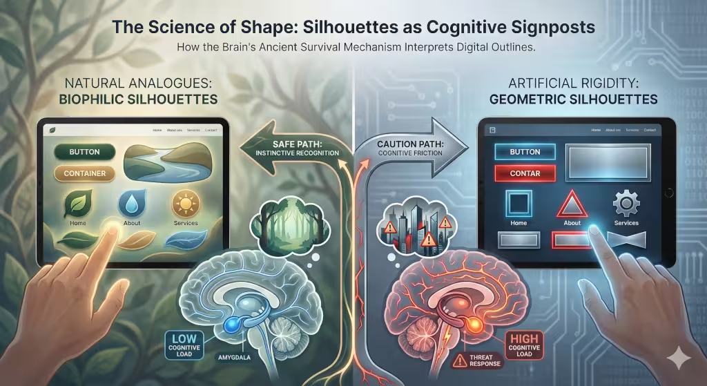
Every time you look at a screen, your brain is doing a lot of work that you do not even notice. Long ago, our ancestors had to survive in the wild. Their lives depended on being able to spot the shape of a predator or a food source very quickly. Because of this, the human brain is hardwired for rapid recognition of any silhouettes it sees. Before you know that a button is blue or that a link says “Buy Now,” your brain has already processed the outline of that object.
In the world of digital design, this is what we call a foundational layer of Digital Biophilia. We are taking the lessons of nature and moving them into the world of the internet. When we use silhouettes that look like things found in nature, like leaves, stones, or clouds, we are talking directly to the oldest part of the human brain. This makes the user feel safe and interested without them even knowing why.
The Neuroscience of Shape Recognition
The way our brains handle shapes is truly amazing. There is a small part of the brain called the amygdala. Its job is to look for threats. When we see sharp, pointy shapes, our brain treats them like a thorn or a tooth. This can make a person feel a tiny bit of stress. On the other hand, curved and soft forms make us feel calm because they look like things that are safe to touch.
Sometimes, humans see faces or familiar patterns in random shapes. This is called pareidolia. In web design, we can use silhouettes to create these patterns on purpose. If a website uses organic outlines that look like friendly shapes, the user will feel a deeper connection to the brand. This is a visceral response, which means it is a feeling that comes from deep inside your body. By using biomorphic shapes, we can lower the stress a person feels when they are trying to learn a new website. It makes the digital space feel more like home.
Biophilic Design Principles and Natural Analogues
To really understand how silhouettes work, we have to look at the work of experts like Stephen R. Kellert and E.O. Wilson. They studied how humans love nature, a concept called biophilia. In web design, we use “Natural Analogues.” This means we use shapes that remind people of nature even if they are not real trees or plants.
One way we do this is by avoiding perfect 90-degree angles. In the woods, you rarely see a perfect square. Instead, you see branching patterns, like the limbs of a tree, or spirals, like the shell of a snail. These are called fractals. When a person sees these types of silhouettes on a website, it helps them think more creatively and feel less tired.
We also use the ideas of “Prospect and Refuge.” This is a fancy way of saying humans like to see what is ahead of them but also feel tucked away and safe. We can use silhouettes to create “prospect” by making open, clear navigation bars. We can create “refuge” by putting content inside soft, rounded forms that look like a cozy corner.
Common Questions about Silhouettes
Many people ask how shapes really change the way we act on the internet. It is a great question. If a button has rounded silhouettes, people are more likely to click it because it looks “touchable” and safe. If the shapes are very sharp and boxy, they look like they belong on a formal document or a legal site, which can make people act more cautiously.
Another common question is why silhouettes matter for icons. An icon is a very small picture. If your icons are not clear, people will have to stop and think about what they mean. This makes the brain work harder than it needs to. Clear silhouettes allow people to scan a page in seconds. This reduces what we call “cognitive load,” which is just a way of saying it stops your brain from getting tired.
Strategic Implementation: From Biology to Browser
So, how do we actually use these silhouettes when we build a website for Silphium Design LLC? First, we look at the “Curvature Effect.” Science tells us that the human eye can follow a curve much more easily than it can follow a sharp corner. We use this to guide the user’s eye toward the most important information on the page.
We also use botanical and animal silhouettes. These do not have to be big pictures. They can be very subtle shapes in the background. They act like “Supporting Actors” in a movie. They are not the main star, but they make the whole scene feel more real and trustworthy.
We can even make them move. Using simple code, we can make the silhouettes of background elements sway slightly, like grass in the wind. This is called “non-rhythmic sensory stimuli.” It keeps the brain engaged in a gentle way, rather than being bored by a static screen.
The SEO and Performance ROI of Biophilic Silhouettes
Using silhouettes is not just about looking good; it is also about making the website work better. From a technical side, they are very easy to turn into SVG (Scalable Vector Graphic) files. These are small files that load very fast. Fast websites are liked by search engines like Google.
When a website uses these natural silhouettes, people tend to stay on the page longer. This is because they feel comfortable. In the world of SEO, we call this “Dwell Time.” If people stay a long time and do not leave right away, search engines think the website is very high quality. This helps the site show up higher in search results. By using keywords related to user well-being and nature-inspired design alongside our silhouettes, we build what is called “topical authority.”
Understanding the Visual Language of Silhouettes
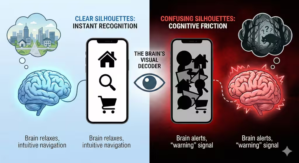
To go further into the topic of silhouettes, we have to think about the language of vision. Think about a dark night. If you see a shape in the distance, you do not see the color of its clothes or the expression on its face. You only see its silhouettes. Your brain immediately starts guessing what it is. Is it a tree? Is it a person? Is it a fence? This is how your brain works on a website too.
When you arrive at a homepage, your eyes dart around. They are looking for the silhouettes of the logo, the navigation buttons, and the images. If they are messy or confusing, your brain gets a “warning” signal. It feels like you are in a cluttered forest where a predator could be hiding. But if the they are organized and follow natural patterns, your brain relaxes. This relaxation is the key to getting people to read your content and buy your products.
Why Every Pixel Counts in Shape Design
Every line tells a story. When we talk about silhouettes in a digital interface, we are talking about every single edge on the screen. This includes the edge of a text box, the shape of a picture frame, and even the space between letters.
If we use silhouettes that are too complex, it creates “visual noise.” Imagine trying to listen to someone talk in a very loud room. It is hard to focus. Complex, jagged silhouettes are like loud noise for your eyes. On the other hand, those that are simple and smooth are like a quiet room. They let the important information stand out. This is why we spend so much time at Silphium Design LLC making sure every one of our silhouettes is purposeful.
The Role of Contrast in Silhouette Recognition
For silhouettes to work, they need contrast. This means the shape needs to stand out from the background. In nature, a black bird against a bright sky has a very strong silhouette. We use this same idea on websites. By making sure they have good contrast, we make the site easier to use for everyone, including people who might not see very well.
When we use forms with high contrast, we are helping the brain “segment” the page. Segmenting is just a way of breaking a big page into smaller, easier pieces. If the silhouettes of your different sections are clear, the user knows exactly where one topic ends and another begins. This makes the whole experience feel much more organized.
How They Can Build Brand Trust
You might wonder how a simple shape can make someone trust a company. It goes back to the idea of “Natural Analogues.” Most of the things we trust in life have soft silhouettes. Think about a smooth river stone or a soft pillow. These shapes do not have hidden dangers.
When a company uses these kinds of silhouettes on their website, they are sending a secret message. They are saying, “We are safe. We are helpful. We are not going to hurt you.” This is very different from a company that uses sharp, aggressive shapes. Those shapes might look “cool” or “modern,” but they can also feel cold and uncaring. For a business that wants to build long-term relationships with customers, choosing the right ones is a vital part of their strategy.
The Connection Between Silhouettes and Accessibility
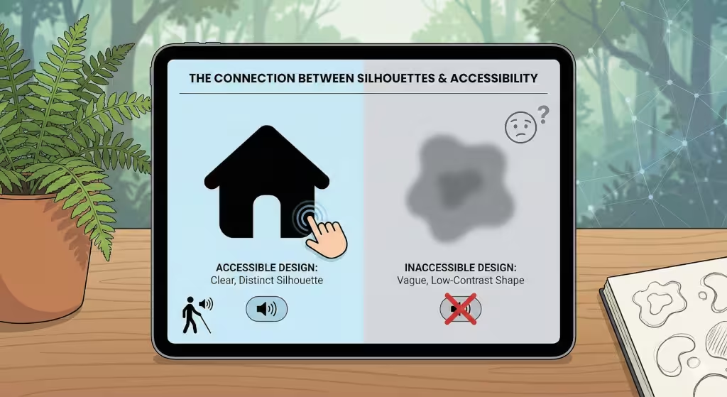
Silhouettes play a huge role in accessibility. For people with visual impairments, they are often the only way they can navigate a page. If a button relies only on color to show what it is, some people might miss it. But if that button has a unique and clear silhouette, such as a shadow effect, it can be identified by its shape alone.
This is why we often use icons that have very distinct silhouettes. A “home” icon shaped like a house or a “mail” icon shaped like an envelope works because they are world-famous. You do not need to read the word “Home” to know what that shape does. By focusing on these clear forms, we make the internet a friendlier place for everyone, no matter how they see the world.
Practical Tips for Using Silhouettes in Your Web Project
If you are starting a new website, here are a few things to keep in mind regarding silhouettes. First, look at your buttons. Are they sharp squares? Try rounding the corners to make them softer. You will likely see that people find them more inviting.
Second, look at your images. Instead of using plain rectangular frames, try using “masked” silhouettes. This means the image is cut into a shape like a circle or a leaf. This breaks up the “boxy” feel of the web and makes your site feel more organic.
Third, think about your whitespace. Whitespace, sometimes called negative space, is the empty area around your content. The silhouettes of your whitespace are just as important as those of your images. If your whitespace has a natural, flowing shape, it will lead the reader’s eye down the page in a way that feels effortless.
The Future of Silhouettes in Digital Interfaces
As we look toward the future, I believe we will see even more use of dynamic silhouettes. With new technology, we can create websites that change based on the time of day or even the weather where the user lives. Imagine a website that has sharp, bright silhouettes in the morning to help you wake up, and soft, flowing silhouettes in the evening to help you wind down.
This is the next step in biophilic design. It is about making our digital tools feel like they are part of the natural rhythm of our lives. By mastering the psychological impact of silhouettes in digital interfaces, we are not just building websites. We are building a better way for humans to interact with the digital world.
Silhouettes and the Emotional Connection
We often think of websites as places to get information. But they are also places where we feel things. Have you ever visited a site and felt instantly stressed? Or visited another and felt like you could breathe more deeply? A lot of that feeling comes from the silhouettes.
Silhouettes are the “skeleton” of your design. If the skeleton is stiff and rigid, the whole site feels stiff. If the skeleton is flexible and graceful, the site feels alive. At Silphium Design LLC, we always start with the silhouettes because we know they set the emotional tone for everything else. We want our users to feel the same peace they feel when looking at a mountain range or a forest canopy. All of those natural wonders are defined by their beautiful, complex silhouettes.
How to Measure the Impact of Your Silhouettes
If you want to know if your silhouettes are working, you can use tools like heatmaps. A heatmap shows you where people are clicking and looking. Often, you will find that people’s eyes are drawn to the most interesting ones on the page. If people are not clicking where you want them to, it might be because the silhouettes in that area are too boring or too confusing.
You can also do “blur tests.” This is where you look at a blurry version of your website. If you can still tell what the different parts of the page are just by their silhouettes, then you have done a good job. If everything just looks like a big grey blob, they are not strong enough. This is a simple but powerful way to test your design.
Final Thoughts from Silphium Design
We are biological creatures, and our eyes are always searching for the shapes of nature. By bringing those silhouettes into our digital interfaces, we are honoring our history and making a better future.
At the end of the day, we must remember that we are not just making pages for computers to read. We are making them for living, breathing human beings. The psychological impact of silhouettes in digital interfaces is a key part of that mission. If we use boxy, harsh outlines, we are forcing humans to adapt to a machine. But if we use organic shapes, we are making the machine adapt to the human.
When you use the right shapes, you create a space where people can relax, learn, and trust your brand. It is the difference between being stuck in a concrete room or sitting in a beautiful garden. As we continue to move more of our lives online, making sure our silhouettes are biophilic will be more important than ever.
Whether you are a designer, a business owner, or just someone who uses the internet, I hope you start to notice the silhouettes all around you. See how they make you feel. Notice which ones draw you in and which ones push you away. The more we understand the power of these shadowy shapes, the more we can create a digital world that truly serves the human spirit.