The Digital Ecosystem Shift
If you imagine the internet as a vast, glowing forest of data, I am the one making sure the paths through those trees feel like home. Lately, the world of web design has been feeling a bit too cold and metallic. It is like living in a glass box with no windows. But there is a change coming. We are seeing a huge move toward nature symbolism in every corner of our screens.
You see, humans are not built to stare at flat, grey boxes all day. We have something called biophilia. This is just a fancy way of saying we have a built in love for living things. Our brains actually relax when they see patterns from the wild. When we use nature symbolism in a website, we are not just making it look pretty. We are helping the person on the other side of the screen feel less tired. We are using shapes that their brain already knows and loves.
In this article, we are going to look at how these natural ideas are changing the way we build websites in 2026. We will look at trends like earthy colors and fractal shapes. We will also look at real examples from big companies like Calm and Patagonia. By the time we are done, you will see why nature symbolism is the secret ingredient for making a website that people actually want to use.
Table of Contents
Nature Distilled and Earthy Palettes
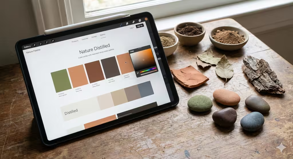
In the past, designers thought that using nature symbolism just meant putting a big picture of a forest on the home page. But in 2026, we are being much more subtle. We call this nature distilled. Instead of showing the whole tree, we use the colors of the bark. We use the soft greens of moss or the deep browns of rich soil.
These earthy palettes are very important for restorative aesthetics. This means the design helps the user feel better while they browse.1 If a website is too bright or uses neon colors, it can cause eye strain. But when we use nature symbolism through color, we create a calm space. Think about the color of clay or the soft grey of a rainy sky. These colors do not scream for attention. Instead, they give the user a place to rest their eyes.
At Silphium Design LLC, we have noticed that users stay on a page longer when the colors feel organic. This is because these tones feel safe. In the wild, bright neon colors often mean danger or poison. Soft, earthy tones mean safety and resources. By using nature symbolism in your color choices, you are telling the user’s brain that they can relax and trust your brand.
Fractal Navigation and Information Architecture
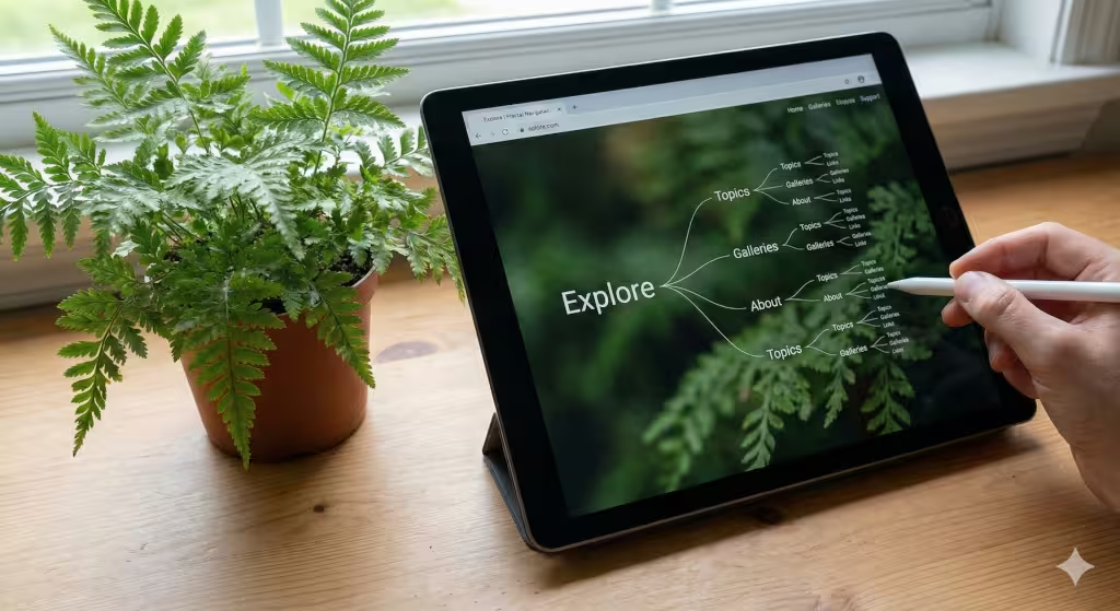
Have you ever looked at a snowflake or a fern leaf? You might notice that the small parts look just like the big parts. This is called a fractal. In 2026, we are using this kind of nature symbolism to organize how people move through a website. We call this fractal navigation.
Most websites use a very rigid menu. It feels like a filing cabinet. But a fractal menu feels more like a growing tree. When you click on a main topic, it branches out into smaller, related topics. These smaller parts have the same look and feel as the main part. This helps the user stay oriented. They never feel lost because the structure of the site follows a pattern found in nature.
Using nature symbolism through fractals also helps with something called cognitive load. That is a big term for how hard your brain has to work. When a website is messy, your brain gets tired. But when a site uses fractal patterns, your brain recognizes the logic instantly. It feels natural. This makes it much easier for people to find what they are looking for without getting frustrated.
Tactile Maximalism and 3D Textures
We spend so much time touching glass screens that we forget what things actually feel like. This is why tactile maximalism is a big trend right now. We are using nature symbolism to bring the “feel” of the outdoors to the digital world.3 Through clever use of shadows and 3D effects, a button on a screen can look like it is carved from wood or polished stone.
This is more than just a visual trick. It adds a sense of weight and reality to a website. When a user sees a texture that looks like sand or linen, they have a physical reaction. Their brain remembers the feeling of those materials. This type of nature symbolism makes the digital experience feel more “real.”
In 2026, we have the technology to make these textures move. Imagine a background that ripples like water when you move your mouse. Or a menu that feels like you are leafing through real paper. These interactions use nature symbolism to bridge the gap between our hands and our eyes. It creates a much more immersive experience that keeps people engaged with the content.
Dynamic Biomorphism

Biomorphism is a long word for “shapes that look like life.”4 In web design, this means moving away from perfect squares and circles. Nothing in nature is a perfect square. Instead, we use shapes that are slightly uneven, like a river stone or a cloud. Using nature symbolism through these organic shapes makes a website feel friendly and approachable.5+1
Dynamic biomorphism takes this a step further by adding movement. In the past, animations on websites were very mechanical. They moved in straight lines and stopped suddenly. But life does not move that way. Life flows. In 2026, we design buttons that grow like a flower when you hover over them. We create page transitions that move like a gentle breeze.
This use of nature symbolism in movement is very powerful. It makes the technology feel less like a machine and more like a companion. It reduces the “digital stress” that many people feel when using complex apps. When the interface behaves like a living thing, it feels more predictable and less scary. At Silphium Design LLC, we believe that every click should feel like a natural interaction.
Case Study A: The Calm App
The Calm app is one of the best examples of nature symbolism in the world today. Their whole goal is to help people feel less stressed. They do this by turning the phone screen into a window to the outdoors. When you open the app, you often see a lake with small waves or a forest with rain falling.
The nature symbolism here is very direct. They use high quality videos and sounds to trigger a relaxation response. But if you look closer, the buttons and menus also follow biophilic rules. They are soft and rounded. The colors are taken directly from the landscapes shown in the background.
This approach works because it uses Attention Restoration Theory. This theory says that looking at nature helps our brains recover from hard work.6 By using nature symbolism, Calm helps users clear their minds. It is not just a meditation tool; it is a masterclass in how to use natural elements to create a functional, healthy user experience.
Case Study B: Airbnb
You might not think of Airbnb as a biophilic company, but they use nature symbolism very effectively. Think about how they show properties. They don’t just show a bed; they show a view from a window. They highlight homes that are tucked into the woods or sitting by the ocean.
Airbnb uses nature symbolism to build trust. They know that people feel safer when they are near natural beauty. By surrounding their booking buttons with images of the environment, they make the act of spending money feel like the start of an adventure. They also use a lot of white space, which feels like the “open air” of a wide field.
Their interface is designed to be “invisible.” They want you to focus on the destination. This “quiet” design is a form of nature symbolism too. It mimics the stillness of a quiet morning. It allows the user to explore without feeling pushed or hurried. This has helped Airbnb become one of the most trusted names in travel.
Case Study C: Forest App
The Forest app is a wonderful example of how to turn nature symbolism into a game. The app helps people stay off their phones so they can focus on work. When you want to focus, you “plant a tree” in the app. As long as you don’t touch your phone, the tree grows. If you leave the app to check social media, the tree dies.
This uses nature symbolism to give users an emotional reason to stay focused. We don’t want to see a digital tree die. It makes us feel a small sense of loss. On the other hand, seeing a whole forest of trees that we grew ourselves gives us a sense of pride.
The app uses simple, cute illustrations of different plants. This nature symbolism makes a boring task like “not checking my phone” feel like a rewarding hobby. It is a great example of how nature can be used to change human behavior in a positive way. It proves that we are deeply connected to these symbols, even when they are just pixels on a screen.
Case Study D: Patagonia
Patagonia is a brand that lives and breathes the outdoors. Their website is a perfect example of nature symbolism used for brand identity. They don’t use many flashy animations or bright colors. Instead, they use raw, unedited photos of mountains and rivers.
The nature symbolism on their site is very honest. It shows nature as it really is, sometimes messy and rugged. This tells the user that Patagonia is an honest company. They use heavy, bold fonts that look like the signs you might see in a national park. Everything about their design feels grounded and sturdy.
By using nature symbolism this way, Patagonia connects with their audience’s values. Their customers love the earth, so the website feels like a place where they belong. It is a great lesson in how design can reflect a company’s mission without saying a single word. The interface itself becomes a symbol of the wild places they want to protect.
How Does Nature Symbolism Affect User Trust?
When you walk into a dark, cold room with no windows, do you feel safe? Probably not. When you walk into a bright garden with flowers and birds, do you feel safe? Yes. Our brains are hardwired to look for signs of life. This is why nature symbolism is so important for building trust online.
When a website uses nature symbolism, it signals to the user that the “environment” is healthy. This happens on a subconscious level. We associate green leaves with growth and clean water with health.7 If a bank uses soft blue colors and patterns that look like flowing water, we might feel more “fluid” and comfortable with our money.
Using nature symbolism also makes a company feel more human.8 In a world full of AI and robots, we crave things that feel alive. A website that looks like a sterile machine can feel cold and uncaring. But a site that uses natural textures and shapes feels like it was made by a person for a person. This human connection is the foundation of long term trust.
What is the Difference Between Biomimicry and Biophilic Design?
These two terms are often used together, but they mean different things.9 It is important to know the difference if you want to use nature symbolism correctly. Think of biomimicry as “learning from nature” and biophilic design as “living with nature.”10+1
Biomimicry is about solving problems.11 For example, a designer might look at how a burr sticks to a dog’s fur to invent Velcro. In web design, biomimicry might mean looking at how an ant colony finds the shortest path to food and using that logic to make a search bar faster. It is about using the “math” of nature to make things work better.
Biophilic design is more about how we feel. It uses nature symbolism to make a space feel good. It is about adding plants to an office or using wood textures on a website. Its goal is to improve our health and mood.12 While biomimicry focuses on performance, biophilic design focuses on the human experience.13 Both are important, but nature symbolism is usually the star of biophilic design.+1
Can Biophilic UI Improve SEO?
You might wonder what nature symbolism has to do with Google rankings. The answer is: quite a lot! Search engines like Google care about how users behave on your site. They want to see that people are staying a long time and not just hitting the “back” button right away.
As we discussed, nature symbolism makes a website more relaxing and easier to use.14 When a user feels calm, they are more likely to stay and read your content. This increases your “dwell time,” which is a big signal to search engines that your site is high quality. If your site is ugly or stressful, people leave fast. That hurts your SEO.
Also, nature symbolism can help your site stand out in search results. If your meta description mentions that your design is biophilic or nature-inspired, it might entice more people to click. People are naturally drawn to these concepts. By making your site better for humans through nature symbolism, you are also making it better for the robots that rank your site.
The Technical Edge: SEO and Semantic Optimization
To really win at SEO in 2026, you need to go beyond just using keywords. You need to use semantic optimization. This means your website needs to be full of related ideas and topics. If you are talking about nature symbolism, you should also mention things like “environmental psychology” or “organic architecture.”
At Silphium Design LLC, we make sure that the code behind the site is just as “natural” as the design. We use schema markup to tell search engines exactly what each part of the page is. If we have a case study about nature symbolism, we tag it so Google knows it is a professional design review. This helps the site show up for very specific searches.
We also focus on image optimization. Since nature symbolism relies heavily on visuals, we have to make sure those images don’t slow down the site. We use the latest file formats and include descriptive “alt text.” This text describes the natural elements in the photo. This is good for accessibility, but it also helps Google understand the “vibe” of your site. It confirms that you are truly an authority on nature symbolism.
The Future of the Living Web
The internet is growing up. We are moving away from the “wild west” of flashing banners and toward a more mature, “living” web. Nature symbolism is at the heart of this change. It is how we make the digital world feel like a place where humans actually belong.
As we have seen, nature symbolism is not just a trend. it is a scientific way to make websites better. Whether it is through the colors we choose, the way we organize our menus, or the way our buttons move, we are bringing the wisdom of the outdoors to the screen. Companies like Calm and Patagonia are already showing us the way.
At Silphium Design LLC, we believe that every website should be a breath of fresh air. By using nature symbolism, we can build a web that is not only powerful and fast but also restorative and kind. The future is green, it is organic, and it is beautiful. I hope you will join us in making the internet a more natural place for everyone.
Nature symbolism is the language of life. When we speak this language on our screens, we connect with our users in a way that words alone cannot. It is a powerful tool for any designer. If you want your website to be more than just a page of text, start looking at the world outside your window. The best design ideas have already been perfected by nature over millions of years.
As we look toward 2027 and beyond, the use of nature symbolism will only get more advanced. We will see virtual reality spaces that feel indistinguishable from a real forest. We will see AI that communicates with us using the rhythms of natural speech. But the core principle will remain the same. We love life, and we want our technology to reflect that love.
By embracing nature symbolism today, you are preparing your brand for the future. You are telling your customers that you care about their well being. You are building a digital home that is built to last. Let us stop building boxes and start planting gardens in our code.
Thank you for spending this time with me. It has been a pleasure to share my passion for nature symbolism with you. Remember, the next time you sit down to design something, ask yourself: how would nature do this? You might be surprised at how simple and beautiful the answer is.
The world of interface design is vast, but with nature symbolism as your guide, you will never truly be lost. It is the compass that points toward better user experiences and more meaningful connections. Let us continue to grow together, one pixel at a time.
In the end, nature symbolism is about more than just a look. It is about a feeling of belonging.15 It is about recognizing that even in our most high tech moments, we are still part of the natural world.16 By bringing nature symbolism into our interfaces, we are simply coming home.+1
I look forward to seeing how you use nature symbolism in your own projects. Whether you are a small business owner or a lead designer at a big agency, these principles can help you. Nature symbolism is for everyone, just like nature itself. Let us make the web a more beautiful place, together.
As Aristaeus, I am always here to help you navigate these green paths. The intersection of biology and computer science is a fascinating place to be. With nature symbolism as our foundation, the possibilities are truly endless. Let us keep exploring, keep learning, and keep growing.
The digital world does not have to be cold. With nature symbolism, it can be warm, inviting, and full of life. It is time to turn the page and start a new chapter in design. A chapter where nature symbolism leads the way to a better, more human internet for all of us.