As the design expert for Silphium Design LLC, I view the internet as a living ecosystem. Just as a forest needs many types of trees to stay healthy, the digital world needs many types of voices to thrive. My background in biology and web design has taught me that the best systems are the ones that welcome everyone.
When we talk about culturally inclusive web design, we are talking about building a digital home where every person feels like they belong, no matter where they come from or what language they speak. In 2026, this is no longer just a nice thing to do; it is the standard for a professional and successful website.
Table of Contents
The Convergence of Biophilia and Inclusivity
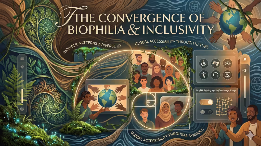
To understand the convergence of biophilia and inclusivity, we must look at how our biological history meets our modern cultural identities. As a biologist and a web designer, I see the human brain as an interface that has been fine-tuned over millions of years to read the “data” of the natural world. Culturally inclusive web design recognizes that while we all share the same biological hardware, our cultural software changes how we perceive that hardware’s output.
The Biological Baseline: Universal Patterns
At our core, every human being responds to certain spatial geometries. This is why culturally inclusive web design often starts with “fractal patterns.” A fractal is a shape that repeats itself at different scales—think of a fern leaf, a snowflake, or the branching of a river. When a user sees these patterns on a website, their parasympathetic nervous system reacts by lowering their heart rate.
This is a universal “handshake” between the website and the human brain. Because these patterns exist in nature everywhere, from the Siberian tundra to the Amazon rainforest, using them in culturally inclusive web design creates a baseline of comfort that transcends language. It says “you are safe here” to a visitor before they have even read a single word of text.
Cultural Variations: The “Habitat” of the Mind
While the love of nature is universal, the type of nature we find comforting is often dictated by where our ancestors thrived. This is where the “inclusivity” part of culturally inclusive web design becomes a technical challenge. For instance, a person from a lush, tropical climate might find high-saturation greens and humid, dense visual layouts to be “home.” However, someone from an arid climate might find a minimalist, wide-open layout with sandy ochre tones more intuitive.
When we apply culturally inclusive web design, we don’t just pick one version of nature. We use “Savanna Theory” principles, the idea that humans prefer open spaces with clear views of the horizon, but we adjust the “skin” of that layout to match the user’s cultural expectations. This ensures that the biophilic elements don’t feel like “colonial” nature (imposing one culture’s view of beauty on another) but rather a localized digital habitat.
Sensory Inclusivity and Evolutionary Logic
Biophilic design also focuses on “non-rhythmic sensory stimuli.” In nature, this is the slight rustle of leaves or the way light shimmers on water. In culturally inclusive web design, we translate this into subtle micro-interactions. Perhaps a button has a soft, organic glow that pulses at the rate of a human breath, or a transition between pages mimics the natural flow of water.
For these to be part of culturally inclusive web design, they must be accessible. For a user with light sensitivity or “vestibular disorders” (dizziness caused by movement on screen), these “natural” movements must be gentle and easy to turn off. True culturally inclusive web design understands that “nature” for one person might be “noise” for another. We provide the “biophilic calm” without forcing a “sensory overload.”
The “Prospect and Refuge” Principle
In my studies at the Taliesin School, I learned about “Prospect and Refuge.” Humans feel best when they have a clear view of what is ahead (prospect) but feel protected from behind (refuge). We use this in culturally inclusive web design by creating clear navigation menus (prospect) and stable, consistent footers or sidebars (refuge).
By organizing a website this way, you are using culturally inclusive web design to satisfy an ancient survival instinct. A user who feels “digitally safe” is a user who will stay, explore, and trust your brand. We are essentially building a digital “clearing in the woods” where every culture feels they have a seat at the fire.
What is Culturally Inclusive Web Design?
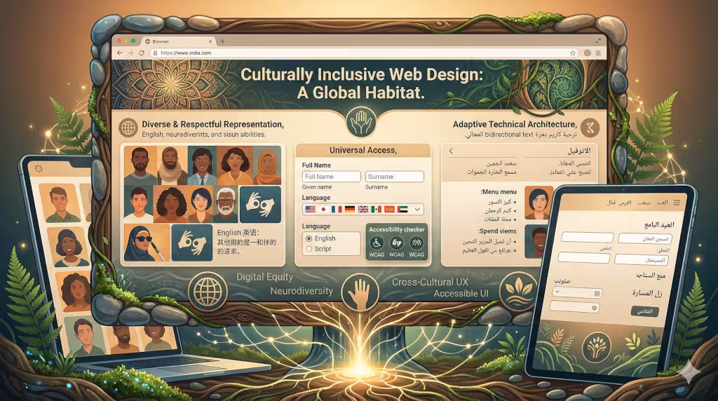
When we define culturally inclusive web design, we are looking at a way of making websites that works for everyone. It goes beyond just translating words from one language to another. It means thinking about how people in different parts of the world see the world. Some cultures read from left to right, while others read from right to left. Some cultures think the color red means “stop,” while others think it means “good luck.”
A website using culturally inclusive web design will change its layout to fit these habits. It makes sure that pictures show people who look like the users. it ensures that the way people find their way around the site feels natural to them. By using culturally inclusive web design, a company shows that it values its visitors. This builds trust, which is the most important thing for any business online today.
Structural Pillars: The Mechanics of Inclusive Design
To build a site with culturally inclusive web design, you need a strong foundation. This starts with the code that runs the website. We use something called Semantic HTML. This is like the skeleton of the page. It tells search engines and screen readers exactly what each part of the page is for. This is a key part of culturally inclusive web design because it helps people who might have trouble seeing or hearing to still use the site easily.
Another big part of culturally inclusive web design is typography. This is just a fancy word for the fonts we use. Not every font works for every language. Some fonts look great in English but look messy in Arabic or Chinese. In 2026, we use “variable fonts.” These are smart fonts that can change their size and weight to stay easy to read in any language. Making sure the text is easy on the eyes is a major goal of culturally inclusive web design.
Color Theory Through a Cultural Lens
Colors talk to us without using words. In culturally inclusive web design, we have to be very careful with the colors we pick. In the United States, white often stands for purity or weddings. In some parts of Asia, white is the color people wear for funerals. If you use too much white on a site meant for those users, they might feel sad without even knowing why.
This is why culturally inclusive web design often uses palettes inspired by nature. Earth tones like browns, greens, and soft blues are usually safe across most cultures. They remind people of the earth and the sky, which we all share. When we apply culturally inclusive web design to color, we also look at contrast. We make sure there is a big enough difference between the text color and the background color so everyone can read it clearly.
Strategic Examples of Culturally Inclusive Web Design
Looking at real-world examples helps us see how culturally inclusive web design works in action. Take a look at big global brands like Airbnb. They use images that show many different kinds of people in their own homes. This is a great example of culturally inclusive web design because it makes people from any country feel like they can find a place to stay.
Another great example of culturally inclusive web design is the BBC News website. They have versions of their site in many languages. When you switch to a language like Arabic, the whole website flips. The menus move to the right side because that is where Arabic readers start looking. This kind of “mirroring” is a core part of culturally inclusive web design. It shows that the designers thought about the user’s daily habits.
Case Study: The Vasa Museum and Wayfinding
The Vasa Museum in Sweden has a website that is a perfect model for culturally inclusive web design. They receive visitors from all over the world. To help them, they use very simple icons and “breadcrumbs.” Breadcrumbs are little links at the top of the page that show you exactly where you are. This is part of culturally inclusive web design because it prevents people from getting lost. It acts like a trail in the woods, giving the user a sense of “prospect and refuge,” which is a biophilic idea that helps people feel safe while they explore.
Terms Associated with Culturally Inclusive Design
When we talk about culturally inclusive web design, we often use other terms like “localization” and “internationalization.” Internationalization is the work we do to make sure the code can handle different languages. Localization is the work we do to make the content feel local to a specific place. Both are needed for high-quality culturally inclusive web design.
Other important parts of culturally inclusive web design include “digital equity.” This means making sure that people with slow internet or old phones can still use your site. If a website has too many heavy videos, a person in a rural area might not be able to load it. By keeping the site light and fast, we practice culturally inclusive web design by being fair to everyone, regardless of their technology.
The Biophilic Advantage: Transcending Cultural Borders
One reason I love culturally inclusive web design is that it allows us to use nature to bring people together. While our cultures are different, our biology is the same. We all find comfort in the “Golden Ratio” or the patterns of a snowflake. When we use these in culturally inclusive web design, we create a universal language.
Using fractals, patterns that repeat at different sizes, in your background can make a site feel more “alive.” This is a biophilic trick that works well with culturally inclusive web design. It makes the user feel like they are interacting with something real and healthy. In 2026, we even use “circadian lighting” on websites. This means the site’s colors change from bright and cool in the morning to warm and soft at night. This is a wonderful way to combine culturally inclusive web design with our natural human rhythms.
What is the Difference Between Accessible and Inclusive Design?
People often ask this question. Accessibility is about following rules. It is like making sure a building has a ramp for wheelchairs. Inclusion is about the feeling of the space. It is like making sure the person in the wheelchair feels welcome and happy once they get inside. In culturally inclusive web design, we do both. We follow the WCAG 2.2 rules to make the site work for people with disabilities, but we also use culturally inclusive web design to make sure the site feels “right” for their culture.
How Do You Create a Culturally Sensitive Website?
To start with culturally inclusive web design, you must do your homework. You cannot just guess what people like. You should talk to people from the culture you are trying to reach. Ask them what colors they like and what kind of stories they enjoy. Testing your site with real people is a vital step in culturally inclusive web design.
Next, look at your forms. In the United States, we usually ask for a “First Name” and a “Last Name.” But in some cultures, people have three or four names, or they put their family name first. Culturally inclusive web design means making your forms flexible so anyone can fill them out without getting an error message. This small change makes a big difference in how a user feels about your brand.
What Are Some Inclusive UI Design Examples?
A good UI (User Interface) using culturally inclusive web design might include buttons that are easy to click even if you have shaky hands. It might also include “Dark Mode.” While many people use Dark Mode to save battery, it is also a part of culturally inclusive web design because it helps people with light sensitivity. By giving people choices, you are practicing culturally inclusive web design.
Another example is using simple language. Sometimes, we use big words to sound smart. But in culturally inclusive web design, we use clear and simple words. This helps people who are learning the language or who have trouble reading complex text. It makes the information open to more people, which is always the goal of culturally inclusive web design.
Local SEO and Search Optimization for Inclusivity
If you want people to find your site, you need to use culturally inclusive web design in your SEO strategy. This means using something called “Hreflang tags.” These are bits of code that tell Google, “This version of the page is for people in Mexico, and this version is for people in Spain.” This is a technical part of culturally inclusive web design that ensures the right person sees the right content.
It also means looking at the keywords people use. People in different countries might use different words for the same thing. By researching these local words, you can use culturally inclusive web design to show up in more search results. This helps your business grow while also helping your users find exactly what they need in their own language.
Frequently Asked Questions about Culturally Inclusive Web Design
Why is culturally inclusive web design important for businesses?
It is important because it expands your audience. When you use culturally inclusive web design, you are not just talking to one group of people. You are opening your doors to the whole world. This leads to more visitors and more sales.
Can biophilic design improve website performance?
Yes! When you use culturally inclusive web design that includes natural patterns, people tend to stay on your site longer. They feel more relaxed and are more likely to read your content. This lowers your “bounce rate” and helps your search engine rankings.
Is inclusive design only for big companies?
Not at all. Every website, even a small blog, can use culturally inclusive web design. Simple things like using clear fonts and respectful images don’t cost any extra money, but they make your site much better for everyone.
Future-Proofing the Digital Habitat
As we move further into 2026, the internet will only become more diverse. By embracing culturally inclusive web design now, you are making sure your website stays relevant for years to come. At Silphium Design LLC, we believe that the most beautiful websites are the ones that reflect the beauty of our natural world and the richness of our human cultures.
Using culturally inclusive web design is like planting a garden. You have to care for it, understand the soil, and respect the local environment. When you do, it will grow into something wonderful that everyone can enjoy. I hope this guide has helped you understand why culturally inclusive web design is the key to a better, more connected internet.
To Get You Started: Some Biophilic Grid Systems
To design a technical specification for a biophilic grid system, we must move away from the rigid, “jail-cell” layouts of early web design. Instead, we look to the math of the natural world. In culturally inclusive web design, a grid should not be a cage for content; it should be a trellis that allows content to grow in a way that feels healthy and alive to any user, regardless of their background.
Below is the technical specification for the Silphium Fibonacci-Fractal Grid (SFFG), a system I have developed to combine high-level web design with the biological patterns our brains crave.
Technical Specification: The Silphium Fibonacci-Fractal Grid (SFFG)

1. The Mathematical Foundation: The Golden Ratio (phi)
In culturally inclusive web design, we use the Golden Ratio (phi ~ 1.618) because it is found in the DNA of almost every living thing. Whether a user is from Tokyo or Toronto, their eyes are trained to find balance in this proportion.
- Main Content Column: W X 0.618
- Sidebar/Refuge Space: W X 0.382
- Implementation: Use CSS Grid with
frunits based on these percentages to ensure the layout “breathes” as the screen size changes. This is a core part of culturally inclusive web design because it maintains harmony on both high-end monitors and older, budget smartphones used in developing nations.
2. Nested Fractals for Information Hierarchy
Fractals are patterns that repeat at different sizes. In culturally inclusive web design, we use nested grids. A large section (the “forest”) contains smaller sections (the “trees”), which contain even smaller elements (the “leaves”).
- The “Rule of Three”: Never have more than three levels of nested depth. This prevents “cognitive fatigue,” which is vital for culturally inclusive web design when users may be processing information in a second or third language.
- Self-Similarity: The padding and margins between a “leaf” (a button) should be a scaled-down version of the margin between “trees” (content blocks). This creates a sense of “organized complexity” that the human brain recognizes as a healthy environment.
3. Dynamic Aspect Ratios and “Organic” Gutters
Standard grids use straight, hard lines. In culturally inclusive web design, we introduce “soft” gutters.
- Curvature Constants: Instead of 900 corners, use a border-radius calculated by the screen width (Vw). A small curve (e.g.,
8pxto12px) mimics the soft edges of stones or leaves. - Negative Space (The “Clearing”): In culturally inclusive web design, whitespace is not “empty.” It is a “clearing in the woods.” We specify that at least 20% of the viewport must remain unoccupied by text or heavy images to allow the user’s eyes to “rest.”
4. Prospect and Refuge Logic (The Z-Axis)
We use Z-index and shadows to create a sense of physical depth. This is a biophilic trick used in culturally inclusive web design to help users understand what is most important.
- Refuge (The Background): Use low-contrast, muted earth tones. This is the “ground” of the website.
- Prospect (The Foreground): Use “Elevation” (soft shadows) for buttons and alerts. This makes them look like they are sitting on top of the grass, making them easy to find. In culturally inclusive web design, this clear “pathfinding” helps users who might be unfamiliar with specific digital symbols.
5. Circadian Color and Light Calibration
To make the grid truly part of culturally inclusive web design, it must react to the user’s local environment.
- System Trigger: Use the
prefers-color-schemeCSS media query combined with a Javascript Geo-location API. - Morning/Day: High contrast, cooler blue-toned whites (simulating sunlight).
- Evening/Night: Lower contrast, warm amber tones (simulating firelight or sunset).
- Technical Note: This reduces “Blue Light” strain, which is an inclusive practice for neurodivergent users and those with chronic eye fatigue.
6. Responsive Scaling for Global Access
Culturally inclusive web design requires that this grid works on a 5-year-old Android phone just as well as a 2026 MacBook.
- Fluid Typography: Use
clamp()functions in CSS so that text sizes adjust smoothly. - Example:
font-size: clamp(1rem, 2.5vw, 2rem); - Why? This ensures that complex characters (like those in Mandarin or Hindi) remain legible at any zoom level, which is a major requirement for culturally inclusive web design.