Table of Contents
The Convergence of Digital Sustainability and Accessibility
Modern web design faces a major challenge. We must balance digital sustainability with universal human access. Digital sustainability means designing websites to use less computer power and less energy. This helps lower the carbon emissions produced by web servers and user devices. Universal human access means making sure everyone can read and navigate a website easily.
To solve this problem, we look at color selection through a scientific lens. Color is no longer just a visual choice. It is a critical functional variable. The specific hues and values we choose directly affect screen power usage and text legibility. When we build websites, we must use high contrast color palettes to satisfy both green energy goals and human accessibility laws.
Luminance contrast is the difference in brightness between the text and its background. Without proper contrast, people with low vision or color blindness cannot read your content. Even users with perfect vision will struggle to read a low-contrast screen when standing outside in direct sunlight. Designing with high contrast color palettes fixes these situational and physical limitations. It gives users a clear visual path through the data.
+-------------------------------------------------------------+
|                     LUMINANCE CONTRAST                      |
|                                                             |
|   [ Low Contrast ]                [ High Contrast ]         |
|   Light Gray on White             Deep Green on Pale Cream  |
|   Hard to read / High power       Easy to read / Low power  |
+-------------------------------------------------------------+
We can find the ultimate inspiration for these digital systems in nature. This approach is called biophilic design, which means bringing natural elements and logic into human-made spaces. In the natural world, contrast serves a real purpose. Animals use bold patterns to communicate, hide, or survive. Plants use distinct tones to attract pollinators. Nature never wastes energy on pointless colors.
By grounding our digital color systems in natural structures, we create web layouts that feel intuitive, steady, and clean. Biophilic design shows us that high contrast color palettes do not have to be jarring or corporate. Instead, they can look organic, comforting, and elegant while remaining fully accessible.
Using high contrast color palettes allows web developers to match the beauty of the natural world with the strict requirements of modern computer monitors. This article will show you how to engineer sustainable color systems. We will look at how screen hardware operates. We will study the math behind human vision. Finally, we will build accessible, eco-friendly digital frameworks that load fast, rank well on search engines, and preserve our planet’s energy.
The Physics and Hardware Architecture of Eco-Friendly Screen Colors
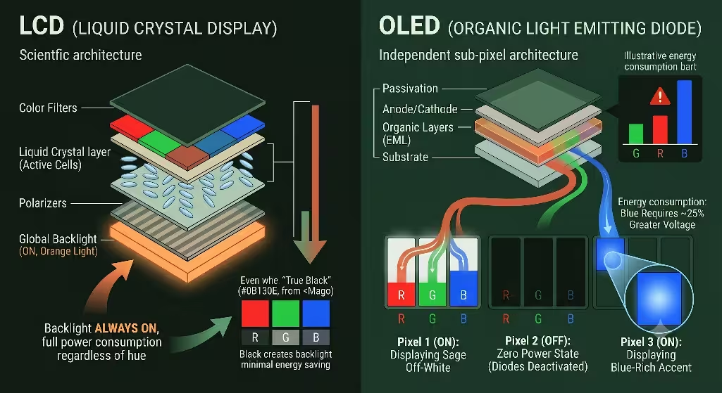
To see why high contrast color palettes save energy, we must look at how computer and smartphone displays work. Millions of people look at screens every day, but different screens handle light and energy in completely different ways. The two main types of displays are Liquid Crystal Displays (LCD) and Organic Light Emitting Diodes (OLED).
         LCD SCREEN ARCHITECTURE                 OLED SCREEN ARCHITECTURE
   +---------------------------------+     +---------------------------------+
   |      Global Backlight (ON)      |     |  Pixel 1 (ON)    |  Pixel 2 (OFF) |
   +---------------------------------+     +---------------------------------+
   |  Liquid Crystals pass/block light|    | Each organic diode makes its own|
   +---------------------------------+     | light. Off = Zero power draw.   |
   | Result: Same power for all hues |     | Result: Black saves energy.     |
   +---------------------------------+     +---------------------------------+
An LCD screen uses a giant backlight that stays turned on at all times. This backlight sits behind a layer of liquid crystals that twist to block or let light pass through. Because the backlight is always running at full strength, it does not matter if your website is bright white or deep black. The display pulls almost the exact same amount of electricity from the battery.
OLED screens are entirely different. An OLED screen does not have a shared backlight. Instead, every single pixel on the display is its own independent light source. Every tiny dot creates its own light and uses its own electricity. If you tell an OLED pixel to display true technical black, which uses the hex code #000000, that specific diode turns off completely. When a pixel is turned off, its power consumption drops to zero milliwatts.
This hardware difference changes how we think about high contrast color palettes. When you use a dark background with bright, clear text, you are turning off large sections of the user’s screen. This saves a massive amount of physical battery power. However, we cannot just make every website pure black and pure white. This would create a terrible reading experience. We must design balanced, high contrast color palettes that use dark, natural base tones to save power while keeping text readable.
We also have to think about the energy cost of specific colors. Human eyes are highly sensitive to green light, but our screens work harder to show other wavelengths. Blue light carries a heavy energy penalty. Because of the physics of light-emitting materials, blue sub-pixels require about 25 percent more voltage than green or red sub-pixels to reach the same level of brightness.
When a display shows high-saturation blues, it drains battery power at a much faster rate. Therefore, sustainable high contrast color palettes avoid using bright blue backgrounds or large blue graphics. Instead, we use earthier tones like deep forest greens, dark grays, and warm charcoal values. These choices lower the voltage required by the screen while maintaining a high level of contrast.
We can measure these carbon savings with real data. When you convert a standard light-mode website into a dark-mode layout that uses high contrast color palettes, the display power drops significantly. On modern OLED mobile devices, smart dark-themed design reduces screen energy consumption by 30 percent to 50 percent.
For a single user, this minor power reduction saves a fraction of a watt. But when a website gets millions of views per year, those fractions of a watt add up to thousands of kilowatt-hours. By deploying high contrast color palettes across high-traffic web applications, corporate brands can directly lower their digital carbon footprint. This honors our environmental goals while keeping web content accessible to everyone.
Mathematical Frameworks for High-Contrast Web Palette Engineering
Designing accessible high contrast color palettes requires more than guessing which colors look good together. We must use verified mathematical frameworks to make sure our text is readable. The World Wide Web Consortium (W3C) sets the global rules for digital accessibility through the Web Content Accessibility Guidelines (WCAG).
   WCAG 2.2 CONTRAST RATIO THRESHOLDS

   +-------------------------------------------------------+
   |  Standard Body Text (< 18pt)   -->  Minimum 4.5:1     |
   +-------------------------------------------------------+
   |  Large Headings (> 18pt)       -->  Minimum 3.0:1     |
   +-------------------------------------------------------+
   |  Enhanced AA/AAA Target        -->  Target 7.0:1+     |
   +-------------------------------------------------------+
The current standard, WCAG 2.2, uses a formula to measure the relative luminance between two colors. Relative luminance is the perceived brightness of a color, scaled from zero for perfect black to one for perfect white. The contrast formula compares these values to create a ratio between 1:1 (no contrast at all) and 21:1 (maximum contrast, like black text on white paper).
To meet the legal requirements for basic web accessibility, your high contrast color palettes must pass two main numbers:
- Standard body text that is smaller than 18 points must have a contrast ratio of at least 4.5:1 against its background.
- Large text that is larger than 18 points or bolded text must have a contrast ratio of at least 3:1.
There is also a newer system called the Accessible Perceptual Contrast Algorithm (APCA). This algorithm is being built for future web standards because it models how human eyes actually see contrast. Unlike the older WCAG formula, APCA accounts for text size, font weight, and whether the text is light on a dark background or dark on a light background. When building modern high contrast color palettes, smart developers check their colors against both systems to ensure total compliance.
We must also look closely at color vision deficiencies, which people often call color blindness. Human eyes use special light-sensitive cells called cones to see red, green, and blue wavelengths. If some of these cells do not work right, a person will experience altered color vision.
The two most common types of color blindness are protanopia and deuteranopia. Both of these conditions make it very difficult for a person to tell the difference between red and green hues. Roughly 8 percent of all men and 0.5 percent of all women experience this type of vision. If a website design relies on red and green to show meaning, like a green button for “Go” and a red button for “Stop”, these users will get confused.
A less common type of color vision deficiency is tritanopia. People with tritanopia struggle to tell the difference between blue and yellow tones. They see the world mostly through shades of pink, red, and deep gray.
To protect these users, high contrast color palettes must never rely on color alone to explain information. If you use a green tone to show that an action was successful, you should also include a text label, an icon, or a clear underline. High contrast color palettes fix this problem by making sure the brightness difference between elements is distinct. Even if a user cannot see the difference between red and green hues, they will easily see the difference in brightness between a dark background and a light icon.
We call this approach data-driven color harmonization. We use digital design tools to test our colors before we write a single line of code. By running our color choices through contrast checkers and color-blindness simulators, we make sure that our high contrast color palettes work for everyone. This mathematical approach removes the guesswork from web styling. It allows us to build clean, eco-friendly layouts that look beautiful to typical eyes while remaining fully functional for users with visual limitations.
Engineered Eco-Friendly, High-Contrast Biophilic Palettes
Let us look at three production-ready web styling frameworks. These systems combine biophilic design with high contrast color palettes. Each palette uses natural tones to create a beautiful, low-energy user experience that meets all legal web accessibility rules.
The Forest Canopy Palette
The Forest Canopy palette mimics the deep, filtered shadows of an old-growth woodland. This dark-mode framework uses organic greens and earthy off-whites to reduce screen energy consumption while maintaining exceptional legibility.
- Background Tone: Deep Obsidian Green (
#0B130E). This color acts as a rich, low-energy canvas. It looks like a dense forest at twilight. Because it has a very low luminance value, it minimizes OLED pixel power draw. - Primary Body Text: Sage Off-White (
#EAEFE9). This soft, natural tone provides a gentle reading experience. It avoids the harsh visual glare of pure white text while creating an outstanding contrast ratio of 14.2:1 against the dark background. - Accent Color: Chlorophyll Mint (
#52B788). We use this vibrant green for links, icons, and interactive buttons. It creates a solid 4.6:1 contrast ratio against the background, keeping your primary user controls accessible and easy to spot.
+-------------------------------------------------------------+
|                     FOREST CANOPY DESIGN                    |
|                                                             |
|   Background: Deep Obsidian Green [#0B130E] (Low Power)     |
|   Body Text:  Sage Off-White      [#EAEFE9] (Ratio 14.2:1)  |
|   Accents:    Chlorophyll Mint    [#52B788] (Ratio 4.6:1)   |
+-------------------------------------------------------------+
The Oceanic Abyss Palette
The Oceanic Abyss palette takes its inspiration from the deep sea. It uses rich, dark blue-blacks paired with cold, crisp highlights. This design is built for technical websites and modern software interfaces that need to look clean and professional.
- Background Tone: Deep Marine Black (
#020813). This color is an ultra-dark navy value that sits right on the edge of true technical black. It deactivates the majority of OLED display pixels to maximize battery savings. - Primary Body Text: Ice White (
#F0F4F8). This is a highly reflective, cool white with a subtle hint of blue. It cuts through the dark background perfectly, producing a crisp 17.5:1 contrast ratio for effortless reading. - Accent Color: Bioluminescent Cyan (
#00B4D8). Inspired by glowing deep-sea organisms, this sharp tone is used for call-to-action buttons. It maintains a 5.1:1 contrast ratio, ensuring all main links remain highly visible.
The Volcanic Stratum Palette
The Volcanic Stratum palette uses the warm, solid tones of volcanic rock, ash, and minerals. It provides a slightly softer alternative to cold dark modes, making it perfect for blogs, online magazines, and content-heavy websites.
- Background Tone: Basalt Charcoal (
#110F0E). This warm, earthy black provides a steady baseline for the eyes. It is incredibly energy-efficient while feeling warmer and more inviting than standard digital grays. - Primary Body Text: Silica Cream (
#FAFAED). A warm, rich cream color that resembles natural sandstone. It delivers a highly legible 16.1:1 contrast ratio, allowing users to read long articles without experiencing eye strain. - Accent Color: Burnt Ochre (
#D4A373). This muted, clay-like orange brings a natural warmth to the layout. It has a 3.8:1 contrast ratio, making it an excellent choice for large section headings, decorative borders, and structural icons.
Multi-Variant Palette Specifications
The table below breaks down the mathematical properties of these three biophilic systems. You can use these values directly in your CSS style sheets to build accessible, eco-friendly digital products.
| Palette Archetype | Design Asset | Hex Code | OLED Energy State | Contrast Ratio |
| Forest Canopy | Background | #0B130E | Ultra-Low Power | Baseline Value |
| Body Typography | #EAEFE9 | Medium Reflectance | 14.2:1 (Passes AAA) | |
| Interactive Accent | #52B788 | Low Spectral Load | 4.6:1 (Passes AA) | |
| Oceanic Abyss | Background | #020813 | Ultra-Low Power | Baseline Value |
| Body Typography | #F0F4F8 | High Reflectance | 17.5:1 (Passes AAA) | |
| Interactive Accent | #00B4D8 | High Spectral Load | 5.1:1 (Passes AA) | |
| Volcanic Stratum | Background | #110F0E | Low Power | Baseline Value |
| Body Typography | #FAFAED | High Reflectance | 16.1:1 (Passes AAA) | |
| Interactive Accent | #D4A373 | Low Spectral Load | 3.8:1 (Large Text Only) |
When you build web applications using these high contrast color palettes, you are treating color as a core part of your engineering stack. You can swap these palettes based on user preferences or the time of day. By using these values, you can build beautiful web designs that respect human vision limitations and lower the world’s electricity consumption at the same time.
Frequently Asked Questions about High Contrast Color Palettes
Understanding the engineering side of high contrast color palettes helps us answer the most common questions that web designers, business owners, and developers ask on search engines. Here are clear, data-driven answers to these common questions.
What is the most eco-friendly color for a website?
From a purely technical perspective, true black with the hex code #000000 is the most eco-friendly color for a website. This is because true black tells an OLED or AMOLED screen to completely shut off the pixels in that area. When a pixel is turned off, it stops drawing electricity from the device’s battery. This directly reduces the amount of energy needed to view the page.
However, a website built with nothing but pure black backgrounds and blinding white text can cause a lot of eye strain. To fix this, high-performance web systems use deep, desaturated dark tones instead. Excellent choices include very dark charcoal, midnight blue, or deep forest green.
These dark background colors use only a tiny amount of electrical power while providing a much smoother reading experience. When you pair these dark backgrounds with soft, off-white text, you create beautiful high contrast color palettes that protect both the planet’s energy and the user’s eyes.
How do you make an eco-friendly color palette high contrast?
To make an eco-friendly design system that features high contrast color palettes, you should start by choosing a dark, low-energy color for your main background. This dark baseline keeps the overall power consumption of the screen very low.
Next, select high-reflectance, low-energy tones for your text and user interfaces. Instead of pure, bright white text, try using warm creams, light silvers, or soft sage tones. These colors stand out clearly against a dark backdrop, creating excellent high contrast color palettes that meet global accessibility standards.
Finally, verify your color choices using digital contrast calculators. Make sure the contrast ratio between your background and your text matches or beats the WCAG 4.5:1 mathematical threshold. This ensures your high contrast color palettes are highly sustainable and completely readable for every user.
Do dark color palettes actually save energy on the web?
Yes, dark color palettes save a significant amount of energy, but this savings depends heavily on the type of screen hardware your users own. Dark layouts save up to 60 percent of a display’s power on devices that use OLED, AMOLED, or Super AMOLED screens. This includes almost all modern smartphones, high-end tablets, and premium consumer laptops sold today.
On older desktop monitors and legacy laptops that use traditional LCD screens with global backlights, dark colors offer almost no power savings. This is because an LCD backlight stays fully turned on regardless of what color is showing on the screen.
However, because the world is rapidly moving toward mobile browsing and OLED hardware, using high contrast color palettes in dark themes has become a highly effective way to improve web sustainability and extend device battery life.
Content Implementation, Local SEO, and Performance Architecture
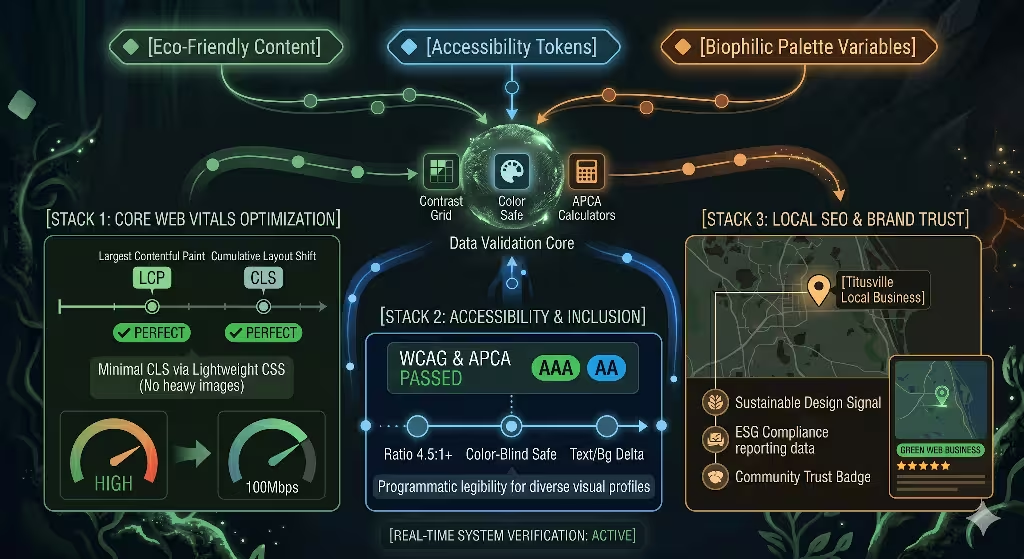
Using high contrast color palettes does more than save battery power and improve readability. It also plays a massive role in search engine optimization (SEO) and web performance. Modern search engines like Google do not just look at the keywords on your page. They also measure how fast your website loads and how easy it is for real people to use.
       HIGH-CONTRAST PERFORMANCE STACK

  +-----------------------------------------+
  |  Clean CSS Variables (No Heavy Images)  |  --> Faster Loading Times
  +-----------------------------------------+
  |  High Accessibility Scores (WCAG AA)    |  --> Improved SEO Rankings
  +-----------------------------------------+
  |  Low Power / Smooth Mobile Experience   |  --> Better User Engagement
  +-----------------------------------------+
Google evaluates user experience through a system called Core Web Vitals. This system tracks things like Largest Contentful Paint (LCP), which measures how fast the main content loads, and Cumulative Layout Shift (CLS), which measures how stable the page elements are as they load.
When you design websites using high contrast color palettes, you can style your entire layout using lightweight CSS code instead of heavy background images or complex graphical textures. This makes your code clean and compact, allowing your web pages to load incredibly fast over mobile data networks.
By avoiding heavy graphics and relying on smart high contrast color palettes, you improve your website’s loading speed. This directly raises your Core Web Vitals scores and helps your pages rank higher in organic search results.
This design methodology also provides a major advantage for local SEO and modern corporate branding. Businesses around the world are now required to report on their Environmental, Social, and Governance (ESG) goals. Companies must show exactly how they are reducing their carbon footprint and making their services accessible to everyone in their communities.
When a local business builds its digital storefront using high contrast color palettes, it can proudly highlight its commitment to digital sustainability. This attracts eco-conscious customers and builds immense brand trust. It shows that your business cares about accessibility laws and real environmental stewardship.
To build and maintain these eco-friendly, high-contrast systems, development teams should integrate several free validation tools into their regular workflow:
- Contrast Grid: This tool allows you to test multiple color combinations at the same time. It creates a clear grid showing which text and background pairings pass or fail WCAG accessibility standards.
- Color Safe: This application helps you generate beautiful high contrast color palettes from scratch based on the specific font sizes and font weights you want to use on your website.
- APCA Calculators: These digital tools help future-proof your website design. They ensure your high contrast color palettes match the upcoming, advanced contrast rules being built for the next generation of global web standards.
By pairing biophilic design with advanced hardware physics and modern SEO strategies, we can transform how the world builds websites. High contrast color palettes prove that we do not have to choose between protecting our planet and serving our users. By deploying these smart, energy-efficient color systems, we can build a faster, cleaner, and more accessible internet for everyone.
Interactive Performance Optimization
To understand how high contrast color palettes save energy and meet accessibility standards, you can use the interactive simulator below. Adjust the background and text tones to see how different combinations affect contrast ratios and screen power draw.