Here at Silphium Design, we see the internet as a digital garden. It is a place where we can either plant seeds of knowledge or let the weeds of confusion grow. As such, the way we show information matters just as much as the information itself. When we talk about using data visualization to show environmental degradation online, we are talking about a vital bridge. This bridge connects hard scientific facts with the human heart. Nature is complex. The loss of our forests or the rising heat of our oceans cannot be felt through a simple spreadsheet. We need a way to see the truth.
In the year 2026, our digital tools have become very powerful. We no longer just look at static pictures. We interact with living data. A good data visualization is like a window. It allows us to look out at the world and see changes that are usually too slow or too big for our eyes to catch.
By using data visualization to show environmental degradation online, we create a digital ecosystem. This system helps us understand the state of our planet. It takes the big, scary numbers of climate change and turns them into a story we can actually follow.
Our goal is to show you how we can use science and design together. We can build websites that do not just report the news but also help people feel a connection to the earth. This is the core of biophilic design. It is about bringing the logic and beauty of nature into the digital world.
Table of Contents
Technical Methodologies for High-Fidelity Visuals
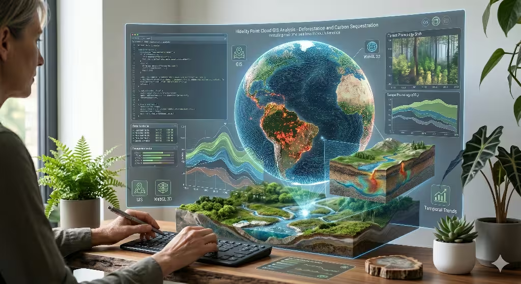
To build a great data visualization, we need the right tools. Think of these tools like the soil in a garden. If the soil is rich, the plants will grow strong. In the world of web design, our soil is made of code and data. One of the most important tools we use is called GIS. This stands for Geographic Information Systems. A GIS is basically a map with many layers. Imagine a map of a forest. One layer shows the trees. Another layer shows the rainfall. A third layer shows where humans are building roads. When we use this kind of data visualization, we can see how all these things interact.
In 2026, we use tools like Mapbox or Leaflet to make these maps come alive on your screen. These tools allow us to show real-time changes. For example, if a fire starts in a rainforest, the data visualization can update almost instantly. This helps people see the “now” instead of just the “past.”
Another technical tool we use is called WebGL. This is a way to make 3D graphics work inside your web browser. When we are using data visualization to show environmental degradation online, 3D is very helpful. It lets us show things like the depth of the ocean or the height of smoke in the air. Instead of a flat chart, you can spin a 3D model of the Earth and see where the heat is trapped. An interesting example of the use of WebGL can be found on the OHZI Interactive Studio website.
We also use something called temporal trends. This is just a fancy way of saying we show how things change over time. A line chart is a simple data visualization that does this. But we can make it better. We can use “streamgraphs.” These look like flowing rivers of color. They show how different parts of the environment are changing together. If you see a green stream getting thinner and a gray stream getting wider, you immediately understand that nature is losing and pollution is winning. This kind of data visualization makes the message clear without needing a lot of text.
Key Environmental Indicators to Track
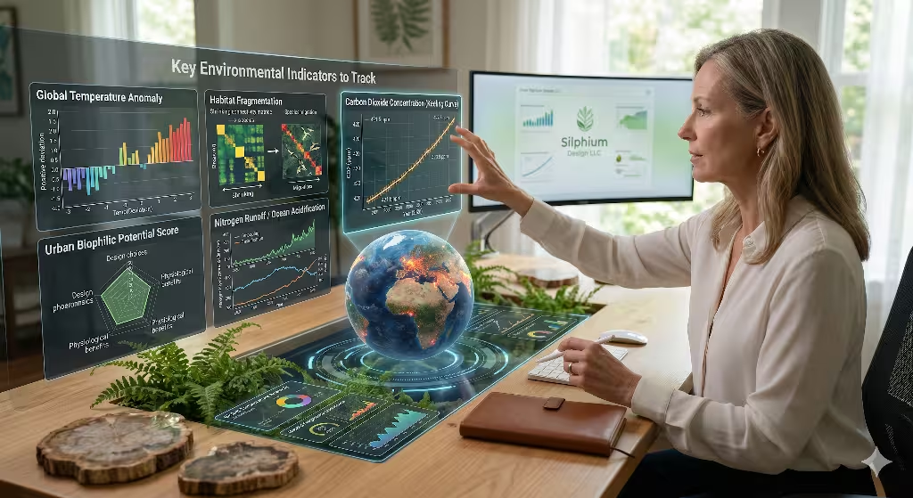
What should we actually show in our data visualization? Not all data is equal. We want to focus on the things that tell the biggest story. The first thing is climate change. We often show this using temperature maps. You have likely seen maps where the world turns from blue to deep red. This is a very effective data visualization. It uses our natural instinct to see red as “hot” or “danger.” In 2026, we also track carbon dioxide levels using the Keeling Curve. A good data visualization of this curve shows a steady climb upward. It looks like a mountain that we are forced to climb.
Next, we look at biodiversity loss. This means the loss of different kinds of animals and plants. This is harder to show than temperature. We often use “Voronoi diagrams.” These look like honeycombs or cracked mud. Each cell in the diagram represents a species or a piece of habitat. As the habitat shrinks, the cells in the data visualization get smaller or disappear. It is a very powerful way to show how the “islands” of nature are being cut off from each other.
We also need to track resource depletion. This includes things like fresh water and healthy soil. A data visualization for water might show a sinking line for underground wells. Or it might show a map where lakes are shrinking over many years. By using data visualization to show environmental degradation online in this way, we make the invisible visible. Most people do not see the water levels underground. But when they see it in a clear data visualization, they start to care. They realize that the resource is not infinite.
Biophilic UI: Designing for the Human Nervous System
When people see data about the environment, they often feel stressed. This is called eco-anxiety. If a website is too dark or too cluttered, it makes the stress worse. As an expert in biophilic design, I focus on making the data visualization feel natural. We use patterns that the human brain already likes. These are called fractal patterns. You see them in the branches of trees or the shape of snowflakes. When a data visualization uses these organic shapes, it feels less like a cold machine and more like a part of the world.
We also use “natural analogues.” This means we use colors and movements that remind us of nature. Instead of bright, neon “computer” colors, we use earth tones. We use the deep greens of a mossy forest or the soft blues of a clear sky. In 2026, a popular trend is “liquid animation.” This is a type of data visualization where the charts move smoothly, like water flowing in a stream. It is very calming. It helps the user stay on the website longer. If they stay longer, they learn more.
There is a concept in design called “prospect and refuge.” Prospect means having a wide view of the landscape. Refuge means having a safe place to hide. In a data visualization, the “prospect” is the big, complex map showing the whole world. The “refuge” is a simple summary or a clear button that tells you what to do next. We always want to give the user a place of refuge. We do not want to drown them in bad news. A good biophilic data visualization shows the problem, but it also shows the path to a solution.
Common Questions About Environmental Data Visualization
Many people have questions about how this all works. One common question is: How can data visualization help the environment? The answer is simple. You cannot fix what you cannot see. By using data visualization to show environmental degradation online, we help leaders make better choices. If a mayor can see exactly which parts of their city are too hot, they can plant trees in those spots. Data visualization turns a vague feeling into a clear plan of action.
Another question is: What are some examples of environmental data visualization? One great example is Global Forest Watch. This website uses satellite data to show where trees are being cut down in real-time. Another example is NASA’s “Vital Signs of the Planet.” They use a data visualization for sea level rise and ice melt. In 2026, we see even more interactive tools. Some websites let you enter your zip code to see how climate change will affect your specific neighborhood. This kind of local data visualization makes the issue feel personal.
People also ask: Why is visualizing environmental data important? It is important because our brains are built for pictures, not lists of numbers. For most of human history, we survived by looking at the world and spotting patterns. We looked for the patterns of the seasons or the tracks of animals. A data visualization taps into that ancient part of our brain. It helps us “read” the state of the world just like our ancestors read the forest. Without a good data visualization, the data just stays hidden in a computer.
Finally, what charts are best for showing environmental change? For maps, we use choropleth maps. These use different shades of one color to show intensity. For change over time, we use area charts or slope graphs. A slope graph is a great data visualization because it shows a starting point and an ending point with a single line. If the line goes down sharply, the message is clear. We also use “small multiples.” This is a set of many small charts that all use the same scale. It lets you compare different countries or years at a glance.
Data Integrity and the 2026 Anti-Greenwashing Standard
In the year 2026, we have to be very careful about “greenwashing.” This is when a company or a group tries to look eco-friendly, but they are not actually doing the work. Sometimes, people use a pretty data visualization to hide the truth. They might change the scale of a graph to make a small improvement look huge. Or they might use “soft” colors to make a dangerous chemical look harmless. As a computer scientist, I believe in data integrity. This means the data must be honest.
A good data visualization should always show where the data came from. We call this “traceability.” On a website, you should be able to click on a chart and see the raw numbers and the source. We also use “live” data. Instead of showing a report from five years ago, we use APIs to pull in data from today. An API is like a straw that lets our website sip fresh data from a scientific database. When we are using data visualization to show environmental degradation online, we must be as transparent as possible.
We also have to watch out for “cognitive load.” This is how much effort it takes for your brain to understand something. If a data visualization is too messy, people will just give up. They might even stop believing the data. To be honest, we must also be clear. A simple, honest data visualization is much better than a complex, confusing one. We want to empower the user, not trick them. In 2026, the best websites are the ones that tell the truth in a way that anyone can understand.
Strategic SEO: Finding the Right Keywords
To make sure people see our work, we have to think about search engines. This is called SEO. We want to use words that people are actually typing into Google. The main phrase we are focusing on is using data visualization to show environmental degradation online. But we also look for other words. These are called “LSI” keywords. They are words that are related to our main topic. For example, we might use “climate dashboards” or “interactive forest maps.”
When we use data visualization on a website, we have to describe it with text. Search engines cannot “see” a picture, but they can read the labels and descriptions. This is why “alt text” is so important. Alt text is a short sentence that describes what is in a picture. For a chart, the alt text might say: “A data visualization showing the 20% drop in local bee populations over ten years.” This helps the search engine understand what the page is about. It also helps people who use screen readers to “see” the data.
We also look for high-traffic keywords in the field of biophilic design. People are searching for ways to make their digital lives feel more natural. By combining “biophilic UI” with “environmental data visualization,” we can reach a lot of people. We want to be the leaders in this space. Our goal is to make sure that when someone searches for the state of the planet, they find a website that is both beautiful and accurate.
The Benefits of Interactive Storytelling
One of the best ways to keep people engaged is through “scrollytelling.” This is a type of data visualization where the story unfolds as you scroll down the page. It is like a guided tour of a landscape. As you move your mouse, a forest might appear. Then, as you scroll further, the data visualization shows the forest disappearing over time. This makes the user feel like they are part of the story. It is much more powerful than just clicking through a slide deck.
Interactive data visualization also lets people explore on their own. They can filter the data by year, by country, or by the type of animal. This creates a sense of “agency.” Agency means the feeling that you have control. When a user can play with the data visualization, they feel more connected to it. They aren’t just being told a fact; they are discovering it for themselves. This is a key part of how we teach people about environmental issues in 2026.
We also use “gamification.” This does not mean making the environment a game. It means using some of the fun parts of games to keep people interested. For example, a data visualization might give you a “badge” for finishing a lesson on water conservation. Or it might show you how your local area compares to others in a friendly way. This kind of data visualization makes learning feel less like a chore and more like an adventure.
Why Biophilic Design Matters for the Future
As we look toward the future, the digital world will only get bigger. We will spend more time in front of screens. If those screens are filled with cold, mechanical designs, we will lose our connection to the physical world. Biophilic design is the cure for this. By using data visualization to show environmental degradation online, we remind people that the “real world” still exists. We use the beauty of nature to make the data more human.
Think about a website that shows the health of a coral reef. A standard data visualization might just be a bar chart showing “percent of coral lost.” But a biophilic data visualization would use textures that look like the ocean floor. It would use colors that match the actual reef. It might even include the sounds of waves or bubbles. This creates a “multi-sensory” experience. It makes the data feel “thick” and real. It makes the user want to protect the reef because they have “visited” it through their screen.
This is the mission of Silphium Design LLC. We believe that technology should not separate us from nature. Instead, it should be a tool that helps us see nature more clearly. Every data visualization we create is an opportunity to heal the relationship between humans and the Earth. We use our skills in biology and web design to build a better digital biome. We want every person who visits our websites to walk away with a better understanding of the world.
Visualizing the Impact of Local Decisions
Large global maps are great, but local data visualization is where real change happens. People care most about the trees in their own park and the water in their own taps. When we are using data visualization to show environmental degradation online, we try to zoom in. We might show a map of a single city. We can show where the “heat islands” are. A heat island is a place with too much concrete and not enough shade. It gets much hotter than the areas with trees.
By showing a data visualization of these heat islands, we can help people see why they need to plant a garden or a tree. We can show how much cooler a street becomes after it gets a green roof. This kind of data visualization is a “before and after” story. It proves that our choices matter. In 2026, many cities use these “digital twins.” A digital twin is a data visualization that is a perfect copy of the city. It lets leaders test out ideas before they build them. They can “plant” 1,000 virtual trees and see exactly how it will lower the temperature on the map.
This use of data visualization is very empowering. It takes a big, global problem and breaks it down into small, local steps. It shows that we are not helpless. We can see the problem, we can track our progress, and we can celebrate our wins. Whether it is a small town in Vermont or a big city like Boston, every community can use a data visualization to tell its own environmental story.
Technical Challenges and Future Solutions
Creating a high-quality data visualization is not always easy. One big challenge is “data lag.” Sometimes the sensors in the forest or the ocean take time to send their signals. If the data visualization is out of date, it is not as useful. In 2026, we are using better satellite tech to fix this. We are also using “edge computing.” This means the data is processed right where it is collected, so it reaches the website faster.
Another challenge is “data noise.” Sometimes there is so much information that the main message gets lost. A good designer knows how to “prune” the data visualization just like a gardener prunes a bush. We remove the extra branches so the main shape is clear. We use “hierarchy” in our design. This means the most important thing is the biggest or the brightest. Less important things are smaller or more muted. This helps the user’s eye find the right path through the data visualization.
Looking ahead, we might even use “augmented reality” or AR. This would let you hold up your phone and see a data visualization “floating” over the real world. You could walk down a street and see a virtual chart showing the air quality right in front of you. This is the next step in using data visualization to show environmental degradation online. It blends the digital and physical worlds into one single experience. It makes the data part of our everyday lives.
A Call to Visual Action
We have covered a lot of ground today. From the technical tools like GIS and WebGL to the biological principles of biophilic design, it is clear that our digital tools are changing. Using data visualization to show environmental degradation online is no longer just a trend. it is a necessity. We need these “digital windows” to help us understand a world that is changing faster than ever before. We must use every tool we have to protect our natural home.
At Silphium Design LLC, we are committed to this work. We believe that a well-designed data visualization can be as beautiful as a flower and as strong as an oak tree. It can teach us, it can move us, and it can call us to action. I hope this article has helped you see the power of data in a new way. Whether you are a designer, a scientist, or just someone who cares about the planet, you have a role to play.
The data is out there. It is waiting for us to give it a voice. By using data visualization to show environmental degradation online, we can tell the story of our planet in a way that leads to a brighter, greener future. Let’s keep building, keep designing, and keep looking for the patterns that will help us save the world. The digital garden is growing, and with the right care, it will flourish for generations to come.