At Silphium Design LLC, we do not just build websites. We build digital homes that feel like nature. Because I studied biology and computer science, I see the internet as a living place. Today, we are going to talk about a very important choice in design. This choice is between a biophilic UI and a minimalist UI.
Many people think minimalism is the best way to keep a website simple. But simple is not always better for your brain. Sometimes, a white screen is actually harder to look at than a screen with natural patterns. We are going to look at how these designs change your cognitive load. Cognitive load is just a fancy way of saying how hard your brain has to work to understand what it sees.
My goal today is to show you why a biophilic UI is often a better choice for your users. We will look at the science of how your brain reacts to shapes and colors. We will also talk about how this helps your website show up better in search engines. By the time we are done, you will see why bringing nature into the digital world is the next big step for the internet.
Table of Contents
The Paradox of the Blank Screen: Introduction to Cognitive Load

When you open a website that is mostly white space, you might think it looks clean. This is what we call a minimalist design. Designers use this because they want to reduce cognitive load. They think that by taking things away, the user has less to think about. But there is a problem with this idea. Humans did not evolve to live in white boxes. We evolved in forests and fields. A totally blank screen can actually make your brain feel uneasy. This is the paradox of the blank screen.
In a biophilic UI, we do not just leave things empty. We fill the space with things that feel familiar to your biology. Think about a leaf or a stone. These things have patterns that your brain knows how to read without trying. When you use a biophilic UI, you are working with the brain instead of against it. This helps lower the mental effort needed to use a site. Instead of a “blank” feeling, the user feels a “natural” feeling.
At Silphium Design LLC, we focus on this connection. We use ideas from experts like Edward O. Wilson. He came up with the “Biophilia Hypothesis.” This says that humans have a built in love for life and living systems. When a biophilic UI uses these natural cues, it feels right. It makes the user want to stay. This is very different from a plain minimalist UI that can feel cold or empty.
Defining the Contenders: Minimalism vs. Biophilia
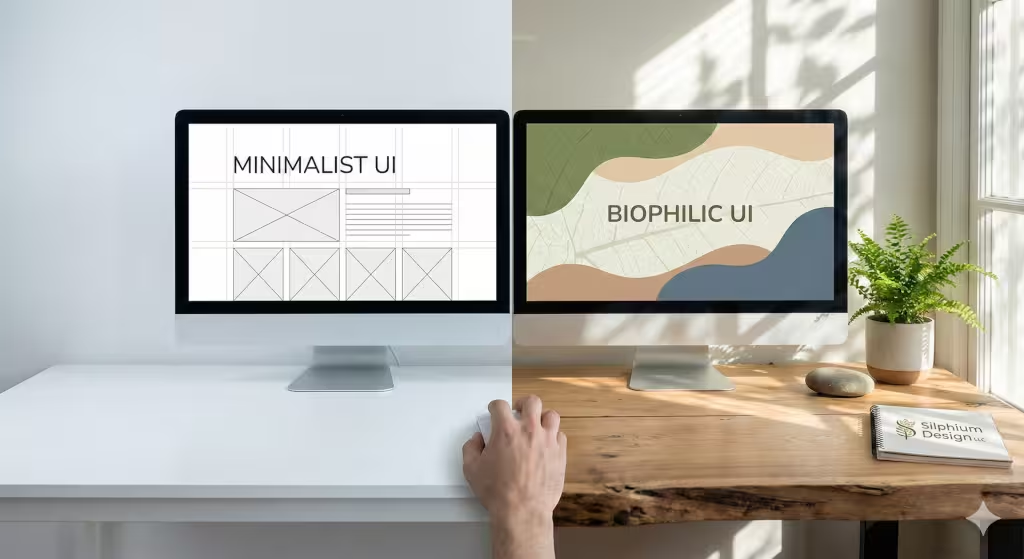
To understand why a biophilic UI works so well, we have to look at what it is competing against. Minimalist design is very popular right now. It uses flat shapes and straight lines. It loves a lot of white space. The goal is to be efficient. It wants to get you to a button or a link as fast as possible. This is good for some things, but it can also be very boring. It can also be stressful if the site feels too clinical.
On the other hand, a biophilic UI uses biomorphic patterns. These are shapes that look like things found in nature. You might see soft curves instead of sharp corners. You might see textures that look like wood or water. This design style also uses the “Prospect and Refuge” principle. This means the site gives you a clear view of where to go (prospect) while making you feel safe and tucked in (refuge).
A biophilic UI is not just about putting pictures of plants on a page. It is about using the math of nature. Nature uses fractals. These are patterns that repeat at different sizes. Your brain can process these fractals very easily. When a biophilic UI uses these patterns, it creates a visual hierarchy that feels easy and smooth. It is not just about “less is more.” It is about “nature is right.”
The Science of “Soft Fascination”
Have you ever noticed how you can stare at a campfire or a flowing river for a long time without getting tired? This is called soft fascination. It is a key part of why a biophilic UI is so powerful. There is a theory called Attention Restoration Theory. It says that our brains have two kinds of attention. One is “directed attention.” This is what you use when you are working on a hard task or reading a dense report. Directed attention gets tired quickly.
The other kind is “undirected attention.” This happens when something is interesting but does not take effort to look at. Nature is the best source of this. When you use a biophilic UI, you are giving the user moments of soft fascination. This allows their brain to rest while they are still on your website. A minimalist UI often lacks this. It stays focused on “directed attention,” which can lead to digital fatigue.
By using a biophilic UI, you are helping your users’ brains recover. They can look at your content longer because they are not getting as tired. This is a huge win for any website. If a user feels better while using your site, they will like your brand more. They will also be more likely to finish what they started, like buying a product or signing up for a newsletter.
Decoding Cognitive Load: Intrinsic, Extraneous, and Germane
To really see the value of a biophilic UI, we need to look at the three types of cognitive load. First is “Intrinsic Load.” This is just how hard a task is by itself. If you are learning a new language, the intrinsic load is high. You cannot change this much with design.
Second is “Extraneous Load.” This is the bad kind of load. It comes from messy layouts or confusing buttons. This is what minimalism tries to fix. By making things plain, it tries to cut out the extra noise. A biophilic UI does this too, but in a different way. Instead of just removing things, it uses natural shapes to organize information. Humans are better at seeing “groups” in nature than in grids.
Third is “Germane Load.” This is the good kind of load. It is the effort your brain puts into learning and remembering. A biophilic UI actually helps with this. When information is presented in a way that matches how we see the world, it is easier to remember. Using a biophilic UI means you are helping the brain turn information into long-term memories. This makes your website much more effective than a site that is just “empty.”
Biomorphic Patterns vs. Geometric Grids

Most websites today are built on a grid. They use squares and rectangles. While this is easy for computers, it is not always easy for eyes. Natural shapes are different. They are biomorphic. This means they are organic and irregular. A biophilic UI uses these shapes to create a more comfortable experience.
One of the coolest things about a biophilic UI is the use of fractals. Scientists found that humans have something called “Fractal Fluency.” This means our eyes are built to process certain types of complex patterns very quickly. In fact, it takes zero mental effort for your brain to process a mid-range fractal. When a biophilic UI uses these patterns in the background or in the menus, it calms the nervous system.
Sharp 90-degree corners can actually cause a tiny bit of stress. In nature, sharp corners often mean something is broken or dangerous. Soft curves mean something is growing or safe. By choosing a biophilic UI over a sharp minimalist UI, you are sending a signal of safety to the user’s brain. This lowers their stress levels and makes them feel more at home on your site.
The “Prospect and Refuge” Principle in UX
When we were early humans, we needed to see the whole field to look for food. This is “prospect.” We also needed a safe place to hide from wind or predators. This is “refuge.” A good biophilic UI uses both of these ideas.
In a website, prospect means having a clear navigation menu. You want the user to see where they are and where they can go. It feels like looking out from a high hill. Refuge means having sections of the site that feel cozy. Darker backgrounds, soft edges, and nested menus can provide this feeling.
A minimalist UI often focuses only on prospect. It is very open and wide. But it can make a user feel exposed. It feels like standing in the middle of a giant white room with no place to sit. A biophilic UI creates “restorative niches.” These are spots on the page where the user can pause and feel secure. This balance makes a biophilic UI much more comfortable to use for a long time.
Sensory Synergy: Beyond the Visual
We often think of web design as just what we see. But a biophilic UI can involve other senses too. This is called multi-sensory UX. Even though we cannot smell or touch a website yet, we can simulate those feelings. We can use textures that look like soft moss or rough stone. These visual cues trigger the “touch” centers in our brain.
Sound is also important. Many websites use loud, mechanical “pings” for notifications. A biophilic UI might use the sound of a small water drop or a soft wooden click. These sounds are much less stressful. They do not interrupt our flow as much as harsh noises do.
We can also use motion design that feels natural. Instead of a box just appearing, it might grow like a leaf opening up. Or it might slide in with a sense of weight and gravity. When the motion on a screen follows the rules of the real world, it is part of a great biophilic UI. It feels honest to the brain. This honesty reduces the confusion and cognitive load that happens when things act “weird” on a screen.
The SEO Impact: Dwell Time and User Retention
You might wonder what a biophilic UI has to do with search engines. The answer is: a lot! Search engines like Google want to show people websites that they actually like. If someone clicks a link and then leaves immediately, that is a bad signal. It’s called a bounce. But if someone stays and reads for a long time, that is a great signal. This is called dwell time.
Because a biophilic UI reduces stress and fatigue, people stay on the site longer. They do not get that “headache” feeling that comes from staring at a bright, cluttered page. Longer stay times tell the search engine that your site is valuable. This helps your biophilic UI rank higher in the search results.
Also, a biophilic UI helps with user retention. If people feel good on your site, they will come back. This builds brand trust. In the world of SEO, being a trusted “entity” is very important. Search engines in 2026 look at who you are, not just what words you use. Having a unique, nature-inspired biophilic UI makes your brand stand out. It makes you a memorable part of the digital ecosystem.
Silphium Design Methodology: The “Hybrid” Approach
At Silphium Design LLC, we know that you cannot just throw a bunch of vines on a screen and call it a day. You have to be smart. We use a hybrid approach. We take the clear organization of minimalism and mix it with the soul of a biophilic UI.
We might use a clean, simple grid for the main shopping cart. That needs to be very fast and easy. But for the background, the headers, and the transitions, we use a biophilic UI. We use colors that come from nature, like sage green, slate blue, and clay brown. These colors are easier on the eyes than pure neon or harsh whites.
We also use “natural light” effects. This means shadows and highlights on the screen look like they are coming from a real sun. This helps the brain understand the “depth” of the page. It makes the digital world feel less flat. This hybrid style is the best of both worlds. It gives you the speed of a minimalist UI with the comfort of a biophilic UI.
The Future of Human-Centric Interfaces
The internet is changing. We are moving away from screens that look like machines. We are moving toward screens that look like us and the world we live in. A biophilic UI is not just a trend. It is a way to make technology more human.
As we spend more and more time online, we need our digital spaces to be healthy. A biophilic UI is like a digital park. It gives us a place to be productive without burning out. It respects our biological limits. It understands that we are animals that need nature to stay sane.
In the future, every great website will likely have elements of a biophilic UI. We will see more organic shapes, more natural sounds, and more fractal math. This will lead to an internet that feels alive. It will be a place where we go to feel better, not just to get things done. Choosing a biophilic UI is a choice to care for your users.
Why Biophilic UI is Better for Cognitive Load
Let’s summarize why a biophilic UI wins. A minimalist UI tries to help by giving you less. But a biophilic UI helps by giving you the right things. It uses “Soft Fascination” to let your brain rest. It uses “Fractal Fluency” to make seeing easier. It uses “Prospect and Refuge” to make you feel safe.
All of these things lower the cognitive load. They make the “extrinsic” noise go away and let the “germane” learning happen. When you build a biophilic UI, you are not just making a pretty site. You are making a smart site. You are making a site that works with the human heart and the human brain.
If you want your website to succeed in 2026, you need to think about these things. You need to think about how your site feels, not just how it looks. A biophilic UI is the key to that feeling. It is the key to keeping your users happy and your search rankings high.
Questions Answered about Biophilic UI
Does biophilic design reduce cognitive load?
Yes, it does. By using patterns that the brain is evolved to recognize, a biophilic UI makes it easier for the eye to scan and understand information. This lowers the total mental energy used.
What is the difference between biophilic and minimalist design in web?
Minimalism is about taking away elements to achieve simplicity. A biophilic UI is about adding natural elements and patterns to achieve comfort and health. One is about “less,” the other is about “life.”
How does nature-inspired design affect the brain?
Nature-inspired design triggers a relaxation response. It lowers cortisol levels and heart rates. In a biophilic UI, this means the user feels calmer and more focused while they are on your website.
Is a biophilic UI good for SEO?
Yes. Because it keeps users on the site longer and reduces “digital fatigue,” it improves dwell time. These are positive signals that search engines use to rank websites higher.
Can I use a biophilic UI for any kind of website?
Absolutely. From banks to flower shops, every site can benefit from a biophilic UI. It is all about how you balance the natural elements with the functional needs of the site.
Creating a Digital Habitat
We have covered a lot today. We looked at how a biophilic UI compares to a minimalist UI. We talked about how our brains love fractals and natural shapes. We also saw how a biophilic UI helps your website stay popular and easy to find.
At Silphium Design LLC, we believe the future is green. Even on a screen. By using a biophilic UI, you are creating more than just a page. You are creating a digital habitat. You are giving people a place to grow and learn without the stress of the modern world.
If you want to help your users feel more at home, consider a biophilic UI. It is the most natural way to design for the web. It respects the history of our species and the technology of our future. A biophilic UI is truly the best way to balance the load on our minds and the beauty in our lives.
I hope this outline and the detailed explanations have been helpful to you. It is a complex topic, but when we break it down into the way our brains work, it becomes very clear why a biophilic UI is so effective. Designing with nature in mind is not just a style. It is a science. And it is a science that leads to better websites for everyone.