Table of Contents
The Mechanics of Asymmetric Balance
When you look at a natural forest, you do not see a perfectly mirrored landscape. Trees grow at different heights, branches extend in unique directions, and rocks sit in random positions. Yet, the entire scene feels complete, stable, and beautiful. In the digital world, we can bring this exact natural balance to our computer screens. We do this through a concept called asymmetric visual hierarchy. When we design websites at Silphium Design LLC, we use this layout strategy to create interfaces that feel alive, engaging, and highly effective. This is most seen with application of the golden ratio.
An asymmetric visual hierarchy happens when a web page layout does not look the same on the left side as it does on the right side. Instead of mirroring elements across a center line, we arrange different elements with varying sizes, colors, and shapes to create a balanced feel. This design approach guides the eyes of your visitors through your content in a intentional way. Using an asymmetric visual hierarchy prevents your website from looking boring, while ensuring that the most important information stands out immediately.
Definition of Terms
To understand asymmetric visual hierarchy, we must first break down the words themselves. Visual hierarchy is the arrangement of elements on a page in order of their importance. It tells the reader what to look at first, what to look at second, and what to look at last. The word asymmetric means that the two halves of the design are not identical. Therefore, an asymmetric visual hierarchy is a system where we use unequal layout parts to establish a clear order of importance for the text, images, and buttons on a website.
In standard web layouts, designers often center everything or put identical columns next to each other. While that approach is safe, an asymmetric visual hierarchy creates a path for the eye by using contrast. For instance, you might place a large, bold headline on the left side of the screen and balance it with a small, brightly colored button on the right side. The two sides do not look the same, but they work together to create an asymmetric visual hierarchy that feels organized and natural to the human brain.
The Cognitive Load Factor
Cognitive load is a term from psychology that refers to how hard your brain has to work to process information. When a user visits a website, their brain instantly tries to make sense of the layout. If a website uses a predictable, perfectly mirrored layout, the brain can get bored very quickly. On the other hand, if a layout is completely chaotic, the brain gets overwhelmed. An asymmetric visual hierarchy solves this problem by finding the perfect middle ground between boredom and chaos.
By utilizing an asymmetric visual hierarchy, you give the user’s brain a clear starting point. The eye is naturally drawn to the element with the most visual weight, such as a large photo or a dark block of text. From there, the asymmetric visual hierarchy guides the eye to smaller elements nearby. This natural movement reduces the effort required to read the page. A well-designed asymmetric visual hierarchy makes your website feel effortless to navigate because it aligns with how human brains naturally process the physical world around them.
The Core Paradox
The core paradox of asymmetric visual hierarchy is that it achieves perfect harmony through tension rather than uniformity. In a symmetrical layout, harmony is easy to achieve because both sides are identical. In an asymmetric visual hierarchy, we intentionally create visual tension by placing items of different sizes and shapes across the screen. This tension creates a sense of movement and energy, which naturally captures human attention.
Even though the layout is uneven, the overall design still feels balanced. Think of a see-saw in a park. If two children of the exact same weight sit at equal distances from the center, the see-saw is perfectly balanced. This is like a symmetrical layout. Now, imagine a heavy adult sits close to the center, and a small child sits far out on the opposite edge. The see-saw is still balanced, even though the two people are completely different. This is how an asymmetric visual hierarchy operates. We use placement and distance to balance different visual elements perfectly.
Symmetry vs. Asymmetry: A Comparative Framework
To truly master the use of an asymmetric visual hierarchy, it helps to compare it directly to a symmetrical system. Both systems have their place in modern web design, but they send very different messages to your audience. Understanding when to use symmetry and when to use an asymmetric visual hierarchy can make the difference between a website that feels stagnant and one that actively drives user interaction.
What is the difference between symmetry and asymmetry in design?
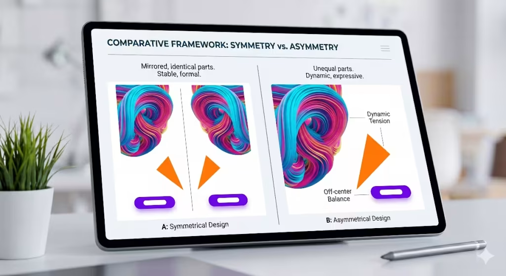
The primary difference between symmetry and asymmetry in design lies in how visual weight is distributed across the page. Symmetry relies on repetition and mirroring. If you draw a line down the middle of a symmetrical website, the left side will look almost exactly like the right side. Asymmetry rejects this mirroring effect. An asymmetric visual hierarchy uses different elements on each side of the line to build an open, engaging layout that feels less rigid.
Symmetrical design is highly predictable and organized. It creates a sense of calm, tradition, and formality. However, an asymmetric visual hierarchy introduces variety, surprise, and movement. While symmetry tells the user to look at everything all at once, an asymmetric visual hierarchy creates a specific journey for the eyes. It forces the visitor to look at the primary element first before moving along a planned path to secondary items.
Structural Mechanics
The structural mechanics of a symmetrical layout are straightforward. You place an image in the center, or you create three identical columns across the screen. The structural mechanics of an asymmetric visual hierarchy require a bit more planning. You must work with a grid system, but you intentionally break or offset the columns to create an uneven layout. This variation allows for a more interesting use of screen space.
When building an asymmetric visual hierarchy, you often use an odd number of grid columns, such as five or seven columns. You might dedicate four columns on the left to a large hero image and use the remaining columns on the right for your text and buttons. This structural imbalance is the foundation of a great asymmetric visual hierarchy. It gives your content room to breathe while establishing a clear visual order that prevents the screen from looking like a simple, uninspired document.
When to Deploy Each System
Choosing whether to use symmetry or an asymmetric visual hierarchy depends entirely on the goals of your website. Symmetrical layouts are excellent for websites that need to communicate absolute stability, trust, and tradition. Government web portals, law firms, banking institutions, and formal academic portfolios often use symmetry because it feels safe, orderly, and unchanging.
Conversely, you should deploy an asymmetric visual hierarchy when you want to build excitement, show innovation, or drive specific user actions. Modern technology websites, creative portfolios, online stores, and editorial blogs thrive when they use an asymmetric visual hierarchy. At Silphium Design LLC, we also find that an asymmetric visual hierarchy works beautifully for biophilic user interfaces. Because nature itself is full of asymmetric balance, websites that focus on environmental conservation or natural resources feel much more authentic when they embrace an asymmetric layout.
The Physics of Visual Weight: How to Achieve Asymmetrical Balance
Many designers wonder how to build an uneven layout without making it look messy. The secret lies in understanding the physics of visual weight. Every item you place on a computer screen has a certain amount of visual weight, which means it pulls the human eye toward it with a specific amount of force. To build a successful asymmetric visual hierarchy, you must learn how to balance these forces across your layout.
How do you achieve asymmetrical balance?
You achieve asymmetrical balance by arranging elements of different visual weights so that the overall composition feels stable. You do not want one side of your website to feel incredibly heavy while the other side feels completely empty. Instead, you use an asymmetric visual hierarchy to offset a heavy element in one area with a collection of lighter elements in another area.
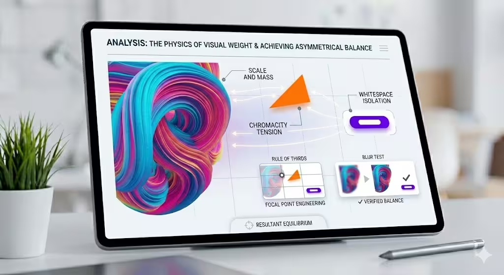
To test if you have achieved this balance in your asymmetric visual hierarchy, you can use the squint test. Close your eyes halfway until the text and images on your screen become blurry shapes. If the blurry shapes look like they are distributed nicely across the page rather than sliding off to one side, your asymmetric visual hierarchy is working. You have successfully created balance without using cloning or mirroring.
The Analytical Variables
To master the physics of an asymmetric visual hierarchy, you must learn to manipulate four primary analytical variables. These variables are scale, color, negative space, and texture. By adjusting these four elements, you can give any component on your website the exact amount of visual weight required to fit into your overall asymmetric visual hierarchy.
Scale and Mass
Scale refers to the size of an element relative to the items around it. In an asymmetric visual hierarchy, a large item naturally carries more visual mass than a small item. If you have an enormous headline on the left side of your page, it will dominate the layout. To achieve balance within your asymmetric visual hierarchy, you can offset that large headline by placing a smaller block of high-density text or a small, detailed graphic on the right side of the screen.
The human eye will always look at the largest item first. Therefore, scale is one of the easiest tools to use when setting up the initial point of an asymmetric visual hierarchy. By making your primary message large, you establish the start of the user’s visual journey. You can then use smaller sizes for secondary text, which keeps the eyes moving smoothly down the page.
Color Chromaticity and Temperature
Color plays a massive role in how we perceive visual weight within an asymmetric visual hierarchy. Bright, highly saturated colors carry more visual weight than dark, muted, or neutral colors. Similarly, warm colors like red, orange, and yellow feel much heavier to the eye than cool colors like blue, green, and gray.
You can use these color traits to balance an uneven layout. For example, if you have a massive, neutral-colored photograph dominating the left side of your website, you can balance your asymmetric visual hierarchy by placing a tiny, bright orange button on the right side. Even though the button is small, its bright color and warm temperature give it enough visual weight to stand up to the giant photograph. This color contrast is a classic way to make buttons pop inside an asymmetric visual hierarchy.
Negative Space (Whitespace)
Negative space, which is often called whitespace, is the empty area around the elements on your page. Many people make the mistake of trying to fill every square inch of a website with content. However, in a great asymmetric visual hierarchy, whitespace is treated as a powerful design element. Whitespace gives your eyes a place to rest and helps to isolate important items.
When you surround an item with a large amount of empty space, you increase its visual weight. A single line of text sitting in the middle of an empty white block will draw immense attention. In an asymmetric visual hierarchy, you can use whitespace on one side of the screen to balance a dense collection of text and images on the other side. This clever use of empty space keeps your layout clean, modern, and easy to read.
Texture and Geometric Complexity
The final variable to consider in your asymmetric visual hierarchy is texture and geometric complexity. Simple geometric shapes, like plain rectangles and smooth circles, have less visual weight than complex, jagged, or highly textured shapes. A detailed pattern, a complex illustration, or an organic shape from nature will always pull the eye away from a simple, flat box.
If your asymmetric visual hierarchy includes a complex background pattern or an intricate hand-drawn illustration on one side of the layout, you must balance it on the other side. You can do this by using clean, minimalist typography and generous amounts of space. By contrasting complexity with simplicity, your asymmetric visual hierarchy remains clear and purposeful, ensuring that your users never feel overwhelmed by too many busy details at once.
Real-World Asymmetric Visual Hierarchy Examples in Web Design
To help you visualize how these concepts look in practice, let us explore three common asymmetric visual hierarchy examples that you see on modern websites every day. These examples show how different industries use uneven layouts to arrange their content, improve their user experience, and make their web pages stand out.
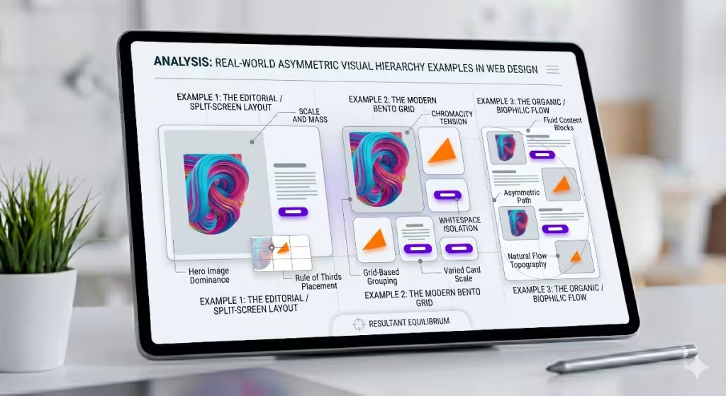
Example 1: The Editorial / Split-Screen Layout
The editorial or split-screen layout is a wonderful example of an asymmetric visual hierarchy used by online magazines, style brands, and news sites. Instead of splitting the screen into two equal halves, this layout uses a 60/40 or 70/30 split. One side of the screen features a large, striking image that takes up most of the space, while the other narrower side contains the article title, author name, and text.
In this specific asymmetric visual hierarchy, the large photo instantly captures the visitor’s attention. Once the user looks at the photo, their eyes naturally move sideways across the split line to read the bold title. This layout creates an experience that feels like reading a premium printed magazine. It uses an asymmetric visual hierarchy to turn a simple article page into a beautiful visual experience that encourages people to stay on the site longer and read more articles.
Example 2: The Modern Bento Grid
The Bento Grid has become incredibly popular in web design over the last few years. Named after the traditional Japanese lunch box that has separate compartments for different foods, a Bento Grid organizes content into a collection of rectangular boxes of various sizes. This layout is a fantastic example of a modern asymmetric visual hierarchy working on a highly functional level.
Instead of a boring list of features, a Bento Grid website might place a massive square box in the top left corner to showcase a primary product feature. Surrounding this large box are smaller rectangles displaying secondary tools, user reviews, or small charts. The grid lines keep everything aligned and neat, but the varied sizes of the boxes build an explicit asymmetric visual hierarchy. Users can easily scan the grid, looking at the largest box first before exploring the smaller compartments at their own pace.
Example 3: The Organic / Biophilic Flow
At Silphium Design LLC, we love to design websites using the organic or biophilic flow model. This style of asymmetric visual hierarchy takes inspiration from the mathematical patterns found in nature, such as the Fibonacci spiral or the Golden Ratio. Instead of placing elements into strict boxes, the content flows down the page in an organic wave.
For instance, you might place a large, curving photo of a forest on the left side of the screen. As the user scrolls down, the next block of text appears on the right side, accompanied by a small graphic of a leaf. The layout alternates down the page in an uneven, flowing pattern. This type of asymmetric visual hierarchy feels incredibly relaxing to the eyes because it mimics the natural rhythms of the physical world. It proves that an asymmetric visual hierarchy can be used to create an emotional connection with your audience while keeping the website organized.
Strategic Value: Why Visual Hierarchy Dictates Conversions
Using an asymmetric visual hierarchy is not just an artistic choice; it is a critical business strategy. The way you arrange elements on your web page directly affects how users behave. By mastering the art of an asymmetric visual hierarchy, you can guide your visitors toward specific goals, such as signing up for a newsletter, buying a product, or contacting your team.
Why is visual hierarchy important?
Visual hierarchy is important because it serves as the invisible tour guide for your website. Without a clear hierarchy, every element on the page competes for attention at the same time. If your headline, your paragraphs, your images, and your buttons all have the exact same size and color, the user will not know where to look. This confusion leads to frustration, and a frustrated user will quickly leave your website.
By establishing a clear asymmetric visual hierarchy, you eliminate this confusion entirely. You tell the user exactly what matters most on the page. An asymmetric visual hierarchy organizes the chaos of the internet, making your content accessible and enjoyable. It transforms a collection of separate text blocks and images into a single, cohesive story that users can understand in a matter of seconds.
Focal Path Engineering
Focal path engineering is the practice of designing a specific highway for the human eye to travel along as it views your website. When you use an asymmetric visual hierarchy, you are engineering this path with great precision. You start by placing a primary focal point where you want the user’s journey to begin. This is usually your main headline or a hero image.
Once you have captured their attention at the starting point, your asymmetric visual hierarchy uses smaller visual cues to pull their eyes down the path. You might lead them from a large photo on the left, down to a short paragraph in the middle, and finally to a bright call-to-action button on the right. By controlling the order in which information is processed, an asymmetric visual hierarchy ensures that the user reads your most persuasive arguments before they reach your final signup button.
Mitigating Analysis Paralysis
Analysis paralysis happens when a person is presented with too many choices or too much information at once, causing them to freeze and make no decision at all. Traditional column-based layouts often cause this problem because they present multiple pieces of content with equal weight next to each other. An asymmetric visual hierarchy is the perfect cure for analysis paralysis.
Because an asymmetric visual hierarchy intentionally gives different weights to different sections, it reduces the options competing for the user’s immediate attention. It tells the brain to focus on one specific thing at a time. By using an asymmetric visual hierarchy to break your content down into a clear path of importance, you make the decision-making process incredibly simple for your visitors, which naturally increases your conversion rates.
UX Metrics Impact
The design choices you make have a measurable impact on your website’s data and success metrics. When you implement a thoughtful asymmetric visual hierarchy, you will see positive changes in your user experience metrics. Specifically, an asymmetric visual hierarchy helps to lower your bounce rate and increase your average session duration.
When a website uses a standard, symmetrical layout, users often scan the page in a fast, lazy pattern without actually reading the content. However, the unexpected design of an asymmetric visual hierarchy catches their interest and slows down their scanning habits. They spend more time looking at your images, reading your text, and interacting with your features. This increased engagement signals to search engines like Google that your website provides high-quality value, which can help boost your local SEO rankings over time.
Practical Implementation Checklist for Developers and Designers
Now that you understand the theory and strategy behind an asymmetric visual hierarchy, it is time to look at how to build one yourself. Creating a successful layout requires a step-by-step approach to ensure your design remains balanced and functional. Here is a practical implementation checklist you can use on your next web project.
Step 1: Establish a Non-Uniform Grid
Every great design begins with a solid foundation. Even though an asymmetric visual hierarchy looks free and flexible, it should still be built on top of a grid system. The secret is to use a non-uniform grid rather than a standard, even layout. Instead of a basic four-column grid where every column is identical, try using an uneven five-column or seven-column grid layout.
Using an odd number of columns makes it much easier to create an asymmetric visual hierarchy. You can dedicate a larger number of columns to your primary content and a smaller number of columns to your sidebar or supporting details. This underlying grid structure ensures that even though your layout is asymmetrical, all your text and images still line up perfectly, keeping the website looking clean and professional.
Step 2: Assign Maximum Chromatic Weight or Scale to Your Core Action
Look at the page you are designing and identify the single most important action you want the user to take. Do you want them to click a buy button, fill out a form, or read a specific quote? Once you have identified this core item, use your asymmetric visual hierarchy tools to give it the most visual weight on the screen.
You can achieve this by making the item larger than everything else around it, or by giving it a bright, high-contrast color. In your asymmetric visual hierarchy, this core item must stand out clearly. By ensuring that nothing else on the page competes with this primary element, you guarantee that every visitor will notice your most important call-to-action immediately.
Step 3: Apply the Rule of Thirds to Position Focal Intersections Off-Center
The Rule of Thirds is a classic technique used by photographers, painters, and designers to create beautiful compositions. To use it, imagine drawing two horizontal lines and two vertical lines across your screen, dividing your page into nine equal boxes. The places where these lines cross are called focal intersections.
    +-----------+-----------+-----------+
    |           |           |           |
    |        (Intersection) (Intersection)
    |           |           |           |
    +-----------+-----------+-----------+
    |           |           |           |
    |        (Intersection) (Intersection)
    |           |           |           |
    +-----------+-----------+-----------+
    |           |           |           |
    |           |           |           |
    |           |           |           |
    +-----------+-----------+-----------+
Instead of centering your main headline or image, place it directly on one of these off-center focal intersections. This simple adjustment is an incredibly effective way to kickstart an asymmetric visual hierarchy. It instantly breaks the boring symmetry of the screen and creates a dynamic layout that feels engaging and natural to the viewer.
Step 4: Execute a Blur Test to Verify Weight Distribution
Once you have finished placing your content, you need to verify that your asymmetric visual hierarchy is working correctly. The easiest way to do this is by performing a blur test. You can do this by squinting your eyes at the screen, or by applying a blur filter to a screenshot of your website in a design program.
When you look at the blurred version of your layout, check which elements stand out first. Your eyes should still travel to your primary headline and core action button in the exact order you planned. If the blurred shapes look messy or feel like they are pulling your eyes to an unimportant corner, you need to adjust your asymmetric visual hierarchy by shifting sizes, changing colors, or adding more whitespace.
Balancing Chaos and Order
Mastering an asymmetric visual hierarchy is all about finding the perfect balance between chaos and order. It is a design system that moves away from the rigid, boring rules of perfect symmetry while refusing to slide into messy, confusing layouts. By understanding how to control visual weight through scale, color, whitespace, and complexity, you can create websites that are both beautiful and highly effective.
At Silphium Design LLC, we believe that web design should reflect the natural world around us. Because nature uses an asymmetric visual hierarchy to build beautiful landscapes, trees, and ecosystems, embracing this style on the internet makes digital spaces feel more welcoming and human. Whether you are building a modern tech landing page, a creative portfolio, or an environmental blog, using an asymmetric visual hierarchy allows you to guide your users on an unforgettable visual journey that drives results.