
Table of Contents
If you place a small houseplant on a windowsill, you can watch a quiet miracle unfold over several days. The plant does not simply stand upright. Its stems curve, its leaves tilt, and its shoots stretch toward the glass where the daylight enters. This physical movement toward light is known as phototropism. In nature, plants do this because light equals life and energy.
In the digital world, humans exhibit a remarkably similar behavior. When our eyes look at a screen, our visual attention naturally drifts toward areas of gentle illumination, soft glow, and clear contrast. Applying phototropism in user interface systems means designing digital spaces that use light the same way nature does. Instead of forcing visitors to read complex layouts through sheer willpower, modern biophilic design creates an organic path for the eye. By understanding the mechanics of phototropism in user interface layouts, designers can build intuitive, calm, and effective digital experiences.
From Auxin Gradients to Cognitive Saccades
The Botanical Reality of Phototropism
To grasp how lighting works in digital spaces, we must first look at the biology of living plants. In a stem, phototropism is not magic; it is chemistry. Plants produce a special growth hormone called auxin. When sunlight hits one side of a plant stem, the auxin shifts toward the darker, shaded side.
Because auxin causes plant cells to stretch and grow longer, the cells on the shady side grow faster than the cells on the sunny side. This uneven growth forces the entire stem to bend toward the sun. Photoreceptor proteins in the plant, sensitive to blue-light wavelengths between 400 and 500 nanometers, act as tiny sensors that guide this directional movement.
When we study phototropism in user interface design, we see a striking parallel. Just as auxin creates an invisible physical gradient that steers the plant, light levels on a screen create an invisible sensory gradient that steers human sight. The digital canvas does not need rigid arrows or flashing warning banners to direct traffic. By using subtle lighting cues inspired by the principles of phototropism in user interface structures, you can guide a person across a layout as smoothly as the morning sun turns a leaf.
The Neurobiology of Screen Interaction
Human visual biology is hardwired to react to light. When you open a webpage or mobile application, your eyes do not take in the entire screen at one time. Instead, your eyes make rapid, jumpy movements called saccades. Between these jumps, your gaze pauses on specific focal points for a fraction of a second. These quick pauses are called fixations.
Your retina has two main types of light-detecting cells: rods and cones. Cones handle color and sharp detail at the center of your vision, while rods sit along the edges to detect brightness and motion. When a small area of a screen has higher relative brightness, your peripheral rods notice the shift immediately. They signal your brain to trigger a saccade, pulling your central gaze right toward the illuminated spot.
The scientific law behind this is the Weber-Fechner Law. This rule of psychophysics states that our perception of a change in brightness depends on the background light around it. If a whole screen is blindingly bright, nothing stands out. But when a interface uses controlled light levels, even a gentle glow commands focus. Applying phototropism in user interface architecture allows designers to work with this biological reality. By shaping contrast carefully, phototropism in user interface products guides ocular saccades toward the most valuable information without causing eye strain.
Defining Digital Phototropism
For years, digital interfaces swung between two extremes. In the early days of smartphones, skeuomorphism ruled the web, filling screens with glossy plastic buttons, beveled glass, and heavy drop shadows. Later, flat design stripped everything away, leaving screens cold, stark, and confusingly two-dimensional. Users frequently struggled to identify which elements were clickable and which were static text.
Digital phototropism represents a mature, biophilic middle path. It is not about painting fake textures or sticking decorative pictures of trees in the background. Instead, digital phototropism is the intentional use of simulated light sources, soft gradients, and ambient depth to show affordance and structure.
In this approach, the interface behaves like an illuminated physical environment. Interactive buttons appear slightly closer to an ambient light source. Secondary cards rest in soft, atmospheric shade. When a designer embraces phototropism in user interface planning, every element feels natural, grounded, and immediately understandable. The screen stops feeling like a flat grid of plastic pixels and starts feeling like an organic space that responds to human perception.
Translating Plant Biology into UI Systems
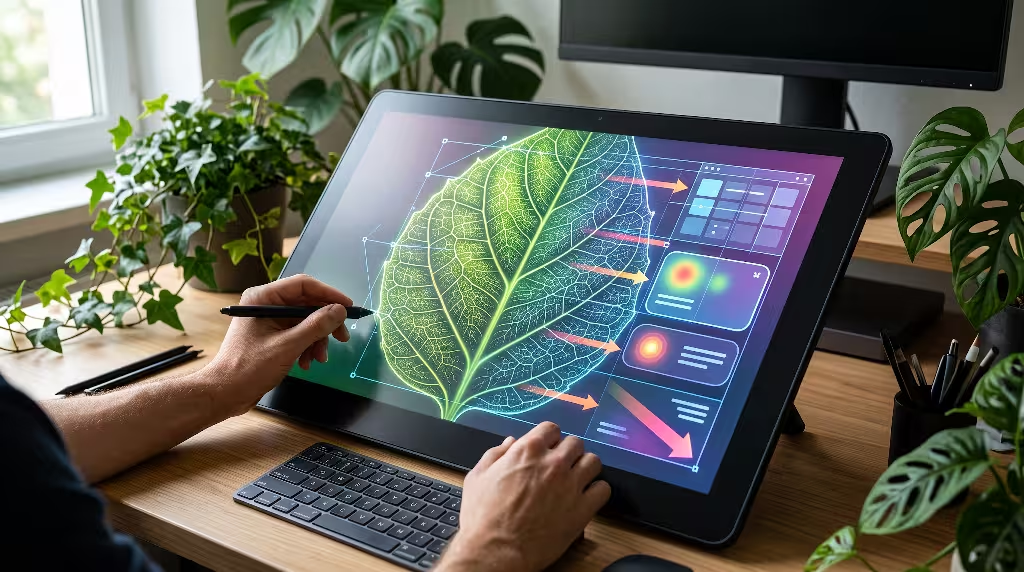
Dynamic Luminance Gradients as Visual Vectors
In nature, daylight rarely falls in harsh, straight lines. As sunlight filters through morning mist or a canopy of leaves, it scatters into a smooth, gradual fade. This natural falloff is logarithmic rather than linear, meaning the light dissolves gently into the surrounding atmosphere.
When creating phototropism in user interface graphics, standard computer-generated linear gradients often feel synthetic and stiff. A simple two-stop linear gradient creates a sharp, artificial line where the two colors meet. To achieve authentic phototropism in user interface components, designers use multi-stop easing gradients that mimic real atmospheric decay.
These organic light gradients act as visual vectors. A visual vector is an invisible line that points the eye in a chosen direction. When a website card has a gentle, feathered highlight at the top left that smoothly darkens toward the bottom right, the human brain automatically follows the illumination down the page. By weaving phototropism in user interface cards and hero sections, you give users clear clues about where to start reading and where to look next.
Specular Anchoring and Micro-Interactions
When light strikes a curved, glossy leaf, it produces a small, bright reflection called a specular highlight. This tiny gleam tells the human eye that the surface is three-dimensional and smooth.
In modern software, we can use specular anchoring to signal that an element can be touched or clicked. A primary call-to-action button, for example, can feature a razor-thin, semi-transparent highlight along its top border. This subtle edge suggests that an overhead light is catching the top bevel of the button.
Furthermore, we can make this lighting interactive. As a visitor moves their mouse across a grid of project cards, the border highlights can shift position based on the cursor location. The cursor acts like a tiny lantern, and the surrounding interface elements react to its presence. Implementing phototropism in user interface micro-interactions in this manner creates a playful, tactile sense of delight. It reassures the user that the system is awake, listening, and responsive to their touch.
Skototropism and Negative Space (The Architecture of Rest)
To understand light, we must also understand darkness. In the tropical rainforest, certain climbing vines exhibit a behavior called skototropism, or negative phototropism. When these young vines sprout on the forest floor, they do not grow toward the light. Instead, they seek out the darkest patch of shadow they can find. That deep shadow usually marks the base of a massive tree trunk, which the vine can then climb toward the sunlit canopy.
In digital design, negative space serves the exact same role as that deep shadow. You cannot build successful phototropism in user interface layouts if every single card, badge, and banner is lit up like a billboard. If everything shines, nothing is visible.
Skototropism in design means treating empty, unlit screen space as a restful sanctuary. Deep slate, charcoal, and muted tones absorb visual energy, allowing the eye to relax between tasks. By carving out calm resting zones, phototropism in user interface compositions ensures that when an illuminated button does appear, it carries genuine meaning and impact. Darkness gives light its purpose.
Frequently Asked Questions about Photoropism in User Interface Design
What is phototropism in user interface design?
Phototropism in user interface design is a biophilic design technique that uses natural light behaviors, directional illumination, and gentle contrast gradients to guide a user’s attention across a software screen.
Just as a living plant bends its stem toward sunlight to capture energy, human eyes automatically travel toward areas of soft illumination and balanced contrast. By mimicking how light travels, reflects, and fades in the physical world, digital phototropism helps people navigate websites and applications without feeling overwhelmed by heavy text, flashy popups, or cluttered menus.
How does light-directed design differ from standard visual hierarchy?
Standard visual hierarchy relies primarily on scale, weight, and color choices. In a typical interface, designers make important items stand out by using massive headline fonts, thick borders, or saturated colors like bright red and electric blue. While this works, it can quickly turn a screen into a noisy, chaotic environment where every element shouts for attention.
Light-directed design, rooted in phototropism in user interface methodology, takes a more refined and biological approach. Instead of simply making an element larger or louder, it adjusts the perceived luminance and depth of the space.
By treating the screen as a coherent three-dimensional environment with consistent ambient light, items gain importance naturally. A user notices an illuminated element because their prehistoric visual instincts tell them to look toward the light, not because an oversized banner forced them to look. The practice of phototropism in user interface systems creates visual order through harmony rather than volume.
Can dynamic lighting in UI violate WCAG accessibility guidelines?
Yes, if dynamic lighting is implemented carelessly, it can easily create accessibility barriers. The Web Content Accessibility Guidelines (WCAG) require specific contrast ratios between text and background surfaces. For normal body text, WCAG 2.2 AA mandates a minimum contrast ratio of 4.5:1, while large text requires at least 3:1.
When designers apply phototropism in user interface screens, they often add glowing halos, soft gradients, or shifting background highlights. If a light gradient flows underneath white or light-gray text, the contrast ratio can quickly drop below the legal 4.5:1 threshold, rendering the words unreadable for people with low vision or color blindness.
To stay fully compliant, phototropism in user interface components must treat lighting as an atmospheric accent, never as an excuse to degrade readability. Text containers should maintain solid or carefully guarded luminance floors. Furthermore, any interactive lighting effects that track the cursor must respect the user’s operating system preferences, especially settings like reduced motion and high-contrast display modes.
What are practical examples of biophilic lighting in modern web interfaces?
You can observe practical examples of phototropism in user interface implementations across many leading modern applications:
- Ambient Glow Dashboards: Modern analytical tools often place high-priority data points inside cards that have a soft, low-opacity radial gradient behind them. This gentle halo draws the user’s attention directly to key metrics, like monthly revenue or server uptime, without using neon warning colors.
- Proximity-Lit Cards: Many creative portfolios and software landing pages feature interactive cards whose borders subtly light up as the mouse moves closer. The border closest to the cursor catches the simulated beam of light, providing instant feedback that the card can be clicked.
- Circadian Rhythm Themes: Some forward-thinking applications adjust their color temperature and light levels based on the user’s local clock. The software delivers crisp, cool lighting during the middle of the day to support alertness, then shifts to warm, amber tones as evening approaches.
- Active Tab Spotlights: Rather than using a plain underline or a stark colored box, a navigation bar can use a soft, top-down spotlight that washes over the active tab, making it appear gently raised into the light.
Each of these examples uses phototropism in user interface styling to create intuitive software that feels alive, grounded, and effortless to use.
The Engineering Stack: Implementation Patterns and Code Architecture
Pure CSS Implementations of Phototropic Flow
Building organic lighting does not require heavy image files or complex graphics engines. Modern CSS gives us powerful, hardware-accelerated tools to create phototropism in user interface layouts with minimal code.
The foundation of this approach relies on modern CSS variables, radial gradients, and the @property rule. By using the @property definition, developers can register custom properties with specific data types, such as percentage or color values. This allows the browser to smoothly animate gradients directly on the graphics processing unit (GPU), avoiding stutter and frame drops.
Here is an example of how you can create an organic, phototropic light surface on an interactive card using modern CSS:
CSS
@property --light-x {
  syntax: '<percentage>';
  inherits: false;
  initial-value: 50%;
}

@property --light-y {
  syntax: '<percentage>';
  inherits: false;
  initial-value: 0%;
}

.phototropic-card {
  --surface-base: #141619;
  --surface-highlight: rgba(255, 255, 255, 0.08);
  --surface-border: rgba(255, 255, 255, 0.12);

  position: relative;
  background-color: var(--surface-base);
  border-radius: 16px;
  padding: 32px;
  overflow: hidden;
  border: 1px solid var(--surface-border);
  transition: --light-y 0.4s ease, border-color 0.4s ease;
}

.phototropic-card::before {
  content: "";
  position: absolute;
  top: 0;
  left: 0;
  right: 0;
  bottom: 0;
  background: radial-gradient(
    800px circle at var(--light-x) var(--light-y),
    var(--surface-highlight),
    transparent 60%
  );
  pointer-events: none;
}

.phototropic-card:hover {
  --light-y: 20%;
  border-color: rgba(255, 255, 255, 0.25);
}
In this code, the pseudo-element creates a wide, soft radial falloff that simulates a light source hovering above the card. When the user hovers over the element, the vertical position of the light shifts down smoothly, making the card look as if it is gently tilting toward the viewer. This basic technique demonstrates how easily phototropism in user interface development can be integrated into standard web projects.
Performance-First JavaScript and WebGL Pipelines
While pure CSS works wonderfully for static or simple hover states, dynamic cursor-tracking across multiple elements requires an efficient JavaScript architecture. If a script updates the DOM directly on every mouse movement, the browser will trigger frequent layout recalculations, causing visible lag.
To deliver smooth phototropism in user interface components at a full 60 frames per second, developers should decouple mouse event listeners from the rendering cycle. This is done by storing the raw mouse coordinates in memory and using window.requestAnimationFrame() to update visual positions only when the screen is ready to paint a new frame.
JavaScript
const cards = document.querySelectorAll('.phototropic-card');
let mouseX = 0;
let mouseY = 0;
let isTicking = false;

window.addEventListener('mousemove', (event) => {
  mouseX = event.clientX;
  mouseY = event.clientY;

  if (!isTicking) {
    window.requestAnimationFrame(() => {
      updateCardLighting(mouseX, mouseY);
      isTicking = false;
    });
    isTicking = true;
  }
}, { passive: true });

function updateCardLighting(x, y) {
  cards.forEach((card) => {
    const rect = card.getBoundingClientRect();
    const localX = ((x - rect.left) / rect.width) * 100;
    const localY = ((y - rect.top) / rect.height) * 100;

    card.style.setProperty('--light-x', `${localX.toFixed(1)}%`);
    card.style.setProperty('--light-y', `${localY.toFixed(1)}%`);
  });
}
For advanced applications with dozens of complex shapes, developers can turn to lightweight WebGL canvas shaders. WebGL runs tiny mathematical programs directly on the graphics card, computing lighting values for millions of pixels at once. This ensures that phototropism in user interface animations remains silky smooth, even on complex dashboards or laptop screens running on battery power.
Adaptive Circadian Theme Modulation
Plants do not live under static light. They follow the daily cycle of the sun, opening their leaves at sunrise, soaking in the bright midday sky, and resting through the night. Our bodies follow a similar cycle called the circadian rhythm, which controls our sleep, mood, and mental focus.
A truly sophisticated application of phototropism in user interface systems connects the digital lighting model to the user’s real-world environment. Using astronomical math libraries, a web application can estimate the sun’s position based on the user’s approximate latitude and local time.
During solar noon, the application presents a crisp, neutral color palette with high ambient brightness, matching the alertness demanded during the workday. As twilight sets in, the application gradually lowers its overall luminance, softens sharp contrast borders, and reduces blue-light wavelengths.
By aligning phototropism in user interface environments with human biology, the software helps reduce eye fatigue and supports healthy sleep patterns. The interface ceases to be a cold glass barrier and becomes a natural extension of the physical room.
Empirical Validation: Testing Phototropic Interfaces
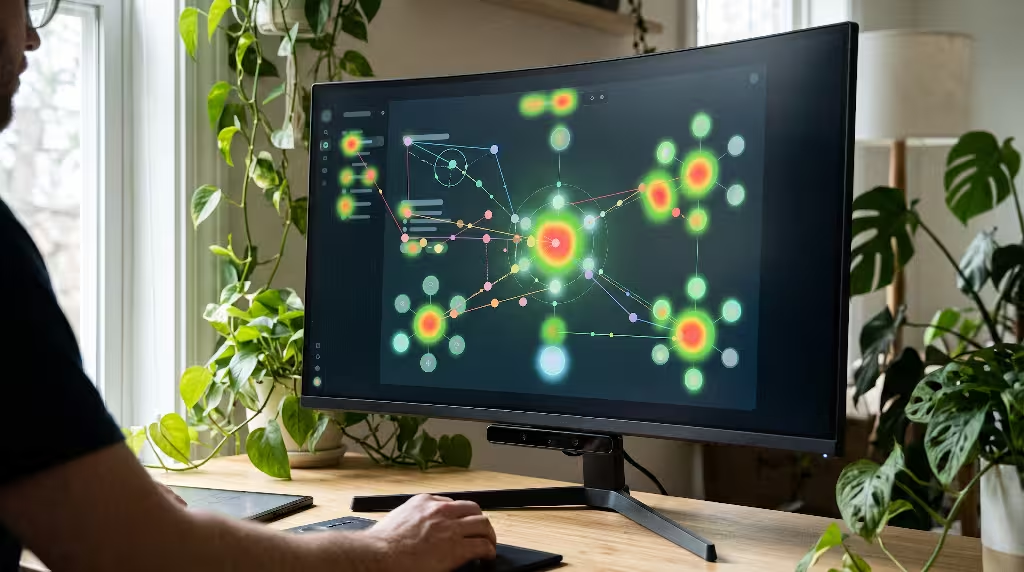
Eye-Tracking and Heatmap Diagnostics
Good design should never rely on guesswork. When we evaluate the success of phototropism in user interface projects, eye-tracking cameras and diagnostic heatmaps provide clear, objective proof of how people actually look at a page.
In traditional web testing, researchers often observe the classic F-shaped reading pattern. When users visit a cluttered, text-heavy page, they read across the top, scan a short distance down, read across again, and then skim straight down the left margin, ignoring the rest of the content. This happens because the user feels overwhelmed and is frantically searching for anything useful.
When a team applies phototropism in user interface layouts, eye-tracking heatmaps show a dramatic change. The messy F-pattern is replaced by smooth, deliberate visual pathways. Because the eye naturally seeks the soft light pools and illuminated borders, users follow the exact visual route the designer intended.
Eye-tracking studies also measure a key metric called Time-to-First-Fixation (TTFF). This metric tracks how many milliseconds it takes for a user to spot an essential item, like a search box or checkout button. Interfaces built around phototropism in user interface principles consistently demonstrate lower TTFF scores, proving that biological lighting helps people find what they need faster and with less mental effort.
Quantitative UX Metrics
Beyond eye-tracking cameras, the business value of phototropism in user interface implementation shows up in standard analytics data:
| Metric | Traditional UI Layout | Phototropic UI Layout | Biological Mechanism |
| Time-to-First-Fixation (TTFF) | 1.8 to 2.4 seconds | 0.7 to 1.1 seconds | Saccadic attraction to localized luminance deltas |
| Task Completion Rate | 74% | 89% | Clear visual affordance and reduced hunting |
| Cognitive Load Index (NASA-TLX) | High (58/100) | Moderate to Low (32/100) | Reduced visual noise and resting dark space |
| Form Abandonment Rate | 34% | 19% | Ambient spotlights keep attention anchored on inputs |
When users spend less time deciphering complex menus and squinting at flat, uncommunicative buttons, their confidence increases. By implementing phototropism in user interface architectures, organizations observe lower bounce rates, fewer user errors, and higher overall satisfaction scores. Clean biological design is not just visually appealing; it delivers measurable commercial results.
Architectural Antipatterns to Avoid
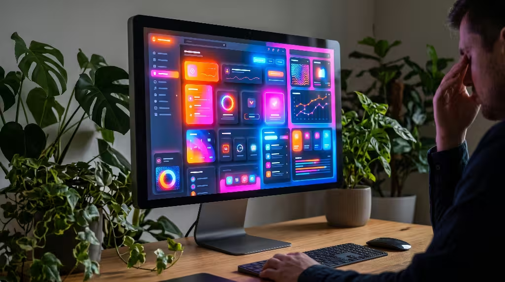
Over-Illumination and Visual Noise (The Glare Effect)
When designers first discover the power of lighting in digital design, they often make the mistake of overusing it. They add bright glows to every card, put radiant halos around every icon, and make buttons pulse with heavy neon colors.
This creates an antipattern known as the glare effect. In nature, looking directly into the midday sun causes temporary blindness and discomfort. On a computer screen, too many bright light sources overwhelm the retina, causing ocular fatigue and headaches.
When every element competes for attention with equal brightness, the principles of phototropism in user interface design completely break down. The eye has nowhere to rest. To prevent this, treat light like a precious resource. Reserve distinct illumination highlights for primary interactive elements, and let secondary content rest comfortably in quiet, muted shades.
Pseudo-Neuromorphic Skeuomorphism
Another common pitfall is confusing biophilic phototropism with outdated skeuomorphism or exaggerated neumorphism. In neumorphic designs, every card and button features thick, double-sided drop shadows, with white highlights on one side and muddy, dark gray smudges on the other.
While this approach tries to mimic physical lighting, it often fails miserably in practical software. The resulting surfaces look soft, squishy, and plastic, like shapes pressed into damp clay. More importantly, these heavy shadows eat up valuable screen real estate and blur the boundary between content cards, making the entire layout look dirty and washed out.
Authentic phototropism in user interface thinking is about clarity and radiance, not plastic clay modeling. Instead of muddy, heavy drop shadows, use thin, crisp specular borders and transparent, luminous gradients. Your goal is to suggest the warmth and direction of natural sunlight, not to create a cartoon replica of plastic objects on a desk.
Performance Degeneration on Low-Power Devices
The final danger in developing phototropism in user interface software is ignoring device performance. Lighting effects that run smoothly at 120 frames per second on an expensive desktop monitor can easily choke an inexpensive smartphone or an older tablet.
If an application attaches heavy mouse-tracking calculations to unoptimized DOM nodes, the mobile browser’s processor will run at maximum capacity. This leads to dropped frames, laggy scrolling, rapid battery drain, and uncomfortably warm hardware. When an interface lags, any feeling of natural, organic harmony is instantly destroyed.
To avoid performance bottlenecks when building phototropism in user interface experiences, always build with progressive enhancement:
- Establish Solid Baselines: Start with clean, accessible, static layouts using standard CSS colors and borders that look great on any device.
- Detect Hardware Capabilities: Use media queries to detect whether the user has a fine pointer (like a desktop mouse) or a touch screen. On touch screens, disable continuous cursor tracking and use simple touch-down highlights instead.
- Respect Battery and Power Constraints: Leverage the CSS
@media (prefers-reduced-motion)query. If a user has enabled battery-saving or motion-reduction settings on their device, shut off dynamic light animations and present beautiful, static lighting states.
By respecting hardware limits, you ensure that the benefits of phototropism in user interface systems remain available, delightful, and accessible to every single user, regardless of what device they carry in their hands.
Natural light has guided living organisms on our planet for hundreds of millions of years. It shapes how trees grow, how flowers open, and how living creatures explore their environments. By taking these time-tested biological lessons and bringing them into modern software, phototropism in user interface design bridges the gap between technology and human nature. When you build digital experiences that work with human biology rather than against it, you create software that feels effortless, intuitive, and genuinely alive.