
Table of Contents
The Interval Between Objects
When you look at a traditional Japanese room, you might notice that the walls are bare and the floor is open. This open area is not empty by mistake. In Japanese culture, this concept is called Ma. It refers to the interval, space, or pause between things. The kanji character for Ma depicts the sun or moon shining through the open space of an open gate. It reminds us that empty space is not simply nothingness. Rather, it is a living, working element that gives form, meaning, and light to everything around it.
In Western web design, people often call this negative space or whitespace. Too often, people treat this space as leftover screen real estate that needs to be filled. Marketing managers often worry when they see large open areas on a screen. They want to pack every pixel with popups, banners, buttons, and blocks of text. In art and design, this nervous habit is known as the fear of empty space. When every inch of a screen screams for attention, nothing stands out. The user feels overwhelmed, anxious, and tired.
When you bring the philosophy of Ma into digital screens, your approach to layout hierarchy changes completely. In digital design, layout hierarchy is how you organize elements so a reader naturally sees what is most important first, what is secondary next, and what is supplemental last. Instead of relying on thick black lines, heavy colored borders, or loud backgrounds to separate content, you can use intentional intervals of space. This creates an intuitive layout hierarchy that lets people read without strain.
In the natural world, spaces between things are never wasted. In a forest, the clearings between tall trees allow sunlight to reach the ground. This space allows fresh saplings to sprout and gives animals a clear path to walk. The open clearing defines the forest just as much as the trees do. In the same way, the intentional space on a web page defines the buttons, the headlines, and the body text. By mastering these spatial intervals, you build a clear layout hierarchy that feels natural, calm, and effortless to explore.
Defining Ma: The Dynamic Presence of Space

To build a strong layout hierarchy, you must first understand that Ma is not dead space. Think about music for a moment. If a pianist presses every key at the exact same time without stopping, you do not hear a song. You only hear a wall of noise. Music is created only when there is silence between the notes. The pause between two notes gives the melody its rhythm, its emotion, and its structure.
Ma works the exact same way on a web page. When you place a headline on a screen, the space above and below that headline is the silence that allows the words to be heard. If the headline touches the paragraph below it, the voice of the headline is muffled. When you give the headline generous room to breathe, its visual volume rises naturally. You do not need to make the font huge or bright red to catch the eye. The interval of space alone establishes its position in the layout hierarchy.
This dynamic presence of space creates a natural visual rhythm. When a person scrolls down a page, their eyes move through a pattern of active elements and resting points. An active element might be an image or a paragraph of text. The resting point is the spatial interval that follows it. This rhythmic pause gives the brain time to absorb the idea before moving to the next concept. A well-planned layout hierarchy uses Ma to orchestrate this rhythm, guiding the reader through the story without cognitive friction.
When you design with Ma, you stop viewing the screen as a blank canvas waiting to be filled. Instead, you view the screen as an open field where every element you place must earn its right to exist. The space around the element is just as valuable as the element itself. This mindset shift is the secret to building an elegant, highly usable layout hierarchy that commands respect and holds attention.
From Architecture to the Browser Viewport
Long before computer screens existed, architects used intervals of space to guide human movement and emotion. Frank Lloyd Wright, one of the greatest American architects, was deeply influenced by Japanese design and the concept of organic architecture. He frequently designed homes with low, narrow entryways that opened up into soaring, high-ceilinged living rooms. This technique, called compression and expansion, uses physical space to create an emotional journey.
When you walk through a low, narrow hallway, you feel a brief moment of compression. Then, when you step into a tall, open room flooded with natural light, you experience an immediate sense of relief, awe, and freedom. This transition does not happen by accident. The architect used spatial intervals to direct your focus and tell your body how to feel.
The browser viewport is simply a digital room. As a web designer, you are an architect of screen space. You can use the exact same principles of compression and expansion to build your digital layout hierarchy. When you bundle related links closely together inside a navigation menu, you create a moment of visual compression. When that menu sits next to an expansive, airy hero section with a single striking sentence, you create an open clearing of expansion.
Traditional Japanese tea houses, built in the Sukiya architectural style, use sliding paper screens, clean wooden posts, and uncluttered mats to create an environment of quiet reflection. There are no heavy decorative moldings or complex carvings. The beauty comes entirely from the proportions of the space and the quality of the light. When you design a website with this same restraint, you remove unnecessary visual clutter. The resulting layout hierarchy feels grounded, peaceful, and remarkably easy to navigate across any device.
The Problem with Modern UI and Attention Fatigue
Open your web browser and visit three typical news websites or corporate software platforms. What do you see? In most cases, you see sticky headers at the top, chat widgets bouncing in the bottom corner, bright banner advertisements blinking in the sidebars, and rows of dense text packed tightly together. Every single part of the screen is fighting for your attention.
This visual clutter causes real mental exhaustion, which psychologists call attention fatigue. The human brain is a pattern-seeking machine. When you land on a webpage, your visual cortex immediately scans the screen to figure out what is important and what can be ignored. If an interface lacks a clear layout hierarchy, your brain has to work overtime to sort through the clutter. Every border, box, badge, and tiny font adds weight to your working memory.
When users feel overwhelmed, their natural reaction is to leave the page. They experience banner blindness, ignore important calls to action, or close the browser tab entirely. This failure of layout hierarchy hurts user satisfaction, and it directly damages business goals like conversion rates and sales.
When you replace noisy design tricks with intentional negative space, you solve this problem at its root. By stripping away heavy container boxes and relying on open intervals of space, you lift the mental burden from your visitor. The layout hierarchy becomes self-evident. The user does not have to spend energy wondering where to look first, because the space naturally funnels their gaze to the right place.
The Thesis of Spatial Intervals
Structuring layouts around intentional spatial intervals creates visual hierarchy faster and more intuitively than explicit dividers, borders, or color fills.
When many designers want to separate two sections of content, their first instinct is to draw a horizontal gray line between them. If they want to highlight a testimonial or a feature, they put it inside a colored card with a drop shadow and an outline. While these decorative elements can occasionally be helpful, overusing them creates visual noise that breaks apart the natural flow of the page.
Think about reading an open book. A printed book does not put a black box around every single paragraph. It does not place a bright yellow border around the chapter title. Instead, the book relies on margins, paragraph indents, and vertical space above headings to establish its layout hierarchy. Your eyes have read books this way for centuries without any trouble.
Digital layouts should work with the same quiet confidence. When you let negative space do the heavy lifting, your user interface gains an effortless clarity. The spatial interval between elements creates an unmistakable layout hierarchy that feels clean, lightweight, and deeply satisfying to read.
The Neurological and Cognitive Foundation of Spatial Intervals
To understand why negative space is so powerful, you have to look at how the human mind processes visual information. Our eyes do not take in an entire web page as a single, static photograph. Instead, our eyes jump rapidly across the screen in quick movements called saccades. Between these jumps, our eyes pause briefly on specific points of interest. These pauses are called fixations.
During each fixation, our brain processes a small amount of visual detail and stores it in working memory. However, working memory is strictly limited. Cognitive Load Theory explains that human beings can only hold a few pieces of information in their conscious thoughts at one time. If a web design bombards the brain with dozens of competing visual stimuli, the working memory reaches an overload state.
A clear layout hierarchy acts as a filter that protects working memory. When you use generous intervals of negative space, you reduce the number of visual elements competing for fixation points. The eye can rest peacefully in empty zones while the brain digests the information it just gathered. By controlling the timing and location of these fixations, you use layout hierarchy to guide the reader through the content in a smooth, logical progression.
This approach honors the basic limits of human biology. Instead of fighting against the brain’s natural cognitive processing limits, an interface built with Ma works alongside them. The resulting layout hierarchy feels intuitive because it matches how our neural pathways naturally sort, group, and retain information.
Cognitive Load and Working Memory in Digital Layouts
Psychologist George Miller published a famous paper showing that the average person can only hold about seven items, plus or minus two, in their short-term memory. When applied to digital design, this means that if your navigation bar contains twelve items packed closely together, the user cannot easily hold that structure in their mind. The layout hierarchy falls apart, and the navigation becomes frustrating to use.
Educational psychologist John Sweller expanded on this concept by dividing cognitive load into three distinct types: intrinsic, germane, and extraneous. Intrinsic load is the effort required to understand the actual topic you are reading about. Germane load is the work your brain does to connect new facts to things you already know. Extraneous load is the wasted mental effort caused by poor presentation and messy design.
A bad layout hierarchy introduces massive amounts of extraneous cognitive load. When lines of text are crammed too close together, your brain has to work hard just to keep your place from one line to the next. When buttons sit on top of background images without enough breathing room, your eyes struggle to separate the text from the background clutter.
By introducing generous negative space, you eliminate extraneous cognitive load almost entirely. The brain can dedicate all of its energy to understanding the actual message on the page. In this way, an intentional layout hierarchy directly improves reading comprehension, user comfort, and information retention.
Gestalt Principles Re-examined Through the Lens of Ma
In the early twentieth century, Gestalt psychologists studied how human beings make sense of chaotic visual fields. They discovered that the human brain naturally groups separate visual elements into organized wholes based on universal rules. When you examine these Gestalt principles through the lens of Ma, you realize that space is the active glue that makes these rules work.
The first major rule is the Law of Proximity. This law states that objects that are placed close to each other are perceived as belonging together, while objects spaced far apart are seen as separate. In web design, you use proximity to build a strong layout hierarchy. If you place a small subheadline close to a large main headline, and then leave a wide gap before the paragraph starts, the user instantly understands that the subheadline belongs to the title. You do not need an arrow or a box to show that connection. The spacing tells the entire story.
The second critical rule is Figure-Ground segregation. When you look at any image, your brain instantly decides what is the figure (the main object of focus) and what is the ground (the background plane). A solid layout hierarchy requires a clear distinction between the two. When an interface has too little negative space, the figure and the ground bleed together into a flat, confusing wall of pixels.
Ma acts as the clear ground that pushes the figure forward. By surrounding your primary buttons, headlines, and callout quotes with generous negative space, you make the figure pop with total clarity. The eye never has to guess what to look at. The layout hierarchy becomes so clean that even a child or an absolute beginner can navigate the interface without hesitation.
Biophilic Affordances: Why Nature Loves Clearings
Biophilic design is the practice of connecting people with the natural world through the built environment. As human beings, we evolved over millions of years in open savannas, mixed woodlands, and along riverbanks. Our visual systems were shaped by these natural landscapes, not by flat plastic screens or industrial concrete boxes. Because of this evolutionary heritage, human beings possess built-in spatial preferences.
One of the most famous habitat theories in environmental psychology is the Prospect-Refuge theory, developed by Jay Appleton. It explains that human beings feel safe and comfortable in environments where they have an open view forward (prospect) while feeling sheltered from behind (refuge). We love standing at the edge of a woodland clearing. The dense trees behind us provide safety, while the sunny, open space ahead allows us to see resources and anticipate changes from a distance.
When a website is crowded with content from edge to edge, it triggers a subtle, subconscious feeling of being trapped in dense, impenetrable underbrush. There is no prospect. There is no clearing. The user feels boxed in by advertisements, popups, and cramped columns of text.
When you apply the Japanese concept of Ma to web design, you create digital clearings. A wide, open section of negative space acts like a sunlit meadow in a forest. It gives the user a vantage point where they can pause, look around, and choose their next path without feeling rushed. By mimicking these spatial patterns found in nature, you create a layout hierarchy that feels welcoming, peaceful, and instinctively familiar.
Micro Ma vs. Macro Ma: Deconstructing the Structure
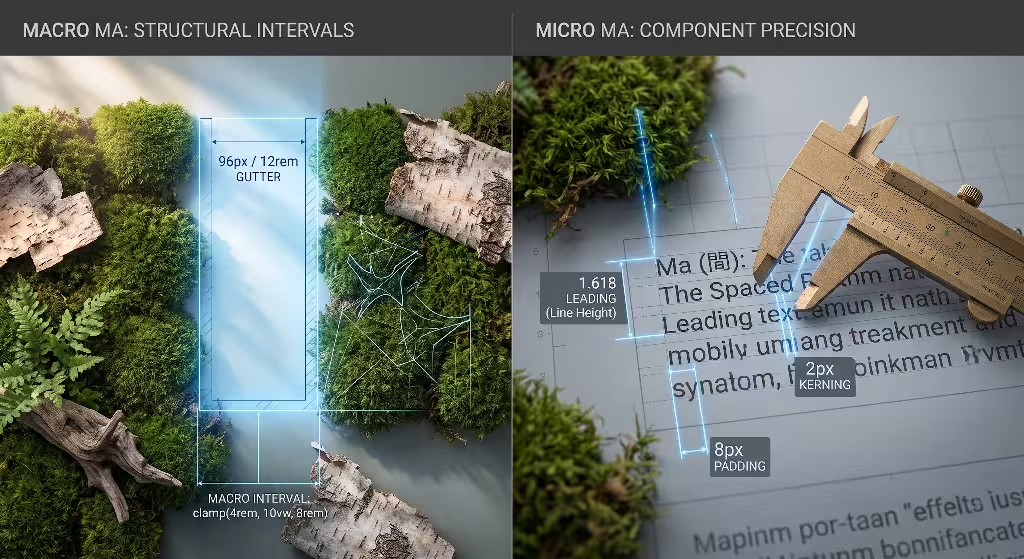
To build a professional layout hierarchy, you must learn to work with negative space at two different scales: Macro Ma and Micro Ma. Both scales are essential, and they must work together in harmony to create a polished, coherent user experience.
Macro Ma refers to the large intervals of space on a page. This includes the wide margins on the left and right sides of your content, the vertical gutters between columns, and the generous empty gaps that separate major sections as you scroll down. Macro Ma forms the broad architectural framework of your page. It sets the overall tone and dictates the pace at which the user moves through your story.
Micro Ma refers to the tiny intervals of space between small interface elements. This includes the leading (the line height between lines of text), the kerning (the space between individual letters), the space between an icon and its text label, and the padding inside a clickable button. While Micro Ma might seem minor, it has a massive impact on daily usability and visual comfort.
If your layout hierarchy has great Macro Ma but poor Micro Ma, the page might look dramatic from a distance, but the text will be miserable to read up close. If you have great Micro Ma but poor Macro Ma, individual paragraphs will read easily, but the overall page will feel disorganized and cluttered. Mastering both scales is the key to creating an exceptional layout hierarchy.
Macro Ma: Structural and Architectural Intervals
Think of Macro Ma as the rooms and hallways of a house. When you design a long-form landing page or an educational article, you are guiding the visitor through a multi-step journey. If you jump straight from one topic to the next without any breathing room, the reader experiences mental whiplash.
By using wide vertical gaps between sections, you create clear visual pauses. These pauses signal to the reader that one thought has ended and a new thought is about to begin. This structural spacing builds a predictable layout hierarchy that allows people to skim the page quickly, locate the exact topic they need, and dive in without feeling lost.
Macro Ma also controls the margins of your reading container. A common mistake in beginner web design is letting lines of text stretch all the way from the left edge of a wide desktop screen to the right edge. When a line of text is too long, the reader’s eyes have a difficult time finding the start of the next line when sweeping back across the screen.
By using generous macro margins to limit the reading column to a comfortable width, you protect the reader from strain. The empty space on the left and right sides of the text acts as a protective buffer. It frames your words, gives them dignity, and strengthens the central layout hierarchy of your primary content.
Micro Ma: Typographic and Component-Level Intervals
While Macro Ma builds the house, Micro Ma polishes the woodwork. The most important place to master Micro Ma is in your typographic styling. Reading text on an illuminated screen is inherently more tiring on the human eye than reading ink on matte paper. If your lines of text are packed tightly together, your eyes will tire quickly.
To build an accessible layout hierarchy, you must give your text room to breathe. For body copy, this usually means setting your line-height to around 1.5 to 1.6 times the size of your font. This vertical space creates clean, open channels between lines that allow the eye to glide smoothly from left to right. When moving to headings, you should tighten this ratio slightly, because large letters naturally carry more built-in whitespace around their shapes.
Micro Ma also dictates how you space paragraphs and lists. Always ensure that the space after a paragraph is larger than the space between the lines inside that paragraph. This basic application of the Law of Proximity reinforces your layout hierarchy. It tells the reader at a glance where a paragraph ends, preventing separate thoughts from blending together into an intimidating block of text.
Finally, consider the padding inside your interactive elements, such as buttons and form inputs. A button that squeezes its label right up against its border looks cheap and uninviting. When you increase the internal padding, you give the button a sense of physical cushion. The button becomes easier to spot, feels satisfying to click, and stands out as a clear interactive target within the layout hierarchy.
Establishing the Spatial Ratio: Fibonacci and Modular Scales
How do you decide how many pixels of space to put between your elements? If you pick random numbers out of thin air, your design will look messy and disjointed. A professional layout hierarchy relies on a mathematical spacing scale that creates visual harmony across the entire screen.
Instead of guessing, many great designers turn to nature for inspiration. Throughout the natural world, living organisms grow according to mathematical proportions, such as the Fibonacci sequence (1, 1, 2, 3, 5, 8, 13, 21…) and the golden ratio. You can see these proportional relationships in the spiral shell of a chambered nautilus, the arrangement of seeds in a sunflower head, and the branching patterns of oak trees.
You can adapt these same organic proportions into a modular spacing scale for your web layouts. By creating a scale of recurring spacing values, you ensure that every margin, padding, and gap on your website shares a mathematical family resemblance:
| Token Name | Proportion Value | Relative Rem Unit | Computed Pixels (at 16px Base) | Typical Layout Role |
--space-xs | 1 unit | 0.5rem | 8px | Button padding, icon-to-label gaps |
--space-sm | 2 units | 1.0rem | 16px | Paragraph breaks, tight component spacing |
--space-md | 3 units | 1.5rem | 24px | Card gutters, list item separation |
--space-lg | 5 units | 2.5rem | 40px | Component boundaries, small section breaks |
--space-xl | 8 units | 4.0rem | 64px | Sub-section margins, banner padding |
--space-xxl | 13 units | 6.5rem | 104px | Major architectural section transitions |
Notice how each step in this scale is related to the others. When your layout hierarchy is governed by an intentional scale like this, the visual rhythm feels balanced and natural. Your elements align with an invisible, satisfying order that users feel instinctively, even if they cannot name the math behind it.
Engineering Negative Space: Modern CSS Implementation Patterns
Understanding the philosophy of Ma is wonderful, but you must also know how to write the code that brings this vision to life on modern screens. In the early days of web development, creating consistent whitespace was difficult. Developers relied on fragile hacks like empty spacer image files, nested tables, or messy margin overrides that broke easily on mobile phones.
Today, modern CSS gives us incredible layout engines built specifically to manage spatial intervals. By using tools like CSS Grid, Flexbox, and the clamp() function, you can build a responsive layout hierarchy that adapts gracefully to any screen size, from a compact smartphone to a massive desktop monitor.
When writing clean CSS, you should treat space as a first-class citizen. Instead of pushing elements around with negative margins or fragile floats, you define explicit layout tracks and allow the browser to distribute the empty space automatically. This approach keeps your code clean, modular, and easy to maintain over time.
Fluid Spacing Scales with the clamp() Function
One of the hardest challenges in web design is making negative space look great on both small phones and giant desktop displays. A 64-pixel margin that looks airy and majestic on a desktop workstation will push all the content off the screen on a mobile phone. Conversely, a 16-pixel gap that looks fine on a phone will look cramped and crowded on a large monitor.
In the past, developers wrote dozens of media queries to change spacing pixel by pixel at specific screen breakpoints. This created rigid, jumpy designs that often broke on intermediate screen sizes like tablets. Today, we can use the modern CSS clamp() function to create fluid, smooth spatial intervals that scale automatically based on the width of the screen.
The clamp() function takes three parameters: a minimum allowed size, an ideal preferred size that changes with the viewport width, and a maximum allowed size. By using clamp() inside your CSS custom properties, you can create a layout hierarchy that breathes dynamically:
CSS
:root {
  /* Fluid spacing variables based on viewport width */
  --space-ma-sm: clamp(0.75rem, 0.6rem + 0.75vw, 1.25rem);
  --space-ma-md: clamp(1.5rem, 1.1rem + 2vw, 3rem);
  --space-ma-lg: clamp(3rem, 2rem + 5vw, 7.5rem);
  --space-ma-xl: clamp(5rem, 3.5rem + 7.5vw, 12rem);
}

.section-container {
  /* Generous vertical macro spacing that scales smoothly */
  padding-block: var(--space-ma-xl);
  padding-inline: var(--space-ma-md);
}

.article-body > * + * {
  /* Consistent micro spacing between text blocks */
  margin-block-start: var(--space-ma-sm);
}

.article-body > h2 {
  /* Higher spatial separation to reinforce layout hierarchy */
  margin-block-start: var(--space-ma-lg);
}
With this fluid approach, you never have to worry about your layout hierarchy falling apart on odd screen sizes. As the viewport expands, the negative space expands alongside it at a smooth, proportional rate. The interface retains its organic balance across all devices.
Decoupling Content from Structure with CSS Grid and Intrinsic Sizing
CSS Grid is the ultimate tool for implementing Ma on the web. In the past, if you wanted space around an element, you had to attach margin or padding directly to that element. This mixed your content styling with your structural layout rules, creating messy code that was difficult to refactor.
CSS Grid allows you to completely decouple content from structural space. You can define a parent grid container, set up your columns and rows, and use the gap property to establish your spatial intervals. The elements placed inside that grid have no idea how much space surrounds them; they simply rest naturally within the tracks you create:
CSS
.card-grid {
  display: grid;
  /* Automatically fit columns without media queries */
  grid-template-columns: repeat(auto-fit, minmax(min(100%, 20rem), 1fr));
  /* Establish clean, structural macro intervals */
  gap: var(--space-ma-md);
  align-items: start;
}
Notice how clean this pattern is. There are no margin hacks on the individual cards. If you decide to add, remove, or rearrange cards, the spatial interval between them remains identical. The layout hierarchy stays intact without requiring any adjustments to the child components.
You can also use CSS Grid to create sophisticated asymmetrical layouts inspired by Japanese art. By naming specific grid lines and leaving certain grid tracks completely empty, you can let the natural background show through in purposeful vertical stripes. This technique creates a distinctive layout hierarchy that feels custom, artistic, and modern.
Subgrid and Preserving Spatial Integrity
For many years, a major limitation of CSS Grid was that child elements could not easily participate in the grid of their parent. If you had a row of three cards, and each card contained a title, a paragraph, and a button, the buttons would rarely line up neatly if one card had a longer title than the others. Developers used to fix this by adding rigid, fixed heights, which frequently caused text to overflow and break the layout hierarchy.
The modern CSS subgrid feature solves this problem completely. With subgrid, child cards can inherit the row tracks and spatial gaps of their parent container. This ensures that every line of text and every button aligns across the entire horizontal row:
CSS
.card-grid {
  display: grid;
  grid-template-columns: repeat(3, 1fr);
  gap: var(--space-ma-lg);
}

.card {
  display: grid;
  /* Card spans three rows and inherits the parent's row sizing */
  grid-row: span 3;
  grid-template-rows: subgrid;
}
When you use subgrid, the micro-intervals inside separate components align with mechanical precision. This alignment reinforces your layout hierarchy across complex interfaces. Even when user-generated content varies in length, your structural intervals remain rock-solid and visually calm.
Frequently Asked Questions About Negative Space and Layout Hierarchy
When designers and developers begin incorporating Ma into their work, they often encounter questions from team members, clients, and stakeholders. Here are direct answers to the most common questions surrounding negative space and layout hierarchy.
What is the difference between negative space and whitespace in design?
Whitespace is the everyday technical term used by digital designers to describe any area of a page that is left unmarked by text, graphics, or code. It is often treated merely as background real estate or the absence of content.
Negative space, viewed through the philosophy of Ma, treats these open areas as an active, living design material. Ma recognizes that the interval between objects has its own presence, weight, and purpose. While whitespace describes what is not there, Ma celebrates what the space accomplishes: providing rhythm, creating clarity, and establishing an effortless layout hierarchy.
How does negative space improve visual hierarchy?
Negative space establishes hierarchy through contrast, isolation, and proximity. The human visual system is naturally drawn to contrast. When an element is surrounded by a wide field of open space, it becomes visually isolated from surrounding distractions. This isolation signals high importance to the brain.
Instead of making headlines oversized or coloring buttons in aggressive neon tones, you can elevate an element simply by increasing the spatial interval around it. This creates a refined layout hierarchy where primary actions stand out clearly without adding visual clutter to the screen.
How do you prevent negative space from feeling like empty or broken design?
Negative space feels empty or broken only when it lacks intentional alignment and proportion. If random gaps appear across a page without rhyme or reason, the user will assume that an image failed to load or that a database query broke.
To prevent this, you must anchor your negative space to a rigorous grid and a consistent spacing scale. Align the edges of your open spaces with other elements on the screen. When empty intervals follow a clear mathematical rhythm, users perceive them as deliberate, premium, and calm rather than incomplete.
What is the Japanese concept of Ma in art and architecture?
In traditional Japanese culture, Ma refers to the fundamental pause, interval, or empty space that gives shape to life. In flower arrangement (Ikebana), Ma is the empty space between branches that allows each blossom to express its individual character. In Noh theater, Ma is the heavy silence between spoken lines that conveys deep emotion.
In traditional architecture, Ma is the open room formed by sliding screens that allows living space to blend seamlessly with surrounding gardens. Across all these disciplines, Ma teaches that form and space are inseparable partners. You cannot have one without the other.
Biophilic Case Study: The Forest Clearing Phenomenon

To see how these concepts function in real-world software, let us examine an analytical case study. A major enterprise analytics platform was struggling with poor user engagement and low customer retention. Their central product was an executive dashboard used by supply chain managers to monitor global shipping routes.
The original interface suffered from extreme information density. The design team had packed dozens of data tables, status badges, metric cards, and charts onto a single screen. Every metric was wrapped in a hard gray border, backed by a drop shadow, and separated by thin black lines. There was virtually no negative space.
Users reported severe eye fatigue within twenty minutes of using the software. The lack of a clear layout hierarchy forced managers to hunt through the screen manually to find mission-critical alerts. Important shipping delays were frequently overlooked because they were buried in visual noise.
+-------------------------------------------------------------+
| ORIGINAL DESIGN: Dense, noisy, lacking layout hierarchy     |
| [Card 1: Data] [Card 2: Data] [Card 3: Data] [Card 4: Data] |
| |Border|Shadow||Border|Shadow||Border|Shadow||Border|Shadow||
| [Dense Table with 15 Rows, Heavy Dividers, and Tiny Fonts]  |
| [Chart 1 w/ Border] [Chart 2 w/ Border] [Chart 3 w/ Border] |
+-------------------------------------------------------------+

+-------------------------------------------------------------+
| BIOPHILIC MA REDESIGN: Clear layout hierarchy via space     |
|                                                             |
|   PRIMARY CLEARING: Critical Alerts (Generous Macro Ma)     |
|   Large metric, quiet label, no borders, wide breathing room|
|                                                             |
|   SECONDARY TRACK: Supporting Metrics (Organized via Grid)  |
|   Clean columns, borderless rows, proportional micro gaps   |
|                                                             |
|   TERTIARY ARCHIVE: Historical Details (Contained below)    |
+-------------------------------------------------------------+
The redesign team completely dismantled the layout. They removed all container boxes, borders, and heavy drop shadows. Inspired by the natural pattern of a forest clearing, they introduced the principles of Ma:
- The Primary Clearing: The single most important metric (system-wide shipping exceptions) was given a massive field of negative space at the top of the screen. No borders were used; the large, dark numbers rested on a calm, off-white background with wide padding.
- Rhythmic Grouping: Secondary metrics were arranged in a three-column grid governed by a 24-pixel spatial interval. Proximity was used to bind related labels to their data points without a single divider line.
- Tertiary Grounding: Historical logs were moved lower on the page, separated from the primary clearing by an expansive 96-pixel macro interval.
The results of this spatial restructuring were immediate and measurable. In usability testing using the NASA Task Load Index (NASA-TLX), users showed a 42% reduction in subjective cognitive workload. Task Completion Time for identifying shipping bottlenecks dropped from 84 seconds down to 19 seconds.
By allowing negative space to define the layout hierarchy, the redesign team turned an exhausting, stressful software tool into an efficient, peaceful interface that executives genuinely enjoyed using.
Accessibility, Contrast, and Responsive Edge Cases
While designing with negative space creates beautiful layouts, you must ensure that your spatial decisions do not compromise digital accessibility. Web accessibility is not an optional extra; it is a fundamental civil right and an essential engineering standard. A good layout hierarchy must work for everyone, including people with low vision, motor impairments, and cognitive differences.
The Web Content Accessibility Guidelines (WCAG) provide clear technical rules that intersect directly with spatial design. When you plan your spatial intervals, you must account for responsive reflow, interactive touch target sizes, and the contrast perception of empty space.
Neglecting accessibility in the pursuit of minimalism is a major design failure. True mastery of Ma means using space to make an interface more accessible, more transparent, and easier to use for every human being, regardless of the hardware or assistive tools they rely on.
WCAG 2.2 Considerations: Reflow and Responsive Zoom
WCAG Success Criterion 1.4.10 focuses on Reflow. It requires that web content can be zoomed up to 400% on a desktop display without forcing the user to scroll in two dimensions (both horizontally and vertically) to read lines of text. When a user zooms in to 400%, a typical 1280-pixel screen behaves like a 320-pixel mobile viewport.
If your layout relies on rigid, hard-coded pixel margins for its layout hierarchy, your layout will shatter under high zoom. A 100-pixel margin that looks balanced at normal size will consume almost the entire screen at 400% zoom, forcing the actual words into a tiny, unreadable column two characters wide.
This is why fluid spacing tokens built with modern CSS are so critical for accessibility. When you define your spatial intervals using relative units and viewport-based calculations, the negative space collapses gracefully as the page zooms:
CSS
.content-wrapper {
  /* Using max-width and percentage-based inline padding */
  max-width: 75ch;
  margin-inline: auto;
  padding-inline: clamp(1rem, 4vw, 3rem);
}
By ensuring that your macro intervals scale down smoothly, you preserve your layout hierarchy under extreme zoom conditions. Low-vision users can read your words comfortably without constantly scrolling back and forth horizontally.
Touch Targets vs. Spatial Voids
Another critical accessibility standard is WCAG Success Criterion 2.5.8, which governs Target Size. This guideline states that interactive targets (such as buttons, navigation links, and form checkboxes) must have an adequate size or sufficient spacing around them to prevent accidental clicks.
When implementing the open spacing of Ma on touch screens, designers sometimes make the mistake of creating tiny, delicate link text surrounded by wide empty voids. While this might look artistic, it creates serious usability problems for users with tremors, arthritis, or limited fine motor control. If a user tries to tap a tiny link with their thumb while riding a bus, they will easily miss the link and hit the empty space instead.
You can solve this by decoupling the visual presentation of an element from its clickable hit area. Use CSS padding on the interactive anchor tag itself, rather than margin on the surrounding container. This expands the clickable touch zone across the empty space while maintaining the clean visual layout hierarchy:
CSS
.nav-link {
  display: inline-block;
  /* Visual font size remains elegant and readable */
  font-size: 1rem;
  /* Micro padding creates a generous touch target */
  padding-block: 0.75rem;
  padding-inline: 1rem;
  /* Minimum touch target size ensures mobile accessibility */
  min-height: 44px;
  min-width: 44px;
}
This pattern gives you the best of both worlds. Visually, the navigation links appear open, airy, and uncluttered, preserving your intentional layout hierarchy. Functionally, the interactive hit target is broad and forgiving, meeting accessibility guidelines and preventing user frustration.
Dark Mode and Spatial Perception Across Display Technologies
When designing with negative space, you must consider how color mode and hardware displays change the human perception of space. A spatial interval that feels comfortable on a standard white background can feel radically different when viewed in a dark mode theme on an OLED mobile display.
On an OLED screen, true black pixels (#000000) turn off completely. They emit zero light. When bright white text is placed directly onto a pure black OLED background, the extreme luminance contrast causes a visual artifact called light bleed or irradiation. The bright letters appear to spill over into the surrounding dark void, making the negative space feel smaller and causing eye fatigue during prolonged reading.
To maintain a balanced layout hierarchy in dark mode environments, you should make subtle adjustments to your colors and spatial proportions:
- Avoid Pure Black: Use deep charcoal or dark slate tones (such as
#121212or#1a1a24) instead of pure black for your primary backgrounds. This softens the luminance contrast and stops light bleed. - Soften Text Brightness: Reduce high-contrast body copy from pure white (
#ffffff) to a soft off-white or light gray (such as#e0e0e0). This protects the crispness of your letterforms. - Increase Letter Spacing Slightly: Add a tiny amount of tracking (
letter-spacing: 0.01em) to body text in dark mode. Because dark backgrounds make text appear slightly thinner and tighter, this micro-spatial adjustment preserves the legibility of your layout hierarchy.
By tuning your spatial intervals for both light and dark modes, you ensure that your design remains comfortable, legible, and visually balanced across all lighting environments.
Strategic Implementation Checklist for Design Systems
Bringing the philosophy of Ma into an organization requires moving from abstract theory to daily engineering habits. If your team does not have a shared system for managing space, developers will continue picking arbitrary pixel numbers, and your layout hierarchy will unravel.
Use this practical checklist to audit your design system and build spatial discipline into your workflow:
[ ] Establish a Unified Spacing Scale
    Define a strict set of 6 to 8 spacing tokens in your design tokens repository.
    Base these values on an organic modular ratio (such as Fibonacci or an 8pt system).

[ ] Ban Arbitrary Pixel Spacing in Production Code
    Configure style linters to disallow hardcoded margin and padding values.
    Require all spatial intervals to pull from your standardized spacing tokens.

[ ] Replace Decorative Boxes with Structural Intervals
    Conduct a visual audit of existing templates.
    Remove unnecessary borders, card backgrounds, and horizontal dividing lines.
    Use Macro Ma gutters to separate thoughts before reaching for a graphical divider.

[ ] Audit Typographic Micro Spacing
    Set body line heights to a minimum of 1.5.
    Ensure paragraph spacing (`margin-block-end`) is visibly larger than line-height.
    Set headline line heights tighter (between 1.1 and 1.25) to prevent floating words.

[ ] Implement Fluid Viewport Scaling
    Replace static desktop media queries with CSS `clamp()` functions for section padding.
    Test your layouts across small phones (320px) and wide desktop screens (1920px+).

[ ] Verify Accessibility and Target Bounds
    Audit all interactive elements to guarantee a minimum 44x44px touch target.
    Test full-page zooming at 400% to ensure content reflows without horizontal scroll.
    Validate contrast ratios across both light and phenological dark themes.
When you follow this checklist, negative space stops being an afterthought or a source of debate between designers and project managers. Instead, it becomes an objective, engineered system. Your layout hierarchy gains structural integrity, your interfaces breathe with the quiet confidence of Ma, and your users enjoy a calm, natural digital experience.