Table of Contents
Deconstructing Wabi-Sabi in Digital Visual Systems
In software architecture and natural botany, living systems do not maintain rigid geometric lines. Every cell wall, leaf margin, and crystal lattice contains minor shifts in structure. Modern digital design often ignores this truth. Over the past decade, web interfaces have relied on cold grids, pure white backdrops, and bright synthetic hues. This sterile look produces mental fatigue for users who spend eight to twelve hours a day staring at backlit screens. At Silphium Design LLC, we study how biological patterns interface with human computer interaction. Our core focus combines organic biology with computational clarity to build websites that feel alive, stable, and restorative.
A key foundation for this approach is wabi-sabi branding. Rooted in traditional Japanese thought, the wabi-sabi worldview values transience, humble balance, and the quiet dignity found in weathered materials. When applied to digital systems, wabi-sabi branding strips away artificial gloss and replaces it with organic pacing, gentle asymmetries, and pigments pulled directly from the earth.
This article examines how to construct a comprehensive visual identity using wabi-sabi branding. We will explore its philosophical origins, its biological foundations, practical color schemes with precise digital values, accessibility math, textural treatments, and step by step deployment strategies. By merging ancient aesthetic discernment with rigorous technical optimization, your brand can build deep digital trust and enduring emotional resonance.
+-----------------------------------------------------------------------+
|                 WABI-SABI BRANDING: CORE ATTRIBUTES                   |
+-----------------------------------+-----------------------------------+
| TRADITIONAL PILLARS               | DIGITAL TRANSLATION               |
+-----------------------------------+-----------------------------------+
| Fukinsei (Asymmetry)              | Off-axis grids, organic layouts   |
| Kanso (Simplicity)                | Stripped UI, minimal cognitive load|
| Koko (Austerity / Weathering)     | Organic micro-textures, matte tones|
| Shizen (Naturalness)              | Biophilic math, earth-derived hex |
| Yugen (Subtle Grace)              | Generous whitespace, quiet depth  |
| Datsuzoku (Freedom from Formula)  | Breaking rigid template norms     |
| Seijaku (Tranquility)             | Low-contrast, glare-reducing tones|
+-----------------------------------+-----------------------------------+
Defining Wabi-Sabi Through a Biophilic Lens
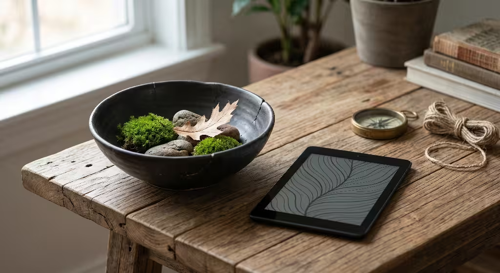
Biophilic design is the practice of connecting people to nature inside built and digital environments. Humans evolved outdoors over millions of years surrounded by natural textures, shifting sunlight, and organic colors. Our sensory systems are fine-tuned to process irregular, natural signals rather than sterile pixels.
When we evaluate wabi-sabi branding through this lens, we see that it reflects the fundamental patterns of biology:
- Natural forms are asymmetric. No two leaves on an oak branch have the exact same shape.
- Materials decay and mature over time. Wood weathers to soft gray, stone smooths under water, and copper oxidizes into rich verdigris.
- Balance comes from relationships, not rigid central alignment.
In digital design, wabi-sabi branding rejects mechanical perfection. It does not mean building messy or broken websites. Instead, it means introducing thoughtful, natural variance into visual assets. We use organic typography, warm paper tones instead of bright neon whites, and spatial layouts that breathe. By honoring the natural life cycle of materials, wabi-sabi branding makes an interface feel like an extension of the physical world.
Why Modern Branding Demands Natural Imperfection
The human visual cortex processes artificial environments with measurable cognitive strain. Pure electric white screens emit high amounts of blue spectrum light. This light signals daylight to the brain, suppressing melatonin and increasing eye strain over long periods of reading. When interfaces use high-contrast, neon colors to demand user attention, they trigger subtle stress responses.
Sterile Modernism (Digital Fatigue)
[ Pure White #FFFFFF ] ---> High Blue-Light Emission ---> Sensory Exhaustion

Wabi-Sabi Branding (Restorative Baseline)
[ Raw Linen #F4F0EA  ] ---> Diffused Natural Warmth  ---> Sustained Visual Comfort
Modern consumers are tired of visual noise and aggressive marketing tricks. When every company uses the same slick vector shapes and bright gradient buttons, every product begins to look identical. This sameness erodes brand trust.
Adopting wabi-sabi branding solves this problem in two ways:
- Visual Restoration: Earth tones, unbleached backdrops, and muted mid-tones lower optical fatigue. This encourages visitors to stay on your page longer, read more deeply, and absorb complex technical information with ease.
- Emotional Resonance: Perfect objects often feel mass produced and impersonal. A design that celebrates subtle natural quirks feels human, honest, and grounded. Through wabi-sabi branding, an organization demonstrates self-assurance and quiet authority without shouting.
Organic Base Pigments: Tonal Breakdown
Every digital palette begins with its primary substrate: the background canvas. In traditional web development, developers default to absolute white (#FFFFFF) alongside stark black (#000000). In nature, these harsh extremes do not exist.
To build an authentic system of wabi-sabi branding, base pigments must be sampled from raw minerals, plant fibers, and natural sediment.
+------------------+---------------+-----------------------------------------------+
| Color Name       | Hex Code      | Natural Biological Source                     |
+------------------+---------------+-----------------------------------------------+
| Unbleached Washi | #F6F3EC       | Raw mulberry bark fibers pressed into paper   |
| River Silt       | #DDD6C9       | Fine alluvial clay deposits along waterways   |
| Oat Straw        | #ECE5D8       | Sun-dried field grasses and grain chaff       |
| Weathered Bone   | #E5DFD3       | Calcified minerals exposed to desert winds    |
| Soft Ash         | #D8D2C7       | Volcanic ash mixed with riverbed gravel       |
+------------------+---------------+-----------------------------------------------+
These tones serve as restful base layers for text blocks and UI cards. Because they reflect the diffuse, scattered light of natural materials, they create a welcoming stage for secondary colors, photography, and type.
Desaturation, Weathering, and Natural Luminescence
To create secondary and accent colors for wabi-sabi branding, we look to natural weathering processes:
- Oxidation: The slow reaction of iron, copper, and bronze when exposed to oxygen and rain.
- Desaturation: The gentle fading of dried botanicals, sun-bleached driftwood, and autumn leaves.
- Mineral Sedimentation: Layered rock, compressed shale, and river mud.
Bright Synthetic Hue: [ Bright Red #FF1100 ]
           |
   Exposed to Wind, Rain, and Sunlight (Natural Patina)
           v
Weathered Organic Tone: [ Baked Persimmon #C36A4D ]
When building a system for wabi-sabi branding, color saturation should rarely exceed 45 percent in your digital tools. Low saturation allows multiple colors to sit side by side without competing for visual dominance.
Luminescence in wabi-sabi branding should feel internal rather than reflective. Instead of using glossy neon highlights, bright tones mimic sunlight shining through unbleached paper, the pale undersides of olive leaves, or mica flakes glinting in dark river stone.
Palette 1: Unglazed Ceramic & Weathered Clay (Tactile / Earth-Centric)
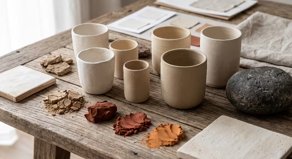
This palette draws inspiration from traditional wood-fired kilns, red earthenware clays, and dry mineral soils. It brings physical warmth, tactile depth, and a grounded presence to modern web layouts.
+--------------------+-----------+--------------------+-------------------------+
| Role               | Swatch    | Hex Code / Name    | Biophilic Function      |
+--------------------+-----------+--------------------+-------------------------+
| Dominant Base      | [ Light ] | #F3EFEA (Raw Kaolin)| Low eye fatigue canvas  |
| Secondary Surface  | [ Muted ] | #E2D7CB (Bisque)   | Card containers, panels |
| Structural Border  | [ Mid ]   | #B8A695 (Stoneware)| Subtle structural lines |
| Focal Accent       | [ Warm ]  | #A45A3C (Baked Clay| Primary call to action  |
| Deep Contrast Text | [ Dark ]  | #2C2623 (Pit Ash)  | High readability type   |
+--------------------+-----------+--------------------+-------------------------+
CSS
/* CSS Tokens: Unglazed Ceramic & Weathered Clay */
:root {
  --palette-ceramic-base: #f3efea;
  --palette-ceramic-surface: #e2d7cb;
  --palette-ceramic-border: #b8a695;
  --palette-ceramic-accent: #a45a3c;
  --palette-ceramic-text: #2c2623;
}
This color scheme is ideal for sustainable retail, organic architecture practices, artisan manufacturing, and editorial magazines. The deep terracotta accent draws user focus smoothly, while the soft kaolin canvas keeps long articles comfortable to read.
Palette 2: Damp Moss & River Slate (Forest Understory / Deep Biophilic)
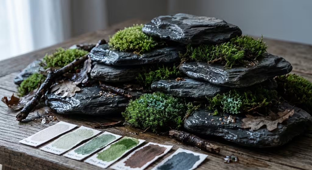
This palette recreates the tranquil atmosphere of a temperate rainforest floor. It pairs deep slate stones with cool greens, damp bark, and pale river mica.
+--------------------+-----------+--------------------+-------------------------+
| Role               | Swatch    | Hex Code / Name    | Biophilic Function      |
+--------------------+-----------+--------------------+-------------------------+
| Dominant Base      | [ Light ] | #EFEFE9 (Pale Mica)| Diffused neutral canvas |
| Secondary Surface  | [ Muted ] | #D8DCD3 (Dry Lichen| Calm interactive blocks |
| Structural Border  | [ Mid ]   | #8F9E8B (Wet Moss) | Visual rhythm dividers  |
| Deep Forest Tone   | [ Rich ]  | #3F4F42 (Pine Bark)| Navigation bars, cards  |
| Deep Contrast Text | [ Dark ]  | #1E2420 (Wet Slate)| Clear, restful text     |
+--------------------+-----------+--------------------+-------------------------+
CSS
/* CSS Tokens: Damp Moss & River Slate */
:root {
  --palette-moss-base: #efefe9;
  --palette-moss-surface: #d8dcd3;
  --palette-moss-border: #8f9e8b;
  --palette-moss-forest: #3f4f42;
  --palette-moss-text: #1e2420;
}
The damp moss scheme works exceptionally well for wellness platforms, natural biology journals, landscape architecture firms, and conservation organizations. Green wavelengths focus directly on the human retina, allowing ocular muscles to relax. By using these tones, wabi-sabi branding helps soothe visitor attention.
Palette 3: Sumi-e Charcoal & Raw Mulberry Fiber (Monochrome / High Contrast Imperfection)
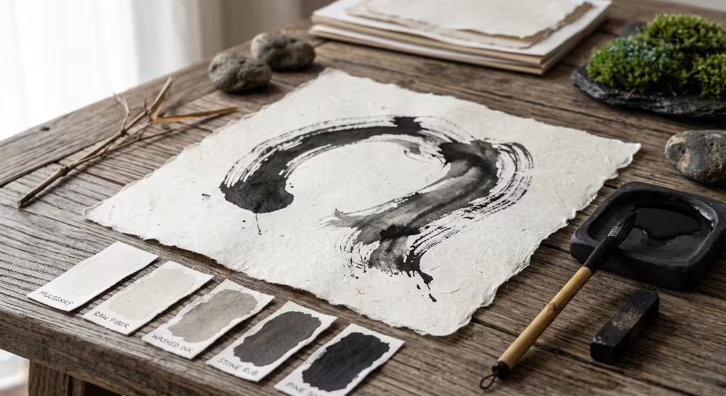
This palette pays tribute to classic East Asian ink wash paintings (sumi-e). Rather than relying on cold, machine-made grays, it uses warm blacks made from pine soot, paired with the cream tones of handmade mulberry paper (washi).
+--------------------+-----------+--------------------+-------------------------+
| Role               | Swatch    | Hex Code / Name    | Biophilic Function      |
+--------------------+-----------+--------------------+-------------------------+
| Dominant Base      | [ Light ] | #F7F5F0 (Mulberry) | Soft paper canvas       |
| Secondary Surface  | [ Muted ] | #E8E4DA (Raw Fiber)| Grouped layout blocks   |
| Mid-Tone Divider   | [ Mid ]   | #9E9B93 (Washed Ink| Borders and table lines |
| Structural Support | [ Dark ]  | #484540 (Stone Rub)| Minor headings, tags    |
| Deep Contrast Text | [ Deep ]  | #1A1918 (Pine Soot)| Maximum clarity text    |
+--------------------+-----------+--------------------+-------------------------+
CSS
/* CSS Tokens: Sumi-e Charcoal & Raw Mulberry Fiber */
:root {
  --palette-sumie-base: #f7f5f0;
  --palette-sumie-surface: #e8e4da;
  --palette-sumie-border: #9e9b93;
  --palette-sumie-secondary: #484540;
  --palette-sumie-text: #1a1918;
}
This high-contrast structure suits engineering consultancies, law firms, minimalist publications, and developer tooling sites. It provides the crisp reading experience needed for dense documentation, while the warm undertones preserve the handmade character of wabi-sabi branding.
Palette 4: Oxidized Iron & Coastal Driftwood (Transience / Weathered Resilience)
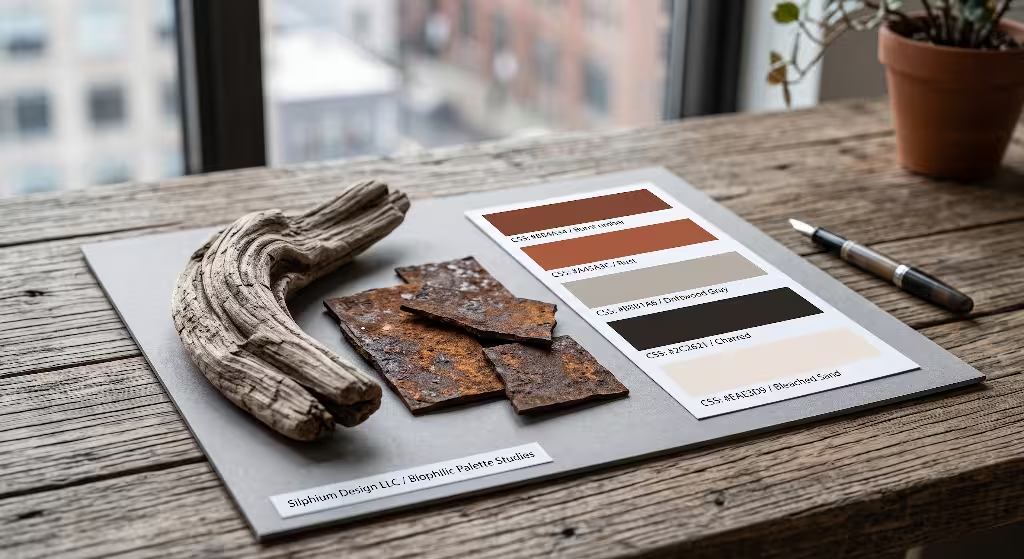
This system captures the beauty of coastal shorelines: salt-bleached cedar logs, sea spray, wet sands, and iron spikes weathered by decades of ocean mist.
+--------------------+-----------+--------------------+-------------------------+
| Role               | Swatch    | Hex Code / Name    | Biophilic Function      |
+--------------------+-----------+--------------------+-------------------------+
| Dominant Base      | [ Light ] | #F2EFEB (Salt Sand)| Bright, warm backdrop   |
| Secondary Surface  | [ Muted ] | #DFD8CE (Driftwood)| Card backings, sidebars |
| Structural Element | [ Mid ]   | #8C8479 (Weathered)| Framing and subheadings |
| Oxidized Accent    | [ Warm ]  | #8F4A33 (Iron Rust)| Direct interactive hits |
| Deep Marine Text   | [ Deep ]  | #1C2326 (Deep Fjord| Primary body text       |
+--------------------+-----------+--------------------+-------------------------+
CSS
/* CSS Tokens: Oxidized Iron & Coastal Driftwood */
:root {
  --palette-coastal-base: #f2efeb;
  --palette-coastal-surface: #dfd8ce;
  --palette-coastal-border: #8c8479;
  --palette-coastal-accent: #8f4a33;
  --palette-coastal-text: #1c2326;
}
This combination suits sustainable ocean industries, durable outdoor brands, and artisanal culinary producers. The weathered wood tones communicate durability, while the rust accent provides an engaging focal point for users.
Overcoming Contrast Hurdles with Muted Tones
A common challenge in wabi-sabi branding is maintaining accessibility. Web Content Accessibility Guidelines (WCAG 2.2) require specific contrast ratios between foreground text and background colors:
- Level AA: A minimum contrast ratio of 4.5 to 1 for standard body text, and 3.0 to 1 for large headings (18pt or 14pt bold).
- Level AAA: A minimum contrast ratio of 7.0 to 1 for standard body text, and 4.5 to 1 for large headings.
Contrast Math Formula:
Contrast Ratio = (L1 + 0.05) / (L2 + 0.05)
Where L1 is the relative luminance of the lighter color,
and L2 is the relative luminance of the darker color.
When designers build sites with earthy, desaturated tones, they sometimes pick mid-gray text on a beige canvas. This fails accessibility audits and makes reading difficult for users with low vision or aging eyes.
ACCESSIBILITY CHECK: WABI-SABI COLOR PAIRINGS

FAIL EXAMPLE (Low Contrast):
Background: Raw Linen (#E6E1D8) [Luminance = 0.74]
Text:       Stone Gray (#8A857C) [Luminance = 0.24]
Contrast Ratio: 2.72 : 1  --> FAILS WCAG AA (Requires 4.5:1)

PASS EXAMPLE (Wabi-Sabi Balanced):
Background: Raw Linen (#E6E1D8) [Luminance = 0.74]
Text:       Deep Charcoal (#242220) [Luminance = 0.02]
Contrast Ratio: 11.28 : 1 --> PASSES WCAG AAA (Exceeds 7.0:1)
True wabi-sabi branding never sacrifices function for mood. To preserve the soft feel of natural materials while meeting strict contrast goals:
- Anchor backgrounds with soft tints like unbleached cotton (
#F7F5F0). - Use deep, mineral-rich tones for text like pine soot (
#1A1918) or wet slate (#1E2420). - Keep warm, low-contrast mid-tones for borders, cards, and decorative shapes where contrast minimums are lower (3.0 to 1 under WCAG 2.2 for non-text UI components).
Responsive Color Systems: Adapting Light and Dark Themes
A complete design system must adapt across different lighting conditions and system settings. When users switch to dark mode, a wabi-sabi website should not revert to electric pitch black (#000000). In nature, nighttime is not a void. It is filled with deep indigo, river stone, and shadowed loam.
CSS
/* Responsive Light and Dark Implementation */
:root {
  --surface-primary: #f6f3ec;
  --surface-secondary: #e9e4d9;
  --text-primary: #211e1c;
  --text-secondary: #5a544c;
  --accent-action: #a45a3c;
  --border-subtle: #cec7b9;
}

@media (prefers-color-scheme: dark) {
  :root {
    --surface-primary: #191b1a;   /* Deep peat slate */
    --surface-secondary: #232725; /* Shadowed basalt */
    --text-primary: #e6e3dc;      /* Soft morning mist */
    --text-secondary: #aba598;    /* River shale */
    --accent-action: #c67554;     /* Terracotta embers */
    --border-subtle: #333835;     /* Damp earth border */
  }
}

body {
  background-color: var(--surface-primary);
  color: var(--text-primary);
  transition: background-color 0.4s ease, color 0.4s ease;
}
This dark mode transition respects the biological rhythm of the eye. Instead of harsh, high-contrast black and white, the interface shifts to a quiet, dimly lit campsite palette that lets the user’s eyes rest.
Beyond Flat Vectors: Micro-Textures and Organic Grain
Flat vector boxes and sharp drop shadows make web designs feel synthetic. Real physical materials have tooth, grain, surface friction, and microscopic depth.
Synthetic Vector vs. Organic Biophilic Surface:
+--------------------------+    +--------------------------+
| Flat Vector Box          |    | Wabi-Sabi Surface        |
| - Pure uniform hex fill  |    | - Subtle noise texture   |
| - Razor sharp edge       |    | - Soft paper tooth       |
| - Synthetic drop shadow  |    | - Diffused organic shadow|
+--------------------------+    +--------------------------+
To capture this quality in digital wabi-sabi branding, we apply subtle SVG noise filters directly to web containers. This gives flat colors the tactile presence of handmade paper without bloating page weight:
HTML
<svg style="display:none;">
  <filter id="natural-grain">
    <feTurbulence
      type="fractalNoise"
      baseFrequency="0.75"
      numOctaves="3"
      stitchTiles="stitch" />
    <feColorMatrix type="saturate" values="0" />
    <feComponentTransfer>
      <feFuncA type="linear" slope="0.04" />
    </feComponentTransfer>
  </filter>
</svg>
CSS
.wabi-card {
  background-color: var(--surface-primary);
  position: relative;
  border-radius: 3px; /* Avoid uniform, mechanical corners */
  border: 1px solid var(--border-subtle);
}

.wabi-card::before {
  content: "";
  position: absolute;
  top: 0;
  left: 0;
  width: 100%;
  height: 100%;
  filter: url(#natural-grain);
  pointer-events: none;
  opacity: 0.8;
}
This tiny filter creates a delicate surface tooth. When light passes across the display, the element feels like unglazed pottery or cold-pressed cotton paper.
Typography Pairings for Wabi-Sabi Branding
Typography carries the voice of your brand. In wabi-sabi branding, typography must balance editorial clarity with organic, human craftsmanship.
+-------------------+--------------------+------------------------------------+
| Type Role         | Font Category      | Recommended Open-Source Faces      |
+-------------------+--------------------+------------------------------------+
| Headings          | Humanist Serif     | Cormorant Garamond, Newsreader     |
| Body Copy         | Low-Contrast Sans  | Plus Jakarta Sans, Source Sans 3   |
| Technical / Data  | Balanced Mono      | JetBrains Mono, Space Mono         |
+-------------------+--------------------+------------------------------------+
- Headings: Choose serifs that show the natural calligraphic sweep of an ink brush or stone carver’s chisel. Cormorant Garamond features delicate line weight shifts that mirror natural growth patterns.
- Body Text: For body paragraphs, pick a humanist sans-serif. These fonts have open letterforms, clear spacing, and slight variations in line stroke that make long articles easy to read.
- Type Scale: Use a musical scale based on natural proportions, such as the Golden Ratio (1:1.618) or the Minor Third (1:1.200). This ensures headers and body copy scale in a harmonious, organic progression.
Luxury Wellness & Hospitality
The hospitality industry provides excellent real-world examples of wabi-sabi branding. Leading wellness resorts and boutique retreats understand that travelers visit them to escape noise, bright lights, and sensory overload.
Hospitality Case Study: Visual Identity Comparison
+---------------------+-----------------------+-----------------------------+
| System Layer        | Standard Luxury Hotel | Wabi-Sabi Wellness Resort   |
+---------------------+-----------------------+-----------------------------+
| Primary Canvas      | Pure White (#FFFFFF)  | Warm Limestone (#F3EEE6)    |
| Primary Text        | Black (#000000)       | Smoked Basalt (#282523)     |
| Secondary Accent    | Metallic Gold (#D4AF37| Weathered Clay (#9E5A3F)    |
| Spatial Rhythm      | Dense, promo-focused  | Wide margins (Ma), quiet    |
+---------------------+-----------------------+-----------------------------+
High-end brands rely on wabi-sabi branding to set an unhurried, thoughtful pace. Their websites use large sections of quiet space, natural stone tones, and candid photography showing unpolished wood and weathered fabric. These choices communicate ease, confidence, and genuine luxury.
Sustainable Packaging & Direct-to-Consumer (DTC)
For modern DTC companies, digital branding and physical packaging must work together seamlessly. A business selling sustainable products cannot use high-gloss, neon packaging without confusing its customers.
Packaging Substrate (Recycled Kraft #C9B29B)
                  |
         Direct Integration
                  v
Digital Canvas System (Warm Earth Base #F4EFEB)
                  |
        Soy Ink Translation
                  v
Interface Typography (Dark Peat Ink #221E1C)
Companies that adopt wabi-sabi branding bridge this gap naturally:
- Packaging uses recycled kraft paper, debossed logos without plastic foils, and unbleached cotton labels.
- The website mirrors these textures with warm tones, tactile paper filters, and soft, natural transitions.
- When a customer moves from browsing the website to unboxing the physical product, the experience feels consistent, honest, and grounded.
Sourcing Pigments from Natural Specimens
Instead of picking random hex codes from a color wheel, strong wabi-sabi branding pulls colors directly from real physical specimens. Designers can gather botanical and geological samples from local ecosystems to create a bespoke palette:
[ Gather Specimen: River Birch Bark ]
                 |
[ High-Resolution RAW Optical Scan ]
                 |
[ Extract Micro-Clusters via k-Means Analysis ]
                 |
+-----------------------------------------------+
| Dominant Fiber:   #EAE3D2 (Dry Paper Birch)   |
| Lenticel Pore:    #3E342F (Deep Bark Groove)  |
| Lichen Growth:    #828C74 (Symbiotic Fungi)   |
| Cambium Edge:     #C49265 (Inner Wood Bark)   |
+-----------------------------------------------+
Using real physical specimens grounds your design system in ecological reality. It gives your branding team an authentic story to tell, connecting your digital product directly to the natural world.
Building the 60-30-10 Brand Architecture
A successful color scheme needs structure and restraint. We recommend using the classical 60-30-10 rule, adapted specifically for wabi-sabi branding:
+---------------------------------------------------------------+
|                  60-30-10 PALETTE ALLOCATION                  |
+-----------------------------------------------+---------------+
| 60% - Grounding Substrate Neutral             | #F6F3EC       |
| Canvas, wide margins, card foundations        | Washi Linen   |
+-----------------------------------------------+---------------+
| 30% - Structural Mid-Tones                    | #221E1C       |
| Primary text, subtle borders, navigation      | Pine Soot     |
+-----------------------------------------------+---------------+
| 10% - Organic Highlight / Accent              | #9B4F35       |
| Key actions, notification dots, focus rings   | Oxidized Iron |
+-----------------------------------------------+---------------+
- 60% Grounding Substrate: This is your canvas color. It covers the overall page background, margins, and card bodies, establishing a calm visual field.
- 30% Structural Tones: This covers primary body copy, headings, footer areas, and card outlines. It provides clear structural hierarchy and easy reading without overwhelming the page.
- 10% Intentional Accent: This color should be reserved exclusively for essential actions: signup buttons, checkout triggers, focus rings, and active navigation indicators. By keeping this accent rare, it retains its communicative power without cluttering the screen.
What Are the Traditional Colors of Wabi-Sabi?
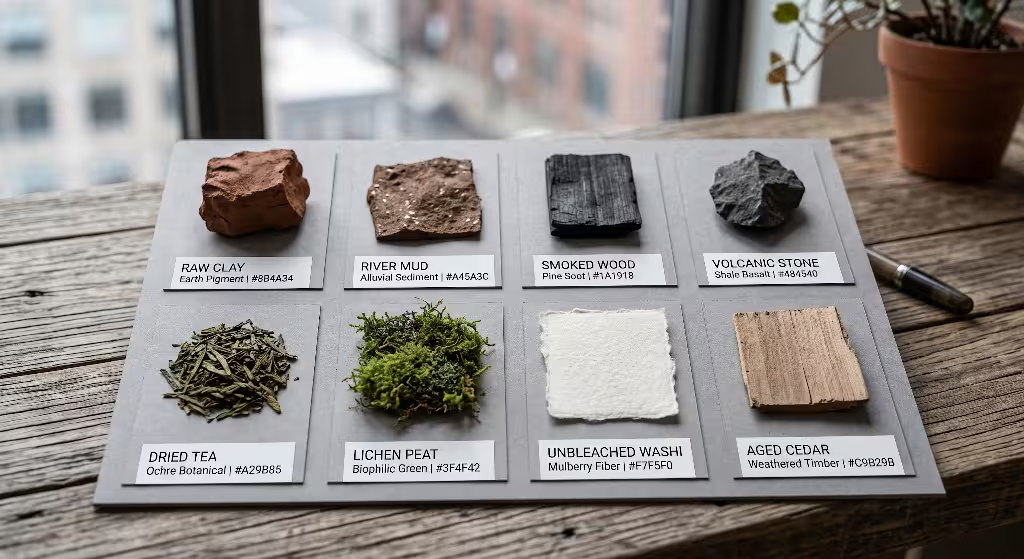
In traditional Japanese design and tea ceremonies, color choices honor natural, unrefined materials:
- Earth Tones: Raw clay (tsuchi-iro), river mud, and dried peat.
- Charcoal & Ash: Smoked wood (kurosumi), cold charcoal, and volcanic stone.
- Botanical Hues: Dried tea leaves, bamboo culms, decaying pine needles, and mountain lichen.
- Weathered Neutrals: Unbleached washi paper, natural raw silk, and sun-bleached river timber.
These colors are quiet and subdued. They accept natural weathering and light shifts without losing their visual character.
How Do You Create a Wabi-Sabi Color Palette for Branding?
To construct a practical palette for wabi-sabi branding, follow this four step method:
- Collect physical specimens: Gather river stone, dried oak leaves, raw linen, or clay fragments.
- Sample and desaturate: Photograph the items in soft, indirect sunlight. Sample their core colors and reduce digital saturation by 10 to 20 percent to prevent display glare.
- Establish value contrast: Pair light background washes with deep mineral tones, ensuring text passes WCAG 2.2 AA contrast tests with a minimum ratio of 4.5 to 1.
- Test across responsive displays: Preview the palette on OLED, standard LCD, and mobile screens in bright sunlight and dark rooms to ensure the tones feel natural and legible everywhere.
What Is the Difference Between Japandi and Wabi-Sabi Color Palettes?
While Japandi and wabi-sabi both value simplicity and natural materials, their technical color choices differ significantly:
+---------------------+-----------------------+-----------------------------+
| Design Aspect       | Japandi Aesthetic     | Wabi-Sabi Branding          |
+---------------------+-----------------------+-----------------------------+
| Primary Source      | Scandinavian + Japan  | Classical Japanese Zen      |
| Color Tone          | Crisp, bright pastels | Weathered, patinated earth  |
| Surface Character   | Clean, sanded blonde  | Aged, oxidized, rough grain |
| Mood & Atmosphere   | Cozy, neat, organized | Quiet, transient, monastic  |
| Ideal Industry      | Modern furniture, tech| Heritage, wellness, crafts  |
+---------------------+-----------------------+-----------------------------+
Japandi blends Scandinavian functionality with Japanese minimalism, using light blonde woods, pale pastels, and smooth surfaces. In contrast, wabi-sabi branding embraces rougher, older, and more weathered textures: cracked ceramics, darkened cedar, and oxidized iron.
Can a Wabi-Sabi Brand Identity Include Bright Accent Colors?
Yes, provided the accent color has an organic origin and is applied with restraint. In nature, vibrant moments occur naturally:
[ Muted Forest Floor: #383B36 ] --------+
                                         |--> Natural Focal Highlight
[ Raw Persimmon Fruit: #D95D39 ] <------+
A system of wabi-sabi branding can incorporate rich accents like:
- Persimmon (Kaki): A warm, glowing orange found in late autumn fruits.
- Fermented Indigo (Ai-iro): A deep, rich blue produced through traditional plant fermentation.
- Saffron (Ukon): A golden yellow pulled from dried turmeric roots.
The key rule is moderation. These vibrant colors should be used for less than 5 to 10 percent of the visual space, serving as purposeful highlights rather than overwhelming backdrops.
Technical SEO & Semantic Architecture Checklist
To ensure your guide on wabi-sabi branding reaches a broad audience, it must be supported by clean search engine optimization and solid technical architecture:
+----------------------+--------------------------------------------------------+
| SEO Component        | Practical Implementation Details                       |
+----------------------+--------------------------------------------------------+
| Structured Data      | Schema.org Article, Brand, and TechArticle graphs      |
| Keyword Density      | Maintain natural wabi-sabi branding density (1.5-2.0%)  |
| Core Web Vitals      | Target LCP under 1.8s, zero CLS via CSS containment    |
| Accessible Semantic  | Clean HTML5: <main>, <article>, <section>, <nav>       |
| OpenGraph Visuals    | High-resolution swatch previews with clean metadata    |
+----------------------+--------------------------------------------------------+
HTML
<!-- Example Schema.org JSON-LD Configuration -->
<script type="application/ld+json">
{
  "@context": "https://schema.org",
  "@type": "TechArticle",
  "headline": "Wabi-Sabi Branding Color Scheme Examples & Biophilic Design Guide",
  "author": {
    "@type": "Person",
    "name": "Aristaeus",
    "jobTitle": "Biophilic Design Expert",
    "worksFor": {
      "@type": "Organization",
      "name": "Silphium Design LLC"
    }
  },
  "keywords": "wabi-sabi branding, biophilic web design, color theory, design systems",
  "articleSection": "Design Systems & Accessibility"
}
</script>
By pairing deep, informative content with semantic markup, fast load times, and clean metadata, your site will rank well for competitive queries while delivering a fast, elegant user experience.
The Long-Term Value of Natural Aesthetic Restraint
Digital design trends come and go quickly. Bold gradients, neo-brutalism, and glassmorphism have all seen spikes in popularity, only to feel dated a few years later. They date quickly because they are tied to specific software trends and fleeting cultural moments.
In contrast, wabi-sabi branding is rooted in the timeless patterns of nature. The colors of damp stone, raw paper, pine bark, and baked earth have been familiar to human eyes for thousands of years. They do not trigger sensory fatigue, and they do not feel out of style as trends evolve.
Investing in wabi-sabi branding creates lasting value for organizations. It communicates quiet confidence, stability, and authenticity, ensuring your digital presence remains relevant, trustworthy, and welcoming for years to come.
Final Takeaway for Visual Designers and Strategists
Designing an effective visual identity requires courage and restraint. It means resisting the temptation to fill every pixel with flashy animations, loud colors, and pushy marketing badges.
When you adopt wabi-sabi branding, you embrace a simpler, more rewarding approach:
- Ground your layouts with pigments sampled from natural, weathered minerals.
- Build spacious page layouts that give your content room to breathe.
- Maintain rigorous contrast and accessibility standards so every visitor can read comfortably.
- Add delicate micro-textures to bring the warm, tactile feel of physical materials to the screen.
When we design with nature as our guide, our websites feel more balanced, thoughtful, and humane. Through thoughtful wabi-sabi branding, you can build digital experiences that cut through daily noise, ease mental fatigue, and create lasting connections with your audience.