Table of Contents
As digital environments become more central to our daily routines, our screens often disconnect us from the natural rhythms that keep our minds calm and focused. At Silphium Design LLC, my work centers on bridging that gap. With a background in plant biology, architectural design, and computer science, I examine how organic systems can live inside mathematical display standards. When designers try to bring the outdoors into a website, the first element they reach for is natural color. However, translating the living palette of a forest canopy into a compliant, legible digital interface is surprisingly difficult.
The beauty of natural growth relies on subtle shifts in light, texture, and biological pigments. Web browsers, on the other hand, rely on hard mathematical formulas, backlights, and strict legal guidelines. When a designer tries to capture a real leaf color without understanding digital color models, the result is almost always an interface that looks muddy or fails basic accessibility audits.
This guide provides an engineering blueprint for creating biophilic interfaces that honor the beauty of the outdoors while strictly meeting the Web Content Accessibility Guidelines (WCAG) 2.2. By understanding the photobiology of foliage, the math behind digital screens, and modern CSS color models, you can build digital experiences that are both biologically calming and universally usable.
The Tension Between Organic Harmony and Digital Legibility
The Biophilic Mandate in Modern Interfaces
Biophilic design is not just a visual trend or a way to decorate a webpage. It is an intentional philosophy based on human biology. For thousands of generations, human visual systems evolved under the open sky, surrounded by natural flora, weathered stone, moving water, and rich soil. Our eyes and nervous systems are naturally tuned to the soft transitions and spectral distributions found in living habitats. When we look at a natural leaf color in the wild, our brains register feelings of safety, resource abundance, and biological calm.
In modern office and home environments, people spend eight to twelve hours a day staring at flat glass screens. Many digital interfaces use high-energy neon blues, aggressive purples, and stark synthetic contrasts that trigger visual fatigue and raise mental stress. Bringing organic elements into website architecture helps reverse that strain. By using tones inspired by plant leaves, clay, bark, and river stones, digital products can lower cognitive strain and create a more grounded user experience.
However, digital biophilia cannot simply borrow colors from a photograph. A real plant reflects ambient sunlight across an infinite continuous spectrum. A digital monitor emits light through tiny red, green, and blue diodes. If you take a sample of a soothing leaf color from a garden photograph and apply it directly to a digital button, the visual harmony often evaporates. The display either looks artificial or turns into an illegible wash of low-contrast tones. The challenge of modern biophilic web design is to preserve the calming emotional quality of nature while respecting the physical realities of light-emitting displays.
The Earthy Mud Failure Vector
The most common failure point in nature-based digital design is what engineers call the earthy mud problem. In traditional print design or fine art painting, mixing earth tones is straightforward. You blend natural pigments, such as ochres, siennas, and raw umbers, to achieve deep, rich neutrals. On a digital screen, colors are additive rather than subtractive. You are combining beams of colored light rather than physical pigments.
When designers attempt to build a soft, woodland-inspired theme, they often choose muted tones like sage, dried moss, light loam, and damp sand. On a high-end designer monitor in a dark room, these delicate combinations can look subtle and sophisticated. But as soon as that interface is loaded on an ordinary laptop screen under office fluorescent lighting, the colors collapse into an unreadable gray-brown haze.
The primary cause of this problem is that natural tones tend to cluster in the middle ranges of relative brightness. A typical olive tone, a mossy green, or an autumn leaf color usually sits right in the visual center of the color spectrum. They are neither bright enough to act as clean backgrounds nor dark enough to provide crisp text contrast. When you place one mid-tone organic shade on top of another, the visual boundary between the letters and the page disappears. The user is forced to squint, leading to severe eyestrain. What was intended to be a calming organic experience turns into a frustrating, inaccessible barrier.
The Regulatory Reality
Beyond the aesthetic and usability challenges, digital accessibility is a firm legal requirement across the globe. Modern design teams cannot treat accessibility as an optional bonus feature. Regulations such as the European Accessibility Act, Section 508 in the United States, and international standards tied to EN 301 549 require digital interfaces to meet explicit success criteria.
The current international benchmark is WCAG 2.2. This standard sets strict mathematical thresholds for how much contrast must exist between text and its background, how visible interactive buttons must be, and how keyboard focus outlines must appear to users navigating without a mouse. If your company website or software application uses a delicate leaf color for body text that fails these mathematical thresholds, your organization faces real legal liability. More importantly, you end up locking out millions of people with low vision, age-related macular degeneration, or color vision deficiencies.
A common misconception among creative teams is that accessibility standards destroy good visual design. Designers sometimes assume that following WCAG requirements forces every website to look like a boring black-and-white spreadsheet. This is completely false. Accessibility does not forbid the use of rich earth tones or fresh botanical themes. It simply requires you to understand the math of color so you can position your natural hues at the correct levels of brightness.
Algorithmic Decoupling of Natural Pigments
To solve both the aesthetic mud problem and the legal compliance issue, we must adopt an engineering strategy called algorithmic decoupling. In simple terms, this means separating the visual character of a natural hue from its lightness and saturation values.
When you see a stunning leaf color in a botanic garden, your eye is not just reacting to a single hexadecimal code. You are responding to the dominant light wavelength of chlorophyll, the translucency of plant tissue, and the way ambient daylight illuminates the surface. You cannot copy and paste that physical phenomenon directly into CSS. Instead, you must isolate the underlying identity of that leaf color and map it into a mathematically controlled digital system.
By decoupling the hue angle from the brightness channel, we can generate an entire family of coordinated shades based on a single botanical inspiration. We can create an ultra-dark woodland green for body text, a bright spring sprout tone for interactive focus rings, and an ultra-pale botanical wash for page backgrounds. Every single step in this family shares the same organic harmony, yet every step meets strict mathematical thresholds. We no longer rely on guesswork or uncalibrated color pickers. Instead, we use predictable color science to build a durable design system.
The Colorimetry of Nature: Photobiology Meets the Relative Luminance Equation
┌─────────────────────────────────────────────────────────────────────────┐
│                      THE BIOLOGICAL SPECTRUM                            │
│                                                                         │
│   Chlorophyll a & b           Carotenoids               Tannins         │
│   (Foliage Greens)        (Warm Ochres / Gold)     (Bark / Rich Humus)  │
│      430nm / 660nm             450nm - 480nm             Broad Decay    │
└────────────────────────────────────┬────────────────────────────────────┘
                                     │
                                     ▼
┌─────────────────────────────────────────────────────────────────────────┐
│                     THE DIGITAL SCREEN CALCULATION                      │
│                                                                         │
│   WCAG Relative Luminance Formula:                                      │
│   L = (0.2126 * R) + (0.7152 * G) + (0.0722 * B)                       │
│                       ▲                                                 │
│                       │ Green light accounts for 71.52% of luminance!   │
└────────────────────────────────────┬────────────────────────────────────┘
                                     │
                                     ▼
┌─────────────────────────────────────────────────────────────────────────┐
│                      THE OKLCH ENGINEERING FIX                          │
│                                                                         │
│     Lightness (L)    +       Chroma (C)      +       Hue Angle (H)      │
│     Exact contrast       Pure color intensity       Stable leaf color   │
│     predictability           without mud               across steps     │
└─────────────────────────────────────────────────────────────────────────┘
The Biological Palette and Pigment Chemistry
To build a realistic digital leaf color system, you must first understand why plants display the colors they do. The green tones that define plant foliage come from chlorophyll, a specialized biological molecule that captures sunlight for photosynthesis. Plants primarily use two varieties: chlorophyll a and chlorophyll b. Chlorophyll a absorbs blue-violet light near 430 nanometers and red light near 662 nanometers. Chlorophyll b absorbs blue light near 453 nanometers and orange-red light near 642 nanometers. Neither molecule absorbs much mid-spectrum green light between 500 and 550 nanometers. As a result, that unused green light reflects back to our retinas, creating the familiar living leaf color of healthy foliage.
Plants also contain secondary pigments called carotenoids and anthocyanins. Carotenoids absorb blue light and reflect warm yellows, oranges, and deep ambers. Anthocyanins produce rich reds, purples, and dark burgundies. Throughout the growing season, a plant leaf color changes based on the balance of these pigments. In early spring, young leaves often have a pale, yellowish leaf color because chlorophyll production is just beginning. In deep summer, mature leaves display a saturated, dark forest leaf color as chlorophyll reaches peak density. In autumn, when the plant withdraws chlorophyll back into its branches, the carotenoids and tannins emerge, shifting the leaf color to golden ochre, rust, and loam brown.
When building a biophilic website theme, you should never treat green as an isolated color. A realistic digital leaf color system must mirror this natural chemistry. A true botanical green always shares a spectral relationship with soil ambers, bark browns, and autumn leaf color variations. When these related hues are mathematically coordinated, the user interface feels balanced, grounded, and unmistakably authentic.
The Mathematical Flaw in Relative Luminance
When translating physical plant pigments into web standards, we run into an immediate mathematical challenge. The WCAG 2.2 accessibility standard calculates contrast using a metric called relative luminance. The formula defines the brightness of any color on a monitor on a scale from 0.0 for pure black to 1.0 for pure white.
The relative luminance formula is:
L = 0.2126 X R + 0.7152 X G + 0.0722 X B
In this equation, R, G, and B represent the linearized red, green, and blue light channels of your display. Look closely at the multipliers in that equation. The red channel is multiplied by roughly 0.21, the blue channel is multiplied by roughly 0.07, and the green channel is multiplied by a massive 0.7152.
The World Wide Web Consortium chose these numbers because human vision evolved under the sun to be exceptionally sensitive to green light. Our eyes have more green-detecting cones than red or blue cones. Because of this biology, green light appears much brighter to us than an equal amount of blue light.
However, this formula introduces a huge distortion for biophilic design systems. Because the green channel carries over 71 percent of the total luminance score, any digital color containing a healthy dose of green gets an inflated brightness score. A soft sage or an olive leaf color might calculate as having high luminance on paper, but in the real world, human eyes struggle to read it when it is used for small text. The formula tells the developer that the color is bright, but practical human vision sees a muted, low-contrast tone.
If you pair an olive leaf color with an off-white background, the mathematical contrast ratio might show a poor 2.8 to 1, while a dark blue with the exact same visual legibility might score much higher. Designers who do not understand this green multiplier often find themselves confused. They cannot understand why their favorite leaf color fails WCAG testing when it looks completely legible on their studio screens. To master accessible green tones, you must realize that the digital green channel behaves like an aggressive amplifier in accessibility formulas.
The Limits of sRGB and the Power of OKLCH for Leaf Color
For decades, digital designers were forced to write colors using hexadecimal strings or the standard sRGB color space. Formats like #4A7C59 or rgb(74, 124, 89) are easy for computers to read, but they are terrible for human engineering. The standard sRGB space is mathematically non-uniform. If you keep the red and green values the same and simply adjust the blue slider, the perceived brightness of your color jumps wildly. Even worse, if you try to make an sRGB leaf color lighter by adding white, the color rapidly loses its vitality and turns into an unappealing chalky gray.
To build a professional, accessible leaf color system, modern development teams must switch to OKLCH. OKLCH is a modern color space supported across all modern web browsers. It structures colors into three clear, predictable dimensions:
- L (Perceptual Lightness): Represents how bright the color looks to human vision, ranging from 0 percent (pure black) to 100 percent (pure white).
- C (Chroma): Measures the purity, saturation, or intensity of the color. A chroma of zero is a dead neutral gray, while a higher chroma delivers a rich, vibrant tone.
- H (Hue Angle): Represents the color family as an angle on a 360-degree circle. A hue angle around 140 represents a clean foliage green, an angle around 90 represents an olive or sap tone, and an angle around 50 represents a warm soil brown.
The immense advantage of OKLCH for biophilic design is that the dimensions are completely decoupled. In the older sRGB model, if you changed the hue to explore a different leaf color, the perceived brightness shifted under your feet, immediately breaking your WCAG contrast ratios.
In OKLCH, perceived lightness is held steady. If you set your Lightness value to 0.25, that color will deliver the exact same high-contrast legibility whether you shift the hue angle to a rich evergreen leaf color, a deep bark umber, or a dark autumnal ochre. OKLCH allows engineers to construct automated palettes where accessibility compliance is mathematically guaranteed from the very start.
WCAG 2.2 Success Criteria Applied to Biophilic Interfaces
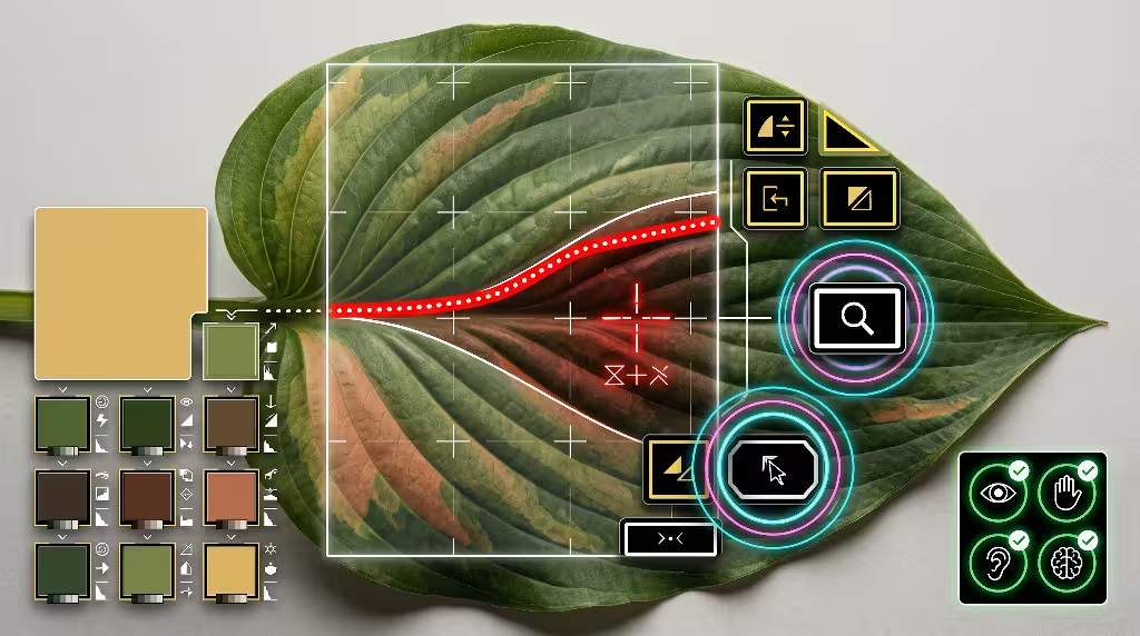
Success Criterion 1.4.3 and 1.4.6: Text Contrast Minimum and Enhanced
The most critical test for any website color system is readability. Under WCAG 2.2, Success Criterion 1.4.3 requires standard body text to have a minimum contrast ratio of 4.5 to 1 against its background. Standard text is defined as any text smaller than 24 pixels if regular weight, or smaller than roughly 18.67 pixels if bold. For large text, the requirement softens to 3.0 to 1. If you want to achieve Level AAA compliance under Success Criterion 1.4.6, those requirements rise to 7.0 to 1 for standard text and 4.5 to 1 for large headings.
This is where uncalibrated biophilic palettes fall apart. Designers frequently try to use a pleasant mid-tone leaf color for body paragraphs on a warm, parchment-style background. For example, pairing a muted forest leaf color like #557A46 against a soft linen background like #FAF7F2 generates an accessibility ratio of only 3.8 to 1. That fails Level AA requirements. To a user with normal 20/20 vision in a dark room, the paragraph might seem readable. But to an older reader or someone viewing a mobile phone outside under direct sunlight, the text fades into an unreadable smear.
To make an organic leaf color pass Level AA or Level AAA standards for body text, you must push the lightness value into the extreme registers. You cannot use a casual mid-tone. You must deepen that shade into a rich canopy green, such as OKLCH lightness 0.24, which delivers a strong 12 to 1 contrast ratio on light backgrounds. Save your mid-tone leaf color variations for oversized decorative headings, subtle accent badges, or large graphical illustrations where the 3.0 to 1 ratio is legally acceptable.
Success Criterion 1.4.11: Non-Text Contrast
Added in modern updates to the accessibility guidelines, Success Criterion 1.4.11 requires a 3.0 to 1 contrast ratio for graphical user interface components and visual states. This rule applies directly to:
- Form input borders, ensuring users can see where a text field starts and ends.
- Interactive icons that convey meaning, such as search magnifying glasses or navigation arrows.
- Active button containers and toggle switch boundaries.
- Selected states in tabs and navigation menus.
Biophilic web designers love soft, organic borders. It is tempting to outline a text input box with a delicate, dried-moss leaf color or a faint sandy stone tint. However, if that input border only achieves a 1.8 to 1 contrast ratio against the surrounding white or linen page, the form fails an accessibility audit. For someone with low contrast sensitivity, that input field is effectively invisible; they see only floating placeholder text with no clear boundary to click.
When building a natural interface, every functional border and icon must meet the 3.0 to 1 line. If you want to use a leaf color for an active checkbox or a search field outline, you must ensure that green tone is sufficiently separated from the page canvas. A practical technique is to use a muted stone tone for purely decorative dividers, but switch to a deep, verified leaf color token whenever a border communicates interactive function.
Success Criterion 2.4.11: Focus Appearance in Natural Themes
One of the newest and most important requirements in WCAG 2.2 is Success Criterion 2.4.11, which governs Focus Appearance. When people browse the web using a keyboard, screen reader, or switch control device, they press the Tab key to jump from one interactive link, button, or input to the next. The browser shows a visual indicator, usually an outline ring, to indicate which element currently holds focus.
Under WCAG 2.2, that focus indicator must meet strict physical and visual criteria:
- It must achieve a contrast ratio of at least 3.0 to 1 between the focused and unfocused states of the element.
- It must achieve at least 3.0 to 1 contrast against the adjacent background colors.
- The indicator must have a minimum physical surface area, typically matching a 2-pixel thick solid perimeter around the component.
Many natural web designs use custom focus rings that fail this requirement. A designer might remove the default browser outline and replace it with a soft sage glow or a subtle earth-tone shadow. These soft glows fail the focus appearance test because their outer edges blur into the background, dropping below the required 3.0 to 1 threshold.
To make a focus state pass while honoring a biophilic aesthetic, you should implement an offset double-ring architecture. The inner ring uses an ultra-clean linen or dark soil tone that separates the component from the indicator. The outer ring uses a high-energy, vibrant sprout leaf color that delivers sharp, unmistakable contrast. This creates an outline that feels like fresh plant growth while providing clear visibility for assistive technology users.
Success Criterion 1.4.1: Use of Color Beyond Green and Brown
Success Criterion 1.4.1 states that color must never be used as the sole visual means of conveying information, indicating an action, prompting a response, or distinguishing a visual element. In nature-inspired design systems, teams often fall into a trap where they map semantic states directly to plant life cycles:
- Green foliage means success.
- Yellow ochre means warning.
- Terracotta red means critical error.
- Bark brown means disabled or inactive.
The biological reality is that roughly 8 percent of men and 0.5 percent of women carry some form of congenital color vision deficiency, commonly known as color blindness. The most common forms, Deuteranopia and Protanopia, make it extremely difficult to distinguish between red, green, and brown.
If your website shows a form input error by simply changing the field border from a woodland leaf color to a warm terracotta red, a color-blind user may see no difference at all. Both shades can collapse into the exact same brownish tone.
To maintain compliance, every color signal must be paired with a redundant non-color indicator. If a form field has an error, you must combine the terracotta border with an explicit warning icon and a clear text message explaining what went wrong. If an interactive link is embedded inside a body paragraph, you must keep an active underline rather than relying solely on a green leaf color to show that the text is clickable. Color should enrich the experience, but the information must remain crystal clear without it.
Engineered Palette Architecture: Hex, OKLCH, and Contrast Verification

The Arboreal and Lithic Token Matrix
To build a reliable digital interface, you must assemble a structured matrix of design tokens. The following tokens balance real botanical inspiration with the rigorous mathematical demands of WCAG 2.2. These values are mapped in both standard hexadecimal codes and modern OKLCH coordinates.
┌─────────────────────────────────────────────────────────────────────────┐
│                    THE ARBOREAL DESIGN TOKEN SYSTEM                     │
│                                                                         │
│  [--bio-canopy-deep]      oklch(0.24 0.05 142)    Contrast: 12.1:1 (AAA)│
│  [--bio-fern-mid]         oklch(0.40 0.09 140)    Contrast:  5.8:1 (AA) │
│  [--bio-lichen-accent]    oklch(0.51 0.10 138)    Contrast:  3.6:1 (UI) │
│  [--bio-sprout-bright]    oklch(0.68 0.14 125)    Focus Ring Accent     │
│  [--bio-bark-umber]       oklch(0.28 0.04  55)    Contrast: 11.4:1 (AAA)│
│  [--bio-clay-terracotta]  oklch(0.48 0.14  42)    Contrast:  5.1:1 (AA) │
│  [--bio-linen-light]      oklch(0.97 0.01  90)    Light Base Canvas     │
│  [--bio-soil-deep]        oklch(0.18 0.01  50)    Dark Base Canvas      │
└─────────────────────────────────────────────────────────────────────────┘
The table below outlines the core color tokens, their semantic roles, and their mathematical performance across light and dark display surfaces.
| Token Name | Semantic Role | Hex Value | OKLCH Value | Contrast on Light Linen (#F8F6F0) | Contrast on Deep Soil (#1B1713) | WCAG 2.2 Status |
canopy-deep | Primary Text / Body Copy | #1E3321 | oklch(0.24 0.05 142) | 12.1:1 | 1.1:1 | Passes AAA (Text) |
fern-mid | Large Titles / Badges | #2E5E35 | oklch(0.40 0.09 140) | 5.8:1 | 2.3:1 | Passes AA (Large) |
lichen-accent | Interactive UI Elements | #487346 | oklch(0.51 0.10 138) | 3.6:1 | 3.7:1 | Passes AA (UI / Non-Text) |
sprout-bright | Focus Outlines / Accents | #7EA854 | oklch(0.68 0.14 125) | 2.1:1 | 6.4:1 | Passes AA (Dark Mode) |
clay-terracotta | Warnings / System Alerts | #A34A28 | oklch(0.48 0.14 42) | 5.1:1 | 2.6:1 | Passes AA (Text) |
bark-umber | Secondary Text / Borders | #3D2E24 | oklch(0.28 0.04 55) | 11.4:1 | 1.2:1 | Passes AAA (Text) |
sand-neutral | Surface Cards / Panels | #EBE4D8 | oklch(0.91 0.02 85) | 1.2:1 | 11.2:1 | Passes Non-Text Surface |
linen-light | Global Light Canvas | #F8F6F0 | oklch(0.97 0.01 90) | 1.0:1 | 14.2:1 | Base Light Canvas |
soil-deep | Global Dark Canvas | #1B1713 | oklch(0.18 0.01 50) | 14.2:1 | 1.0:1 | Base Dark Canvas |
Systematic Pairing Rules for Leaf Color and Earth Tones
Having a set of verified color tokens is only half the battle. You must also enforce strict pairing rules so team members know how to combine them safely. In a biophilic interface, unexpected color combinations happen easily. A front-end developer might place a mid-tone leaf color on top of a stone card background, unintentionally breaking compliance.
To maintain accessibility across your entire digital product, establish these structural pairing rules:
- The Rule of the Light Canvas: When working on a light linen surface (
#F8F6F0), the only allowable text tokens arecanopy-deepandbark-umber. Standard body copy must never usefern-mid,lichen-accent, orsprout-bright. Mid-tone leaf color tokens simply do not carry enough dark luminance to guarantee readability for small text. - The Interactive Fill Rule: When creating primary buttons, use
canopy-deeporfern-midas the container background, and use pure white or ultra-palelinen-lightfor the button text. Never place a dark leaf color on top of an earth-toned button fill; the resulting contrast ratio drops below usable levels. - The Non-Text Boundary Rule: Any input border or graphical card edge resting on a light linen canvas must use a token with an OKLCH lightness of 0.55 or lower. This ensures that the outline meets the mandatory 3.0 to 1 contrast ratio required by Success Criterion 1.4.11. Decorative lines that carry no interactive meaning can use lighter sand tones.
- The Polarity Swap: When switching to a dark mode theme, the color relationships must invert completely. You cannot simply take your dark woodland leaf color and drop it onto a black background. Instead, your dark background becomes a deep humus soil tone, while your primary text shifts to an ultra-pale lichen green or bleached birch white.
Balancing Chromatic Richness and Text Sharpness
One of the most delicate challenges in natural color design is keeping colors rich without sacrificing sharpness. In the OKLCH color space, chroma controls how intense a color looks. If you push the chroma of a leaf color too high, the green becomes artificial, looking like a neon glow stick rather than a living plant. If you drop the chroma too low, the leaf color washes out into a lifeless, industrial gray.
For a biophilic website theme, the ideal chroma zone sits between 0.04 and 0.12. A chroma value near 0.05 gives you an authentic, organic feel that resembles real plant tissue observed in soft outdoor light. This moderate chroma level keeps the interface visually grounded while preventing eye fatigue during long reading sessions.
Furthermore, visual sharpness relies heavily on luminance contrast rather than color saturation. The human eye detects edges, letters, and shapes through lightness differences far more effectively than through hue differences. By anchoring your text with an ultra-deep canopy leaf color that has a low lightness value of 0.24, you deliver razor-sharp typography. The user’s visual cortex gets all the crisp edge definition it needs, while the subtle green hue angle provides a natural, organic undertone.
Frequently Asked Questions about Earth Tones and Leaf Colors
What contrast ratio is required for WCAG 2.2 AA in web design?
For a web design to achieve WCAG 2.2 Level AA compliance, text and visual elements must satisfy three distinct mathematical thresholds:
First, standard body text smaller than 24 pixels regular or 18.67 pixels bold must achieve a minimum contrast ratio of 4.5 to 1 against its background. This ensures that people with moderate vision loss can comfortably read paragraphs, form labels, and table contents.
Second, large text measuring 24 pixels or larger, or bold text measuring 18.67 pixels or larger, must reach a contrast ratio of at least 3.0 to 1. Because larger letterforms have thicker strokes and cover more surface area on the retina, they remain readable at slightly lower contrast levels.
Third, under Success Criterion 1.4.11, non-text elements such as form field boundaries, interactive icons, and button borders must maintain a 3.0 to 1 contrast ratio against the surrounding surfaces. In addition, WCAG 2.2 introduced Success Criterion 2.4.11, which requires keyboard focus indicators to achieve at least a 3.0 to 1 contrast ratio against both the focused element and the adjacent background.
┌─────────────────────────────────────────────────────────────────────────┐
│                    WCAG 2.2 CONTRAST RATIO RULES                        │
│                                                                         │
│  Standard Body Text (< 24px) ──────────────► 4.5:1 Minimum Contrast     │
│  Large Text (≥ 24px or ≥ 18.67px Bold) ────► 3.0:1 Minimum Contrast     │
│  UI Components & Input Borders ────────────► 3.0:1 Minimum Contrast     │
│  Keyboard Focus Indicators ────────────────► 3.0:1 Minimum Contrast     │
│  Level AAA Enhanced Text ──────────────────► 7.0:1 Minimum Contrast     │
└─────────────────────────────────────────────────────────────────────────┘
Can green and brown earth tones ever meet WCAG contrast requirements?
Yes, green and brown earth tones can easily pass WCAG standards, but they must be managed through luminance separation rather than hue selection. The reason people struggle with natural earth tones is that they frequently select mid-tone greens and mid-tone browns that share similar lightness levels. When two colors share a similar lightness, the mathematical contrast ratio remains low regardless of how different the colors look to an artist.
To make an earth tone system pass, you must create a wide spread between your foreground and background lightness values. For example, if you place a deep woodland leaf color like #1E3321 on top of a soft birch linen background like #F8F6F0, the contrast ratio measures 12.1 to 1. That easily beats even the strictest Level AAA requirement.
Similarly, if you use a dark podzol soil brown for your background, you can safely use an ultra-pale dried-grass yellow or a delicate sprout leaf color for your text, achieving ratios well above 8.0 to 1. Earth tones fail accessibility tests only when designers attempt to layer mid-tones together. When you anchor your palette with very dark and very light natural tones, your design stays fully compliant.
Why do sage green and olive tones consistently fail accessibility audits?
Sage green and olive tones fail accessibility tests more often than almost any other natural colors. The reason comes down to their position within the color spectrum and their balance of pigments. Olive and sage tones sit at hue angles between 70 and 110 degrees, combining green and yellow wavelengths with low to moderate saturation.
Because they contain significant green light, the WCAG relative luminance formula assigns them a high brightness score. However, because they are desaturated with gray or darkened with brown, their actual light output on a monitor falls right in the middle registers, typically between 0.30 and 0.50 relative luminance.
When you place an olive or sage leaf color on a white or off-white background, the contrast ratio almost always lands between 2.2 to 1 and 3.4 to 1. This falls well short of the mandatory 4.5 to 1 ratio for body text.
Even worse, on lower-quality computer screens or under ambient glare, these colors wash out quickly. They give designers a false sense of legibility in high-end design programs, but they fall apart in real-world browsing environments. If you want to use sage or olive in your interfaces, use them for large decorative backgrounds or non-essential visual accents, never for critical body text or functional input borders.
How does color blindness affect the perception of leaf and earth color systems?
Congenital color vision deficiencies affect roughly 1 in 12 men and 1 in 200 women worldwide. The vast majority of these individuals experience red-green color blindness, scientifically known as Deuteranopia (missing green-sensitive retinal cones) or Protanopia (missing red-sensitive retinal cones).
For someone with red-green color blindness, the eyes cannot distinguish between wavelengths of light that fall in the red, yellow, and green regions of the spectrum. When looking at a classic earth tone system, foliage greens, autumn leaf color variations, bark browns, and terracotta reds all blend into the same dull yellow-gray family.
If your design uses a fresh leaf color to indicate that a file upload was successful, and a warm terracotta red to indicate that it failed, a color-blind user will see two elements that look nearly identical.
To make your biophilic design system work for everyone, you must design for value contrast rather than hue contrast. Even if two colors look the same in hue to a color-blind user, a large difference in lightness will make them clearly distinguishable. Always verify your color tokens using color-blindness simulation software, and ensure that every status update includes clear text labels or distinct icons alongside the color.
How does the new WCAG 2.2 Focus Appearance (2.4.11) affect organic color palettes?
The introduction of Success Criterion 2.4.11 in WCAG 2.2 has a major impact on organic and biophilic websites. In the past, designers often treated keyboard focus rings as an afterthought, allowing browsers to render their default blue outlines or hiding them entirely to preserve an earthy aesthetic.
When biophilic designers did create custom focus rings, they often picked a soft moss or pale earth tone that blended quietly into the surrounding design.
Under the new WCAG 2.2 guidelines, focus indicators must stand out clearly. The focus outline must achieve at least a 3.0 to 1 contrast ratio against the component it surrounds, and it must also achieve a 3.0 to 1 ratio against the adjacent background canvas. A soft, low-contrast leaf color cannot pass this double requirement.
To solve this problem without abandoning your natural theme, you can use a high-chroma accent leaf color like sprout-bright (#7EA854) paired with an intentional outline offset. By introducing a 2-pixel gap between the button and the focus ring, the outline remains completely distinct. This technical implementation ensures that your website provides smooth, safe navigation for keyboard users while preserving a fresh, cohesive woodland aesthetic.
Implementation: Code Architecture, Design Tokens, and Dark Mode Polarity
Production CSS Variable System for Light and Dark Modes
To bring an accessible biophilic color system into production, you should organize your design tokens into native CSS variables. Using modern CSS features, we can define our palette with the oklch() color function, allowing browsers to render colors with mathematical precision.
The code block below provides a complete, production-ready design token architecture supporting both light and dark themes. Notice how every pairing is engineered to satisfy WCAG 2.2 contrast minimums automatically.
CSS
:root {
  /* ==========================================================================
     LIGHT THEME: BIOPHILIC LINEN CANVAS
     ========================================================================== */

  /* Canvas and Surface Tokens */
  --bio-surface-canvas: oklch(0.97 0.01 90);      /* #F8F6F0 Linen Base */
  --bio-surface-card:   oklch(0.93 0.02 85);      /* #EDE6D8 Soft Birch Card */
  --bio-surface-border: oklch(0.55 0.04 60);      /* #8A7A6D 3.1:1 on Canvas */

  /* Text Typography Tokens (WCAG AA & AAA Compliant) */
  --bio-text-primary:   oklch(0.24 0.05 142);     /* #1E3321 Canopy Green: 12.1:1 */
  --bio-text-secondary: oklch(0.38 0.04 55);      /* #4C3C30 Deep Loam: 6.5:1 */
  --bio-text-muted:     oklch(0.42 0.03 135);     /* #4F5B4E Muted Fern: 4.8:1 */

  /* Interactive Elements */
  --bio-action-fill:    oklch(0.28 0.07 140);     /* Deep Evergreen CTA */
  --bio-action-hover:   oklch(0.22 0.06 140);     /* Darkened Canopy Hover */
  --bio-action-text:    oklch(0.98 0.00 0);       /* Pure White Text: 8.4:1 */

  /* Status Indicators (Always pair with text/icons) */
  --bio-status-alert:   oklch(0.48 0.14 42);      /* #A34A28 Terracotta: 5.1:1 */
  --bio-status-notice:  oklch(0.45 0.11 95);      /* #706323 Autumn Sap: 4.6:1 */

  /* WCAG 2.2 Focus Indicator Tokens (SC 2.4.11) */
  --bio-focus-outer:    oklch(0.24 0.05 142);     /* Sharp Forest Outer Ring */
  --bio-focus-inner:    oklch(0.97 0.01 90);      /* Isolating Canvas Gap */
}

@media (prefers-color-scheme: dark) {
  :root {
    /* ==========================================================================
       DARK THEME: RICH HUMUS & PODZOL CANVAS
       ========================================================================== */

    /* Inverted Surfaces */
    --bio-surface-canvas: oklch(0.18 0.01 50);    /* #1B1713 Deep Humus Soil */
    --bio-surface-card:   oklch(0.24 0.02 55);    /* #29231E Petrified Bark Card */
    --bio-surface-border: oklch(0.60 0.03 70);    /* #8E8377 3.2:1 on Dark Canvas */

    /* Inverted Typography Tokens */
    --bio-text-primary:   oklch(0.94 0.02 90);    /* #F0EEE4 Bleached Birch: 13.0:1 */
    --bio-text-secondary: oklch(0.82 0.04 125);   /* #C4CEB5 Pale Lichen: 7.4:1 */
    --bio-text-muted:     oklch(0.70 0.03 130);   /* #9FA897 Weathered Leaf: 4.9:1 */

    /* Inverted Interactive Elements */
    --bio-action-fill:    oklch(0.75 0.12 135);   /* Bright Moss CTA */
    --bio-action-hover:   oklch(0.82 0.14 135);   /* Luminous Sprout Hover */
    --bio-action-text:    oklch(0.18 0.01 50);    /* Deep Soil on CTA: 6.8:1 */

    /* Dark Mode Focus Indicators */
    --bio-focus-outer:    oklch(0.85 0.12 125);   /* Luminous Sprout Ring */
    --bio-focus-inner:    oklch(0.18 0.01 50);    /* Dark Isolating Gap */
  }
}

/* ==========================================================================
   INTERACTIVE COMPONENT APPLICATION
   ========================================================================== */

.bio-card {
  background-color: var(--bio-surface-card);
  border: 1px solid var(--bio-surface-border);
  color: var(--bio-text-primary);
  padding: 1.5rem;
  border-radius: 8px;
}

.bio-button-primary {
  background-color: var(--bio-action-fill);
  color: var(--bio-action-text);
  border: none;
  padding: 0.75rem 1.5rem;
  font-weight: 600;
  border-radius: 4px;
  cursor: pointer;
  transition: background-color 0.2s ease;
}

.bio-button-primary:hover {
  background-color: var(--bio-action-hover);
}

/* Hardened Focus Implementation for WCAG 2.2 SC 2.4.11 */
.bio-button-primary:focus-visible,
.bio-input:focus-visible {
  outline: 2px solid var(--bio-focus-outer);
  outline-offset: 2px;
  box-shadow: 0 0 0 2px var(--bio-focus-inner);
}
Polarity Inversion: Shifting Leaf Color from Day to Night
When you adapt an organic color system for night reading or dark mode displays, you must never perform a naive color inversion. If you simply invert colors in an image editor, your forest green turns into an unnatural synthetic purple, destroying the biophilic atmosphere of your interface.
True biological adaptation works differently. Think about how a forest appears at night under the light of the moon. The rich greens of the canopy do not invert into magenta. Instead, the landscape shifts its brightness hierarchy. The soil, tree trunks, and deep vegetation recede into dark velvet charcoal tones. The pale surfaces, such as birch bark, pale lichens, and dew drops resting on a leaf, reflect the soft moonlight.
To execute a polarity inversion correctly:
- Shift the Base Canvas: Move your canvas from a daytime linen tone (
#F8F6F0) down to a deep humus soil tone (#1B1713). Avoid using pure digital black (#000000). Natural earth at night is a deep, warm charcoal brown, not an empty void. - Invert Text Roles: Shift your text from dark canopy tones to pale botanical neutrals. Use a soft birch tone (
#F0EEE4) for primary body paragraphs, delivering a clean 13 to 1 contrast ratio that protects night-adapted eyes from glare. - Elevate Interactive Accents: In a light theme, primary buttons use deep evergreen tones with white text. In dark mode, reverse that balance. Use a vibrant, luminous moss leaf color for the button fill, and set the button text in deep charcoal brown. This preserves high contrast while making buttons easy to locate in the dark.
- Preserve the Hue Angle: Keep your hue angles consistent across both themes. If your daytime green is set to hue angle 140 in OKLCH, keep your night-mode green near hue angle 135 to 140. This ensures that the biological identity of your brand stays recognizable no matter which theme the user selects.
Algorithmic Palette Validation Workflow
Building an accessible design system requires continuous automated testing. Designers and developers are busy people, and manual contrast checks can easily be forgotten during a fast product sprint. To protect your product from accessibility regressions, you should integrate automated checks directly into your development workflow.
┌─────────────────────────────────────────────────────────────────────────┐
│                    AUTOMATED VALIDATION PIPELINE                        │
│                                                                         │
│   [Git Commit]                                                          │
│        │                                                                │
│        ▼                                                                │
│   [Stylelint Token Linter] ──► Checks that all colors use valid tokens  │
│        │                                                                │
│        ▼                                                                │
│   [Axe-Core / Lighthouse] ───► Calculates WCAG 2.2 relative luminance   │
│        │                                                                │
│        ▼                                                                │
│   [Automated Pull Request] ──► Pass: Deploy to Production               │
│                                Fail: Block merge until contrast passes  │
└─────────────────────────────────────────────────────────────────────────┘
A resilient validation pipeline uses three layers of protection:
- Layer 1: Design Token Linting: Use CSS linters like Stylelint to prevent developers from writing hardcoded hex values in component stylesheets. Force all color assignments to use your approved design tokens, such as
var(--bio-text-primary)orvar(--bio-surface-canvas). - Layer 2: Headless Browser Auditing: Integrate automated testing tools like
axe-coreand Google Lighthouse into your GitHub Actions or continuous deployment pipeline. Every time a developer opens a pull request, the automated runner boots up the site and checks every page for WCAG 2.2 contrast compliance. If a developer accidentally pairs a mid-tone leaf color with an incompatible background, the build fails immediately, preventing the bug from reaching your live users. - Layer 3: Environmental Glare Testing: Accessibility audits should not stop at automated software passes. Evaluate your biophilic interfaces on budget mobile screens in direct sunlight, and test them with grayscale filters turned on. If your page remains easy to read when all color is removed, you can be completely confident that your system is resilient, functional, and universally accessible.
In the Future: Bridging WCAG 2.2 to WCAG 3.0 and APCA
The Flaws of the Flat Ratio Formula
While WCAG 2.2 is the current legal and technical standard across the web, accessibility researchers have recognized for years that its contrast formula is incomplete. The simple 4.5 to 1 ratio treats contrast as a flat, symmetrical equation. According to the WCAG 2.2 formula, dark text on a light background has the exact same contrast score as light text on a dark background, provided the luminance values are simply flipped.
In actual human vision, this is not how eyes work. Human vision is non-linear and asymmetrical. When you view light text on a dark background, a visual effect called irradiation occurs. The bright light from the letters bleeds across your retina, making thin fonts look slightly thicker and easier to read.
Conversely, dark text on a bright background can be overwhelmed by display glare. Furthermore, the old formula completely ignores font weight and physical character size. A hairline font at 14 pixels gets evaluated with the exact same 4.5 to 1 threshold as a thick, heavy headline font at the same size.
For organic and biophilic design, this mathematical limitation creates strange anomalies. The WCAG 2.2 formula often passes bright orange-brown colors on white backgrounds that are physically difficult to read, while failing light green text on dark backgrounds that human eyes can read with ease. Because of these issues, the accessibility community is actively building a more sophisticated visual model for the upcoming WCAG 3.0 guidelines.
APCA and Spatial Frequency for Leaf Color
The foundation of WCAG 3.0 contrast evaluation is the Advanced Perceptual Contrast Algorithm, or APCA. Developed by visual scientists, APCA replaces the flat mathematical ratio with a calculated lightness contrast score, expressed as Lc.
Unlike the older system, APCA factors in spatial frequency, which means it accounts for how font size, stroke thickness, and viewing distance influence human reading ability. Under APCA:
- Contrast is evaluated based on the specific font weight and font size used on the page.
- The polarity of the display is taken into account; light mode and dark mode are calculated using different perceptual curves.
- Local background glare and surrounding light levels are considered.
┌─────────────────────────────────────────────────────────────────────────┐
│                      CONTRAST MEASUREMENT EVOLUTION                     │
│                                                                         │
│   WCAG 2.2 Relative Luminance            WCAG 3.0 APCA System           │
│   • Flat mathematical ratio (4.5:1)      • Perceptual contrast (Lc)     │
│   • Ignores font stroke thickness        • Dynamic to font weight/size  │
│   • Symmetrical (Light = Dark)           • Polarized (Dark mode aware)  │
│   • Treats all colors uniformly          • Corrects for green glare     │
└─────────────────────────────────────────────────────────────────────────┘
For biophilic web design, APCA is a huge step forward. Under the APCA model, a subtle leaf color that might fail the rigid 4.5 to 1 test can easily pass for a bold headline, because the heavy stroke width provides plenty of visual information for the human eye.
At the same time, APCA will flag thin, delicate fonts set in a dark leaf color if their stroke is too narrow to provide safe legibility. Designing with modern OKLCH tokens today prepares your system directly for this future. Because OKLCH is based on perceptual lightness, moving from WCAG 2.2 to APCA will require only minor calibration rather than a complete redesign of your color palette.
Preparing Your Design System Today
You do not need to wait for WCAG 3.0 to be finalized to begin using advanced visual science. You can future-proof your digital interfaces today by adopting three practical habits:
- Anchor Your Core Hues in OKLCH: Stop defining your design systems using older sRGB hexadecimal strings. Build your master color libraries in OKLCH so that perceived lightness is locked across all biological hues.
- Increase Font Weight on Natural Tones: If you want to use a botanical tone like
fern-midor an autumn leaf color for headings, increase your font weight from regular 400 to semi-bold 600. The thicker stroke increases the spatial frequency of the letterforms, making the color significantly more readable for users with low contrast sensitivity. - Audit with Both WCAG 2.2 and APCA Tools: While you must maintain legal compliance under WCAG 2.2 today, run parallel checks using APCA contrast calculators. If your primary text tokens pass both WCAG 2.2 Level AA and achieve an APCA score of Lc 75 or higher, you can be certain that your biophilic interface is robust, legally sound, and ready for the future of digital accessibility.
The Future of Accessible Biophilic Web Design
Digital technology does not have to feel cold, sterile, or exhausting. By bringing the colors, patterns, and calming textures of the living world into our digital environments, we can create interfaces that support mental clarity, reduce daily stress, and reconnect people with the natural world.
However, the beauty of nature must never become an excuse for poor digital accessibility. A website that celebrates plant life while locking out users with visual disabilities fails the core principle of biophilic philosophy, which is the universal connection between all human beings and living systems.
True mastery in design requires both creative sensitivity and scientific rigor. By pairing the rich biology of natural pigments with the mathematical clarity of the OKLCH color space and WCAG 2.2 guidelines, we can design digital products that pass every technical audit while delivering an organic, grounded user experience.
When you treat color not as a random decorative choice, but as an engineered system of light and biology, you achieve the ultimate goal of biophilic web design: an interface that feels as natural, effortless, and welcoming as a walk through the woods.