When people shop online, they often face a sudden wave of stress when it comes time to pay. You have probably been there yourself. The standard online payment screen is built like a cold, concrete bunker. It uses harsh colors, stiff boxes, and loud warning signs to show that it is safe. Add a few affiliate disclaimers, privacy policy, and terms and you have to wonder what you are getting into. Going beyond this, the sterile design actually triggers fear and anxiety in the human brain.
At Silphium Design LLC, we are changing this pattern by using nature-inspired principles. We use biophilic ux for secure checkout pages to fix this problem. By bringing the calming patterns of the natural world into the final steps of an online purchase, we can lower stress and help users feel safe.
In this article, we will explain how we build these interfaces. We will look at how biophilic ux for secure checkout pages can turn a stressful chore into a peaceful, secure experience. We will explore the science of stress, the design patterns we use, and the technical ways we keep pages safe. Our goal is to show you how a natural approach can improve your website and help your customers feel at ease.
Table of Contents
The Payment Bottleneck and the Neurobiology of Checkout Anxiety
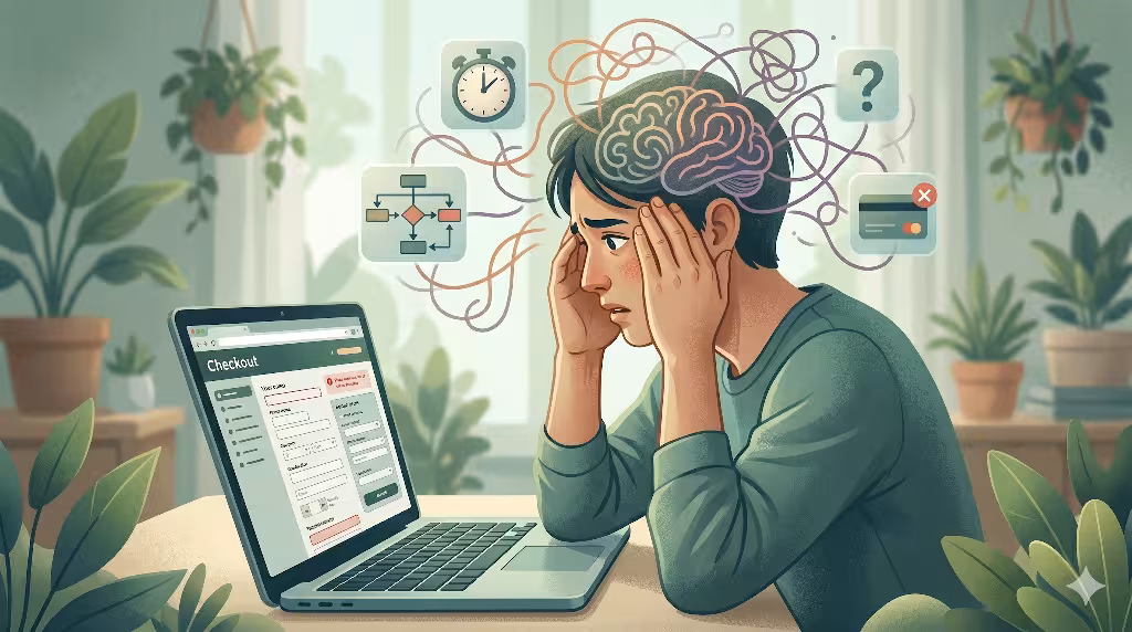
When we look at how people buy things online, the checkout page is the biggest bottleneck. Up until that point, the shopper is enjoying looking at items and adding them to a cart with eager antcipation. But when they reach the payment step, the mood changes. This change happens because of how the human brain reacts to risk and stress.
The cryptographic paradox is a major issue in modern web design. To make a page feel safe, many designers use design elements that look cold, robotic, overly industrial, and clinical. They use bright red error text, sharp corners (which as you know from other posts, signal danger), and heavy padlocks.
While these elements are meant to signal safety, they often do the exact opposite. They trigger technology anxiety and overload the user with mental stress. The brain sees these harsh visual cues as a sign of danger rather than a sign of protection. When we use biophilic ux for secure checkout pages, we solve this paradox. We create a visual space that feels naturally safe and protective without using scary or robotic warnings.
To fix this bottleneck, we must look at the psychology of cart abandonment. Many businesses think that people leave their carts because of technical bugs or high shipping costs. While those things matter, quantitative analysis shows a deeper cause. Shoppers often leave because of their internal mental and emotional states. They experience anticipated regret, which means they worry they will regret spending the money. They also feel transaction risk, which is the fear that their data will be stolen. This mental friction causes them to freeze and close the tab. By using biophilic ux for secure checkout pages, we can soothe these emotional triggers and help the user move forward with confidence.
This is where the biophilic intervention comes into play. Digital biophilia is the practice of putting nature-inspired design elements into digital user interfaces. We use these natural patterns to act as an emotional stabilizer during moments of high friction. The human brain evolved in nature, so it naturally relaxes when it sees organic shapes, soft light, and balanced patterns. By bringing these elements into the payment flow, we lower the user’s stress level. Implementing biophilic ux for secure checkout pages gives the brain the familiar, calming signals it needs to feel truly secure during a financial choice.
Core Architecture: Demystifying Digital Biophilia in Transactional Spaces
To understand how this works, we have to look at how we transfer physical design principles onto a digital screen. Biophilic design started in architecture and urban planning. Architects found that adding plants, natural light, and organic materials to buildings made people healthier and happier. By applying biophilic ux for secure checkout pages, we can channel the same feelings to the screen.
At Silphium Design LLC, we take those same structural frameworks and scale them down to fit onto a computer or smartphone screen. We turn physical well-being into functional digital wellness. When applying biophilic ux for secure checkout pages, we do not just slap pictures of trees onto the screen. Instead, we use the underlying math, geometry, and spacing found in healthy natural environments to arrange our forms and buttons.
The data supporting this method is very strong. Empirical evidence from stress mitigation studies confirms that nature-inspired designs work well. Whether a person is in a real forest or looking at simulated natural patterns on a screen, their body reacts the same way. Their physiological stress levels drop. Their heart rate stabilizes, and their mental arousal goes down during difficult tasks. Online shopping is a mentally demanding task, especially when it involves typing in a credit card number and getting it right. By utilizing biophilic ux for secure checkout pages, we create a digital buffer. This buffer protects the user from the digital stress that usually ruins the shopping experience.
There is a simple reason why these principles belong on the payment screen. The checkout page represents the highest risk for an online shopper. It is the exact moment where they must give up their hard-earned money and sensitive personal data. Because the stakes are high, the user is in a state of high alertness. Any small glitch or ugly design choice can scare them away. When we implement biophilic ux for secure checkout pages, we use natural spatial patterns to soften this experience. We turn a stressful transaction into a smooth, organic transition that feels as natural as walking down a garden path.
Mapping the 14 Patterns of Biophilic Design to Digital Checkout UI
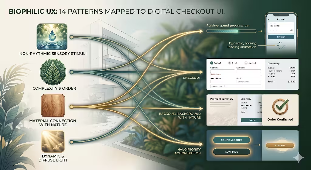
To make these ideas practical, we can look at the official 14 patterns of biophilic design from Terrapin Bright Green. These patterns were created for buildings, but we can translate them directly into user interface components. Let us examine five key patterns that work beautifully when we build biophilic ux for secure checkout pages.
The first pattern is complexity and order. In nature, things are complex but highly organized. Think of the way a fern leaf grows or how a snowflake forms. They use fractals, which are repeating patterns that look similar at any scale. We can use these fractal visual hierarchies to counter information overload on a payment screen. Instead of throwing twenty input boxes at the user all at once, we use symmetrical layouts based on organic proportions. We use progressive disclosure, which means we only show the steps the user needs to see right now. This keeps the layout organized and keeps the user’s mind clear as they complete the biophilic ux for secure checkout pages.
The second pattern is material connection. In a physical building, this means using real wood, stone, or wool. On a digital screen, we can create a material connection by using gentle textures. We can use CSS code to create soft background textures that subtly evoke the feeling of linen paper, smooth matte cardstock, or raw minerals. When these textures are placed inside the input boxes where users type their card details, they create a sense of grounding. The screen no longer feels like a cold sheet of glass. It feels substantial and trustworthy, which is a major goal when crafting biophilic ux for secure checkout pages.
The third pattern is dynamic and diffuse light. Nature is rarely lit by harsh, static fluorescent bulbs. Instead, natural light changes softly throughout the day, moving through trees and clouds. We can bring this into web design by avoiding sudden, jerky visual changes. When a user clicks a button or runs into an error, we do not want a bright red box to flash instantly. Instead, we use slow, luminous transitions that take between 200 and 400 milliseconds to ease in and out. We can use soft, breathing animations for loading states instead of a frantic spinning wheel. This gentle movement maintains a calm atmosphere within our biophilic ux for secure checkout pages.
The fourth pattern is biomorphic forms. This means using shapes that mirror the curves and geometry found in living things. Most web designs use perfect rectangles with sharp 90-degree corners. These sharp shapes do not exist in comfortable natural settings, and they can make the brain feel tense. For effective biophilic ux for secure checkout pages, we swap those harsh corners for soft, rounded edges. We use corner radiuses between 8 and 16 pixels to make buttons and input fields look smooth. These curved shapes feel safer and more inviting to the human eye, which reduces visual tension.
The fifth pattern is refuge. In the wild, animals look for a place of refuge where they can feel safe from danger while still seeing what is ahead. We can build a digital sense of refuge on a payment screen. We do this by enclosing the most sensitive payment fields, like the credit card number and the security code, inside a distinct visual capsule. This capsule can have a soft, protective drop shadow and a slightly warmer background color. This design isolates the critical data entry fields from the rest of the page. It tells the user’s brain that their most private information is cradled and protected, which is the core purpose of biophilic ux for secure checkout pages.
Balancing Visual Serenity with Cryptographic Security (The Dev Stack)
As a web designer, I know that beauty means nothing if the page is not secure or fast. When we design biophilic ux for secure checkout pages, we must balance visual peace with strict cryptographic safety. We cannot let our design elements slow down the page loading times or create holes where hackers can steal data. Every design choice must work within the rules of modern web development and data privacy.
One of the biggest technical challenges comes from the Payment Card Industry Data Security Standard, also known as PCI-DSS. To keep cards safe, modern websites use secure text boxes called iFrames that are hosted by payment companies like Stripe or Braintree. These iFrames are locked down for security, which can make them hard to style. However, we can use custom CSS properties provided by these services to apply our nature-inspired styles. We can pass our organic fonts, soft colors, and rounded corners directly into the secure fields. This allows us to maintain excellent biophilic ux for secure checkout pages without breaking the sandbox security that keeps financial data safe.
We also have to make sure these layouts work perfectly on every device. A checkout flow must look just as soothing and organized on a small smartphone screen as it does on a large desktop monitor. We use responsive layout grids that stretch and shrink smoothly like natural organisms. This flexible design helps users of all ages and abilities. When building biophilic ux for secure checkout pages, accessibility is a top priority. The forms must be easy to read for people with poor eyesight, and they must work perfectly with screen readers for the blind. Natural design is for everyone, so our code must reflect that inclusivity.
Finally, true biophilic design requires us to eliminate all dark patterns. Dark patterns are sneaky design tricks that companies use to fool people into spending more money or signing up for things they do not want. Examples include hiding extra fees until the last second or checking subscription boxes automatically. These tricks destroy trust and cause immediate digital stress. Because biophilic design is rooted in the honesty and balance of nature, it rejects these deceptive tactics. When we develop biophilic ux for secure checkout pages, we focus on absolute transparency. We give the user full control over their choices, use clear pricing, and maintain an honest pace that honors the user’s intelligence.
Common Questions about Biophilic UX for Secure Checkout Pages
How does biophilic UX design reduce cognitive load during online checkouts?
When a customer encounters a complicated checkout form, their brain experiences technostress. This happens because the form forces their short-term working memory to work too hard to figure out what to do. Biophilic UX design fixes this problem by balancing layout complexity with natural predictability.
By using organic visual hierarchies, familiar spacing, and soothing color tones, we make it much easier for the brain to process information. The user does not have to hunt for the next step or guess what an input box means. This reduces mental fatigue, lowers anxiety, and allows the shopper to complete their purchase using a clear, calm mental path. This shows why biophilic ux for secure checkout pages is so valuable for modern websites.
Can nature-inspired design elements improve e-commerce conversion rates?
Yes, they certainly can. In the world of e-commerce, conversion rate optimization is all about removing the friction that stops people from buying. Because financial transactions naturally cause a small amount of worry, lowering that anxiety directly leads to more sales. When businesses use biophilic ux for secure checkout pages, they create a welcoming environment that reduces the user’s urge to run away or abandon their cart. By comforting the shopper during the most stressful part of the journey, you increase their confidence and willingness to finish the payment. A calm customer is a confident customer, and confident customers are much more likely to complete their purchases.
Does digital biophilia compromise web application security or speed?
Not at all, as long as the system is coded correctly by professional developers. Digital biophilia is a philosophy that guides how we handle styling, spacing, and visual pacing. It is not about loading huge, heavy photographs of forests or playing loud background sounds of rain. At Silphium Design LLC, we build biophilic ux for secure checkout pages using incredibly lightweight code. We use clean SVGs for icons, programmatic CSS code for smooth gradients, and native system fonts that load instantly. We also use hardware-accelerated animations that run beautifully without draining device batteries. The security remains completely intact because our visual styles fit perfectly over standard, locked-down encryption methods.
How does user age affect susceptibility to checkout anxiety and UI design?
As people grow older, their comfort levels with digital technology can vary widely. Many older adults experience higher levels of technology anxiety. They may worry about making mistakes, clicking the wrong button, or falling victim to online financial scams. This means that sterile, fast-paced, or confusing checkout pages can be very intimidating for elderly shoppers. When we build biophilic ux for secure checkout pages, we take these age-related factors into account. We use larger text sizes, clear organic contrasts, and reassuring visual spaces. By avoiding frantic animations and providing clear, grounding feedback, we remove the barriers that make older users anxious. This creates a safe, comfortable experience for shoppers of any age.
Measuring Metrics and ROI: The Neuro-UX KPIs
To prove that our designs work, we must track concrete data and business metrics. We do not just design by feeling; we use rigorous data science to measure how well our biophilic ux for secure checkout pages perform. We look at two main areas: primary conversion indicators and behavioral diagnostics.
First, we track primary conversion indicators through analytical tools like Google Analytics 4. We look closely at the checkout drop-off rate, which tells us exactly what percentage of users leave at each step of the payment process. When we launch biophilic ux for secure checkout pages, we look for a significant drop in this number. We also measure the mean time-to-complete transaction. If a user can fill out the form faster and with fewer corrections, it proves that the nature-inspired layout has reduced their cognitive load and cleared away unnecessary friction.
Second, we use behavioral diagnostics to see how users interact with the page in real-time. We analyze heatmaps and session recordings to check for a reduction in rage clicks. Rage clicks happen when a frustrated user clicks a broken or confusing button over and over again. By switching to biomorphic feedback forms, we can guide users gently through errors, which stops frustration before it starts. We also monitor form analytics to see if users hesitate before typing their data into sensitive boxes. When we use the refuge pattern in our biophilic ux for secure checkout pages, we find that users hesitate less, showing that they feel an immediate sense of trust.
Summary of Biophilic Checkout Best Practices
To help you see how these ideas come together, let us look at a practical summary of how to build a nature-inspired payment area. Every detail matters when creating a balanced interface.
First, let us look at colors and contrast. Instead of using blinding white backgrounds and harsh neon borders, you should choose a palette inspired by the earth. Use soft sand tones, gentle stone grays, and muted forest greens for accents. When an error occurs, avoid flashing an aggressive bright red box. Instead, use a warm, organic terracotta shade that alerts the user without causing a panic response. These natural tones soothe the eyes and keep the user’s mind at ease while they interact with your biophilic ux for secure checkout pages.
Next, consider the layout and flow of the information. Do not crowd the screen with text fields and checkboxes. Use plenty of open space, which acts like a breath of fresh air for the user’s mind. Group related fields together into smooth, rounded cards that look like polished river stones. Make sure the transition from the shipping information to the billing details feels smooth and continuous. By organizing the journey into clear, logical steps, you ensure that your biophilic ux for secure checkout pages feel like a peaceful progression rather than an overwhelming test.
Finally, think about how the interface gives feedback. When a user types their information correctly, give them subtle, satisfying confirmations. A checkbox could appear with a soft fade, or a border could glow gently like morning light. If they make a mistake, use clear, friendly language to help them fix it. Never blame the user or use robotic error codes. By treating the customer with respect and kindness, you reinforce the sense of safety that is so important for biophilic ux for secure checkout pages.
Implementing Nature’s Geometry for Better Trust
The math found in nature can be used to improve the layout of online forms. Living things grow according to precise geometric rules, such as the golden ratio and the Fibonacci sequence. These mathematical ratios feel deeply satisfying to the human eye because our brains are trained to recognize them in the physical world. When we bring these same proportions into our web layouts, the interface feels balanced and orderly.
When arranging input fields for biophilic ux for secure checkout pages, you can use these natural ratios to determine the size and spacing of your design elements. For example, the ratio between the width of the main payment form and the sidebar can match the golden ratio. The blank spaces between form sections can grow and shrink using natural mathematical steps. This prevents the layout from feeling random or disorganized. When a layout feels mathematically harmonious, the user’s brain perceives it as high quality and highly professional. This immediate perception of quality builds a deep sense of trust before the user even types a single number.
Furthermore, these natural proportions help with scannability. A user should be able to look at a payment screen and understand exactly what is required of them in less than a second. If the fields are placed haphazardly, the eyes must dart around the screen, which causes visual fatigue. By using nature’s geometry to guide the user’s eyes down the page, you create a visual pathway that feels effortless to follow. This smooth visual journey is a core requirement when designing biophilic ux for secure checkout pages that convert visitors into loyal customers.
The Role of Micro-Interactions in Emotional Stabilization
Micro-interactions are the small animations and visual changes that happen when a user touches, clicks, or hovers over an element on a web page. In standard web development, these moments are often ignored or treated as minor details. However, in emotional design, these small moments are highly influential. They offer a golden opportunity to reassure the user and keep them calm.
When a customer submits their payment details, there is usually a brief period of waiting while the bank approves the transaction. This waiting period is often the most anxious moment of the entire shopping experience. The user wonders if their card will go through, or if they will accidentally be charged twice. If the screen freezes or shows a harsh, fast-spinning loading icon, their anxiety peaks.
When we build biophilic ux for secure checkout pages, we design this waiting state with extreme care. We use a slow, pulsing ambient light effect that mimics the rhythm of a calm breath. This breathing animation tells the user that the system is working steadily and securely, which helps them feel relaxed while they wait.
Another important micro-interaction is the way input errors are handled. If a user types an invalid card number, a typical website might display a sharp red outline and a blunt message like “INVALID CARD.” This harsh feedback can make the user feel foolish or defensive. In our biophilic ux for secure checkout pages, we handle errors with gentleness. The input box might shift slightly using a smooth, fluid motion that looks like a leaf moving in the wind. The error message appears in clear, helpful language, explaining how to fix the issue without using scolding tones. This supportive feedback maintains the peaceful atmosphere of the checkout experience.
Enhancing Digital Textures for Sensory Grounding
The digital world often feels flat and weightless, which can make it feel detached and untrustworthy. In contrast, the physical world is full of rich, tactile textures that give us a sense of place and presence. By bringing subtle digital textures into web design, we can ground the user and make the interface feel more reliable and substantial.
When designing biophilic ux for secure checkout pages, we can use advanced CSS styles to create background patterns that mimic organic materials. These patterns must be incredibly faint so they do not distract from the text or make the page hard to read. A very soft, dappled pattern can suggest the look of handmade recycled paper or refined clay. When the user looks at these containers, their brain associates the visual texture with solidity and permanence. This tactile connection helps reduce the feeling that their money is disappearing into a strange, empty digital void.
These grounding textures are especially helpful on mobile devices. When people shop on smartphones, they are often on the move, surrounded by distractions like traffic, noise, or crowded trains. This chaotic environment makes it even harder to focus and increases transaction anxiety. By using sensory grounding techniques within your biophilic ux for secure checkout pages, you create a focused, peaceful sanctuary on the user’s screen. The rich, natural texture acts as a visual anchor, helping the mobile shopper block out ambient chaos and finish their purchase with peace of mind.
Overcoming Resistance to Biophilic Web Design
Even though the benefits of nature-inspired design are clear, some business owners and developers are hesitant to try it. They might think that biophilic design is just a passing trend, too artistic for a serious commercial website, or in today’s world, a political statement. They may believe that a secure payment page must look strictly industrial to be taken seriously by consumers.
To overcome this resistance, we must point to the data and the changing expectations of modern shoppers. Today’s consumers are highly sensitive to how websites make them feel. They are exhausted by loud advertisements, flashing notifications, and aggressive sales tactics. They flock to brands that offer a clean, respectful, and peaceful experience. Implementing biophilic ux for secure checkout pages is not about making a website look pretty; it is about applying proven evolutionary psychology to improve user performance and increase corporate revenue. When business owners see that natural design patterns lower cart abandonment and boost customer loyalty, their doubts quickly disappear.
Developers can also be hesitant because they worry about extra work or complicated code libraries. It is important to emphasize that biophilic design does not require complex frameworks or heavy assets. It is simply a smarter way to use the tools that developers already use every day. By setting up clear design tokens for organic colors, rounded spacing, and smooth animations, a development team can build biophilic ux for secure checkout pages easily within their existing workflows. It is an efficient, high-impact approach that benefits the business, the development team, and the end user.
Future Horizons: The Evolution of Natural Interfaces
As technology continues to advance, the opportunities for combining nature and web design will grow even larger. We are moving past flat screens and entering a world of spatial computing, voice interfaces, and advanced personalization. These new technologies will allow us to take nature-inspired design to a whole new level.
Imagine a checkout experience that adjusts its visual themes based on the time of day or the season of the year. If a customer is buying an item in the evening, the biophilic ux for secure checkout pages could smoothly shift to warmer, deeper sunset tones to match the natural light outside their window. If they are shopping in the spring, the interface could use fresh, energetic tones that mirror the changing seasons. This deep connection to the natural clock helps the digital world feel unified with the physical world, creating a profound sense of harmony and comfort for the user.
We can also look forward to using biometric feedback to create responsive, empathetic interfaces. For instance, if a user’s smartphone detects that their touch is hesitant or stressed, the biophilic ux for secure checkout pages could automatically simplify the layout, increase the text size, and offer more supportive guidance. By listening closely to the user’s physical state, our websites can become true partners in reducing digital stress. At Silphium Design LLC, we are committed to leading the way into this bright, natural future, making the internet a healthier place for everyone.
Building Lasting Brand Trust through Organic Values
At its core, using nature-inspired principles on a payment page is about more than just making a single sale. It is about building a deep, lasting relationship between the consumer and the brand. When a company takes the time to design a checkout process that respects the user’s mental well-being, it sends a powerful message. It shows that the business cares about the person behind the credit card, not just the money in their bank account.
Most e-commerce websites treat the checkout as a cold, transactional machine. Once the user enters their data, they are pushed out of the system with a generic confirmation message. This leaves them feeling disconnected. By maintaining excellent biophilic ux for secure checkout pages all the way through the final thank-you screen, you leave a lasting positive impression. The customer finishes the transaction feeling calm, respected, and satisfied. This positive emotional ending makes them much more likely to remember your brand fondly and return for future purchases.
In a crowded marketplace where many products look identical, the way a website makes a customer feel is its greatest competitive advantage. By embracing digital biophilia, you lift your business above the noise. You turn a standard financial transaction into an opportunity for restoration and peace. Investing in biophilic ux for secure checkout pages is a smart, strategic choice that protects your users, strengthens your brand, and drives long-term commercial success.
Practical Steps to Update Your Existing Checkout
If you already have an online store and want to start using these principles, you do not have to rebuild your entire website overnight. You can make small, iterative updates to your existing system to start seeing the benefits of natural design right away. A step-by-step approach allows you to test each change and see how your customers respond.
Change Your Brand’s Digital Color Palette
Start by changing your brand’s digital color palette on the payment screen. Look at your current input borders and buttons. If they are using harsh, saturated blacks or bright, stressful primary colors, soften them. Swap them out for organic shades like charcoal, deep slate, or warm sand. This simple CSS update requires very little code but instantly changes the mood of the page, laying a solid foundation for your biophilic ux for secure checkout pages.
Spacing and Padding on Form Fields
Next, look at the spacing and padding around your form fields. Many checkouts crowd their input fields close together to save space on the screen. This crowding causes immediate visual stress. Increase the margins and padding to let the elements breathe. Give each input box plenty of room, making it easy for the user to see where one task ends and the next begins. Adding this breathing room is a fast, effective way to introduce biophilic ux for secure checkout pages to your current online storefront.
Error Messages on the Payment Form
Finally, review the text and error messages on your payment form. Remove any cold, technical jargon or aggressive warnings. Rewrite your error states to be helpful, warm, and supportive, guiding the user gently through any mistakes. By combining softer colors, spacious layouts, and kind language, you can quickly establish highly effective biophilic ux for secure checkout pages that keep your customers calm and boost your conversion rates.
The Path Forward for Web Engineering
We have spent decades building a digital world that is fast, loud, and clinical. While this approach has made online shopping highly efficient, it has also created a wave of digital stress and technology anxiety. As web designers, it is our responsibility to fix this imbalance. We must remember that behind every screen, mouse click, and credit card transaction is a living human being with an evolutionary need for order, beauty, and nature.
By embracing biophilic ux for secure checkout pages, we bridge the gap between high-tech security and human well-being. We prove that a website can be completely safe, lightning fast, and compliant with international security rules while still feeling peaceful and inviting. We use the ancient wisdom of the natural world to solve the modern problems of digital anxiety and cart abandonment. It is a holistic, scientific approach that respects the user’s mind and body.
At Silphium Design LLC, we believe that the future of the internet is organic. We will continue to build digital spaces that feel less like concrete cubicles and more like open, natural ecosystems. We invite you to join us on this journey. Start looking at your user interfaces through the lens of biophilia, and see how bringing nature onto the screen can transform your web designs, protect your users, and unlock new levels of success for your business.