Imagine walking through a quiet forest in the heart of Pennsylvania. The air is cool and smells like pine needles and damp earth. As a botanist and a web designer, I spend a lot of time looking at the ground and the trees. One day, while looking at the tightly wound center of a fern, I realized something important. The way that fern grows is not a mistake. It follows a perfect plan. This plan is hidden in the seeds of a sunflower and the shell of a snail.
In the world of science and art, we call this the golden ratio. It is a mathematical secret that makes things look beautiful to our eyes. When I shifted my career from studying plants to building websites, I brought this secret with me. Our goal at Silphium Design LLC is to make the internet feel as natural as that forest. We use the golden ratio to build websites that do not just look good but feel right.
This article will show you how the Fibonacci connection helps us create digital spaces that our brains are already programmed to love.
Table of Contents
The Biological Imperative of Proportion
Human beings have spent thousands of years living in nature. Because of this, our eyes and brains have learned to recognize certain patterns. These patterns helped our ancestors survive. If a plant grew in a specific way, it was healthy. If a landscape had a certain balance, it was a safe place to live. This deep history has created what we call a biological imperative. It means our bodies are literally built to prefer things that follow the golden ratio.
When you look at a website that is messy, your brain has to work very hard. It gets tired. But when a website uses the golden ratio, your brain relaxes. It recognizes the pattern from the natural world. This is why biophilic design is so powerful. It uses the math of the forest to make the internet easier to use. By using the golden ratio, we reduce the stress that people feel when they browse the web. We are not just making things pretty. We are making them match the way the human eye naturally wants to see the world.
The Mathematical Foundation: From Sequence to Constant
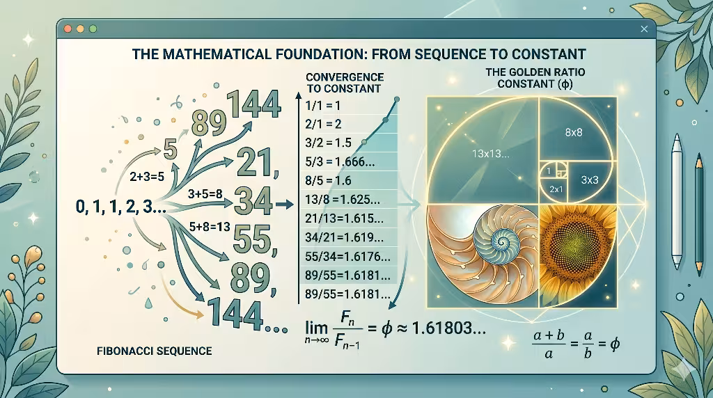
To understand how this works, we have to look at some simple math. Do not worry, it is quite easy to follow. Everything starts with something called the Fibonacci sequence. This is a list of numbers where you get the next number by adding the two before it. It looks like this: 0, 1, 1, 2, 3, 5, 8, 13, and so on.
As these numbers get bigger, something amazing happens. If you divide one number by the one before it, you get a special number. For example, 8 divided by 5 is 1.6. If you go higher, like 21 divided by 13, you get 1.615. The further you go, the closer you get to a number called Phi. This number is about 1.618. This is the official number of the golden ratio.
In computer science, we use this number like a blueprint. Just like a sunflower uses it to pack as many seeds as possible into a small space, we use the golden ratio to pack information onto a screen. We call this phyllotaxis in the plant world. In the digital world, we call it smart layout design. By using the golden ratio, we ensure that every part of a website has enough room to breathe.
Designing with the Golden Ratio: Layout Architecture
When we start building a website, the first thing we think about is the layout. A layout is like the floor plan of a house. If the rooms are the wrong size, the house feels uncomfortable. We use the golden ratio to decide how wide the main part of the page should be.
If you have a website that is 1000 pixels wide, you do not just guess where to put the sidebar. You divide 1000 by 1.618. This gives you about 618 pixels. That becomes your main content area. The rest, about 382 pixels, becomes your sidebar. This specific balance is the golden ratio in action.
When a user lands on a page built this way, they do not feel overwhelmed. Their eyes know exactly where to go first. The golden ratio creates a clear path for the eye to follow. It makes the sidebar look like it belongs there rather than being stuck on the side as an afterthought. This is the difference between a website that feels like a machine and one that feels like a living thing.
Typography and Visual Hierarchy
Most people do not think about math when they read text, but they should. The size of the letters on a screen changes how we feel about what we are reading. We use the golden ratio to set the sizes for our headings and our body text.
If your main paragraph text is 16 points high, you multiply that by 1.618 to find the size of your subheadings. That gives you about 25 points. You can do it again to find the size of your main title. This creates a visual ladder. Your eye starts at the biggest text and steps down to the smallest. This ladder is built using the golden ratio.
Using the golden ratio for fonts makes the page look organized. It tells the reader what is most important without them even knowing it. It creates a rhythm on the page. Just like a song has a beat, a website has a visual beat. The golden ratio keeps that beat steady and pleasant.
Image Cropping and Composition
Images are a huge part of the internet. A good photo can tell a story faster than a thousand words. But a photo can also be distracting if it is not cropped correctly. This is where we use the golden spiral. The golden spiral is a curve that starts wide and gets tighter as it moves toward the center. It is based entirely on the golden ratio.
When we place an image on a website, we try to put the most important part of the image where the spiral is tightest. If we are showing a picture of a flower, the center of the flower goes in that spot. If it is a picture of a person, their eyes might go there. This use of the golden ratio draws the viewer’s attention naturally.
It feels more comfortable than putting the subject right in the middle of the frame. The golden ratio allows the eye to travel around the image before landing on the main point. This makes the experience of looking at the site feel more like a journey. It is a small detail, but using the golden ratio in photos makes a big impact on how much people like a site.
Semantic SEO and the Psychology of Shape
You might wonder what math has to do with search engines like Google. The answer is quite a bit. Search engines want to show people websites that are helpful and easy to use. If people stay on a website for a long time, Google thinks that site is good. This is where the golden ratio helps with SEO.
When a site is designed with the golden ratio, people stay longer. They do not click the back button because they feel frustrated. They feel calm. Because the golden ratio reduces cognitive load, people can read more and learn more. Google sees this behavior and moves the website higher in the search results.
Also, using the golden ratio creates a sense of trust. We subconsciously trust things that look like they belong in nature. A website that uses the golden ratio looks professional and authoritative. It looks like the owners put care into the design. This trust makes people more likely to click on links and share the content. In the end, the golden ratio is a tool for both beauty and business.
Mobile Responsiveness and Organic Scaling
Today, most people look at websites on their phones. This can be tricky for designers because phone screens are small. However, the golden ratio works on any size screen. Whether you are looking at a giant monitor or a tiny smartphone, the proportions stay the same.
We use the golden ratio to decide how elements should shrink or grow. Instead of just picking random numbers, we use the ratio to make sure the balance is kept. This is called organic scaling. It means the website moves and changes like a living plant.
A leaf grows in proportion to the branch it is on. A website should grow in proportion to the screen it is on. By using the golden ratio, we make sure the mobile version of a site feels just as natural as the desktop version. This consistency is key to a good user experience. It ensures that the golden ratio is always there to guide the user, no matter what device they use.
What is the golden ratio in design?
This is a question many people ask when they first hear about this concept. Simply put, it is a tool used to create balance. In design, the golden ratio is a mathematical ratio of 1 to 1.618. It is often called the Divine Proportion.
Designers use it to create layouts, logos, and art that feel “right” to the viewer. It is not a rule that must be followed perfectly every time, but it is a very good guide. When someone asks about the golden ratio in design, they are talking about using nature’s math to make human-made things look better. It is the secret ingredient in many of the world’s most famous buildings and paintings.
How do you use the Fibonacci sequence in graphic design?
Using the sequence is like using a set of building blocks. Each number in the sequence can represent a size or a space. For example, you might have a small box that is 3 units wide, a medium box that is 5 units wide, and a large box that is 8 units wide. Because these numbers are part of the sequence, they will always look good together.
In graphic design, the Fibonacci sequence helps create a sense of movement. You can use it to decide how much white space to leave between columns. You can use it to decide how thick a border should be. By following the sequence, you are ensuring that your design follows the golden ratio. This makes the final product feel unified and strong.
Why is the golden ratio important for UX?
UX stands for User Experience. It is all about how a person feels when they use a website. The golden ratio is important here because it makes the experience smoother. When a site uses the golden ratio, the user does not have to think about where to look. Their brain already knows.
This is important because we all have a limited amount of mental energy. If we spend all our energy trying to navigate a messy site, we have no energy left to read the content. The golden ratio saves that energy. It makes the site “fluent” for the brain. This is why the golden ratio is a favorite tool for top-tier designers. It turns a frustrating task into a pleasant one.
Tools for Biophilic Implementation
You do not have to be a math genius to use these ideas. There are many tools that help designers use the golden ratio every day. There are calculators online where you can type in one number and it will give you the golden ratio version of that number. This is great for figuring out font sizes or column widths.
Many design programs, like Figma or Adobe XD, have special plugins. These plugins draw the golden ratio lines or spirals right over your work. This lets you move things around until they line up perfectly. There are also code snippets for developers. These allow us to build the golden ratio into the very fabric of a website’s code. Using these tools makes it easy to bring a touch of the forest into the digital world.
The Connection Between Nature and Code
At Silphium Design LLC, we believe that code and nature are not as different as they seem. Computer code is a set of instructions. DNA is also a set of instructions. Both can use the golden ratio to create something beautiful.
When I write code, I think about the way a tree branches out. It starts with one trunk, then splits into smaller and smaller pieces. A website’s menu can do the same thing. By using the golden ratio in our code, we create a structure that is logical and sturdy. This is the heart of biophilic design. It is the marriage of biology and technology. We are using the oldest math in the world to build the newest things in the world.
The Future of Sustainable Web Design
As we move forward, the internet is going to get even bigger. There will be more websites and more information than ever before. This can be overwhelming. I believe the future of the web lies in making things simpler and more natural.
The golden ratio will play a huge part in this. We need to build sites that respect the human mind. We need to create spaces that feel like a breath of fresh air. By focusing on the golden ratio, we can make the internet a place that heals rather than stresses. Sustainable design is about more than just saving energy. It is about saving our mental well-being. Using the golden ratio is a step toward a kinder, more beautiful digital future.
Synthesizing Nature and Machine
In my life as a botanist and a web designer, I have seen many things. I have seen the way a shell curves and the way a computer processes a billion bits of data. The most beautiful thing is when these two worlds meet. The golden ratio is the place where they shake hands.
Designing with the golden ratio is not just about following a trend. It is about honoring the way life grows. It is about making a website that feels as solid as a mountain and as delicate as a leaf. When we use the Fibonacci connection, we are not just building pages. We are building ecosystems.
I hope this look into the golden ratio has helped you see the world a bit differently. The next time you see a flower or a website you really like, look for the math. Look for the balance. Chances are, the golden ratio is there, working its magic. At Silphium Design LLC, we will keep using this secret to build a better web, one pixel at a time. The golden ratio is the key to a world where technology and nature live in perfect harmony.
In conclusion, the golden ratio is our most valuable asset in the world of design. It connects us to our roots and guides us toward our future. By understanding and applying the golden ratio, we can create websites that truly resonate with people. We can make the digital world feel as real and as beautiful as the natural one. The golden ratio is the key, and the door is wide open. Let us walk through it together and see what we can create. The golden ratio is our guide, and the possibilities are endless.