
Table of Contents
The Evolution of Cultural Event Web Architecture
The digital world is changing how we experience human culture. Years ago, websites for museums, festivals, and art galleries were just digital noticeboards. They displayed a basic address, opening hours, and a plain list of events. Today, the internet demands much more. Modern web interfaces must act as living, breathing extensions of physical spaces. As a designer focusing on biophilic design, which means bringing natural patterns into digital technology, I look at websites as digital ecosystems. Just like a forest canopy manages light and space, successful web interfaces must manage information, beauty, and human behavior.
When we look at successful examples of web interfaces for cultural events, we see a massive shift. These platforms no longer just pass along data. They create deep immersion, which means they make users feel like they are truly inside an exhibition or concert hall. To achieve this, engineers and artists build narrative-driven frameworks. These frameworks use digital storytelling to guide a visitor from initial curiosity to buying a ticket. They use sensory translation, turning the physical texture of oil paint, the echo of a theater, or the energy of a live crowd into visual elements on a screen.
Building these modern web interfaces requires balancing technical power with human psychology. When a website mirrors natural systems, it becomes easier for the human brain to understand. This approach reduces cognitive fatigue, which is the mental tiredness people get from looking at messy or confusing layouts. A successful digital ecosystem must blend high-speed performance with artistic beauty. If a page takes too long to load, the artistic beauty does not matter because the user will leave.
The following matrix shows how modern web interfaces for cultural events have evolved over time to meet these high standards.
| Design Era | Primary Focus | Structural Style | Technology Used | User Experience |
| Early Web (1995-2005) | Basic information sharing | Rigid tables and plain text | Static HTML and basic CSS | Informational but flat and unengaging |
| Interactive Web (2006-2018) | Online multimedia | Standard columns and video boxes | Flash, early JavaScript, basic CMS | Functional but often slow and cluttered |
| Modern Ecosystems (2019-2026) | Deep sensory immersion | Adaptive layouts and fluid grids | Modern JavaScript, cloud assets, headless CMS | Highly intuitive, immersive, and accessible |
This evolution shows that web interfaces are now essential tools for cultural preservation and business growth. By studying successful examples of web interfaces for cultural events, we can learn how to build digital spaces that captivate audiences while loading instantly.
What Components Make a Cultural Website Successful?
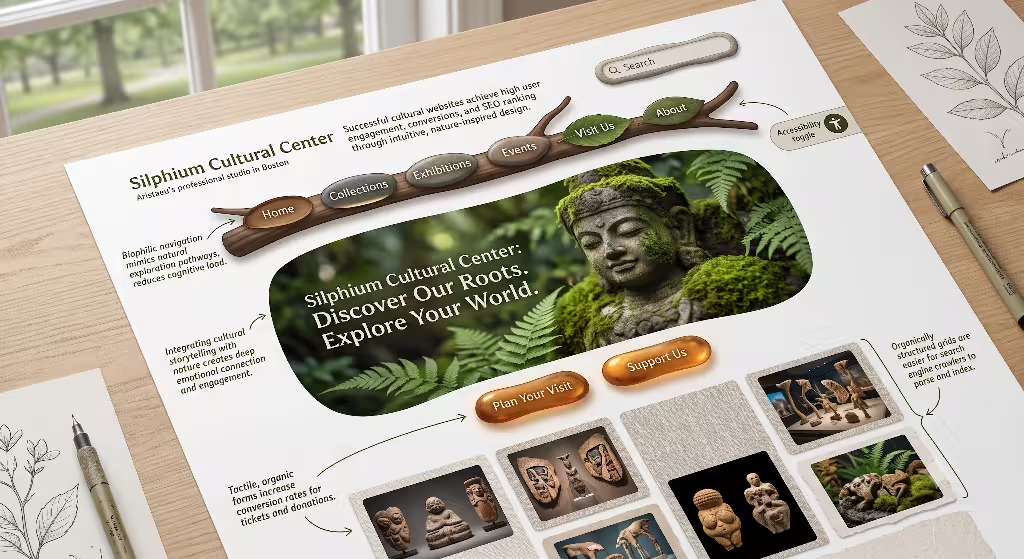
To build top-tier web interfaces, creators must understand specific design rules. A cultural website cannot look like a standard corporate banking portal or a basic online store. It needs to reflect creativity while remaining highly usable. The layout must feel alive yet organized. We can break these requirements down into distinct user interface design patterns.
Asymmetric and Dynamic Grids
Most basic websites use rigid, perfectly even boxes. However, successful web interfaces for cultural events often use asymmetric grids. Asymmetric means the two sides of the layout do not mirror each other perfectly. Instead, they use balanced unevenness. This style mimics how we experience a physical art gallery. When you walk through a museum, paintings are not all the same size, and they are not spaced out like items on a supermarket shelf. Some are huge wall-sized canvases, while others are small sketches.
Dynamic grids allow web interfaces to adjust based on the content. An article about a massive outdoor music festival might use wide, sweeping content blocks. A page detailing delicate historical jewelry might use tight, focused visual clusters. This layout style keeps the user’s eyes moving naturally across the screen. It creates a sense of discovery, making the viewer want to scroll further down the page to see what comes next.
Persistent Micro-Interactions
Micro-interactions are small animations or visual changes that happen when a user interacts with a page. For example, when you hover your mouse over a button, it might gently change color, or an image might softly expand. In high-quality web interfaces, these moments are persistent but subtle. They provide instant feedback, telling the user that the website is responsive and working correctly.
If a user hovers over a date on a festival calendar, a tiny preview of the performing artists should appear smoothly. These micro-interactions must be highly optimized. If they use too much computer processing power, they will cause lag, which makes the page feel heavy and broken. Clean web interfaces use modern browser styles to handle these animations smoothly, ensuring the code stays lightweight.
Fluid Typography Systems
Typography refers to how text looks on a screen. Cultural events require text that reads easily on a tiny phone screen and a giant desktop monitor. To solve this, advanced web interfaces use fluid typography systems. Instead of setting text to a fixed size, developers use formulas based on the width of the viewer’s screen.
This approach means headings and body text scale up and down smoothly like an accordion. The text never becomes so large that it breaks the layout, and it never becomes so small that users have to squint. Good typography also uses clear visual hierarchy. This means the most important information, like the event title and date, stands out immediately, while supporting details sit quietly underneath.
Biophilic Contrast Elements
As an expert in biophilic design, I know that human beings evolved in natural environments, not in front of bright glowing screens. Because of this, standard corporate web interfaces can cause eye strain and mental fatigue. Cultural platforms can avoid this by using natural patterns and geometric shapes found in the physical world. This design approach is known as biophilic contrast.
We can look at how nature organizes space. Visual patterns like the spiral of a seashell or the branching paths of a tree trunk can inspire the layout of web interfaces. When a website uses color palettes derived from earth, stone, water, and plants, it creates a sense of comfort. These organic colors, combined with soft geometric shapes, create a pleasant contrast against sharp digital screens. By using these natural rhythms, web interfaces feel less mechanical and more human. This encourages visitors to stay on the site longer, exploring exhibits and reading articles without feeling fatigued.
Case Studies: Successful Examples of Web Interfaces for Cultural Events
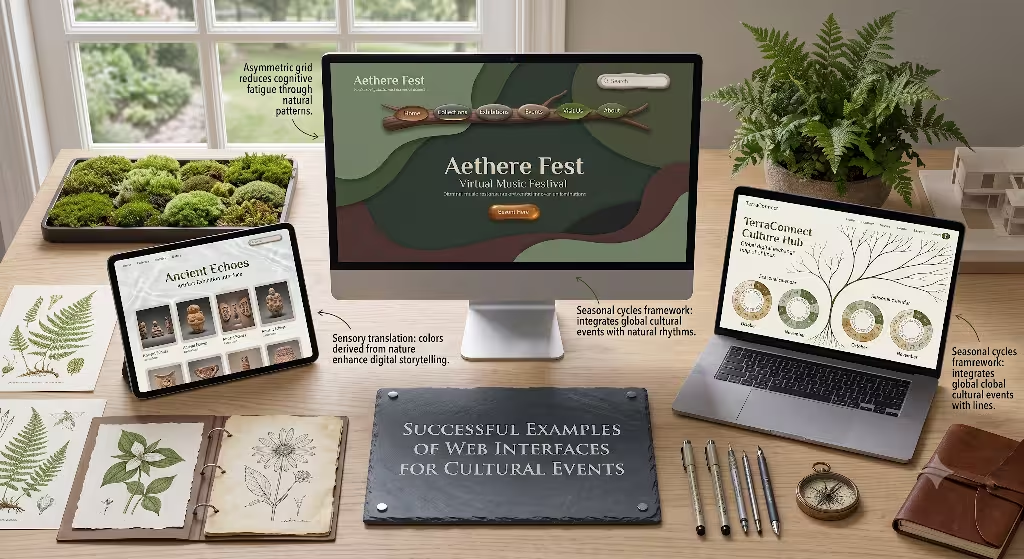
To truly understand how these principles work in the real world, we must analyze successful examples of web interfaces for cultural events. The following case studies look at world-famous institutions and modern festivals that have mastered the art of digital design.
A. The Immersive Historical Archive: Rijksmuseum (Rijksstudio)
The Rijksmuseum in Amsterdam created one of the most famous web interfaces in the cultural sector. Their platform, known as Rijksstudio, completely changed how people interact with classical art online. Instead of hiding their collection behind small, low-quality images, they opened up their archive with ultra-high-resolution files.
The core design lesson here is asset exposure. The web interfaces designed for Rijksstudio treat the artwork as the actual structure of the website. The background colors are neutral and deep, pulled directly from the historic paint tones used by artists like Rembrandt. The text is clean and minimal. There are no heavy borders or bright neon boxes around the images. The art pieces float naturally within the digital space.
Furthermore, these web interfaces allow users to interact with the art. Visitors can zoom in so close that they can see the tiny cracks in the historic oil paint. Users can also crop pieces of the art, save their own custom collections, and even download high-quality files to print at home. By giving control to the audience, the website becomes a personal interactive studio rather than a distant museum catalog.
B. The Global Icon Portal: Le Louvre
Le Louvre in Paris faces a unique challenge. Millions of people from all over the world visit their platform every month. Many of these users speak different languages, have varying levels of tech-savviness, and look for completely different things. Some want to buy a physical ticket for tomorrow morning, while others are students in Asia researching ancient sculptures.
To serve everyone, the Louvre built web interfaces that focus heavily on clear information architecture, which is the system used to organize and label content. The homepage uses a clean, layered navigation menu. It separates the physical visitor tools from the digital exploration tools immediately.
One of their biggest achievements is the integration of 360-degree virtual walkthrough frameworks. These web interfaces let users walk through the physical gallery rooms from their home computers. The system links individual visual spots to an asset database. If you see a statue you like during the virtual tour, you can click on it to open a clean information card with historical facts. The interface handles this massive amount of data smoothly, ensuring that users do not get lost in a maze of links.
C. The Modern Identity Hub: Leslie-Lohman Museum of Art
The Leslie-Lohman Museum of Art focuses on modern themes and community identity. Their digital presence requires a style that feels bold, artistic, and deeply educational. To achieve this, their web interfaces use a modern headless content management system, which is a flexible database tool that separates back-end data from front-end design.
This technical setup allows their web interfaces to display a massive archive of past events alongside active ticket sales for current shows. The visual style relies on strong editorial layouts. It looks less like a standard corporate site and more like a high-end art magazine. They use large typography, high-contrast color choices, and robust filtering engines. Visitors can quickly sort through decades of art history by year, artist, medium, or exhibition theme. The design shows that web interfaces can handle complex historical data while looking fresh and cutting-edge.
D. The Large-Scale Multi-Vector Festival: SXSW
South by Southwest, known as SXSW, is a massive event in Austin, Texas, that combines music, film, and interactive media. Their physical event features thousands of different speakers, screenings, and concerts happening at the exact same time across an entire city. Their web interfaces have to organize this beautiful chaos into a single usable screen.
The SXSW platform relies on an advanced schedule-filtering engine. When users load the site, they are met with a highly responsive framework. This framework adapts instantly whether it is viewed on a wide desktop screen in an office or a mobile device on a crowded street corner. The web interfaces allow users to build personal schedules, star their favorite events, and filter listings by venue, time, and topic. During the live event, the interface updates in real time to show room capacities and schedule updates. This is a prime example of how web interfaces must prioritize utility and speed during high-traffic periods.
How Do You Build Immersive Digital Experiences for Cultural Heritage?
Building web interfaces for cultural heritage requires specialized development methods. Designers cannot just throw images onto a template and hope for the best. They must construct a technological system that respects history while utilizing modern browser capabilities.
The 360-Degree Walkthrough Hotspot Matrix
A common feature in cultural web interfaces is the online gallery tour. To build this effectively, developers use a system called a hotspot matrix. This involves capturing high-resolution panoramic photographs of a physical room and stitching them together into a spherical digital environment.
Inside these web interfaces, developers place interactive coordinates, or hotspots. When a user looks around the room and clicks on an object, the interface pulls data from a central museum database. This system requires excellent optimization. The images must be compressed using advanced file formats so they load instantly, even on slower mobile networks. The coding behind these web interfaces must ensure that moving around the virtual space feels smooth, preventing users from experiencing jerky screen movements.
Thematic Narrative Story-Exhibitions
Another powerful tool for cultural web interfaces is the scroll-driven narrative exhibition. Instead of forcing a user to click through separate pages, these interfaces present a single long page that reacts as the user scrolls down. Using modern animation scripts, elements move onto the screen based on the user’s scroll speed.
As you scroll, a historical document might slide in from the left, while a map on the right zooms in on the town where that document was signed. These web interfaces use a technique called scroll-snapping, which gently locks the screen into place at key moments in the story. This setup ensures that the user reads the information in the correct chronological order, making the digital experience feel like a guided tour through a physical museum.
The Augmented Reality Layer Integration
The line between physical spaces and digital spaces is blurring. Modern web interfaces for cultural events now frequently include augmented reality, which means placing digital objects into the real world using a smartphone camera.
When a visitor stands in a physical gallery, they can open the museum website on their phone. The web interfaces can access the device’s camera to overlay helpful metadata onto the exhibit. For example, if a visitor points their phone at a damaged ancient statue, the website can display a 3D digital model showing what the statue looked like when it was new. This system requires highly secure, lightweight coding that works directly inside mobile web browsers, eliminating the need for visitors to download a bulky app from an app store.
Critical Functional and Conversion Requirements
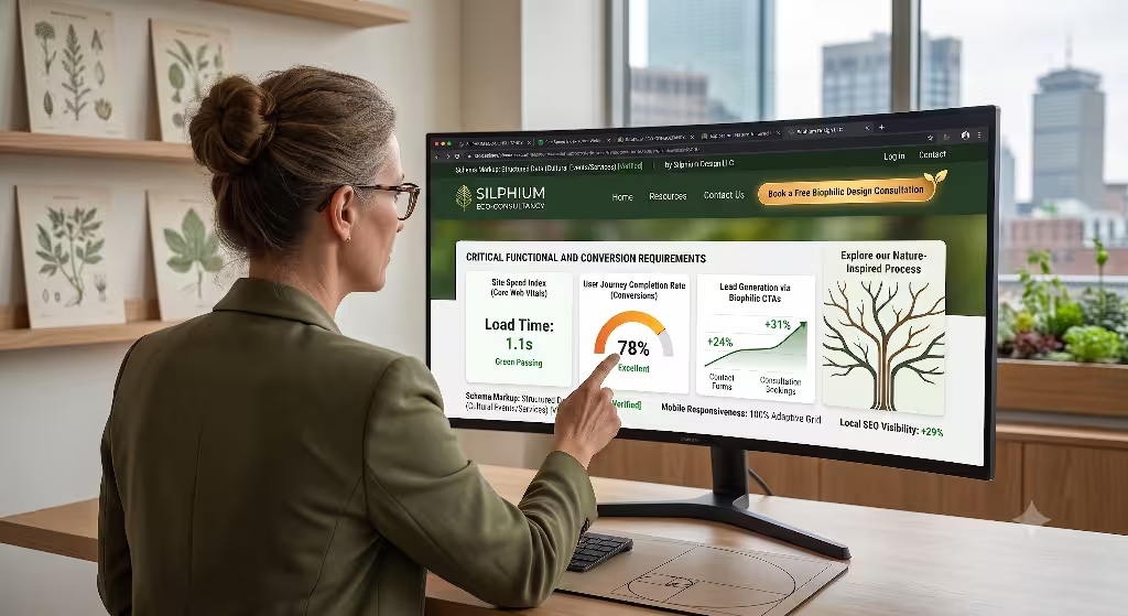
While beauty and immersion are important, web interfaces must also perform well as business tools. Cultural institutions rely on ticket sales, donations, and memberships to survive. Therefore, the user interface must be optimized for conversion rate optimization, which means designing pages to encourage users to take action.
Ticketing and CRM API Synchronicity
The checkout process is often where websites lose potential customers. If a user tries to buy a ticket and encounters an error or a confusing form, they will often give up. Successful web interfaces connect directly to customer relationship management systems through clean application programming interfaces, which are tools that let different software programs talk to each other safely.
This connection means that when a user selects a ticket date on the website, the interface talks to the museum box office database instantly. It checks seat availability in real time and processes payments securely without forcing the user to load a slow third-party checkout site. The web interfaces must keep this process streamlined, using clear error messages if a user types their credit card number incorrectly, and autofilling information whenever possible to save time.
Scannable Scheduling Layouts
For major festivals or multi-day museum exhibits, web interfaces must feature scannable scheduling layouts. Human beings read web pages in specific visual patterns, often looking across the top and down the left side of the screen. Designers arrange important elements along these natural viewing lines.
A clean schedule interface uses tabular sorting, which means organizing days into clear clickable tabs. Users can click on a specific date to reveal a list of events sorted by time. High-contrast labels should clearly distinguish between free events, paid workshops, and sold-out sessions. The following table highlights the essential elements that these web interfaces must use to maximize conversions.
| Interface Element | Primary Conversion Goal | Target Metric | Design Best Practice |
| Sticky CTA Header | Ticket Sales / Registrations | Increase Click-Through-Rate by 15% | Keep the button visible at the top of the screen during scrolling, using a distinct contrast color. |
| Interactive Calendar | Session Bookings / Sign-ups | Reduce Abandonment on schedule views | Allow users to filter by event type with a single tap, keeping loading times under half a second. |
| Streamlined Checkout Form | Transactions / Donations | Limit form completion time to under 60 seconds | Remove non-essential fields, support modern mobile payment wallets, and display clear progress markers. |
By implementing these functional components, web interfaces move past being basic visual portfolios. They become highly efficient engines that support the financial health of the cultural institution.
Web Standards, Accessibility, and Inclusivity
Culture belongs to everyone, which means cultural web interfaces must be accessible to every single human being, regardless of their physical or cognitive abilities. Building inclusive interfaces is a core legal and moral requirement for modern web developers.
WCAG 2.2 Compliance Engineering
Web Content Accessibility Guidelines, known as WCAG, outline the international standards for digital accessibility. Modern web interfaces must follow these rules strictly to ensure that individuals with disabilities can navigate them easily.
First, this requires high color-contrast parameters. Text must stand out sharply against its background so that visually impaired individuals can read it easily. Second, developers must write absolute screen-reader text alternatives for every single asset. A screen reader is a software tool used by blind individuals that reads out the text on a monitor. If a cultural website displays a famous painting, the underlying code must include a detailed text description of that artwork so the screen reader can explain it to the user. Finally, all web interfaces must support keyboard-only navigation pathways. This allows individuals who cannot use a computer mouse to navigate through menus and buy tickets using only the arrow keys on their keyboard.
“Quiet Mode” Toggle Optimization
Many modern websites feature complex background videos, flashing elements, and elaborate parallax moving systems. While these features look impressive, they can cause major issues for users with ADHD, autism, dyslexia, or vestibular processing variations, which are conditions that affect balance and spatial awareness. Too much movement on a screen can cause these users to feel dizzy, anxious, or overwhelmed.
To solve this, advanced web interfaces now include a Quiet Mode toggle button. This feature sits clearly at the top of the webpage. When a user clicks it, the interface instantly stops all background animations, pauses video elements, and simplifies the layout into a clean high-contrast text system.
+-----------------------------------------------------------+
|  [Logo]          [Exhibits]   [Tickets]    [QUIET MODE: ON] |
+-----------------------------------------------------------+
|                                                           |
|  HISTORY EXHIBIT (Animations Paused)                      |
|  -----------------------------------                      |
|  Text is now locked in place. High contrast colors are    |
|  active. Screen reader support is fully optimized.        |
|                                                           |
+-----------------------------------------------------------+
By putting control back into the hands of the reader, the website ensures that everyone can enjoy cultural education safely and comfortably.
Technical Performance and Search Engine Optimization
A beautiful layout matters very little if search engines cannot find the page, or if it takes too long to load on a smartphone. High-performance engineering is an essential part of creating successful web interfaces for cultural events.
Core Web Vitals Optimization
Google and other major search engines evaluate web interfaces based on speed metrics known as Core Web Vitals. These metrics measure how fast a page renders its visual elements, how quickly it responds to a user’s first click, and how stable the layout remains during loading.
To achieve top marks, web interfaces must use advanced asset compression. Large images of museum pieces must be converted into modern image formats that compress file sizes dramatically without losing visual quality. Scripts and styling files should be minified, which means stripping out unnecessary spaces and code lines to make the files as small as possible. Furthermore, developers must set explicit width and height dimensions for all media blocks. This prevents elements from jumping around on the screen while the page loads, creating a much smoother viewing experience.
Semantic HTML and Clean Coding Patterns
Search engine robots read the underlying code of web interfaces to understand what an article is about. If the code is cluttered or disorganized, search engines will struggle to index the content correctly, resulting in lower search rankings.
Developers must use semantic HTML, which means using specific code tags that describe the actual meaning of the text. For example, instead of using generic text blocks for headings, creators must use proper header tags to show the visual hierarchy of the article. Important details like dates, addresses, and ticket prices should be wrapped in structured data schemas. These schemas act as a universal translation system, allowing search engines to display event times and prices directly within search results pages. Clean coding patterns ensure that web interfaces remain easy to update, highly secure, and highly discoverable by global audiences.
Future-Proofing Cultural Web Design
The world of digital design is moving forward rapidly. As web interfaces continue to evolve, the most successful platforms will be those that merge artistic beauty with high-speed performance and absolute accessibility. Cultural institutions must remember that their website is often the primary entrance to their physical space.
By analyzing successful examples of web interfaces for cultural events, we see that the best designs respect the past while using modern technology. They leverage fluid grid systems, prioritize user comfort through biophilic choices, and ensure that every individual can access information easily. By focusing on asset compression, mobile responsiveness, and clean semantic code, organizations can build durable digital environments. These advanced web interfaces will continue to engage, educate, and inspire audiences around the world for years to come.