Table of Contents
Introduction to Digital Biomimicry
Modern digital screens are flat, smooth, and cold. For many years, software developers and website creators focused on making user interfaces as clean and simple as possible. This movement led to a style known as flat design. While flat design looks clean, it creates a sterile digital environment that does not match the real world. Human beings did not evolve in a perfectly flat, clinical environment. Our ancestors spent millions of years living in nature, surrounded by rich textures, organic shapes, and diverse landscapes. When we spend hours looking at flat, featureless glass screens, our minds can experience a form of sensory deprivation. This deprivation often leads to higher stress levels, eye strain, and mental fatigue.
To solve this problem, we can look to a concept called digital biomimicry. This practice involves copying natural systems, forms, and elements to improve human technology. In the world of web design, this is where the idea of implied texture becomes incredibly valuable. We need to answer a primary question that many designers are asking today: what is implied texture in biophilic UI?
To put it simply, implied texture is the visual simulation of physical, tactile natural surfaces within a two dimensional digital space. It is a way of tricking the human eye and brain into perceiving a surface as rough, soft, grainy, or organic, even though the user is touching a smooth glass screen. By using clever shading, highlights, micro-patterns, and natural gradients, web designers can make a digital background look like sandstone, leaf fibers, or fine river silt. This design method aims to evoke an innate evolutionary response in the person using the website.
This entire concept is deeply tied to the biophilia hypothesis, which was popularized by a biologist named E.O. Wilson. The biophilia hypothesis states that human beings have an independent, deeply rooted biological need to connect with nature and other living systems. When we are isolated from nature, our well-being suffers. When we are exposed to natural elements, our bodies and minds relax.
In the field of human-computer interaction, or HCI, we are starting to realize that websites do not have to be cold and mechanical. We can build digital spaces that act like natural shelters. By incorporating implied texture into our layouts, we bridge the gap between our ancient biological needs and modern computer software. This article will explore how this design method works, why our brains love it, and how you can use it to build better websites that lower user stress and improve digital engagement.
The Neuroscience of Visual-Haptic Cross-Mapping
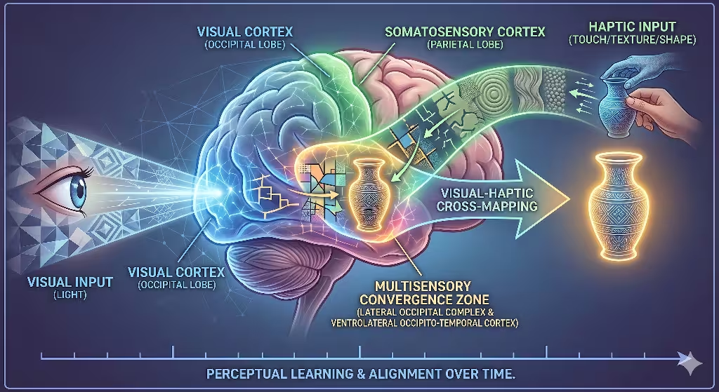
To understand why implied texture works so well, we have to look inside the human brain. Our senses do not work in isolation. When you look at an object, your brain does not just process the light hitting your eyes. It immediately starts guessing what that object would feel like if you reached out and touched it. This process is known as visual-haptic cross-mapping.
When a user opens a website, their eyes scan the screen. If the website uses implied texture, specific parts of the brain light up. The visual cortex handles the shapes and colors on the screen. At the same exact time, the visual cortex passes information to the somatosensory cortex. The somatosensory cortex is the part of your brain that processes the sense of touch.
Even though your finger is resting on a flat smartphone screen, your brain simulates the physical sensation of touching a real surface. This is what scientists call visual tactility. When your mind observes organic irregularity, natural grain, or wood fiber patterns on a screen, it recognizes those patterns from the physical world. Your brain uses its memories of real-world objects to fill in the blanks.
This brain activity has a massive impact on how we feel when we use computers. Traditional flat user interfaces can cause screen-induced sensory deprivation. When everything on a screen is perfectly flat and uniform, the brain gets bored and tired. It has to work harder to separate different elements on the screen because there are no natural depth cues. This leads to a hidden form of cognitive fatigue.
By introducing carefully crafted implied texture, you give the human brain the rich sensory inputs it craves. The brain recognizes the organic patterns and enters a state of high visual fluency. Visual fluency means the brain can process information easily and with very little effort. When a website is easy for the brain to process, the user feels more relaxed. Their heart rate can drop, and their mental fatigue decreases. As web designers, we can use this neurological loop to build interfaces that feel deeply restorative rather than exhausting.
What is implied texture in digital design?
To master this method, we must answer a common query: what is implied texture in digital design? It is important to separate generic textures from biophilic ones. In general digital design, an implied texture can be anything that looks like a three dimensional surface. For example, a designer might create a background that looks like industrial carbon fiber, a brushed aluminum plate, or a synthetic plastic grid. While these are examples of implied texture, they are not biophilic. They copy man-made, industrial materials that do not trigger our evolutionary love for nature.
Biophilic implied texture focuses entirely on replicating organic surfaces found in the natural environment. This includes things like sandstone strata, biological cell structures, tree bark, cork, and water ripples. The goal is not to create a chaotic or messy screen, but to introduce the subtle, organized variations that nature creates over time.
It helps to look at the history of web design to see how this idea evolved. In the early 2010s, web designers used a style called skeuomorphism. This style used literal, heavy representations of real-world objects. For instance, a digital calendar app might have a background that looked exactly like a heavy leather book with fake yellow stitching. This early version of texture was often too loud, distracting, and heavy. It made websites look cluttered and slowed down how fast pages could load.
Today, we use a much more refined approach. Modern implied texture does not copy real-world objects in a clumsy, literal way. Instead, it uses abstracted natural analogues. We take the core visual rules of natural surfaces and apply them gently to user interfaces.
Think about the difference between a high-gloss plastic surface and a soft, matte stone surface. A glossy digital button looks slick and artificial. A button with a soft, matte implied texture looks grounded, stable, and tactile. By using modern digital tools, we can create subtle grain effects and soft shadow gradients that give a webpage depth without making it look old-fashioned or cluttered. This balance allows us to keep the clean layouts of modern design while adding the emotional warmth of the natural world.
The Geometry of Nature: Fractals and Visual Fluency
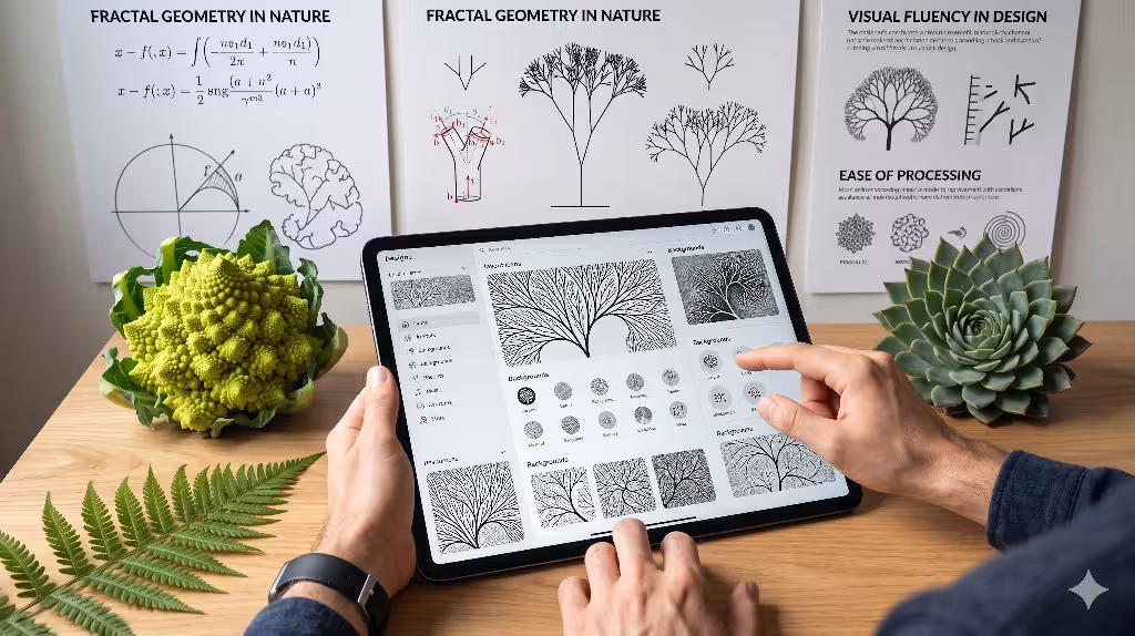
Nature may look random at first glance, but it is actually built on deeply organized mathematical rules. One of the most important rules involves fractals. A fractal is a geometric pattern that repeats itself at different scales. If you zoom in on a small part of a fractal pattern, it looks exactly like the larger whole. This property is known as statistical self-similarity.
You can find fractals everywhere in the physical world. They exist in the way tree branches split into smaller twigs, the way veins spread across a leaf, the way coastlines twist, and the way crystals grow inside stone. Human eyes have spent millions of years looking at these patterns. Because of this long exposure, our brains are hardwired to process fractal geometry with incredible ease.
When we create an implied texture for a website, we can use these mathematical rules to create visual comfort. Scientists measure the complexity of a fractal pattern using something called a fractal dimension, which is written as a D-value. Studies have shown that human beings feel the most relaxed when they look at patterns with a statistical mid-range fractal dimension, specifically between D equals 1.3 and D equals 1.5.
When an implied texture matches this specific mathematical range, it triggers an instant relaxation response in our nervous system. If a background texture represents stone veining or leaf structures using these dimensions, the human eye can scan the page effortlessly. This effortless scanning improves the overall user experience.
In web design, this concept directly affects user behavior metrics. If a user lands on a website that feels harsh, clinical, or confusing, their brain experiences a small spike in frustration. This frustration often causes them to leave the site quickly, which increases the website bounce rate. However, when you use a balanced implied texture built on fractal principles, the user feels an immediate sense of cognitive comfort. They are more likely to stay on the page, read the content, and interact with the design. By using the geometry of nature, we turn abstract pixels into a welcoming space that satisfies both human biology and search engine algorithms.
How do you use biophilic design in UI?
Another important query to address is: how do you use biophilic design in UI? You cannot simply slap a stone background onto a standard website and call it a day. Biophilic design is an entire philosophy. To make it work, you must integrate every element into a unified digital ecosystem. An implied texture will fail if it is surrounded by bright neon colors, harsh geometric shapes, and artificial animations. Every part of the user interface must work together.
First, you need to combine your implied texture with a natural color theory palette. This means using earth tones, muted greens, deep blues, soft browns, and sandy grays. These colors are common in natural environments and help reinforce the tactile feel of your textures. For instance, an implied texture that looks like fine sand works best when paired with warm beige and soft terracotta colors.
Second, you should replace harsh, perfectly square corners with organic curves. Nature rarely works in perfect right angles. By using gentle curves for your buttons, cards, and content containers, you mimic the shapes of river stones, flower petals, and rolling hills. When an organic container shape holds a beautiful implied texture, the entire element feels cohesive and natural.
Third, you can implement circadian lighting systems within your digital product. In the physical world, light changes throughout the day. It starts bright and cool in the morning, turns warm in the afternoon, and fades into darkness at night. You can design your website to change its appearance based on the user’s local time. During the day, the website can use a light user interface that highlights a bright, sandy implied texture. As the sun sets, the website can automatically transition into a dark mode. This dark mode can shift the background to a deep, charcoal basalt or dark slate implied texture.
Finally, you must map your textures directly to digital functionality. The texture should never feel like an accidental smudge or a random decoration. It must feel like an intrinsic part of the user interface. For example, you can use a slightly rougher implied texture on interactive elements to show that they can be clicked or dragged. By connecting texture to function, you build an intuitive digital space that feels alive and deeply responsive.
Taxonomic Breakdown of Biophilic Implied Textures
To help you choose the right styles for your web projects, let us break down natural textures into three main classes. Each class has its own unique visual characteristics, ideal digital applications, and psychological effects on the human user.
| Texture Class | Natural Manifestation | Digital UI Application | Psychological Signal |
| Geological | Granite crystals, sandstone layers, marble veining. | Cards, minimalist backdrops, splitters, container elements. | Permanence, weight, structural grounding. |
| Botanical | Leaf vein grids, timber grain variance, mossy depth. | Hero headers, text overlays, secondary backgrounds. | Growth, vitality, softness, renewal. |
| Aquatic/Atmospheric | Fluid ripples, vaporous gradients, mist patterning. | Dynamic hover states, loading animations, negative space. | Movement, tranquility, adaptability. |
Let us examine these categories in greater detail. The first class is geological textures. These involve patterns inspired by solid earth materials, such as weathered granite, layered sandstone, and sweeping marble veins. When you apply a geological implied texture to a website layout, you give the digital space a sense of permanent weight. This texture style is perfect for background containers, sidebars, and structural elements that need to feel solid and reliable. A financial website or a corporate portal can use a subtle marble or granite implied texture to silently communicate trust, safety, and long-term stability to its visitors.
The second class is botanical textures. This category includes the microscopic grids found in leaf veins, the gentle ring variations of timber grain, and the soft, rich depth of forest moss. A botanical implied texture brings a feeling of life, health, and freshness to a screen. These patterns are excellent for hero headers, product display backgrounds, and informational areas. When a user sees a soft wood grain or a leaf-inspired implied texture, their brain associates the website with growth, vitality, and renewal. This makes it a perfect choice for wellness brands, educational sites, and environmental organizations.
The third class is aquatic or atmospheric textures. This group focuses on more fluid and less solid natural patterns, like gentle water ripples, soft morning mist, or vaporous cloud gradients. This type of implied texture works wonderfully for dynamic parts of a website. You can use it for hover states, loading screens, and open areas of negative space. An atmospheric implied texture sends a psychological signal of movement, peace, and adaptability. It keeps the website from feeling stiff or frozen, allowing the user interface to flow naturally from one section to the next.
Why is texture important in user interface design?
We must also answer another critical industry query: why is texture important in user interface design? In the early days of computers, everything was text-based. As technology improved, designers invented the graphical user interface. To make these interfaces work, designers relied heavily on borders, lines, and boxes to separate different pieces of information. While lines get the job done, they can make a screen look incredibly cluttered and complicated. This is where an implied texture becomes an essential tool for modern designers.
Texture acts as an intuitive signifier. It provides clear visual cues without needing harsh artificial lines or dark borders. When you apply a subtle implied texture to a background card, you instantly separate that card from the rest of the page. The human eye detects the change in surface quality and understands that the card contains a unique group of information. This method allows you to build a clean visual hierarchy while maintaining an open, airy feel across your entire layout.
Furthermore, you can use specific types of textures to guide a user’s attention to important parts of a webpage. If you want a user to click a registration button or a primary call to action, you can give that element a unique matte implied texture inspired by dark volcanic rocks like basalt or slate. When surrounded by smoother, lighter elements, this weighted, textured button gains a strong visual presence. The user’s eye is naturally drawn to the textured element because it looks tangible and highly touchable.
Using an implied texture also has a profound impact on brand psychology. When a business uses a generic flat design, it risks looking identical to thousands of other companies. It feels cold, corporate, and detached. By embracing a rich, biophilic implied texture, a brand can stand out from the digital crowd. The texture injects a sense of human craft, authenticity, and real-world warmth into a digital product. It helps users form an emotional connection with the website, which leads to increased consumer trust, higher engagement, and better brand loyalty over time.
Technical Execution and Web Performance Optimization
Understanding the theory behind biophilic design is wonderful, but we must also know how to build these interfaces using clean computer code. As a web developer, you cannot simply save massive, high-resolution photos of stone walls and use them as website backgrounds. Large image files take a long time to download, which destroys your website performance and harms your search engine optimization. If your site takes too many seconds to load, it will fail Google’s Core Web Vitals test, and your search engine rankings will drop. We must apply our implied texture using smart, lightweight coding methods.
One of the best ways to create an implied texture is through CSS micro-noise overlays. Instead of loading an image file, you can write a few lines of CSS code that generate a tiny, repeating digital grain pattern directly inside the user’s web browser. By adjusting the opacity of this micro-noise to a incredibly low level, such as two or three percent, you create a beautiful, matte implied texture that looks exactly like fine sand or pressed paper. Because this texture is generated by code, it adds zero weight to your page size, ensuring your website remains lightning-fast.
Another powerful tool for creating an implied texture is using scalable vector graphics, or SVG filters. SVGs are mathematical formulas rather than static pixels, meaning they can scale up to any screen size without losing quality. You can use specific HTML tags like <feTurbulence> and <feDisplacementMap> inside your SVG code. These tags allow you to mathematically generate organic patterns that mimic natural surfaces like flowing water currents or rough stone edges. An SVG-driven implied texture is highly flexible, loads instantly, and can even change shapes smoothly when a user moves their mouse over an element.
HTML
<svg xmlns="http://www.w3.org/2000/svg" width="0" height="0">
  <filter id="biophilic-grain">
    <feTurbulence type="fractalNoise" baseFrequency="0.8" numOctaves="3" result="noise" />
    <feColorMatrix type="matrix" values="1 0 0 0 0  0 1 0 0 0  0 0 1 0 0  0 0 0 0.03 0" />
    <feComposite operator="in" in2="SourceGraphic" />
  </filter>
</svg>
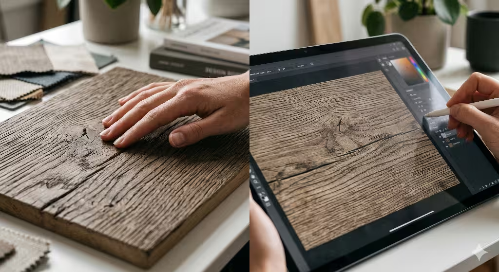
When you absolutely must use a real photograph to display an intricate implied texture, you should always deploy modern web image formats like WebP or AVIF. These formats offer advanced compression tools that shrink image file sizes significantly while keeping the visual details perfectly sharp. You should also use responsive image tags to serve smaller versions of the texture file to mobile phones and larger versions to desktop monitors. By combining smart image management with procedural code, you can enjoy all the biological benefits of an implied texture without sacrificing a single millisecond of loading speed.
What are natural analogues in biophilic UI design?
To round out our knowledge, let us answer one more vital industry query: what are natural analogues in biophilic UI design? Biophilic design can be divided into three main experiences. The first is nature in the space, which involves bringing real physical elements like plants, sunlight, and water fountains inside a building. The second is nature of the space, which looks at how layout rooms and hallways mimic natural caverns or open plains. The third experience is natural analogues, which is the most important category for website developers and digital designers.
A natural analogue is a non-living representation of nature. It means you are using human artwork, geometric patterns, textile textures, and digital pixels to reflect the living world indirectly. When you use an implied texture on a webpage, you are building a natural analogue. You are not putting a real leaf or a real piece of sandstone onto the screen. Instead, you are using light, color, and math to create an implied texture that reminds the user’s biological operating system of those physical materials.
[Physical Nature] ---> [Natural Analogue] ---> [Digital Human Interface]
  (Real Sandstone)       (Implied Texture)       (Calming Web Experience)
You can take natural analogues a step further by translating organic physics into your website micro-interactions. A micro-interaction is the small movement or animation that happens when a user clicks a button, opens a menu, or scrolls down a webpage. Traditional websites often use linear animations, where elements move at a single, unchanging speed. This mechanical movement looks completely unnatural and can feel jarring to the human eye.
Instead, you can design your user interface movements to copy the laws of physical nature. When a user scrolls down your page, you can make elements slide into view using fluid dynamics or wind deceleration equations. A menu could slide open with the gentle acceleration of a falling leaf, or a notification badge could ripple outward like a pebble dropped into a calm pond. When these natural physics are paired with a beautiful implied texture, the digital environment feels less like a piece of cold machinery and more like an extension of the organic world.
Designing for the Biological Organism
As we look toward the future of technology, we must change how we think about computer screens. For too long, the tech industry treated human beings like cold computers that only care about raw data and quick loading speeds. We forgot that we are biological organisms with ancient evolutionary histories. When we force people to spend their workdays looking at sterile, flat digital interfaces, we create an environment that causes unnecessary stress, eye strain, and mental fatigue.
Using an implied texture is a powerful way to fix this digital disconnect. By adding soft grain, organic patterns, and natural geometries to our web designs, we build a bridge between our modern digital lives and our ancient biological needs. An implied texture transforms a flat, boring webpage into a rich, visual environment that captures the user’s attention while lowering their stress levels. It satisfies our natural biophilic desires without requiring us to step away from our computers.
For web designers and business owners, this design strategy offers a massive competitive advantage. Websites that embrace an implied texture are proven to achieve higher user engagement, lower bounce rates, and increased user trust. They stand out in a crowded online world by offering an experience that feels comforting, authentic, and restoratively human. It is time to abandon the cold, clinical look of basic flat design and start building websites that respect our human biology.
If you are ready to improve your digital presence, look at your current website design. Ask yourself if it feels like a cold concrete wall or a welcoming natural shelter. Start small by introducing a subtle, code-generated implied texture to your card containers or background spaces. Combine those textures with warm earth colors, soft organic curves, and natural animation movements. By designing your software with human biology in mind, you will create digital products that are not only highly successful on search engines but are also deeply loved by the human beings who use them every day.