The Biological Blueprint of the Digital World
Nature is the oldest and smartest designer we know. When you look at a sunflower, you are not just looking at a flower. You are looking at a masterclass in spatial efficiency. Each seed is placed in a way that takes up the least amount of space while giving each seed the most room to grow. This is not an accident. It is a mathematical system called phyllotaxis. In the world of web design, we are starting to use these same patterns. We call this algorithmic phyllotaxis.
Here at Silphium Design, we continually look for the bridge between the forest and the keyboard with the ultimate goal to bring nature to the web. Algorithmic phyllotaxis is one of those bridges. It is the use of plant growth math to arrange elements on a website screen. Most websites today, as often stated on this blog, are built like a stack of boxes. They are rigid and square. But humans did not evolve in a world of boxes. We evolved in a world of curves, spirals, and organic flow. When we use algorithmic phyllotaxis, we are speaking to the part of the human brain that feels at home in nature. This is what we call biophilic design.
In this article, we will explore why algorithmic phyllotaxis is the future of the internet. We will look at how it works and why it makes websites easier to use. By the end of the article, you will hopefully understand how a simple plant pattern can make a website faster, more beautiful, and more successful in search engine rankings.
Table of Contents
The Mathematics of The Golden Angle
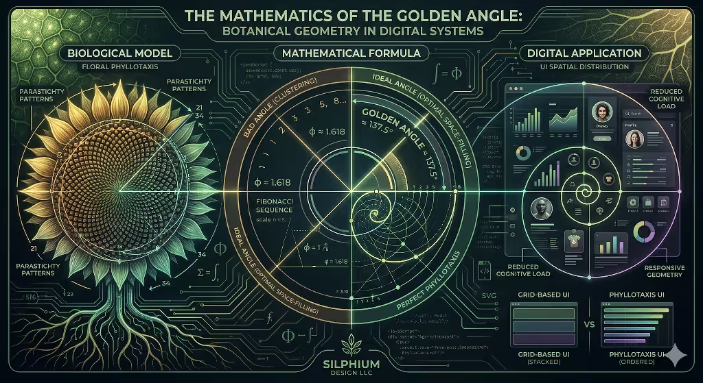
To understand algorithmic phyllotaxis, we have to look at the math behind a circle. Imagine you are a plant and you want to grow leaves around a stem. If you grow a leaf every 90 degrees, they will eventually block each other from the sun. If you grow them every 180 degrees, they will be in a straight line. But if you use the golden angle, which is about 137.5 degrees, something magical happens. The leaves never perfectly overlap therefore offering the maximum space for photosynthesis. This is the heart of algorithmic phyllotaxis.
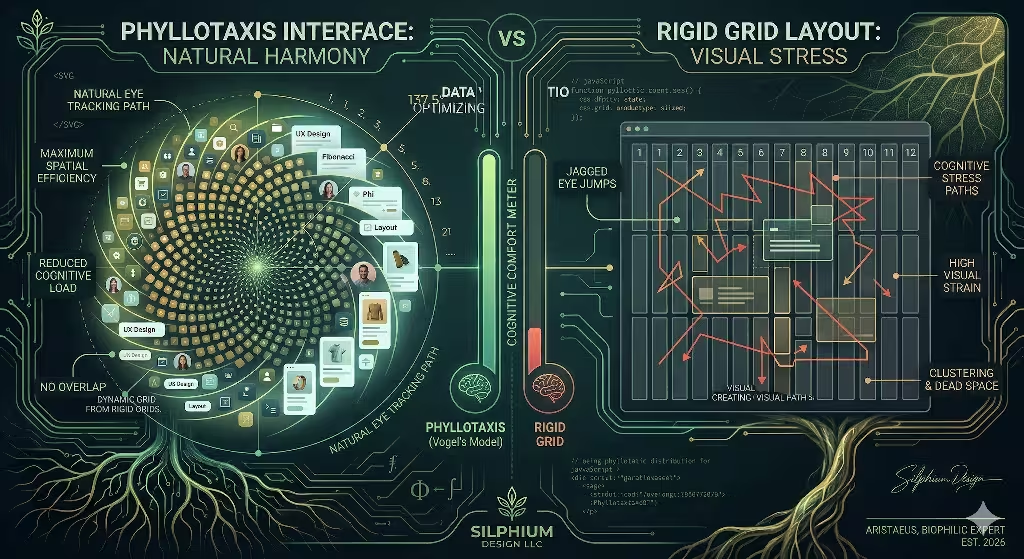
This math is often called Vogel’s Model. It uses a specific formula to place items in a spiral that fills space perfectly. In web design, algorithmic phyllotaxis allows us to place buttons, images, or bits of data in a way that feels balanced. We use the Golden Ratio, also known as Phi, to find these spots. When a user looks at a screen designed with algorithmic phyllotaxis, their eyes do not have to jump around in jagged lines. Instead, their eyes follow a natural curve. This reduces eye strain and makes the information easier to digest.
Using algorithmic phyllotaxis means we are using the Fibonacci sequence. This is a series of numbers where each number is the sum of the two before it. You see these numbers in the number of petals on a flower or the scales on a pinecone. When we build a website layout using algorithmic phyllotaxis, we are using the same math that has worked for millions of years in the wild.
Practical Applications in Modern Web Design
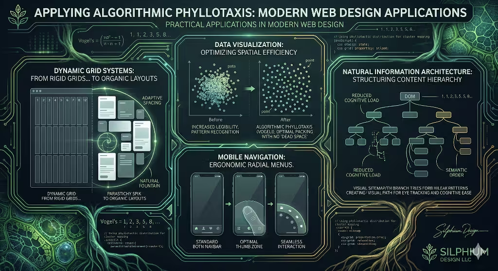
You might wonder how a sunflower pattern fits onto a rectangular computer screen. The truth is that algorithmic phyllotaxis is very flexible. One of the best ways to use it is in grid systems. Instead of a boring grid of squares that used in traditional websites, we can use algorithmic phyllotaxis to create a dynamic grid. This means the most important items are at the center of the spiral, and less important items fan out toward the edges.
Data visualization is another place where algorithmic phyllotaxis shines. If you have a map with a thousand dots, they usually look like a messy cloud. But if you apply algorithmic phyllotaxis to those dots, they organize into a clear and more perceivable pattern. This helps the user see trends and groups without being overwhelmed. It makes the data look like a living thing rather than a pile of numbers.
We can also use algorithmic phyllotaxis for navigation menus. On a mobile phone, your thumb moves in an arc. A straight menu at the top of the screen is hard to reach. A menu designed with algorithmic phyllotaxis can follow the natural curve of your thumb. This makes the website much easier to use with one hand. By using algorithmic phyllotaxis, we are designing for the human body as much as the human eye.
How does the Fibonacci sequence improve web UX?
Many designers ask how these old math rules help the modern user experience. The answer is cognitive load. Cognitive load is how hard your brain has to work to understand what is on the screen. Because our brains are used to seeing patterns like the Fibonacci sequence in the real world, we recognize them instantly. When a website uses algorithmic phyllotaxis, the brain does not have to search for the structure. The structure is already familiar, resulting in a calmer experience.
Algorithmic phyllotaxis creates natural focal points. In a standard web layout, the eye often gets lost in the corners. With algorithmic phyllotaxis, the “weight” of the design pulls the eye toward the most important content. This makes the user feel more relaxed. A relaxed user stays on the site longer. They are more likely to read your blog posts or buy your products. This is why algorithmic phyllotaxis is a powerful tool for businesses that want to connect with people on a deeper level.
Is phyllotaxis design better for mobile or desktop?
While algorithmic phyllotaxis works well on all screens, it is especially useful for mobile devices. Desktop screens are wide and flat, which makes them easy to fill with boxes. But mobile screens are small and often used while moving. Space is at a premium. Algorithmic phyllotaxis allows a designer to pack a lot of information into a small area without it looking cluttered.
On a desktop, algorithmic phyllotaxis can be used for artistic storytelling. It can guide a user through a long page in a way that feels like a journey. On mobile, algorithmic phyllotaxis is about utility. It puts the most used buttons exactly where the fingers want to go. Whether you are on a giant monitor or a small phone, algorithmic phyllotaxis ensures the layout adapts to the space in an organic way. It is the ultimate form of responsive design.
What tools are used for algorithmic design?
To build a website using algorithmic phyllotaxis, you need more than just a drawing program. You need code. Most designers use tools like CSS Grid and the Canvas API to create these patterns. Some use a library called Three.js to make the spirals move in 3D. The math is simple enough that a basic JavaScript loop can create a complex phyllotaxis pattern in seconds.
At Silphium Design LLC, we use often use SVG or Scalable Vector Graphics to render these patterns. Since algorithmic phyllotaxis is based on math, SVG is the perfect way to display it. The images are sharp on every screen and the file sizes are very small. This helps the website load quickly. Using algorithmic phyllotaxis is not just about looks. It is about using code that is as efficient as the plants that inspired it.
Technical Implementation: From Biology to Code
Implementing algorithmic phyllotaxis requires a shift in how we think about positioning. In standard design, we use X and Y coordinates on a flat plane. In algorithmic phyllotaxis, we often use polar coordinates. This means we think in terms of an angle and a distance from the center. A simple loop in your code can calculate the position of every element by increasing the angle by 137.5 degrees for every new item.
This method of algorithmic phyllotaxis is very performant. Instead of the browser having to calculate complex flexbox rules for every box, it just solves a quick math equation. For websites with a lot of moving parts, algorithmic phyllotaxis can actually save battery life on a user’s phone. It is a clean way to handle large amounts of data. By following the laws of algorithmic phyllotaxis, the code becomes as elegant as the visual result.
| Biological Element | Web Design Equivalent | UX Benefit |
| Primordia | UI Components / Icons | Optimal Density |
| Divergence Angle | Rotation / Spacing | Prevents Visual Overlap |
| Parastichy Lines | Visual Pathing / Flow | Natural Eye Tracking |
The SEO and Performance Impact
Many people are surprised to learn that algorithmic phyllotaxis can help with search engine optimization. Search engines like Google want to see that users are happy. One way they measure this is through dwell time. Dwell time is how long a person stays on your page. Because algorithmic phyllotaxis makes a site more comfortable to look at, people stay longer. Going further, because these websites, often look different, people dwell longer too. Sort of web version of made you look. This tells Google that your content is valuable.
Algorithmic phyllotaxis also helps with what we call Natural Information Architecture. When your site is laid out logically using growth patterns, search engine crawlers can understand the hierarchy of your information better. It creates a clear path from the “root” of your site to the “leaves” of your content. By using algorithmic phyllotaxis, you are making your site easier for both humans and robots to read.
Furthermore, the speed of algorithmic phyllotaxis is a major plus. Google loves fast sites. Since these patterns are generated by simple math, they do not require heavy image files. This means your page loads faster, which is a key factor in ranking high on search results. Algorithmic phyllotaxis is a win for design, a win for the user, and a win for SEO.
Creating a Sense of Harmony
When we talk about the phyllotaxis arrangement, we are really talking about harmony. Many of the great architects, including Frank Lloyd Wright and Mies van der Rohe, learned that architecture should belong to the land. A concept called organic architecture. I believe websites should belong to the human mind, through biophilic web design. Algorithmic phyllotaxis creates a sense of balance that we often lose in the digital world. It brings a bit of the garden into the browser.
When a user visits a site built with algorithmic phyllotaxis, they might not know why it feels good, but they will feel it. It is the difference between a concrete parking lot and a park. Both have a purpose, but one makes you want to stay. By choosing this arrangement, you are choosing to respect the user’s focus and energy. You are choosing a design that grows with them.
The Future of Generative UI
We are moving toward a world where websites change based on who is looking at them. This is called Generative UI. Algorithmic phyllotaxis is a big part of this future. Imagine a website that rearranges its buttons into a spiral based on how you hold your phone. Or a news site that uses algorithmic phyllotaxis to show you more stories in a way that does not feel crowded.
At Silphium Design LLC, we are at the forefront of this change. We believe that algorithmic phyllotaxis is not just a trend. It is a return to the basics of how things grow. As computers get faster, we can use more complex math to create web and internet experiences that were impossible ten years ago. We are no longer limited by the box. We can finally build the digital forest.
Why Algorithmic Phyllotaxis Matters Now
In 2026, the internet is more crowded than ever. There are billions of pages competing for our attention. To stand out, you need more than just good content. You need a design that feels right. Algorithmic phyllotaxis offers a way to be different while still being functional. It is a way to prove that your brand is innovative and creative.
By using algorithmic phyllotaxis, you are signaling to your audience that you care about quality. You are using the same principles used by great artists and scientists throughout history. From the sketches of Leonardo da Vinci to the computer theories of Alan Turing, the patterns of algorithmic phyllotaxis have always been a sign of genius. Now, we can use these same patterns to make the web a more beautiful place for everyone.
Building Your First Phyllotactic Layout
If you are a developer looking to start with algorithmic phyllotaxis, start small. Try arranging a set of social media icons in a spiral. Use the golden angle of 137.5 degrees and see how they fit together. You will quickly see that this arrangement handles different numbers of items much better than a standard grid. Whether you have five icons or fifty, algorithmic phyllotaxis makes them look like they belong together.
As you get more comfortable with algorithmic phyllotaxis, you can start applying it to larger parts of your site. Maybe your portfolio page uses a spiral. Maybe your blog index uses algorithmic phyllotaxis to highlight featured posts. The possibilities are endless. The math of algorithmic phyllotaxis is a tool that allows your creativity to flourish without losing structure.
Embracing the Organic Web
Algorithmic phyllotaxis is more than just a fancy term. It is a philosophy of design. It reminds us that even in a world of silicon and code, we are still biological creatures. We crave the patterns of the natural world. By bringing algorithmic phyllotaxis into web design, we are making the internet a more human place.
We have seen how algorithmic phyllotaxis improves user experience by reducing cognitive load. We have seen how it helps mobile users navigate more easily. We have even seen how it helps with SEO and site performance. Algorithmic phyllotaxis is a rare example of a design choice that is both beautiful and highly practical. It is the perfect marriage of biology and computer science.
At Silphium Design LLC, we will continue to explore the depths of algorithmic phyllotaxis. We believe that the best designs are not invented; they are discovered in the world around us. By using algorithmic phyllotaxis, we are following the path that nature has already cleared for us. It is a path that leads to better websites, happier users, and a more vibrant digital ecosystem.