In the visual language of branding, few elements possess the immediate, universal resonance of the natural world. From the simple strength of an oak tree to the intricate grace of a fern, nature offers a vast and potent vocabulary. The strategic use of plant forms in logo and brand illustration is more than a fleeting design trend; it is a fundamental method of connecting with an audience on a deep, almost primal level. This practice taps into our innate human affinity for the environment, allowing brands to communicate complex ideas like growth, health, and stability with a single, elegant image.
This article will serve as a comprehensive guide, exploring the strategic advantages, core design principles, and practical applications of incorporating plant forms into your branding. We will dissect why these natural shapes are so effective and provide a clear framework for using them to build a memorable, meaningful, and highly successful brand identity.
Table of Contents
Why Do Plant Forms Resonate? The Psychology of Botanical Branding

So, why do these shapes affect us so deeply? The answer lies in a concept known as the Biophilia hypothesis. This is the idea that humans possess an instinctive tendency to seek connections with nature and other forms of life.1 It’s a built in part of our biology, developed over hundreds of thousands of years of living within the natural world, not separate from it. When we see plant forms, a part of our brain recognizes a familiar, life affirming pattern. This connection is not just poetic; it has a direct psychological impact, evoking powerful feelings that brands can strategically align with.
Harnessing this connection requires an understanding of the specific symbolism carried by different plant forms. This is not arbitrary but is built on centuries of cultural association and the physical characteristics of the plants themselves.
- Leaves: Perhaps the most common of all botanical symbols, the leaf is a powerhouse of positive meaning.2 A single leaf often represents growth, renewal, and a direct connection to nature.3 It is the visual shorthand for “eco friendly,” “organic,” and “fresh.” The shape itself can vary in meaning. A simple, rounded leaf feels gentle and nurturing, while a sharp, pointed leaf might suggest precision or vitality. A laurel wreath, an ancient symbol built from leaves, communicates victory, honor, and achievement.4 The thoughtful use of leaf based plant forms can instantly position a brand as healthy and environmentally conscious.
- Trees: The tree is a symbol of immense strength, stability, and longevity.5 Its roots dig deep, suggesting heritage, groundedness, and a solid foundation. Its trunk represents resilience and support, while its branches reaching upward signify growth, aspiration, and connection. The “tree of life” is a powerful archetype found in nearly every culture, symbolizing the interconnection of all things.6 A brand using a tree in its logo is often communicating that it is dependable, established, and built to last. This makes these types of plant forms ideal for financial institutions, healthcare providers, and family focused businesses.
- Flowers: Where trees suggest strength, flowers communicate beauty, life, and delicacy.7 They are symbols of blossoming, potential, and affection. The specific species of flower chosen can add even deeper layers of meaning. A rose is universally tied to love and passion, making it suitable for a romance-themed or luxury brand.8 A lotus, which grows from mud to bloom in pristine beauty, is a powerful symbol of purity, enlightenment, and rebirth, making it perfect for wellness centers, yoga studios, and spiritual brands.9 The vibrant colors and intricate structures of these plant forms make them visually captivating and emotionally resonant.
- Vines & Ferns: These plant forms speak to interconnectivity, resilience, and elegance. Vines, with their winding and climbing nature, can represent pathways, growth over time, and connection.10 They can create beautiful, flowing lines in a design that feel organic and dynamic. Ferns, with their complex, fractal patterns, evoke a sense of intricacy, heritage, and natural wonder.11 Their delicate structure can lend an air of sophistication and artistry to a brand, making them well suited for creative businesses, artisanal products, or brands wanting to project an image of detailed craftsmanship.
By understanding this rich symbolic language, you can select plant forms that do more than just decorate your logo; they can infuse it with a layer of meaning that communicates your core values instantly.
Foundational Principles for Designing with Plant Forms
Simply choosing a plant is not enough. The effective integration of plant forms into a brand identity depends on solid design principles. How you render the shape, where you place it, and what color you make it are all critical decisions that will determine its success. An understanding of these fundamentals is essential for creating a professional and impactful design.
Abstraction vs. Realism
One of the first decisions a designer must make is where on the spectrum from abstract to realistic their design will fall. Neither approach is inherently better; the correct choice depends entirely on the brand’s personality and industry.
- Abstract/Stylized Forms: This approach involves simplifying plant forms into their most essential shapes. Think of a leaf reduced to a simple teardrop with a stem or a tree represented by a triangle and a rectangle. These minimalist plant forms are clean, modern, and incredibly versatile. They work well at small sizes, making them ideal for app icons and favicons. This style is often used by technology companies, financial services, and modern consultancies who want to signal a connection to growth or nature without appearing overly rustic or “earthy.” An abstract mark is sophisticated and leaves more to the viewer’s imagination.
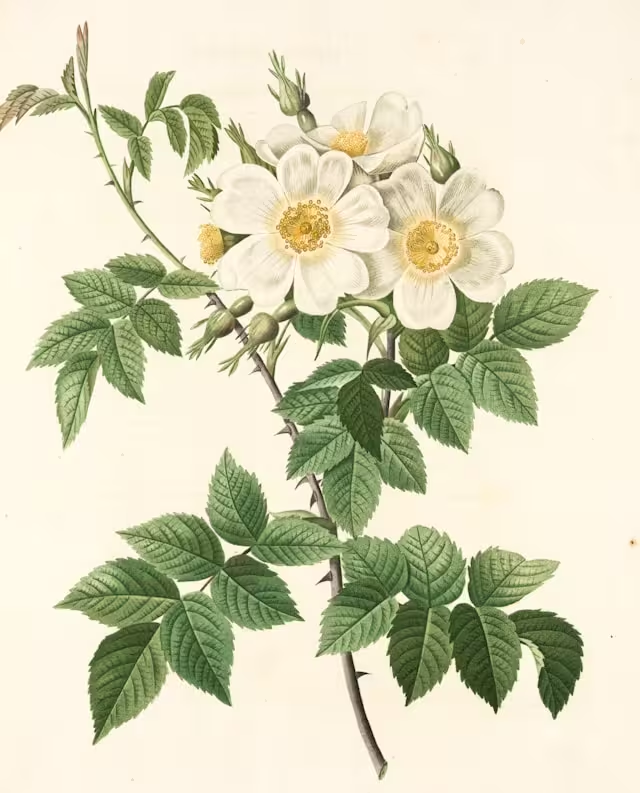
- Realistic/Illustrative Forms: On the other end of the spectrum is a realistic or highly detailed illustration. This involves rendering plant forms with attention to texture, light, and anatomical detail. Think of a vintage botanical drawing of a flower or a detailed engraving of an oak tree. This style evokes feelings of tradition, craftsmanship, heritage, and authenticity. It is an excellent choice for organic food brands, artisanal craftspeople, wineries, florists, and any business that wants to emphasize the natural quality and careful creation of its products. These detailed plant forms create a rich visual experience, but care must be taken to ensure they remain clear when scaled down.
Balance and Composition
Composition is the art of arranging elements within your design to create a cohesive and visually pleasing result.12 When working with the often complex and asymmetrical shapes of plant forms, balance is key.
- Integration: The plant element must work in harmony with the brand name or logotype. It should not feel like a separate, tacked on item. It could be integrated into a letter, act as a container for the text, or sit alongside it in a balanced lockup. The goal is to create a single, unified mark.
- Negative Space: This is the empty space around and between the elements of your design. With intricate plant forms like ferns or tree branches, the negative space is just as important as the positive space. Well managed negative space prevents a logo from feeling cluttered and can even be used to create clever secondary images or shapes, adding a layer of discovery for the viewer.13
- Symmetry and Asymmetry: Symmetrical designs, where both sides of the logo are a mirror image, feel formal, stable, and balanced.14 This can be effective for brands wanting to project trustworthiness. Asymmetrical designs, which are balanced but not identical on both sides, feel more dynamic, organic, and energetic.15 The natural growth patterns of most plant forms lend themselves beautifully to creating graceful, asymmetrical compositions.
Color Theory in Botanical Design
Color is a primary driver of emotion, and the palette you choose for your plant forms will have a massive impact on how your brand is perceived.
- Greens: This is the most obvious and common choice. Green directly communicates nature, health, freshness, and environmental responsibility.16 A bright, vibrant green feels energetic and new, while a deep, dark forest green feels more established, traditional, and serene.
- Browns/Earthy Tones: Browns, tans, and ochres evoke feelings of stability, reliability, and organic authenticity.17 They are grounding colors that feel rustic and wholesome, making them perfect for coffee brands, woodworkers, and natural product lines.
- Bright Florals: A palette of vibrant pinks, yellows, purples, and reds drawn from flowers can communicate energy, beauty, joy, and creativity. These colors are attention grabbing and can give a brand a lively and personable feel, suitable for lifestyle brands, event planners, or cosmetic companies.
- Monochrome: Do not underestimate the power of a single color design. A black or white logo forces the viewer to focus entirely on the shape and structure of the plant forms. This can result in a timeless, sophisticated, and highly impactful mark that works across any application.
Case Studies: Brands That Grew from a Botanical Seed
Examining how successful brands have implemented plant forms provides invaluable insight. These companies demonstrate how a well chosen botanical element can become a memorable and effective cornerstone of a brand identity.
- The Body Shop: This global brand has built its entire ethos around natural ingredients and ethical, environmental practices. Their branding consistently uses green color palettes and simple, natural imagery. While their logo has evolved, the core message conveyed through their visual identity has remained rooted in nature. Their use of these visual cues is a classic example of aligning a brand’s appearance with its core values, using plant forms to communicate “natural” and “ethical” long before a customer reads a single word.
- Whole Foods Market: The Whole Foods logo is a masterclass in effective botanical branding. The central element is a stylized letter ‘O’ that doubles as a piece of fruit with a leaf sprouting from the top. This simple, clever mark instantly communicates “organic,” “food,” and “freshness.” The simple green color reinforces this message. It is friendly, accessible, and perfectly summarizes the company’s value proposition in a single glance. Their successful implementation of plant forms demonstrates the power of a clear and direct visual metaphor.
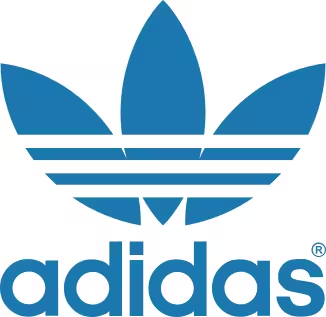
- Adidas: This is a fantastic example of using abstract plant forms to convey a powerful message. The original Adidas “Trefoil” logo, launched in 1971, was inspired by a three leaf plant. The three leaves were meant to represent the brand’s reach across the three major landmasses of the Americas, Europe/Africa, and Asia. It’s a stylized, geometric take on a natural shape. It does not scream “nature” in the way the Whole Foods logo does. Instead, it uses the underlying principle of natural growth and diversity to create a mark that felt modern, athletic, and global. This shows the immense versatility of designing with plant forms.
- Local Niche Example (A Coffee Shop): Imagine a local, high end coffee shop called “The Daily Grind.” To communicate its focus on artisanal, single origin beans, it could develop a brand identity using detailed illustrations of the coffee plant. The logo might feature a circular emblem with an engraved style drawing of a coffee branch with leaves and cherries. This visual approach immediately tells a story of quality, origin, and craftsmanship. These plant forms could then be used to create a beautiful pattern for their coffee cups, bags, and website background, creating a rich, cohesive, and memorable brand experience.
A Practical Guide: How to Incorporate Plant Forms into Your Brand Identity
Knowing the theory is one thing; applying it is another. Here is a practical, step by step approach to guide you in using plant forms to build a compelling brand identity.
Step 1: Define Your Brand’s Core Message
Before you sketch a single leaf, you must understand what you want to say. Are you about stability and trust? Or are you about dynamic growth and innovation? Are you fun and energetic, or calm and serene? Write down a list of three to five keywords that describe your brand’s personality and values. This list will be your compass, guiding your choice of plant forms.
Step 2: Choose the Right Plant Symbolism
With your core message defined, research plant forms that align with it. This is the most crucial step. Do not just pick a plant because you think it looks nice. Pick it because it means something relevant to your business.
- A financial advisor aiming to project trust and long term growth might choose a mighty oak tree.
- A luxury spa focused on tranquility and purity would be well served by a serene lotus flower.18
- A data analytics company that helps businesses grow could use an abstract, geometric seedling sprouting upwards.
- A wedding photographer might use the delicate, romantic forms of gypsophila or olive branches.
Step 3: Sketching and Ideation
This is the creative heart of the process. Start sketching. Do not commit to a single idea too early. Explore dozens of possibilities. Play with the level of abstraction. How would your chosen plant look if it were a simple, one color icon? How would it look as a detailed, realistic illustration? Try integrating it with your brand name in different ways. This phase is about exploring options and discovering the most effective and unique visual solution for your specific brand.
Step 4: Beyond the Logo – Creating a Cohesive Brand Illustration System
A strong brand identity is more than just a logo. Consider how your chosen plant forms can be expanded into a full visual system that reinforces your message across all touchpoints.
- Patterns: Create repeating patterns from your botanical elements. These can be used as website backgrounds, on packaging, tissue paper, or the inside of an envelope.
- Icons: Develop a set of custom icons for your website or social media based on your primary plant forms. This creates a cohesive and professional look.
- Illustrative Flourishes: Use parts of your main illustration—a single leaf, a winding vine—as small decorative elements on business cards, brochures, and social media posts.
This holistic approach ensures your brand feels consistent, thoughtful, and deeply rooted in its visual identity.
Common Pitfalls and How to Avoid Them
While designing with plant forms can be incredibly effective, there are common mistakes that can weaken your brand. Being aware of these potential pitfalls is the first step to avoiding them.
- Overly Complex Designs: A common error, especially with realistic illustrations, is creating a logo that is too detailed.19 Remember, a logo must be versatile. It needs to be clear and recognizable when printed on the side of a pen just as it is on a giant billboard. If your beautiful, intricate tree becomes an unreadable smudge when shrunk down, it has failed as a logo. Always test your design at various sizes.
- Generic Imagery: The world is full of logos featuring a generic green leaf swooping over a company name. While it communicates “nature,” it is also forgettable and fails to differentiate the brand. Avoid clichés. Find a unique plant, or render a common plant in a unique style. Your goal is to be memorable, not to blend in. The specific qualities of your chosen plant forms should be distinctive.
- Mismatching Symbolism: This is a critical strategic error. The meaning of your chosen plant must align with your brand’s industry and values. Using a sharp, thorny cactus for a brand of baby products would create a jarring and negative emotional response. The symbolism should feel intuitive and appropriate, reinforcing the customer’s trust, not confusing them.
Trends in Botanical Branding
The use of plant forms in branding is timeless, but the way we execute it continues to evolve with technology and design sensibilities.
- Animated Botanical Logos: In our digital first world, logos are no longer static.20 Subtle animation can bring botanical branding to life. Imagine a logo where a leaf gently sways in the breeze or a flower slowly blooms as a webpage loads. These small moments of motion can be captivating and add a layer of sophistication.
- Generative Art: Designers are now using algorithms and artificial intelligence to create unique, complex botanical patterns.21 This allows for the creation of endless variations of plant forms for backgrounds and branding materials, ensuring that every piece of collateral is unique yet consistent with the overall brand feel.
- Integration with Biophilic Web Design: The most exciting trend is the extension of botanical branding into the full user experience. This is the core of biophilic design. The plant forms from the logo can inspire the entire website’s layout, using organic grids, natural textures, and a color palette drawn from nature. This creates an immersive digital environment that is calming, engaging, and reinforces the brand’s connection to the natural world on every level.
Planting the Seeds for a Strong Brand
The strategic incorporation of plant forms into a logo and brand identity is a powerful way to cultivate an authentic connection with an audience. By tapping into the deep, psychological resonance of the natural world, you can communicate core values like growth, health, stability, and beauty in an instant. The key lies in a thoughtful approach: understanding the symbolism of the plant you choose, applying sound design principles of composition and color, and extending that visual idea into a cohesive brand system. When done with care and intention, a brand identity rooted in nature will not only be beautiful but will also be strong, resilient, and poised for growth.
Ready to cultivate your brand’s visual identity? Contact Silphium Design LLC to explore how biophilic design can make your business flourish.