Ever felt that undeniable pull, that quiet sigh of contentment when you step into a room with botanical & floral motifs or graced by a simple, elegant plant, or when a surprisingly vibrant flower pushes its way through a city sidewalk crack? It’s a little spark of… something, isn’t it? A whisper of the wild that just feels right. Now, hold that feeling. Why do you reckon we, as complex, technologically-driven beings, have such a profound, almost instinctual connection to these botanical wonders?
It’s not just a fleeting fancy, you know. There’s a fascinating concept in the science world – ever heard of the biophilia hypothesis? The idea, in a nutshell, is that we humans are intrinsically wired to seek connections with nature and other living systems. It’s in our very programming! This connection often translates into feelings of calm, a sense of growth, and an appreciation for all things organic. It’s like a cool breeze for the mind.
But here’s where it gets particularly compelling for us as architects of the digital world. We see these beautiful botanical and floral motifs increasingly making their way into web design, promising to bring that natural serenity to our screens. And why not? Who wouldn’t want their interface to evoke such positive vibes?
However, and this is a big “however,” have you ever considered if a design can be too beautiful? Can a cascade of digital petals or an intricate network of leaves become so visually dominant that it actually obscures the path for the user, making the interface… well, a bit of a jungle to navigate? Where, my friends, do we draw that delicate line between immersive aesthetic pleasure and crystal-clear interface clarity? It’s a crucial question, because the last thing we want is to “over-design” ourselves into a corner, sacrificing usability at the altar of beauty.
So, stick with me! In this exploration, we’re going to get our virtual hands dirty. We’ll dissect the core principles for effectively integrating these natural designs, examine some truly inspiring examples of websites that masterfully balance beauty with function, and I’ll equip you with practical considerations to ensure your botanical-themed interfaces are not just visually stunning, but also intuitively clear and a joy to use. Think of this as your foundational course in digital botany for designers! So let’s now cultivate some amazing user experiences?
Well, hello again, digital pioneers and design enthusiasts! Asteria here, ready to roll up our sleeves and really get into the nitty-gritty of our blooming discussion on Botanical and Floral Motifs in Web Design. We’ve admired their beauty from afar, but now it’s time to look through the microscope, or perhaps, the macro lens!
Last time, we touched upon that innate human pull towards nature – that delightful ‘biophilia’ – and pondered the crucial tightrope walk between crafting something visually stunning and ensuring it’s utterly usable. Can a website dripping in digital dahlias actually guide a user, or will it lead them down a garden path to confusion? That’s the core question, isn’t it?
So, let’s cultivate some clarity and delve deeper into how we can make these natural elements truly flourish in the digital landscape.
Table of Contents
Understanding Botanical & Floral Motifs in the Digital Landscape
You know, before we start planting these beautiful elements into our designs, shouldn’t we understand the seeds and soil a bit better? What exactly are we talking about when we say “botanical motifs,” and how have they taken root in the ever-evolving digital world?
- A. Types of Motifs: From Subtle Textures to Bold Illustrations When we talk about bringing the outdoors in, digitally speaking, what tools are in our gardening kit?
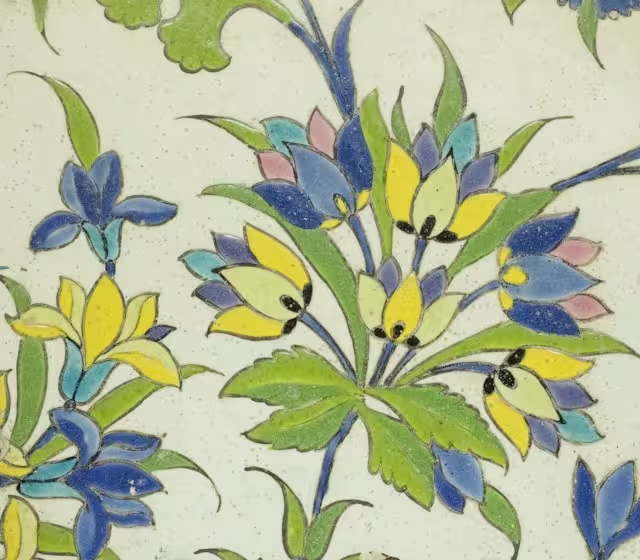
- Illustrations: These can range wildly, can’t they? From delicate, vintage botanical sketches that evoke a sense of history and refinement, to bold, modern, even abstract interpretations of leaves and flowers that scream contemporary. Which style do you think whispers “luxury,” and which shouts “organic and earthy”?
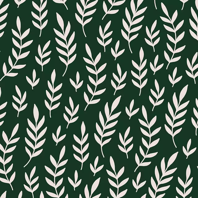
- Patterns: Think of these as the carefully arranged flowerbeds of your design. Will you opt for a seamless, repeating pattern that provides a subtle textured background, almost like digital wallpaper? Or perhaps a more prominent hero section pattern that makes an immediate, bold statement? The key is intention, wouldn’t you agree?
- Photography: A picture is worth a thousand words, or so they say! High-quality, evocative photography of flora can transport a user. But is it just about a pretty picture, or does the mood of the photography—dew-kissed morning leaves versus the stark silhouette of a desert plant—play a more significant role in conveying your message?
- Color Palettes Derived from Nature: This is a fascinating one. We can draw inspiration from the deep earthy tones of a forest floor or the vibrant, joyful hues of a wildflower meadow. How do these palettes influence a user’s emotional response even before they consciously register the botanical elements themselves?
- Iconography with a Floral/Botanical Twist: Even the smallest elements, like icons, can carry the theme. A simple leaf shape for a “save” button, perhaps? Or a budding flower to indicate growth or a new feature? How subtle is too subtle, and when does it become clever design?
- B. Historical Context & Modern Trends (A Quick Stroll Through the Garden of Time) It’s not as if this appreciation for nature in design sprouted overnight! If we peek back, we can see influences like the Art Nouveau movement at the turn of the 20th century. Remember those sinuous, organic forms, those flowing lines inspired by plant stalks and flowers? That was an early embrace of nature’s aesthetics in a big way. Fast forward to today, and what are we seeing? There’s a significant trend towards eco-conscious branding, where botanical motifs aren’t just decorative but symbolic of a company’s values. Think about wellness platforms aiming to soothe and heal – isn’t nature the perfect visual language? And what about artisanal e-commerce sites selling handcrafted goods? Floral and botanical touches can suggest natural ingredients, handcrafted quality, and a connection to the earth. From my professional vantage point here at Silphium Design, these trends don’t just happen; they shape user expectations. People expect a “natural” brand to look, well, natural!
- C. LSI Keywords & Related Concepts: The Mycorrhizal Network of Meaning Now, for a slightly more technical, but incredibly important, branch of our discussion: understanding the semantic landscape. When we talk about “Botanical & Floral Motifs,” search engines and even savvy users are also thinking about related terms. Knowing these helps us create richer, more discoverable content. Consider these:
- Organic web design: This isn’t just about food! It implies a design that feels natural, flowing, and harmonious.Nature-inspired UI: A broader term encompassing all elements of nature, not just plants.Biophilic design: We’ve met this friend! It’s about designing in a way that connects humans to nature.User experience (UX) with natural elements: How do these motifs specifically impact the experience of using a site?Visual hierarchy in themed design: With strong visual themes, how do we ensure users still see what’s most important?Sustainable web aesthetics: While not always a direct visual, the feeling of a site using natural motifs can align with broader concepts of sustainability and eco-friendliness.
The Photosynthesis of Good Design: Principles for Balancing Aesthetics & Clarity
Alright, we’ve got our seeds of inspiration. Now, how do we make them grow into something that’s not just beautiful, but also functional and healthy for the user experience? This is where the real science and art of design come together, much like photosynthesis itself, converting light (inspiration) into energy (usability)!
- A. “Form Follows Function… Mostly”: Prioritizing Usability It’s a classic design mantra, isn’t it? “Form follows function.” But what does that really mean when you’re yearning to add that stunning, digitally painted orchid to your homepage? I’d pose this: if a button shaped like a beautiful, intricate leaf is so stylized that users hesitate to click it, have we truly succeeded in our design? The answer, from a technical standpoint, often lies in established usability heuristics. Think of the foundational principles from folks like the Nielsen Norman Group – visibility of system status, user control and freedom, consistency, error prevention, recognition rather than recall. These aren’t just dusty old rules; they are the bedrock of user-centric design. Botanical motifs, however lovely, must serve these principles, not subvert them. We also need to consider cognitive load. If an interface is too busy, too packed with elaborate floral details, does it force the user’s brain to work harder than it needs to, just to find the information they’re looking for? The best designs, I believe, often feel effortless.
- B. Strategic Placement & Hierarchy: Letting Motifs Support, Not Overwhelm So, if we can’t just splash digital paint everywhere, how do we integrate these motifs effectively? It’s all about strategy and visual hierarchy.
- Backgrounds vs. Foregrounds: A subtle, desaturated floral pattern as a background can add texture and interest without competing with foreground content like text and buttons. Conversely, a bold botanical illustration might work as a focal point in a hero section, but then other elements around it need to be simpler.Accents and Embellishments: Sometimes, less is more. A delicate vine winding around a content box, or small floral icons, can add thematic charm without compromising core functionality.Guiding the Eye: Can a motif actually help with navigation? Imagine a subtle, illustrated branch that subtly draws the eye towards a call-to-action button. It’s about making the decoration do something.
z-indexto control layering (essentially going in and out, adding depth),opacityto soften elements, and variousbackgroundproperties (background-size: cover;,background-position: center;,background-attachment: fixed;for parallax effects) that give us fine-grained control over how these visual treats are presented. The art is in using these tools with restraint and purpose. - C. Color Theory in Botanical Design: Readability is King Nature gifts us an explosion of color! But here’s a crucial thought moment: how can the vibrant reds of a poppy or the deep greens of a fern translate to a screen without making your text completely unreadable? This is where color theory, and specifically contrast, takes center stage. Readability isn’t just a nice-to-have; it’s fundamental. The Web Content Accessibility Guidelines (WCAG) provide clear technical benchmarks – for example, a contrast ratio of at least 4.5:1 for normal text and 3:1 for large text. So, if you have a lovely leafy green background, your white or light-colored text must meet these contrast requirements.How do we manage this?
- Use vibrant floral colors as accents, perhaps in illustrations or buttons that have clear text on them, rather than as large text backgrounds.
- Opt for more muted or desaturated botanical palettes for larger background areas.
- Consider placing text within a semi-opaque box overlaying a busier botanical image to ensure the text stands out. Accessibility isn’t an afterthought; it’s integral to good design. After all, what good is a beautiful message if it can’t be easily read by everyone?
- D. Minimalism and Botanicals: An Unlikely Pair? When you think “botanical,” you might imagine lush, dense foliage. And when you think “minimalism,” you probably picture clean lines and lots of white space. Can these two seemingly opposite approaches actually work together? I’d argue, absolutely! Sometimes, the most impactful way to use a botanical element is with extreme restraint. A single, exquisitely rendered leaf casting a soft shadow on an otherwise stark page can be incredibly elegant and draw the eye more effectively than a whole bouquet. This is where negative space (or white space) becomes your greatest ally. It gives your botanical elements room to breathe, preventing visual clutter and enhancing clarity. So, could it be that in the digital garden, sometimes pruning back allows the true beauty of a single bloom to shine?
- E. Consistency Across the Digital Ecosystem Let’s say you’ve found the perfect balance of rose illustrations and readable text on your website. Fantastic! But what about your mobile app? Your social media profiles? Your email newsletters? Professional insight alert: Maintaining a consistent visual language is paramount for brand recognition and trust. If your website whispers “elegant orchid,” your Instagram shouldn’t scream “psychedelic sunflower” (unless that’s a very specific, intentional brand strategy!). The way botanical motifs are used should feel cohesive across all your digital touchpoints. This doesn’t mean identical replication, as different platforms have different constraints, but the essence, the style, the feeling of your botanical branding should be consistent. This consistency builds familiarity and reinforces your brand identity in the user’s mind.
Cultivating Clarity: Practical Techniques & Tools
Knowing the principles is one thing; putting them into practice is another. So, what are some tangible techniques and tools we can use to ensure our digital gardens are both beautiful and navigable? Let’s get our hands on some (metaphorical) gardening tools!
- A. Choosing the Right Motifs for Your Brand & Audience Before you even think about how to implement botanical motifs, the crucial first step is what to implement. Not all flowers fit all vases, right?
- Understand Your Brand’s Personality: Is your brand playful and vibrant (perhaps bold, colorful florals)? Or is it sophisticated and serene (maybe elegant line art of leaves or muted watercolor botanicals)? What if it’s rugged and outdoorsy (ferns, pine cones, more textured natural elements)? The motif should be an extension of your brand’s voice. What Message Do You Want to Convey? Are you aiming for a feeling of natural purity, creative inspiration, luxurious indulgence, or eco-conscious responsibility? Different botanical elements carry different connotations. A single, perfect rose says something very different from a wild, untamed meadow. Know Your Audience: Who are you trying to reach? What are their aesthetic preferences? A design that appeals to a younger, trend-conscious audience might differ significantly from one targeting established professionals. Could doing some user persona research here help you choose motifs that truly resonate?
- B. Software & Resources for Creating/Sourcing Botanical Elements Once you have a direction, where do you find or create these beautiful elements?
- Creation Tools: For bespoke illustrations, vector graphics software like Adobe Illustrator is invaluable. Why vector? Because vector graphics (SVGs, for example) are infinitely scalable without loss of quality – perfect for responsive web design where your motif might need to look crisp on a tiny mobile screen and a giant desktop monitor. For manipulating photographs or creating more painterly raster effects, Adobe Photoshop remains a go-to. And for those who prefer a more hands-on digital drawing experience, tools like Procreate on a tablet can be fantastic for creating organic-feeling artwork.
- Sourcing Stock Assets: Not every project has the budget or timeline for custom illustration. That’s where stock asset sites come in.
- Photos: Sites like Unsplash and Pexels offer a wealth of high-quality, free-to-use (always check licenses!) botanical photographs.
- Vectors & Illustrations: Platforms like Vecteezy, Freepik, or even Adobe Stock have vast libraries of botanical vectors and illustrations. A word of caution from a seasoned professional: while convenient, ensure the quality is high and be mindful of licensing terms. Also, consider if a widely used stock image will make your design feel unique enough.
- Custom vs. Stock – A Quick Thought: While stock can be efficient, if your brand truly wants to stand out, investing in custom botanical illustrations can create a unique and memorable visual identity. Isn’t there a certain appeal to having a design element that is uniquely yours?
- C. A/B Testing Your Designs So, you’ve implemented your chosen botanical theme. It looks stunning to you and your team. But how do you know it’s working effectively for your users and your goals? This is where we put on our lab coats! A/B testing (or split testing) is a wonderfully technical yet straightforward way to get answers. The concept? Show two versions of a page to different segments of your audience simultaneously: Version A (perhaps your existing design or a minimalist version) and Version B (the one with your new botanical motifs). Then, you measure which version performs better against specific goals.
- What to Test? You could test the impact of a floral hero image on bounce rate. Does a page with subtle botanical background patterns have a higher conversion rate on its call-to-action button compared to a plain background? Does a version with more prominent floral accents lead to longer time on page?
- Key Metrics to Track: Conversion rates (e.g., sign-ups, purchases), bounce rate, average session duration, click-through rates on specific elements, task completion rates (if applicable).
- The Importance of Data: A/B testing moves design decisions from “I think this looks better” to “The data shows this version performs 15% better.” It’s about making informed, evidence-based choices. Doesn’t that appeal to the scientist in all of us?
Case Studies: Botanical Designs in the Wild (Inspiring Examples)
Theory and principles are vital, but seeing things in action often sparks the best understanding, doesn’t it? While I can’t pull up live websites in our current chat, let’s imagine a few hypothetical (but plausible!) examples of brands that are beautifully balancing botanical aesthetics with interface clarity. Consider these mini-case studies from my mental design library (note, though there are companies with similar names, the ones below are hypothetical, except for #4):
- Case Study 1: “VerdantBloom Tea Co.” – Artisanal Online Tea Shop
- The Brand: VerdantBloom positions itself as a purveyor of high-quality, organic, artisanal teas. Their brand values revolve around natural ingredients, tranquility, and a mindful tea-drinking experience.
- Botanical Implementation:
- Subtle, watercolor illustrations of tea leaves (e.g., camellia sinensis, mint, chamomile) are used as section backgrounds, often with a slightly desaturated, calming color palette.
- Product pages feature high-resolution photos of the loose-leaf tea, sometimes accompanied by small, elegant line drawings of the specific herbs or flowers in that blend.
- Iconography for categories like “Herbal Infusions” or “Green Teas” subtly incorporates leaf or petal shapes.
- The blog, focusing on wellness and tea culture, uses larger, more expressive botanical hero images for articles.
- Balancing Aesthetics & Clarity:
- Clarity: Text overlays on watercolor backgrounds always have a solid, slightly opaque backing box or sufficient clear space to ensure excellent readability (meeting WCAG contrast). Navigation is clean and minimalist, using a sans-serif font that contrasts well with the softer, more organic visuals.
- Aesthetics: The overall feel is serene, sophisticated, and trustworthy, directly reflecting the brand’s promise of natural quality. The motifs never overshadow the product images or crucial information like pricing and “add to cart” buttons.
- To Reflect: How does this subtle, integrated approach make “VerdantBloom” feel different from a tea company that uses no botanical imagery, or one that uses very loud, generic floral stock photos? Does it build a certain kind of trust or expectation of quality?
- Case Study 2: “Leaf & Node” – A Sustainable Tech & Lifestyle Blog
- The Brand: “Leaf & Node” focuses on the intersection of technology, sustainable living, and modern design. They aim for a forward-thinking, intelligent, yet accessible tone.
- Botanical Implementation:
- The design uses a more abstract, geometric interpretation of botanical forms – think stylized leaf silhouettes combined with clean lines, perhaps hinting at circuitry patterns morphing into natural shapes.
- The color palette is a mix of earthy greens and grays with a bright, energetic accent color (e.g., a vibrant coral or electric blue).
- Hero images for articles might feature a split design: one half a striking nature photograph, the other a clean typographic treatment or a piece of tech.
- Infographics about sustainability metrics might use growing plant visuals (e.g., a tree growing taller to represent increasing renewable energy use).
- Balancing Aesthetics & Clarity:
- Clarity: The underlying grid structure is strong, ensuring content is well-organized. Typography is paramount, with clear hierarchies for headings, subheadings, and body text. The abstract motifs are used primarily as header backgrounds or subtle section dividers, never interfering with the core content.
- Aesthetics: The look is modern, innovative, and conveys a sense of intelligent optimism. The botanical elements feel integrated with the “tech” aspect, not just tacked on. It suggests a harmonious relationship between nature and technology.
- To Reflect: For a blog like “Leaf & Node,” why might an abstract or geometric botanical style be more effective than traditional, realistic floral illustrations? What does this choice communicate about their perspective on sustainability and technology?
- Case Study 3: “The WildScribe” – Luxury Eco-Resort Booking Site
- The Brand: “The WildScribe” offers bookings for exclusive, remote eco-lodges that promise immersive nature experiences and sustainable luxury.
- Botanical Implementation:
- Stunning, full-bleed professional photography of the resorts’ natural surroundings (lush rainforests, mountain wildflowers, etc.) is central to the design. These images are the primary botanical element.
- Overlaying text is kept to a minimum on these hero images, often using elegant, thin serif fonts in white or a very light, complementary color, always with a subtle text shadow or scrim for readability.
- Iconography for amenities might use minimalist symbols of local flora/fauna.
- Interactive maps showcasing lodge locations might use subtle leaf markers.
- Balancing Aesthetics & Clarity:
- Clarity: Because the photography is so rich, the UI elements (navigation, booking forms, text blocks) are often designed with a very clean, almost stark minimalism, sometimes in semi-transparent dark overlays to ensure they stand out. Booking call-to-actions are prominently placed and use a contrasting accent color.
- Aesthetics: The design aims to be immersive and aspirational, selling the experience of being in nature. The botanicals here are not just decoration; they are the product.
- To Reflect: In this instance, the “botanical motif” is the core offering. How does the interface design then step back to allow the natural beauty to take center stage without abdicating its functional responsibilities?
These examples, though imagined, illustrate the diverse ways botanical and floral motifs can be thoughtfully woven into web design to enhance both aesthetic appeal and brand messaging, all while keeping user clarity sharply in focus. It’s about finding that perfect symbiosis, wouldn’t you agree?
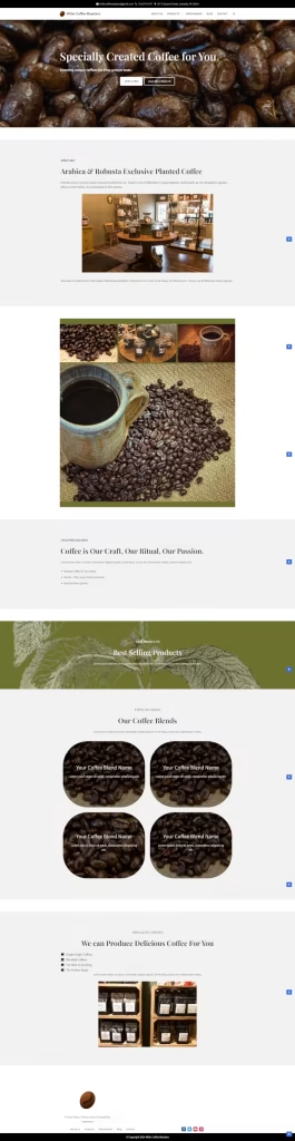
- Case Study 4: “Miller Coffee Roasters” – Small Town Coffee Roaster (website completed by Silphium Design LLC)
- The Brand: “Miller Coffee Roasters” is a small roaster located in Jeannette, Pennsylvania.
- Botanical Implementation:
- An illustration of a coffee plant was used as background in the front page.
- Numerous of roasted coffee beans are included throughout the website.
- Images are enclosed on circular outlines to represent the shapes of coffee beans.
- The text color is approximate to the color of a roasted coffee bean.
Potential Pitfalls: Avoiding Thorny Issues
Now, as much as we love a beautiful digital garden, even the most well-intentioned designs can sometimes hit a snag, a thorny patch, if you will. What are some common pitfalls when working with botanical and floral motifs, and more importantly, how can we sidestep them? Let’s put on our protective gloves for this part.
- A. Overuse and Clutter: The “Too Much of a Good Thing” Syndrome
- The Impact: Imagine walking into a room so crammed with plants you can barely move. Digitally, this translates to cognitive overload. Too many competing floral elements, patterns, and colors can overwhelm the user, making it difficult to focus, find information, or complete tasks. The design, instead of being inviting, becomes visually noisy and frustrating.
- How to Avoid It:
- Embrace White Space (Negative Space): Give your elements room to breathe! White space isn’t wasted space; it’s a powerful design tool that improves readability and reduces clutter.
- Establish a Clear Visual Hierarchy: Decide which botanical elements are primary (e.g., a hero image) and which are secondary or tertiary (e.g., subtle background texture, small icons). Not everything can shout for attention at once.
- One “Star” at a Time: If you have a particularly bold floral illustration, let it be the star of that section. Keep other elements around it simpler and more subdued. Could you try the “squint test”? Squint at your design; what stands out? Is it what you want to stand out?
- B. Poor Image Optimization: Slow Load Times Frustrating Users
- The Impact: Those gorgeous, high-resolution botanical photos or intricate vector illustrations can be heavy. If not optimized, they can drastically slow down your page load times. And what do users do when a page is slow? They leave! This directly impacts user experience, bounce rates, and even SEO.
- How to Avoid It:
- Compress Images: Use tools to compress your JPEGs, PNGs, and SVGs without significant loss of visual quality.
- Choose the Right Format: Use JPEGs for photographs, PNGs for graphics needing transparency (like cut-out leaves), and SVGs for scalable vector graphics like icons and simple illustrations (they’re often incredibly lightweight!). Consider modern formats like WebP, which often offers better compression than JPEG or PNG.
- Lazy Loading: Implement lazy loading for images that are “below the fold” (not visible until the user scrolls). Why load everything at once if the user might not even see it?
- Responsive Images: Use HTML’s
<picture>element or thesrcsetattribute in<img>tags to serve different image sizes for different screen resolutions. A massive desktop image shouldn’t be loaded on a small mobile screen. - Question Everything: Does that full-screen background need to be a 2MB photograph, or could a more efficient CSS gradient combined with a small, repeating SVG motif achieve a similar aesthetic effect with a fraction of the file size?
- C. Sacrificing Readability for Visual Flair
- The Impact: Text placed over busy floral backgrounds without enough contrast, or tiny, delicate fonts chosen purely for their “organic” feel, can make content incredibly difficult or even impossible to read for many users. This alienates users and undermines the entire purpose of your content.
- How to Avoid It:
- Contrast, Contrast, Contrast: Test text and background color combinations rigorously using contrast checkers to meet WCAG AA or AAA standards.
- Background Management: If using a floral image behind text, consider applying a solid color overlay with reduced opacity to the image, or placing the text within a clearly defined, opaque box.
- Font Choices: While a script font might look “flowery,” prioritize legibility for body text. Choose clear, readable sans-serif or serif fonts. Reserve highly stylized fonts for short headings, if at all, and ensure they are still easily decipherable.
- Font Size: Don’t make users squint! Ensure your base font size is adequate for comfortable reading, typically at least 16px for body text.
- D. Inconsistency or Off-Brand Application
- The Impact: Using wildly different styles of botanical motifs across your website, or choosing motifs that clash with your overall brand identity, can create a disjointed, unprofessional user experience. It can confuse users and dilute your brand message.
- How to Avoid It:
- Develop a Style Guide: If botanical motifs are a core part of your visual identity, include guidelines for their usage in your brand style guide. Specify color palettes, illustration styles, and appropriate placement.
- Purposeful Selection: Don’t just add a flower because it looks pretty. Does it align with your brand’s values and the specific message of that page or section?
- Holistic View: Regularly review your website and digital assets as a whole to ensure visual consistency. Do all the “plants” in your digital garden feel like they belong to the same ecosystem?
- E. Ignoring Accessibility Standards (Beyond Just Color Contrast)
- The Impact: Beyond readability, other accessibility issues can arise. Complex animations might trigger issues for users with vestibular sensitivities. Relying solely on visual cues from botanicals to convey information can exclude users with visual impairments.How to Avoid It:
- Keyboard Navigation: Ensure any interactive botanical elements (e.g., a clickable floral button) are fully accessible and operable via keyboard.ARIA Attributes: Use Accessible Rich Internet Applications (ARIA) attributes where necessary to provide additional semantic information to assistive technologies, especially if botanical elements are part of custom interactive components.Reduced Motion: Respect the
prefers-reduced-motionmedia query. If you have botanical animations, provide a way to disable them or offer a less motion-intensive alternative for users who prefer it.No Information by Color/Shape Alone: If a particular leaf color or flower shape signifies something important (e.g., “on sale” or “new item”), ensure there’s also a text label or icon that conveys this information redundantly.
- Keyboard Navigation: Ensure any interactive botanical elements (e.g., a clickable floral button) are fully accessible and operable via keyboard.ARIA Attributes: Use Accessible Rich Internet Applications (ARIA) attributes where necessary to provide additional semantic information to assistive technologies, especially if botanical elements are part of custom interactive components.Reduced Motion: Respect the
- The Impact: Beyond readability, other accessibility issues can arise. Complex animations might trigger issues for users with vestibular sensitivities. Relying solely on visual cues from botanicals to convey information can exclude users with visual impairments.How to Avoid It:
The Future in Bloom: Evolving Trends in Nature-Inspired Design
The world of web design is hardly static, is it? It’s a constantly evolving ecosystem! So, as we gaze into our crystal ball (or perhaps, a dewdrop on a leaf), what future trends might we see in the application of botanical and floral motifs? Where is this particular branch of design headed?
- A. Interactive Botanical Elements: More Than Just Static Beauty? We’re already seeing subtle animations – a leaf that gently sways on hover, a parallax effect that gives depth to a floral background. But could this evolve further?
- Microinteractions: Imagine botanical elements responding more dynamically to user input. A flower that “blooms” when a form is successfully submitted? Or a vine that “grows” to indicate scroll progress?
- Gamification: Could subtle game-like interactions involving botanical elements increase engagement on certain types_of sites (e.g., educational platforms, children’s websites)?
- The Million Dollar Question: The key challenge here will be to ensure such interactivity enhances the experience rather than becoming distracting or gimmicky. Could hyper-interactive botanicals inadvertently lead us back into that “clutter” trap we just discussed, or can they genuinely add a new layer of delight and intuitive feedback? And what are the performance implications of more complex animations? These are the frontiers we’ll be exploring.
- B. Procedural Generation of Natural Patterns: AI in the Digital Garden? This is where my MIT-trained mind gets particularly excited! Think about algorithms and Artificial Intelligence.
- Unique, Organic Designs: Imagine AI that can generate unique, infinitely variable botanical patterns that still feel completely organic and natural. This could mean truly one-of-a-kind backgrounds or design accents for every user or every visit, tailored to specific parameters.
- Data-Driven Botanicals: Could patterns subtly change based on time of day, weather data, or even user mood (if such data were ethically available and used)? A site that subtly shifts its floral hues to match the season?
- Technical Thought: This moves beyond simply picking a stock illustration. It involves coding generative art, which could open up incredible avenues for personalized and ever-fresh nature-inspired user experiences. But, how do we ensure the “art” created by AI still has “heart” and aligns with design principles?
- C. Greater Emphasis on Sustainability in Digital Design Aesthetics As global consciousness about environmental sustainability grows, we’re seeing this reflected more and more in brand messaging. I believe this will increasingly influence visual design choices.
- Visual Reinforcement: Botanical and nature-inspired motifs are a natural fit (pun intended!) for brands wanting to project an eco-conscious image. We might see more designs that visually communicate sustainability – not just through overt imagery of thriving nature, but perhaps through the use of color palettes that evoke natural, undyed materials, or textures that feel raw and unprocessed.
- “Lightness” as a Metaphor: Could the visual “lightness” and “airiness” of a design subtly hint at a “lighter” environmental footprint, even if it’s more metaphorical than literal? Minimalist designs incorporating sparse, elegant botanical touches might become even more prevalent.
- Beyond Decoration: The motifs might be used to tell stories about sustainable sourcing, a company’s commitment to conservation, or the natural origins of their products more directly and compellingly. Does the way we visually represent nature online have a role to play in fostering a deeper appreciation and sense of responsibility towards the natural world itself? That’s a question I find myself pondering on my hikes around the less-concrete parts of New York.
The future of botanical design in the digital realm promises to be more dynamic, more intelligent, and more deeply connected to broader cultural values. It’s an exciting time to be watching these digital seeds sprout!
Have Questions? Maybe We Have the Answer
Below are some common questions asked on the internet about this topic.
- A. How do you use floral patterns in UI without it looking dated or cluttered? Ah, the fear of the “digital doily” effect! It’s a valid concern. So, how do we keep things fresh and prevent our beautiful botanicals from looking like grandma’s curtains (unless, of course, that’s the specific vintage vibe you’re aiming for!)?
- Modern Interpretations: Think less chintz, more chic. This could mean flat design florals, where the shapes are simplified and colors are solid or subtly graded. Or perhaps abstract botanical shapes that hint at nature without literal representation. Geometric interpretations of leaves and petals can also feel very contemporary.
- Strategic, Sparse Use: We touched on this with minimalism. Instead of a full-page repeat, maybe it’s a floral border on one side, or a single, elegant motif in the footer.
- Pairing with Cleanliness: Crisp, modern typography is essential. Generous white space is your best friend. A well-defined grid layout can provide structure that balances the organic flow of the florals.
- Context is Key: An ornate, detailed floral might look dated on a tech startup’s site, but it could be perfectly appropriate, even luxurious, for a heritage perfume brand. It’s about alignment with the brand’s story. So, the question isn’t just “is it dated?” but “is it appropriate and well-executed for this context?”
- B. What are the best practices for using botanical themes in e-commerce design? This is a great practical question! When you’re selling products, the product itself needs to be the star of the show, doesn’t it?
- Product as Hero: Ensure your botanical motifs don’t visually compete with or obscure product images. Use them as framing elements, subtle backgrounds, or thematic accents that enhance the product’s appeal rather than distracting from it. For instance, if you’re selling organic skincare, a faint, out-of-focus leaf in the background of a product shot can reinforce the “natural” message without being intrusive.
- Brand Storytelling: Botanical themes can be powerful for e-commerce brands that want to evoke certain values. Selling artisanal jams? Illustrations of the fruits and blossoms involved can tell a story of freshness and natural ingredients. Eco-friendly clothing? Subtle patterns of leaves or sustainable fibers can visually underpin your brand’s commitment.
- Influencing Perceived Value: Done well, a sophisticated botanical theme can elevate the perceived quality and desirability of products. It can make an online shop feel more like a boutique experience. But, could an inappropriate or poorly executed theme actually reduce perceived value? Something to ponder.
- C. Can botanical designs improve user engagement? This is where psychology meets design! If, as the biophilia hypothesis suggests, nature has a calming and positive effect on us, is it possible that incorporating these elements into a website might make users feel more relaxed, more welcome, and therefore more likely to stay longer and explore further? It’s certainly a compelling idea. A visually pleasing environment, whether physical or digital, tends to be more inviting. If botanical motifs contribute to a sense of harmony and reduce visual stress, it could translate to lower bounce rates and increased time on page. However, let’s be clear: pretty flowers alone won’t save a site with poor navigation, slow load times, or irrelevant content. Engagement is a multi-faceted gem, and while aesthetics play a role, they are part of a larger ecosystem of good UX, valuable content, and solid performance. Perhaps the question is, all other things being equal, could a well-implemented botanical theme give you an edge in user engagement?
- D. How does accessibility factor into using visual motifs like florals? A critical question, and one close to my heart as someone who believes the internet should be for everyone. Beauty should never come at the cost of accessibility.
- Alt Text is Non-Negotiable: Every image, including those lovely botanical illustrations or photos, needs appropriate alternative text. If the image is purely decorative, a
alt=""(null alt text) tells screen readers to ignore it, which is often the correct approach to avoid unnecessary noise. But if the botanical image conveys meaning (e.g., an infographic using leaf shapes to represent data points), the alt text must describe that meaning. - Color Contrast, Again!: I know, I sound like a broken record, but it’s that important! Text on floral backgrounds, text within buttons that have floral accents – all must meet WCAG contrast guidelines. Test, test, and test again with color contrast analyzers.
- Information Hierarchy: Ensure that no essential information is conveyed only through the botanical motif. For example, don’t rely on a specific flower color alone to indicate a sale item if a colorblind user might not perceive that difference.
- Animations & Motion: If your botanicals involve animation (e.g., gently swaying leaves), be mindful of users with vestibular disorders. Provide a mechanism to pause or stop motion, or respect the
prefers-reduced-motionmedia query. Could those subtle animations, if not managed, turn a serene experience into a dizzying one for some users?
- Alt Text is Non-Negotiable: Every image, including those lovely botanical illustrations or photos, needs appropriate alternative text. If the image is purely decorative, a
Conclusion: Harvesting the Best of Both Worlds
So, we’ve journeyed through the digital forests and meadows, examined the petals and the pixels, and considered how to cultivate interfaces that are both captivatingly beautiful and crystal clear. What’s the main takeaway from our expedition?
It’s that botanical and floral motifs, with their inherent connection to our biophilic selves, offer a potent tool for creating engaging, emotionally resonant web experiences. However, like any powerful tool, it requires skill, thoughtfulness, and a deep respect for the user. The goal isn’t just to decorate; it’s to communicate, to enhance, and to guide.
We’ve seen that success lies in a delicate balance:
- Function First: Aesthetics must always serve usability. A beautiful design that doesn’t work is, quite simply, not a good design.
- Strategic Placement & Hierarchy: Motifs should support and enhance content, not overwhelm or obscure it.
- Color Awareness & Accessibility: Readability and inclusivity are non-negotiable. Our digital gardens must be welcoming to all.
- Consistency: A cohesive visual language across all touchpoints builds brand trust and recognition.
Here at Silphium Design LLC, we believe that true technical competence and reliability are rooted in an honest approach to such challenges. It’s about understanding not just the how but the why of design choices. When used with intention and skill, botanical and floral motifs aren’t mere ornamentation; they become an integral part of a clear, effective, and delightful user experience. They allow us to harvest the very best of both worlds: the evocative power of nature and the clarifying logic of good design.
So, I leave you with a final thought, a seed to plant in your own creative mind: What natural element truly inspires you, and how might its unique essence – its form, its texture, its feeling – be translated into a digital interface that is not only clear and functional but also profoundly beautiful and engaging?
Go forth and design thoughtfully. The digital world is your canvas!