The Evolution of Digital Space
Hello. I am Aristaeus. At Silphium Design LLC, we look at the internet as a living ecosystem. When we talk about a website, we are really talking about a space where humans spend their time. Lately, many designers have moved toward minimalism. They want to make things clean and simple. However, there is a big difference between a design that is simple and one that feels empty. As someone with a background in biology and computer science, I see this as a challenge for the modern user experience. We must ask if a sparse design helps the user or if it just makes them feel lost.
Evaluating user experience in minimalist environments is about more than just looking at a pretty screen. It is about how our brains process information. If a screen is too busy, we get tired. If a screen is too empty, we might feel bored or confused. This is where biophilic design comes in. Biophilia is the idea that humans have a natural love for living things. We can use this love to make digital spaces feel better. By adding natural patterns or soft colors to a simple design, we create a better user experience. This article will look at how we measure these feelings and how we can build better websites for everyone.
Table of Contents
The Psychological Intersection: Cognitive Load vs. Biophilia
To understand the user experience, we first have to look at how the brain works. Every time you look at a website, your brain has to do work. This work is called cognitive load. Think of your brain like a small bucket. If you pour too much information into the bucket, it overflows. In a very busy website, the bucket fills up fast. Minimalism tries to keep the bucket empty. But a completely empty bucket is not useful either. We need to find the right amount of “stuff” to put in.
Evaluating user experience in this context means looking at how much effort a person uses. If a person can find what they need without thinking too hard, they have a good user experience. However, humans also need some visual interest. In nature, we never see a perfectly flat, white wall. We see trees with many leaves or stones with different textures. These natural patterns help our brains relax. When we bring these patterns into a minimalist design, we support the user experience. We reduce the stress of a blank screen while keeping the design simple. This balance is what makes a website feel “right” to a human visitor.
Principles of Minimalism in UX Research
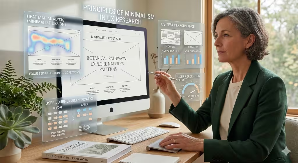
In the world of user experience, minimalism is a powerful tool. It helps us focus on what is important. One of the main ideas is using “white space.” White space is just the empty parts of a page. It is not wasted space. It is actually a way to guide the eye. When there is plenty of room around a button, that button is easier to see. This makes for a much smoother user experience because the user does not have to hunt for where to click.
Another part of evaluating user experience in minimalist designs is looking at words and fonts. When you have very few items on a page, every word counts. The type of font you use can change how a person feels. A thin, sharp font might feel cold. A round, soft font might feel more natural. Researchers often check to see if people can read the text easily. If the text is too small or the color is too light, the user experience suffers.
We also look at “affordances.” An affordance is a clue that tells you how to use something. For example, a button should look like it can be pushed. In a minimalist world, these clues must be very clear. If they are too hidden, the user experience will be poor.
Biophilic Synergy: Beyond Visual Quiet
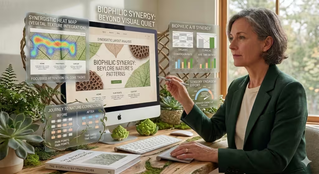
True minimalism should not be silent. It should hum with the rhythm of nature. When we talk about biophilic synergy, we are talking about how nature and simple design work together. For a great user experience, we can use “natural analogues.” These are things that look like nature but are man-made. Think of a website background that has a very faint pattern like wood grain or the veins of a leaf. It is still a simple background, but it feels warmer.
We also evaluate the user experience by looking at how light changes on a screen. In nature, light is never the same. It changes from morning to night. Some modern websites now use “circadian” modes. This means the colors on the screen get warmer as the sun goes down. This helps the person using the site feel more in tune with the world outside. It also makes the user experience much more comfortable for the eyes. By mimicking the way the world works, we make digital tools feel less like machines and more like part of our lives.
Methodology for Evaluating User Experience in Minimalist Environments
How do we actually measure if a design is working? We use several methods to test the user experience. One common way is using a task called the NASA-TLX. This test asks people how much mental effort they used to finish a job. If they say it was very hard, we know the user experience needs help. We also look at “Time on Task.” This is just a clock that tells us how long it takes to find a specific link. In a good minimalist site, this time should be very low.
We also use a tool called the Biophilic Aesthetic Preference Scale. This is a fancy way of asking people if they like how the site looks and feels on a deep, natural level. We want to know if the simple design makes them feel calm or if it makes them feel lonely. Evaluating user experience this way helps us see the human side of the data.
Another method is a “Post-Occupancy Evaluation.” In the old days, architects used this to see how people liked a new building. Today, we use it for websites. We ask users how they feel after spending ten minutes on the site. Does their head hurt? Do they feel happy? This feedback is key to a high-quality user experience.
The Role of Color in User Experience
Color is one of the first things a person notices. In a minimalist site, color is often used very sparingly. This means that when you do use a color, it has a lot of power. For a positive user experience, we often look toward the “Earth” palette. These are colors like moss green, sandy brown, and sky blue. These colors are easy on the eyes. They don’t cause the “digital eye strain” that bright neon colors do.
When we evaluate the user experience, we check to see if the colors are doing their job. For example, a “Buy Now” button should be a color that stands out but still fits with the natural theme. If the color is too jarring, it breaks the sense of calm. If it is too subtle, the user might miss it. Finding that sweet spot is essential for a high-quality user experience. We also have to consider how colors look in “Dark Mode.” Many people prefer dark screens at night. A good biophilic design will shift its colors to feel like a moonlit forest rather than a dark cave. This helps the user experience remain consistent across all times of day.
Motion Design and User Confidence
Motion is another key part of the modern user experience. In the past, websites used lots of flashy animations. These were often distracting and made the site slow. Today, we use “purposeful motion.” This means an animation only happens if it helps the user understand something. For example, if you delete an item, it might slowly fade away like mist. This gives the user a clear signal that the item is gone, which builds a sense of trust and a better user experience.
We evaluate these motions to make sure they are not too fast or too slow. If an animation is too slow, it makes the site feel “laggy.” If it is too fast, it can be startling. We want the motion to feel organic, like a leaf falling or water flowing. This type of smooth, natural movement is very soothing for the brain. It makes the digital world feel more predictable. When a user can predict what will happen next, they feel in control. That feeling of control is a major part of a successful user experience.
A Question Answered: “Does minimalism decrease user engagement?”
This is a very good question that many people ask. Some worry that if a site is too simple, people will leave quickly. They think that “engagement” means staying on a page for a long time. But in my view of the user experience, staying a long time is not always good. Sometimes it means the user is lost! In 2026, we have seen that minimalist sites often have a better “Click-Through Rate.” This means people actually do what they came to do, like buying a product or signing up for a list.
Minimalism actually increases the quality of the user experience. People move faster and feel more confident. However, if a site is too empty, people might get bored. This is where we add biophilic touches. A tiny bit of movement, like a leaf blowing in the wind or a soft wave effect, can keep people interested. This keeps them on the page without making them feel overwhelmed. So, minimalism does not decrease engagement if it is done with a human touch. In fact, it often leads to a much more loyal user experience.
A Question Answered: “How do you measure usability in a sparse UI?”
Usability is a big part of the user experience. When a screen has very few buttons, we have to make sure every button works perfectly. We measure this with “Recall Tests.” We show a user a page for five seconds and then hide it. Then we ask them where the main menu was. If they can remember it easily, the user experience is strong. If they cannot, the design is too sparse.
We also use something called “Heuristic Evaluation.” These are like a set of rules for the user experience. One rule is that the system should always tell the user what is happening. For example, if you click a button and nothing changes on the screen, you might think it is broken. In a minimalist design, we might use a small “loading” animation that looks like a growing plant. This gives the user feedback and keeps the user experience feeling alive. By checking these rules, we can find problems before the website goes live.
The Technical Analysis
As a computer scientist, I also look at the math behind the user experience. Every element on a page takes energy to load. A busy website with lots of big photos and messy code uses a lot of electricity. A minimalist design is much “leaner.” This means the code is shorter and the site loads very fast. Speed is one of the most important things for a good user experience. If a site takes five seconds to load, most people will just leave.
We also have to think about accessibility. This means making sure everyone can use the site, including people who might have trouble seeing or moving. Sometimes, minimalist designs use very light gray text on a white background. This looks cool, but it is a disaster for the user experience of someone with poor vision. We must use high contrast and clear labels. We also look at how “screen readers” see the site. A screen reader is a tool that reads the website out loud for people who are blind. If the code is simple and clean, the screen reader can do its job much better. This makes for a truly inclusive user experience.
Case Studies: Biophilic Minimalism in 2026
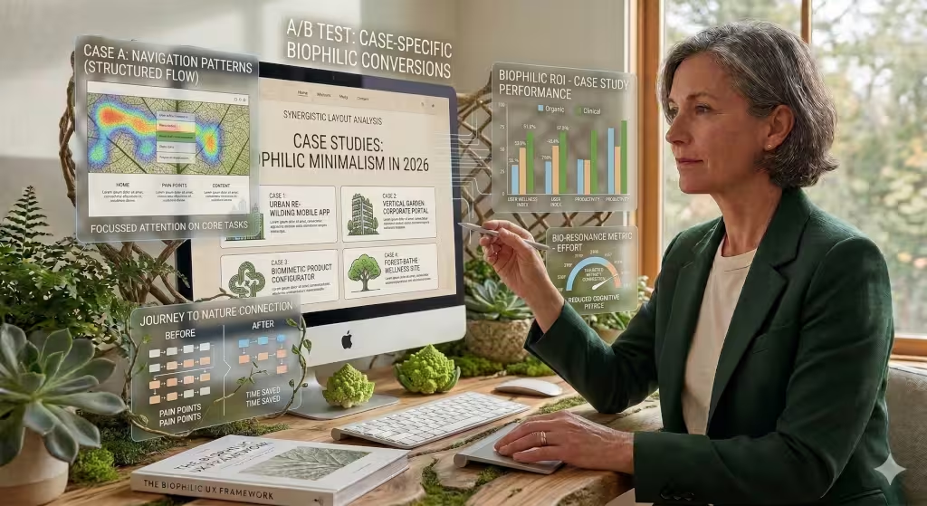
In the year 2026, we have seen some amazing examples of this work. One company that sells plants used a very simple design for their shop. They used lots of white space and very clear photos. But they also added a sound feature. When you hovered your mouse over a product, you could hear the faint sound of birds or rain. This tiny biophilic touch made the user experience feel magical. People spent more time looking at the plants because they felt like they were in a garden.
Another case was a big bank. Banks usually have very boring websites. They decided to use a minimalist look with soft green and blue colors. They also used “fractal” patterns in the background. Fractals are shapes that repeat themselves, like the branches of a tree. Science shows that looking at fractals can lower a person’s heart rate. By using these shapes, the bank created a calming user experience for people who were stressed about their money. Both of these cases show that evaluating user experience helps us find ways to combine tech and nature for the better.
The Future of Intentional Design
Evaluating user experience in minimalist environments is an ongoing journey. We are learning every day that “less” is only better if it serves a human purpose. A website is not just a tool; it is an experience. By using the principles of biophilic design, we can create spaces that are both efficient and beautiful. We can make the internet a place that feels natural and healthy.
The best user experience comes from knowing when to stop. It comes from removing the noise so that the signal can be heard. At Silphium Design LLC, we believe that the future of the web is quiet, green, and kind. We will continue to measure, test, and build with these values in mind. A great user experience is one that lets you finish your work and then get back to the real world feeling refreshed.
Final Summary of Key Metrics
To wrap things up, let’s look at a simple list of what to watch for when evaluating user experience in minimalist environments:
- Visual Clarity: Can you understand the page in three seconds?
- Cognitive Load: Does the user feel tired or stressed?
- Task Success: Can the user finish their job without errors?
- Biophilic Connection: Does the site feel “alive” and natural?
- Technical Speed: Does the page load almost instantly?
- Accessibility: Can everyone use it, regardless of their abilities?
By focusing on these points, we ensure that our work at Silphium Design LLC always puts the human first. We are not just building websites; we are building digital gardens where people can thrive. The user experience is the heart of everything we do. Thank you for reading.