Table of Contents
De-Abstracting the Digital Canvas
The digital world often feels like an invisible space that exists everywhere at the same time. Many creators believe that a website looks, feels, and operates the exact same way whether a person opens it in a crowded downtown coffee shop or on a quiet front porch in a farming town. This is the myth of the homogeneous user. It is the false idea that all internet users have the same tools, the same surroundings, and the same mental habits.
When we build digital design interfaces with this assumption, we ignore the physical reality of human beings. Web layout and development do not happen in a vacuum. The ground beneath our feet shapes how we look at screens. To create excellent digital design, we must look closely at the geographic ecosystems where people actually live and work.
The basic premise of modern digital design is that physical environments dictate digital experiences. The major differences between urban and rural digital design are not matters of personal taste. Instead, they are caused by a mix of three concrete factors. These factors are network infrastructure, environmental sensory density, and sociological trust vectors. Infrastructure determines if a page loads in milliseconds or minutes. Sensory density determines how much visual clutter a brain can process at one time. Trust vectors determine what kind of proof a person needs before they trust a business online. When these three factors interact, they create two entirely different groups of user expectations.
From a biological perspective, our brains are deeply wired to respond to our physical surroundings. This relationship between nature and human construction is the foundation of biophilic digital design. Urban users live in high-density areas full of concrete, glass, and constant noise. This environment forces their brains to filter out vast amounts of background data just to survive the day.
Rural users live in lower-density spaces where natural patterns, open horizons, and slower rhythms are common. These physical realities transfer directly onto the screen. An urban user interacts with digital design as a fast-paced shield against chaos, while a rural user views digital design as a functional tool that must prove its value through clarity and reliability. To bridge this gap, we must study the structural rules of both worlds.
The Infrastructure Matrix: Latency, Payloads, and Edge Delivery
The Hardware and Network Gap
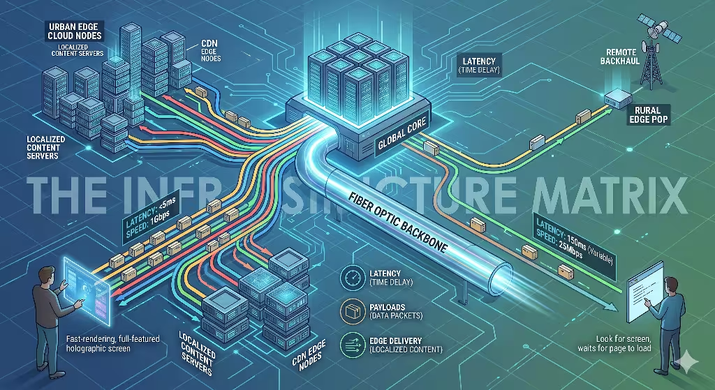
To understand how digital design performs across different regions, we have to look at the physical wires, towers, and devices that carry data. In high-density urban zones, infrastructure is abundant. These areas are packed with high-speed fiber-optic cables, 5G cellular networks, and local data centers. Urban users routinely access the internet through multiple high-end devices at the same time, such as a fast work laptop, a modern smartphone, and a smart television. Because data travels short physical distances between local servers and these powerful devices, connection speeds are incredibly fast.
In rural communities, the physical map of the internet looks completely different. Fiber-optic cables are rare because laying wire across hundreds of miles of open land is expensive. Instead, rural users often rely on older copper telephone lines, distant cellular towers, or space-based satellite internet. These systems are highly vulnerable to physical interference. Tall trees, rolling hills, and severe weather storms can easily degrade a satellite or cellular signal.
Furthermore, the devices used in rural areas are frequently kept for longer lifecycles. A rural user might open a website on a five-year-old smartphone or a budget desktop computer. When a heavy website tries to load over a high-latency connection onto an older processor, the system slows down. This gap means that modern digital design cannot treat data delivery as a guaranteed constant. It must treat data delivery as a variable resource that changes with every mile away from a major city.
Performance Metrics as UX Constraints
Network speeds create tight boundaries around what is possible in digital design. User experience, or UX, is directly tied to these technical limits. In urban centers, the standard user expectation is instant gratification. Urban users expect a web page to render completely in less than one second. They want smooth visual animations, instant search results as they type, and complex interactive tools.
Because their internet connections can handle immense amounts of data, urban digital design can include heavy client-side JavaScript execution. This means the user’s powerful device does most of the heavy lifting to build the page layout in real time. If a site takes three seconds to load in a city, the user will often close the tab out of sheer frustration.
Rural users have a much higher functional tolerance for loading screens, but their patience operates under a different rule. They understand that a page might take five to ten seconds to load when their connection is weak. However, their ultimate rejection happens when digital design causes a page layout to break completely. When a website uses massive, unoptimized asset payloads, a slow network will often drop pieces of the data during transmission. This causes images to appear as broken icons, buttons to become unclickable, and text layouts to shift wildly across the screen.
An urban user experiences a slow site as a minor annoyance. A rural user experiences a broken, shifting layout as a total failure of utility. Therefore, rural digital design must focus on structural stability. The code must be written so that even if the connection drops halfway through, the core text and primary navigation buttons still render in a perfectly readable order.
Optimization Frameworks
To solve these performance problems, we must use specific technical optimization frameworks. Excellent digital design should never force a slow network to carry useless weight. The first step in this framework is moving away from massive, bloated software frameworks. Instead, developers should focus on semantic, lightweight HTML and CSS. Semantic HTML uses direct code elements to describe page parts, which allows browsers to read and display the text instantly without waiting for heavy tracking scripts or styling sheets to arrive.
The second step is establishing a strict asset budget cap. For a website to remain functional across both urban and rural areas, the total payload of the initial homepage should stay under 1.5 megabytes. This budget requires designers to optimize every single piece of media. Images must be compressed using next-generation formats, and code files must be minified, which means removing all unnecessary spaces and characters from the background scripts.
Additionally, we must use asset serialization. This is a method where the server sends the absolute most important parts of the webpage first, such as the primary text content, while delaying non-essential elements like heavy footers or tracking pixels. By capping the payload and controlling the order of delivery, modern digital design ensures that users in low-bandwidth regions are never locked out of information.
Psychological & Cultural Paradigms of Interface Consumption
Information Density vs. Spatial Clarity
The physical layout of a person’s daily environment trains their eyes and brain to read digital design in specific ways. Urban environments are dense landscapes filled with neon signs, moving vehicles, flashing billboards, and crowds of people. This constant stream of ambient visual stimulation acts as an intense training ground for the human brain. Urban users become experts at filtering out visual noise. When they look at a screen, they can easily navigate high information density. They are comfortable with compressed text layouts, multi-tiered navigation systems, and busy dashboards that display dozens of data points at once. In fact, if an urban interface has too much empty space, they might feel the site lacks value or moving speed.
Rural environments offer a different sensory experience. The physical landscape is defined by natural horizons, open spaces, and repetitive biological textures like forests or fields. Because the rural brain is not forced to block out a chaotic wall of advertisements every day, it approaches digital design with an expectation of spatial clarity. Rural users generally prefer linear navigation paths where one step leads logically to the next. They appreciate clear functional hierarchies where the most important action, like a checkout button or a contact form, is large and distinct.
When a rural user encounters abstract design trends, such as hidden menus that only appear when you hover your mouse, they do not see innovation. They see an unnecessary obstacle that wastes their time and bandwidth. Clean spacing and predictable layouts give the interface an air of respect and utility.
Trust Architecture and Social Capital
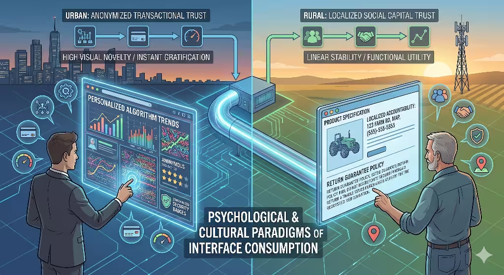
The way a community builds trust offline deeply impacts how it evaluates digital design online. Urban communities operate heavily on an anonymized, fast-paced transaction model. In a large city, people routinely buy goods from automated kiosks, ride in cars driven by strangers via mobile apps, and order food from ghost kitchens they will never see. Because of this lifestyle, urban digital design can rely on global trust indicators. Urban users trust an interface if it displays standard security badges, uses sleek payment systems, and features peer-review aggregators containing thousands of anonymous star ratings. They want the checkout process to have as few steps as possible, prioritizing speed above all else.
Rural communities are built on a framework of deep social capital and direct personal accountability. In a small town, business owners often look their customers in the eye every single week at the local market or community center. Trust is personal, local, and hard-earned. When a rural user visits a website, they look for that same accountability inside the digital design. They are immediately skeptical of overly polished, slick corporate templates that hide the actual human beings behind the company.
To build trust for a rural audience, digital design must include localized symbols and explicit proof of physical presence. This means prominently displaying a real physical address, showing a direct local phone number rather than an unhelpful automated chat widget, and offering clear statements about product durability and return policies. They do not want an anonymous transaction; they want to know that if something goes wrong, a real person will answer the phone.
Common Questions Answered About Urban vs. Rural Digital Design
How does the digital divide affect user expectations in rural areas?
The digital divide is a term that describes the gap between people who have easy access to modern internet technology and those who do not. However, when we look at digital design, this divide is not just about whether a wire reaches a home. It is a psychological barrier that changes a user’s operational confidence. When a person lives in a rural area with an unreliable network, they develop an undercurrent of technology anxiety. They are accustomed to web pages freezing, payment forms spinning indefinitely, and data disappearing mid-transmission. This anxiety completely reshapes what they expect from digital design.
Because of these past frustrations, rural users require explicit, immediate system feedback. If a user clicks a button and nothing happens on the screen for three seconds, an urban user might just click it again rapidly. A rural user, however, will assume the site has crashed or, worse, that their credit card has been charged twice.
To solve this through digital design, we must build clear visual indicators into every interaction. When a button is pressed, it must instantly change color, display a loading wheel, or show a clear text message like “Processing your order, please do not close this window.” This immediate feedback reduces user anxiety and prevents them from abandoning the task. The digital divide means that rural digital design must place clarity, reassurance, and technical honesty far above aesthetic minimalism.
What are the main differences in consumer behavior between urban and rural users?
Consumer behavior is the study of how people make decisions about what they buy, use, and trust. The geographic separation between city life and country life creates distinct behavioral patterns that must be addressed through intentional digital design. Urban consumers are driven heavily by trends, instant gratification, and friction reduction. They live in a culture of hyper-convenience where food, clothes, and entertainment can be delivered to their door within an hour. Therefore, when they interact with digital design, they look for high novelty and rapid exploration. They love discovering new features, browsing through complex video lookbooks, and interacting with hyper-personalized recommendation algorithms. If a website feels old or static, the urban consumer moves on to a competitor.
Rural consumers exhibit behavior that favors long-term utility, careful evaluation, and deep brand loyalty. Because they cannot simply run down the street to a specialty store, they use the internet to find goods and services that are genuinely durable and practical. When a rural consumer interacts with digital design, they are looking for comprehensive product data, plain-text specifications, and transparent pricing.
They are rarely swayed by flashing discount countdown timers or high-pressure sales tactics, which they often view as manipulative gimmicks. However, once a rural user finds a website that loads reliably on their connection, answers their questions clearly, and treats them honestly, their loyalty is incredibly strong. They will return to that exact platform for years, creating a steady stream of lifetime value that outlasts the fickle, trend-chasing habits of urban markets.
How can web developers optimize interfaces for regional connectivity gaps without maintaining two separate sites?
In the early days of web development, companies sometimes built two entirely different versions of a website: a heavy version for desktops and a light, text-only version for mobile devices or slow networks. Today, maintaining two separate sites is an expensive, inefficient nightmare that hurts search engine optimization. The modern solution is to design a single, highly responsive framework that uses adaptive loading techniques. This means the website itself is smart enough to measure the quality of the user’s connection and change its asset delivery in real time.
+-------------------------------------------------------------+
|                USER CONNECTS TO THE WEBSITE                |
+-------------------------------------------------------------+
                              |
                              v
+-------------------------------------------------------------+
|          SERVICE WORKER MEASURES NETWORK TELEMETRY          |
+-------------------------------------------------------------+
                              |
               +--------------+--------------+
               |                             |
    [IF HIGH-BANDWIDTH GAUGE]     [IF LOW-BANDWIDTH GAUGE]
               |                             |
               v                             v
+-----------------------------+ +-----------------------------+
| - Loads heavy client scripts| | - Halts non-essential script|
| - Displays video backgrounds| | - Swaps videos for images  |
| - Renders high-res imagery  | | - Delivers ultra-light WebP |
+-----------------------------+ +-----------------------------+
               |                             |
               +--------------+--------------+
                              |
                              v
+-------------------------------------------------------------+
|          CORE SEMANTIC HTML/CSS RENDERS STABLY             |
+-------------------------------------------------------------+
To achieve this, developers can use Service Workers, which are background scripts that run inside the user’s browser. The Service Worker can test the network speed before downloading heavy media files. If the tool detects a slow rural connection, it tells the server to halt non-essential tracking scripts and swap out heavy video backgrounds for static images.
Furthermore, the digital design should use modern, next-generation image formats like WebP or AVIF. These file types can compress a high-resolution photo down to a fraction of its original size without making it look blurry. By using responsive images that automatically resize based on both screen size and connection speed, a developer can ensure that an urban user gets a media-rich experience while a rural user gets an ultra-fast, perfectly stable layout from the exact same web address.
Bridging the Divide: Applying Organic Structuring (Biophilic Design)
The Unified Design Solution
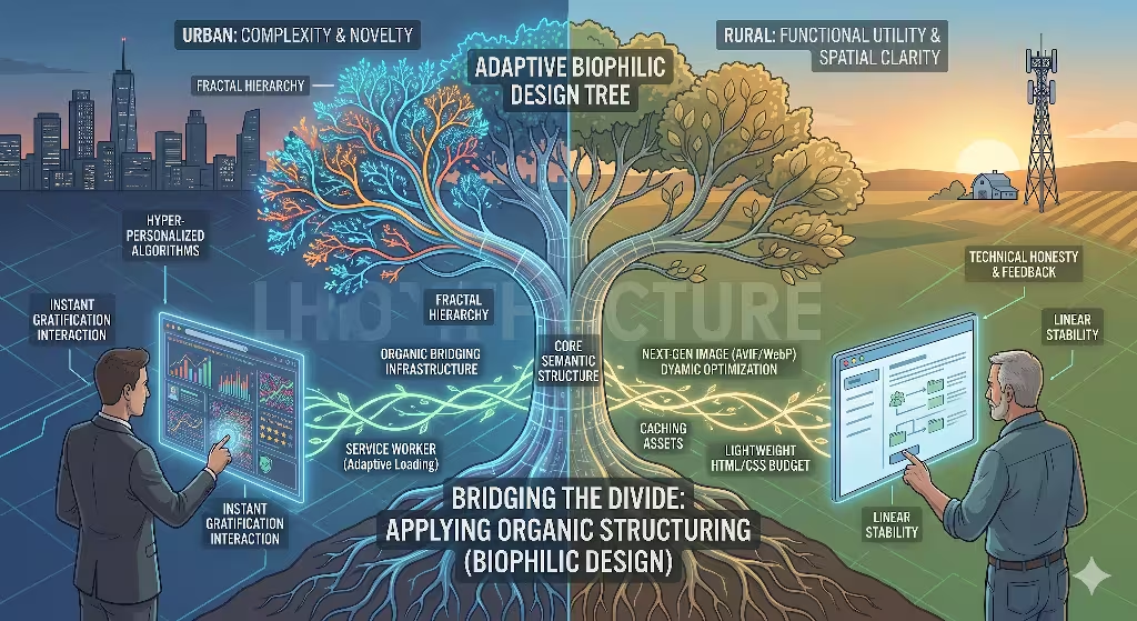
As digital design experts, we do not have to accept a permanent fracture between the urban and rural online worlds. We can create a unified design solution that satisfies both audiences at the same time. The secret to bridging this gap lies in the rules of biophilic design. This is an evolutionary approach that incorporates the structural patterns, visual rhythms, and organizational logic of the natural world into human-made environments.
Whether a human being lives in a high-rise loft in Boston or a farmhouse in Vermont, their underlying biological operating system is identical. Our eyes and brains evolved over millions of years to process natural landscapes. When we apply these organic rules to digital design, we create interfaces that feel deeply intuitive to everyone, regardless of their local internet speed or geographic location. In sense, we bring everything down to the lowest common denominator.
Biophilic digital design does not mean just pasting pictures of green leaves or forest trees onto a webpage background. That is a superficial fix that does nothing to help user experience or network speeds. True organic structure is built into the very bones of the interface layout. It focuses on reducing visual fatigue, optimizing the path of information, and creating a sense of calm reliability. By designing layouts that mirror the math and balance of natural systems, we can satisfy the urban user’s demand for high sophistication while honoring the rural user’s need for clean spatial clarity and rock-solid technical performance.
Fractal Hierarchies
One of the most powerful concepts we can borrow from nature is the fractal hierarchy. In the physical world, a fractal is a pattern that repeats itself at different scales. Think of a large tree: the main trunk splits into large branches, which split into smaller twigs, which then hold individual leaves. The same math applies to a river system or the veins inside a leaf. Human brains can read this type of layout with almost zero effort because it matches the organic geometry we see every day in nature. When we bring fractal hierarchies into digital design, we create an info architecture that scales beautifully across all user expectations.
       [MAIN TRUNK]  -->   Global Navigation (Clear, Broad Categories)
           |
     +-----+-----+
     |           |
  [BRANCH]    [BRANCH] --> Sub-Navigation (Logical Groupings)
     |           |
   +-+-+       +-+-+
   |   |       |   |
  [TWIG]      [TWIG]   --> Micro-Content (Specific Details / Data Points)
In a web interface, a fractal layout means that information scales logically from broad concepts to precise details. The global navigation bar acts as the main trunk, holding three or four clear, easily understood paths. When a user clicks into a section, the page layout breaks down into predictable sub-branches. This structure allows an urban user to skim across the surface at high speeds, using their visual training to spot the exact branch they need without getting bogged down by a wall of text.
At the same time, it provides the rural user with a linear, comforting path that never hides features behind confusing, trendy interactions. Furthermore, because a fractal hierarchy relies on clean, structured text grouping rather than heavy background programming, the underlying code remains incredibly light, ensuring rapid load times on low-bandwidth networks.
Chromatographic and Structural Grounding
Color and visual weight are the final pieces of an organic digital design strategy. Many interfaces today use harsh, blinding neon colors and perfectly flat, artificial shapes that cause intense eye strain after just a few minutes of viewing. To ground an interface for all users, we should look to the color palettes and structural textures of our local ecological environments. This technique is called cryptographic grounding. It means selecting background tones, font colors, and accent shades that mirror the natural light and earth tones found in the physical world.
Instead of a piercing, pure white background that strains the eyes under office lights, an organic layout might use a soft alabaster, stone-gray, or muted clay tone. Primary buttons can use deep forest greens, rich ocean blues, or warm terracotta ochres. These color choices do more than just make a site look beautiful; they create a subconscious sense of safety, authenticity, and calm.
For the urban user who is bombarded by flashing advertisements all day, a structurally grounded website acts as a peaceful digital oasis, causing them to stay on the page longer. For the rural user, these natural color balances feel immediately familiar and trustworthy, removing the corporate coldness that often makes online platforms feel distant and unreliable. By anchoring our visual choices in the timeless rules of nature, we create a digital space where every user feels completely at home.
The Blueprint for Globally Inclusive Digital Systems
The Final Assessment
As we look toward the future of web development, we must realize that geography will always influence how humans interact with technology. The divide between urban and rural user expectations is not a temporary trend that will vanish with the next software update. It is a permanent reflection of how physical infrastructure, daily surroundings, and community lifestyle shape human psychology. Excellent digital design must reject the lazy habit of building only for the high-speed networks of major technology hubs. We must treat accessibility and geographical inclusivity as core design metrics, not as afterthought chores.
Building inclusive systems means understanding that every line of code we write and every image we upload carries a physical cost. When we optimize a interface to load flawlessly on a weak satellite connection in a remote valley, we are not hurting the urban user. In fact, we are making the system better for everyone. A website that is light enough to load on a slow country road will load with explosive speed in the center of a metropolis. By studying the technical constraints of infrastructure and the psychological needs of different cultural landscapes, we can create an internet that leaves no community behind.
The Competitive Advantage
For businesses and web administrators, designing for the entire geographic spectrum is a massive competitive advantage. Many companies pour their entire marketing budget into highly competitive, trend-driven urban markets, completely ignoring the millions of users who live in rural communities. When you intentionally optimize your digital design to serve both worlds, you unlock a massive wave of untapped potential. You capture the attention of a highly loyal, resilient customer base that your competitors have locked out with bloated, unoptimized websites.
In the long run, the organizations that build authority across diverse user populations are those that value technical competence, structural honesty, and natural clarity. By applying the timeless patterns of biophilic architecture to modern web development, we can create digital platforms that are both high-performing and deeply human. The future of the internet does not belong to the loudest, heaviest, or most complex systems. It belongs to the designs that can adapt, survive, and thrive in every corner of the physical map.
Detailed Geographical Performance Comparison
To see exactly how these differences play out across different regions, let us look at a direct technical breakdown. The following matrix contrasts specific web performance metrics and behavioral expectations between highly dense cities and rural communities.
| Technical & Cultural Metric | Urban User Environment | Rural User Environment |
| Primary Network Connection | Fiber-optic, high-density 5G, local Wi-Fi nodes | Satellite, long-range 4G/5G, copper DSL |
| Average Initial Page Load Target | Under 1.0 second | 3.0 to 5.0 seconds (with stable layout) |
| Total Asset Payload Limit | Uncapped (often 5MB to 10MB per page) | Strict 1.5MB maximum cap |
| Processor Lifecycle | Short (1 to 2 years, modern high-end chips) | Long (3 to 5+ years, budget or older devices) |
| Visual Processing Habit | High density, multi-tiered data, high novelty | Spatial clarity, linear paths, low visual noise |
| Core Conversion Driver | Speed, convenience, global trend validation | Utility, explicit durability, local accountability |
| Primary Navigation Style | Hidden menus, experimental gesture layouts | Visible hierarchies, predictable text labels |
Technical Appendix: Adaptive Implementation Sample
For developers looking to integrate these regional optimization strategies into their current digital design workflow, the following plain-text outline shows how a modern web server handles incoming requests using network telemetry. This framework ensures that your system automatically drops unnecessary asset weight before it ever reaches a slow connection.
1. Client Device sends an HTTP request to the main website server.
2. The server reads the Network Information API headers sent by the browser.
3. Check the effective connection type (ECT) parameter:
    - If ECT equals '4g' or 'fiber' and latency is under 50ms:
        * Deliver full media package.
        * Enable high-definition video background scripts.
        * Serve high-resolution images.
    - If ECT equals '3g', 'slow-2g', or high-latency satellite:
        * Strip out all non-essential marketing tracking scripts.
        * Replace video background elements with a lightweight CSS color block.
        * Swap high-res images for ultra-compressed, responsive WebP vector assets.
4. Render the core semantic HTML stream directly to the client browser for instant layout stabilization.
By putting this technical blueprint into action, your web platform transforms from a rigid, unyielding template into a living, responsive digital ecosystem. It is an approach that respects human limits, celebrates technical efficiency, and brings the balance of the physical world straight to the screen.