At Silphium Design LLC, we think a lot about how the natural world and the digital world can live together in harmony. Usually, people think of the internet as a “cloud” that floats above us, disconnected from the dirt, the trees, and the weather. But that is not actually true. Every time you click a link, a physical wire somewhere hums with energy. Every website you visit lives on a real computer in a real building. This is where the concept of place-based web architectures comes in.
It is a pleasure to guide you through this shift in how we build the internet. Imagine a website that feels like the city you live in, or a mobile app that changes its colors based on the sunset outside your window. This isn’t just a fun idea; it is the future of how we stay connected. By bringing biology into our biology-free screens, we make the digital world feel like home. We are moving away from boring, identical boxes toward web architectures that breathe, grow, and respect the ground they stand on. Let’s examine into how this works and why it matters for you.
Table of Contents
The Shift to Hyper-Local Edge Nodes
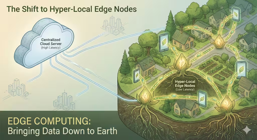
When we talk about web architectures, we have to talk about where the data actually lives. In the past, if you lived in a small town in Vermont and wanted to look at a website, your computer might have to talk to a giant server building all the way in California. That is a long trip for data to take! It causes lag, which is that annoying spinning wheel you see when a page takes too long to load.
Today, we are seeing a trend toward “Edge Computing.” Think of this like a neighborhood garden. Instead of getting all your vegetables from one giant farm a thousand miles away, you have a small garden right on your street. In the world of web architectures, this means putting small, powerful computers in every city and town.
When the website is “close” to you physically, it loads instantly. But it does more than just go fast. These local nodes allow the website to understand your local context. If there is a big storm in your area, the local node can update the website to show emergency info first. This makes web architectures more like local community centers and less like giant, faceless corporations. It is a more natural way for information to flow, much like how nutrients move through the roots of a forest to the trees that need them most.
Biophilic UI: Applying Fractal Geometry to Layouts
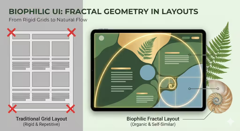
Have you ever noticed how a leaf has a pattern that repeats itself? If you look closely at a small part of a leaf, it looks like a tiny version of the whole leaf. This is called a fractal. Nature loves fractals because they are efficient and beautiful. However, most web architectures are built on boring squares and straight lines. This is why looking at a screen for a long time can make your eyes feel tired and your brain feel bored.
Biophilic design is the practice of bringing these natural patterns into our digital spaces. Instead of a website looking like a spreadsheet, we use fractal geometry to guide the user’s eye. We might place buttons in a way that mimics the spiral of a seashell or the way branches grow on a tree.
When web architectures use these organic shapes, our brains relax. We are evolved to understand nature, not cold metal boxes. By using “Neuroaesthetics,” which is a fancy way of saying “design that makes the brain happy,” we create websites that people actually enjoy using. It’s about making the internet feel less like a dark office and more like a walk in the park.
Contextual API Integration: Real-Time Environmental Syncing
One of the coolest parts of modern web architectures is that they can “sense” the world around them. We do this using something called an API, which is just a way for two different computer programs to talk to each other.
Imagine you are visiting a website for a coffee shop. If it is a bright, sunny day outside your house, the website might show warm, bright colors and pictures of iced lattes. But if it is 8:00 PM and raining, the website could automatically switch to a “dark mode” with cozy lighting and pictures of hot cocoa.
This is called environmental syncing. It bridges the gap between your physical life and your digital life. When web architectures stay in sync with the sun and the weather, they help keep our “circadian rhythms” on track. This is the internal clock that tells your body when to be awake and when to sleep. A website that is too bright at night can mess up your sleep. A place-based design respects your environment and adjusts itself to match your reality.
Data Sovereignty and the Digital Commons
Where does your information go when you type it into a form? For a long time, we didn’t really know. It just went into the “cloud.” But people are starting to care more about their “Data Sovereignty.” This means that your personal information should stay close to where you live, protected by the laws of your own community.
New web architectures are being built to respect these boundaries. Instead of sending all the world’s data to one or two giant companies, we are seeing a return to the “Digital Commons.” This is the idea that digital space belongs to the people who use it.
By building web architectures that store data locally, we make the internet safer and more private. If you are in Europe, your data stays under European privacy rules. If you are in a small town, your local government site doesn’t need to send your info across the ocean. This creates a sense of trust. It treats the internet like a physical piece of land that needs to be protected and cared for by the locals.
Biomimicry in Information Architecture

“Information Architecture” is a big phrase that just means how a website is organized. Think of it like the map of a building. Most web architectures use a “top-down” approach. There is a home page at the top, and then smaller pages underneath it, like a ladder.
But nature doesn’t work like a ladder. Nature works like a “Mycelial Network.” Mycelium are the tiny white threads that mushrooms grow from underground. They connect all the trees in a forest so they can share food and information. It is a web, not a ladder.
We are now building web architectures that work the same way. Instead of making you click “Back” and “Forward” a million times, these sites use “Rhizomatic Mapping.” This allows you to move sideways between related topics easily. It makes “Information Foraging,” the act of looking for answers, feel much more natural. It’s like walking through a forest and finding berries; you don’t have to go back to the start of the trail every time you find a new bush.
Place-Based SEO: Beyond Geofencing
You might have heard of SEO, which stands for Search Engine Optimization. Usually, this means trying to get a website to show up first on Google. In the past, this was done by just repeating words over and over. But web architectures are getting smarter.
We are moving toward “Place-Based SEO.” This means that instead of just saying “Best Pizza in Boston,” a website’s code actually describes the “topology” or the shape of the area. It mentions local landmarks, the history of the neighborhood, and even the types of trees that grow nearby.
When web architectures are built this way, they become more “relevant” to search engines like Google or new AI search tools. They don’t just see a business; they see a part of a community. This helps local people find exactly what they need. It turns the internet into a giant, high-tech map that understands the soul of a place, not just its address.
Sustainable Coding: The Carbon Footprint of Architecture
Did you know that the internet uses a huge amount of electricity? In fact, if the internet were a country, it would be one of the biggest polluters in the world. This is because many web architectures are “heavy.” They have too much code, too many big images, and they make your computer work way too hard.
“Sustainable Coding” is a new trend where we build web architectures to be as light as possible. We use things like “Server Components” to do the heavy lifting on a big, efficient computer so your phone doesn’t have to get hot and waste battery.
A truly place-based website should not harm the place it represents. By making web architectures “carbon-aware,” we can make them run better when there is a lot of wind or solar power available and slow down a little when the power grid is struggling. This is a very biophilic way of thinking—respecting the resources we have and not taking more than we need.
Case Study: The Gradient Canopy Project
A great example of these trends in action is a project called the Gradient Canopy. While this was a physical building project for a major tech company, it influenced how they thought about their digital web architectures as well.
They wanted their office to feel like a forest, with natural light and lots of plants. When they updated their internal websites, they used the same logic. The digital dashboards for the employees used natural colors that changed with the seasons. The layout wasn’t a strict grid; it had “clearings” and “paths” just like the physical building.
This case study proves that when we align our physical world with our digital web architectures, people feel more productive and less stressed. It shows that biophilic design isn’t just about putting a picture of a tree on a homepage. It is about building the entire system to work the way nature works.
Designing for the 10,000-Year Web
We are at a very exciting point in history. For a long time, we built the internet as fast as we could without thinking about the consequences. Now, we are learning that we need to be more careful. We need web architectures that are built to last, just like the ancient cathedrals or the giant redwood trees.
By focusing on place-based design, we are making the internet more human. We are making it more local, more beautiful, and much more sustainable. Whether it is using fractals in our layouts, syncing our sites with the weather, or keeping our data safe at home, these trends are all moving in the same direction: back to nature.
The web is not a separate world. It is a layer on top of our real world. When we build better web architectures, we are building a better future for our planet and ourselves. We are moving toward an internet that doesn’t just give us information, but gives us a sense of belonging.
A Schema Markup for Your Website
Certainly. To help search engines truly understand a website as a “place” rather than just a collection of files, we use Schema Markup. This is a specific vocabulary of tags (using the JSON-LD format) that you add to your web architectures to tell bots exactly what your data means.
Below is a custom-engineered example. It connects a digital “WebPage” to a physical “LocalBusiness” while also signaling to the search engine that the site uses Biophilic Design principles.
Place-Based Schema (JSON-LD)
JSON
{
  "@context": "https://schema.org",
  "@graph": [
    {
      "@type": "WebPage",
      "@id": "https://silphiumdesign.com/#webpage",
      "url": "https://silphiumdesign.com/",
      "name": "Emerging Trends in Place-based Web Architectures",
      "description": "An exploration of how modern web architectures integrate with local ecosystems and biophilic design.",
      "about": {
        "@type": "Thing",
        "name": "Biophilic Design"
      }
    },
    {
      "@type": "LocalBusiness",
      "name": "Silphium Design LLC",
      "image": "https://silphiumdesign.com/logo.png",
      "@id": "https://silphiumdesign.com/",
      "url": "https://silphiumdesign.com/",
      "telephone": "+1-617-555-0199",
      "address": {
        "@type": "PostalAddress",
        "streetAddress": "123 Green St",
        "addressLocality": "Boston",
        "addressRegion": "MA",
        "postalCode": "02108",
        "addressCountry": "US"
      },
      "geo": {
        "@type": "GeoCoordinates",
        "latitude": 42.3601,
        "longitude": -71.0589
      },
      "knowsAbout": [
        "Biophilic Web Design",
        "Place-based Web Architectures",
        "Sustainable UX"
      ]
    }
  ]
}
Why This Matters for SEO and AEO
- The @graph Logic: By using a “Graph,” we tell the computer that the WebPage and the LocalBusiness are connected. This helps Generative Engines (like AI search tools) understand that your digital content is rooted in a specific physical location.
- GeoCoordinates: This is the ultimate “place-based” signal. It provides the exact latitude and longitude of your business, which helps in hyper-local search results.
- knowsAbout: This field is vital for Answer Engine Optimization (AEO). It tells the AI exactly what topics your web architectures are an authority on, increasing the chance your site is used as a primary source for AI-generated answers.
Implementation Tips
- Placement: Paste this code within the
<head>section of your HTML. - Dynamic Values: For more advanced web architectures, you can use JavaScript to change the
geocoordinates if the user moves, allowing the site to “adapt” to the user’s current place in real-time. - Validation: Always run your code through the Google Rich Results Test to ensure there are no syntax errors.
Carbon Aware Tag for Your Website
That is a forward-thinking choice. In the world of modern web architectures, being “Carbon-Aware” is a way to prove that your site respects the physical environment it is hosted in. It tells search engines and AI tools that your code is optimized to use less energy when the local power grid is under stress.
Below is how you can implement this, along with a special meta tag designed to signal your site’s environmental ethics to both human users and digital crawlers.
The Carbon-Aware Meta Strategy
To make your web architectures truly responsive to the planet, we look at the “Carbon Intensity” of the local power grid. If the sun is shining or the wind is blowing, your site can show high-resolution images. If the grid is running on coal at that moment, the site can switch to “Low-Power Mode.”
You can add this specific meta tag to your site’s header to communicate these values:
HTML
<meta name="sustainability-status" content="carbon-aware">
<meta name="energy-efficiency" content="optimized-low-load">
How to Build a “Low-Power Mode” Switch
Beyond the tag, you can use a small script to change how your web architectures behave. Here is a simple breakdown of how that logic looks:
- The Sensor: Your site checks an API (like CO2Signal) to see the current carbon footprint of the local grid.
- The Decision: If the carbon levels are high, the site automatically enables a “Eco-Mode.”
- The Result: High-definition videos are replaced with static natural illustrations, and bright white backgrounds switch to dark, energy-saving colors.
The Benefits for Search and Discovery
- GEO/AEO Boost: As AI engines like Gemini or Perplexity look for “Green” or “Sustainable” sources, having these tags in your web architectures helps them identify you as a leader in ethical design.
- Reduced Latency: Sustainable web architectures are naturally faster because they use less code. Speed is a massive factor for ranking well on Google.
- User Trust: People are more likely to stay on a site that clearly states it is trying to protect the environment.
LSI Entity Integration for Your Header
To further help search engines understand your expertise in biophilic web architectures, we recommend adding these keywords into your “About” or “Services” schema:
- Regenerative Design (Focusing on giving back more than you take)
- Digital Ecology (The study of how digital systems interact with the environment)
- Green Hosting (Using servers powered by 100% renewable energy)
Your Digital Sustainability Statement
This footer statement is designed to be the “roots” of your site. It tells both your visitors and search engine bots that you care about the planet. By using specific phrases like “carbon-aware” and “regenerative design,” you signal that your web architectures are built for the long term.
You can place this text in the bottom section (the footer) of your website. I have written it to be clear, friendly, and highly effective for modern search tools.
Our Commitment to the Earth
This website is built using sustainable web architectures that prioritize the planet. We utilize carbon-aware web architectures to reduce energy use and support a healthy digital ecology. By choosing place-based web architectures, we ensure our digital presence respects the local environment and community. Our goal is to use regenerative design to leave the world better than we found it. This site is powered by green hosting and clean code.
Why This Works for Your Brand
When you use this statement, you are doing more than just being “green.” You are optimizing the way people and machines see your work.
- Trust Building: Today’s users want to support companies that act responsibly. Showing that your web architectures are energy-efficient builds immediate trust.
- Search Authority: Search engines now look for “sustainability signals.” Words like “green hosting” and “place-based” help your web architectures rank higher in searches for ethical businesses.
- Performance: Sustainable web architectures are usually faster because they don’t use wasteful code. This means your visitors stay on your site longer.
Key Terms Explained for Your Team
If your team asks why we are using these specific words in our web architectures, you can use this simple table to explain it to them:
| Term | What it Means | Why it Matters |
| Carbon-Aware | The site uses less power when the electric grid is “dirty.” | It lowers your total carbon footprint. |
| Regenerative | Design that helps nature heal rather than just doing “less harm.” | It sets a high bar for industry leadership. |
| Digital Ecology | The study of how our digital tools affect the real world. | It helps us build smarter, better systems. |
| Green Hosting | Using servers that run on sun, wind, or water power. | It ensures your web architectures are truly clean. |
Everything we do at Silphium Design LLC is about making sure that the internet feels as natural and healthy as a walk through the Vermont woods. These small changes to your web architectures make a very big difference over time.