We often treat websites as if they are immaterial. We think they exist only on a screen, made of light and code. This is a fundamental error. Every single website is a piece of infrastructure. It consumes real energy, stored on physical servers in massive data centers that run 24 hours a day. Like a building, every website has an environmental footprint. And like a building, its internal design directly impacts the human beings who use it.
This article explores two deeply different philosophies for website design.
First, we have Traditional Website Design. This is the model that has dominated the internet for 25 years. It is a paradigm focused primarily on functionality, immediate conversion rates, and the latest aesthetic trends. It prioritizes speed to market and often relies on resource intensive features to “wow” the user.
Second, we have Ecological Website Design. This is a more advanced, holistic paradigm. It understands that a website is part of an ecosystem. This approach synthesizes two distinct and vital concepts:
- The Eco-Technical (Sustainability): This is the practice of minimizing the site’s energy consumption and carbon footprint. It is the “green” part of the design.
- The Eco-Psychological (Biophilia): This is my area of expertise. This part of the design integrates nature inspired patterns and flows to improve human well being, reduce cognitive stress, and make the website a restorative place for the user.
The primary difference between these two schools of website design is their core philosophy. Traditional website design is extractive. It is designed to take user attention and server resources. Ecological website design is restorative. It is designed to conserve server resources and restore the user’s attention and energy.
Table of Contents
What is Traditional Website Design? (The Extractive Model)

When you look at most of the web today, you are looking at traditional website design. This model was born from a simple directive: use the website to get a business goal, and do it as fast as possible.
The Philosophy
The philosophy of traditional website design is almost entirely centered on ROI, or Return on Investment. Every decision is measured against a short term metric. How many clicks? What is the conversion rate? How can we get the user to a “buy” button with minimum friction?
This philosophy shapes the entire website design process. It leads to a “more is more” mentality. More features, more plugins, more pop ups, and more pages are seen as better. The design is often built to compete for the user’s attention rather than support the user’s goal. This website design model views the user as a target to be converted.
Technical Characteristics
This ROI first philosophy creates a specific technical footprint. A traditional website design is almost always “heavy.”
- Bloated Code: It often relies on heavy frameworks, complex content management systems, and dozens of third party plugins. These tools are used because they are fast for the developer, not because they are efficient for the server or the user.
- Heavy Assets: This model encourages large, high resolution images, auto playing videos, and complex animations. Little thought is given to file compression or modern formats. The goal is visual impact, and the cost is high data transfer.
- Agnostic Hosting: The website is hosted on whatever server is cheapest or fastest, with zero regard for the energy source. Most data centers run on fossil fuels, meaning this website design directly contributes to carbon emissions.
Content Strategy
The content strategy for a traditional website design is equally wasteful. It is based on frequency and trends. Marketers are told to “feed the beast” by publishing new blog posts constantly. This creates a massive amount of digital waste. These are low quality, trend chasing articles that are read once (if at_all) and then sit on a server, consuming energy, forever.
The User Experience (UX)
The result of this model is a user experience that is, frankly, stressful. It is an extractive experience.
Think about the average traditional website. You are immediately hit with a pop up for a newsletter. Another pop up asks you to accept cookies. An auto playing video starts in the corner. The navigation menu has twenty items. The colors are bright and artificial, designed to grab your eye.
This is not a calm environment. This is a high stress, high cognitive load environment. This website design is demanding, not helpful. It is trying to force you down a funnel, not guide you on a journey.
What is Ecological Website Design? (The Restorative Model)
Ecological website design starts from a completely different setENof questions. It asks:
- How can this website use the least amount of energy?
- How can this website make the user feel better?
This is a restorative model, and it is built on two core pillars.
Pillar 1: The Eco-Technical (Sustainability & Low Carbon)
This is the first half of ecological website design. It is the practical, technical side. It is focused on sustainable web design and building a low carbon digital presence. The internet is responsible for about 4% of all global greenhouse gas emissions. That is more than the entire airline industry. The eco-technical pillar is our solution to that problem.
This approach to website design is built on a few key tactics.
Efficient Coding
A sustainable website design begins with clean, efficient code. Many traditional websites are built on pre-made themes or bloated platforms. They are full of “junk code,” or code that is loaded but never used. This is like building a house with five extra floors of empty rooms; it is heavy, wasteful, and slow.
Efficient coding means writing clean, semantic HTML. It means minimizing the use of JavaScript and CSS. It means avoiding bloated plugins and frameworks, and instead, building only what is necessary. This lean approach makes the website design incredibly fast.
Asset Optimization
Assets are the images, videos, and fonts that your website loads. In a traditional website design, these are the heaviest parts. In an ecological website design, they are optimized to be as light as possible.
This means using modern image formats like WebP or AVIF, which are much smaller than old JPEGs. It means using vector graphics (SVGs) for logos and icons, which are tiny code based files instead of pixel based images. It means we “lazy load” images, which is a simple trick. The image only loads if the user actually scrolls down the page to see it. This one technique saves a massive amountttof data.
Minimalist Aesthetics
In ecological website design, minimalism is not just a “look.” It is a function. A design that uses more negative space (or “white space”), simple typography, and a limited color palette is not just elegant. It is also efficient.
Using fewer colors means a smaller CSS file. Using system fonts (the fonts already on your computer) means the user does not have to download a new font file at all. This “less is more” approach to website design creates a faster, lighter experience.
Green Hosting
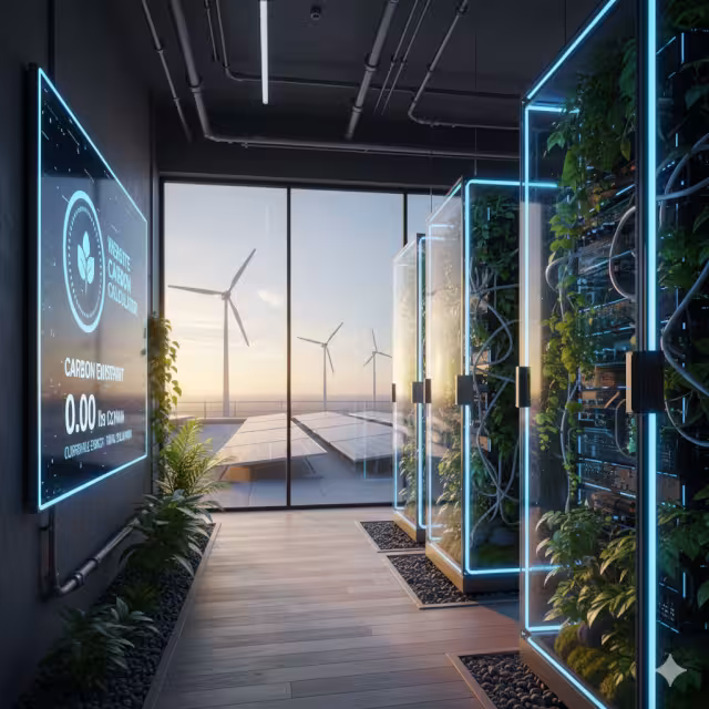
This is one of the most important technical choices. Your website lives on a server. That server needs power, 24/7. Green Hosting means choosing a hosting provider that powers its data centers with 100% renewable energy, such as wind or solar. This is a non negotiable part of any true sustainable website design.
This is not guesswork. We can measure this. We can use tools like the Website Carbon Calculator (created by the agency Wholegrain Digital). This tool allows us. to measure how much data our website design transfers and estimate its carbon emissions per visit. This gives us a clear benchmark to improve.
Pillar 2: The Eco-Psychological (Biophilia & Human-Centricity)

This is the second, and in my view, the most substantive, pillar of ecological website design. This is where we move beyond technical efficiency and into human efficiency. This is the application of biophilic design to the digital world.
The concept is simple. It was defined by the biologist E.O. Wilson with his Biophilia hypothesis. This hypothesis states that human beings have an innate, biological need to connect with nature. We evolved for millions of years in natural environments. We have only been in sterile, concrete boxes (and digital boxes) for a few hundred years.
Our brains are not built for the stress of modern life. A bad website design is a digital concrete box. It is a high stress, artificial environment that causes cognitive fatigue.
My work consists of applying biophilic principles to website design to create a low stress, restorative, and human centric experience.
Nature in the Space
This is the most direct application. It involves using authentic imagery of nature. This does not mean sterile, generic stock photos of a single leaf on a white background. It means using real, vibrant images of landscapes, plants, water, and natural materials. It means incorporating textures like wood grain or stone into the website design. These elements have been shown to lower blood pressure and reduce stress.
Natural Analogues
This is a more subtle, but powerful, technique. It involves using patterns and shapes from nature in the user interface. Our world is built on straight lines and perfect 90 degree angles. Nature is built on organic shapes, fractals, and curves.
In biophilic website design, we use these natural analogues. We use organic, rounded shapes for buttons instead of sharp boxes. We use natural color palettes (earth tones, greens, blues) that are calming to the eye. We create layouts that mimic the fractal patterns you see in a fern or a river delta. This part of the website design feels “right” to the human brain, even if the user cannot explain why.
Prospect & Refuge
This is a deep evolutionary preference. “Prospect” is our desire to see our surroundings clearly. “Refuge” is our desire for a safe, protected space to focus.
A traditional website design often fails at both. Cluttered pages give us no “prospect.” Aggressive pop ups violate our sense of “refuge.”
A biophilic website design delivers both.
- Prospect: We create “prospect” with clear navigation, simple menus, and generous use of negative space. The user can see “where they are” and “where they can go” at a glance.
- Refuge: We create “refuge” with clearly defined content areas. The text is legible, contained in a comfortable column, and not competing with animations. The user feels like they have a safe, quiet space to read and think.
The user experience of this website design is intuitive, calming, and builds trust. It supports the user’s goal instead of competing for their attention.
The 10 Key Differences: Traditional vs. Ecological Design (A Comparative Analysis)
When you place these two philosophies side by side, the differences are not just cosmetic. They are fundamental. Here is a direct analysis of the 10 key differences.
1. Core Philosophy
- Traditional: The philosophy is extractive and ROI driven. The primary question is, “How can this website make the most money in the shortest amount of time?” This website design is trend based.
- Ecological: The philosophy is restorative and value driven. The primary question is, “How can this website provide the most value to the user and the planet?” This website design is holistic.
2. Resource Use
- Traditional: This website design is resource greedy. It uses large files, bloated code, and energy agnostic hosting. It treats bandwidth and server power as infinite, free resources.
- Ecological: This website design is frugal. It is built on optimization. Every asset is compressed, every line of code is efficient, and it uses Green Hosting. It respects that digital resources are physical resources.
3. Carbon Footprint
- Traditional: The carbon footprint is high and unmeasured. By using heavy assets and fossil fuel powered servers, a traditional website design actively contributes to digital pollution.
- Ecological: The carbon footprint is minimal, measured, and offset. We use tools like the Website Carbon Calculator to get a baseline and work to make it as close to zero as possible. This is a responsible website design.
4. Aesthetics
- Traditional: The aesthetics are complex, data heavy, and follow fleeting trends. The “look” of the website design changes every two years to keep up, which creates massive digital waste.
- Ecological: The aesthetics are timeless and minimalist. By using biophilic patterns, natural palettes, and simple layouts, the design is efficient. It does not need a complete redesign every time a new trend appears.
5. Content Strategy
- Traditional: The content strategy is based on quantity and disposability. It produces high volume, low quality, trend focused content that quickly becomes useless.
- Ecological: The content strategy is sustainable. It is based on quality and evergreen value. We create high value content that remains relevant for years. This is better for the user and requires far fewer server resources. This is a pillar of a smart website design.
6. Performance
- Traditional: Performance (page speed) is often slow. The site is weighed down by its own bloat. Developers must add complex “caching” layers just to make it usable.
- Ecological: Performance is inherently fast. Because the website design is built on efficient code and optimized assets, it loads almost instantly, even on a slow mobile connection. No tricks are needed.
7. User Experience (UX)
- Traditional: The UX is demanding and creates high cognitive load. It is stressful, with pop ups, complex menus, and competing elements. It aims to extract attention.
- Ecological: The UX is calming and creates low cognitive load. The biophilic and minimalist elements build trust and support focus. It aims to restore attention. This human centric website design is simply better for the brain.
8. Accessibility (WCAG)
- Traditional: Accessibility (making the web usable for people with disabilities) is often an afterthought. The complex, trend based UIs are difficult to make accessible.
- Ecological: Accessibility is a core principle. The simplicity, clean code, and clear layouts of an ecological website design are naturally more accessible. It is easier for screen readers to navigate and for users to understand.
9. SEO Focus
- Traditional: SEO (Search Engine Optimization) often focuses on “hacks” or keyword stuffing. It’s an adversarial relationship with the search engine.
- Ecological: This website design earns its rank. Google’s Core Web Vitals (CWV) are a perfect example. These are Google’s metrics for speed and user experience. An ecological website design scores perfectly on CWV. Its evergreen content builds E-E-A-T (Experience, Expertise, Authoritativeness, Trust). Its biophilic UX leads to lower bounce rates, signaling a high quality page.
10. Business Goal
- Traditional: The primary business goal is the short term sale. This website design is built to get the conversion now, even if it burns out the user.
- Ecological: The primary business goal is the long term relationship. This website design builds brand loyalty. A user who feels calm, respected, and supported by your website is a user who will trust you and return for years.
The Business Case for Ecological Design: Beyond Environmentalism

Some may see this as a purely environmental or ethical choice. It is not. Adopting an ecological website design is one of the most powerful business decisions you can make. The “fluffy” parts are the profitable parts.
Improved SEO
Let’s be direct. Google wants you to have an ecological website design. They just call it other names. Google’s Core Web Vitals are their metrics for a good user experience. They measure:
- LCP (Largest Contentful Paint): How fast does the main content load? An ecological website design, with its optimized assets, is extremely fast.
- FID (First Input Delay): How fast does the page respond when a user clicks? An ecological website design, with its efficient code, is very responsive.
- CLS (Cumulative Layout Shift): Does the page jump around as it loads? An ecological website design, being simple and minimalist, is stable.
This is the best technical SEO you can implement. A fast, efficient, accessible website design will outrank a slow, bloated one every time.
Enhanced Brand Perception
Modern consumers are intelligent. They can see through “greenwashing” (pretending to be eco friendly). When your website is the message, it is powerful. A website design that is provably low carbon, fast, and respectful of the user’s attention sends a clear signal: this is an authentic, modern, and responsible brand. This builds a level of trust that no marketing slogan can buy.
Lower Long-Term Costs
This is simple mathematics. A traditional, bloated website design is expensive. It requires more server power to run, which means a higher hosting bill. Its trend based aesthetic means it requires a costly, full redesign every few years.
An efficient, ecological website design costs less. It uses fewer resources, lowering hosting costs. Its timeless, evergreen design and content strategy mean it can last for five to ten years with only minor updates. This is a more durable and economic asset.
Higher Conversion (The Biophilic Argument)
This is the most important point. A stressed user does not explore. A confused user does not buy.31 A user who feels “trapped” by your website design will simply leave.
The biophilic component of ecological website design is the ultimate conversion tool. By creating an environment of “prospect and refuge,” we lower the user’s cognitive load. We lower their stress. We make them feel safe and intelligent. A user who is calm and focused is a user who can think clearly about your value. They are more likely to read, to trust, and to convert.
This is how a smart, restorative website design directly leads to a healthier, more profitable business.
The Web Is a Habitat, Not Just a Tool
The central error of the last two decades of website design has been to treat the web as a tool—a place to be mined for clicks, attention, and sales. This is the traditional, extractive model.
But the web is not a tool. It is a habitat.
It is a digital environment where human beings spend their time, form their thoughts, and feel real emotions. Like any habitat, it can be either toxic or restorative. It can be a source of pollution, or a model of sustainability.
Ecological website design understands this. It treats the web as an ecosystem that connects technology and humanity. It applies the principles of sustainability (Pillar 1) to protect the planet’s physical resources. It applies the principles of biophilia (Pillar 2) to protect the human’s cognitive resources.
This shift from an extractive to a restorative website design is not merely a trend. It is the necessary and intelligent future of the internet.
Do not just take my word for it. Test it. Take your current website and run it through the Website Carbon Calculator. See what its design costs the planet. Then, go through your website and ask yourself a simple question: Does this feel more like a stressful, concrete box, or a restorative, natural space?
The results may convince you that it is time to stop building web pages and start building an ecosystem.