In the natural world, clarity and contrast is a tool for survival. A brightly colored berry stands out against a backdrop of green leaves, signaling a source of food. The sharp silhouette of a hawk against the pale sky is an unmistakable warning. Nature uses contrast to send clear, efficient messages that require almost no effort to understand. This principle of effortless clarity is the foundation of a functional and harmonious environment.
When we move into the digital ecosystems we build, this natural law is just as critical. A website with poor contrast creates a kind of digital fog, making information difficult to see and causing frustration for users. It builds an unnecessary wall, shutting out people who may have trouble seeing clearly.
This guide will cut through that fog. We will provide a clear map of the standards, methods, and most importantly, the essential tools for testing contrast in web design. By using these tools, you can ensure your digital space is as clear, functional, and welcoming as the natural world it should seek to emulate.
Table of Contents
The Non-Negotiable Imperative of Color Contrast
Before we examine the specific tools, we must first establish why this matters so profoundly. Choosing colors for a website isn’t just about what looks good; it’s about what works for the human eye. The relationship between the color of your text and the color of its background is called contrast. When that contrast is strong, the message is clear. When it’s weak, the message gets lost. This isn’t a minor detail—it’s a fundamental pillar of good design that impacts everyone who visits your site.
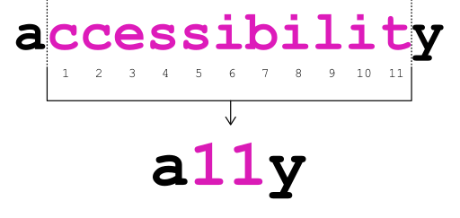
Accessibility (A11Y): Building a Web for Everyone
The most critical reason to focus on color contrast is accessibility, often shortened to “A11Y” (the ’11’ represents the eleven letters between ‘A’ and ‘Y’). Imagine trying to read a light gray newspaper printed on slightly darker gray paper. For many people, that’s what browsing a low-contrast website feels like every day. Millions of people live with visual impairments like low vision or color blindness. For them, a website with weak contrast between the text and the background isn’t just annoying; it can be completely unusable.
For instance, someone with cataracts might see the digital world as if through a hazy or cloudy lens, which makes it much harder to distinguish between similar colors. Others live with color vision deficiency (CVD), commonly known as color blindness. They don’t see colors in the same way most people do, and certain color combinations, like red and green or blue and yellow, can appear to merge into one. If you use those colors for your text and background without checking their contrast, your message will simply disappear for a portion of your audience.
Ensuring your website is accessible is not only the ethical and right thing to do, but in many places, it’s also a legal requirement. By consciously designing with high-contrast colors, you are building a digital space that is open and welcoming to everyone, regardless of their visual ability.
User Experience (UX) & Readability: Designing for the Human Brain
While accessibility rightly focuses on users with disabilities, the benefits of good contrast extend to every single person who visits your website. A strong user experience (UX) means making your website easy and pleasant to use. Readability—how easily a reader can understand a written text—is a huge part of that.
Have you ever felt your eyes get tired after reading on a screen for a long time? This is called digital eye strain or computer vision syndrome. One of the biggest causes of this strain is forcing your eyes to work harder to decipher text from its background. When the contrast is low, your brain has to put in extra effort just to see the words, leaving less mental energy for understanding what they mean. A high-contrast design lets the eyes relax. The words seem to lift off the page, making them easy to scan and comprehend.
This is true for everyone, in every situation. Think about someone trying to read your website on their phone while sitting in the bright sunshine. The glare on the screen will wash out colors, and if your contrast was weak to begin with, your text will become completely invisible. Or consider an older adult whose eyes, as a natural part of aging, require more light and stronger contrast to read comfortably. For them, a high-contrast design isn’t just helpful; it’s the difference between staying on your site or leaving in frustration. Good contrast is a universal design choice that makes your website better for every user, every time.
The Biophilic Design Principle: Learning from Nature’s Clarity
My work is rooted in biophilic design, which is the practice of connecting our human-built world with nature. This connection can be physical, like adding plants to an office, but it can also be philosophical. We can observe the principles that make natural environments so calming and effective and apply them to our digital spaces.
Nature is the ultimate master of efficient design. It doesn’t waste energy on things that don’t work. Contrast in nature is always purposeful. A poisonous frog uses bold, high-contrast patterns to warn predators to stay away. A flower uses high-contrast colors to attract the specific pollinators it needs to survive. There is no ambiguity; the message is instantly clear.
We can apply this same principle to web design. A clear, high-contrast interface is a form of digital ergonomics. It works with our natural biology instead of against it. It reduces the subconscious stress and cognitive load that comes from trying to decipher a messy or unclear digital environment. By making our websites visually clear and easy to read, we are creating digital habitats that are more harmonious, less stressful, and fundamentally more human-centric. A well-designed, high-contrast website feels calm and authoritative because it communicates with an effortless clarity learned from the natural world.
Decoding the Technical Standard: WCAG Contrast Ratios
To ensure that “good contrast” isn’t just a matter of opinion, a global standard has been established. This standard provides specific, measurable targets that every website should aim for. The organization that sets these rules is the World Wide Web Consortium (W3C), and their rulebook is called the Web Content Accessibility Guidelines, or WCAG.
The WCAG uses a mathematical formula to determine the contrast between two colors and expresses it as a ratio. This ratio looks like 1:1 or 21:1.
- A ratio of 1:1 means there is no contrast at all (e.g., white text on a white background).
- A ratio of 21:1 is the highest possible contrast (e.g., black text on a white background).
The WCAG sets minimum ratios that your design must meet to be considered accessible. There are two main levels of compliance: Level AA and Level AAA.
- Level AA: This is the globally accepted standard and the target that most websites should aim for. It represents a level of accessibility that makes your site usable for most people with visual impairments.
- Level AAA: This is a higher, more stringent standard. It makes your content accessible to an even wider range of people. While it’s an excellent goal, it can be difficult to achieve for all parts of a website, especially for designs with a wide range of colors. For most websites, meeting Level AA is the primary goal.
Here are the specific ratios you need to know:
WCAG 2.1 Success Criterion 1.4.3 Contrast (Minimum) – Level AA
This is the most important rule to follow for general web content.
- For normal text, the contrast ratio between the text and the background must be at least 4.5:1. Normal text is considered anything smaller than 18pt (or 24 pixels) or 14pt (or 18.5 pixels) if it’s bold. This covers most of the paragraph text on a website.
- For large text, the requirement is a bit lower. The ratio must be at least 3:1. Large text is defined as text that is at least 18pt (24px) or 14pt (18.5px) and bold. This typically applies to headings. The reason the requirement is lower is that larger, thicker text is naturally easier to read, so it doesn’t need quite as much contrast.
WCAG 2.1 Success Criterion 1.4.6 Contrast (Enhanced) – Level AAA
If you are designing for an audience that requires a higher level of accessibility, or if you simply want to exceed the standard, you can aim for Level AAA.
- For normal text, the contrast ratio must be at least 7:1.
- For large text, the contrast ratio must be at least 4.5:1.
WCAG 2.1 Success Criterion 1.4.11 Non-text Contrast
Contrast isn’t just about words. It’s also about all the other things on a page that a user needs to see to understand and use your website. This includes things like buttons, icons, and the borders around form fields.
- For user interface components and graphical objects, the visual parts required to identify and operate them must have a contrast ratio of at least 3:1 against the background next to them.
- Example 1: If you have a “Submit” button, the button’s background color needs a 3:1 contrast ratio with the website’s background color it sits on.
- Example 2: If you have a text box where a user types their name, the border around that box needs a 3:1 contrast ratio with the background.
- Example 3: If you have a shopping cart icon, the lines that make up the icon need a 3:1 contrast ratio so people can clearly see it.
These numbers might seem technical, but the tools we’re about to discuss do all the math for you. Your job is to understand what the targets are so you can use the tools effectively.
The Arsenal: A Review of Primary Contrast Testing Tools
Now we arrive at the practical part: the tools that make testing for these WCAG ratios simple and efficient. You don’t need to be a math whiz or a computer programmer. You just need to know which tool to use and when to use it. We can group these tools into three main categories based on how and when you’d use them in your process.
Online & Browser-Based Analyzers
These are websites or simple applications you can use anytime to check color combinations quickly. They are perfect for designers creating a color palette or for anyone who wants a fast, definitive answer on a specific color pair.
- WebAIM Contrast Checker
- Who it’s for: Everyone. This is the undisputed industry standard. It’s simple, fast, and completely reliable. This is my go to for checking the contrast of text, buttons, and other website elements.
- How it works: The webpage presents you with two input fields: “Foreground Color” and “Background Color.” You simply paste the six-digit hex codes (the code that represents a color online, like
#FFFFFFfor white or#000000for black) for your text and background colors. Instantly, the tool calculates the ratio and gives you a clear “Pass” or “Fail” report for normal and large text at both AA and AAA levels. It even provides a slider that lets you lighten or darken your colors to find the nearest compliant version. - Pros: Extremely simple to use, widely trusted, provides clear pass/fail results.
- Cons: You need to know the hex codes of the colors you’re testing, which might require using another tool (like a color picker) to find them first.
- Adobe Color
- Who it’s for: Designers, especially those who already use Adobe products like Photoshop or Illustrator.
- How it works: Adobe Color is a powerful suite of tools for creating color palettes. Within it, the “Accessibility Tools” section allows you to check your entire color palette at once. It shows you which combinations from your palette pass WCAG standards and which ones fail. It even includes a color blindness simulator that shows you what your palette looks like to people with different types of CVD.
- Pros: Integrated into a professional design workflow, checks multiple color combinations at once, includes a valuable color blindness simulator.
- Cons: Can be more complex than a simple checker if all you need is a quick test of two colors.
- TPGi Colour Contrast Analyser (CCA)
- Who it’s for: Anyone who wants a dedicated tool on their computer that can check colors anywhere on their screen.
- How it works: This is a free, downloadable application for Windows and macOS. Its standout feature is an “eyedropper” tool. Instead of needing to know the hex codes, you can just click the eyedropper, then click on the text color on your screen, and then click on the background color. The CCA grabs the colors and instantly gives you a pass/fail report, just like the WebAIM tool. This is incredibly useful for checking colors in images, on live websites, or within any application on your computer.
- Pros: The eyedropper tool is extremely convenient, works offline, can test anything visible on your screen.
- Cons: Requires you to download and install software.
Browser Extensions for Real-Time Audits
This next category of tools lives right inside your web browser (like Chrome or Firefox). They are powerful because they can scan a live webpage and report on all its accessibility issues, including contrast errors, in just a few seconds.
- WAVE Web Accessibility Evaluation Tool
- Who it’s for: Content creators, project managers, and developers who want a quick visual overview of a page’s accessibility.
- How it works: You install the WAVE extension, navigate to the webpage you want to test, and click the WAVE icon in your toolbar. The tool injects icons and indicators directly onto the page. It will flag contrast errors with a small red icon. Clicking on the “Details” tab in the WAVE sidebar will give you a full report, showing you every single contrast error, what the foreground and background colors are, and what the ratio is.
- Pros: Provides a holistic view of accessibility (not just contrast), visually shows you exactly where the errors are on the page.
- Cons: The number of icons it adds to a page can sometimes be overwhelming for a first-time user.
- Axe DevTools by Deque
- Who it’s for: Web developers. This tool is designed to fit directly into the development process.
- How it works: Axe DevTools integrates into the “Developer Tools” panel that’s already built into your browser. A developer can open this panel, navigate to the “Axe DevTools” tab, and click “Scan all of my page.” In seconds, Axe provides a list of all accessibility violations, sorted by severity. It flags contrast issues, highlights the exact element in the code that is failing, and provides recommendations on how to fix it.
- Pros: Highly accurate, trusted by major tech companies, integrates seamlessly into a developer’s workflow, provides code-level fixes.
- Cons: Can be intimidating for non-developers as it requires opening and navigating the browser’s developer panel.
- Google Lighthouse
- Who it’s for: Anyone who wants a general report card on a webpage’s quality, including developers and SEO specialists.
- How it works: Lighthouse is also built directly into the Chrome browser’s Developer Tools. You navigate to the “Lighthouse” tab, check the “Accessibility” category, and click “Analyze page load.” Lighthouse runs a series of audits and gives your page a score out of 100 for Performance, Accessibility, Best Practices, and SEO. In the Accessibility section of the report, it will specifically list any contrast issues it finds.
- Pros: Built into Chrome (no installation needed), provides a high-level score that is easy to understand, checks more than just accessibility.
- Cons: The accessibility audit is not as in-depth as a specialized tool like Axe DevTools. It’s a great starting point but might miss some issues.
Design-Phase Plugins (Figma, Sketch, Adobe XD)
The best time to fix a problem is before it’s even created. This category of tools works inside design software, allowing designers to check for contrast issues as they are creating the website’s layout. This prevents contrast errors from ever making it into the final code.
- Stark
- Who it’s for: UI/UX designers using modern design applications like Figma, Sketch, or Adobe XD.
- How it works: Stark is a plugin that you install directly into your design software. As you work, you can select any two layers (like a text layer and a background shape) and Stark will open a small window showing you the contrast ratio and whether it passes AA and AAA standards. It also includes a powerful color blindness simulator that changes your entire design canvas to show you how it would appear to people with different types of CVD.
- Pros: Catches errors at the earliest possible stage, fully integrated into the design workflow, powerful simulation features.
- Cons: Is typically a subscription-based service for its full feature set.
- Contrast
- Who it’s for: Designers who want a very fast, no-frills contrast checker inside Figma or Sketch.
- How it works: Similar to Stark, this plugin lets you select two layers and instantly see the contrast ratio and pass/fail results. It’s known for being very simple and lightweight. It often includes a feature to view a list of all the colors used in your document so you can check them against the WCAG standards easily.
- Pros: Very easy to use, provides quick and clear results, often free for basic use.
- Cons: May not have as many advanced features (like the simulators) as more comprehensive plugins like Stark.
Methodology: A Systematic Approach to Contrast Auditing

Knowing the tools is one thing; knowing how to use them in a structured way is another. A proper contrast audit is not a one-time check but a process that should be integrated into your workflow from start to finish. Here is a systematic approach to follow.
- Component Inventory (The Planning Stage): Before you even begin designing, think about all the pieces of your website. Make a list of all the text styles you will need (paragraph text, headings, captions, links), all the interactive elements (buttons, form fields, navigation links), and any icons or graphics that convey important information. This inventory gives you a checklist of everything you will need to test later on.
- Design-Phase Testing (The Blueprint Stage): This is where you prevent problems. As the designer creates the visual look of the website in a tool like Figma, they should use a plugin like Stark or Contrast. Every time they choose a text color and a background color, they should run a quick check. Does the main paragraph text pass the 4.5:1 ratio? Do the headings pass 3:1? Is the color of the text inside the button high enough contrast against the button’s background? Checking here saves countless hours of fixing problems later.
- Development-Phase Testing (The Building Stage): Once the design is approved, a developer starts turning it into a real website with code. During this process, they should regularly use a tool like Axe DevTools. Before they finish a new component, like a contact form, they can run a quick Axe scan. The tool will immediately flag if the border of an input field has low contrast or if an error message’s red text is unreadable against its background. This catches errors that might have been missed in the design phase.
- Live Audit (The Final Inspection): After the website is built and live on the internet, it’s time for a final, comprehensive check. Use a browser extension like the WAVE tool to run a full-site audit. Navigate to every important page on your website and click the WAVE button. It will generate a report of any lingering contrast errors. For tricky spots, like text on top of a background image, use the TPGi Colour Contrast Analyser (CCA) with its eyedropper tool to check the specific area where the contrast looks lowest. This final inspection ensures that nothing was missed and that the live product is truly accessible.
Advanced Considerations & Common Failure Points
As you get more experienced with contrast testing, you’ll start to notice a few common traps where issues frequently appear. Being aware of these can help you proactively avoid them in your designs.
- Text Over Images: This is by far the most common and difficult contrast challenge. A beautiful photograph can have both very light and very dark areas. If you place white text over it, it might be perfectly readable over the dark parts of the image but completely disappear over the light parts. The solution is not to avoid images, but to control the background directly behind the text. You can do this by adding a semi-transparent dark overlay (called a scrim) over the image, placing the text inside a solid-colored box, or adding a subtle text shadow to make the letters pop.
- Focus States and Other States: Every interactive element on a website (a link, a button, a form field) needs to have a visually distinct “focus” state. This is the ring or outline that appears when you use the Tab key on your keyboard to navigate a page. This focus indicator must also meet the 3:1 non-text contrast ratio so that keyboard-only users can see where they are on the page. Similarly, check the
hover(when the mouse is over it) andactive(as you click it) states of buttons and links to ensure they remain high-contrast. - Disabled Elements: Sometimes, a button or form field is “disabled” or grayed out until a user completes another action. According to WCAG, these disabled elements are technically exempt from contrast requirements. However, this can create a poor user experience. If a user can’t read the text on a disabled button, they won’t know what it does or how to enable it. Whenever possible, it is best practice to make even disabled elements meet the 3:1 contrast ratio so that they are still legible.
- Gradients: What happens when your background is not a solid color but a gradient that fades from light to dark? This is a tricky situation. The best practice is to identify the part of the gradient that has the worst contrast with the text sitting on top of it and test that specific point. If the worst spot passes, the rest will too. Some advanced tools can help with this, but a manual check with an eyedropper tool is the most reliable method.
Conclusion: Integrating Contrast as a Core Design Tenet
We have journeyed from the “why” of contrast to the “what” of the technical standards and finally to the “how” of the tools and methods. The key takeaway is that ensuring digital accessibility is not a final step to be checked off a list, but a foundational principle that should guide every design decision from the very beginning. The tools—from the simple WebAIM checker to the sophisticated Stark plugin—are merely instruments. The real work is a shift in mindset.
By embracing high-contrast design, you are not limiting your creativity; you are sharpening your communication. You are choosing clarity over ambiguity. This aligns perfectly with the core principles of biophilic design. We are creating digital environments that work in harmony with human biology, not against it. A clear, accessible, high-contrast website is a calm, welcoming, and effective space. It communicates with the effortless authority of a natural system, delivering its message to everyone, without exception.
For a comprehensive accessibility and biophilic design audit of your web properties, contact Silphium Design LLC.