When you look at a computer screen or a smartphone, you are looking at a flat piece of glass. This flat surface is very different from the real world. In the physical world, everything around us has depth, texture, and multiple levels. Nature builds things in stacks, from the deep soil under your feet to the high leaves in the sky.
As a designer with roots in both biology and web design, I have spent years studying how these natural systems work. At Silphium Design LLC, we believe that the current flatness of the internet is making people tired. Our eyes and brains did not evolve to look at completely flat objects for hours at a time. This issue is where the core idea of layering in design becomes highly useful for modern websites.
By studying natural systems, we can learn how to build digital spaces that feel good to the human eye. The main goal of this approach is to fix visual tiredness by introducing natural depth to your screen. When we use layering in design, we are not just making things look pretty.
We are using proven rules of nature to make websites easier to use, faster to understand, and more successful at keeping visitors interested. This method is based on the basic rules of biophilic design, which is a method of designing things to connect humans more deeply with nature. Experts like Stephen Kellert have shown that humans crave visual complexity and order. Nature mixes these two things perfectly. By using layering in design, we can bring that natural balance to the digital world.
Table of Contents
The Forest Floor as the Background Layer

To understand how layering in design works on a website, we can look at a normal forest. A forest is built in clear sections. The absolute lowest section is the forest floor. In nature, the floor consists of soil, rocks, roots, and fallen leaves. It is dark, steady, and quiet. It holds everything else up. If you do not have a strong forest floor, the rest of the ecosystem will fall apart.
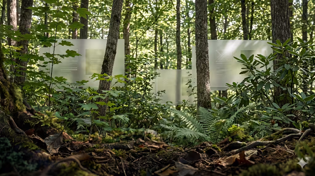
In web development, the forest floor is your primary background layer. This is the baseline container of your website. When applying layering in design to a background, you want to use colors and textures that feel heavy and stable. This means using muted tones, deep earthy shades, or soft dark grays. The background should never fight for attention. Its only job is to serve as a solid foundation for the rest of your content. An example is the Landscape Design Website, shown above.
Many web designers make the mistake of using a completely bright, flat white background with harsh black text. This creates a high amount of contrast that hurts the eyes after a few minutes. If you look at a natural forest floor, you will see that it is full of soft, low contrast changes. You can mimic this by adding very faint textures or gentle color gradients to your website background. This initial step in layering in design helps the user feel grounded. It signals to the brain that there is a safe, steady floor underneath the information they are reading.
The background layer must also remain completely still. In a real forest, the ground does not shift or move wildly while the trees blow in the wind. When you use layering in design, the baseline background must stay fixed or move very little. This gives the human eye a constant point of reference. When a user scrolls down your page, a stable background layer allows their brain to process the moving text much faster. It creates a sense of comfort because the foundation feels reliable and strong.
The Understory as the Midground Layer
Above the forest floor sits the understory. In a real forest, this area is filled with bushes, ferns, small trees, and climbing vines. The understory lives in filtered light. It is where most of the daily activity happens, as animals move through the bushes and plants grow toward the sun. It is filled with rich details, but it is still protected by the tall trees above.
When we translate this to a digital workspace, the understory becomes your midground layer. This is where your actual content lives. It includes your text blocks, information cards, product grids, and navigation menus. Layering in design requires this midground layer to sit clearly on top of your background layer. It must look like it is lifted slightly off the ground, just like bushes rise above the soil.
To achieve this level of layering in design, we use containers and cards. Instead of letting your text float aimlessly on the background, you place the text inside defined shapes. These shapes should have a slightly lighter color or a different shade than the background floor. This color difference creates a clear separation. The human brain instantly understands that the content card is closer to them than the background behind it. This makes the information feel organized and easy to sort through.
The midground layer is where your users will spend 90% of their time. Because of this, layering in design must focus heavily on readability in this zone. The contrast between your text and the content card must be high, even though the contrast between the card and the background can be softer. By creating these distinct steps of depth, you guide the user’s eyes naturally from the background to the card, and then directly to the words they need to read. This mimics how a person looks through a forest, seeing past the ground to focus directly on a specific plant.
The Emergent Canopy as the Foreground Layer
The highest part of a forest is the emergent canopy. This layer is made of the tallest tree crowns that reach high into the sky. The canopy gets hit by direct, unfiltered sunlight. It is bright, full of energy, and highly visible from a distance. The canopy draws your attention immediately because it stands out against the sky and stands far above the ground.
In the world of web layout, the canopy is your foreground layer. This layer contains your most important items, such as your call to action buttons, pop up alerts, primary menus, and interactive forms. Layering in design dictates that the foreground must appear to float high above both the midground and the background. It needs to look like it is catching the most light.
To create a powerful canopy using layering in design, you must use bright colors and crisp edges. If your background is a quiet forest brown and your midground cards are a soft slate gray, your canopy buttons should be a vibrant leaf green or a sunny sky blue. This extreme change in brightness tells the user’s brain that these items are highly important. They look closer to the user, making them feel instantly touchable and interactive.
When a user sees a clear canopy layer, they do not have to guess what to click next. The layering in design makes the primary action jump off the screen. This is exactly how nature works. A bright red berry stands out against green leaves because it sits on the outer edge of a bush, catching the light. By mimicking this natural hierarchy, your website becomes highly intuitive. Users can navigate your pages without feeling confused, because the canopy always guides them toward the final goal.
Strategic Implementation Framework
To successfully build a website using these natural principles, you need a clear plan of action. You cannot just throw elements onto a screen and hope they look deep. You must follow a careful engineering process to ensure your design remains fast, clean, and beautiful.
1. Map the Ecological Analogy: Phase 1: Wireframing.
Isolate layout components into distinct visual planes: background floor, midground understory, and foreground canopy. Establish clear visual rules for what lives in each plane before writing code.
2. Establish Systematic Z-Index Tokens: Phase 2: CSS Architecture.
Avoid arbitrary layout stacks. Define strict, tokenized z-index layers to guarantee that the digital ecosystem scales predictably without layering conflicts across different devices.
3. Apply Diffuse Opacities and Shadows: Phase 3: Visual Polish.
Mimic nature’s handling of light. Use CSS box shadows with large blur radii and low opacities to simulate the soft, ambient occlusions found under a forest canopy, avoiding harsh, unnatural borders.
4. Optimize for Core Web Vitals: Phase 4: Performance Auditing.
Ensure heavy graphics or layered SVG paths do not induce layout shifts. Set explicit dimensions and use CSS transform properties for layer movements to keep rendering fast and clean.
What Does Layering Mean in Nature-Inspired Design?
When people first hear about nature-inspired layouts, they often think it just means adding photos of trees or using the color green. However, true layering in design goes much deeper than surface decorations. In a nature-inspired context, layering means organizing your digital materials, textures, colors, and lighting to match the structural depth found in healthy wild ecosystems. It is a way of building a digital world that matches how the real world is put together.
Think about walking through a real meadow. You do not just see a flat wall of grass. You see tiny mosses on the dirt, taller blades of grass bending in the middle, and wild flowers rising above everything else. Your eyes constantly shift between these different levels. This natural arrangement is exactly what layering in design tries to bring to a computer screen. It is the intentional creation of digital depth that rewards the human eye for looking around.
When we use layering in design, we create a visual hierarchy that feels familiar to our ancient biology. Human beings spent thousands of years living in environments with deep physical layers. Our eyes are highly trained to spot things that are close, things that are at a medium distance, and things that are far away. When a website utilizes layering in design, it satisfies this deep biological need. It turns a boring, flat screen into a rich landscape that feels natural to explore.
Furthermore, layering in design means understanding how different elements interact with one another. In nature, a tall tree casts a soft shadow on the bushes below it. The bushes filter the sunlight before it hits the moss on the ground. A web developer using layering in design must copy these subtle interactions. When you make a button sit on a card, that button must interact with the card through light and shadow. This attention to detail makes the digital space feel real, authentic, and comforting to the visitor.
How to Create Depth in Design Using Nature Without Creating Clutter
A major worry for many web creators is that adding multiple layers will make a website look messy and disorganized. This is a very fair point, because a messy website will scare users away instantly. However, if you look closely at a natural forest, it is packed with millions of leaves, branches, and rocks, yet it rarely feels cluttered. Nature knows how to handle massive complexity without creating visual chaos. We can use these exact same tricks to master layering in design without ruining our user interface.
The secret lies in a concept called the principle of non-rhythmic sensory stimuli. In simple terms, this means that nature uses changes in repetition, texture, and focus to keep things orderly. To prevent clutter while using layering in design, you must establish strict rules for your textures and gradients. A great rule of thumb is to use your most complex textures on the large background layers, but make those textures very soft and blurry. As elements move forward into the midground and foreground, the textures should become completely smooth and simple.
Another powerful technique for maintaining clean layering in design is atmospheric perspective. If you look at a row of mountains in the distance, the mountains that are farthest away look light gray and misty. The mountains that are closest to you look dark green and sharp. You can apply this exact natural law to your web elements. Background layers should have lower contrast and less color saturation. Foreground layers should have sharp edges and high color saturation. This separation keeps the layers distinct, preventing them from bleeding into a messy blob.
Finally, you must use negative space, which is the empty area around your content cards and buttons. In a forest, there are open clearings between the groups of trees. These clearings give your eyes a place to rest. When implementing layering in design, leave plenty of empty space between your midground cards. Do not crowd your screen with too many competing shapes. By balancing complex, layered zones with clean, empty spaces, you create a beautiful layout that feels alive yet perfectly organized.
Why Structural Layering is Critical for Digital User Experience
To build a truly great website, you must understand the psychology of your users. Human beings are always looking for the easiest path to get what they want. If a website is hard to read or difficult to navigate, users will leave within seconds. This is why structural layering in design is absolutely critical for a modern digital user experience. It directly reduces the amount of work a user’s brain has to do to understand your website.
Because humans evolved in a three dimensional world, our brains are hardwired to sort information by depth. When you present a user with a completely flat website, you are forcing their brain to do extra work. The brain has to read every single word just to figure out what is important and what is a secondary detail. By using layering in design, you use visual cues to handle that sorting process automatically. The user instantly knows where to look first because the layers do the talking.
This concept ties directly into a classic biophilic design principle known as prospect and refuge. Human beings feel happiest when they have a clear view of their surroundings (prospect) while feeling safe and protected from behind (refuge). You can create this exact emotional feeling on a website through smart layering in design. A solid, darker background layer acts as your refuge, making the digital space feel safe and steady. A bright, clearly elevated foreground canopy provides the prospect, showing the user exactly where they can go next.
When users feel safe and oriented, their anxiety levels drop. They stay on your website longer, read more of your articles, and are much more likely to buy your products or contact your business. Layering in design is not a visual gimmick; it is a fundamental tool for human ergonomics. It shapes the digital environment to fit the natural shape of human thought, leading to happier visitors and much more successful websites.
Glassmorphism as a Canopy Analogy
Now let us look at the actual technical tools we use to build these layers on a computer screen. One of the most beautiful modern coding techniques is called glassmorphism. This is a design style where web elements look like sheets of frosted glass floating in space. Glassmorphism is a perfect digital analogy for a natural forest canopy, and it is a wonderful way to demonstrate layering in design.
In a real forest, the canopy is not a solid, opaque roof. When you look up, you can see light filtering through the semi-transparent leaves. You can see the shapes of branches behind other branches. Glassmorphism copies this exact property by using a special CSS style property called backdrop-filter blur. This code tells the computer web browser to blur whatever is sitting directly behind the container box.
CSS
.canopy-card {
  background: rgba(255, 255, 255, 0.4);
  backdrop-filter: blur(12px);
  border: 1px solid rgba(255, 255, 255, 0.2);
  border-radius: 16px;
}
When you use this code for your midground or foreground elements, you create an incredibly realistic sense of layering in design. The user can still see the soft colors and shapes of the background layer glowing through the card, but the blur effect keeps the text on top perfectly sharp and readable. This mimics looking through a clear pane of ice or a thin leaf. It connects the different layers of your website together into a unified ecosystem, rather than cutting them off with solid, ugly walls of blocky color.
Dynamic Lighting Shadows
In the physical world, we do not see flat lines separating objects. Instead, our brains recognize different objects because of how light falls across them. Shadows are the primary tool that nature uses to tell us how far away an object is. Therefore, if you want to master layering in design, you must learn how to create realistic, dynamic digital shadows using modern web code.
Many basic web designers use a simple, dark, heavy drop shadow on their buttons and boxes. This often looks terrible because it looks like a thick black line drawn under the element. Nature does not make shadows that way. Natural ambient light comes from multiple directions, creating a shadow that is incredibly soft, spread out, and subtle. To achieve true layering in design, you must stack multiple box shadows together in your CSS code.
CSS
.biophilic-layer-mid {
  box-shadow:
    0 4px 6px -1px rgba(34, 47, 32, 0.05),
    0 10px 15px -3px rgba(34, 47, 32, 0.1),
    0 20px 25px -5px rgba(34, 47, 32, 0.05);
}
By blending multiple shadows with small adjustments to the blur and spread sizes, you create an organic shadow that looks exactly like the soft darkness found under a real bush or stone. Notice that we also use a tiny hint of an earthy color, like a dark forest green or charcoal brown, inside the shadow color code rather than pure black. This minor adjustment makes the layering in design look incredibly natural. It makes the content card appear to genuinely float above the background floor, casting a realistic shadow that changes based on how high the layer is supposed to sit.
Parallax and Kinetic Depth
The ultimate way to bring layering in design to life is through motion. In the real world, when you move your head while driving a car, the nearby fence posts flash past very quickly. However, the distant trees move slowly, and the mountains far away do not seem to move at all. This natural event is called the kinetic depth effect, or parallax motion. It is the single most powerful tool our brains use to calculate distance and space.
We can code this exact behavior into a website to create an unforgettable experience of layering in design. By using simple JavaScript or modern CSS scroll binding techniques, we can make the background layer scroll at a slower speed than the midground content text. When a user scrolls down the page, the subtle speed difference instantly creates an illusion of massive three dimensional depth.
When implementing parallax motion for layering in design, you must always keep the movement extremely gentle. If the background moves too fast or shifts in weird directions, it will cause motion sickness and confuse the visitor. The goal is to make the background move just a tiny bit slower, perhaps 20% slower than the main text. This soft delay mimics the slow, steady shift of the horizon when walking through an open field. It turns the act of scrolling through a website into a beautiful, natural journey across a layered landscape.
Dwell Time Optimization and User Engagement Metrics
As a professional web developer, I do not just care about making things look beautiful; I also care deeply about business metrics and search engine performance. One of the most important metrics for modern search engine optimization is dwell time. This is the total amount of time a user spends looking at your page after clicking on it in search results. If a user clicks your link and leaves immediately, search engines assume your site is bad and will lower your rankings.
This is where layering in design acts as a secret weapon for your SEO strategy. When a website uses natural depth, it naturally captures human eye tracking much longer than a flat, boring layout. The human eye loves to explore organic structures. By breaking your content into a distinct background, understory, and canopy, you create a visual puzzle that the brain enjoys solving. This naturally keeps people on your page for a longer period of time.
When your dwell time metrics increase, search engines take notice. They realize that visitors find your page interesting and valuable. As a result, your website will naturally begin to rank higher for your target keywords. Layering in design bridges the gap between pure artistic beauty and hard, analytical data. It uses our evolutionary biological traits to keep users glued to the screen, which directly translates into better search engine visibility and more traffic for your company.
Accessibility Integration and WCAG Compliance
Whenever you are working with advanced visual styles like shadows, blurs, and organic background textures, you must be extremely careful about web accessibility. Web accessibility means ensuring that your website can be easily used by everyone, including people with vision challenges or color blindness. The World Wide Web Consortium sets strict rules for this, known as the Web Content Accessibility Guidelines.
Layering in design must never be used as an excuse to break these accessibility rules. In fact, a proper natural layout should actually make accessibility easier. Even if you have a complex forest texture on your background floor layer, your midground understory card must have a solid, high contrast background color directly behind any text. The text itself must maintain a strong contrast ratio of at least 4.5:1 against that card layer.
HTML
<!-- Proper accessible layer nesting structure -->
<div class="forest-floor-background">
  <main class="understory-card" aria-label="Main Content">
    <h1 class="canopy-text-foreground">Layering in Design Principles</h1>
    <p>Ensuring clear text contrast across all digital strata.</p>
  </main>
</div>
By keeping your text in a clean foreground plane that sits on a clear midground plane, you ensure that screen readers and visually impaired users can easily navigate your site. Layering in design is about creating order, not chaos. By using clean geometric containers to hold your text above the organic background textures, you protect your text readability perfectly. This allows you to have a gorgeous, nature-inspired style while still maintaining a perfect score on modern accessibility audits.
Semantic HTML Alignment for Search Engine Crawlers
The final piece of the puzzle is making sure that search engine robot crawlers can understand your layered layout. Search engines do not see shadows, blurs, or parallax motion the way a human does. They only read the raw code of your website. Therefore, to get the full SEO benefit of your layout, you must map your visual layering in design directly to proper semantic HTML5 tags.
In HTML5, tags like main, section, article, and aside are used to define the logical hierarchy of a webpage. When you code your website, your forest floor background should map to the overall body container. Your midground understory elements should use clear semantic tags like article or section boxes. Your high canopy items, such as your main navigation and call to action headers, should use nav and header tags.
When you align your visual layering in design with your structural HTML code, you create a beautiful system that works perfectly for both humans and computers. The search engine crawler reads the clean, nested HTML tags and instantly understands which pieces of information are the most critical. At the exact same time, the human user looks at the screen and instantly understands the exact same hierarchy through shadows, colors, and visual depth. This total alignment is the ultimate goal of high performance biophilic web development.
By combining the timeless laws of natural ecosystems with advanced modern web code, we can create digital spaces that feel like a breath of fresh air. Using layering in design allows us to break free from the tiring flatness of modern screens. It allows us to build websites that are not only highly optimized for search engines, but are also deeply comforting, beautiful, and intuitive for the human beings who use them every single day.