Beyond Greenwashing: What Biophilic Web Design Actually Is
Here’s a hard truth: your website is probably boring and hard for people to understand.
This often the result of how you were taight to do websites. You were likely taught to build with boxes, to think in grids, to cram information into sterile, fluorescent-lit containers that look more like a spreadsheet than a human space. You were told this was “clean design” and efficient. It’s not and worse yet, lazy. The result of this industrial-era thinking is a digital world that feels like a windowless office, a concrete jungle of right angles and cold efficiency that increases cognitive load and quietly wears on the soul.
Every sharp corner, every perfectly centered block of text, every lifeless white background is a micro-aggression against our own biology. We’ve spent millions of hours of development time creating digital environments that no human would ever choose to live in.
And we wonder why bounce rates are high and why users feel fatigued. We’ve created a pandemic of digital burnout by ignoring the fundamental truth of who we are. For 99.9% of human history, our environment wasn’t made of pixels and divs; it was made of trees, water, rock, and sky. Our brains are hardwired to respond to that environment, to find patterns in it, to seek solace and information from its forms. We are, at our core, biological creatures who have been temporarily placed in a digital cage.
In this post we will show how to stop building boxes and start designing experiences. The solution isn’t a fleeting trend you’ll see on a design blog today and forget tomorrow. It’s a fundamental, scientific principle called the Biophilia Hypothesis. Coined by the brilliant Harvard biologist Edward O. Wilson, it’s the simple idea that we have an innate, biological need to connect with nature and other forms of life. It’s not a preference; it’s a deep-seated part of our human software. It’s why we feel better near a window, why we crave a walk in the park, and why a website that understands this is not just an improvement—it’s a revolution.
So, let’s be absolutely clear. Biophilic web design is not about slapping a stock photo of a leaf on your homepage and calling it a day.2 That’s just greenwashing and lipstick on a pig. This is a deep, functional design discipline. It’s about strategically engineering an online environment that mimics the restorative patterns, organic shapes, and sensory experiences of the natural world to create digital spaces that don’t just look good, but feel right.3 It’s about building something that works better because it’s built for the people who actually use it. Going further it is about respecting human evolution in a field obsessed with the next fleeting framework.
Table of Contents
The DNA of Biophilic UX: Translating Nature into Code and Pixels

To truly implement biophilic design, you have to understand its DNA. It’s not a single element but a system of principles working in concert. The academics who study this like to break it down into complex frameworks, but for our purposes—for the people who actually build things—it can be distilled into three core pillars.4 Master these, and you’ll be designing on a level most of your competition doesn’t even know exists.
Pillar 1: Direct Experience of Nature
This is the most straightforward pillar, but don’t mistake simplicity for lack of power. It’s about incorporating real, tangible, and unambiguous elements of nature into your design. The key here is authenticity and dynamism. Our brains are incredibly good at spotting a fake. A low-quality, obviously stock photo of a beach is worse than no photo at all.
- Light: Nature is defined by the play of light. Sterile web design often uses flat, uniform color (
#FFFFFFeverywhere), which is the digital equivalent of a room with no windows. Instead, think like a cinematographer. Use subtle gradients that mimic the sun’s position. Employ soft, diffused shadows on elements to create a sense of depth and place, suggesting a light source.6 A background that subtly shifts from a light blue to a pale orange can simulate a time of day, creating a calming, temporal anchor for the user. - Water: Water is life.7 It’s mesmerizing because it’s constantly in motion. A static image of water is a dead thing. A high-resolution, slowly looping video of a river flowing, waves lapping, or rain on a window pane, used as a hero background, can be transformative. It taps into a primal sense of peace.8 The key is subtlety; it should be a quiet, ambient presence, not a distracting animation.
- Air & Weather: How do you show air? Through its effect on other things. A design that feels “airy” is one with an abundance of negative space, allowing elements to breathe.9 You can also simulate weather. The Calm app does this beautifully, offering users the choice of a soundscape with gentle rain.10 On a website, this could be a background with subtly animated particles that drift like snow or pollen, creating a living atmosphere.
- Plants & Animals: Again, authenticity is king. If your brand is about rugged outdoor gear, use high-quality, original photography of real people using your products outdoors. Avoid sterile studio shots. If you must use a stock image, find imagery that feels candid and unstaged. For a more abstract approach, use silhouettes of birds in the distance or the subtle pattern of animal hide in a texture.
Pillar 2: Indirect Experience of Nature
This is where the true artistry comes in. Indirect experience is about abstraction—evoking the feeling of nature using materials, shapes, colors, and patterns that are not literal representations but rather simulations of natural forms. Something similar to an impressionistic painting. This is where you speak to the subconscious.
- Natural Materials & Textures: The digital world is unnaturally smooth. Adding texture is a powerful way to make it feel real and tactile. Instead of a flat color background, try a subtle noise filter to give it the feeling of recycled paper or raw stone. Use high-resolution images of wood grain, marble, or fabric as container backgrounds. The goal isn’t to trick the user into thinking their screen is made of wood, but to evoke the idea of wood—its warmth, its solidity, its organic origin.
- Biomorphic Forms & Organic Shapes: Nature abhors a straight line.11 Yet, web design is dominated by the rectangle.12 Break free from the tyranny of the box. Use
border-radiusin your CSS to soften every sharp corner.13 Design buttons that are pill-shaped. Create section dividers that are gentle, flowing curves instead of hard horizontal rules.14 These organic shapes are less cognitively demanding for our brains to process.15 They feel safer and more welcoming than their aggressive, 90-degree counterparts and are more natural. - Complexity & Order (Fractal Patterns): Nature is often a blend of incredible complexity and underlying order.16 Think of a fern leaf, a snowflake, or a river delta. They are made of simple, repeating patterns that scale at different sizes. These are known as fractal patterns. Our brains are uniquely tuned to find these patterns beautiful and calming.17 You can incorporate this by using background patterns that have fractal qualities—think branching tree limbs, leaf veins, or crystalline structures.18 This creates visual interest without creating chaos, a concept known as “organized complexity.” It provides the brain with a satisfying puzzle to subconsciously solve.
Pillar 3: The Human-Spatial Response
This is the most advanced and holistic pillar. It’s about how the overall structure of your digital space affects human psychology. It’s about creating an environment that feels safe, coherent, and intriguing. This is where you move from being a graphic designer to being a digital architect. The core concept here is “Prospect and Refuge.”
- Prospect (A Clear View): Prospect is our need to see our surroundings and potential opportunities or dangers from a distance. In web design, this translates to a clear and predictable user experience. It means having an unobstructed view of the path forward. A well-structured navigation, clear calls-to-action, and a logical information hierarchy all serve the need for prospect. The user should never feel lost or wonder where to go next. A mega-menu, when designed well, is a fantastic example of prospect—it lays out the entire landscape of the site in one view.
- Refuge (A Place of Safety): Refuge is our need for a safe, protected space from which to observe that view. It’s a place of comfort and security. In web design, refuge is created by clean, uncluttered layouts.19 It’s the strategic use of negative space that allows the eye to rest.20 It’s a limited and harmonious color palette that doesn’t scream for attention. It’s typography that is legible and calm. A website filled with pop-ups, competing animations, and dozens of colors is the opposite of refuge; it’s an environment of constant threat and cognitive assault. Providing a “reading mode” toggle on a long article is a perfect example of creating a digital refuge.
By weaving together these three pillars—the direct experience of a living background, the indirect experience of organic shapes and textures, and the spatial response of a clear and calm layout—you create a truly biophilic experience. It’s a symphony, not a solo.
Genius in the Wild: 10 Examples of Biophilic Design That Just Work
So far we have discussed why we should do biophilic design. Now let’s look at the code and pixels. I’ve dissected ten examples here. Some are obvious, some are subtle. Some are from massive corporations, others from boutique studios. But they all demonstrate a sophisticated understanding of the principles we just covered. This isn’t just a gallery; it’s an autopsy.
1. The Calm App Website
- The Diagnosis: This is the low-hanging fruit, the poster child for digital biophilia, but it’s a masterpiece of execution. It doesn’t just sell you on meditation; its design is a meditative act. The moment you land on the page, your blood pressure drops. It’s not a website; it’s a digital sanctuary.
- Biophilic Principles Applied:
- Direct Experience: The entire background is a stunning, high-definition, slowly moving video of a natural scene—a serene lake, a misty mountain range. This is Pillar 1 executed flawlessly. It’s not just decorative; it’s functional. It sets the user’s emotional state.
- Human-Spatial Response: The interface is the definition of “Refuge.” There is minimal text, a single, clear call-to-action (“Continue with…”), and vast amounts of open space. The user is presented with a beautiful, calming prospect (the scene) from a position of absolute refuge (the uncluttered UI). It’s brilliant psychological design.
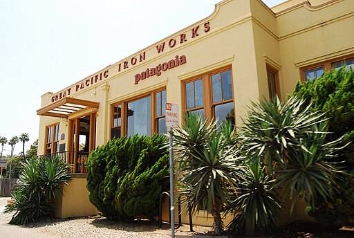
2. Patagonia
- The Diagnosis: Patagonia’s brand is the outdoors, so this is an obvious fit.21 But where they succeed is in their absolute commitment to authenticity. Their site never feels like a corporation trying to sell you something; it feels like a dispatch from a team of people who just got back from climbing a mountain.
- Biophilic Principles Applied:
- Direct Experience: The photography is the hero.22 It’s rugged, real, and often features intense weather and challenging situations. This isn’t calm, serene nature; it’s wild, untamable nature. This builds immense brand credibility.
- Indirect Experience: The site’s color palette is pulled directly from the earth—slate grays, deep blues, forest greens, and earthy browns. The typography is often a simple, functional sans-serif that feels honest and unpretentious, like a well-made tool. It’s material honesty in digital form.
3. The Sill
- The Diagnosis: A company that sells houseplants online had better have a biophilic website, and The Sill delivers. Their design is clean, bright, and nurturing, perfectly mirroring the experience of caring for a plant.
- Biophilic Principles Applied:
- Indirect Experience: This is their strongest suit. The site uses soft, rounded corners on almost every container and button, creating an organic and friendly feel. The color palette is dominated by various shades of green, contrasted with a warm, creamy off-white background that feels more like natural parchment than a harsh screen.
- Human-Spatial Response: The product grids are incredibly well-organized, using ample white space. This creates an “organized complexity” similar to a well-tended garden. You see a lot of information (prospect), but it never feels overwhelming (refuge).
4. Google Arts & Culture: The Ocean Agency
- The Diagnosis: A collaboration that showcases underwater nature. What makes this site special is its immersive, fluid feel. It avoids the typical “web page” structure and instead feels like you’re scuba diving through content.
- Biophilic Principles Applied:
- Direct Experience: It’s almost entirely composed of breathtaking underwater video and photography. The parallax scrolling effects create a sense of depth and movement that mimics being underwater.
- Human-Spatial Response: The navigation is an act of discovery. As you scroll, content fades in and out, new pathways open up. It creates a sense of “mystery” and “intrigue,” which is a key component of the Prospect/Refuge model. You want to see what’s around the next coral reef.
5. Silphium Design (Yes, Us)
- The Diagnosis: If you’re going to preach a sermon, you’d better live by the gospel. Our own site is a laboratory for these principles. We designed it to be a testament to our belief that technology should feel human.
- Biophilic Principles Applied:
- Indirect Experience: We lean heavily on organic shapes.23 Our section dividers are not horizontal lines but gentle, sweeping curves that guide the eye downward naturally. Our color palette is minimalist, using the green and yellow of the yellow-cup plant (Silphium perfoliatum), stone-like grays, and plenty of “airy” white space to evoke a sense of calm professionalism. The butterfly hero is a call to nature.
- Human-Spatial Response: We architected the site for clarity (prospect). The service offerings are clearly delineated, and case studies are easy to navigate. This is combined with the uncluttered aesthetic (refuge), creating a space that feels both authoritative and approachable. It’s a deliberate choice to build trust through tranquility.
6. The New York Times: “Snow Fall” (and its successors)
- The Diagnosis: While not a homepage, this 2012 article was a watershed moment in digital storytelling that is deeply biophilic in its execution. It integrated ambient video, parallax effects, and dynamic layouts to create a living, breathing story about an avalanche.
- Biophilic Principles Applied:
- Direct Experience: The use of subtle, full-screen video of falling snow created an atmosphere that you could almost feel. It transported the reader directly into the story’s environment.
- Human-Spatial Response: The long-form scroll format, punctuated by stunning visual breaks, creates a narrative journey.24 The reader has a clear path forward (prospect), but the presentation is so beautiful and immersive it also feels like a comfortable place to spend time (refuge).
7. Melyssa Griffin
- The Diagnosis: A business coach whose brand is built on approachability and warmth. Her website design masterfully uses subtle biophilic cues to create a feeling of trust and welcome, which is critical for her target audience.
- Biophilic Principles Applied:
- Indirect Experience: The design is filled with soft, rounded shapes, from the buttons to the photo frames. The color palette is warm and natural, using peaches, soft pinks, and sage greens. The most subtle element is the use of hand-drawn, organic-feeling icons and underlines, which feel human and personal, not machine-generated.
8. Headspace
- The Diagnosis: Like Calm, Headspace is in the business of mental well-being.25 Where they differ is their approach to biophilia. Headspace uses less direct nature photography and more indirect, abstract representations of it through color and illustration.
- Biophilic Principles Applied:
- Indirect Experience: Their famous illustration style uses soft, rounded characters and shapes with no hard corners. The color palettes are bright but muted, like a field of wildflowers on an overcast day (oranges, yellows, blues). This abstract approach creates a playful, non-intimidating version of nature. It’s a garden of the mind.
- Human-Spatial Response: The user journey is exceptionally well-guided. The app and website use a “one concept at a time” approach, creating immense “refuge” by reducing cognitive load to near zero.
9. LEVER Architecture
- The Diagnosis: An architecture firm known for its innovative use of mass timber. Their website is a perfect digital reflection of their physical work: clean, structured, yet warm and deeply connected to natural materials.
- Biophilic Principles Applied:
- Indirect Experience: The site’s genius is in its simulation of materials. The backgrounds have a subtle texture like unfinished wood. The color palette is restrained, focusing on the tones of light wood, concrete, and glass. The typography is a clean, architectural sans-serif, suggesting precision and craft. It feels like you’re walking through one of their buildings.
- Human-Spatial Response: The project galleries are laid out on a clean grid, providing a strong sense of order and prospect. The generous spacing and minimalist navigation provide a complementary sense of refuge.
10. Apple’s iPhone Product Pages
- The Diagnosis: Apple is the undisputed master of creating digital “refuge.” Their product pages are exercises in minimalism and focus. While not overtly “natural,” they use biophilic principles to create a sense of calm and desire.
- Biophilic Principles Applied:
- Human-Spatial Response: This is Apple’s playground. The pages use an incredible amount of white space, forcing you to focus on one beautiful product shot at a time. This is “refuge” at its most extreme. The scroll-based animations that reveal features one by one provide a clear and compelling sense of “prospect.” You are safely guided on a journey of discovery.
- Indirect Experience: While the aesthetic is technical, the use of perfectly rounded corners on hardware and software elements is a deliberate choice. It makes powerful technology feel soft, approachable, and organic to the touch.
Why Your CFO Should Care: The ROI of Going Wild

I get it. Design is often seen as a “soft” discipline, a matter of taste. You can’t take “beauty” to the bank. But biophilic design isn’t just about making things pretty. It’s a competitive advantage rooted in neuroscience and psychology, and it has a direct, measurable impact on the metrics that matter.26 When you pitch this to your boss or your client, don’t talk about beauty. Talk about the bottom line.
1. Reduced Cognitive Load = Lower Bounce Rates27
- The Problem: A cluttered, chaotic website with sharp angles, competing colors, and confusing navigation is cognitively expensive.28 The user’s brain has to work harder to parse information, leading to frustration and fatigue. This is a primary driver of high bounce rates. They don’t leave because they couldn’t find the button; they leave because your site made them tired.
- The Biophilic Solution: Designs that use organic shapes, natural color palettes, and a clear Prospect/Refuge structure are easier for our brains to process.29 This concept is known as Cognitive Fluency. When an experience is fluent (easy), we not only enjoy it more, but we also trust it more. Lowering the cognitive barrier keeps users on the page longer, drastically increasing session duration and lowering bounce rates.
2. Increased Focus & Engagement = Higher Conversion Rates
- The Problem: In a distracting digital environment, the user’s attention is fragmented.30 They miss key value propositions and calls-to-action because their focus is being pulled in ten different directions by auto-playing videos, aggressive pop-ups, and a rainbow of buttons.
- The Biophilic Solution: Creating a sense of “Refuge” is the ultimate tool for guiding attention. By using a minimalist layout and ample negative space, you create a visual hierarchy that tells the user exactly what is most important.31 A calm user is a focused user. A focused user is far more likely to absorb your marketing message, complete a complex form, or click the “Buy Now” button. Biophilic design doesn’t just reduce stress; it directs intent.
3. Enhanced Brand Perception & Trust
- The Problem: Trust is the most valuable currency on the internet.32 Users are inherently skeptical. A website that feels cheap, generic, or aggressive triggers our internal alarms.
- The Biophilic Solution: Nature feels honest. A design that incorporates natural textures, authentic imagery, and calming patterns feels more trustworthy and authentic by association.33 A brand that invests in a serene and human-centric user experience is perceived as being more competent, confident, and customer-focused. This isn’t just about feeling good; it’s about building the brand equity that leads to long-term customer loyalty and higher lifetime value.
4. Measurable Well-being Benefits
- The Problem: We now spend a significant portion of our lives staring at screens, leading to measurable increases in stress and eye strain.34
- The Biophilic Solution: Studies on biophilia in physical spaces have shown it can lower heart rate and blood pressure.35 While the effect is more subtle in digital spaces, the principles hold. Using off-white or cream backgrounds (
#F8F7F4) instead of pure white (#FFFFFF) can significantly reduce eye strain. Incorporating fractal patterns can have a measurably calming effect.36 A website that leaves a user feeling slightly less stressed than when they arrived is an incredible competitive advantage in a world where most digital experiences do the opposite.
Don’t ask for a budget for a “redesign.” Build a business case for a “performance upgrade” driven by human-centered, biophilic principles. Frame it as a strategic investment in cognitive fluency and user trust.37 The numbers will follow.
Stop Building Boxes. Start Designing Experiences.
We stand at a crossroads. For twenty years, we’ve been building the web with digital bricks and mortar. We’ve optimized for search engines, we’ve optimized for ad revenue, we’ve optimized for every metric imaginable except the one that truly matters: the human spirit. The result is a digital landscape that is largely functional but emotionally barren. It’s an endless suburb of identical boxes.
This is not an indictment; it’s an opportunity. An incredible one. The next decade of the web won’t be defined by who has the flashiest animations or the most complex JavaScript framework. It will be defined by who creates the most human, most intuitive, and most restorative digital spaces. It will be won by the architects, not the bricklayers.
Biophilia isn’t a style. It’s a return to form. It’s an acknowledgment of the million-year-old operating system running in our heads. It’s the understanding that a curve is more calming than a corner, that a texture is more trustworthy than a flat surface, and that a sense of place is more valuable than a pile of information.
The tools are already in your hands—the CSS for rounded corners, the libraries for subtle motion, the access to stunning natural imagery. The principles are clear. The science is sound. The only thing missing is the will—the will to challenge the tyranny of the grid, to reject the coldness of corporate sterility, and to build something that feels like a breath of fresh air in a world that is suffocating from digital noise.
Now that you know, go build something human.