We have all felt it. That flash of frustration when a website is confusing, cluttered, or just plain overwhelming. Statistics show that most users will abandon a webpage in seconds if it doesn’t feel right. For years, the solution was thought to be faster loading speeds or bigger buttons. But what if the answer is something far more fundamental, something wired into our very DNA?
The solution may lie in the use of natural patterns. When we talk about natural patterns in website and app design, we are not just talking about using a picture of a forest as a background. We are talking about incorporating the deep, underlying structures of nature into the very layout, flow, and function of a digital experience.
This article moves beyond theory to show you the real proof. We will explore specific case studies that analyze how integrating these powerful natural patterns directly leads to better user interaction, higher engagement, and a sense of calm and clarity for the user. It is time to see the data behind the design.
Table of Contents
Why Our Brains Love Natural Patterns
To understand why natural patterns are so effective in digital design, we first need to understand a little about the human brain. For hundreds of thousands of years, our brains evolved outdoors, constantly surrounded by the shapes and flows of the natural world. Our survival depended on our ability to understand these natural patterns. It is a language our minds understand instantly, without any effort. Bringing these same patterns onto a screen taps into this deep, built in preference.
The Biophilia Hypothesis: Our Connection to Nature
A famous biologist from Harvard University named E.O. Wilson developed an idea called the “Biophilia Hypothesis.” It is a simple but powerful concept: humans have an innate tendency to seek connections with nature and other forms of life. We feel better when we are around nature. We feel calmer, more focused, and happier. This is why having plants in an office can boost productivity or why a walk in the park can clear your head.
This same idea applies to the digital world. A screen is a space where we spend hours every day. When that space is filled with harsh, rigid, and unnatural designs, it can subconsciously create stress. But when we fill that space with the gentle curves, repeating structures, and organized complexity of natural patterns, we are creating a more humane and welcoming digital environment. It satisfies that deep need for a connection to the natural world, even through a screen. Using natural patterns is a way to make technology feel less like a machine and more like an extension of our own world.
Recharging Your Brain with Attention Restoration Theory
Have you ever tried to focus on a difficult task for a long time and found your mind starting to wander? That is called directed attention fatigue. Your ability to concentrate is like a muscle, and it gets tired with overuse. A cluttered or confusing website forces you to use this muscle constantly, quickly leading to fatigue and causing you to leave the site.
Attention Restoration Theory, or ART, is a concept developed by researchers Stephen and Rachel Kaplan. It suggests that we can restore this tired attention muscle by looking at things that are effortlessly fascinating. Nature is filled with these “soft fascinations.” Think about watching clouds drift by, looking at the ripples on a pond, or observing the complex veins of a leaf. You are not trying to focus, but your mind is gently engaged.
Digital natural patterns can do the same thing. A design that uses the soft, repeating structures found in nature can give the user’s brain a tiny break, a moment to recharge. This allows them to stay focused on their task for longer without feeling mentally drained. This is crucial for websites where you want users to read a long article, fill out a detailed form, or browse through many products. These natural patterns help sustain their attention.
Reducing Stress with Stress Reduction Theory
Just as some environments can restore our minds, others can cause stress. Stress Reduction Theory, or SRT, suggests that our emotional and physiological responses are often tied to our surroundings. Unnatural environments, with their sharp angles, lack of order, and overwhelming stimuli, can trigger a low level of stress in our bodies.
A physicist named Richard Taylor conducted fascinating research on a specific type of natural patterns called fractals. He discovered that looking at certain fractal natural patterns, those with a specific level of complexity common in nature, can reduce a person’s physiological stress levels by as much as 60 percent. Our brains are incredibly good at processing these types of patterns, and doing so feels calming and orderly to our minds. When a website’s design is chaotic, it can feel threatening on a subconscious level. When the design uses the clean, predictable, yet interesting complexity of natural patterns, it can create a feeling of safety and calm, making the user more relaxed and receptive to the information on the screen.
The Key Natural Patterns in Design
There are many kinds of natural patterns, each with its own unique feel and function. Here are a few of the most important ones used in digital design:
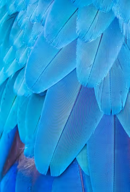
- Fractals: These are patterns that repeat themselves at smaller and smaller scales. A perfect example is a tree, where a large branch splits into smaller branches, which split into even smaller twigs. Or a snowflake, where the overall six sided shape is repeated in its smaller crystalline arms. In web design, fractals can be used to create navigation menus that feel intuitive or to generate background textures that are complex but not chaotic. These natural patterns are endlessly interesting.
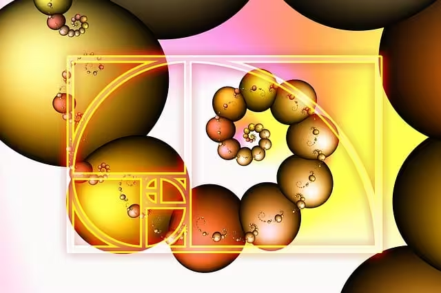
- The Golden Ratio & Fibonacci Sequence: You have probably seen this pattern without even realizing it. It is a special mathematical rule of proportion, often represented by the Greek letter phi (ϕ). It is found in the spiral of a nautilus shell, the arrangement of seeds in a sunflower head, and the proportions of the human body. For centuries, artists and architects have used this ratio to create works that are perfectly balanced and beautiful to the human eye. In web design, the Golden Ratio can be used to determine the size and placement of columns, images, and text blocks to create a layout that feels harmonious and “right.”
- Voronoi Tessellations: This might sound complicated, but the pattern is very familiar. It is the pattern of a giraffe’s spots, the cells in a honeycomb, or the cracks that form in drying mud. It is nature’s way of dividing up space efficiently. In design, these natural patterns can be used to create interesting photo galleries, data visualizations, or content blocks that break free from the boring, rigid grid of standard boxes. It provides organization that feels organic and alive.
How We Know It Works: Measuring the Effect of Natural Patterns
Making a website look nice is one thing, but proving that a design choice actually improves how people use it requires data. We can’t just rely on feelings. Fortunately, we have powerful tools to measure the exact impact of using natural patterns in a design. These methods allow us to see the difference in user behavior, attention, and even their emotional state.
Quantitative Metrics: The Hard Numbers
These are the methods that give us cold, hard data about user behavior.
- A/B Testing: This is the gold standard for testing design changes. It is like a taste test for a website. We create two versions of a page: Version A is the original design, and Version B is the new design that includes natural patterns. We then show Version A to half of our website visitors and Version B to the other half. After a while, we compare the results. Did Version B get more clicks, more sales, or did people stay on the page longer? This direct comparison tells us exactly which design is more effective.
- Heatmaps & Click Tracking: A heatmap is a visual tool that shows us where users are paying attention on a page.14 It creates a color overlay, like a weather map, where “hot” red spots show where most people clicked, moved their mouse, or spent the most time looking. Click tracking does something similar, showing every single click on the page. By comparing the heatmaps of an old design versus a new one with natural patterns, we can see if the new design is successfully guiding the user’s eye to the most important elements.
- Core Web Vitals: These are the key performance indicators for any website, like a report card. We look at metrics like dwell time (how long a person stays on the page), bounce rate (the percentage of people who leave after viewing only one page), and conversion rate (the percentage of users who complete a desired action, like making a purchase or signing up for a newsletter). An increase in dwell time and conversion rate, along with a decrease in bounce rate, is strong evidence that the design with natural patterns is performing better.
Qualitative & Biometric Data: Understanding the “Why”
Numbers are great, but sometimes we need to understand the human experience behind them.
- Eye-Tracking Studies: This is a fascinating technology that uses a special camera to follow a person’s eye movements as they look at a website. It shows us their exact gaze path, where their eyes stop (fixations), and how quickly they move between points (saccades). This tells us if a design is easy to scan, if the information is presented in a logical order, and if the natural patterns are helping to guide their attention or causing a distraction.
- Biometric Feedback: This takes measurement to the next level by looking at the body’s physical response to a design. We can use sensors to measure a user’s Galvanic Skin Response (changes in sweat gland activity, which indicates emotional arousal) or their Heart Rate Variability. These tools can tell us, on a physiological level, if a design is making a user feel stressed, excited, or calm. It is scientific proof that using calming natural patterns can have a real, measurable effect on a user’s state of mind.
- System Usability Scale (SUS): Sometimes the best way to know if something works is to just ask. The SUS is a simple, ten question survey with a proven track record. It asks users to rate their experience with a website on things like ease of use, complexity, and confidence. It gives the website a score from 0 to 100. Comparing the SUS scores before and after implementing natural patterns provides clear feedback on how users perceive the site’s usability.
The Proof is in the Pixels: Four Real World Examples
Theory and measurement methods are important, but the best way to understand the power of natural patterns is to see them in action. Here are four case studies from different industries that show how applying these principles led to significant, measurable improvements.
Case Study 1: Fractal Branching in E-commerce Navigation to Reduce Choice Overload

- The Context: A large online clothing retailer had a massive catalog with thousands of items. Their website used a traditional “mega menu,” a huge dropdown box with hundreds of links organized in columns and rows.
- The Problem: User data showed a major problem. People were getting lost and overwhelmed by the sheer number of choices. This “choice overload” led to a high bounce rate on category pages and a large number of abandoned shopping carts. Users simply gave up before they could find what they wanted.
- The Solution: The design team decided to experiment with natural patterns. They replaced the rigid, grid based mega menu with a new navigation system based on a fractal tree structure. When a user hovered over a main category like “Women,” it didn’t just drop down a box of links. Instead, it smoothly expanded into main branches like “Tops,” “Bottoms,” and “Dresses.” Hovering over “Tops” would then expand that branch further into “T-Shirts,” “Blouses,” and “Sweaters.” The entire interaction felt more like exploring the branches of a tree than reading a spreadsheet. This use of natural patterns felt more intuitive.
- The Results: The team ran an A/B test for one month, showing the old menu to half the users and the new fractal menu to the other half. The results were clear. The website version with the fractal navigation saw a 12% decrease in bounce rate on its main category pages. Furthermore, the average session duration increased by 7%. Eye-tracking studies confirmed that users could find specific product categories much faster with the fractal menu, as their eyes could easily follow the branching natural patterns without having to scan large blocks of text.
Case Study 2: Golden Ratio & Organic Layouts in a Content-Heavy News Portal
- The Context: A popular digital magazine and news portal was packed with high quality content, but its design was holding it back. The layout was a very rigid, blocky grid of sharp-cornered boxes, making the pages look dense and visually exhausting.
- The Problem: Analytics showed that while many people were landing on articles, very few were scrolling down to finish them. The “time on page” was low, and user feedback surveys frequently mentioned that the site felt “cluttered” and “tiring to read.”
- The Solution: The redesign focused on creating a more organic and breathable reading experience using two key natural patterns. First, they re-architected the entire page layout based on the Golden Ratio (1:1.618). The main article content was placed in a wide column, and the sidebar with related links was placed in a narrower column, with their widths conforming to this classic ratio. Second, they replaced all the sharp edged boxes with content “cards” that had subtle, rounded corners and soft drop shadows. This small change made the elements feel less harsh and more like smooth stones than sharp blocks.
- The Results: The impact was almost immediate. Heatmap analysis of the new design showed a 30% increase in average scrolling depth, meaning users were reading much further down the articles. A follow up user survey saw a huge jump in scores related to aesthetic appeal and reading comfort. The combination of a balanced layout and softer, more organic shapes made the content feel more approachable and less intimidating, encouraging users to engage with it more deeply.
Case Study 3: Animated Natural Textures in a Wellness App to Increase Engagement

- The Context: A mobile app designed to help people with stress and anxiety through guided breathing exercises was struggling to keep users engaged. The interface was clean but also sterile and static.
- The Problem: User retention was low. People would use the app a few times and then stop. The core feature, the breathing exercise screen, was just a circle that expanded and contracted on a plain background. It was functional, but not captivating. It failed to create the calm, immersive experience it was promising.
- The Solution: The developers decided to bring the screen to life with subtle, animated natural patterns. They replaced the static, plain background with a procedurally generated animation that mimicked the gentle ripples on the surface of calm water. The ripples would slowly pulse in perfect sync with the user’s guided breathing rhythm. This subtle visual cue reinforced the exercise and created a deeply calming and immersive atmosphere. It was a perfect example of digital biophilia.
- The Results: The company tested the new version with a panel of users while monitoring their biometric data. The results were astounding. Users of the new version showed a measurable decrease in average heart rate during the breathing sessions compared to when they used the old, static version. More importantly, the app’s overall analytics recorded a 22% increase in the completion rate for the breathing modules. The addition of living natural patterns transformed a boring task into a beautiful and rewarding experience.
Case Study 4: Voronoi Patterns for Data Visualization in a B2B Analytics Dashboard
- The Context: A software company provided a powerful analytics dashboard for its business clients. The dashboard was full of important data but presented it using standard bar charts, pie charts, and tables of numbers.
- The Problem: Many of the company’s clients were not data analysts. They found the dashboard intimidating, confusing, and difficult to interpret. They struggled to spot key trends and insights quickly, which reduced the perceived value of the software.
- The Solution: Instead of more charts, the design team tried a radical approach using Voronoi natural patterns. They created a new visualization module that represented the client’s key performance indicators as a collection of organic cells, like a honeycomb or a stained glass window. The size and color of each cell represented a different data value. At a glance, a user could see a large, bright red cell and instantly know that was an area needing attention, without having to read any numbers. Hovering over a cell would bring up the specific details.
- The Results: The company conducted user testing sessions with a group of non-technical clients. They found a 15% reduction in the “time-to-insight,” which is the amount of time it took a user to identify a critical piece of information from the data. The feedback was overwhelmingly positive. Clients described the new Voronoi view as more “intuitive,” “approachable,” and even “fun to use.” By using organic natural patterns to display data, the company made complex information accessible to everyone.
Bringing Nature to Your Screen: What We’ve Learned
As these case studies clearly show, the use of natural patterns in digital design is not just a stylistic trend or a way to make things look pretty. It is a powerful, data-driven approach to creating more effective, engaging, and human-friendly digital experiences. From fractal menus that simplify choice to organic layouts that encourage reading, these patterns tap into the fundamental way our brains are wired. They can reduce stress, restore our ability to focus, and make complex information feel simple and intuitive.
The common thread is clear: when we design in harmony with the principles of nature, we are designing in harmony with human nature. The future of design will likely see even deeper integration of these ideas. Imagine websites with generative backgrounds of natural patterns that subtly shift based on the time of day, or interfaces that adapt their complexity to match a user’s focus level.
For now, the lesson is straightforward. Designers, developers, and business owners should look beyond the rigid grids and sharp angles that have dominated screen design for decades. Start small. Try rounding the corners on your content boxes. Experiment with a layout based on the Golden Ratio. Conduct your own A/B tests. The evidence is growing every day: by bringing the wisdom of natural patterns to our digital world, we can build websites and applications that not only perform better but also feel better to use.