The psychology of shapes in design is the study of an unspoken language. Long before you read a word, register a color, or process a call to action, your brain has already analyzed, interpreted, and passed judgment on the fundamental shapes of a design. This process is instantaneous, universal, and deeply rooted in our evolutionary survival. Shapes are not mere decoration; they are the primary visual syntax our brains use to instantly assess a brand’s character, an interface’s function, and an environment’s safety.
Are you looking at something stable and trustworthy, or something dynamic and dangerous? Is this environment welcoming, or is it sterile and cold? Your brain answers these questions in milliseconds, all by decoding the geometry and forms presented to it.
This article will deconstruct this “shape language.” We will examine the cognitive framework that gives shapes their power and explore its critical application in modern, human-centric web design, where the right shapes can be the difference between engagement and abandonment.
Table of Contents
The Cognitive Framework: Why Shapes Have Meaning
We are not born with a conscious understanding that a circle feels “friendly” or a sharp triangle feels “dangerous.” We acquire these associations through a combination of evolutionary hardwiring and learned experience. Our brains are pattern recognition machines, and the meanings we assign to shapes are a core part of that system. This is based on three key concepts.
Gestalt Principles and Pattern Recognition
In the early 20th century, German psychologists developed Gestalt psychology. This is a field that explores how our minds perceive whole forms from incomplete parts. The central idea is that our brains crave order and will automatically try to “fix” chaos by grouping elements.
For example, your brain will group similar shapes together, connect dots to see a line, or “close” an incomplete circle. Shapes are the most basic components of this system. We don’t see a collection of random lines and curves on a website; we see a “header,” a “sidebar,” and “buttons.” Our brain instantly organizes these visual “blobs” into understandable shapes and structures. This is why a clean, well-defined layout feels calming. It gives the brain less work to do. The arrangement of shapes on a page is the foundation of all visual hierarchy and “scannability.”
Semiotics and Symbolic Association
Semiotics is the scientific study of signs and symbols. That’s just a technical way of saying that some things stand for other things. A red-light means “stop.” A heart means “love.” In design, shapes are powerful symbols.
- A square becomes a symbol of stability.
- A circle becomes a symbol of unity.
- A triangle becomes a symbol of direction.
These associations are learned. We live in square buildings, so we associate these shapes with structure. The sun and moon are circles, so we associate these shapes with consistency and wholeness. Over time, these learned meanings become so strong they feel like instincts. A brand can use these symbolic shapes to tell you a story about itself before you’ve even read its name.
The Neurological Basis (The “Why” It Works)
This process is not just philosophical; it’s biological. When you see a shape, your visual cortex processes it. That signal is then relayed, in part, to your amygdala (the brain’s emotion center) and the fusiform gyrus. This gyrus is a fascinating part of the brain that acts like a high-speed recognition tool. It is specialized in identifying faces, but it is also highly active in identifying and categorizing other common objects and, crucially, simple shapes.
This means your brain links emotional responses directly to specific forms. Sharp, angular forms (like a jagged rock or a broken tool) can trigger a low-level threat response. They are processed as “alert” signals. In contrast, soft, curved, and rounded forms (like a smooth stone, a piece of fruit, or a human face) are processed as “safe.” This is a survival instinct that directly impacts how we experience web design today. These primitive responses to shapes are the building blocks of user experience.
The Lexicon of Form: Decoding Geometric and Organic Shapes
Every design is built from three basic types of shapes: geometric, organic, and abstract. Understanding the specific psychology of each category is essential for designing with intent.
Geometric Shapes (Man-Made Order and Structure)
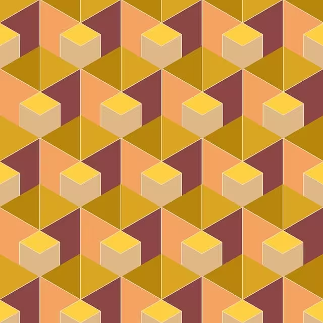
These are the shapes of logic, mathematics, and human-made structure. They are balanced, symmetrical, and predictable. They include squares, rectangles, triangles, and circles. Because they represent order and control, they are the most common ones used in digital design, forming the very grids and containers that hold our websites together.
- Squares and Rectangles:
- Psychology: Squares and rectangles are the visual definition of stability, reliability, order, and trust. Their four right angles feel solid and grounded, like the foundation of a building or a locked safe. They represent security and conformity. There are no surprises with a square.
- Association: We see these shapes in bricks, boxes, books, and computer monitors. They are the ones used for data and infrastructure.
- Application: Squares and rectangles are the default for a reason. They are perfect for grids, framing content, and creating a sense of order. They are heavily used by financial institutions (like American Express), technology companies (like Microsoft), and any brand that wants to project ultimate strength and dependability. These solid shapes feel competent.
- Triangles:
- Psychology: Triangles are the most dynamic of the geometric shapes. They are full of energy, power, direction, and growth. A triangle resting on its base feels stable and strong, like a mountain. An upward-pointing triangle suggests progress, ambition, and moving up.
- Association: We see them as arrows, peaks, and warning signs. Their meaning can change based on their orientation. A triangle pointed down can feel like a “play” button, but it can also feel unstable, tense, or risky.
- Application: Triangles are ideal for guiding the user’s eye. An arrow-like triangle in a “back to top” button is a clear directional cue. Brands in science, tech, religion, or fitness often use triangles to imply purpose and forward momentum (e.g., Adidas, Delta). The three points of the triangle create a natural visual tension.
- Circles, Ovals, and Ellipses:
- Psychology: Circles are the opposite of triangles. They have no angles, no beginning, and no end. This makes them feel unified, communal, harmonious, and safe. They also represent wholeness and infinity. Because they mimic the shapes of faces and eyes, we perceive them as friendly and approachable. They can also represent motion, like a wheel.
- Association: The sun, the moon, the Earth, a friendly face, a protective embrace, a wedding ring. These are all positive, universal associations.
- Application: Circles are perfect for logos of brands that want to feel inclusive, collaborative, and friendly (e.g., Target, Pepsi, Audi). In web design, profile pictures are almost always in circles in order to feel more human. The continuous line of these circular forms makes them feel complete.
Organic & Biomorphic Shapes (Nature and Comfort)

These are the shapes of life. They are irregular, asymmetrical, and flowing. Organic shapes are found in nature: leaves, clouds, water, stones, and cells. They are the opposite of rigid, man-made geometric forms.
- Psychology: Organic forms feel natural, comfortable, flexible, and human. They are calming and grounding. While geometric forms represent structure, organic forms represent life, growth, and spontaneity.
- Association: Leaves, puddles, winding rivers, coastlines. These are non-threatening and familiar. This is where we introduce the term biomorphic forms, which are shapes designed to look like or suggest living organisms.
- Application: Biomorphic forms are crucial for wellness, healthcare, food, and eco-conscious brands (e.g., Whole Foods). In web design, they are used to soften a design. A “wave” or “blob” divider is used to break up the harsh rectangular grid. Using biomorphic forms can make a digital interface feel less sterile and more human.
- Spirals: A spiral is a special type of organic shape. It is found in nature in shells, galaxies, and flower petals. It represents growth, creativity, and the “golden ratio” (also known as the Fibonacci sequence). This is a mathematical pattern our brains are deeply programmed to find beautiful. These complex natural shapes feel balanced and profound.
Abstract Shapes
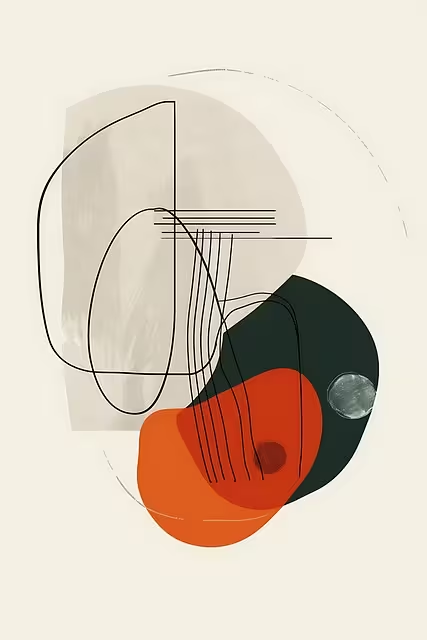
Abstract shapes are often symbolic or conceptual. They are typically modified or simplified versions of geometric or organic shapes.
- Psychology: These shapes are unique, modern, and intriguing. Their meaning is not always universal; it must be learned.
- Association: The Nike “Swoosh” is a perfect example. On its own, it’s just a checkmark-like shape. But through branding, it has come to represent speed, motion, and athletic achievement.
- Application: Abstract forms are used to create a completely unique brand identity. They are highly memorable because they are different. These unique shapes are a blank slate that a brand can fill with its own meaning.
Application in Branding and Logo Design
A logo is a brand’s visual signature, and its core shapes are its most important component. The choice of shapes is the first and most immediate signal of a company’s values.
How Shape Choice Defines Brand Identity
Let’s analyze a few examples to see how brands use shapes.
- World Wildlife Fund (WWF): The logo is a panda. But look closer. It is constructed entirely of soft, rounded, organic shapes. There are no sharp corners. This use of curved forms makes the brand feel gentle, caring, approachable, and safe. It is non-threatening, which is perfect for a charitable organization.
- Amazon: The logo uses simple, lowercase typography. But the key is the abstract shape beneath it: an orange “smile” that is also an arrow. This curve simultaneously conveys friendliness (a smile) and efficiency (an arrow pointing from A to Z). It’s a brilliant use of a simple abstract shape.
- Mitsubishi: The logo is three triangles (or diamonds, a type of rhombus) arranged in a specific pattern. These are sharp, geometric shapes. They convey precision, technology, power, and high performance. You would expect this from a car and electronics company, not a children’s charity. The psychology of these shapes perfectly matches the brand’s industry.
The dominant forms in a logo set the entire tone for the brand’s perceived personality.
The Role of Negative Space
Sometimes, the most important shape is the one that isn’t there. Negative space is the empty area around or between the main elements of a design. When used skillfully, this space can form its own “hidden” meaning.
The most famous example is the FedEx logo. At first glance, you see the bold, rectangular shapes of the letters. This projects stability and reliability. But if you look at the negative space between the “E” and the “x,” you will see a perfect arrow. This hidden shape powerfully communicates the brand’s entire purpose: speed, direction, and forward movement.
The brain loves “discovering” these hidden shapes. It feels like solving a small puzzle, which creates a positive, memorable interaction with the brand. This makes the design “sticky” and clever. Using the shapes of empty space is an advanced, but highly effective, design technique.
The Biophilic Synthesis: Shapes in Human-Centric Web Design
This is where the psychology of shapes moves beyond simple branding and becomes a critical tool for user well-being. As the Design Expert for Silphium Design, my focus is on biophilic design, which means integrating nature into the built environment. This applies just as much to our digital environments.
Moving Beyond the Grid: Geometric vs. Biomorphic Layouts
For the last two decades, most of the web has been built on a rigid grid. Websites are, fundamentally, a collection of squares and rectangles. This is efficient. It creates order and is easy for developers to build. However, it is also visually sterile. Staring at an endless series of hard-edged boxes contributes to digital fatigue and cognitive boredom.
The biophilic solution is to intentionally integrate organic shapes and biomorphic forms into these rigid layouts. This can be done by:
- Using subtle, wave-like dividers between content sections.
- Using “blob” or “pebble” shapes as background elements.
- Allowing images and text to break out of the grid in a controlled, natural-feeling way.
A common question is: “Are organic shapes better than those that are geometric?” The answer is no. They serve different purposes and must work in harmony.
- Geometric Outlines provide the necessary structure, clarity, and foundation. They make a site usable.
- Organic Outlines provide the psychological comfort, visual interest, and human touch. They make a site enjoyable.
The most effective modern designs balance both. They use a strong grid for easy navigation but soften it with biomorphic forms to make the experience feel more natural and less robotic.
The Science of Natural Forms: Fractal Fluency
The late Harvard biologist E.O. Wilson popularized the Biophilia hypothesis. This is the idea that humans have an innate, genetic connection to nature and living systems. We are simply happier and healthier when we are around natural elements.
This brings us to fractals. Fractals are complex, self-repeating patterns found everywhere in nature. You see them in the veins of a leaf, the branches of a tree, the structure of a snowflake, and the patterns of a coastline.
A fascinating body of research has shown that our brains are built to process these natural, fractal shapes with incredible ease. This is called “Fractal Fluency.” Staring at a simple geometric outline, like a blank wall, is actually tiring for the brain. Staring at a complex natural scene full of fractal shapes is restorative. Our brains process these shapes with very little effort, and this fluency, this ease of processing, registers as a feeling of pleasure and calm.
We can apply this to web design. Using subtle fractal patterns (like wood grain, leaf veins, or stone textures) or biomorphic shapes in a website’s background can reduce cognitive load. These natural forms can create a “micro-restorative experience” for the user, lowering their stress and making them want to stay on the page longer.
Forms, UX, and Attention Restoration Theory (ART)
Closely related to biophilia is Attention Restoration Theory (ART). This theory, developed by researchers Stephen and Rachel Kaplan, posits that our brains have two types of attention: “directed attention” (which we use for work, driving, and navigating websites) and “fascination” (which is an effortless attention we use when looking at nature). Directed attention is a limited resource that gets used up, leading to fatigue. ART states that exposure to natural elements can restore our “directed attention” batteries.
We can use the psychology of shapes to apply this theory to user experience (UX).
Think about a Call to Action (CTA) button. A button with sharp 90-degree corners feels “sharper.” It can be perceived as slightly more aggressive or demanding. A button with soft, rounded corners mimics the “safe” forms found in nature. It is perceived as more approachable, friendly, and less intimidating. This is not an accident. There is a reason almost all modern, “friendly” social media apps and tech companies (like Google, Twitter, and Facebook) use heavily rounded shapes in their UI.
These rounded shapes increase click-through rates because they are psychologically more appealing. The layout itself can also use gentle, S-shaped curves to guide the user’s eye down the page. This mimics a natural path or river, feeling more intuitive and less like a forced march than a rigid, Z-pattern layout. These deliberate choices in shapes are a core part of human-centric design.
Designing with Intent
Shapes are the most fundamental building blocks of design, and they are saturated with psychological meaning. They are a silent, universal language that communicates directly with the oldest parts of our brain.
Geometric shapes build trust, establish order, and project strength. Organic shapes foster comfort, create engagement, and make a digital experience feel human. Abstract shapes build intrigue and create unique, memorable identities.
The future of effective and ethical design lies in understanding this psychology. We must move beyond designing for pure function. By looking to the principles of biophilia, we can balance the rigid, geometric shapes of our technology with the soft, organic forms of our own biology. By designing with intent, we can use the power of shapes to create digital worlds that are not only usable but also restorative and innately human.