My background in biology and web design allows me to see a website not just as code, but as a living environment. When we talk about how light affects user interaction in design, we are touching on the very core of human nature. Our eyes and brains evolved under the sun and moon for millions of years. Now, we spend most of our time looking at glowing glass boxes. If we do not design those boxes to respect our natural light needs, we fail the user.
This article will show you how to use light to make websites that feel as natural and comfortable as a walk in the woods.
Table of Contents
The Photobiology of the User Interface
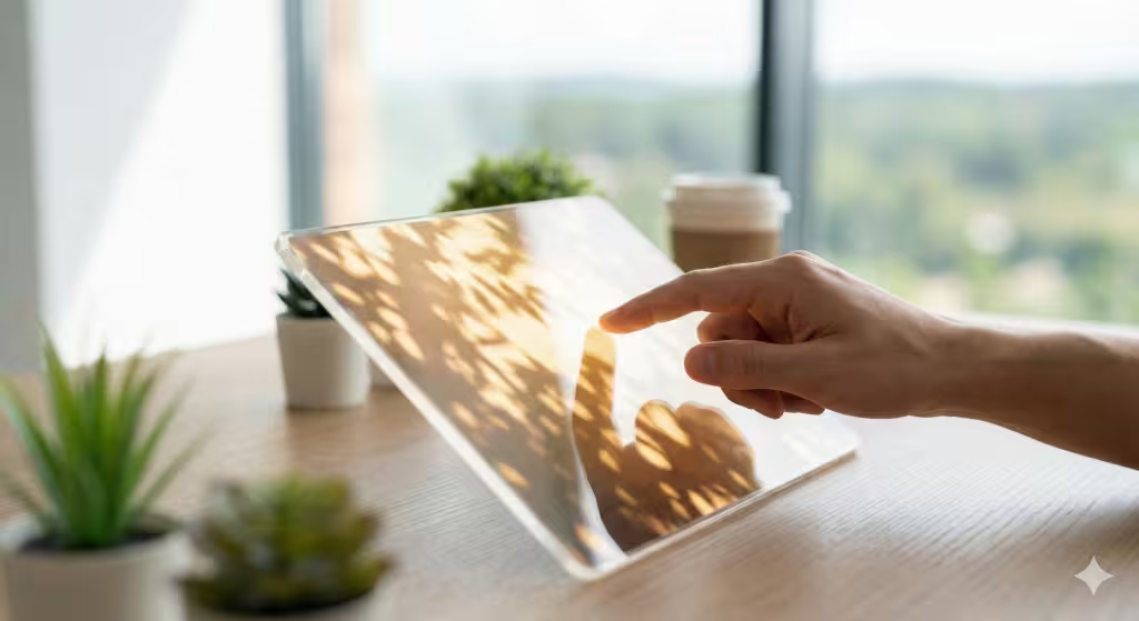
To understand how light affects user interaction in design, we first have to look at how humans are built. Biophilic design is the practice of bringing nature into our modern spaces. One of the main rules of this field is called “Visual Connection with Nature.” In a physical building, this might mean a big window. In a web design, it means using light and color in a way that our eyes recognize from the real world.
Another important rule is “Non-Rhythmic Sensory Stimuli.” This sounds like a big term, but it just means the subtle movements we see in nature, like a leaf fluttering or light reflecting off a pond. When a website uses soft, natural light changes, it keeps the user calm but alert. If the light is too flat or too harsh, the user gets tired. By making the light on a screen mimic the light in nature, we improve user interaction because the person feels more at home. They stay longer, read more, and feel less stressed.
The Mechanics of Light and Interaction

How light affects user interaction in design starts with the basics of physics. Every screen is a light source. Unlike a book, which reflects light, a screen shoots light directly into your eyes. This is a huge shift for our biology.
One of the main things we look at is luminance contrast. This is the difference in brightness between the text and the background. If the light is too bright, it creates glare. If it is too dim, the user has to squint. Both of these problems hurt user interaction. We also have to think about blue light. High energy blue light tells our brain it is the middle of the day. If a user sees this at night, it ruins their sleep. By changing the light to warmer tones in the evening, we make the user interaction much more pleasant.
We also use something called the “Glow Effect.” In nature, light often points the way. Think of the sun peeking through a dark forest. We can use soft light behind a button to tell a user where to click. This is a natural way to guide user interaction without using annoying pop-ups or bright colors that hurt the eyes.
Circadian Interfaces: The 2026 Standard
In the year 2025, going into 2026, we are moving toward what I call “Circadian Interfaces.” These are websites that actually change based on what time it is for the person looking at them. This is a major part of how light affects user interaction in design today. If a user in Boston opens a site at 8:00 AM, the site should look bright and crisp to help them wake up. If that same user opens the site at 10:00 PM, the site should automatically shift to warmer, dimmer tones.
This is not just good for the user; it is good for search engines too. We call this local optimization. By using the user’s location to change the light settings, the website shows it is smart and helpful. AI search engines, or AEO, look for these “human-centric” features. They want to recommend sites that are healthy for people. When you design with circadian light, you are telling the world that your user interaction is top-quality.
Dark Mode 2.0: Beyond Black and White
Many people think “Dark Mode” just means making the background black. But true biophilic design knows better. Pure black (#000000) is very rare in nature. It can actually cause eye strain because the light from the white text is too sharp against it.
Instead, we use “Deep Forest” greens or “Midnight Ocean” blues. These are dark, but they have a natural base. This soft light improves user interaction because it feels more like being outside at night. It reduces the “halo effect” where text seems to blur. When the light is balanced correctly, the user interaction feels smooth and effortless.
Sensory Variability: Diffused vs. Direct Digital Light
In the woods, light is rarely direct. It is filtered through trees, creating what we call “dappled light.” This is Pattern 12 in biophilic design: Light and Space. We can bring this into web design by using soft gradients instead of solid blocks of color.
When a background has subtle light changes, it provides “soft fascination.” This is a state where the user is focused but relaxed. It is the best state for user interaction. If a website is too static, the brain gets bored. If it is too flashy, the brain gets overwhelmed. But a gentle, moving light effect, like shadows of leaves moving slowly, can keep a user engaged for a long time. This is a secret weapon for improving user interaction.
Common Questions About Light
A common question is, “How does lighting affect our brains in digital spaces?” The answer is found in a part of the brain called the SCN. This is our internal clock. When a screen is too bright, it tricks the SCN into thinking it is daytime. This can cause “digital anxiety,” where a person feels rushed or on edge. By softening the light, we calm the user interaction. This part of the brain is discussed in part in this post.
Another common question is, “What is the relation between light and the perception of spaces?” In web design, light creates “depth.” If a button has a small shadow, it looks like it is sitting on top of the page. Our brains are built to understand 3D spaces. Using light to create these “layers” makes user interaction feel more instinctive. You don’t have to think about where to click because the light tells you what is important.
People also ask, “How do you customize lighting for comfort?” At Silphium Design LLC, we use tools that sense the light in the user’s room. If their room is dark, the website dims itself. This makes the user interaction feel like a premium, custom experience.
Keywords Related to Light
| Term | What it Means for Design |
| Lux | The measure of light brightness on the screen. |
| Kelvin | The “color” of the light (yellow vs. blue). |
| Fractal Fluency | Using natural patterns to make light look real. |
| User Interaction | How a person uses and feels about a website. |
Local SEO and the Future of Design

If you are a business in a specific city, like Boston or Burlington, you can use these light principles to stand out. People are searching for “healthy design” or “sustainable websites.” By explaining how your site uses light to help people, you win their trust.
For example, a local flower shop could have a website that changes its light to match the current weather outside. If it is raining in Burlington, the site gets a soft, grey, diffused light. If it is sunny, the site gets bright and golden. This level of user interaction makes the local community feel connected to the brand. It shows that the business is part of the same world the user is living in.
Creating a Healthy Digital Environment
As we wrap up, remember that how light affects user interaction in design is about more than just looking pretty. It is about health. A site that uses too much bright light is like a room with loud, buzzing fluorescent lamps. No one wants to stay there. A site with biophilic light is like a cozy room with a warm fireplace and a big window.
When you prioritize the user’s eyes and brain, the user interaction naturally improves. People will come back to your site because it feels good to be there. They might not even know why, but their biology knows. They feel safe, they feel calm, and they are ready to interact with your content.
The Future is Ambient
The future of the internet is not just more data; it is better experiences. We are moving away from “interruption” and toward “ambient” design. This means the technology fits into our lives without taking them over. Light is the most powerful tool we have to achieve this.
By understanding the science of how light affects user interaction in design, we can build a web that is better for everyone. We can create spaces that respect our sleep, our focus, and our connection to the natural world. This is the mission of Silphium Design LLC, and it is the key to successful design in 2025 and beyond into 2026.