Table of Contents
The Digital Ecosystem and Energy Metabolism
Most people think that a website is just light and magic. They think that when they open a browser, it does not cost the Earth anything. But as someone who has studied both biology and web design, I can tell you that every pixel has a cost. We call this digital metabolism. Just like a plant uses sunlight and water to grow, a website uses electricity and data to show up on your screen.
If the internet were its own country, it would be the sixth largest user of electricity in the whole world. This is a big problem for the environment. When we talk about energy-efficient UI design for Clean Tech, we are looking at how to make the digital world a better place for the physical world. For companies that make clean energy or green tools, their website should be as green as their products.
Here at Silphium Design, we believe in biophilic design. This means bringing the patterns of nature into our digital spaces. Nature is very smart. It never wastes energy and has evolved to be very efficient. A tree does not grow a leaf it does not need. A river does not flow in a way that wastes its force. We should build websites the same way. We need to stop thinking of the internet as something that is weightless. It has a real weight in carbon and heat. When we use smart UI design, we are helping the planet.
In this article, we will look at how to build a better UI design. We will see how to save battery life on your phone, your laptop, or your tablet. We will talk about how to make sites load faster. We will even look at how the colors you pick can change how much power a computer uses. This is the future of the web. It is a world where our screens work with nature instead of against it.
Defining Energy-Efficient UI Design for Clean Tech
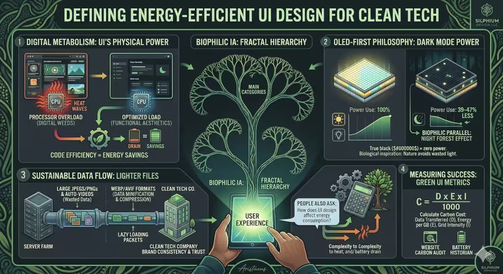
You might be asking, what is energy-efficient UI design? Simply put, it is a way of building digital tools that use as little power as possible. When you use a phone or a laptop, the screen and the brain of the device (the CPU and/or GPU) use electricity. If a website is heavy with big files or messy code, the device has to work harder. This drains the battery and uses more power from the wall.
For a Clean Tech company, having a green UI design is a way to show they mean what they say. If you sell solar panels but your website uses a lot of energy, people might not trust you. A good UI design helps the hardware stay cool and live longer. It makes the experience better for the user because things happen fast.
A common question is: What is energy-efficient UI design? It is the practice of making choices that lower the load on the device. This includes things like picking the right colors, using smaller images, and writing clean code. It is about making sure that the data moving from the server to your screen is as light as possible. When we talk about UI design in this way, we are looking at the whole life of the digital product.
The OLED-First Philosophy: Harnessing Dark Mode
One of the best ways to save energy is to think about the screen itself. Most new phones and laptops use OLED screens. These screens are different from the old LCD screens. On an old screen, there was a big light in the back that stayed on all the time. But on an OLED screen, every single pixel is like a tiny light bulb that can turn itself off.
When you use a UI design that has a lot of black, the screen actually turns off those pixels. This means they use zero power. This is very important for Clean Tech. If you use a true black color, you can save nearly half of the battery power on some devices. This is why dark mode is so popular now. It is not just because it looks cool. It is because it is better for the battery.
In biophilic design, we can think of this as the “Night Forest” style. In a real forest at night, there is not much bright light. It is calm and dark. This is easy on our eyes and easy on the planet. When we use this kind of UI design, we help people who might have eye strain. We also help the device stay charged for a longer time. Using deep grays and charcoal colors can make a site feel premium while still being very green.
Quantitative studies show that switching from a light theme to a dark theme can save between 39% and 47% of power. That is a huge deal! If everyone used a dark UI design for their apps, we could save a massive amount of electricity every year. It is one of the easiest changes a designer can make to have a big impact.
Digital Minimalism and Eco-Brutalism
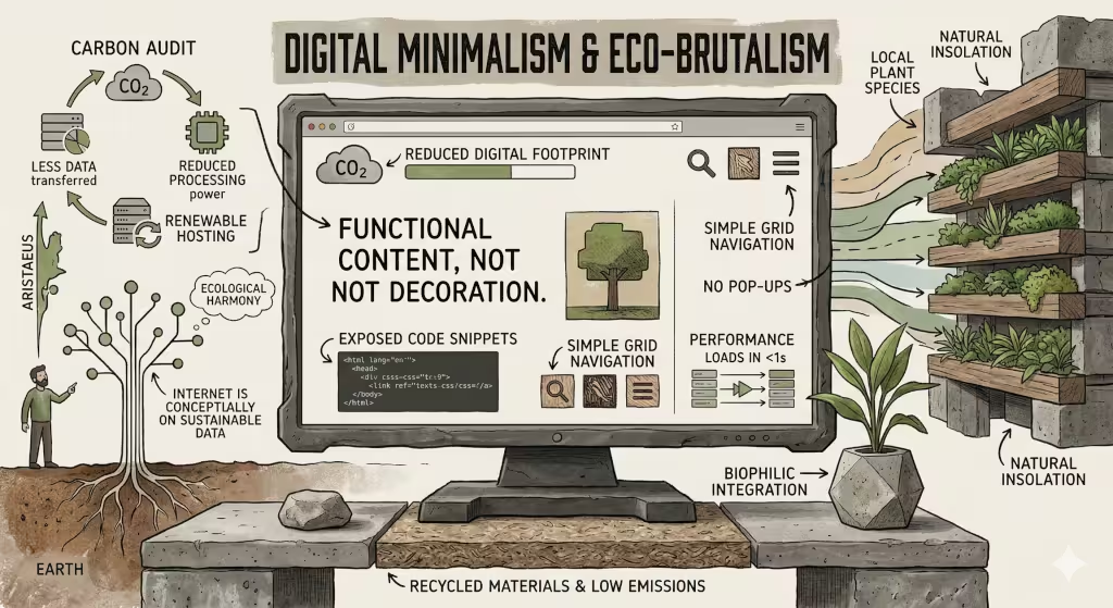
There is an old saying that “less is more.” In the world of UI design, this is a law. Every extra thing you put on a screen costs energy. If you have a big video that plays by itself, that is a “digital weed.” It takes up space and eats resources that could be used for other things. We need to practice digital minimalism.
Minimalism in UI design means only keeping what is needed. If a button does not help the user reach their goal, take it out. If a decorative line is just there to look pretty but adds weight to the file, delete it. This makes the site load faster. It also makes it easier for people to find what they are looking for.
Some designers are now using a style called “Eco-Brutalism.” This style uses very simple parts. It often uses the fonts that are already on your computer, like Arial or Roboto. This is smart because the website does not have to download a special font from a server. This saves data and energy. It gives the UI design a raw and honest look.
We should also look at our images. Many websites use huge photos that are much bigger than they need to be. By using modern formats like WebP or AVIF, we can make images look great but weigh very little. A small change in how you save a photo can make a UI design much more efficient. It is like packing a suitcase for a trip, the lighter it is, the easier it is to carry.
Biophilic Patterns for Information Architecture
Nature is the best teacher for organizing things. Think about how a tree grows. It has a trunk, then branches, then smaller twigs, and finally leaves. This is a “fractal hierarchy.” In UI design, we can use this same pattern. We want to organize our information so it is easy to find, like following a branch to a leaf.
When a user has to click many times to find what they want, they are wasting energy. Each click sends a request to a server. Each request uses electricity. A good UI design makes the path short and clear. This is not just good for the user; it is good for the environment. We want to reduce “click-depth” so that the device does not have to work as hard for as long.
We can also use “biomorphic interactions.” These are movements on the screen that feel like nature. Think of how a leaf falls or how water ripples. These movements should be made using simple code that the computer hardware can handle easily. We should avoid heavy libraries that make the computer’s fan spin fast. A smooth and natural UI design feels better to the human brain and uses less power.
Another common question is: How does UI design affect energy consumption? The answer is simple. Every part of the interface, from the colors to the way the menus move, requires the processor to do work. The more complex the UI design, the more heat the processor makes. By keeping things simple and natural, we keep the device cool and the energy use low.
Sustainable Technical Implementation
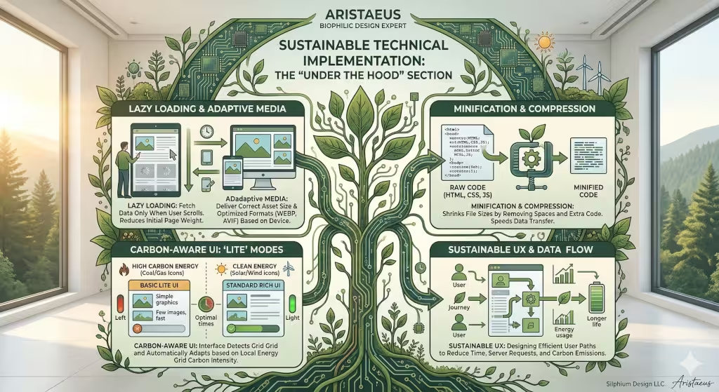
Building a green website is not just about how it looks. It is about how it is built. As someone who works in web design, I care a lot about the code behind the UI design. We want to make sure the “engine” of the site is efficient. One way to do this is called “lazy loading.”
Lazy loading means the website only downloads an image when you scroll down to see it. If you never go to the bottom of the page, the site never uses the energy to get those images. This is a very smart way to handle a UI design. It saves a lot of data for people on mobile phones.
Another trick is “minification.” This is when we take all the code and squeeze it down. We remove all the extra spaces and notes that humans need, but computers do not. This makes the files smaller and faster to send over the internet. A lighter file means a faster UI design and less carbon.
We can also build what we call “Carbon-Aware UI.” Imagine a website that changes its look based on how much clean energy is being made at that moment. If the sun is shining and there is lots of solar power, the site might show more colors. If it is a cloudy day and the grid is using coal, the site could switch to a “lite” mode with fewer images. This teaches the user about energy while saving it at the same time.
User Psychology and Cognitive Load
When a website is messy, it makes our brains work harder. We call this “cognitive load.” Just like a computer uses more power when it has to think, a human uses more mental energy when a UI design is confusing. If a user is stressed or lost, they will spend more time on the site, which uses more device power.
A good UI design should be “calm.” It should guide the user gently to where they need to go. In biophilic design, we talk about the “prospect and refuge” feeling. This means having a clear view of where you can go (prospect) and feeling safe where you are (refuge). We can do this in UI design by using clear headings and lots of white space (or dark space in dark mode).
When we make the user’s journey fast and easy, we are being green. The faster a person finds what they need, the sooner they can put their phone away. This saves the battery on their device and the power at the data center. A clean tech company should want their UI design to be a breath of fresh air. It should feel as natural as a walk in the park.
Users also tend to trust companies more when their website works well. In the clean energy world, trust is everything. If your UI design is fast and doesn’t drain their battery, they will feel that your company is competent. They will see that you care about every detail, including the energy used by your pixels.
Measuring Success: Metrics for Green UI
How do we know if our UI design is actually green? We cannot just guess. We need to measure it. There are tools we can use to see how much carbon a website makes. One is the Website Carbon Calculator. It looks at how much data a page sends and where the server gets its power.
We should also look at “Battery Historian.” This is a technical tool that shows exactly how much battery an app uses. It can tell us if a certain part of our UI design is eating too much power. For example, we might find that a specific animation is making the GPU work too hard. Then we can fix it to make it more efficient.
There is even a math formula we can use to find the carbon cost of our UI design. We look at the data moved, the energy per gigabyte, and how dirty the power grid is. It looks like this:
C = (D X E X I) / 1000
In this formula, C is the carbon, D is the data, E is the energy, and I is the intensity of the grid. By using this, we can give a real number to our green efforts. It turns UI design into a science. We can set goals to lower this number every year.
Case Studies in Clean Tech UI
Let’s look at some real examples. Imagine a company that makes software for solar panels. They wanted a new UI design that felt natural. Instead of using high-resolution photos of the sun, they used “dithered” images. These are images that use dots to create a picture. They look like old-school art and use very little data.
This UI design was a big hit. It loaded in less than a second on most phones. Because it used a dark background and orange dots, it saved a lot of battery on OLED screens. The users felt like they were using a tool that was part of the solar ecosystem. It was a perfect match for a clean tech brand.
Another example is an electric car charging app. They used “Glassmorphism” for their UI design. This is a style that looks like frosted glass. Usually, this takes a lot of computer power to blur the background. But they used a special new way to do it that was built into the device’s hardware. This gave them a modern look without the heavy energy cost.
These examples show that you do not have to give up style to be sustainable. You just have to be smart about how you use your UI design. By picking the right tools and styles, you can create something beautiful that also respects the Earth.
Designing for the 2026 Landscape
As we move into 2026, the way we think about the internet is changing. We can no longer act like energy is unlimited. The world is getting hotter, and we all have to do our part. This includes those of us who work in UI design. We have a big responsibility to build a digital world that can last.
Biophilic design is not just a trend. It is a way to bring balance back to our lives. When we use energy-efficient patterns in our UI design, we are following the wisdom of nature. We are creating tools that are helpful, beautiful, and kind to the planet. For clean tech companies, this is the only way forward.
In the future, every website will have a carbon score. People will choose apps based on how much they drain the battery. We need to start preparing for that world now. We need to make sure our UI design is as efficient as possible. We need to remember that every pixel counts.
Building a green UI design is a journey. It starts with one small change—maybe a darker color or a smaller image. But those small changes add up. Together, we can create a web that is as green as the world around us. Let’s make sure our digital metabolism is healthy and sustainable for generations to come.