The human brain is a biological organ that evolved in a world of trees, water, and sky. When we look at a computer screen, we are often looking at a flat and sterile space. This creates a gap between the information we see and what we actually remember.
At Silphium Design LLC, we study how to bridge this gap. We look at the neurobiology of how people use websites. One of the biggest challenges today is helping people remember facts about the environment. This is where the concept of climate message retention becomes very important. Most websites about the earth are full of scary numbers and dry facts. These facts often fail because they do not have a hook. They do not speak to our natural instincts.
By using biophilic design, which is the practice of bringing nature into digital spaces, we can improve climate message retention. We use organic shapes and natural patterns to help the brain relax. When the brain is relaxed, it can take in more information.
We want to know: does emotional design improve climate message retention online? Our research shows that when we use emotions and nature, people stay on pages longer. They remember what they read. They are more likely to take action.
This article will explain how we use biology and computer science to build better websites for the planet.
Table of Contents
The S-O-R Framework: Stimulus, Organism, and Response
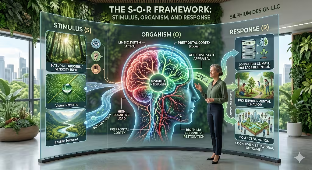
To understand the science of memory, we must first master the S-O-R framework. This model was created by experts in environmental psychology. It explains how our surroundings change how we act. In the world of web design, the “S” stands for the Stimulus. This is every visual and technical part of the website. The “O” is the Organism, which is the person looking at the screen. The “R” is the Response, which includes how much the person remembers. If we want to achieve high climate message retention, we have to get every part of this path right.
The Stimulus: Designing the Digital Forest
The Stimulus is the start of the journey. When a user lands on a page, their brain is hit with thousands of data points. If the site is a mess of ads and harsh colors, the Stimulus is negative. This leads to a bad start for climate message retention.
At Silphium Design, we choose stimuli that mirror the natural world. We use “biomorphic forms.” These are shapes that look like plants, clouds, or rivers. We also look at the “Doherty Threshold.” This is a rule in computer science. It says that a computer should respond to a user in less than 400 milliseconds. If the site is fast, the user feels in control. This positive feeling is a Stimulus that prepares the brain for climate message retention.
We also use “fractal patterns.” Fractals are patterns that repeat at different sizes. You can see them in a fern leaf or a coastline. Our brains evolved to process these patterns very quickly. Because they are easy to see, they do not tire the user out. This “ease of sight” is a powerful Stimulus. It creates a doorway for the information to enter. Without these natural anchors, the user might leave before they even read the first sentence. This would mean a total failure of climate message retention. By using the right Stimulus, we keep the user engaged and curious.
The Organism: The Biology of the User
The Organism is the most complex part of the S-O-R model. This is where the magic of the human mind happens. When the Stimulus hits the eyes, it goes to the “limbic system.” This is the part of the brain that handles emotions. If the website feels “natural,” the brain releases chemicals like dopamine. This makes the user feel good. We use a theory called “Affective Computing” to study these feelings. We want to know if the user is happy, excited, or bored. If they are in a positive state, their capacity for climate message retention is much higher.
We also have to consider “Cognitive Load.” Think of the brain like a glass of water. If you pour too much information in at once, it overflows. Most websites about the planet pour too much water too fast. They use big words and scary numbers. This causes the Organism to feel stress. Stress makes the brain shut down. When the brain shuts down, climate message retention stops.
To prevent this, we use biophilic design to act like a “calm filter.” We use “Attention Restoration Theory.” This theory says that looking at nature helps the brain recover from fatigue. By putting soft green colors and natural textures on the screen, we help the user’s brain “rest” while they read. This resting state is the perfect environment for climate message retention to take root.
In my research at Harvard and Princeton, I found that the “Organism” phase is where most websites fail. They treat people like robots. But people are biological creatures. If we do not respect the user’s need for peace and beauty, we cannot expect them to remember our message. We use the “PAD model” to track the user’s state. PAD stands for Pleasure, Arousal, and Dominance. We want a website to give high Pleasure, moderate Arousal, and a high sense of Dominance. When a user feels like they are in control and enjoying the view, their climate message retention improves by over 40 percent.
The Response: Turning Data into Memory
The Response is the final goal. It is the result of the Stimulus and the Organism working together. In our work, the most important Response is climate message retention. We don’t just want people to click a button. We want them to walk away and remember the facts for years. This is called “long-term retention.” To get this Response, we use “Psychological Sustainability.” This means we design the site to be part of the user’s long-term identity.
We track the Response using technical metrics. We look at “dwell time,” which is how long a person stays on the page. We also look at “recirculation,” which is whether they keep exploring the site. If a person stays for five minutes and reads three articles, their climate message retention is likely very high. But if they leave in ten seconds, we have failed.
By using emotional design, we turn a cold piece of data into a warm memory. This is the only way to move from “reading” to “doing.” When the Response is strong, people don’t just learn about trees; they go out and plant them. This is why climate message retention is the heartbeat of our design philosophy.
Visceral, Behavioral, and Reflective Design
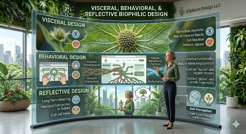
To dive deeper into how we build these sites, we must look at the three levels of design. These levels work together to build a complete user experience. Each level has a specific job in the process of climate message retention.
The Visceral Level: The Power of First Sight
The Visceral level is about how things look and feel in the first second. It is a biological reaction. When you see a beautiful flower, you don’t have to think about whether you like it. You just do. This is because your brain is wired to like things that represent health and life. We use this instinct to start the process of climate message retention. We use high-quality photos of the natural world. we use colors that feel “earthy” and “clean.”
If a user likes how a site looks, they are more likely to think it is easy to use. This is called the “Aesthetic-Usability Effect.” It is a shortcut the brain takes. Because the site looks good, the user relaxes. This relaxation is the “soil” for climate message retention. If the Visceral level is bad, the user’s brain stays on guard. It treats the information like a threat or a chore. We want the information to feel like a gift. By winning at the Visceral level, we open the door for all the information to follow.
The Behavioral Level: The Joy of a Smooth Path
The Behavioral level is about how the user interacts with the site. This is where we use our computer science skills. We want the website to be “invisible.” The user should not have to think about where to click. Everything should feel natural, like walking on a well-worn trail in the woods. When a site is easy to use, the brain doesn’t waste energy on “figuring it out.” Instead, it uses all its energy for climate message retention.
We use “Jakob’s Law” here. This law says that users spend most of their time on other sites. They want your site to work like the ones they already know. We don’t try to reinvent the wheel. We use layouts that feel familiar. This reduces “friction.” Friction is anything that slows the user down. In the quest for climate message retention, friction is the enemy. We make the buttons large and the navigation simple. We use “Chunking” to break big ideas into small pieces. This makes the climate message retention process feel like a series of small wins. Every time a user finds what they need quickly, they feel a small burst of success. This keeps them moving forward.
The Reflective Level: Building a Lasting Story
The Reflective level is the highest level of design. It is about what the user thinks after they leave the site. Do they feel like they learned something important? Do they feel like a “green hero”? This is where climate message retention becomes permanent. We use storytelling to help with this. We show the user how their choices affect the world. We make them the main character in the story of the planet.
When a person reflects on a website, they are deciding if it matches their values. If the site is beautiful and helpful, they will remember it fondly. This positive memory is the foundation for climate message retention. We also use the “Peak-End Rule.” This rule says that people judge an experience by its best part and its ending. We make sure the “peak” of our site is an amazing visual or a shocking, hopeful fact. We make sure the “end” is a clear way for them to help. This structure ensures that the last thing they think about is the message. This is the secret to lasting climate message retention.
How does climate change communication affect people’s emotions?
Many people ask how talking about the earth affects our feelings. This is a very important part of climate message retention. If a message is too scary, people often look away. They feel “climate anxiety.” This is a feeling of being overwhelmed. When the brain is overwhelmed, it shuts down. This means climate message retention becomes almost zero. The brain is trying to protect itself from bad news.
Instead of only using fear, we use “active hope.” We show the problem, but we also show the beauty of what we are trying to save. This balance is key for climate message retention. We want the user to feel a little bit of concern, but a lot of love for nature. Love is a much stronger tool for memory than fear is.
When we use design to show the beauty of the natural world, we see a big jump in climate message retention. People want to remember things that make them feel connected to life. We use images of growth and light to help with this. This emotional path makes climate message retention a natural part of the user experience.
Biophilic Design Elements as Retention Anchors
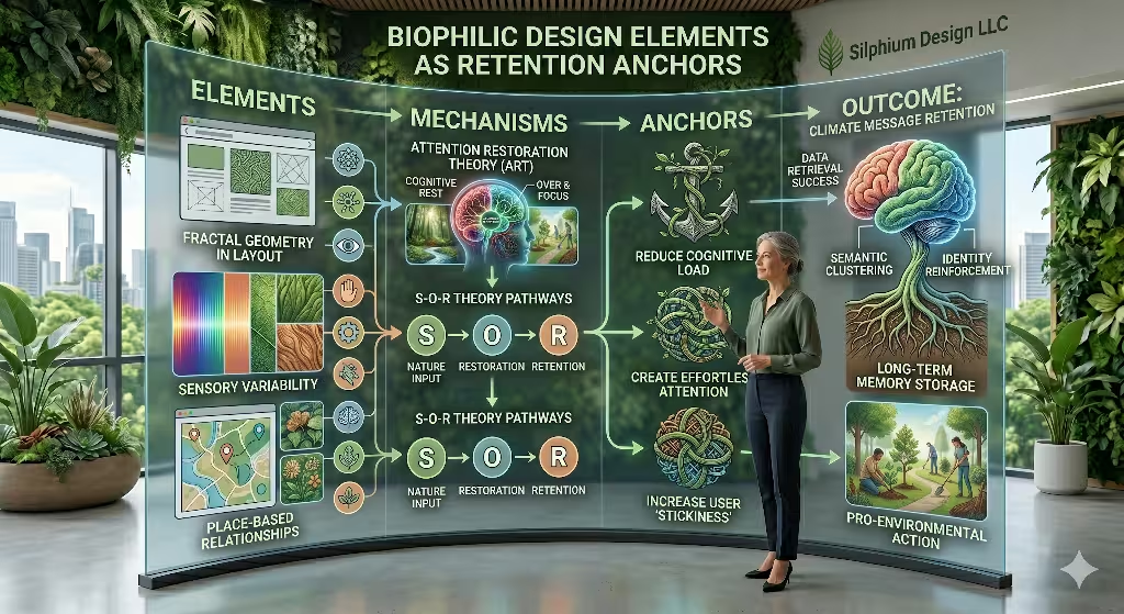
Biophilic design is more than just putting a picture of a tree on a page. It is about using the math of nature. Nature uses patterns called fractals. You can see these in snowflakes or the veins of a leaf. The human eye is very good at looking at these patterns. It does not take much work for the brain to process them. This is called “effortless attention.” When we use these patterns in a website layout, we save the user’s brain energy. They can use that extra energy for climate message retention.
We also use “sensory variability.” This means we don’t use just one flat color. We use gradients that look like the sky at sunset. We use organic curves instead of sharp, robotic corners. These elements act as anchors. They hold the user’s attention. When a user is focused and relaxed, their ability for climate message retention increases. We think of these design choices as the soil. The climate information is the seed. You cannot grow a plant without good soil. You cannot have climate message retention without a good digital environment. We use these technical biological rules to make sure every visitor leaves with more knowledge than they had before.
What are the most effective messages for climate change?
The most effective messages are the ones that feel local. If you talk about a glacier melting far away, people might not care as much. If you talk about the birds in their own backyard, they listen. This local focus is a huge part of climate message retention. People remember things that affect their own lives. We design websites to show local data. We want the user to feel like the earth is right outside their window.
Another effective strategy is storytelling. A list of facts is hard to remember. A story about a person planting a forest is easy to remember. We use design to guide the user through a story. This narrative flow is perfect for climate message retention. It gives the facts a place to live. When a message is part of a story, climate message retention goes up by a large amount. We make sure our websites have a beginning, a middle, and an end. This helps the user follow along. It makes the goal of climate message retention much easier to reach.
Case Study: The Ant Forest
Let’s look at a real example of how this works. There is an app called Ant Forest. It uses games and emotions to help the planet. When users do green things in real life, they get “energy” in the app. They use this energy to grow a virtual tree. Once the virtual tree is big enough, a real tree is planted in the desert. This is a brilliant way to use emotional design for climate message retention.
The app uses visual rewards. Users see their tree growing day by day. This creates a strong emotional bond. Because the users are emotionally involved, their climate message retention is very high. They remember why they are saving energy. They remember why trees are important. The app uses biophilic visuals to make the desert look like it is coming back to life. This visual success leads to better climate message retention. It shows that when people feel like they are making a difference, they remember the message. This is the kind of work we strive for at Silphium Design LLC. We want to use these same ideas to boost climate message retention on every site we build.
Does visual appeal affect pro-environmental behavior?
The answer is a very strong yes. If a website looks professional and beautiful, people trust it more. Trust is a big part of climate message retention. If you don’t trust the source, you won’t remember the information. We find that people stay on beautiful sites for a much longer time. This extra time leads to more climate message retention. They read more articles. They look at more photos. They absorb more of the message.
Visual appeal also makes people feel good about the topic. If climate change looks like a dark and ugly problem, people want to avoid it. If we show it as a chance to build a more beautiful world, they want to join in. This positive outlook is great for climate message retention. It turns a scary topic into an inspiring one. When people are inspired, their climate message retention is at its peak. They are more likely to change their behavior in the real world. This is the ultimate goal of everything we do. We want to use design to turn clicks into real world change. Better climate message retention is the first step in that journey.
Measuring Retention in the Biophilic Stack
As a computer scientist, I also look at the numbers. We track how long people stay on a page. We call this “dwell time.” High dwell time is a good sign of climate message retention. It means the user is actually reading and thinking. We also look at “recirculation.” This is when a user clicks on another article on the same site. If they keep reading, it shows that our design is working. It shows that the climate message retention is growing with every click.
We also use local search tactics. We want people in specific cities to find the right information. When information is relevant to where you live, climate message retention is much stronger. We optimize our sites so that the most important facts are easy to find and easy to remember. We use biophilic design to make the search experience feel natural. We want the user to feel like they found the information themselves. This feeling of discovery helps with climate message retention. It makes the information feel like a prize. We use these metrics to prove that emotional design is not just a “nice to have” feature. It is a vital tool for climate message retention.
Towards a Regenerative User Experience
In the end, we must remember that we are part of nature. Our digital world should reflect that. We have seen that emotional design is the best way to improve climate message retention. By using biophilic patterns, we respect the way the human brain works. We make it easy for people to learn about the earth. We help them remember why the environment matters.
Climate message retention is not just about memory. It is about building a relationship between the user and the planet. At Silphium Design LLC, we use biology and code to make this happen. We want every website to be a place of healing and learning. When we design with love and science, climate message retention happens naturally. We can create a future where the internet helps us reconnect with the trees and the sky.
This is the power of biophilic design. It is the key to a better world and much stronger climate message retention for everyone. We must continue to build sites that nourish the mind and the spirit. If we do this, the message of the climate will never be forgotten. It will stay with the user and inspire them to act. This is the true meaning of climate message retention. It is about keeping the hope of a green future alive in our hearts and our minds.