Architecture and web design are not static things. They are not just bricks, mortar, or lines of code. They are “frozen music.” They are living stories. When we walk into a room or click on a website, we are entering a narrative. If that environment is silent, it fails. A space without a story is a space without a soul.
We see a problem in the modern world. Many people focus on minimalism. They strip away colors, textures, and details until there is nothing left. This leaves us with sterile boxes. We see this in office buildings that look like hospitals. We see it in websites that look like generic templates. These environments do not hold our attention. They do not make us feel anything. When we are designing spaces like this, we are failing the human need for connection.
The solution is something called Narrative Design. This is the strategic use of layout, senses, and nature to guide a person through a journey. It works for a physical building. It works for a digital website. The goal is the same. We must guide the user from the start of the journey to the end.
My thesis is simple. Designing spaces that tell stories requires two things. First, we need ancient evolutionary cues. This is biophilia, or our love of nature. Second, we need futuristic technology. This includes digital screens and smart lights. When we mix these, we create deep emotions. We create places that matter.
Table of Contents
The Narrative Arc in Spatial Design
To understand how to build a space, we must look at how to write a story. There is a famous concept called the “Hero’s Journey.” It was made popular by a man named Joseph Campbell. He studied myths from all over the world. He found that all great stories have the same structure. A hero leaves home, faces a challenge, wins a victory, and returns changed.
When we are designing spaces, the person using the space is the hero. The architect or the designer is the author. We must build the stage for their journey.
The Call to Adventure: The Entrance and Homepage
Every story starts with a hook. In a movie, this is the moment the hero decides to leave home. In architecture, this is the entrance.
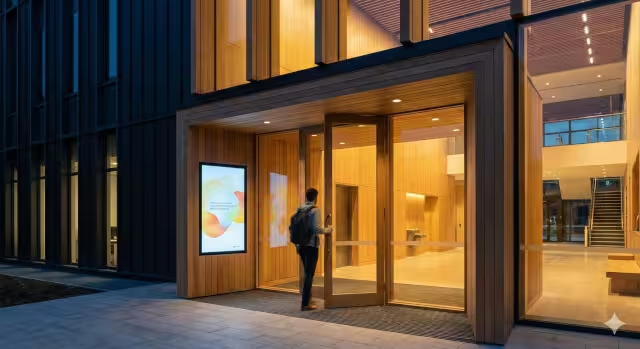
When designing spaces for physical buildings, the entrance is critical. We call this the “transition zone.” Frank Lloyd Wright was a master of designing spaces around the entrance. It is the space between the loud, busy street and the calm interior. Imagine walking into a spa. You do not just walk through a door into a massage room. You walk into a foyer. The ceiling might be lower. The light might be dimmer. The sound of the traffic fades away. This is a design trick called “compression.” It squeezes your senses slightly. It signals to your brain that you are entering a new world. You are leaving your old worries behind.
This works the same way on the internet. When designing spaces on the web, the “Call to Adventure” is what we call “above the fold.” This is the first thing you see before you scroll down. It must be a hook. It must tell you exactly where you are. If a website is cluttered or confusing, the hero leaves. They click the back button. We must use a clear image and a strong headline. This is the digital handshake. It invites the user to start the journey.
The Journey: Circulation and User Flow
Once the hero enters the world, they must travel through it. In a story, this is the plot. In architecture, this is circulation. It is how people move through the space.
When designing spaces effectively, we do not want people to be confused. But we also do not want them to be bored. We use a biophilic concept called “Mystery.” This does not mean being scary. It means partially hiding the view. Imagine a hallway that curves slightly. You cannot see the end of it. You want to know what is around the corner. This pulls you forward. It makes you curious. A straight hallway is boring. A curved hallway tells a story. It suggests that there is something more to discover.
On a website, the circulation is the User Experience, or UX. When designing spaces online, we must anticipate what the user needs. We do not force them. We guide them. We use visual hierarchy. This means making important things big and unimportant things small. We use buttons that look clickable. We create a path that feels natural. If the user has to stop and think about where to click, the story is broken. The flow should feel like a river. It should carry the user along without effort.
The Climax and Resolution: The Destination
Every story has an ending. The hero defeats the dragon. The couple gets married. In design, this is the destination.
When designing spaces in a home, this might be the hearth or fireplace. It is where the family gathers. In an office, it might be the big conference table or the view from the corner office. This is where the transformation happens. It is the point of the journey. The lighting here should be perfect. The materials should be high quality. This is the reward for the journey.
In digital design, the climax is the conversion. This is when the user buys the product or signs up for the newsletter. When designing spaces for the web, this moment must be seamless. There should be no friction. It should feel like a victory. When the user clicks “submit,” they should feel good. A simple animation, like a checkmark or a “thank you” message, serves as the resolution. It tells the user the story is over and they succeeded.
Biophilia: The Universal Language of Storytelling
You might ask why nature matters in storytelling. It matters because nature is the oldest story we know. Human beings evolved in nature for millions of years. We have only lived in concrete cities for a very short time. Our brains are hardwired to understand nature.
When we are designing spaces that use biophilic elements, we are speaking a universal language. We do not need to explain it. People just feel it. Biophilia is the tool we use to make the story feel real.
Visual Connection to Nature
The most obvious way to do this is with sight. We need to see nature. This means windows. But it is not just about letting in light. It is about “Prospect.”
Prospect is a pattern of biophilic design. It means having a long view over a distance. Think of early humans on the African savanna. They liked to be up high on a hill. They could see animals or danger coming from far away. It made them feel safe and powerful.
When designing spaces today, we use this same logic. A room with a view makes us feel good. It connects us to the time of day. We see the sun move. We see the weather change. This grounds the user in time. It connects the indoor story to the outdoor reality.
Non-Visual Connection: Sound and Touch
Stories are not just for the eyes. They are for the ears and hands too. A good storyteller uses a scary voice or a soft voice to set the mood. A designer does the same thing.
Soundscapes are vital. In many modern offices, it is too quiet or too loud. Both are bad. When designing spaces for focus, we can use water features. The sound of running water is called “white noise.” It masks the sound of talking. But it is also relaxing. It lowers our heart rate. It tells our ancient brain that there is clean water nearby. This is a survival signal. It makes us feel calm.
Touch is also a story. This is called haptics. When you touch a plastic table, it feels cold and dead. It has no history. When you touch a solid wood table, you feel the grain. You feel the age of the tree. When designing spaces with natural materials like stone, wood, and wool, we add “age” to the room. We add a backstory. The user can feel that this material came from the earth. It creates a sense of permanence.
The Pattern of Refuge
Every hero needs a place to rest. In biophilic design, we call this “Refuge.”
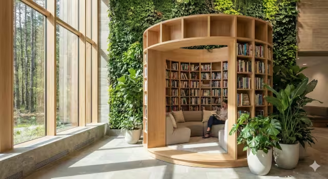
Refuge is a small, protected space. It has a cover overhead and protection at the back. Think of a high-backed reading chair in a library. Think of a booth in a restaurant. People love booths. They feel safe. They can see out, but nobody can sneak up behind them.
This is very important for neurodiversity. Some people get overwhelmed by open spaces and bright lights. When designing spaces that are inclusive, we must provide refuge. We must create nooks and crannies where people can retreat. These are the quiet chapters in the story. They allow the user to pause and breathe before continuing the journey.
The Phygital Frontier: Blending Real and Virtual Narratives
We are living in the year 2025. The line between the physical world and the digital world is blurring. We call this “Phygital.” This is a mix of physical and digital.
When designing spaces in the modern era, we cannot ignore technology. But we must not let technology take over. It must serve the story.
Augmented Reality Layers
Augmented Reality, or AR, is a powerful tool. It allows us to put digital information on top of the real world. Imagine you are in a historic hotel. You point your phone at a brick wall. On your screen, you see a video of what that wall looked like 100 years ago. You see the “ghosts” of the past.
This adds a deep layer of storytelling. It turns a static building into a living museum. When designing spaces for retail stores, AR can show you how a product was made. You can scan a pair of jeans and see the cotton field where they grew. This builds trust. It tells the story of the product’s journey.
The Website as the Digital Twin
Your website is not just a brochure. It is a digital building. We often talk about a “Digital Twin.” This usually means a 3D model of a building. But in storytelling, it means the website should feel like the building.
If you are designing spaces for a luxury spa, the physical space is quiet, slow, and soft. The website for that spa should be the same. It should not have flashing lights or loud pop-ups. It should use slow-motion video. It should use soft colors. It should play calming sounds.
When the user moves from the website to the physical building, it should feel like one continuous story. The transition should be seamless. If the website feels cheap and fast, but the building is expensive and slow, the story is broken. The user will be confused. Consistency is key when designing spaces across different platforms.
Technical Execution: How to Build the Narrative
Now we must look at the technical details. How do we actually build these stories? It requires specific tools and techniques for both architects and web designers.
Materiality as Memory for Architects
For the physical builder, materials are the words. We must choose them carefully. We should use local materials. This is called Genius Loci, or the “Spirit of Place.“
If you are building in Vermont, you should use Vermont granite and maple wood. These materials belong there. They hold the memory of the landscape. If you bring in plastic from a factory far away, it has no connection to the place. It feels alien.
When designing spaces that tell stories, we look for materials that age well. Copper turns green over time. Wood gets darker. Leather gets softer. These changes show the passage of time. They show that the building is alive. A plastic wall never changes until it breaks. It has no story arc. Natural materials have a life cycle.
Lighting Design: The Mood Setter
Lighting is one of the most powerful tools for storytelling. It changes the mood instantly.
We must design for the “Golden Hour.” This is the time right before sunset. The light is warm and soft. It makes everyone look good. It signals to the body that the day is ending and rest is coming.
When designing spaces, we should use lighting controls that mimic the sun. In the morning, the light should be bright and blue-white. This wakes us up. It creates a story of energy and productivity. In the evening, the lights should dim and turn amber. This creates a story of intimacy and relaxation. If a restaurant has bright fluorescent lights at dinner, it kills the mood. It tells the wrong story. It feels like a cafeteria, not a dining experience.
Scroll-Telling for Web Designers
For the web designer, the scroll bar is the timeline. We have a technique called “Scrollytelling.”
This is when the website changes as you scroll down. Images might move or fade in. Text might appear. It gives the user control over the pace of the story. If they scroll fast, the story moves fast. If they stop, the story pauses.
This is much better than a video. A video forces you to watch at its speed. Scrollytelling is interactive. When designing spaces on a screen, we use parallax effects. This is where the background moves slower than the foreground. It creates a 3D feeling. It draws the user in. It makes the flat screen feel deep.
Micro-interactions: The Dialogue
On a website, small details matter. These are called micro-interactions.
When you hover your mouse over a button, does it change color? Does it grow slightly? This is the website talking back to you. It is saying, “Yes, I see you. I am ready.”
When designing spaces in code, these micro-interactions are like body language. If a person stands perfectly still and does not blink, it is creepy. If a website is perfectly static, it feels broken. Small movements make it feel alive. A loading bar that fills up is a promise. It says, “Wait one second, the next chapter is coming.”
Commonly Asked Questions about Designing Spaces
I often get asked questions about how this works in the real world. Here are some common ones regarding designing spaces.
Why do architects need to be storytellers?
Architects need to be storytellers because clients do not understand blueprints. They understand feelings. If an architect shows a drawing, the client sees lines. If the architect tells a story about how the morning light will hit the kitchen table while the family eats breakfast, the client sees a life. Storytelling sells the design. It translates the form into a feeling.
How can interior design tell a story about history?
You can tell a story by mixing the old and the new. This is called layering. You might put a modern computer on an antique desk. You might use a rug that has been in the family for years in a new house. When designing spaces, these layers show time. They show that the current owner is part of a long chain of history. It respects the past while living in the present.
What is the difference between decoration and narrative design?
Decoration is just making things look pretty. It is surface level. Narrative design is about meaning. It is about why things are there. A painting on the wall is decoration. A window placed to frame a specific tree that was planted by the owner’s grandfather is narrative. When designing spaces, we must go deeper than decoration.
Does biophilic design really work for technology companies?
Yes, absolutely. In fact, tech companies need it the most. Their workers spend all day staring at screens. This causes fatigue. When designing spaces for tech offices, we use plants and natural light to restore their attention. It helps them focus. It reminds them that they are biological beings, not machines.
Conclusion
We have covered a lot of ground. We have looked at the entrance as a call to adventure. We have looked at circulation as the journey. We have seen how nature serves as the universal language of our stories.
Whether you are placing a window in a wall or writing code for a landing page, you are a director. You are setting the scene. You are guiding the actor.
The world is filling up with AI-generated content. It is filling up with cheap, fast construction. In this world, authenticity is the ultimate luxury. Spaces that tell authentic, human stories will always be valuable. They are the places we want to be. They are the websites we want to visit.
When designing spaces, remember that you are not just building a shelter or a tool. You are building a memory. You are shaping how people feel, how they think, and how they connect.
So, look at your environment right now. Look at your office or your living room. Look at your company website. Does it have a clear beginning, middle, and end? Does it invite you in? Does it make you feel safe? Does it tell you who you are?
If not, it is time to start editing. It is time to start designing spaces that speak.