In the digital landscape, the architecture of a website serves as more than just a container for information. It is a spatial environment that affects the user’s nervous system. As a designer at Silphium Design LLC, I view the choice between custom shapes and standard shapes not merely as an aesthetic preference, but as a technical decision rooted in evolutionary biology and computer science. Most websites today are built on a rigid grid of squares and rectangles. While these standard shapes offer structural efficiency, they often fail to engage the human brain on a primal level. Human beings did not evolve in a world of perfect right angles.
We evolved in a world of curves, irregular edges, and organic flow. By incorporating custom shapes that mimic these natural forms, we can reduce the mental effort it takes for a person to process a page. This article will provide a technical comparison of these two approaches. We will look at how the brain handles visual data, why custom shapes are the key to brand survival in a saturated market, and how to implement these designs without slowing down your site speed.
Table of Contents
The Geometry of Human Connection
Why do our eyes jump toward a curved line in a sea of straight boxes? The answer lies in how our brains are built. In nature, sharp points and hard edges often mean danger, like a thorn or a jagged rock. Smooth, custom shapes usually signal something safe, like a river stone or a leaf. When you land on a website that is nothing but boxes, your brain sees it as a machine. It feels cold. When you use custom shapes, you are speaking a language the human heart understands.
We have two main players in this design game. First, we have standard shapes. These are the squares, circles, and rectangles you see everywhere. They are the bricks of the internet. They are easy to code and they fit together perfectly. Then, we have custom shapes. These are biomorphic, which is a fancy word for “shaped like life.” They might look like clouds, waves, or blobs. They don’t follow a straight grid.
My main argument is this: while standard shapes give a website its skeleton, custom shapes give it its soul. If you want a site that people just “use,” stick to boxes. If you want a site that people “feel” and remember, you need to use custom shapes.
Cognitive Load: The Fluency of Organic Forms
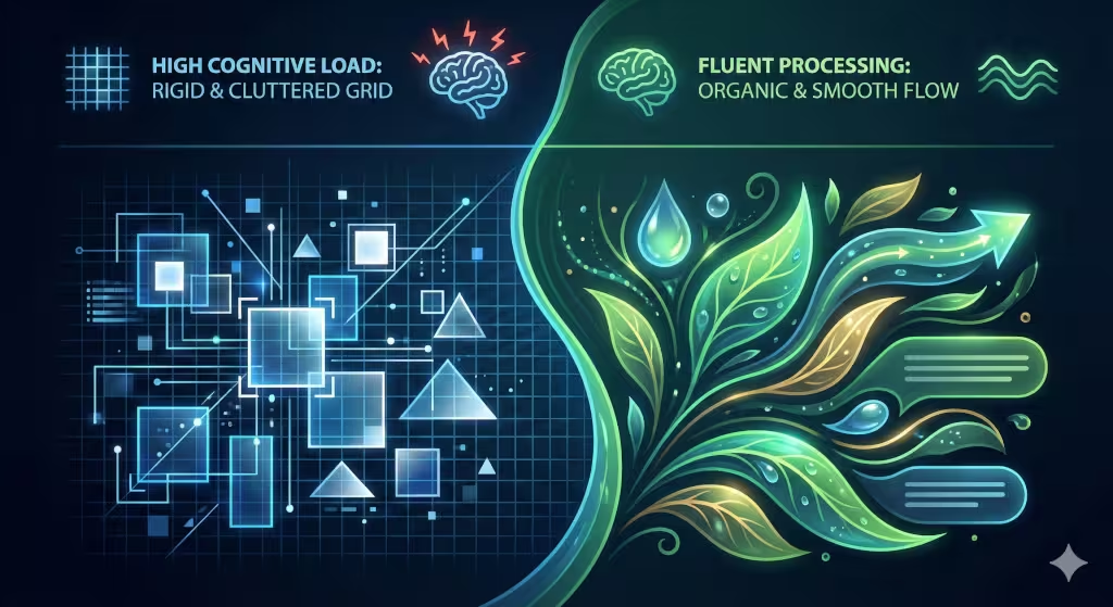
In computer science, we talk about processing power. Your brain has a limited amount of it. This is what we call cognitive load. When a design is hard to look at, it uses up more of your brain’s battery.
Standard shapes are very easy for the brain to categorize, but they can also be boring. If everything is a box, the brain starts to ignore things. We call this banner blindness. You stop seeing the important stuff because it all looks the same.
Custom shapes work differently. Because they are unique, they catch the eye. However, if they are designed correctly—using smooth curves—the brain actually processes them very quickly. This is called visual fluency. A smooth curve allows the eye to slide across the screen without stopping. A sharp corner acts like a tiny speed bump for your eyes. By using custom shapes with flowing edges, you help the reader move through your content faster and with less stress.
Psychological Archetypes: Stability vs. Growth
When we analyze the visual language of a website, we have to look past the colors and the fonts. We have to look at the “bones” of the design. In my work at Silphium Design LLC, I often explain to clients that every line you draw on a screen sends a silent message to the user’s subconscious. This is where the choice between standard shapes and custom shapes becomes a psychological tool.
If we want to understand how a user feels when they land on a page, we have to look at the archetypes of geometry. These are universal meanings that almost every human associates with certain forms.
The Standard Shape Archetype: The Fortress of Stability
Standard shapes like squares and rectangles are the most common elements on the internet. There is a technical reason for this: computer screens are made of pixels, which are tiny squares. It is very easy for a computer to render a box. However, from a psychological standpoint, these shapes represent stability, order, and formality.
When a user sees a perfectly aligned grid of rectangles, their brain recognizes a “man-made” environment. It feels like a city street or a filing cabinet. This creates a sense of security. If you are building a website for a bank, a law firm, or a data center, you want to use these shapes. They tell the user, “We are organized. We follow the rules. Your information is safe here.”
The downside is that too many standard shapes can feel cold or “boxed in.” If every single element is a square, the design lacks a pulse. It feels stationary. In biology, things that don’t move or change are often dead. That is why a site with only standard shapes can sometimes feel “soulless.”
The Custom Shape Archetype: The Spirit of Growth
Custom shapes—specifically those that are organic or “biomorphic”—tell a completely different story. These are the shapes of the natural world: the curve of a river, the irregular oval of a stone, or the silhouette of a leaf.
In psychology, these custom shapes represent movement, evolution, and creativity. Because these shapes do not have 90-degree corners, the eye does not “stop” at the edges. Instead, the eye flows around the shape. This creates a feeling of “becoming.” When a brand uses custom shapes, it signals to the user that they are innovative and alive.
For a startup, a creative agency, or a wellness brand, custom shapes are essential. They suggest that the company is not a rigid machine, but a growing organism that can adapt to the customer’s needs. These forms lower the user’s “fight or flight” response. While a sharp corner can feel like an obstacle, a custom curve feels like an invitation.
The Triangle: The Bridge of Tension
Triangles are technically standard shapes, but they behave like custom shapes because they have “points.” A triangle is an archetype of direction and power. It is a shape that works like an arrow.
If you take a standard triangle and soften its edges—turning it into a custom shape—you keep the “power” but remove the “threat.” This is a technique we use to create a “gentle push.” We can guide a user’s eyes toward a sign-up button using a custom shape that tapers off in that direction. It feels less like an order and more like a suggestion.
Finding the “Living” Balance
At Silphium Design LLC, we don’t suggest throwing away the boxes entirely. We need the stability of standard shapes to provide a foundation. Think of a garden: you have the wooden fence (the standard shapes) that provides the boundary, and then you have the winding paths and growing plants (the custom shapes) that provide the life.
By mixing these two, you create a website that feels both trustworthy and exciting. You give the user the “fortress” of a reliable layout, but you decorate it with the “growth” of organic forms. This balance is what keeps people on a page. It satisfies the part of the brain that wants order, but it also delights the part of the brain that craves nature.
When we use custom shapes to break out of a standard box, we are essentially telling the user that our ideas are too big to be contained. It is a powerful way to show, rather than tell, that your brand is a leader in its field.
Brand Differentiation: Breaking the Template
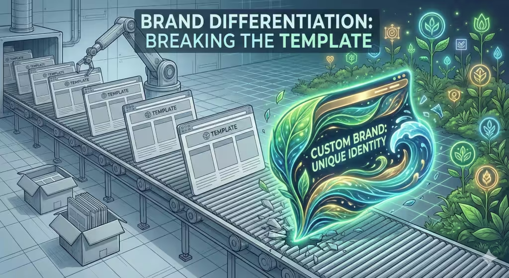
The internet is currently in a “boring” phase. Most designers use the same tools, which means most sites look like they were made by the same person. This is the commodity trap. If your website looks like everyone else’s, customers will treat your business like it’s just a commodity.
Using custom shapes is how you break out of that trap. Imagine a row of ten houses. Nine of them are plain gray boxes. The tenth house has a round door and a curved roof. Which one are you going to look at? Which one will you remember a week later?
By using custom shapes, you create a visual “thumbprint” for your brand. At Silphium Design LLC, we use these unique forms to make sure our clients don’t just blend in. We want the shapes on the screen to match the personality of the business.
Wayfinding and Directional Cues
How do you tell a user where to click? Most people just put a big red button. That is a standard shape doing a standard job.
But what if the entire background of the section was a custom shape that pointed like a finger toward the sign-up form? This is called wayfinding. Instead of using an arrow, you use the natural flow of the page.
Organic shapes can act like a river. In nature, water flows around obstacles and moves toward the lowest point. In web design, we can make the user’s eyes flow around the text and move toward the “Buy Now” button. This feels much more natural than being hit over the head with a flashing arrow. It makes the user feel like it was their idea to click, rather than feeling like they were pushed.
Technical Implementation: Performance & Scalability
Now, let’s talk about the technical side. As a computer scientist, I care about how fast a site loads. In the old days, making custom shapes was hard. You had to use big image files that made the site slow.
Today, we use SVGs. This stands for Scalable Vector Graphics. Instead of a heavy photo, an SVG is just a little bit of code that tells the browser how to draw the shape. This means you can have beautiful custom shapes that load instantly.
We also use something called CSS clip-path. This is a bit of code that allows us to take a standard square image and “clip” it into a custom shape. It’s like using a cookie cutter on dough. It keeps the site light and fast while making it look organic.
The risk here is clutter. If you use too many custom shapes, the computer has to work too hard to draw the page. You have to find a balance. Use standard shapes for the heavy lifting and custom shapes for the visual impact.
Accessibility and Inclusivity
Good design must work for everyone. This includes people who can’t see colors well or people using screen readers.
Standard shapes are great for accessibility because they are predictable. A square button is easy to recognize. However, custom shapes can actually help people with color-blindness. If you only use color to show that something is important, a color-blind person might miss it. If you use a unique custom shape, they can see the difference even without the color.
We must also think about “touch targets.” On a phone, your finger needs a certain amount of space to click a link. If your custom shape is too thin or weirdly angled, people might miss the button. We always make sure that even the most creative custom shapes have a solid “hit area” so the site remains easy to use for everyone.
Conversion Rate Optimization (CRO)
In the end, a website needs to do a job. It needs to sell a product or share a message. This is called conversion.
Standard shapes are great for “friction.” Sometimes you want a user to stop and think. But most of the time, you want to reduce friction. Rounded corners and organic custom shapes actually lower a person’s “defenses.”
Think about it: would you rather hug a cactus or a pillow? Sharp corners on a website act like a cactus. They make the user feel slightly on edge. Rounded and custom shapes feel like a pillow. They make the user feel comfortable. A comfortable user is much more likely to stay on the page longer and eventually buy what you are selling. This isn’t magic; it’s just biology.
The Biophilic Edge: Nature in the Machine
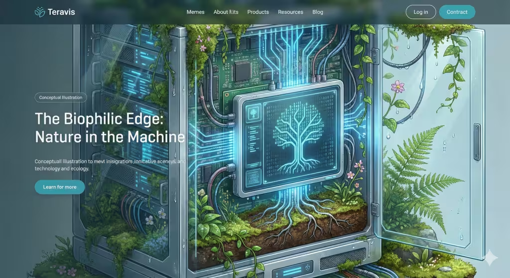
This is where my background in biology comes in. Biophilic design is the practice of bringing nature into our man-made spaces. We do this in buildings with plants and windows. In web design, we do it with custom shapes.
One tool we use is the Golden Ratio. This is a math formula (1:1.618) that appears everywhere in nature—from the spiral of a shell to the arrangement of seeds in a sunflower. When we build custom shapes using this ratio, they feel “right” to the human eye.
We also look at fractals. A fractal is a pattern that repeats at different sizes. Think of a tree branch that looks like a small version of the whole tree. When we use custom shapes that have these repeating patterns, it actually lowers the heart rate of the person looking at the screen. We are literally using the geometry of the forest to make the internet a calmer place.
Finding the Dynamic Balance
So, which is better? The answer is both.
If you build a site with only standard shapes, it will be functional but forgettable. It will feel like a spreadsheet. If you build a site with only custom shapes, it will be beautiful but confusing. It will feel like a piece of abstract art that no one knows how to use.
The best designers use a “dynamic balance.” Use standard shapes for the structure—the columns, the navigation bars, and the footers. Then, use custom shapes to break those lines. Use them to draw attention to your best content. Use them to make your brand feel human.
The future of the web is not more boxes. The future is adaptive design. Soon, we will have sites that change their custom shapes based on how you are feeling or what time of day it is. But for now, just remember that a little bit of nature goes a long way. By stepping away from the “square” thinking of the past, we can build a digital world that actually feels like home.
At Silphium Design LLC, we believe that every pixel should serve a purpose. Whether it is a simple square or a complex organic form, every choice matters. By understanding the science behind these forms, we create websites that don’t just sit there—they live, breathe, and grow with your audience.