Strategic Overview: The Living Letter
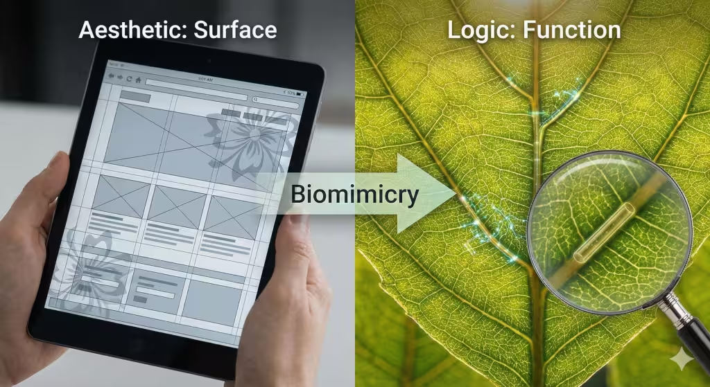
Most people think of nature and computers as two different things. They see trees outside and screens inside. But in my work, I see them as one. We use a science called biomimicry to make websites better. This science is all about looking at how nature solves problems and then using those same tricks for our own designs.
Think about a leaf. It has veins that carry water. Those veins are not just random lines. They are built to be as strong and fast as possible. Now think about the letters on your phone. Those letters should be just as smart. When we use the principles of biomimicry in typographic design, we stop just picking “pretty” fonts. Instead, we build letters that work like living things. They become easier to read, better for the environment, and much more natural for our eyes.
In this article, I will show you how we use nature’s secrets to change the way we use type. We will look at math, biology, and computer science. We will see how a simple font can act like a forest or a river. My goal is to help you see that the best designs are not just made by people. They are inspired by the billions of years of life that came before us.
Table of Contents
Beyond Aesthetics to Biological Logic
When we talk about biomimicry, we are not just talking about making things look like flowers. That is just decoration. True biomimicry is about logic. It is about the “why” behind the “what.” In the world of web design, most people use a grid. They use straight lines and hard boxes. This is okay, but it is not how our brains grew to see the world. Our brains grew up in forests and fields. We are used to curves, patterns that repeat, and flow.
Most modern websites feel cold. They feel like a machine made them. By using biomimicry, we can make a website feel like a home. We use biological strategies to solve human problems. For example, if a font is hard to read, we look at how light moves through water or how shadows fall on a rock. Nature has already solved the problem of “visibility” in every possible way.
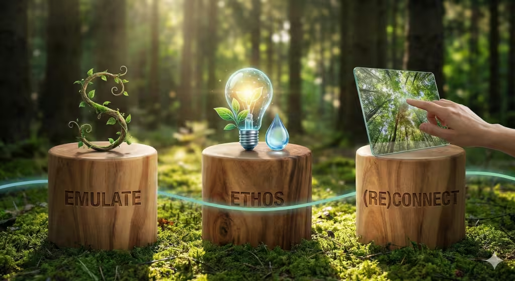
The three big parts of this are Emulate, Ethos, and (Re)Connect. To emulate means to copy nature’s forms. Ethos is the heart of the design, making sure it helps life instead of hurting it. (Re)Connect is about making the user feel like they are part of the natural world again, even when they are staring at a screen. When we bring these into typography, the results are amazing.
The Core Pillars of Biomimetic Typography
To really understand how biomimicry works in type, we have to look at the three pillars. These pillars hold up everything we do at Silphium Design LLC.
First is the Emulate pillar. This is where we look at the shape of things. Have you ever noticed how a vine curls? It is a very strong shape. It can hold a lot of weight but still move in the wind. When we design a letter “S” or “C,” we can use that same vine shape. This makes the letter feel alive. It also makes it easier for the eye to follow. This is the most common way people use biomimicry in art.
Second is the Ethos pillar. This is about being a good neighbor to the planet. Some fonts use a lot of “ink” or “pixels.” This takes more energy for a computer to show. If we use biomimicry, we design fonts that use the least amount of energy possible. We look at how a cell uses very little energy to do a lot of work. This is how we make “green” websites that are good for the earth.
Third is the (Re)Connect pillar. We want people to feel calm when they read a blog post. If the font is too sharp or messy, it makes people feel stressed. But if we use patterns found in nature, like the way branches grow on a tree, people feel more relaxed. Biomimicry helps us build a bridge between the digital world and the real world.
Principle 1: Organic Geometry and the Golden Ratio
Nature loves math. One of the most important numbers in biomimicry is the Golden Ratio. This number is about 1.618. You can find it in the spiral of a seashell and the way a sunflower grows. In design, we use this number to make sure things look “right.”
When we apply the Golden Ratio to typography, we call it organic geometry. We don’t just guess how big a headline should be. We use the Golden Ratio. If your main text is 12 px in size, we multiply it by 1.618 to find the best size for the title. This makes the page feel balanced. It is the same balance you feel when you look at a beautiful landscape.
We also look at hexagonal shapes. Bees use hexagons to build honeycombs because they are the most efficient shape for space. In web design, we can use this “honeycomb logic” to organize our text. This is a type of biomimicry that helps us fit more information on a screen without making it look crowded. It gives the design a structural integrity that feels strong and natural.
The human eye is trained by evolution to find these proportions. When a font follows the Golden Ratio, we can read it faster. We don’t get tired as easily. This is because our brains don’t have to work as hard to understand the shapes. It is a biological shortcut for better reading.
Principle 2: Branching Patterns and Information Hierarchy
In a forest, you have big trees, medium bushes, and small grass. This is a hierarchy. It tells you what is most important. Biomimicry teaches us to use this same system in our typography. We call this Dendritic Design. The word “dendritic” comes from the Greek word for “tree.”
Think about how a river starts as a small stream and grows into a big delta. Your information should flow the same way. The main headline is the big river. The subheadings are the branches. The small body text is like the leaves. By using this biomimicry approach, we guide the reader through the story. They don’t get lost because they are following a path that feels natural to them.
We also use something called Fractal Scaling. A fractal is a pattern that looks the same whether you look at it up close or far away. Think of a fern leaf. Each small part of the leaf looks like a mini version of the whole leaf. In typography, we can make our font families work like fractals. The way the “o” is shaped in the big headline should match the way the “o” is shaped in the tiny fine print. This creates a sense of harmony. It makes the whole website feel like one single, healthy organism.
Principle 3: Adaptive Resilience and Self-Organization
Nature is very good at changing when things get tough. If it gets cold, animals grow thicker fur. This is called resilience. In web design, we need our fonts to be just as smart. This is why we use variable fonts. A variable font is a single file that can change its weight, width, and style on the fly.
This is a high level form of biomimicry. Just like a plant turns toward the sun, a biomimetic font can change based on the user’s screen. If the screen is small, the letters might get a bit wider to be easier to read. If the room is dark, the font might get a little thicker. This is called self-organization. The design “knows” what to do to stay readable.
We also use something called the Voronoi Method. Imagine bubbles in a sink. Where they touch, they create lines. This pattern is found in dragonfly wings and dried mud. In typography, we use this logic to decide how much space to put between letters. We don’t just use a standard “kerning” number. We look at the “force field” around each letter. This type of biomimicry makes the text look like it grew into place, rather than being forced there.
Nature as Measure: Resource-Efficient Typography
One of the biggest lessons from biomimicry is that nature does not waste anything. Nature uses only the energy it needs. In the digital world, we often waste a lot of energy. A website with heavy, complex fonts takes more electricity to load and show. This might seem small, but with billions of people online, it adds up.
We are now seeing the rise of Eco-fonts. These are designs created using biomimicry to be as light as possible. Some fonts actually have tiny holes in the letters. When you print them, they use less ink. On a screen, we can design fonts that require fewer pixels to be turned on. This saves battery life on your phone. It is a way of “doing more with less,” which is a core rule of the natural world.
Janine Benyus, a famous leader in biomimicry, says we should use “life friendly chemistry.” In the digital world, this means using “life friendly code.” We want our typography to be clean and simple. By reducing the data size of our fonts, we make the internet faster and better for everyone. This is how we use nature as a measure for our success.
Technical Application: AI and Generative Biomimetic Fonts
As a web designer, I love using Artificial Intelligence (AI) to help with biomimicry. We can now write programs that act like evolution. We give the computer a “goal,” like making a letter that is easy to read at a distance. Then, we let the computer create thousands of different versions.
We use algorithms that mimic “natural selection.” The computer keeps the “strongest” fonts and lets the “weak” ones go. Over time, the font “evolves.” Some of these fonts end up looking like things found in nature, even if we didn’t tell the computer to do that. They might look like bone structures or coral reefs.
This is called generative morphogenesis. It sounds like a big word, but it just means “growing a shape.” By using AI and biomimicry together, we can find designs that a human might never think of. We are using the “brain” of the computer to tap into the “wisdom” of nature. This is the future of design at Silphium Design LLC.
Case Studies: Nature in Action
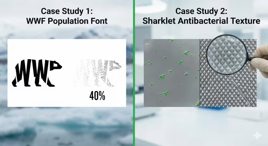
Let’s look at some real world examples. One famous case of biomimicry in type is the WWF “Population” font. The designers made a font where the thickness of the letters changes based on how many of an animal are left in the wild. If there are many animals, the font is bold and strong. If the animal is dying out, the font becomes very thin and almost disappears. This is a powerful way to use the “life” of a font to tell a story.
Another example is the use of “Sharklet” patterns. Shark skin has a very specific texture that keeps bacteria away. Scientists have used this pattern to make surfaces for hospitals. In design, we can use similar “anti clog” patterns in our layouts. We make sure the “white space” in our typography flows like water around a rock. This prevents the “clumping” of text that makes it hard to read.
Even big brands are starting to use biomimicry. They want their logos and websites to feel “authentic.” They use textures that look like wood grain or stone. They use colors found in the desert or the ocean. But the smartest ones are using the deep logic of biomimicry to make their entire user experience feel as smooth as a bird’s wing.
Frequently Asked Questions about Biomimicry
What is the difference between biophilic and biomimetic design?
Biophilic design is about our love for nature. It’s about putting plants in an office or using green colors. Biomimicry is about the science of nature. It’s about using the way a plant grows to build a better structure. One is about feelings, and the other is about function.
How does nature inspire typography?
Nature provides the ultimate guide for balance and flow. From the curves of a river to the symmetry of a butterfly, these patterns help us create letters that are easier for the human brain to process. Biomimicry helps us find these patterns and use them in our fonts.
Can biomimicry improve website accessibility?
Yes! Nature has spent billions of years making sure organisms can see and navigate their world. By using those same rules for contrast, spacing, and hierarchy, we make websites that are easier for everyone to use, including people with vision problems.
What are Janine Benyus’s 6 Life’s Principles in a design context?
These principles include things like “be resource efficient,” “adapt to changing conditions,” and “evolve to survive.” In design, this means making websites that use less data, work on all devices, and can be updated easily over time. It’s about building things that last.
The Future of Living Type
We are just at the beginning of this journey. At Silphium Design LLC, we believe that the internet should not be a “dead” place. It should be a digital garden. By using biomimicry, we can create typography that breathes and grows. We can make websites that feel like they belong in our world, not just on our screens.
When you use the principles of biomimicry in typographic design, you are choosing a path of wisdom. You are saying that nature is the best teacher we have. Whether it is through the math of the Golden Ratio or the resilience of a variable font, these lessons make our work better. They make the user’s life easier. And they help protect the planet we all share.
The next time you look at a letter on a screen, look closely. Does it have the curve of a wave? Does it have the strength of a tree trunk? If it does, you are seeing the power of biomimicry in action. It is a beautiful way to design, and it is the only way to build a truly sustainable future for the web.
Conclusion and Next Steps
Typography is the voice of your website. By using biomimicry, you make that voice more natural and more powerful. We have seen how nature’s math, structures, and efficiency can transform a simple font into a work of biological art.
If you are a designer, start looking at the world around you for inspiration. Don’t just look at other websites. Look at the bark on a tree. Look at the veins in a leaf. Use those patterns in your next project. If you are a business owner, think about how a “living” website could help your brand grow and thrive.
A List of Bio-Inspired Fonts to Use for Your Website
Selecting the right typeface is like choosing the right species to plant in a garden. Each has a specific role to play in the digital ecosystem. Here is a curated list of bio-inspired fonts, categorized by the specific biomimicry principle they use.
1. The “Efficiency” Class (Resource-Saving Fonts)
These fonts follow nature’s rule of “doing more with less.” They are designed to save energy, ink, and data weight, which helps with website loading speeds—a key factor for local SEO.
- Ryman Eco: This is one of the most famous sustainable fonts. When looked at closely, the letters are made of thin, hollow lines. When printed or viewed on certain screens, the eye (or the ink bleed) fills in the gaps. It uses up to 33% less ink than standard fonts.
- Ecofont (Vera Sans): This font uses a “honeycomb” logic by placing tiny holes inside the letters. At normal reading sizes, the holes are invisible to the human eye, but they significantly reduce the amount of resources needed to render or print the text.
- Century Gothic: While not explicitly “biomimetic” by brand name, its design uses very thin lines and wide, circular shapes. Research shows it is one of the most ink-efficient “standard” fonts available, mimicking the efficiency of a thin blade of grass.
2. The “Geometric” Class (Math-Based on Nature)
These fonts use the mathematical “codes” of the natural world, such as the Golden Ratio ($\phi$) or the Fibonacci sequence, to create a sense of deep, subconscious harmony for the reader.
- Phibonacci: This is a monospaced font built entirely on a Golden Ratio grid. Every curve and line follows the same spiral pattern found in nautilus shells and sunflowers. It creates a very rhythmic, “calm” reading experience.
- Genomics (Custom by Codeage): Inspired by the structure of DNA, this typeface uses “circular perfection” to mirror biological cycles. It blends the precision of science with the softness of organic life, making it excellent for health or technology brands.
- Fibonacci (by Rachel Sinclair): This font is a literal translation of the Fibonacci spiral into letterforms. It has an Art Nouveau feel, reminiscent of climbing vines and the “vigorous upward vitality” found in plant growth.
3. The “Organism” Class (Form-Mimicking Fonts)
These fonts look and feel like they were grown rather than manufactured. They use the Emulate principle to bring the texture of the outdoors to the screen.
- Branch & Vine: This font integrates subtle leaf and stem motifs directly into the strokes. It is perfect for logos where you want an immediate connection to a forest or garden.
- Coral Reef (by Vozzy): A display font that mimics the branching, skeletal structures of underwater reefs. It provides a unique, “textured” look that feels ancient and biological.
- Autumnal: This font captures the “flow” of falling leaves. Its strokes are not perfectly straight; they have the slight, graceful curves of organic matter influenced by wind and gravity.
4. The “Experimental” Frontier (Generative & Evolved Type)
This is where biomimicry meets AI. These are often used in high-level branding or academic research to show what the future of design looks like.
- The WWF “Population” Font: A dynamic font where the “weight” (thickness) of the letters is tied to real-world data about endangered species. As populations drop, the font becomes thinner, literally “fading away” before the reader’s eyes.
- ARSO-Selection Fonts: Emerging from research using the Advanced Reptile Search Optimization (ARSO) algorithm, these fonts are “evolved” by a computer. The algorithm mimics natural selection to find the most “legible” curves and spacing, resulting in typefaces that are biologically optimized for the human eye.
Why This Matters for Your Website
Using these fonts isn’t just a “style” choice. It has technical benefits:
- Lower Cognitive Load: Nature-aligned shapes are easier for the brain to recognize, which keeps users on your page longer (improving your “bounce rate”).
- Sustainability: Using “lighter” fonts like Ryman Eco or optimized variable fonts reduces the energy used by your server and the user’s device.
- Brand Authority: In local SEO, having a unique, nature-inspired visual identity makes your business more memorable than “cookie-cutter” competitors.