Table of Contents
The Biology of the Digital Canvas

Many web designers look at a blank screen and think about what they can add to it. They think about images, text blocks, buttons, and logos. They treat the blank areas of the screen as empty space that needs to be filled up. This is a common mistake. In the world of design, this empty space is called whitespace.
To build websites that truly work well for human beings, we must change how we think. We need a major shift in our design habits. We must stop seeing whitespace as passive nothingness. Instead, we should view it as an active, structural space that holds a design together. When you look at a website, the whitespace is just as important as the words and pictures. It is the invisible glue that makes the visible parts easy to see and understand.
Humans have a deep, built-in love for the natural world. Scientists call this idea biophilia. Biophilia means that our minds and bodies are tuned to the shapes, rhythms, and spaces found in forests, fields, and oceans. Because our ancestors lived in wild environments for thousands of years, our eyes and brains evolved to process natural layouts with ease.
When a website mimics these natural layouts, something amazing happens. The layout lowers our physical stress. It makes our hearts beat a little slower, and it helps our minds focus. By using biophilic principles, we can make digital spaces feel like real, peaceful places. This approach allows us to use natural spatial rules to fix common problems in modern user experience design.
The core goal of this guide is to master the art of layout by understanding whitespace through patterns found in nature. We can look at the physical world as a massive, ancient design engine. For billions of years, plants, animals, and geological forces have solved the problem of spatial efficiency. They have learned exactly how much room to leave between things so that life can thrive.
By studying these natural systems, we can discover a helpful blueprint for modern user interface design. We can learn how to place content on a computer screen or mobile phone in a way that feels completely right to the human eye. Nature does not waste space, and it does not crowd things either. Nature uses whitespace with perfect balance, and we can do the exact same thing on the web.
The Mathematics of Nature’s Layout Engine
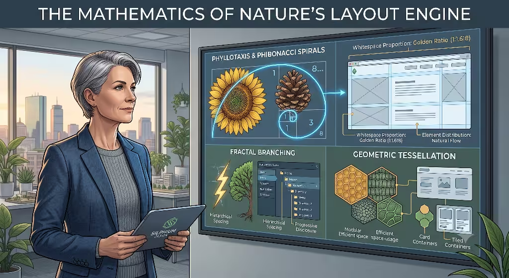
Nature might look random at first glance, but it is actually built on deep mathematical rules. One of the best places to see this is in phyllotaxis, which is the scientific word for how leaves are arranged on a plant stem. If you look at a sunflower, a pinecone, or a houseplant, you will notice that the leaves or seeds grow in a clear spiral pattern. They do not stack directly on top of each other.
Instead, they twist at a specific angle. This angle is based on the Fibonacci sequence, a series of numbers where each number is the sum of the two numbers before it. This sequence creates a mathematical value known as the Golden Ratio, which is roughly equal to 1:1.618.
Plants use this mathematical ratio for a very simple, practical reason: survival. By spreading leaves out along this specific spiral, a plant makes sure that every single leaf gets enough sunlight and rain. If the leaves grew directly over one another, the top leaves would block the sun, and the bottom leaves would wither. The empty space between the leaves is a functional asset. In web design, we call this macro whitespace. Macro whitespace refers to the large areas of open space between major sections of a page.
When we use the Golden Ratio to plan our web layouts, we create a natural distribution of elements. We leave enough macro whitespace around our text blocks and images so that they do not block each other out. This gives each part of the webpage room to catch the user’s attention, just like a leaf catching sunlight.
Another vital concept is fractal geometry, which was discovered by a mathematician named Benoit Mandelbrot. Fractals are patterns that repeat themselves at different sizes. If you look closely at a single branch of a fern, it looks like a small version of the whole fern leaf. If you look at a rocky mountain peak, it looks a lot like the entire mountain range. This quality is called self-similarity, and it means that the small parts of a system reflect the large parts. Nature uses fractal geometry to build complex structures that feel unified and balanced.
We can apply this idea of scaling to two different types of spacing on a website: micro whitespace and macro whitespace. Micro whitespace is the small amount of space between letters, words, and lines of text. Think of it like the tiny, tight patterns inside a snowflake or the delicate veins on a dragonfly wing. If the letters are too close together, the words become impossible to read. If the lines of text are packed too tightly, the reader’s eyes get tired very fast.
Macro whitespace, on the other hand, consists of the wide margins and large gaps between big layout boxes. This type of space is like the sweeping expanses of a river delta or the open sky between mountain ridges. A great biophilic website connects these two sizes. The small micro whitespace in the paragraphs must match the scale of the large macro whitespace between the sections. When these spaces follow a shared fractal scale, the website feels unified. The user can sense the inner harmony of the layout, even if they do not know the math behind it.
Nature also creates beautiful layouts through chemical reactions. A famous scientist named Alan Turing created a theory called morphogenesis, which explains how natural patterns develop. He wrote about reaction-diffusion systems, which describe how chemicals spread out and interact to create distinct visual markings. This is how leopards get their spots, how zebras get their stripes, and how tropical fish get their bright bands. These chemical systems show us how nature forms clear borders without using hard, artificial lines. The spots on a leopard are separated by clean paths of plain fur. The dark stripes on a zebra are balanced by bright paths of white space.
This natural process teaches us a valuable lesson about web design. We do not always need to use dark borders, heavy boxes, or thick lines to separate different sections on a screen. Instead, we can use clean paths of whitespace to create readable boundaries. When you leave enough open space between two different pieces of content, the human brain automatically understands that they are separate topics. This creates a soft, organic grid system that looks elegant and keeps the user from feeling trapped by heavy digital boxes. Whitespace becomes the boundary lines, making the entire website feel open, breezy, and alive.
Common Questions Answered about Whitespace
When people search the internet to learn about design and nature, they often ask specific questions. To build a truly valuable guide, we must explore these common questions and see how they apply to our digital work.
How do natural patterns use negative space?
In the world of biology, negative space is another term for whitespace, and it is a matter of life and death. In an ecosystem, isolation is not a mistake; it is a tool that allows resources to flow smoothly. A perfect example of this is a forest phenomenon called crown shyness. When you walk through a forest of certain tree species and look up at the sky, you will see something remarkable. The topmost branches of the trees do not actually touch each other. Instead, they leave a clear, winding gap of open sky between their leaves. It looks like a network of bright rivers flowing through a dark green canopy.
Trees practice crown shyness for a few smart reasons. First, it stops their branches from rubbing together and breaking when the wind blows hard. Second, it stops leaf-eating bugs from crawling easily from one tree to another. Finally, it lets sunlight reach deeper into the forest floor so younger plants can grow. The trees use this canopy channel of whitespace to protect themselves and share resources.
In web design, we must use whitespace in the exact same way. Think of your paragraphs, buttons, and images as the crowns of trees. If you pack them too close together, they cause visual friction. The elements blur into a giant mass of pixels, and the user gets confused. By leaving channels of whitespace between your layout sections, you create visual breathing room. This space protects your content from clashing and allows the user to navigate your site without getting lost in a dense jungle of information.
What is the relationship between the Golden Ratio and website whitespace?
The Golden Ratio gives us a timeless mathematical rule for balancing text and whitespace on a screen. As we noted before, this ratio is roughly $1:1.618$. It has been used for centuries by famous artists, architects, and designers because it matches the organic proportions of the human body and the natural world. When you use this ratio to build a website, you are using the same system that shapes a beautiful nautilus shell or arranges the seeds in a sunflower.
To use the Golden Ratio for whitespace, you can look at the size of your content containers and your margins. For example, if your main text area is 1000 pixels wide, you can divide that number by 1.618 to find the ideal size for your sidebar or your outer margins. This gives you a margin of roughly 618 pixels. You can also use this ratio to plan your typography.
If your body text is 16 pixels large, you can multiply it by 1.618 to find the perfect line spacing or heading size. This creates an interconnected system where the text size and the whitespace around the text grow at the exact same rate. This ratio-driven whitespace builds a clear visual hierarchy. It instantly tells the user’s eye which parts of the page are most important. It creates an organic sense of structural harmony that makes the digital layout feel solid, professional, and comforting.
How does biophilic web design utilize negative space to reduce cognitive load?
When a website is crowded, messy, and packed with too many elements, it causes a problem called high cognitive load. Cognitive load is the amount of mental effort it takes for a person to process information. When someone visits a cluttered website, their brain has to work incredibly hard to sort through the noise. They have to dodge flashing banners, read tiny text, and guess where to click. This chaotic digital environment triggers a subtle stress response in the human nervous system. It mimics the feeling of being in a wild threat environment, like a thick, dark forest where a predator might be hiding. The user quickly feels tired, annoyed, and ready to leave your website.
Biophilic web design uses strategic whitespace to fix this neurological problem. In nature, humans feel most relaxed when they are looking at a wide-open savanna or a clean, well-structured forest path. These environments offer a low-stress data array. They allow our eyes to see far ahead, look for threats, and spot resources without any confusion.
When we use generous whitespace on a website, we are rebuilding that open savanna on the screen. The whitespace acts as a mental buffer. It gives the human brain a chance to pause, rest, and digest the information it just read. Instead of forcing the user to fight through a wall of text, biophilic whitespace guides their eyes smoothly down the page. It makes visual scanning easy and pleasant, which keeps users happy and encourages them to stay on the website much longer.
Cross-Domain Mapping: Nature vs. Digital Architecture
To understand how these natural systems fit into modern web development, we can map organic structures directly onto user interface elements. This cross-domain mapping shows that nature and code are not opposites. They are just two different ways to organize space.
The following matrix connects organic patterns directly to front-end development styles:
| Natural Entity / Pattern | Biological Function | Digital UI/UX Equivalent |
| Crown Shyness | Prevents physical damage; allows light penetration. | Macro Whitespace and Margin Isolation; prevents visual friction between disparate CTA sections. |
| Dendritic Branching | Optimizes resource distribution and network efficiency. | Visual Hierarchy and Typography Scaling; guides the user’s eye from primary headings down to body text. |
| Hexagonal Tessellation | Maximizes structural integrity and storage with minimal material weight. | CSS Grid and Flexbox Containers; optimizes structural spacing without wasting screen real estate. |
| Dunes and Waves | Fluid energy dissipation via physical fluid dynamics. | Asymmetric Layouts and Smooth Scrolling; guides user flow through soft, non-rigid structural transitions. |
Let us look deeper at each of these four areas to see how they work in real life. First, look at crown shyness. In a forest canopy, this spatial gap keeps trees safe and lets light through. In web design, this maps directly to macro whitespace and margin isolation. Imagine you have a section on your webpage that explains a complex service, and right below it, you have a bright button that says Buy Now.
If you do not leave enough whitespace between that text and the button, the user feels rushed. The two sections crash into each other. By using margin isolation, you create a clear gap of whitespace. This gap acts like the open sky between tree branches. It keeps the two ideas separate and lets the user think clearly before making a choice.
Second, think about dendritic branching. This is the pattern you see in river systems, tree roots, and the blood vessels inside human lungs. A main trunk splits into big branches, which split into smaller branches, which split into tiny twigs. This branching pattern is nature’s way of moving water, nutrients, and air with total efficiency.
In digital design, this maps directly to visual hierarchy and typography scaling. Your main heading is the thick tree trunk. It needs a lot of whitespace around it to stand out. Your subheadings are the branches, and your body text paragraphs are the small twigs. By using a natural branching scale for your font sizes and text margins, you guide the reader’s eye smoothly from top to bottom. The whitespace around the titles tells the brain exactly where the main path begins.
Third, look at hexagonal tessellation, which is the pattern found in honeycombs. Bees build hex shapes because they are mathematically perfect. They allow the bees to store the maximum amount of honey while using the absolute minimum amount of wax. The walls are thin, and the spaces are tightly optimized. In web code, this maps perfectly to CSS Grid and Flexbox containers. These are modern coding tools that let developers build structured boxes on a screen.
By using these tools wisely, we can create layouts that hold a massive amount of information without looking messy. We can use the layout properties to set precise gaps of whitespace between our content cards. This gives us a strong, clean system that maximizes our screen space without crowding the user.
Finally, consider the gentle shapes of sand dunes and ocean waves. These patterns are formed by fluids, wind, and water moving across the earth. They do not have sharp corners or rigid ninety-degree angles. Instead, they use smooth, rolling slopes to move energy along. In web design, this maps to asymmetric layouts and smooth scrolling transitions.
Most websites look like rigid stacks of rectangles. But a biophilic website can use soft curves and off-center elements to create a natural sense of motion. By placing whitespace unevenly down the page, you create a visual rhythm that mimics a winding trail or a rolling wave. This fluid distribution of whitespace draws the reader deeper into the page, making the act of scrolling down the screen feel natural and relaxing.
Semantic & LSI Keyword Architecture
To help search engines like Google find and value our content, we need to understand how search algorithms think. Modern search engines do not just count how many times you use a single word. Instead, they look at the whole semantic cloud of terms around a topic. They look for related words, which are often called Latent Semantic Indexing or LSI keywords. When a website combines design terms with biological terms in a natural way, search engines recognize that the article is highly educational and carries true authority.
When we write about design, we must use a clear set of layout terms. We should weave words like visual hierarchy into our sentences to explain how space organizes information. We must talk about minimalist layouts to show how removing clutter makes a website beautiful. We should mention interface design and information architecture to prove that whitespace is a functional framework, not just a decoration. Other terms like padding, line-height, and the figure-ground relationship help explain the technical side of micro whitespace. By using these specific words, we show search engines that our guide is deeply rooted in real design science.
At the exact same time, we need to balance those design terms with scientific words from the world of biology. We should use terms like biophilic design and biomimicry to establish our core theme. We can talk about environmental psychology to explain how human emotions change when we look at different layouts.
Mentioning morphogenesis and self-similarity explains the deeper math of how natural patterns grow. We can also reference classical scientific texts, such as the famous book on growth and form by D’Arcy Thompson. This book explored how physical forces shape living things. When these biological terms sit right next to web design words on a page, they form a strong semantic web. This tells search engine crawlers that our content provides deep, unique value that cannot be found on generic design blogs.
Coding the Biophilic Web

Understanding the theory of natural space is wonderful, but we also need to know how to build it with real code. In the world of web development, there is a growing movement called green coding. Green coding means writing clean, efficient code that takes less processing power to run. When a website requires less energy from a server and a phone battery, it lowers its carbon footprint and helps protect the planet.
Using whitespace wisely is actually a fantastic way to practice green coding. When you build a minimalist layout that relies on open space rather than heavy images, giant video backgrounds, and complex script files, your website files become very small. The website loads almost instantly, even on slow mobile networks.
By using modern web layout tools like CSS Grid and Flexbox, you can create beautiful layout gaps using simple text instructions. You do not need to download heavy graphic files to act as dividers. Instead, you just tell the browser to leave a specific percentage of whitespace between your content boxes. This approach mimics the efficiency of nature. Just like a honeycomb or a leaf layout, you are maximizing your output while using the smallest possible amount of physical energy and digital data.
Let us look at a real-world case study to see how this works. Imagine a busy online store that sells garden tools. In its old design, the website was packed tight. The product images were crowded together with no padding. The text descriptions had tiny margins, and the checkout buttons were squeezed right next to the navigation links. The website owners noticed that users were leaving the site quickly without buying anything. The crowded screen created too much visual noise, causing users to feel stressed and leave.
To fix this, the team redesigned the online store using a ratio-driven whitespace matrix. They did not change the products, and they did not rewrite the text. They simply opened up the layout. They used the Golden Ratio to add spacious margins around the product photos. They increased the line height inside the descriptions to create clean paths of micro whitespace between the sentences. They also used margin isolation to place wide bands of macro whitespace around the main checkout buttons.
The results of this biophilic layout shift were immediate and powerful. Because the visual noise was gone, users could find what they wanted without getting tired. The clean paths of whitespace guided their eyes directly to the buying options. The website felt professional and calm, like a clean, open store path. Within three months, the time users spent on the site doubled, and the store sales increased significantly. This case study proves that whitespace is not a waste of screen space. It is a powerful business tool that directly improves user experience and boosts engagement.
Designing for the Future Ecosystem
True design optimization lies in recognizing a simple truth: whitespace is not empty. It is the vital, active connective tissue of information. Just like the open air in a forest canopy or the blank spaces on a tiger’s fur, the space without content is what gives the content its shape, its beauty, and its utility. When we crowd our web screens with too much noise, we are fighting against thousands of years of human evolution. We are building digital spaces that clash with our natural wiring.
By understanding whitespace through patterns found in nature, we can move past old, messy design habits. We can stop building screens that cause stress, and start building digital environments that feel harmonious, balanced, and alive. As web strategists and content creators, our goal should be to treat the digital canvas like a living ecosystem. Every paragraph, image, and button should have its own niche, surrounded by the perfect amount of breathing room to thrive.
The next time you sit down to design a website, write a blog post, or plan a layout, take a step away from your computer screen. Go outside and observe the local ecological patterns in your own backyard or park. Look at how the leaves on a tree branch stretch out to find the sun. Look at the clean gaps between the clouds, or the natural spacing of stones along a river bank. Take those lessons of natural structural balance and implement them directly back into your digital workspace. Your readers will thank you, your search engine rankings will grow, and your digital corner of the web will become a far more peaceful place to visit.