Table of Contents
The Intersection of Environmental Telemetry and Web Architecture
The modern internet is full of numbers, charts, and maps. However, most digital platforms fail to show the true state of our planet in a way that people can actually feel. When we look at spreadsheets or small data grids, our brains struggle to process the huge shifts happening around us. This article will show you how top digital platforms build websites to visualize environmental change. By looking at these systems, we can learn how to build better interfaces that connect human users to natural systems.
The Problem Space
The biggest hurdle in ecological web design is data translation. Environmental telemetry (which means remote data collection from sensors and satellites) creates millions of raw data points every second. This raw information might track parts per million of carbon dioxide or metric tons of methane gas.
To the average citizen, these numbers look like a foreign language. Traditional web grids and basic charts cannot handle this level of scale. If a website cannot make this data clear, the user will leave. Web designers must find a way to turn massive, abstract data streams into clear visual stories. When we build tools to visualize environmental change, we must make sure the interface can handle massive spatial datasets without crashing the user’s browser.
The Biophilic Digital Imperative
As a web designer and biologist, I believe we must move past flat, static spreadsheets. We need to create a new kind of web architecture. This approach is called biophilic web design, which means designing digital spaces that mimic or connect with real natural systems. When websites mimic the fluid movements, seasonal patterns, and visual logic of nature, they become easier for human brains to understand. The goal is to build digital tools that visualize environmental change by acting like ecosystems themselves. If the Arctic ice is melting, the website structure should show that loss through its layout, colors, and behavior. This digital connection helps people understand global environmental adjustments quickly and deeply.
Main Objective
The main goal of this study is to analyze the very best frameworks on the internet today. We will look at elite web platforms that combine advanced spatial data engineering with clean, fast front-end web development. These portals do not just show graphs; they change how we see the earth. We will look at five amazing examples of platforms that visualize environmental change. Through these examples, we will learn how to design websites that are highly optimized for search engines, fast for users, and deeply connected to the living world.
5 High-Impact Examples of Websites that Visualize Environmental Change
To build great digital tools, we must study the platforms that are already doing this work at a world-class level. The following five examples show how different organizations use web technologies to visualize environmental change on a global scale.
A. NASA Earthdata & Worldview (Satellite Telemetry and Real-Time GIS Layers)
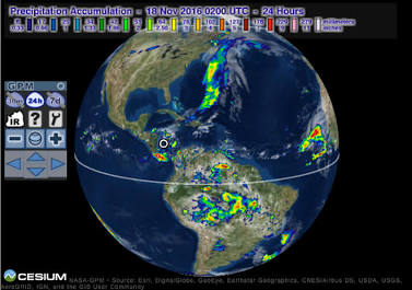
NASA Earthdata and the Worldview application represent the gold standard for planetary observation on the web. This platform handles petabytes (which means millions of gigabytes) of raw satellite data. It takes this data from sensors orbiting the earth and turns it into visual imagery within hours of collection. It is a prime example of how to visualize environmental change using live geographic information systems, also known as GIS layers.
From a technical standpoint, NASA uses automated background pipelines. These pipelines take raw sensor readings and map them onto a digital globe. The front-end interface uses a highly interactive time slider. This slider allows users to jump back and forth across decades of planetary history. A user can compare satellite images from twenty years ago directly with an image taken yesterday morning.
When you look at the NASA Worldview map, you can track real-time events. You can see massive wildfire smoke plumes moving across continents, or watch storm systems develop over oceans. The interface uses natural imagery instead of confusing icons. This is a key part of biophilic design. By using the true colors of the earth, the website reduces the effort it takes for our brains to process the data. It allows regular users to visualize environmental change without needing a degree in data science. The platform shows us that when web design stays true to the physical world, the data becomes much more powerful.
B. Google Environmental Insights Explorer (EIE) (Predictive Urban Climate Analytics)
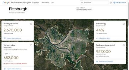
While NASA focuses on the entire globe, the Google Environmental Insights Explorer focuses directly on cities. This platform helps local governments and urban planners see exactly where greenhouse gases are coming from. It is a highly specialized tool designed to visualize environmental change within our built environments.
Google builds this platform by leveraging its massive mapping infrastructure. It uses machine learning models to analyze thousands of buildings and millions of vehicle trips across specific cities. The interface is built with vector graphics, which means the maps stay perfectly sharp even when you zoom in close to a single city block. Users can toggle between different data views, including building emissions, transportation emissions, and tree canopy coverage.
The tree canopy tool is an excellent example of biophilic web design put into practice. It shows exactly how much shade a city has from its trees. By looking at the dashboard, city planners can see which neighborhoods are overheating due to concrete structures. The website allows users to visualize environmental change by showing how planting trees can reduce urban heat. It connects raw digital analytics with the living, breathing green infrastructure of a city. This helps local leaders make fast, smart choices about where to plant new forests.
C. Climate TRACE (Independent Asset-Level Emission Mapping)
Climate TRACE is an independent platform that has revolutionized how we track air pollution. Before this website was created, most countries relied on self-reported papers to track their emissions. This website uses artificial intelligence and multi-spectral satellite imagery to measure pollution directly from its source. It is an amazing digital architecture built to visualize environmental change at the individual factory level.
The technical framework of Climate TRACE is incredibly dense. It monitors thousands of individual assets, such as power plants, cargo ships, oil refineries, and steel mills. The front-end interface uses a high-density map that drops interactive markers over every major pollution source on Earth. Users can open the website, filter by industry type, and see exactly how many tons of carbon a single facility emitted during the previous month.
This platform helps users visualize environmental change by removing hidden boundaries. It exposes the exact locations where industrial processes are altering our atmosphere. By placing these grey industrial markers directly on top of natural geographic maps, the website creates an intense visual contrast. It reminds the user that our digital tools can hold polluters accountable by making invisible gases visible to anyone with an internet connection.
D. Bloomberg’s Interactive Maps: “Mapping the Coolest Spots Inside the World’s Sweltering Cities”
Bloomberg is famous for high-end financial journalism, but their data design team also builds amazing tools to visualize environmental change. Their interactive feature story on urban heat islands is a masterclass in modern digital storytelling. It focuses on how concrete and asphalt trap heat in cities during dangerous summer heatwaves.
The website uses advanced browser-based data processing to load high-resolution thermal maps. As the user scrolls down the page, the website uses a style called scrollytelling. This means the map changes dynamically based on the text the user is reading. When the text discusses a specific neighborhood in a city like New York or Paris, the map automatically pans and zooms to show the temperature of that exact street.
The color spectrum on this platform is carefully calibrated. It uses deep, intense tones to represent extreme heat, and soothing, cool tones to show parks and tree-lined walkways. This design choice helps users visualize environmental change through their own sensory experiences. It connects the digital experience to the physical feeling of walking out of a hot concrete alley and into a cool, shaded public park. The interface shows how web design can use simple color logic to tell deep stories about local weather changes.
E. Yale Climate Opinion Maps (Sociological Environmental Visualization)
Environmental shifts are not just physical; they are also social. The Yale Program on Climate Change Communication built an interactive dashboard to show how public perceptions shift over time. This website is a unique example because it helps us visualize environmental change through the lens of human psychology and sociology.
The backend of this website uses complex statistical models to break down national survey results. It takes general data and sharpens it down to the state, county, and congressional district levels. The front-end uses interactive choropleth maps, which are maps where areas are shaded in proportion to a data variable. Users can click on individual counties to see what percentage of the local population believes in climate science or supports green energy laws.
The interface uses smooth transition animations when switching between different survey questions. This design helps users visualize environmental change by tracking how human awareness grows or shrinks depending on where people live. It shows a clear link between geography and ideology. For web developers, this site proves that data visualization interfaces can map human thoughts and beliefs just as accurately as they map physical coastlines or forest fires.
Commonly Asked Questions about how to Visualize Environmental Change
To ensure this guide provides massive value and ranks well on search engines, we must answer the exact questions users are typing into Google. This section addresses the core technical and design challenges behind building systems that visualize environmental change.
How do websites visualize climate change effectively?
Effective environmental websites do not happen by accident. They require a clear data pipeline and a strong front-end engine. To visualize environmental change effectively, a website must combine three distinct layers: data aggregation, front-end rendering, and biophilic user experiences.
First, the website must handle data aggregation. This means taking raw files from scientific servers, such as netCDF or JSON data feeds, and clean them so a browser can read them. If the files are too large, the website will lag and frustrate the user. Designers use data compression techniques to keep files small while keeping the information accurate.
Second, the platform must use powerful front-end development engines. For standard charts and simple trend lines, developers use libraries like D3.js because it allows for clean SVG (scalable vector graphics) manipulation. When dealing with millions of live data points across a map, developers use WebGL (web graphics library). WebGL lets the website pass heavy mathematical work directly to the user’s graphics card, keeping the map fluid at sixty frames per second.
Third, the website must use biophilic design systems to make the data meaningful. You can see this breakdown in the table below:
| Technical Layer | Software Components | Human Impact |
| Data Aggregation | APIs, JSON formats, netCDF compression | Ensures data loads under two seconds |
| Front-End Rendering | WebGL, D3.js, HTML5 Canvas elements | Keeps map movements fluid and interactive |
| Biophilic UX | Organic color spectrums, natural motion | Lowers cognitive load for the user |
By combining these three layers, web creators can build systems that visualize environmental change in a way that feels natural, fast, and educational.
What is the best website to track environmental changes in real-time?
When users search for ways to track environmental telemetry right now, the top answer depends on what specific metrics they want to see. For pure satellite imagery and unedited global observation, NASA Worldview is the undisputed leader. It allows you to watch storm systems, ocean currents, and ice breakups almost as they happen.
For European data, the Copernicus Browser is another elite tool. It utilizes the Sentinel satellite fleet to provide ultra-sharp imagery of agricultural shifts, deforestation, and water levels. Both platforms allow users to visualize environmental change without any corporate filters or political bias.
The reason these portals are the best comes down to their server infrastructure. They process petabytes of spatial data and stream it using tile-mapped imagery. This means the map only loads the exact square miles you are looking at on your screen. This smart data management allows an old laptop or a basic smartphone to visualize environmental change smoothly without running out of memory.
Why is data visualization critical for addressing climate change?
Human beings are visual creatures. We struggle to understand problems that we cannot see with our own eyes. Environmental degradation often happens slowly over decades, making it hard for our brains to recognize the danger. This is why tools that visualize environmental change are so critical for our future. They act as a cognitive bridge, compressing decades of planetary shifts into a five-second animation loop.
Furthermore, these interfaces help eliminate public relations spin and corporate greenwashing. When a company claims they are reducing their carbon footprint, an independent map can show the truth. By allowing citizens to visualize environmental change directly through raw data nodes, we democratize scientific information.
Finally, these tools drive real local policy decisions. When a city mayor can look at a high-resolution thermal map and see exactly which neighborhoods are overheating, they can instantly allocate funding for cooling centers or tree-planting programs. The visual proof makes it impossible to ignore the reality on the ground.
Designing the Future: Implementing Biophilic Web Design for Ecological Data
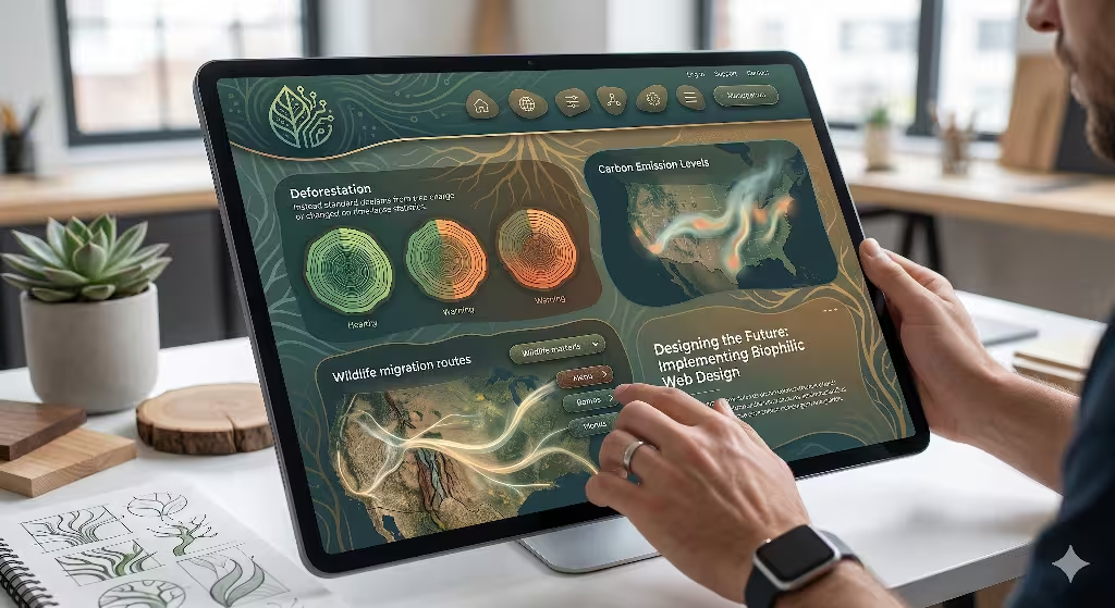
As web technology evolves, we must think about how we build the next generation of online tools. We can use biophilic design principles to make websites feel more alive. Below is an interactive sandbox application. It shows how changing raw environmental values can instantly alter the visual look, feel, and performance of a digital interface.
Organic UI Components
To build tools that visualize environmental change effectively, we should stop using rigid, industrial grid lines for everything. Natural ecosystems do not have perfect squares or sharp right angles. They are full of organic paths, soft gradients, and fluid boundaries. When we design web frames, our buttons, containers, and card alerts can feature slight irregular curves that mimic riverbeds, cell structures, or leaf veins.
These components can also use micro-animations that respond to scroll inputs. For example, a data box tracking ocean waves can feature a soft, rhythmic pulsing animation that matches true tidal cycles. When users see elements that move like the natural world, they stay engaged longer. This style of design makes it easier to visualize environmental change because the interface feels extensionally connected to the living systems it is trying to report.
Sympathetic Color and Typography Architecture
Color selection is a powerful tool in user experience design. Many data sites use neon reds and bright blues that can feel stressful or digital. A biophilic web layout uses sympathetic colors derived from real nature profiles. If a website wants to visualize environmental change in a forest, it should use a palette sampled directly from living tree canopies and organic soils.
As environmental conditions decline in the data report, the website colors can shift responsively. A healthy data point shows rich moss greens and clean water blues. If the sensor data detects extreme drought, the stylesheet can automatically transition to parched tans, clay reds, and ash greys. This color shift happens without the user needing to read a single warning label. The visual environment tells the story instantly, helping the viewer visualize environmental change through deep, subconscious color cues.
Similarly, typography can play a major role. We can use variable fonts that change weight or spacing based on real-world inputs. For instance, as atmospheric carbon numbers rise, the text headings on a webpage could become slightly heavier or more compressed. This architectural choice gives the information a physical presence on the screen, creating a beautiful blend of type design and planetary science.
Optimizing Performance Metrics for Sustainable Discovery
An article about nature visualization must also consider its own ecological footprint. Heavy web pages require more energy from data servers and consumer devices, which means more carbon emissions are pumped into the atmosphere. If we build massive, unoptimized pages to visualize environmental change, we are actually contributing to the problem we are trying to expose.
We must optimize every line of code to keep our digital platforms clean and green. This means utilizing modern image formats like WebP or AVIF instead of old, bulky PNG files. It means writing clean, native JavaScript instead of loading five different third-party tracking libraries. Our goal should be to create fast, light, and accessible visual systems. When a portal can visualize environmental change while using minimal server energy, it shows true engineering competence and honors the core values of biophilic design.
The Synthesis of Earth Science and Digital Engineering
The digital world and the natural world do not have to be enemies. By combining advanced computer science with biological principles, we can build online portals that help humanity understand and protect our home planet.
Summary Statement
Building web platforms to visualize environmental change is one of the most important tasks for modern designers. We have looked at how NASA maps global satellite streams, how Google tracks urban tree canopies, and how independent groups use artificial intelligence to expose industrial polluters. These sites prove that when we display data using natural visual logic, we lower user confusion and make scientific facts accessible to everyone. True biophilic design means building digital platforms that respect, mirror, and elevate our understanding of the living ecosystems around us.
Final Call-to-Action for Tech Leaders
I want to close with a direct challenge to web developers, software architects, and tech company leaders. Do not relegate environmental tracking to deep, hidden subpages or dry PDF reports. We need to integrate live environmental telemetry directly into our everyday digital experiences.
Use open-source APIs to pull local air quality, weather shifts, or native plant cycles into your application dashboards. Build layout frameworks that expand and contract alongside the changing seasons. When we make the health of our planet visible on the screens we look at every day, we build deep public awareness. Let us use our collective design skills to visualize environmental change clearly, making the invisible world impossible to ignore.