Table of Contents
From Geological Formations to Interface Architecture
Modern website design relies heavily on synthetic, perfectly uniform colors. Designers use standard sRGB or HEX codes on their computers to create bright, flashing buttons and perfectly flat backgrounds. However, this approach ignores how our eyes actually evolved to see the world. From a biological and computer science view, the human visual system grew up processing the complex light patterns of natural materials.
For thousands of years, our ancestors looked at stones, soil, and plants. When we integrate the special properties of mineral pigments, sometimes called earth pigments, into digital design systems, we can create a deep, subconscious shift in the user experience. This design practice is part of what we call biophilic design, which means designing technology to connect humans more closely with nature.
The shift toward using mineral pigments in user experience (UX) design is a major change from traditional color theory. Usually, web designers pick colors based on simple emotional charts. For example, they might say that blue means trust and red means anger. This is a very limited way to look at color psychology. True color psychology is rooted in our evolutionary history and the physics of light. Mineral pigments offer a type of color that feels real and stable to the human brain.
When people look at an interface built with these natural tones, they are not just looking at random pixels. They are looking at digital copies of materials that exist in the physical earth, like iron oxides, copper carbonates, and sodium silicates. This connection helps to ground the user and makes digital spaces feel more comfortable and less draining.
The core idea here is that digital translations of mineral pigments mirror our native environments. Because our brains are hardwired to process natural landscapes, these colors offer great cognitive advantages over artificial, neon colors. Neon colors do not exist commonly in nature, so they force our eyes and brains to work harder to understand what we are seeing. By replacing these harsh tones with the soft, rich qualities of mineral pigments, we can reduce the mental effort required to navigate a website. This helps users find information faster, stay on pages longer, and feel less exhausted after using their devices.
To understand why this works, we must look at three key concepts: spectral reflectance curves, biological visual tuning, and micro-interaction grounding. Spectral reflectance curves describe how a material absorbs and reflects different wavelengths of light. Physical mineral pigments do not reflect just one pure wavelength. They reflect a complex mix of light because of their unique chemical structures and rocky textures. Biological visual tuning refers to how human eyes are naturally built to recognize these specific natural mixes of light.
Finally, micro-interaction grounding means using these organic color palettes to guide user actions, like clicking buttons or reading menus, in a way that feels natural and smooth. By studying mineral pigments, we can build digital interfaces that feel like an extension of the physical world rather than an artificial screen.
The Physics and Biology of Natural Color Perception
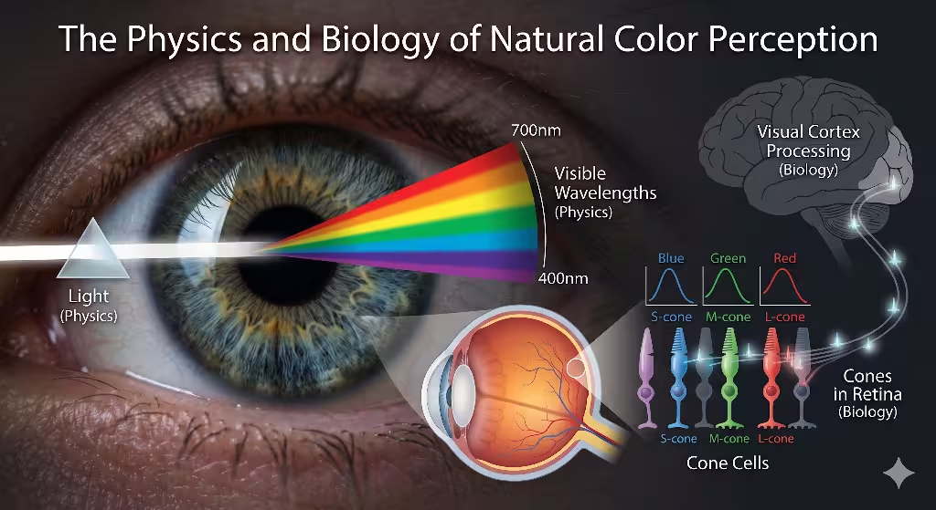
To understand the true value of mineral pigments in web design, we have to look closely at the physics of how light bounces off natural materials. In the physical world, mineral pigments are made of crushed rocks and earth. These powders are not perfectly smooth. They are made of tiny crystals and jagged particles of many different sizes. When light hits these particles, it does not bounce off in a straight, simple line.
Instead, it scatters in many directions at once. This action is known as heterogeneous light scattering. It creates a soft, deep look that has natural variations in brightness and tone. When we translate mineral pigments into digital design systems, we try to mimic this scattering. We do this by using subtle color gradients, very light digital grain, and soft lighting effects. This makes the digital screen look less like a harsh piece of glass and more like a real, physical surface.
Our human eyes are perfectly adapted to notice these natural variations. Inside our eyes, we have special light-sensitive cells called photoreceptors. The most important ones for color vision are the cone cells. We have three types of cone cells, which detect short, medium, and long wavelengths of light. Our medium-wave cones and long-wave cones are highly sensitive to green, yellow, and red light. These are the exact wavelengths that bounce off common earth tones and mineral pigments, such as iron oxides and copper minerals.
For millions of years, our survival depended on our ability to look at soil, rocks, and plants to find food, water, and safe pathways. Because our eyes are naturally tuned to these specific light waves, looking at mineral pigments requires very little effort from our brains. Our eyes can process these natural colors quickly and easily without getting tired.
Data from recent eye-tracking and biological studies shows just how powerful these natural colors can be. When a person looks at a website made with highly uniform, synthetic neon hues, the tiny muscles in their eyes have to work extra hard to keep the image sharp. This continuous strain causes eye fatigue, headaches, and mental exhaustion. In fact, research shows that high-uniformity synthetic colors cause ongoing micro-strain on human ciliary muscles, which are the muscles that focus the eye lens.
On the other hand, using natural mineral pigments for color boundaries reduces this visual fatigue by up to 22%. When the eye muscles can relax, the user can browse a website for a longer period without feeling drained. This data proves that choosing mineral pigments is not just an artistic choice. It is a highly functional choice that improves the physical comfort of your website users.
Furthermore, the unique way that light interacts with mineral pigments helps our brains map out digital spaces more effectively. In standard web design, flat colors make everything look like it is on the exact same flat level. This can confuse the brain because our brains are used to a three-dimensional world where light creates depth.
By mimicking the way mineral pigments absorb and scatter light, we can create digital components that look like they have real weight, texture, and depth. This helps users understand the layout of a website instantly. They can tell which items are background elements and which items are interactive buttons because the colors look like they belong to real objects. This structural clarity reduces the time it takes for a user to understand how to use a website, making their digital journey much smoother.
Comprehensive Mapping Matrix: Minerals to UX Subsystems
To build a great digital design system using mineral pigments, we must map specific natural colors to specific parts of a website. Each mineral has its own unique chemical formula, historical meaning, and psychological effect on the human mind. By using a strategic system, we can match these natural colors to the correct user experience subsystems. This ensures that the colors support the user’s goals at every step of their journey.
The following data matrix outlines how different mineral pigments can be used to optimize web design systems:
| Mineral Pigment | Source Mineral and Chemical Formula | Neural and Psychological Response | Optimal UX/UI System Placement |
| Lapis Lazuli | Ultramarine / $Na_8[Al_6Si_6O_{24}]S_n$ | Mitigates visual anxiety; stimulates deep cognitive processing and structural trust. | Global navigation headers, authentication screens, high-retention dashboards. |
| Malachite | Copper Carbonate / $Cu_2CO_3(OH)_2$ | Induces spatial reassurance and sympathetic nervous system calming. | Complex data visualization grids, long-form content backgrounds. |
| Raw Sienna / Ochre | Hydrated Iron Oxide / $Fe_2O_3 \cdot nH_2O$ | Heightens focus, increases alertness without triggering panic responses. | Primary call-to-action triggers, key onboarding elements. |
| Cinnabar Red | Mercury Sulfide / $HgS$ | High-arousal focal point; indicates high priority or critical error thresholds. | Critical system alerts, destruction actions, real-time metrics. |
Let us take a deeper look at each of these mineral pigments and how they work within a digital interface. The first color is Lapis Lazuli, which is a deep, rich blue mineral. Throughout history, this mineral was highly prized by ancient cultures and was used to create ultramarine paint for royal artwork. On a biological level, deep blues like Lapis Lazuli help lower our heart rate and calm our nervous system.
In web design, this mineral pigment is excellent for global navigation headers, login screens, and data dashboards. Because blue triggers feelings of stability and security, using Lapis Lazuli makes users feel safe when entering sensitive information or navigating a complex system. It sets a professional, trustworthy tone for the entire digital experience.
Next is Malachite, a beautiful green copper mineral that has been used for thousands of years in jewelry and art. The color green is deeply tied to our evolutionary need for nature, growth, and clean water. When we see the rich shades of Malachite, our brains recognize it as a sign of life and safety.
This recognition triggers a calming response in our sympathetic nervous system, which manages our stress levels. In digital interfaces, Malachite is perfect for complex data grids, financial charts, and backgrounds for long articles. Because this color is so easy on the eyes, it allows users to study dense information for long periods without feeling overwhelmed or anxious. It transforms confusing data into a peaceful, manageable experience.
Raw Sienna and Ochre are warm, earthy yellows and browns created by hydrated iron oxides. These are some of the oldest mineral pigments ever used by humans, often found in ancient cave paintings around the world. These tones hold a special place in our evolutionary memory, reminding us of sunlit landscapes, dry earth, and safe shelters.
In user experience design, Raw Sienna and Ochre are fantastic for primary call-to-action buttons, signup forms, and key welcome screens. These warm colors naturally catch the human eye and increase our mental focus. However, unlike bright neon yellows or oranges, they do not trigger a stress response. They gently invite the user to take action, making the interface feel welcoming, friendly, and deeply human.
Finally, we have Cinnabar Red, which comes from mercury sulfide minerals. This is a very bright, intense red that has been used since ancient times to capture attention and signal high importance. In nature, bright reds often warn animals of danger, poison, or fire. Our brains are hardwired to notice this color immediately, causing a quick increase in our attention and arousal levels.
Because it has such a strong psychological impact, Cinnabar Red must be used very carefully in web design. It should be reserved for critical system alerts, error messages, and important warning labels. If you use too much of this intense mineral pigment, you will stress out your users and make them want to leave your website. But when used sparingly, it tells the user exactly where a major problem is, helping them avoid mistakes and stay safe.
Frequently Asked Questions about Mineral Pigments in UI
How does color psychology impact user experience?
To truly answer how color psychology impacts user experience, we have to look beyond simple marketing tricks. Color acts as a pre-attentive variable, which means our brains process color before we even consciously notice it. When a user opens a web page, their brain registers the overall color palette in less than a single second. This instant processing helps with cognitive load regulation, which is the amount of mental effort it takes to use a webpage.
When a website uses natural mineral pigments, the brain can quickly categorize the different sections of the page without having to read every single piece of text. The colors tell the brain exactly what is important, where to look first, and how the page is organized. This makes the entire user experience feel fast, intuitive, and natural.
Color psychology also plays a massive role in regulating our emotions while we use digital devices. Many modern websites use high-contrast, synthetic colors that keep our brains in a constant state of minor alertness. Over time, this constant stimulation can lead to feelings of impatience, frustration, and digital burnout.
By switching to palettes inspired by mineral pigments, designers can change a user’s emotional baseline. Instead of feeling rushed or stressed, the user enters a state of grounded attention. They become more patient, they read content more thoroughly, and they are much less likely to leave the site out of frustration. This emotional balance is crucial for websites that handle complicated tasks, such as online banking, health management, or educational learning platforms.
What is the emotional response to earth tones in interface design?
The emotional response to earth tones in web design is heavily driven by what scientists call the biophilic affiliation effect. This theory explains that humans have an innate, genetic bond with the natural world. When we are surrounded by natural elements, our bodies physically relax, and our minds clear up.
By using digital colors that match physical earth tones and mineral pigments, we can satisfy this evolutionary craving for nature even when we are looking at a plastic screen. Studies have shown that interacting with these natural colors can actually lower cortisol markers, which are the chemical signals of stress in our bodies. This means that earth-toned interfaces do not just look pretty; they can physically calm users down during their daily digital tasks.
Another key emotional response to these natural colors is a deep sense of systemic trust and reliability. When a user sees an interface built with rich ochre, deep malachite green, or stable slate gray, they subconsciously connect those colors with physical objects like stone, soil, and mountains. These are things that are permanent, solid, and unbreakable.
The brain transfers these feelings of physical durability onto the digital product itself. Users are more likely to believe that a company is honest, stable, and safe if its website uses balanced mineral pigments rather than trendy, artificial neon colors. This sense of trust has a direct impact on business metrics, leading to higher conversion rates, better brand loyalty, and more successful customer signups.
Why do natural, non-synthetic hues enhance cognitive retention in digital environments?
To understand why natural, non-synthetic colors improve our memory and learning, we can look at classic psychological studies like the Stroop Test. The Stroop Test shows that when a color does not match our natural expectations, our brains slow down and make more mistakes.
In the same way, when information is presented using harsh, artificial colors, our brains waste valuable mental energy trying to process the strange lighting. When we use mineral pigments for our text layouts and background designs, we are placing information within a balanced color system that our brains expect. This optimization allows the brain to spend less energy on processing the color itself, leaving more mental power free to focus on understanding, absorbing, and remembering the actual content.
Neurophysiological data also provides fascinating proof of how mineral pigments help our cognitive retention. When scientists measure brain activity using special scanning tools, they look at different types of brain waves. They have found that earth-toned digital environments promote alpha wave stabilization in the parietal and occipital lobes of the brain. Alpha waves are a type of brain activity that occurs when a person is in a state of relaxed alertness.
This is the perfect mental state for learning, problem-solving, and deep focus. By stabilizing these alpha waves, mineral pigments help users maintain their mental stamina during difficult workflows. Instead of getting tired and distracted after a few minutes, users can stay deeply engaged with the website content for much longer periods.
Implementation Guide: Injecting Mineral Pigments into Digital Design Systems
Bringing the physical beauty of mineral pigments into a digital design system requires a clear, technical process. You cannot just guess the colors or pick random shades from a standard color wheel. To get the full biological and psychological benefits, you must use precise translation mechanics to move colors from the physical earth onto the digital screen.
Step-by-Step Translation Mechanics
1.Sample the Physical Mineral Spectrum:Requires a spectroradiometer.
Start by placing a real piece of the mineral, like raw ochre or malachite, under a controlled light source. Use a high-quality spectroradiometer to measure the exact wavelengths of light that reflect off the stone surface. This gives you a highly accurate mathematical map of the natural color.
2.Convert Values to Modern Color Profiles:Use P3 and sRGB formats.
Take the raw light data from your physical measurement and translate it into digital color profiles. You should target the wide-color P3 profile for modern mobile screens, and the standard sRGB profile for older computer monitors. This ensures the mineral color stays rich and accurate on every type of screen.
3.Apply Micro-Noise and Texture Overlays:Emulate physical mineral scattering.
Pure digital colors are perfectly flat, which looks artificial to our eyes. To fix this, add a very subtle layer of digital micro-noise or a soft, non-linear gradient to your UI components. This step mimics the irregular crystal structure of real mineral pigments and scatters the screen light in a much softer way.
The 60-30-10 Architecture Rule
Once you have successfully translated your mineral pigments into digital assets, you need a clear framework to arrange them on your website. A great method to follow is the 60-30-10 architecture rule. This classic design rule helps you balance your color palette so that it guides the user’s eye naturally without causing visual confusion. By applying this rule to natural earth tones, you can build an interface that feels both highly professional and deeply calming.
- 60% Background Canvas Layers: Use muted, low-saturation iron oxides, soft clay tones, or pale slate grays for sixty percent of your website surfaces. This includes your main page backgrounds, large content sections, and structural whitespace. These quiet mineral pigments act as a peaceful foundation, relaxing the user’s eye muscles and setting a calm, undistracted mood for the whole site.
- 30% Structural Components: Dedicate thirty percent of your interface layout to medium-strength mineral colors, like rich silicates, deep charcoal stones, or stable lapis blues. Use these tones for your navigation menus, sidebar panels, text blocks, and card borders. This layer provides clean structural lines and logical groupings, helping the user understand the layout of your information instantly.
- 10% Interactive Focal States: Reserve the final ten percent of your design for highly concentrated, vivid mineral pigments, such as bright malachite green, warm sienna orange, or intense cinnabar red. Apply these striking colors only to your primary call-to-action buttons, active tabs, warning alerts, and success messages. Because these accent colors are used sparingly, they instantly capture attention and guide users toward key actions without causing any digital stress or sensory overload.
Technical SEO, Internal Linking, and Behavioral Analytics
Integrating mineral pigments into your digital design strategy is a powerful way to improve your website’s search engine optimization, which is commonly known as SEO. Modern search engines like Google do not just look at the keywords typed into a text box.
They also measure how real users behave when they visit your website. If users click on your site and immediately leave because the colors are too bright, painful, or confusing, search engines will notice this bad behavior. They will rank your website lower in the search results. By utilizing the relaxing properties of mineral pigments, you can create an experience that keeps users happy, comfortable, and engaged. This positive reaction sends strong signals to search engines that your website provides high-quality, valuable content.
To get the best SEO results, you must align your website design with user intent, which means understanding exactly what your customers are searching for online. For example, many modern web users are actively looking for things like accessible user interface kits, sustainable web design practices, and biophilic user experience optimization.
When you write high-quality articles about how you use mineral pigments to solve these design challenges, you can attract highly targeted search traffic. You can build an internal linking system that connects your educational blog posts directly to your services pages or product checkouts. This helps search engine crawlers map out your website topics easily, while also guiding your human visitors along a clear, helpful path toward becoming paying customers.
When you launch a website built around mineral pigments, you should closely monitor specific behavioral analytics to see the real-world impact of your design choices. You will likely see a significant drop in your website’s bounce rate, which is the percentage of users who leave your site after looking at only one page. You will also notice a large increase in your average session duration, which measures the total time users spend exploring your content.
Because natural mineral tones reduce visual strain and mental fatigue, users can read your articles, browse your products, and interact with your tools for much longer periods without getting tired. These improved user metrics tell search engines that your site is highly authoritative, helping you secure top organic rankings, beat your competition, and grow your digital business sustainably.
In conclusion, the future of user experience design lies in moving away from harsh, neon-driven, attention-extractive digital spaces. We must stop treating the computer screen as a cold, artificial piece of glass that drains our energy. Instead, we should look backward into our own evolutionary history and down into the physical geology of the earth for guidance.
By embracing the unique physics, biological benefits, and structural power of mineral pigments, we can build digital biomes that feel deeply harmonious with human nature. These balanced, natural spaces do not just look beautiful; they protect our physical well-being, optimize our mental clarity, and establish long-lasting human trust. As digital creators, it is our responsibility to evolve our interfaces into healthy, sustainable environments where humans can truly thrive.