Table of Contents
The Digital Habitat Paradigm
When you open a web browser today, you are stepping into a built environment. Just like walking into a concrete building or a crowded supermarket, your brain reacts to everything you see on the screen. For thousands of years, humans lived in natural spaces surrounded by trees, water, and open skies. Our minds and eyes evolved to understand and feel comfortable in those natural spaces.
Yet, most modern websites are built like sterile boxes. They use blinding neon colors, sharp corners, and constant pop-up windows that fight for your attention. This creates a massive problem for the everyday internet user. It causes a specific type of mental exhaustion known as digital fatigue. When users get tired of a website, they leave. They close the tab, bounce away to another page, and forget about the brand entirely.
To fix this issue, web designers must look at the science of eco-psychology. This field of study looks at the deep relationship between human beings and the natural world. When we bring the rules of eco-psychology into web design, we change how websites work. We stop treating a webpage like a plastic tool and start building it like a digital habitat. A digital habitat is an online space where a human mind feels safe, calm, and focused.
By using the ideas found in eco-psychology, we can build websites that match how our brains naturally process information. This does not mean we just paste pictures of trees on every page. Instead, it means we use the hidden patterns, shapes, and balances of nature to guide the user. The result is a major shift in web performance. By aligning web interfaces with our natural instincts, we can reduce mental stress. When a website feels like a natural home, users want to stay. This design choice directly improves how long people look at a site, how much they trust a company, and how often they return.
Using eco-psychology in design is not just a nice idea for visual art. It is a calculated method to help websites succeed in a crowded market. The modern internet is full of noise, and users are tired of feeling overwhelmed. Web design that ignores our natural settings will always cause a small amount of friction in the mind. By embracing eco-psychology, we can remove that friction entirely.
This article will show you exactly how this science changes everything about web design. We will look at how human brains process screens and how natural layouts keep people happy. We will also explore the math and data that prove these ideas work. Making websites feel more like nature is the best way to build a loyal audience online.
Cognitive Load and Attention Restoration Theory (ART) in UX
To understand how eco-psychology improves a website, you must first understand how the human brain pays attention. Your brain has two main ways of looking at the world. The first way is called directed attention. This happens when you force yourself to focus on a specific task, like reading a spreadsheet or finding a tiny button on a messy webpage.
Directed attention takes a lot of hard work. It uses up mental energy quickly, and when you run out of that energy, you feel stressed and tired. The second way is called involuntary attention. This happens when your mind effortlessly notices things that are interesting or beautiful, like a flickering campfire or waves hitting a beach. This effortless focus gives your brain a chance to rest and rebuild its energy.
The study of eco-psychology points to a famous idea called Attention Restoration Theory. This theory proves that spending time looking at natural patterns allows our mental energy to recover. On a standard website, users are constantly forced to use directed attention. They have to dodge advertisements, ignore flashing banners, and read small text packed closely together. This creates a high cognitive load, which is just a technical term for a tired brain. When you use eco-psychology to design a user interface, you actively lower this cognitive load. You create a space that taps into involuntary attention instead of draining the user’s mental battery.
How do we apply this phase of eco-psychology to a real website? We do it by introducing soft fascination. In web design, soft fascination means using visual elements that hold the attention gently without demanding hard work from the brain.
For example, instead of a sudden, flashing pop-up window, a site might use a slow, fading transition that feels like a shadow moving across grass. Instead of filling every corner with text, the design leaves plenty of open space. This space acts like a quiet clearing in a forest. When a user lands on a site built with eco-psychology in mind, their eyes can rest. They do not have to fight through visual clutter to find what they need. Because their brain is not getting tired, they do not feel the urge to click away. They stay on the website longer because the experience feels rewarding and peaceful.
Lowering mental strain is a powerful way to win the loyalty of your visitors. Most people do not realize why they dislike certain websites. They just know that a specific site makes them feel rushed or annoyed. By using eco-psychology, you remove those hidden bad feelings. You create a smooth path for the user to follow. When a person notices that a website feels easy to read and gentle on the eyes, they subconsciously connect those good feelings to the brand. This shows that eco-psychology is an essential tool for creating online spaces that people actually enjoy using every single day.
Structural Biomimicry: Organic Grids vs. Rigid Contours
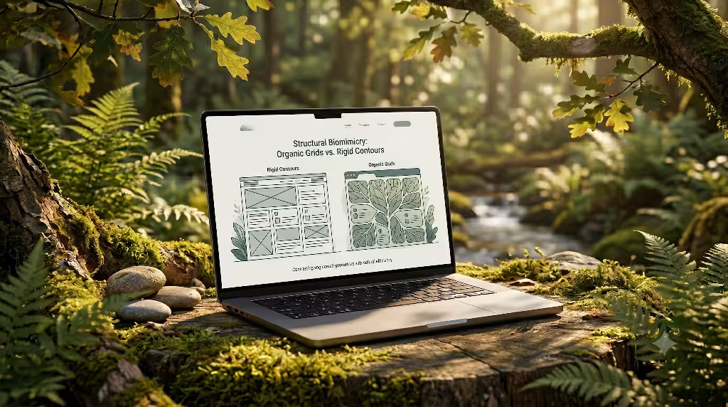
Most websites today are built on a grid of harsh rectangles. Every piece of text is trapped inside a sharp box, and every image has perfectly square corners. While boxes are easy to program, they do not exist in the natural world. Our ancestors did not grow up looking at perfect ninety degree angles. They grew up looking at organic shapes, rolling hills, and curved river stones. The science of eco-psychology shows that our eyes find it easier to track curved and organic shapes than sharp, rigid boxes. When a website relies too heavily on harsh squares, it creates a subtle sense of tension in our minds.
To solve this problem, web designers can turn to structural biomimicry, which means copying the shapes and structures found in nature. By applying eco-psychology to the layout of a page, we can replace stiff grids with organic layouts. This does not mean your website should look messy or disorganized. Instead, it means you soften the edges of your design. You can use rounded containers that mimic the smooth shape of a pebble. You can design backgrounds with gentle, sweeping lines that look like the curve of a hillside. When text and images sit inside these natural shapes, the layout feels much more inviting to the human eye.
The way a user’s eye moves across a page is called visual rhythm. A rigid website forces the eye to stop and start abruptly at every corner. An organic layout designed through the lens of eco-psychology allows the eye to glide smoothly from one section to the next. Think about how a tree branch splits into smaller twigs. This is a natural pattern that our brains understand instantly. You can use this same branching pattern to organize your website’s menus and information. When important links and text follow a natural flow, users do not have to search hard to find them. The layout guides their eyes naturally down the page.
Using organic contours also changes how people feel about the safety of a website. In nature, sharp objects like thorns or broken rocks mean danger. Sharp corners on a screen can trigger those same ancient danger signals deep in our subconscious minds. By choosing soft, curved shapes rooted in eco-psychology, you signal to the user that your digital space is safe and friendly. This simple shift in shape makes the entire browsing experience feel less mechanical and much more human. It turns a boring digital transaction into a pleasant journey through a well-crafted space.
Chromatic Harmony and Atmospheric Perspective
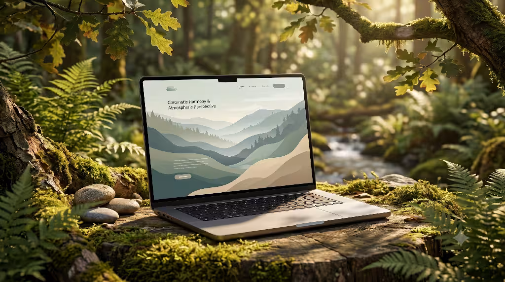
Color choice is one of the most powerful tools in web design, yet it is often used incorrectly. Many websites use bright, neon colors to grab your attention. While a bright yellow or neon blue button might get you to click once, it quickly hurts your eyes if you look at it too long. The human eye has to work very hard to process high intensity, artificial colors. According to eco-psychology, our visual systems are tuned to the colors of the earth. We are built to process the quiet blues of the sky, the rich greens of leaves, and the warm browns of soil and stone.
When we use eco-psychology to build a color palette, we focus on chromatic harmony. This means we choose colors that work together the same way they do in a natural landscape. Instead of using a pure, blinding white background, an eco-psychology approach might use a soft cream or a light grey like morning mist. Instead of a harsh black for text, we might choose a deep charcoal or a dark forest green. These choices instantly reduce eye strain. When a user opens a page with these balanced colors, their eyes do not have to adjust to a digital glare. They can read the content comfortably for a long period without getting a headache.
Another incredible tool from nature is atmospheric perspective. When you look at a mountain range in real life, the hills that are closest to you look dark and sharp. The mountains that are far away look lighter, softer, and a bit blue because of the air between you and them. This change in color tells your brain how deep a space is. We can bring this idea into web design using eco-psychology. By using gentle gradients and soft blurs in the background, we can give a flat screen a sense of deep, open space. A website that feels open and deep is much more pleasant than one that feels flat and crowded.
Creating this sense of depth helps prevent users from feeling trapped. A messy, bright website can make a person feel like they are locked in a small room with flashing lights. A website that uses eco-psychology to create depth feels like looking out an open window. It gives the user breathing room. When people feel like they have space to breathe, they are less likely to rush off the page. They will take their time to explore your articles, look at your products, and connect with your message.
Dynamic Evolution: Circadian UX and Environmental States
The natural world is never completely still. It changes constantly throughout the day as the sun moves across the sky. In the morning, the light is warm and soft. At noon, it is bright and clear. In the evening, the light turns golden and then deepens into a cool, dark night. Our bodies have an internal clock called a circadian rhythm that responds to these shifts in light. Most websites completely ignore this natural cycle. They look exactly the same whether you open them at eight in the morning or midnight. This lack of change goes against the core ideas of eco-psychology, which emphasize our connection to natural rhythms.
To bring a website to life, we can use an approach called Circadian UX, which is rooted in eco-psychology. This means the website changes its look based on the time of day for the person using it. For example, if a user visits your site at ten at night, the website can automatically switch to a evening mode. This mode would use warmer tones, lower brightness, and softer contrasts to match the dark room the user is sitting in. If they visit at noon, the site can be bright and energetic. This prevents the website from shocking the user’s system with a blast of bright blue light late at night, which can ruin their sleep patterns.
We can also use eco-psychology to make websites react to environmental states, like the current season or the local weather. Imagine visiting a travel website on a rainy afternoon, and the site gently adjusts its background to feature cozy, warm tones. If it is winter, the site might adopt a quiet, snowy color palette. These changes make the digital world feel connected to the real physical world outside the user’s window. It breaks down the wall between our screens and our actual environment, creating a highly personalized experience.
This dynamic style of design does wonders for user engagement. When a website adapts to the time and weather, it feels alive and smart. It shows a deep level of care for the user’s well-being. From the perspective of eco-psychology, this adaptation mimics how humans have always lived in harmony with changing seasons and daily cycles. By making your digital habitat evolve dynamically, you build a stronger bond with your audience. They will sub-consciously appreciate that your website respects their natural daily life instead of forcing them to stare at an unchanging, artificial screen.
Spatial Psychology: The Prospect and Refuge Framework
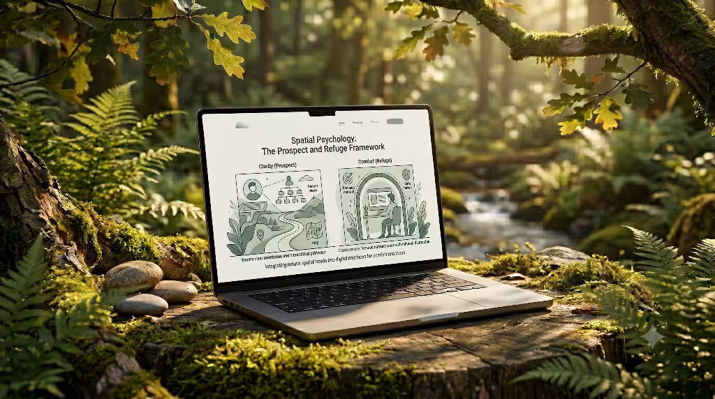
Long ago, when humans lived out in the open wild, they had to choose their camp spots very carefully. They looked for places where they could see far into the distance to spot food or danger, but they also wanted a safe place to hide their backs from predators. In environmental science, this is called the prospect and refuge framework. Prospect means having a clear view of your surroundings. Refuge means having a safe, protected place to rest. The science of eco-psychology shows that humans still crave this exact balance today, even when they are looking at a computer screen.
When you apply this part of eco-psychology to a website, you change how you arrange the layout. You can create prospect by making the website’s navigation incredibly clear and open. When a user lands on a page, they should instantly see a clear path forward. They should know exactly where they are, where they can go, and what will happen if they click a button. This satisfies the ancient human need to survey the landscape and feel in control of the environment. If a website is confusing or hides its links, it destroys prospect, making the user feel lost and anxious.
At the same time, an eco-psychology design must provide refuge. Refuge on a webpage comes from the smart use of whitespace and quiet zones. Whitespace is the empty space around text and pictures. When you surround an important paragraph or an image with plenty of empty space, you give it a protective shell. It separates that content from the rest of the busy page. This creates a mental safe zone where the user can read and think without being distracted by nearby elements. It feels like stepping into a quiet cabin after walking through a windy forest.
Balancing these two forces is a masterful way to keep users engaged. A website with too much prospect and no refuge feels completely bare, cold, and exposed. A website with too much refuge and no prospect feels dark, cluttered, and hard to navigate. By using eco-psychology to build a perfect balance, you create an interface that feels both exciting to explore and safe to rest in. Users will happily glide through your clear pathways because they know they can always find a peaceful spot to stop and read your content.
Behavioral Mechanics: Haptic Feedback and Physical Intuition
When we interact with objects in the real world, our hands and eyes expect them to behave in a certain way. If you push a stone, it slides with weight. If you drop a leaf, it floats gently to the ground. If you press a physical button on an old radio, it clicks down and snaps back up. Our brains have a built-in physical intuition for how things should move and feel. Yet, the digital world often breaks these rules. Web pages often feature elements that appear out of nowhere, disappear instantly, or jump around erratically. This erratic movement contradicts the principles of eco-psychology, which teach us that our minds thrive on predictable, natural physics.
To fix this digital disconnect, we can design behavioral mechanics that match the physical world. By using eco-psychology, we can build buttons and menus that mimic real, tactile objects. For example, when a user moves their mouse over a link, the button can gently lift up and cast a soft shadow below it, looking like a raised pebble on a path. When they click it, the button can sink down slightly to show it has been pressed. This gives the user a sense of haptic feedback, making a flat glass screen feel like a real three dimensional object that responds to human touch.
The way items move on the screen, known as web animation, must also follow natural laws. Instead of a menu snapping open in a single millisecond, eco-psychology suggests using animations that mirror fluid dynamics or gravity. A menu should slide down with a gentle deceleration, easing into place just like a swinging gate slows down before it stops. When page transitions move like water or wind, they feel completely natural to our eyes. The brain does not have to spend any extra energy trying to understand where an item came from or where it went.
Designing with physical intuition makes your website feel highly responsive and satisfying. Every time a user clicks an element and watches it move naturally, their brain receives a small, pleasing confirmation loop. This removes the guesswork from using a computer interface. Eco-psychology reminds us that we are physical creatures who love physical touch. By bringing the laws of natural movement to your digital layouts, you make your website feel less like a complex machine and more like an extension of the physical world.
Quantitative Metrics: The Direct Impact on User Engagement
While the ideas behind eco-psychology sound beautiful, they are also backed by hard business data. Web design is not just about making things look pretty; it is about getting results. When a company spends money to build a website, they want to see users stay longer, click more links, and buy more products. Thankfully, the science of eco-psychology directly improves the core data points that track online success. By building a website that treats the user like a living biological creature, you can watch your performance metrics rise.
When a website is loud, bright, and boxy, users experience an immediate wave of digital fatigue. This causes a high bounce rate, which means people leave the site within seconds of arriving. When you apply eco-psychology to change the layout, colors, and shapes, you lower that initial shock. Users find the page welcoming, so they stay to read the first paragraph. This lowers your bounce rate significantly. Once they are on the page, the natural grids and soft colors keep their eyes comfortable. This comfort leads to a higher average session duration, meaning people spend far more minutes exploring your content instead of running away to a competitor’s site.
To see exactly how these natural choices change user numbers, let us look at a direct breakdown of design elements and their target data tracking points.
| Eco-Psychological Element | Behavioral Response Triggered | Target UX/SEO Metric |
| Organic Grids & Radiated Patterns | Lowered visual friction & structured tracking | Reduced Bounce Rate |
| Circadian UX Adjustments | Minimized eye strain during evening hours | Increased Average Session Duration |
| Prospect & Refuge Layouts | Heightened sense of user control and safety | Higher Conversion Rate (CVR) |
| Tactile Elements & Natural Motion | Satisfying psychological confirmation loops | Increased Pages Per Visit |
As the table shows, every single choice made through eco-psychology has a direct, positive reaction in user behavior. When you give users a sense of prospect and refuge, they feel safe. A safe user is much more likely to trust a company, fill out a contact form, or buy a product, which boosts your conversion rate. When your animations follow natural laws, moving through the site feels fun and easy.
This encourages visitors to click through multiple pages, increasing your pages per visit score. All of these numbers tell search engines that your website is highly valuable, which helps your site rank higher in search results over time. Eco-psychology is a proven way to turn cold traffic into a thriving digital community.
Frequently Asked Questions about Eco-Psychology
When people look up web design and environmental science online, they often ask the same important questions. To make this guide as helpful as possible, we have gathered the top questions from search engines and answered them directly using our knowledge of eco-psychology.
What is eco-psychology in web design?
In web design, eco-psychology is the practice of building digital spaces that match the natural mental settings of human beings. It is a design system that blends environmental psychology with computer science. Instead of building websites that look like cold, neon machines, this approach uses the colors, shapes, paths, and movements found in nature. The goal is to reduce the mental stress that people feel when they look at modern screens. By turning a website into a natural digital habitat, we make it easier for people to read, browse, and connect with a brand without getting tired or frustrated.
Can a website really mimic nature to improve mental well-being?
Yes, a website can absolutely mimic nature to help users feel better. Science shows that our brains react to pictures and patterns of nature even if they are displayed on a flat digital screen. For example, looking at natural geometric patterns can actually lower a person’s stress levels and reduce their heart rate. When a website uses soft earth tones, open layouts, and gentle movements, it acts like a small mental break. It gives the user a moment of peace in the middle of a busy digital day, proving that good web design can protect our mental energy.
How do natural patterns affect user behavior on digital interfaces?
Natural patterns change user behavior by removing visual friction and making a website feel intuitive. When a webpage uses a branching layout like a tree or smooth curves like a river stone, the human eye can track information effortlessly. The brain does not have to work hard to figure out where to look next. This ease of use makes the visitor feel calm and in control. Because the experience is comfortable and stress free, users naturally spend more time on the site, read more articles, and remember the brand much more clearly.
What metrics track digital engagement in biophilic UX?
We track the success of natural web design using standard website analytics tools. The most important metrics to watch are the bounce rate, the average session duration, and the pages per visit. A successful natural design will cause your bounce rate to drop because people will not run away from the page. It will cause your average session duration to go up because the soft colors and open space allow people to read longer without eye strain. Finally, you will see a rise in conversion rates as users feel safe and comfortable enough to trust your business.
Technical Synergy: Merging Eco-Psychology with Core Web Vitals and Accessibility
Building a beautiful, natural website is a fantastic goal, but it must still work perfectly on a technical level. You cannot create a great digital habitat if your website takes forever to load or fails to work on a mobile phone. True eco-psychology design matches the rules of nature, and nature is incredibly efficient. A tree does not waste energy growing useless parts, and a river always finds the fastest path down a mountain. In the same way, a website built with eco-psychology must be lean, fast, and highly optimized for modern search engines.
Search engines use a set of rules called Core Web Vitals to measure how good a website is. These rules check how fast a page loads, how quickly it responds when you click a button, and how stable the elements are as they appear on the screen.
If you use heavy background videos of forests or massive, uncompressed images of mountains, your website will become slow and clunky. This violates the rules of eco-psychology because a slow website causes instant anger and stress for the user. To keep your site natural and fast, you must use clean code, lightweight graphics, and optimized CSS styles. Your fluid animations should be programmed efficiently so they do not cause the screen to stutter or lag.
We must also make sure our natural design choices follow website accessibility laws, such as the Web Content Accessibility Guidelines. These laws ensure that everyone, including people with vision loss or other disabilities, can use the internet safely. When you use an earth-toned color palette, you must ensure there is still enough contrast between the text and the background. For instance, putting light green text on a cream background is hard for anyone to read. You must choose a deep, dark green for the text to ensure it stands out clearly. Eco-psychology is about inclusion and comfort for all human beings, so accessibility must always be a top priority during the design process.
When you merge eco-psychology with top tier technical performance, you create the ultimate modern website. You get a digital space that pleases search engine algorithms because it is lightning fast and accessible to everyone. At the same time, you get a space that delights human visitors because it feels calm, beautiful, and deeply familiar. The future of the internet does not belong to the loudest, brightest, or most aggressive websites. It belongs to the sites that respect our human nature and provide a peaceful place for us to work, shop, and learn. By embracing eco-psychology, you can lead the way in building a better, healthier digital world for everyone.