Table of Contents
The Intersection of Digital Architecture and Natural Order
Humans have spent thousands of years living in nature. Our eyes and brains evolved to process trees, landscapes, and open skies. Today, we spend most of our time looking at glowing screens. When a user lands on a website, their brain works the exact same way it did in the wild. They scan the page instantly. In fact, research shows that modern users take less than six seconds to read the actual words on a webpage.
Before they read a single line of text, their brain has already made a decision about the site. This split second choice is guided entirely by visual hierarchy. If the page is a messy wall of data, the user leaves. If the page uses an organic arrangement, the user stays. By blending biology with computer science, we can create web designs that feel natural. This method uses nature to direct human focus. When you build a clean digital space, you are setting up a strong visual hierarchy that helps the user find what they need.
What is biophilic web design? It is the practice of bringing elements of the natural world into digital spaces. This does not mean just pasting pictures of trees on a homepage. True biophilic design means using the patterns, shapes, and systems of nature to build a website. When we bring these elements into a user interface, we reduce stress and clear up mental clutter. A proper layout uses visual hierarchy to make the screen feel like an open landscape. This allows the human brain to relax and process information faster.
A good digital layout acts like an extension of the physical world. By organizing your layout with a clear visual hierarchy, you give the user a sense of peace. This connection to nature keeps people on the page longer. It turns a boring digital chore into a pleasant journey. Good visual hierarchy ensures that the most critical details stand out first. By using natural order, you can guide attention without making the user work hard.
Cognitive Ergonomics: The Psychology of “Soft Fascination”
The human brain gets tired when it stares at rigid grids and flashing ads. In psychology, there is a concept called Attention Restoration Theory. This theory states that looking at natural patterns can actually restore our mental energy. Nature does not demand intense, stressful concentration. Instead, it offers something called soft fascination. This is a gentle type of attention that keeps us engaged without wearing us out.
When we design websites, we can use a natural visual hierarchy to create soft fascination. By laying out elements in a predictable way, we give the brain a break. A website with a broken visual hierarchy forces the brain to work too hard. This leads to user frustration and high bounce rates. If you want people to trust your website, you must plan your visual hierarchy with cognitive ergonomics in mind.
We can look at classic Gestalt principles to understand how this works in digital spaces. The first principle is proximity. In nature, things that belong together grow together. Trees form groves, and rocks form ledges. On a website, you must group related items closely. This creates an automatic visual hierarchy that the eye can scan in milliseconds. If a button is too far from its text description, the visual hierarchy breaks down. The second principle is similarity. Nature uses matching colors and textures to show that objects share a common purpose.
For example, all leaves on a specific plant look alike. In web design, you must make similar functions look identical. Your links should use the same color, and your secondary items should share a shape. This consistent look builds a reliable visual hierarchy across your entire site. When your layout uses these natural groups, your bounce rates go down. Users feel safe and comfortable because the visual hierarchy matches how they view the physical world.
Structural Scale and Size: The Canopy Effect
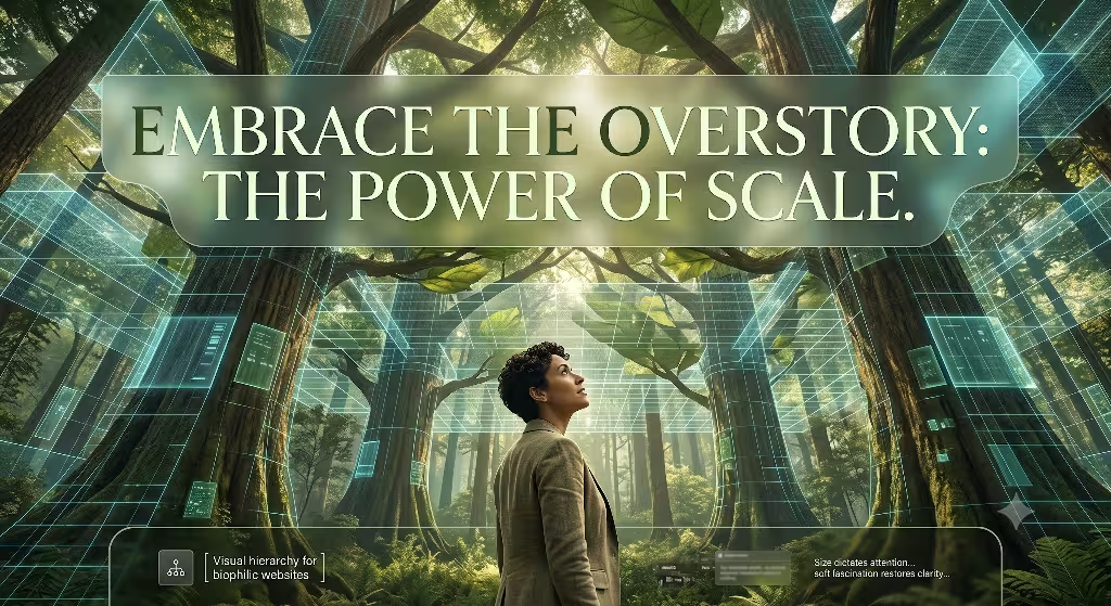
If you walk into a dense forest, you notice a clear structure. The massive trees form a high canopy that catches the sunlight. Below that, smaller bushes make up the understory. Finally, the moss and soil form the forest floor. You can use this exact structural scale to build your digital visual hierarchy. Size is the most powerful tool a designer has to capture attention.
When everything on a page is the same size, there is no visual hierarchy at all. The user has no idea where to look first. To fix this, you must create a bold contrast in scale. Your primary headings must act like the forest canopy. They need to stand out immediately. A strong visual hierarchy uses large text to shout out the core message.
Let us look at the exact numbers for a stratified layout. Your body copy is the base of your site, like the forest floor. It should usually be around 16 pixels for easy reading. To build a great visual hierarchy, your main H1 heading should be much larger. It should be two to three times the size of your body copy.
For instance, making your H1 heading 48 pixels creates an instant visual hierarchy that nobody can miss. The understory consists of your H2 and H3 subheadings. These should sit comfortably between the body text and the main header. This vertical layout chunks information into natural layers. The canopy, or the hero area, holds your main value statement. The understory gives context and details. The forest floor, which is your website footer, holds the basic utility links. This structural scale creates a clear visual hierarchy. It guides the eye from the top of the canopy down to the roots of the page.
| Layer Name | Typical Element | Target Font Size | Role in Visual Hierarchy |
| The Canopy | Main H1 Heading | 48px to 64px | Captures immediate attention and states core value |
| The Understory | H2 and H3 Subheads | 24px to 32px | Explains context and splits content into chunks |
| The Forest Floor | Body Copy & Footer | 16px | Provides deep information and basic utility links |
Chromatic Architecture: Low-Saturation Palettes and High-Contrast Anchors
Color is another vital tool for building a proper visual hierarchy. Many modern websites use bright, neon colors that hurt the eyes. A biophilic approach uses low-saturation colors found in the natural world. These colors are gentle, and they build a calming visual hierarchy. Think of moss greens, earthy browns, rock grays, and soft blues. When you use these tones for your background, you create a peaceful environment. The user can look at the screen for a long time without feeling tired. However, a good visual hierarchy also needs contrast. If every color is soft, nothing stands out. You must use high-contrast anchors to guide the eye to your most important actions.
To optimize your conversions, you should keep your main layout neutral and save bright colors for your calls to action. Imagine a bright red berry hanging on a dark green bush. The berry stands out because of the natural contrast. You can do the same thing with your website buttons. If your page uses soft grays and greens, an orange or warm gold button creates an instant point in your visual hierarchy. This draws the eye right to the signup form or checkout button.
At the same time, you must follow accessibility rules. The Web Content Accessibility Guidelines state that text must have a contrast ratio of at least 4.5 to 1 against its background. A strong visual hierarchy never sacrifices usability for looks. By balancing soft natural tones with sharp contrast anchors, you create a beautiful visual hierarchy that everyone can navigate easily.
Typographic Hierarchy and Biomorphic Forms
Typography is the backbone of web information. To create a natural feel, you should choose fonts that feature biomorphic forms. These are fonts with soft curves and organic shapes that mimic living things. Avoid rigid fonts that look like cold machines. Instead, pick letters that have fluid paths and clean curves. These organic shapes make the text feel human and alive. However, beautiful letters are useless if they are hard to read. Your choice of fonts must support your overall visual hierarchy. The fonts must help the user separate a big title from a regular paragraph instantly.
Information layering is the secret to great scannability. You should always left-align your body text. Human eyes prefer left-aligned text because it creates a predictable starting point for every line. This layout choice strengthens your visual hierarchy by making the reading track smooth. You should reserve centered text for short, impactful areas.
For example, a single quote or a short hero statement can look great when centered. To keep your visual hierarchy strong, you must maintain consistency across every single page. Use the exact same font sizes, weights, and spacing on your blog posts as you do on your product pages. When your typography follows a strict system, users do not have to relearn how to read your site. A consistent typographic visual hierarchy builds a clear path that leads users through your content effortlessly.
Spatial Mechanics: Executing “Prospect and Refuge” in Digital Spaces
In environmental psychology, there is a famous concept known as prospect and refuge. Prospect means having a wide, open view of your surroundings so you can see threats or opportunities. Refuge means having a safe, enclosed place to hide and rest. You can apply these two feelings to web layout design to improve your visual hierarchy. When a user feels both safe and free on a website, they stay longer and interact more. You can use spatial mechanics to build these feelings directly into your user interface.
+--------------------------------------------------------+
| [Prospect: Open Hero Area / Wide View of Site Content] |
|                                                        |
|   +------------------------------------------------+   |
|   | [Refuge: Sticky Header / Safe Navigation]     |   |
|   +------------------------------------------------+   |
|                                                        |
+--------------------------------------------------------+
Prospect is achieved by using sweeping white space, expansive hero layouts, and unconfined grids. Do not crowd your pages with endless boxes and borders. Give your elements room to breathe. This open space allows the eyes to move freely, creating a clear visual hierarchy where major items stand out. Refuge is achieved by giving the user safe anchors. A sticky navigation bar that stays at the top of the screen acts as a refuge. No matter how far down a user scrolls, they know they can get home with one click.
How do you implement visual hierarchy in website design? You do this by manipulating size, color contrast, and spacing to lead a user’s eye across common scanning patterns. Most people read digital screens in an F or Z pattern. A great layout places the most critical elements along these natural eye paths. By matching these patterns with open prospect spaces and secure refuge anchors, you build an intuitive visual hierarchy. The user never feels trapped or lost, which builds massive trust in your digital space.
Biomimetic Motion, Depth, and Dappled Light
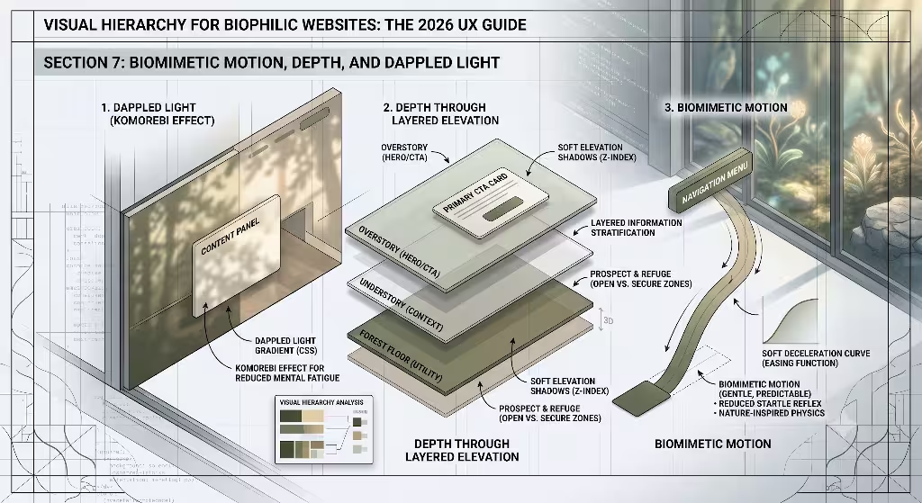
Movement in the digital world often feels mechanical and jarring. Things pop up out of nowhere, or spin in circles. Biophilic web design looks to nature for better motion models. This is called biomimetic motion. Think about how a leaf falls from a tree. It does not drop like a heavy stone. It glides, slows down, and lands softly. When you animate buttons or menus, you can use CSS easing functions to copy this organic physics. A menu should slide out with a gentle deceleration. A button should change color smoothly, like a stone getting wet in the rain. This type of motion enhances your visual hierarchy by drawing attention quietly without startling the user.
CSS
/* Example of biomimetic easing for smooth, natural visual transitions */
.biophilic-button {
  transition: background-color 0.4s cubic-bezier(0.25, 1, 0.5, 1),
              transform 0.4s cubic-bezier(0.25, 1, 0.5, 1);
}

.biophilic-button:hover {
  background-color: #2e5a44;
  transform: translateY(-2px);
}
You can also use depth and light to guide user focus. In a forest, sunlight filters through the leaves to create dappled light. This is called the komorebi effect. You can replicate this effect by using soft CSS gradients and layered background shadows.
By adding depth, you lift critical elements away from the background canvas. A form with a soft, wide drop shadow looks like it is floating slightly above the page. This physical depth creates an instant tier in your visual hierarchy. The brain notices the floating object first because it looks closer. Using light and shadow this way makes your site feel three-dimensional. It sets up a clear visual hierarchy that feels as real as physical objects sitting on a desk.
Structural Fractals: Mirroring Natural Sub-divisions
Nature loves fractals. A fractal is a mathematical pattern where a small part looks exactly like the whole thing. Think of a fern leaf. A single tiny leaf looks like a miniature version of the entire branch. A large tree has branches that look like small trees. You can bring this beautiful geometric order into your web layout. When your information architecture uses fractal principles, your site gains a deep sense of visual harmony. The localized sub-menus and secondary components should repeat the foundational design language of the global macro-layout.
This means your cards, widgets, and sidebars should follow the same proportions as your main page template. If your main page uses a specific ratio for its margins, your small content boxes should use that exact same ratio. This repetition creates an integrated visual hierarchy that connects every element together. To make this work, you can merge standard 12-column digital grids with organic asymmetry. A rigid, perfectly symmetrical grid can look cold and robotic. By shifting elements slightly or using uneven column widths, you mirror the beautiful imperfections of nature. This controlled asymmetry creates points of interest. It breaks up boring patterns and uses visual hierarchy to highlight your most important content columns.
Technical Sustainability and Green Performance Metrics
True biophilic design goes far beyond visual aesthetics. It must also consider the physical impact a website has on our planet. Every time a user loads a webpage, servers consume electricity. If a site is bloated with huge images and messy code, it requires more energy to load. This means web design has a direct connection to carbon emissions. A sustainable web page uses a clean visual hierarchy to reduce this digital waste. When a site has a clear layout, users find what they need faster. This means they spend less time loading pages, which saves data and energy.
To achieve this, you must focus on lean coding practices. Get rid of heavy JavaScript frameworks that do not add value. Clean, minimalist code directly correlates with fast loading speeds and lower server energy use. You should also optimize your visual elements. Compress your images and use vector graphics where possible. A lightweight site loads in a flash, which is great for user experience and search engine optimization.
Furthermore, you should deploy your website using green hosting solutions. These are data centers powered entirely by renewable energy sources like wind or solar power. By pairing a sustainable backend with a clean visual hierarchy, you create an eco-friendly digital space. You protect the user from mental fatigue while protecting the physical world from unnecessary pollution.
Practical Implementation Checklist and Conversion Framework
To bring all these biophilic ideas together, you need a clear action plan. Transitioning a standard corporate website into a natural layout requires checking both design and technical elements. The goal is to build a high-converting system that respects human biology. When your visual hierarchy aligns with natural human instincts, your engagement metrics skyrocket. Users do not feel forced to click. They follow the natural flow of the page because it feels right.
Use this quick checklist to evaluate your site design:
- Verify Scale: Ensure your H1 headers are at least two times larger than your 16px body copy.
- Check Color Balance: Keep 90% of your canvas in neutral, low-saturation natural tones. Save the remaining 10% for high-contrast CTA anchors.
- Audit Spatial Mechanics: Confirm that you have open spaces for prospect and sticky elements for refuge.
- Review Motion: Replace instant element pop-ups with smooth, biomimetic easing transitions.
- Measure Speed: Optimize code to ensure your page loads in under two seconds to lower energy waste.
By sticking to this framework, you create a powerful visual hierarchy that benefits everyone. Your readers get a peaceful browsing experience that reduces stress. Your business gets better retention and higher conversion rates. Finally, search engines reward your fast, clean site with better rankings. Merging the laws of nature with web design is not just a trend. It is the future of building a healthy, successful internet.
Detailed Visual Hierarchy Matrix
To help you apply these steps, use this table to check your design choices against biophilic goals. It shows how traditional design choices compare to nature-inspired methods.
| Design Element | Traditional Approach | Biophilic Approach | Impact on Visual Hierarchy |
| Grid Layout | Strict, boxy symmetry | Balanced asymmetry | Creates natural focal points that guide the eye to key elements |
| Color Usage | Bright, highly saturated tones | Low-saturation earth tones | Reduces eye strain and allows high-contrast CTAs to pop |
| Whitespace | Pack as much text as possible | Open spaces (Prospect) | Gives the mind room to breathe and highlights important content |
| Page Depth | Flat, two-dimensional planes | Layered shadows (Komorebi) | Creates a physical sense of what is close and important |
| Page Animation | Linear, robotic speed changes | Decelerating curves | Directs attention smoothly without breaking user concentration |
The Science of Visual Tracking
To truly master visual hierarchy, we must understand how human eyes track across a screen. When a person opens a webpage, their eyes move in predictable paths. If your site lacks a clear structure, their eyes wander aimlessly. This confusion causes a high bounce rate. Biophilic design fixes this by using natural waypoints. Just like a traveler looks for rivers or mountains to find their way, a web user looks for visual anchors. Your headers, images, and buttons act as these digital landmarks.
[Eye Enters Top Left] ---> [Tracks Across Header]
                                   |
                                   v
[Scans Down Left Margin] <--- [Catches Middle Image]
         |
         v
[Finds Main CTA Button] ---> [Conversion Action]
When you layout a page, you must think about the weight of each element. Visual weight is how much an item draws the eye. Large text has high weight. Bright colors have high weight. Unique shapes have high weight too. A master of visual hierarchy balances these weights across the screen. You do not want all your heavy items in one corner. This makes the page feel lopsided and unnatural. Instead, distribute your elements so the eye flows smoothly from one piece of information to the next. This gentle flow mimics a winding path through a garden, making the reading experience feel easy and rewarding.
Overcoming Common Web Layout Mistakes
Many designers fall into traps that ruin their visual hierarchy. The biggest mistake is trying to make everything stand out. When you make every sentence bold or every icon bright, nothing is important. You destroy the contrast needed for a functioning visual hierarchy. You must have the courage to leave large areas of your site completely empty. This empty space is not wasted space. It is the silence that allows your main message to be heard clearly.
Another common error is using too many different font sizes. A chaotic text layout confuses the reader’s brain. Stick to a simple system of three or four specific text sizes. This discipline creates a predictable visual hierarchy that the user can learn instantly. Furthermore, avoid hiding your navigation options in confusing menus. Remember the rule of refuge. Users need to see a safe way to move around your site at all times. Keeping your navigation clean and visible reinforces your visual hierarchy and gives users the confidence to explore deeper pages.
The Evolution of User Interfaces
As we look to the future, web design is moving away from cold, industrial styles. The early days of the internet featured harsh gray boxes and basic blue links. Later, sites became packed with complex animations and heavy images. Today, we realize that users want simplicity and comfort. They want digital spaces that reflect the physical world they love. This shift is why understanding visual hierarchy through a biophilic lens is so essential for modern designers.
By studying how humans interact with nature, we can build interfaces that feel intuitive. We do not need to force people to learn complicated site maps. Instead, we use the timeless laws of scale, contrast, and space. This natural approach to visual hierarchy makes your website accessible to everyone, regardless of their tech background. It breaks down barriers and builds a friendlier digital ecosystem. When you design with these principles, you are creating a lasting asset that stands out in a crowded digital landscape.
Biophilic SEO: Connecting Usability with Search Rankings
Search engines have grown incredibly smart over the years. They no longer look only at keyword repetition to rank a page. Today, search algorithms measure how real people interact with your site. If users click on your link and leave immediately, search engines notice. This behavior tells them your site is confusing or unhelpful. By building a clear visual hierarchy, you keep users engaged, which directly boosts your search engine optimization.
When a visitor finds a site with an excellent visual hierarchy, they spend more time reading your posts and viewing your products. They click through to secondary pages because the navigation feels safe and easy. These long visit times tell search engines that your website provides high-value content. A biophilic approach naturally creates these positive signals. You are satisfying both the human reader and the search algorithm at the exact same time. Good design is good search engine optimization. By focusing on a natural visual hierarchy, you build a sustainable traffic source that helps your digital platform grow year after year.
Final Thoughts on Design Harmony
Building a website is like planting a digital garden. It requires patience, structure, and a deep understanding of how living things interact with their environment. You cannot just throw elements together and hope for the best. You must curate the space with intention. Every header, color choice, and empty space must work together to build a unified visual hierarchy. This harmony is what separates a great website from a mediocre one.
As you move forward with your design projects, remember to look out your window for inspiration. Pay attention to how a tree splits into branches, or how sunlight strikes a stone path. Bring those lessons back to your code and layouts. By anchoring your visual hierarchy in the proven systems of the natural world, you create digital interfaces that are beautiful, fast, and highly effective. You bridge the gap between human evolution and modern technology, creating a digital space where users can truly thrive.