Table of Contents
The Biophilic Dilemma in Modern UI/UX
As has been stated in a lot of places on this blog, human beings evolved in nature. For thousands of years, our ancestors looked at trees, soil, stone, and water. Because of this history, our brains are hardwired to feel calm and focused when we see organic shapes. This connection is called biophilia. When we bring these elements into user interface (UI) and user experience (UX) design, we call it digital biophilia. Incorporating things like wood grains, leaf patterns, and rough stone textures into a website can make users stay longer and feel less tired while browsing the internet.
However, a big problem arises when we try to balance nature with digital web standards. Web design must follow strict rules so that everyone can use it, which brings us to a major question: are natural textures accessible for all users? Web accessibility means making sure that people with disabilities can read and navigate your site easily. When you place text directly on top of a stone or wood image, the visual noise can make reading very difficult. This is the main biophilic dilemma that modern web designers face today.
To build a truly inclusive internet, we must make sure our natural textures are accessible to people who use screen magnifying tools or have trouble seeing subtle color changes. My core thesis is simple: digital spaces do not have to choose between natural beauty and legal accessibility compliance. By using smart frontend engineering and clear design choices, we can satisfy both our biological love for nature and our technical duty to create an open web for everyone. If you follow the right steps, you can keep your natural textures accessible without losing the organic feel that makes your website stand out.
The Fundamental Question: Are Natural Textures Accessible?
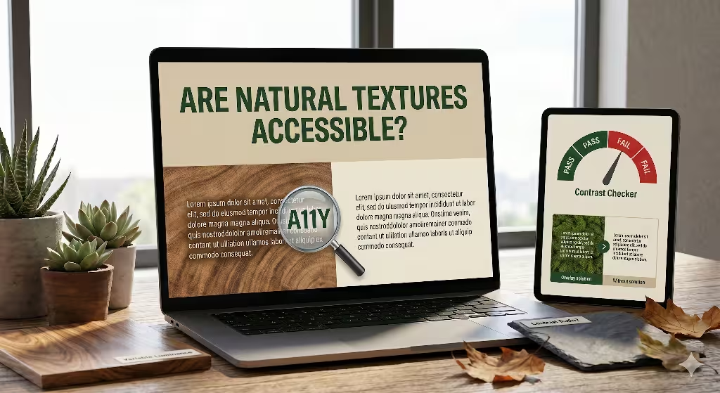
When web developers ask if natural textures are accessible, they are looking for a direct path to blend art and utility. The short answer to this question is that they are not accessible by default. Real elements from the outdoors are full of unpredictable changes. A single piece of oak wood has dark lines, light spaces, knots, and cracks. This means the surface does not have one solid color. Because the surface changes every few pixels, putting words on top of it creates a reading hazard. If you want to ensure your natural textures are accessible, you have to look closely at how light and dark areas interact on the screen.
Web accessibility is governed by a global standard called the Web Content Accessibility Guidelines, or WCAG. The latest version, WCAG 2.2, has specific rules about contrast. Success Criterion 1.4.3 says that standard text must have a contrast ratio of at least 4.5 to 1 against its background.
Success Criterion 1.4.11 says that non-text items, like icons or borders, must have a 3 to 1 contrast ratio. When you use a plain white background with black text, meeting this rule is easy. But when you try to keep your natural textures accessible, a single letter might rest on a light wood grain spot and a dark wood grain spot at the same time. This variation drops the contrast ratio below the legal limit in certain areas of the screen.
We also must separate decorative textures from informative textures. A decorative texture is just there to look nice, like a mossy border on the edge of a page. If text does not sit on top of it, the rules are much friendlier. But if that texture is behind your main paragraphs, you must work hard to make those natural textures accessible.
Think about how a messy background affects vulnerable groups of people. A user who is older might have cataracts, which makes images look blurry. A user with low vision might need to turn up the brightness or zoom in very close. If your natural textures accessible strategies are weak, these users will see the text blend right into the background image.
People with color blindness, like protanopia or deuteranopia, have trouble separating certain red and green shades. If your background is a green leaf texture and your text is brown, they will see a blurry, unreadable screen. There are also situational issues, such as a person trying to read a blog post on a smartphone outside under bright sunlight. If you have not made your natural textures accessible, the sun’s glare will wash out the text completely.
The Technical Challenge: Micro-Contrast and Luminance Variance

Understanding why organic backgrounds cause trouble requires looking at how screens show graphics. Traditional contrast tools are built for flat web design. You paste in the hex code of the text and the hex code of the background, and the tool gives you a pass or fail grade. But these tools fail completely when you ask them if your natural textures are accessible. A standard checker only measures two single colors. It cannot look at a stone pattern that contains fifty different shades of grey, white, and black in a tiny space.
This brings us to the idea of micro-contrast. Micro-contrast is the quick change between light and dark pixels inside an image asset. In a wood texture, the lines of the grain create small areas of high micro-contrast. Your eyes must work extra hard to separate the shapes of the alphabet from the shapes of the wood grain. This added work increases cognitive load, which means the brain gets tired quickly. If a user has a learning disability or reading difficulties, high micro-contrast can make them abandon your website entirely. To keep natural textures accessible, you must find ways to tame this micro-contrast.
Another technical term to know is luminance variance. Luminance is just a scientific word for how bright a pixel looks to the human eye. Solid backgrounds have zero luminance variance because every pixel is exactly the same brightness. Natural textures have high luminance variance because the pixels shift from bright to dark constantly. When you place text over high variance, the letters can bleed into the background noise.
To see this clearly, let us look at how text acts on different backgrounds:
| Aspect | Solid Background Field | Textured Organic Background |
| Luminance Value | Uniform across the entire area | Dynamic fluctuation (high pixel variance) |
| Mathematical Testing | Simple Hex-to-Hex verification | Target area pixel sampling required |
| Typographic Fit | Adapts easily to light or dark weights | Requires robust font weights and sizes |
| Cognitive Strain | Low (predictable letter boundaries) | High (letters bleed into background noise) |
When you study this table, you can see why keeping natural textures accessible takes extra planning. You cannot rely on guesswork. You have to actively sample the brightest and darkest points of your background asset to ensure the words stay clear. If you leave the text unshielded, you fail to make your natural textures accessible, and your site will break international compliance laws.
Basic Readability Tips for Biophilic Backgrounds
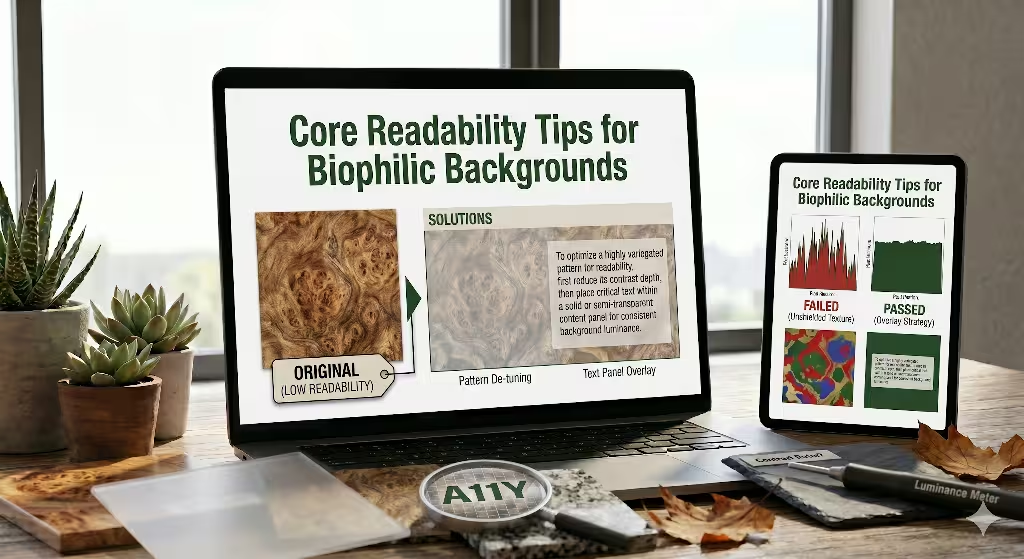
Fortunately, there are proven ways to make your natural textures accessible without destroying your organic theme. As a designer who loves nature, I have tested many methods to find what works best. The goal is to let the natural texture show through while creating a safe zone for your words.
Strategy 1: Text Containment Overlays
The most dependable way to keep natural textures accessible is to use a text containment overlay. This means you do not place the words directly on the raw texture. Instead, you put a solid or semi-transparent layer between the texture and the text. This layer acts like a shield. By using code, you can make this shield look elegant.
You can use alpha channel opacity in your CSS, which is written as rgba or hsla. This allows you to create a white or dark box that is partly see-through. The natural texture still shows through the box, but the luminance variance is flattened out. This makes your natural textures accessible because the text now sits on a smooth, controlled surface.
Another great modern tool is the CSS backdrop-filter property. This tool lets you blur the texture directly behind the text container without blurring the text itself. Here is a simple example of how to write this in your website style sheet:
CSS
background: rgba(255, 255, 255, 0.85);
backdrop-filter: blur(8px);
This bit of code creates a beautiful frosted glass effect. It keeps the warm tones of your natural texture visible, but it wipes out the dangerous micro-contrast. It is an excellent technique for keeping your natural textures accessible while maintaining a premium, organic look.
Strategy 2: Structural Typographic Enhancements
If you do not want to use boxes or overlays, you must change the way you style your fonts. To make natural textures accessible, you cannot use thin, delicate typefaces. Light fonts have thin lines that easily drop into the dark cracks of a texture image. Instead, you should choose thick, heavy font weights.
You should also choose sans-serif fonts with clean, geometric shapes. Fonts like Arial, Helvetica, or open-source choices like Roboto work well because their letter paths are predictable. The human brain can recognize them faster against a busy background. Ensure your body text is large, starting at 16 pixels or higher, to give the letters more physical presence on the screen.
You can also use text shadows to make your natural textures accessible. A text shadow should not be a giant, ugly glow from the 1990s. Instead, use a tight, dark shadow that outlines the letters. This shadow separates the edges of the font from the background pixels. For example, using a style like text-shadow: 0 1px 3px rgba(0,0,0,0.6) creates a tiny boundary line. This boundary ensures that even if a white letter passes over a bright spot in a stone texture, the dark shadow keeps the letter shape distinct, which helps keep your natural textures accessible under tough lighting conditions.
Strategy 3: Slicing and Spatial Isolation
The third path is about clever layout choices. You do not need to wrap your entire website in textures to make it feel connected to nature. In fact, using too many textures can overwhelm any user. To keep your natural textures accessible, use spatial isolation. This means you slice your layout into clean zones.
You can place your rich, high-contrast wood or leaf textures in the side margins of the page, where no text is written. You can use them in large hero images at the top of the page, keeping the text inside a separate, clean column. By keeping your paragraphs inside flat, solid-colored content panels, you make your reading zones perfectly safe. Meanwhile, the outer areas of the screen display your beautiful natural motifs. This layout strategy keeps your natural textures accessible because the text and the textures never fight for the same pixels.
Common Questions about Natural Textures in Web Design
When people search the internet for advice on biophilic design, they often ask very specific questions. To help you understand this topic completely, here we will answer the four most common questions that users type into search engines regarding web access and organic textures.
Question 1: Can you use textured backgrounds in web design?
Yes, you can absolutely use textured backgrounds in your web designs. Textures add depth, warmth, and personality to a digital space, breaking away from cold, flat layouts. The secret is knowing where and how to use them. If a texture is purely decorative and does not sit under any text or interactive buttons, you can use it freely. You just need to make sure it does not distract the user or slow down the loading speed of your page.
However, the moment you decide to overlay text, you must take active steps to ensure those natural textures accessible. Using textures incorrectly can ruin your user experience, but using them with proper contrast shields makes your site both beautiful and functional.
Question 2: How do you make textured backgrounds accessible?
You make textured backgrounds accessible by reducing the luminance variance behind your words. As we discussed earlier, you can use semi-transparent overlays, add CSS backdrop blurs, or apply strategic text shadows. Another great method is to reduce the contrast of the texture itself before uploading it to your website. You can open your image editor and lower the contrast of a wood or stone image so that the difference between the light and dark lines is very small. By flattening the texture image itself, you make your natural textures accessible because you have eliminated the sharp micro-contrast that hurts human eyes.
Question 3: What is the WCAG requirement for background textures?
The official WCAG requirement states that any text placed over a background asset must maintain a minimum contrast ratio of 4.5 to 1 for regular text, and 3 to 1 for large text. When dealing with textures, this rule applies to every single spot where the text sits. If your text passes over a dark line in a marble texture and the contrast drops to 2 to 1 in that specific spot, your page is technically out of compliance.
To make your natural textures accessible under WCAG law, you must measure the worst-case scenario points on your screen. If your text cannot pass the test across the entire texture, you must add an overlay or a container to meet the standard.
Question 4: Does background texture affect readability?
Yes, background textures affect readability significantly. When an image has lots of small details, your eyes must work harder to separate the shapes of the text from the shapes in the background pattern. This extra work causes physical eye strain and slows down reading speeds. For users with dyslexia, visual tracking issues, or low vision, a busy background can make a webpage completely impossible to read. This is why learning how to keep your natural textures accessible is an essential skill for any modern web designer who wants to build an ethical website.
Frontend Checklist for Auditing Biophilic UIs
To help you audit your website and verify that your natural textures accessible, I have created a clear checklist. You can use these steps during your next design review to make sure you are protecting your users while keeping your biophilic themes alive.
- Verify the texture asset uses the correct HTML attributes. If a texture image is purely decorative and has no text on it, ensure it includes
aria-hidden="true"or an emptyalt=""tag so screen readers know to skip it entirely. - Test background-to-foreground ratios using sample point analysis. Do not just test one spot. Find the brightest pixel and the darkest pixel directly underneath your text block and run your contrast calculations there to ensure your natural textures accessible across the whole surface.
- Implement a togglable High Contrast Mode stylesheet. Give your users a clear button at the top of the page that allows them to turn off background textures completely, swapping them for solid white or black fields if they use assistive technology.
- Ensure typography scales gracefully up to 200% zoom. When a user magnifies your page, the text will shift position. Make sure the text does not drift out of its protective overlays and land on unshielded textured zones.
- Check your site under simulated outdoor lighting. Test your design on a mobile screen under direct sunlight to make sure your natural textures accessible choices hold up against extreme real-world glare.
Inclusive Nature-Inspired Design
Building beautiful, nature-inspired websites is a wonderful way to improve the digital world. By bringing the textures of the earth onto our screens, we create spaces that feel calm, human, and grounded. But as designers, our first duty is always to the people who use our software. We must make sure that our love for organic patterns never creates a barrier for someone with a disability.
Knowing how to make your natural textures accessible is not a limitation on your creativity. Instead, it is an engineering challenge that forces you to write better code and build smarter layouts. By using clear text containers, smart typography enhancements, and proper layout spacing, you can honor the natural world while respecting every single user on the internet. True biophilic design is inclusive, welcoming, and open to everyone.