The Philosophy of the Imperfect Brand
A. Conceptualizing Wabi-Sabi in Modern Branding
The digital world is full of loud, bright colors. For years, companies have used flashing screens, neon lights, and perfectly shiny designs to get your attention. But a big shift is happening right now. Many modern brands are turning away from this hyper-polished, high-chroma look. They want something different. They are choosing a path that feels real, calm, and deeply connected to the earth. This design movement is based on an ancient philosophy from Japan known as wabi-sabi.
To understand how this changes a branding color scheme, we have to look at what the words actually mean. Wabi is all about rustic simplicity. It means finding peace in quiet things and feeling satisfied with understatement. Sabi is the beauty that comes with age, wear, and the natural passage of time.
When you combine them, you get a view of the world that honors things that are broken, old, or irregular. It is the opposite of a sterile, machine-made corporate style. When we bring this philosophy into the digital space, we build a branding color scheme that feels human. It honors raw textures, soft light, and natural changes. At Silphium Design LLC, we use these principles to make websites feel like an extension of the physical earth.
B. The Psychology of Low-Chroma, Organic Palettes
Why do these colors work so well on a modern website? The secret lies in human biology and psychology. High-contrast, glowing neon colors put a heavy cognitive load on our brains. In simple terms, they make our eyes work too hard and tire out our minds. On the other hand, a low-chroma branding color scheme uses desaturated colors. These are tones that look like they have been mixed with a bit of gray, brown, or white. They copy the soft light you find in a forest or on a rocky beach.
When a user visits a website that uses an organic branding color scheme, their nervous system relaxes. These colors build a deep, subconscious sense of trust and calm. It tells the user that the brand is confident, stable, and honest. They do not need to scream for attention because their quality speaks for itself. In this comprehensive guide, we will analyze five specific wabi-sabi branding color scheme examples. We will look at how they work across different industries. We will show you how to apply these natural tones to your own digital and physical projects.
Table of Contents
The Anatomy of a Wabi-Sabi Palette in a Branding Color Scheme
A. The 60-30-10 Rule of Visual Weight Distribution
Creating a great branding color scheme is not just about picking pretty colors. It is about balance and knowing where to place each tone. In our design work, we use a classic framework called the 60-30-10 rule. This rule splits your layout into three distinct layers of visual weight. It keeps the design clean, organized, and easy to read.
First, sixty percent of your layout is the canvas. For a true wabi-sabi look, this background layer must never be a harsh, pure digital white. Pure white feels like a cold hospital room. Instead, we use soft neutrals like ashen white, limestone, bone, and oat. These shades have a high reflection rate, which keeps the screen bright. However, they also hold a faint warmth that makes the background feel like handmade paper.
Second, thirty percent of your layout forms the structure. This layer includes things like text blocks, secondary cards, section backgrounds, and main navigation areas. Here, we use grounding tones like earthy gray-browns, mushroom taupes, and fog grays. These colors give the design its shape and weight without breaking the peaceful mood.
Third, the final ten percent is saved for the story or the accent. This is your action color. You use it for buttons, important links, alerts, and key call-to-action areas. In a standard corporate project, this might be a bright red or a neon blue. But in a wabi-sabi branding color scheme, your accent is faded, deep, or historic. We love to use weathered tones like faded indigo, oxidized rust, charred soot, or a beautiful kintsugi-inspired antique gold. Kintsugi is the Japanese art of fixing broken pottery with gold lacquer. It turns a flaw into a beautiful focal point.
| Palette Layer | Visual Weight Percentage | Recommended Wabi-Sabi Tones | Digital Design Function |
| The Canvas | 60% of the interface | Bone, Limestone, Oat, Ashen White | Background surfaces, negative space, text backdrops |
| The Structure | 30% of the interface | Taupe, Mushroom, Fog Gray, Timber Brown | Typography, secondary sections, cards, borders |
| The Story | 10% of the interface | Antique Gold, Faded Indigo, Rust, Soot | Call-to-action buttons, active states, key icons |
B. Finish and Texture Metaphors in Digital Design
A big challenge with a digital branding color scheme is that screens are flat and glassy. Nature is not flat or glassy. Nature is rough, bumpy, lined, and soft. To make a digital screen feel organic, we have to translate physical finishes into our web design code. We do this by choosing colors that remind people of physical objects.
When you select your hex codes, think about concrete things. Look for the chalky appearance of dry limewash on a brick wall. Think about the rough, uneven surface of hand-thrown ceramics. Look at the deep grain of raw timber, or the soft matte finish of smooth river stones. We can bring these elements to life on a website by using subtle CSS techniques. For example, we can add a very faint image overlay that looks like paper grain. We can use low-contrast borders instead of harsh black lines. This makes the colors look like they are sitting on a textured surface rather than floating on a cold pixel grid.
5 Curated Wabi-Sabi Branding Color Scheme Examples
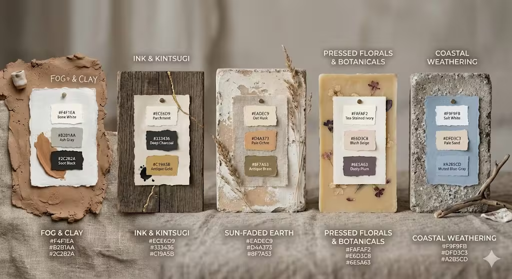
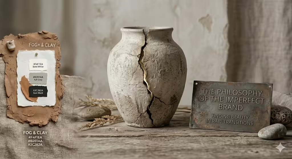
A. Example 1: Fog & Clay (The Minimalist Ceramicist)
Our first branding color scheme example is inspired by a quiet morning inside an artist’s studio. Imagine a misty fog rolling past a window while raw, wet clay sits on a pottery wheel. This palette is an excellent choice for sustainable skincare lines, clean beauty products, and artisan e-commerce stores. It relies heavily on soft, desaturated tones that feel gentle on the skin and the eyes.
The background canvas uses Bone White (#F4F1EA). This shade provides a clean, open backdrop that feels light but warm. For the structural elements and secondary sections, we bring in Ash Gray (#B2B1AA). This color looks like cold river stones or wet cement, providing a beautiful middle ground. The primary text and structural borders use Soot Black (#2C2B2A). This is a soft, charcoal-like black that avoids the harsh look of pure digital black. Finally, the accent color is Warm Clay (#C8A285). This earth tone provides a gentle pop of color for buttons and highlights. It reminds the customer of terracotta pots and raw soil, instantly grounding the brand.
Canvas (60%): Bone White -------> #F4F1EA
Structure (30%): Ash Gray ------> #B2B1AA
Accent (10%): Warm Clay --------> #C8A285
Text & Borders: Soot Black ------> #2C2B2A
B. Example 2: Ink & Kintsugi (The Premium Academic)
If you want an organic feel that still communicates luxury, our second branding color scheme example is a perfect fit. This combination is inspired by old books, heavy parchment paper, and handmade ink. It works beautifully for boutique architecture firms, high-end editorial platforms, design studios, and premium lifestyle brands. It balances deep shadow with a bright, historic accent.
The canvas layer is built with Parchment (#ECE6D9), a rich off-white that feels heavy and historic. The main structural weight comes from Deep Charcoal (#333436), which gives excellent readability for long articles. To add depth, we use Indigo Ink (#2B323F) for secondary cards and header elements. This shade feels like natural dye made from plants. The crowning piece of this branding color scheme is Antique Gold (#C19A5B). This gold accent is not shiny, metallic, or bright yellow. It is a muted, dusty gold that looks like old lacquer used in kintsugi repairs. It draws the eye directly to your most important links and buttons while maintaining an air of quiet luxury.
Canvas (60%): Parchment --------> #ECE6D9
Structure (30%): Deep Charcoal -> #333436
Accent (10%): Antique Gold -----> #C19A5B
Supporting: Indigo Ink ---------> #2B323F
C. Example 3: Sun-Faded Earth (The Organic Agrarian)
Our third branding color scheme example comes straight from dry summer fields. It captures the colors of dried grasses, baked dirt, and wild olive trees. This palette is designed for eco-friendly product packaging, sustainable farming brands, herbal wellness companies, and organic food suppliers. It is a warm, deeply comforting group of colors that tells a story of growth and natural harvesting.
We start with an open canvas of Oat Husk (#EADEC9). This color looks like raw grain or a linen sack. For our secondary structure, we use Pale Ochre (#D4A373). This is a warm, sun-baked earth tone that brings light and energy to the page. For text, icons, and natural framing, we introduce Dusted Olive (#A3A380). This sage-like green feels directly tied to the plant world. The final accent touch is Antique Brass (#8F7A53), a dark, weathered greenish-brown. You can use this for primary buttons and active states. It gives the layout a sturdy, time-tested feel that honors the great outdoors.
Canvas (60%): Oat Husk ---------> #EADEC9
Structure (30%): Pale Ochre ----> #D4A373
Accent (10%): Antique Brass ----> #8F7A53
Supporting: Dusted Olive -------> #A3A380
D. Example 4: Pressed Florals & Botanicals (The Artisanal Studio)
Wabi-sabi is not just about browns and grays. It also includes the soft, muted tones of fading plant life. Our fourth branding color scheme example is inspired by old botanical journals filled with dried roses, pressed tea leaves, and vintage linen. This is a lovely direction for high-end floral design studios, slow-fashion clothing lines, and handmade jewelry brands. It feels deeply personal, romantic, and beautifully aged.
The backdrop is built on Tea-Stained Ivory (#FAFAF2), an ultra-soft white with a hint of warm green and yellow hiding inside. For our layout cards and secondary text blocks, we use Blush Beige (#E6D3C8). This shade brings a soft, human flesh-tone quality to the design. The primary text and deep shapes rely on Dusty Plum (#6E5A63), a rich but heavily muted purple that looks like dark fruit skin. For buttons and interactive details, we use Dried Rose (#B8978E). This accent is a dusty, desaturated pink-brown. It provides a clear visual signal for users without ever feeling loud or aggressive.
Canvas (60%): Tea-Stained Ivory -> #FAFAF2
Structure (30%): Blush Beige ----> #E6D3C8
Accent (10%): Dried Rose -------> #B8978E
Text & Shapes: Dusty Plum ------> #6E5A63
E. Example 5: Coastal Weathering (The Architectural Retreat)
Our fifth branding color scheme example takes its inspiration from a rocky, wind-swept coast. Think of driftwood baking in the sun, salt crusting on a stone wall, and cold ocean fog hanging over the sand. This palette is an incredible choice for modern interior design firms, coastal boutique hotels, high-end wellness retreats, and biophilic web applications. It brings a crisp, breezy sense of space and clean air to a user’s screen.
The foundation of this layout is Salt White (#F9F9FB), a cool, crisp background that mimics sea foam and clean limestone. We pair this with Pale Sand (#DFD3C3) for structural dividers and background blocks to add a necessary layer of beach-like warmth. The text and core navigational systems use Driftwood Gray (#8B8682), which provides a natural, woody contrast that is highly readable. For buttons, tabs, and interactive states, we deploy Muted Blue-Gray (#A2B5CD). This slate-like tone looks like the ocean on a cloudy day, creating a beautiful and refreshing digital landscape.
Canvas (60%): Salt White -------> #F9F9FB
Structure (30%): Pale Sand -----> #DFD3C3
Accent (10%): Muted Blue-Gray --> #A2B5CD
Text & Icons: Driftwood Gray ---> #8B8682
Common Questions about Wabi-Sabi Branding Color Schemes
A. What are the colors of Wabi-Sabi?
When you look at a classic wabi-sabi design, you will notice that the colors look like they were gathered from a walk in an untouched landscape. The primary colors of this style are heavily desaturated earth tones. They include rich forest greens, soft moss, warm clays, sandy ochres, and deep terracotta. Alongside these earth tones, you will find mineral colors like river slate, wet cement, chalky limestone, and bone white.
Vegetal shades like dried green tea leaves and pressed herbs are also common. You will also see colors that show the passage of time, like oxidized copper, rusted iron, and charred wood soot. The key rule for a wabi-sabi branding color scheme is that every color must feel like it was made by nature rather than a chemical factory. They should have lower saturation, which means they look soft, deep, and slightly weathered.
B. What is the difference between Japandi and Wabi-Sabi design?
This is a question that trips up a lot of designers. Both styles share deep roots in Japanese aesthetics, but they look and feel different when applied to a modern design system. Japandi is a hybrid movement. It blends the clean lines, sharp functionality, and bright wood tones of Scandinavian modernism with classic Japanese minimalism. A Japandi branding color scheme is very organized, bright, and streamlined. It often uses clean, high-contrast lines, smooth black shapes, and pristine, unblemished backgrounds. It values order and sleek perfection.
Wabi-sabi goes in a completely different direction. Instead of chasing sleek perfection, it embraces flaws and organic asymmetry. A wabi-sabi branding color scheme prioritizes surfaces that look worn, weathered, and marked by time. While Japandi wants a clean, smooth wooden table, wabi-sabi loves a rough piece of driftwood with cracks and a twisted grain. In digital design, Japandi looks like a crisp, high-end tech layout with minimalist icons. Wabi-sabi looks like a warm, artistic space filled with natural movement, asymmetrical layouts, and rich, grainy textures.
C. How do you implement Wabi-Sabi colors in digital branding without looking “dirty”?
This is a very important technical problem. When you mix earth tones like browns, grays, and ochres on a flat digital screen, there is a risk that the website will look messy, old, or dirty. To fix this, you must rely on a concept called Ma. This is the Japanese design principle of negative space, or empty space. By leaving wide, clean margins around your content, you give your earth tones room to breathe. The empty space tells the viewer’s eye that the design is deliberate and highly professional, not cluttered or unpolished.
Another critical step is to pay close attention to your typography and contrast. To pass modern web accessibility laws, your text must stand out clearly from the background. If you use a soft tan background, ensure your body text is a very dark, solid charcoal or soot black. Use sharp, clean, beautiful serif typography. The contrast between perfect, crisp modern typefaces and organic, textured background colors creates a gorgeous balance. It shows the user that you are competent and professional, while still maintaining an authentic, natural soul.
SEO Implementation Strategy for Web Masters
A. Schema Markup for Color Architecture
To get the most value out of your new branding color scheme, you need to make sure search engine robots can understand your design choices. We can achieve this by adding structured data, also known as schema markup, to the code of your web pages. When you share color palettes, you should wrap your code inside a HowTo schema or an ItemPage schema. This tells search engines exactly what your colors are, what their hex codes mean, and how they are used.
By doing this, your website becomes eligible for rich snippets in search results. This means that when a user searches for design inspiration, Google can display your color swatches, color names, and hex values directly on the search engine results page. This drastically increases your visibility and helps drive high-quality organic traffic directly to your blog or design studio.
B. Image Alt Text & Semantic Anchor Text Optimization
Every image, mood board, and color swatch in your branding color scheme you upload to your website needs to be optimized for search engine crawlers. Robots cannot look at a picture of a clay pot or a sand palette and see its beauty. You have to explain it to them using highly descriptive text embedded in your HTML tags. This is called image alt text.
Avoid using short, unhelpful file descriptions like alt="palette1.jpg" or alt="color scheme". Instead, use deep, context-rich descriptions that help visually impaired users and search robots at the same time. For example, a great alt tag would look like this: alt="Wabi-sabi branding color scheme example featuring a matte bone white background, ash gray structural cards, and a warm clay accent button". When you link to other pages on your site, use descriptive text instead of generic phrases like “click here.” Use natural, keyword-rich anchor text like “explore our collection of sustainable web design examples” to build a strong internal link network.
C. Internal Linking Infrastructure
A healthy website functions like a thriving ecosystem. Every page should be connected to another page in a way that makes logical sense for the reader. If you write an in-depth article about a natural branding color scheme, you should create direct links to your articles on biophilic web design, minimalist layout structures, and local search trends.
This strategy does two great things for your business. First, it keeps human readers engaged on your website for a longer time. They can easily click from an article about colors to a deep dive into typography or organic layouts. Second, it makes it incredibly easy for search engine crawlers to map your entire website. It shows the search engines that you have deep, professional expertise across the entire field of natural web design, which lifts your overall authority and improves your rankings.
Conclusion & Action Plan
A. Moving Beyond Hex Codes
When you sit down to build a beautiful branding color scheme, it is easy to get stuck on the technical numbers. You can spend hours tweaking hex codes and looking at color wheels. But a true wabi-sabi identity is much more than a collection of digital numbers. Color is only the first layer of a great brand identity. To make the design feel truly authentic, the colors in your branding color scheme must work in perfect harmony with your typography and your structural layouts.
Pair your organic colors, in your branding color scheme, with humanistic typography. Look for serif typefaces that feel like they were carved out of stone or printed on an old printing press. They should have subtle flaws, varied line weights, and warm curves. Avoid ultra-rigid, geometric shapes that look like they were drawn by a robot. Instead, embrace asymmetrical layouts. Let your images sit off-center. Give your text blocks varying lengths of white space. When your layout moves with the natural rhythm of an organic landscape, your colors will come alive.
B. Final Takeaway
The most important lesson we can take from the world of wabi-sabi is very simple: embrace the flaws. Your digital presence does not need to look like a sterile, high-gloss template from a massive corporate tech giant. In a modern marketplace where everyone is trying to look louder, brighter, and more perfect than their neighbors, a quiet voice stands out. This can be relfected in your branding color scheme.
A brand that feels collected over time, deeply human, and beautifully weathered will always cut through the noise. By choosing an organic branding color scheme, you are building a safe harbor for your users. You are inviting them into a space that feels honest, grounded, and real. Take these examples, play with the distributions, and build an online presence that honors the natural beauty of our world.